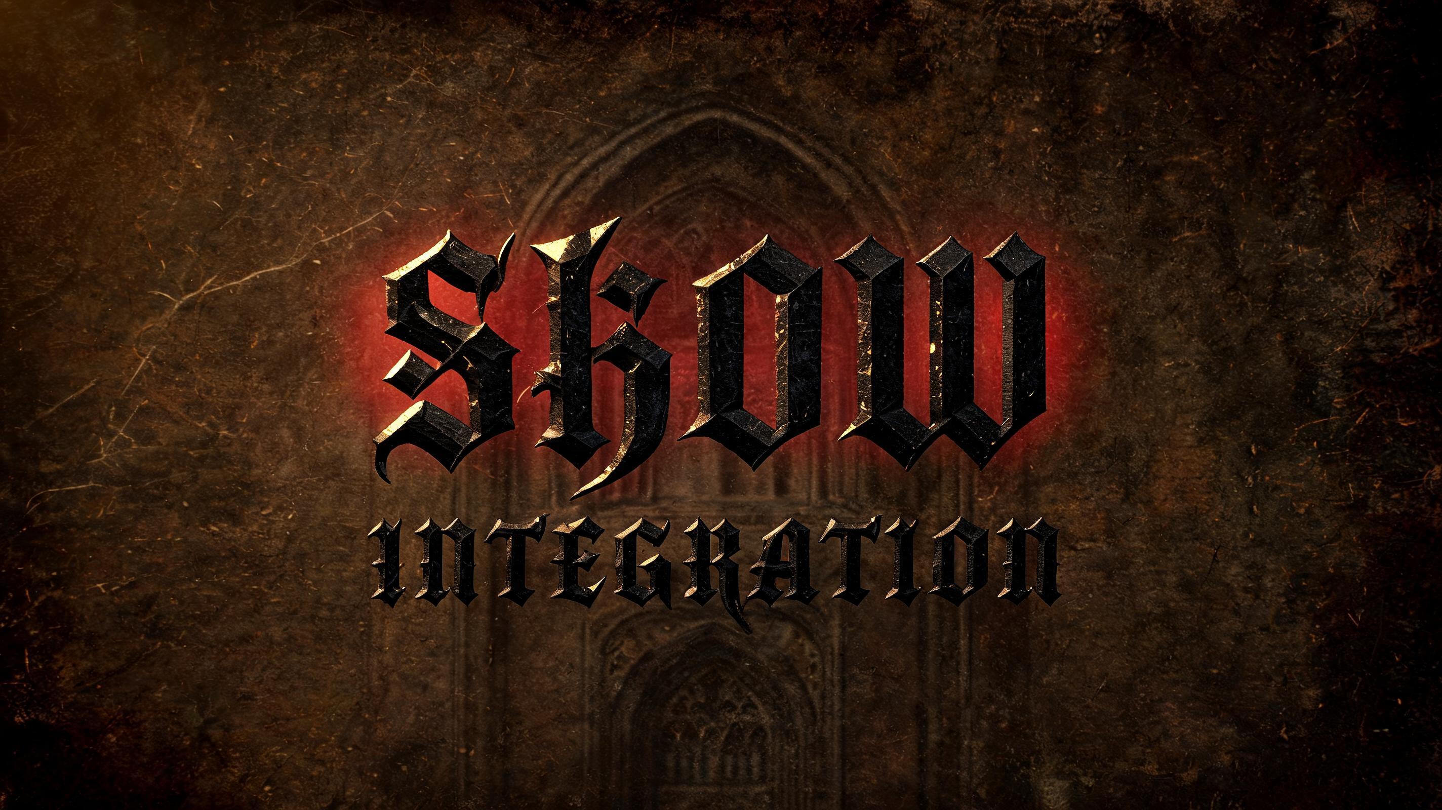
SHOW INTEGRATION - Gotische Schrift Text Effect


Nutzt BytePlus Seedream 5.0, das Modell dieses Werks · 15 Credits


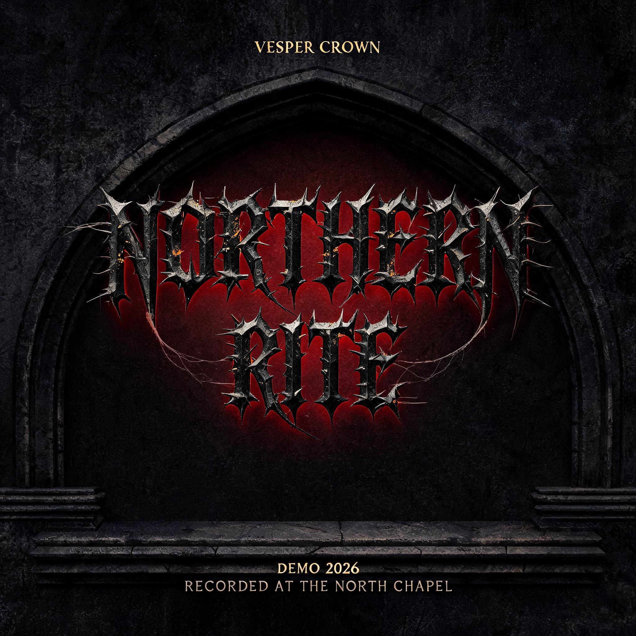
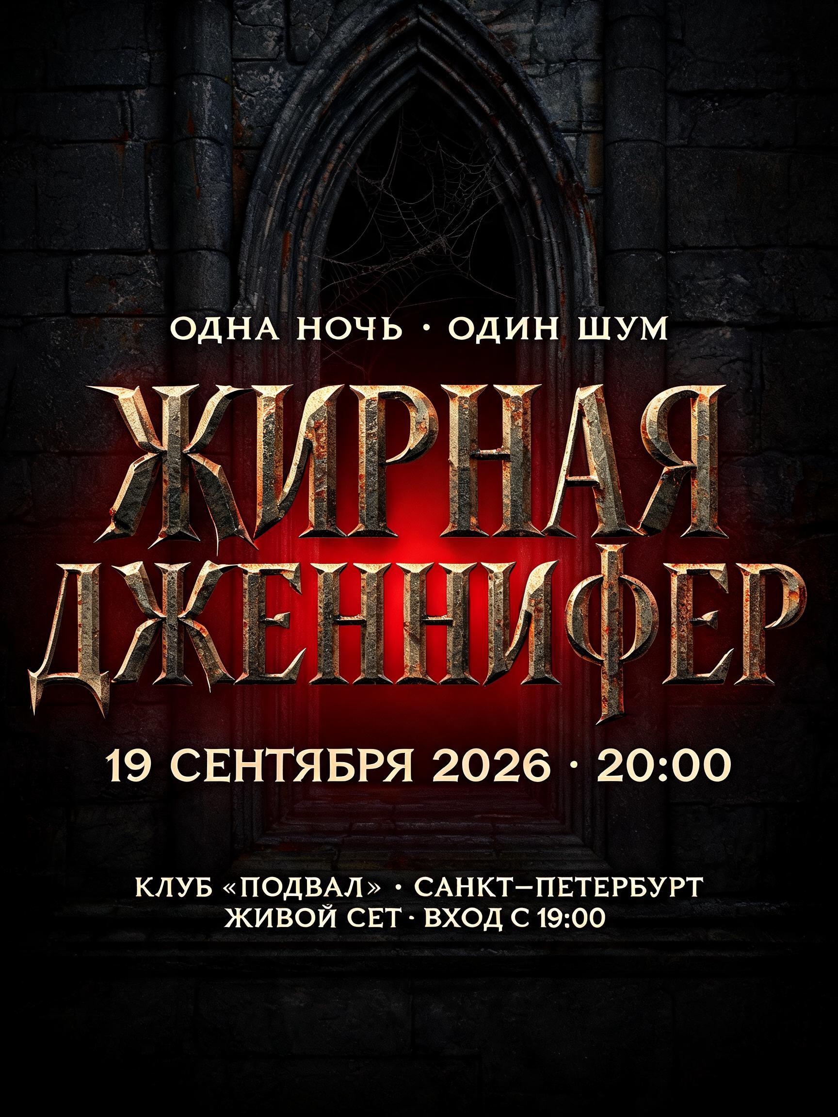
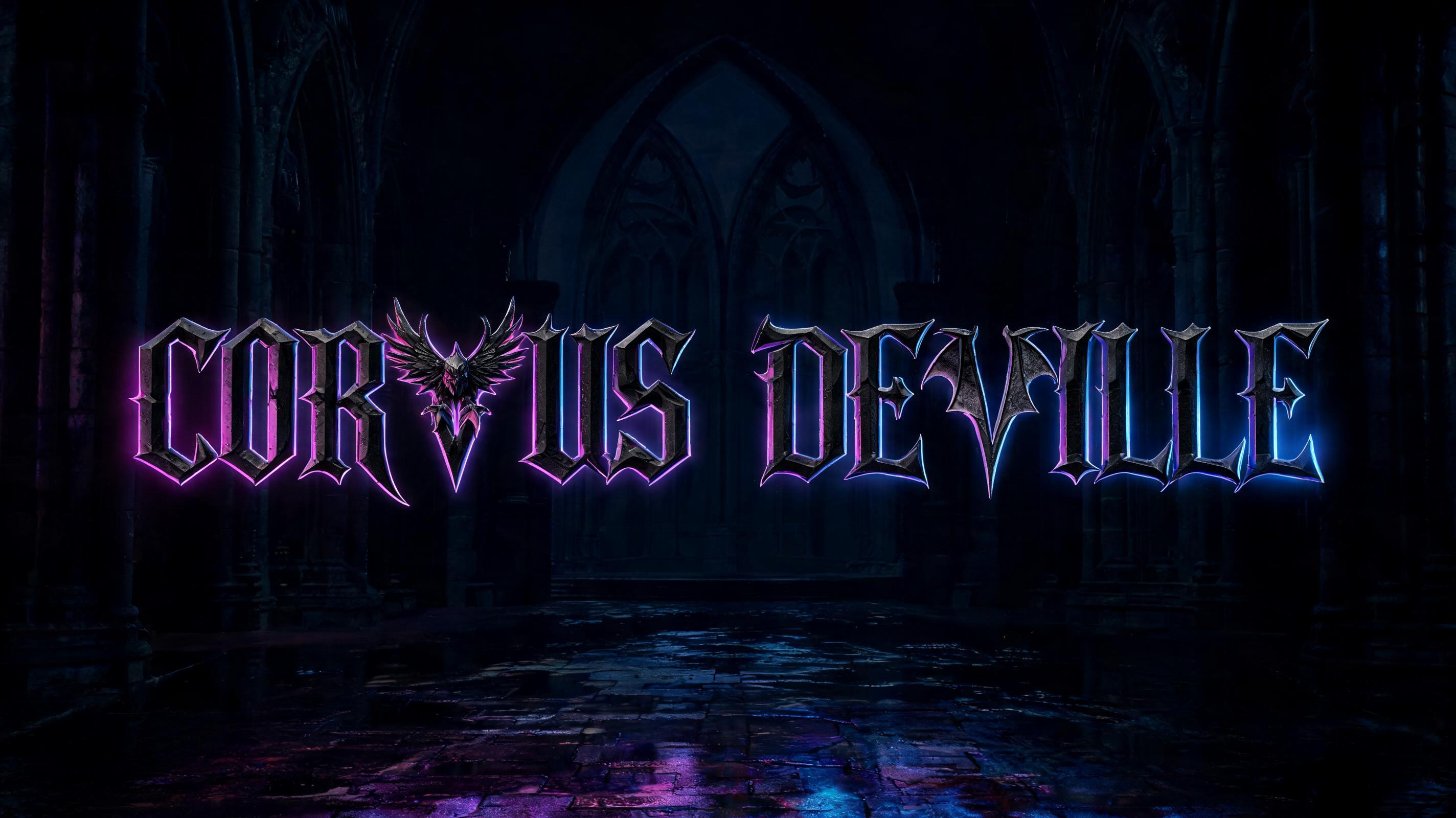


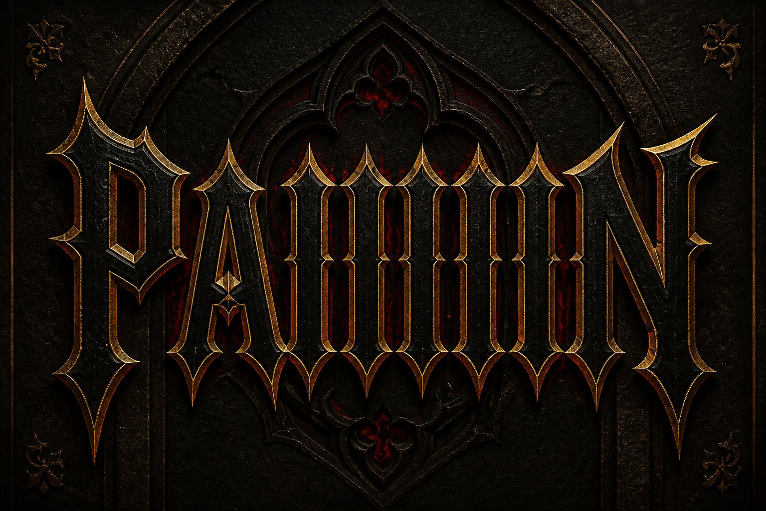


“SHOW INTEGRATION” is a Gothic Font text effect Texteffekt erstellt mit FontVibe KI. Präzise Textura-Fraktur: schmale, gebrochene Striche, rautenförmige Enden und starker Kontrast von dick und dünn, in schwarzer Tinte mit Goldakzenten auf dunklem, altem Pergament.
rendered in precise gothic blackletter letterforms with authentic calligraphic construction — diamond-shaped stroke terminals, strong thick-thin contrast, pointed arch counters. Rich black ink with warm depth on dark parchment or deep charcoal background. Subtle gold ink highlights on serifs and capitals. Medieval scribal precision. No cobwebs, no rust, no atmospheric fog — pure typographic craft. LETTERFORM PRIORITY: when the chosen font carries its own treatment, that font's letterform shapes take priority and own the letters; this style governs the rich ink, the parchment ground and the subtle gold highlights. FALLBACK MATERIAL: if the font carries no material of its own, render the letters as precise gothic blackletter in rich black ink with subtle gold highlights on dark parchment — pure typographic craft, no cobwebs, rust or fog. COLOR PRIORITY: keep the font's own colors if specified; otherwise black ink with warm gold accents. The rendered text “SHOW INTEGRATION” dominates a wide ceremonial typographic composition, with SHOW carrying greater scale and INTEGRATION forming a subordinate inscription beneath it. Preserve the externally supplied font’s own letterform shapes and colors; apply dense iron-black ink treatment only where the font has no inherent material. Dark parchment ground with fibrous grain, soot-darkened edges, faint age stains, and restrained engraved border fragments inspired by cathedral manuscript margins. Black ink appears slightly raised and absorbed into the paper, with crisp edges, subtle warm gold leaf catching along selected capitals, terminals, and inner contours. Behind the lettering, a deep charcoal cathedral-arch silhouette is pressed into the parchment as a low-relief blind emboss, nearly swallowed by shadow. Controlled crimson illumination blooms softly from behind the text, creating a narrow red halo around the dark forms without obscuring readability. Low amber candlelight skims across the ink surface from one side, revealing shallow paper texture and minute metallic gold flecks. No cobwebs, no corrosion, no fog, no polished chrome, no modern interface elements. High-resolution editorial title treatment, medieval scribal precision, deep black, muted parchment umber, oxblood red, and restrained antique gold.
Gemacht für Gebrochene Schrift
Generiert am 14. September 2026 · 2848 × 1600 · JPEG · BytePlus Seedream 5.0 · Von der erstellenden Person geteilt · Kostenlos kommerziell nutzbar (CC BY 4.0)


