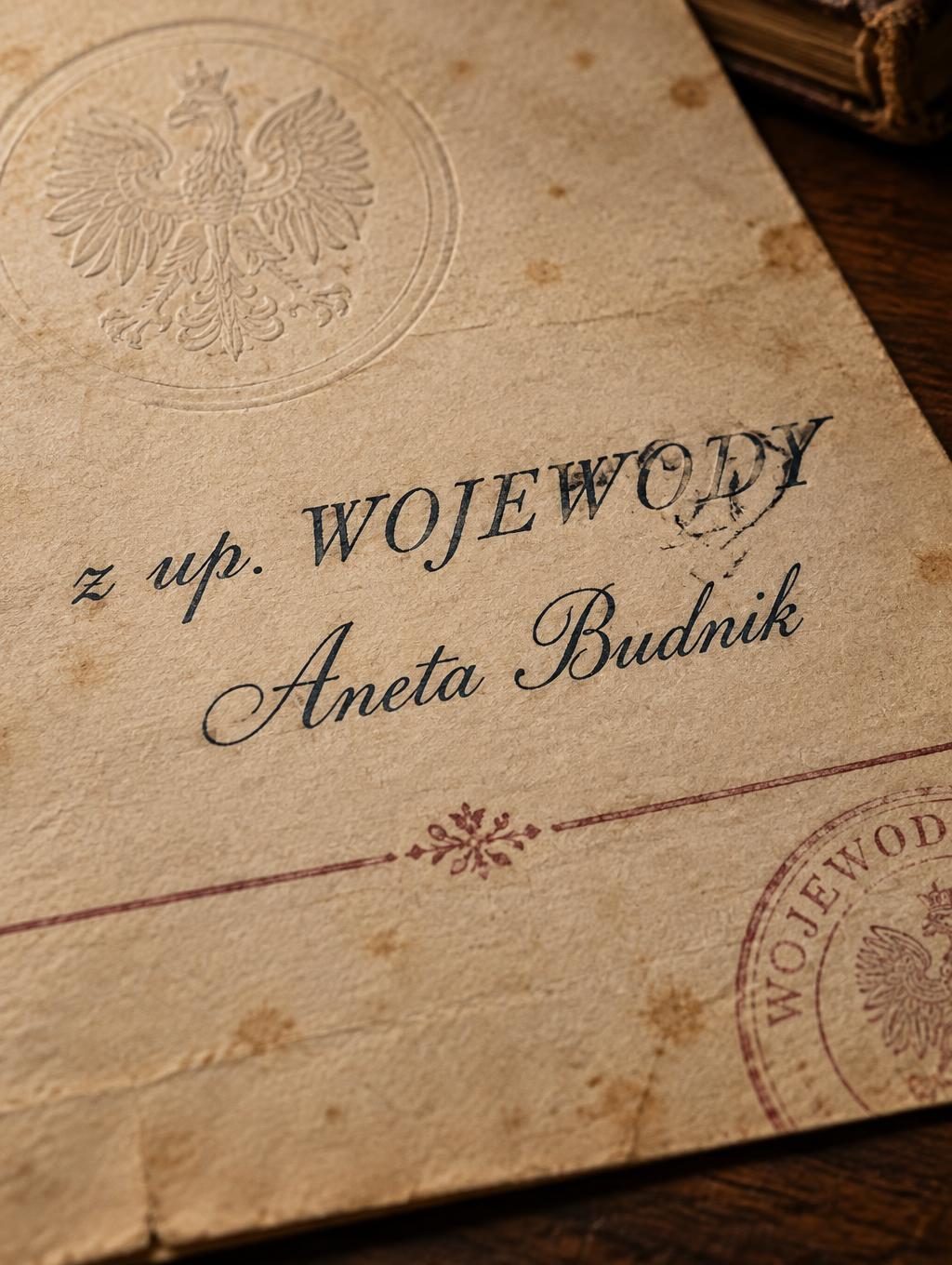
z up. WOJEWODY Aneta Budnik - Vintage Text Effect


Nutzt OpenAI GPT-Image-2.5 Sunburst, das Modell dieses Werks · 15 Credits


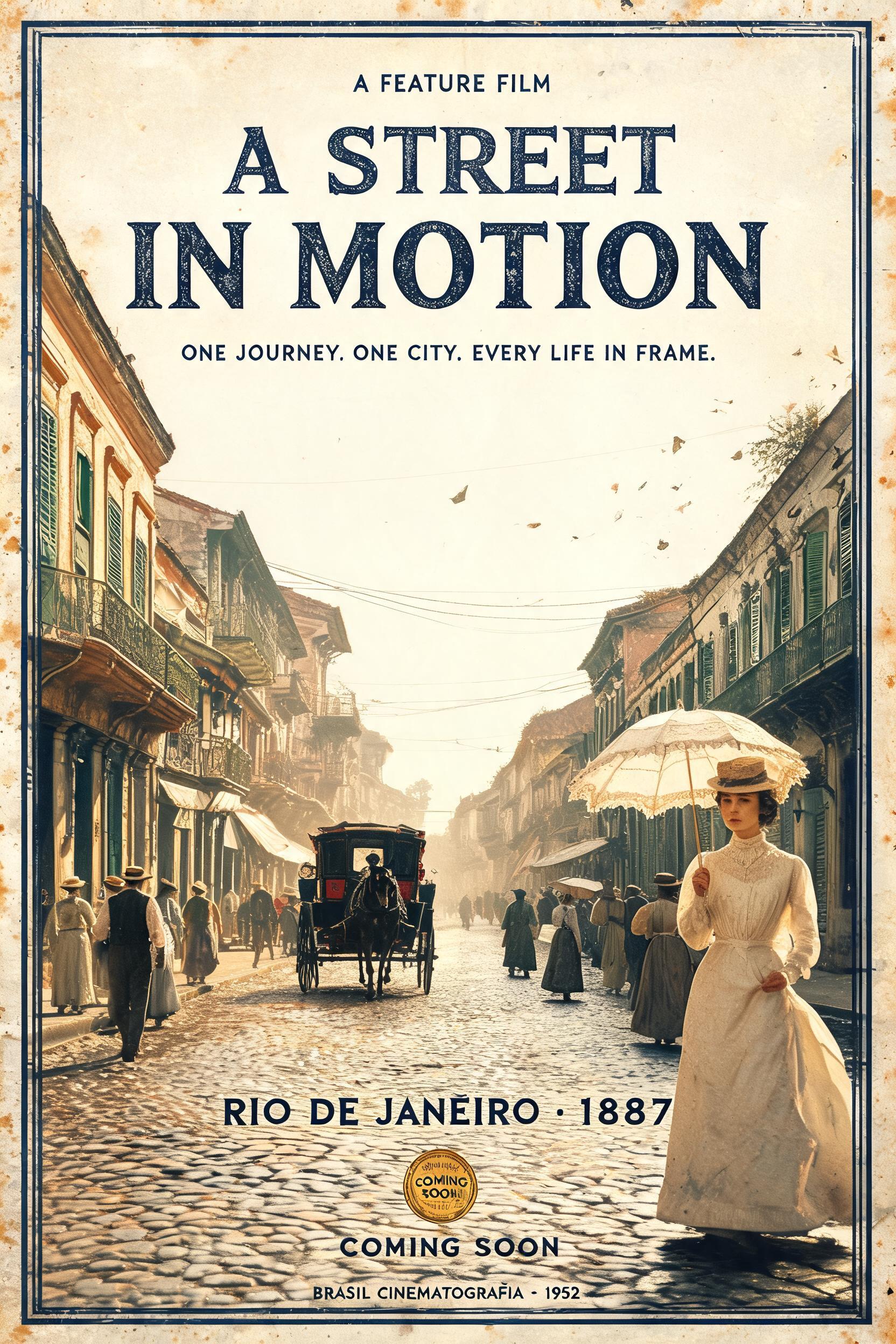
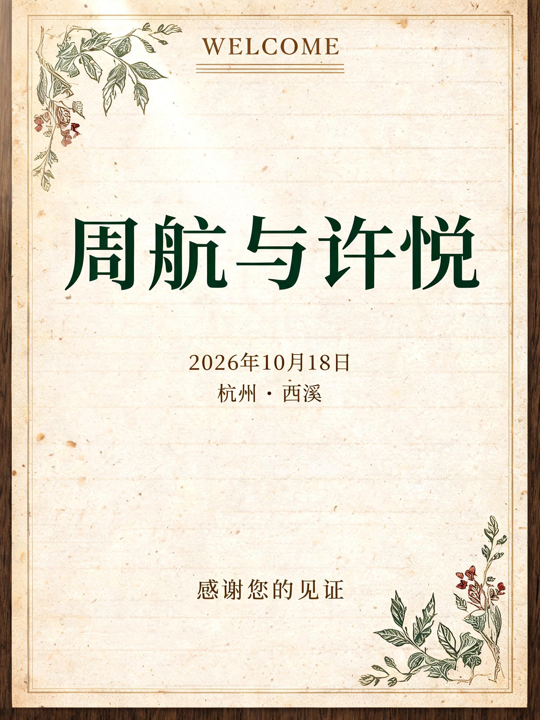
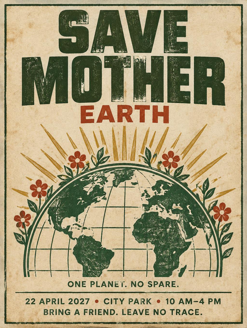
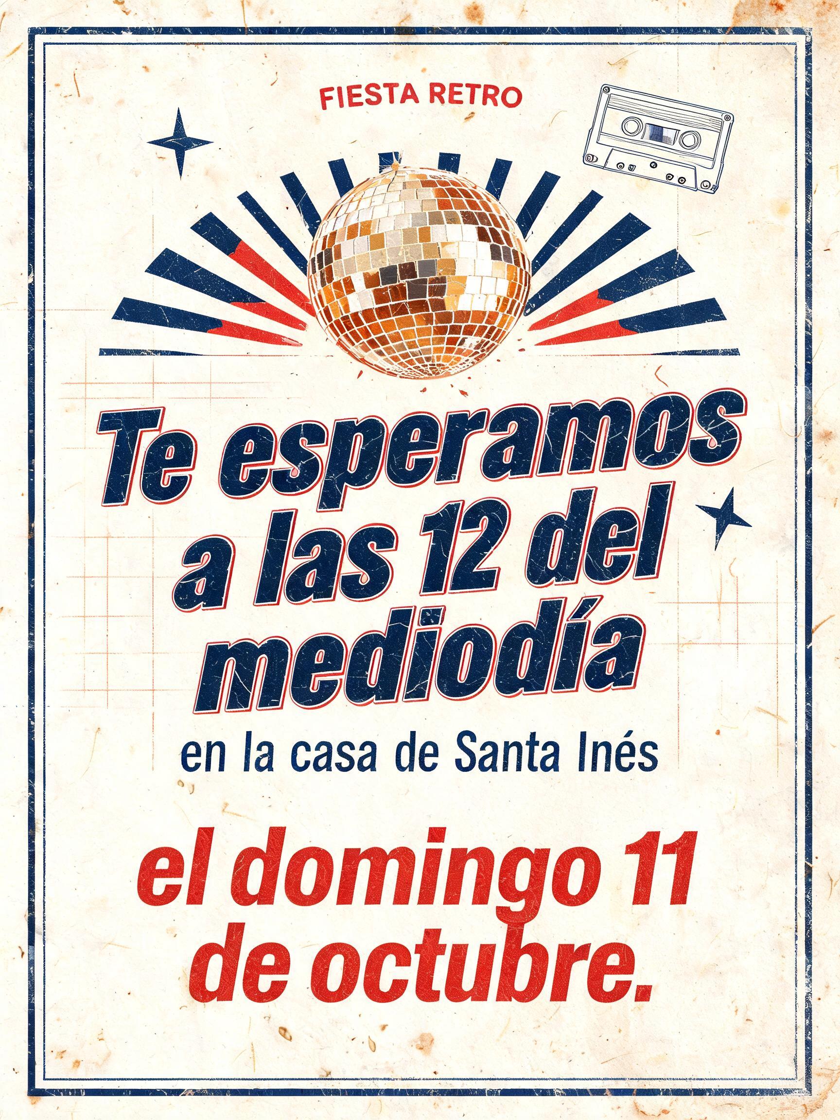
„z up. WOJEWODY Aneta Budnik“ ist ein Vintage-Texteffekt, erstellt mit FontVibe KI. Serifenversalien im Buchdruck in cremefarbenen Baumwollkarton gepresst, mit leicht ausbrechender Farbe, auf dem Fundament einer alten Presse zwischen verstreuten Bleilettern.
a timeless vintage piece carrying the physical evidence of an older making — warm, aged and classic. SURFACE / STYLE: the lettering looks produced by a heritage craft and softened by time — a letterpress impression bitten into cotton paper with ink slightly broken up, weathered paint on aged metal or wood, a worn rubber-stamp or postal imprint, or warm gold leaf — carrying patina, foxing, grain and gentle wear. SCENE ATMOSPHERE: a warm nostalgic setting — aged cream or kraft paper, dark wood, soft amber light, faint dust and a faded heritage feel. PALETTE: warm aged tones — cream, kraft, sepia, faded red, forest green, navy, tan and antique gold — muted and time-softened, never neon-bright. LETTERFORM PRIORITY: when the chosen font carries its own treatment (western slab, art deco, art nouveau, letterpress, postal or rubber stamp, gold leaf, typewriter, hand-lettered script, grunge chalk), that font treatment takes absolute priority and owns the letters; this style supplies the warm aged tone, the time-worn surface and the nostalgic heritage scene. FALLBACK MATERIAL: if the font carries no material of its own, render the letters as a classic serif printed in warm faded ink on aged cream paper with a soft letterpress impression and gentle wear, so the timeless vintage feel always reads. A formal vintage administrative document rendered on thick aged cream cotton paper, carrying the exact text “z up. WOJEWODY\nAneta Budnik” as the dominant printed inscription. The words have the physical character of an official archival letter: deep yet restrained letterpress pressure, faded navy-black ink with slight edge breakup, tiny dry-ink flecks, and subtle debossed paper fibers visible around each impression. “WOJEWODY” carries stronger visual weight, while “z up.” and “Aneta Budnik” read as a measured official designation and signature line with clear hierarchy. Surround the typography with restrained institutional details: a faint circular blind-embossed seal ghosted into the paper, a thin faded burgundy rule, sparse typed docket marks, and a soft partial ink-stamp texture that never obscures the requested words. Paper corners show mild handling wear, pale foxing specks, uneven warm sepia aging, and a few delicate crease shadows. Dark walnut desk surface appears at the edge of the scene, with amber raking light revealing paper grain, shallow impression depth, dust motes, and the tactile surface of an archived provincial-office document. Muted cream, tan, faded burgundy, antique navy, and dark wood palette; no modern objects, no neon, no additional prominent text.
Gemacht für Stempel-Schrift-Generator
Generiert am 4. Oktober 2026 · 1024 × 1360 · JPEG · OpenAI GPT-Image-2.5 Sunburst · Von der erstellenden Person geteilt · Kostenlos kommerziell nutzbar (CC BY 4.0)


