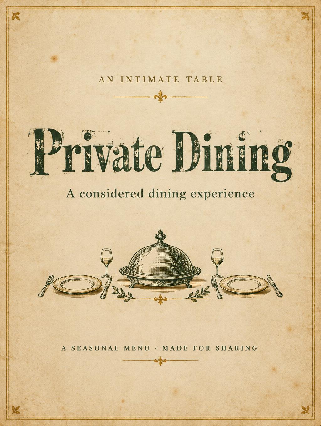
Private Dining AN INTIMATE TABLE A considered dining experience A SEASONAL MENU · MADE FOR SHARING - Vintage Text Effect


Nutzt OpenAI GPT-Image-2.5 Sunburst, das Modell dieses Werks · 15 Credits

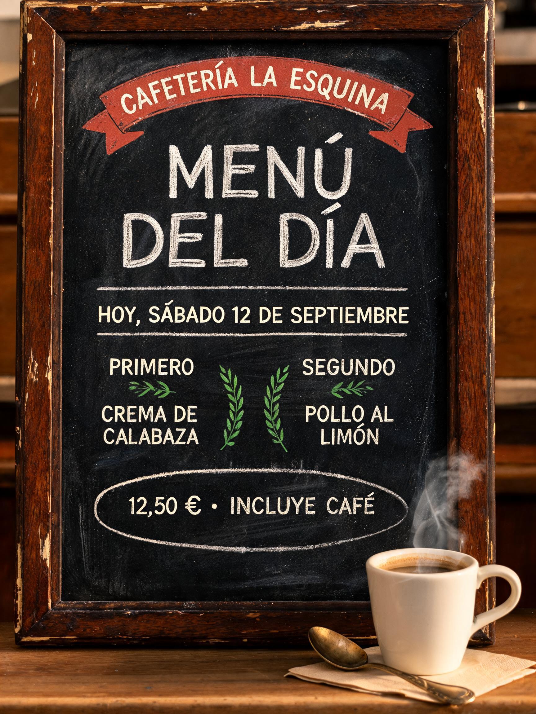
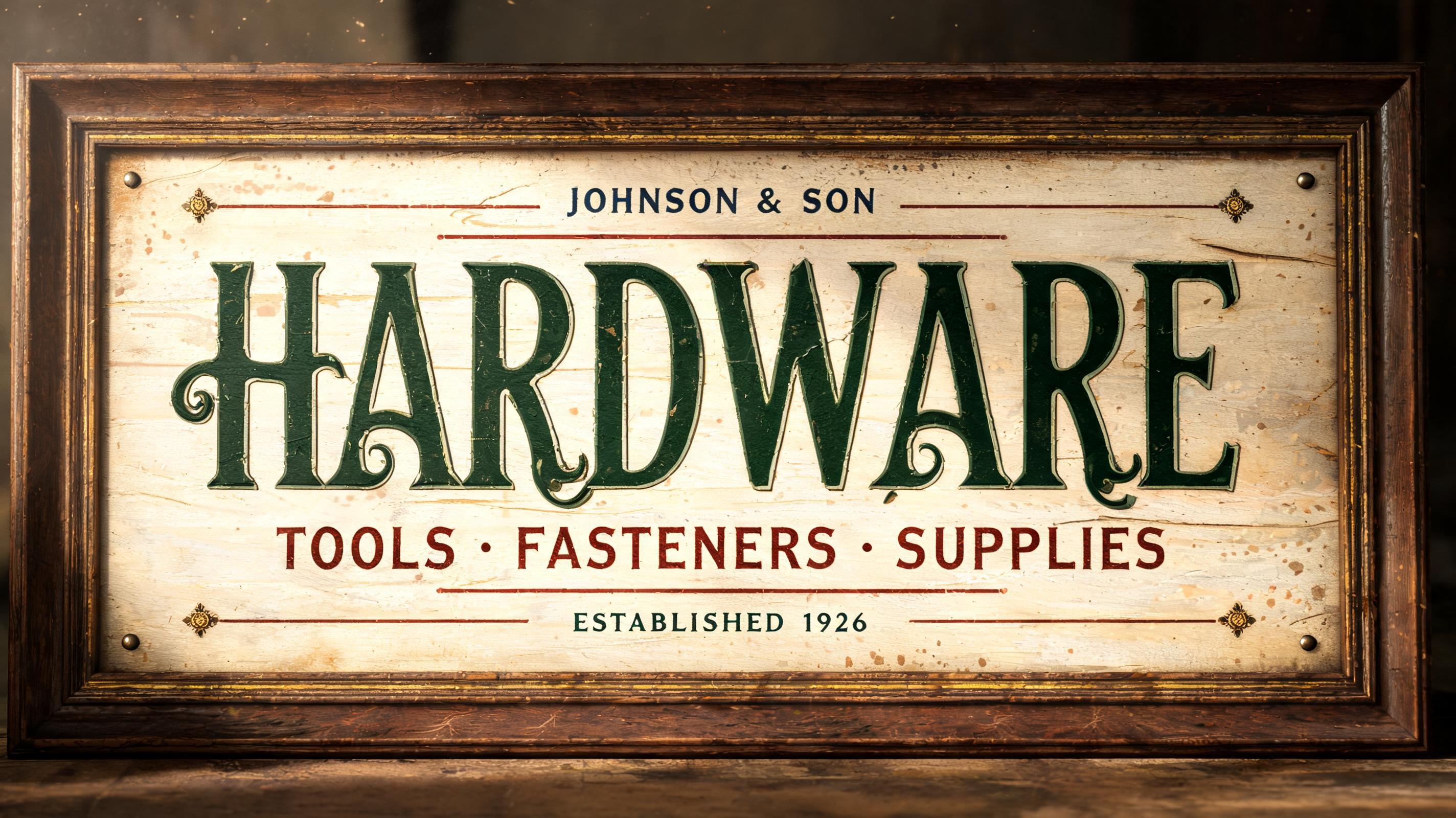
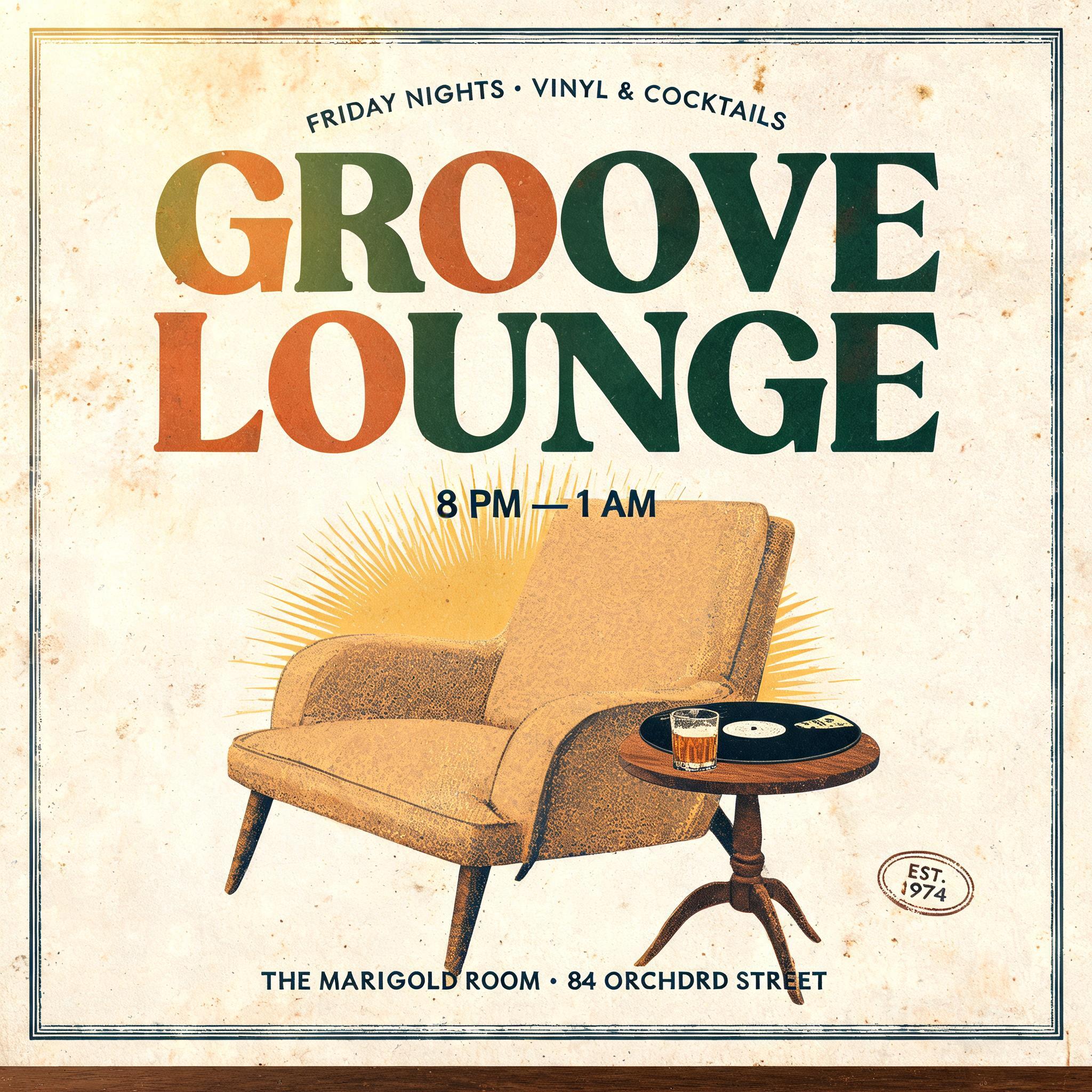
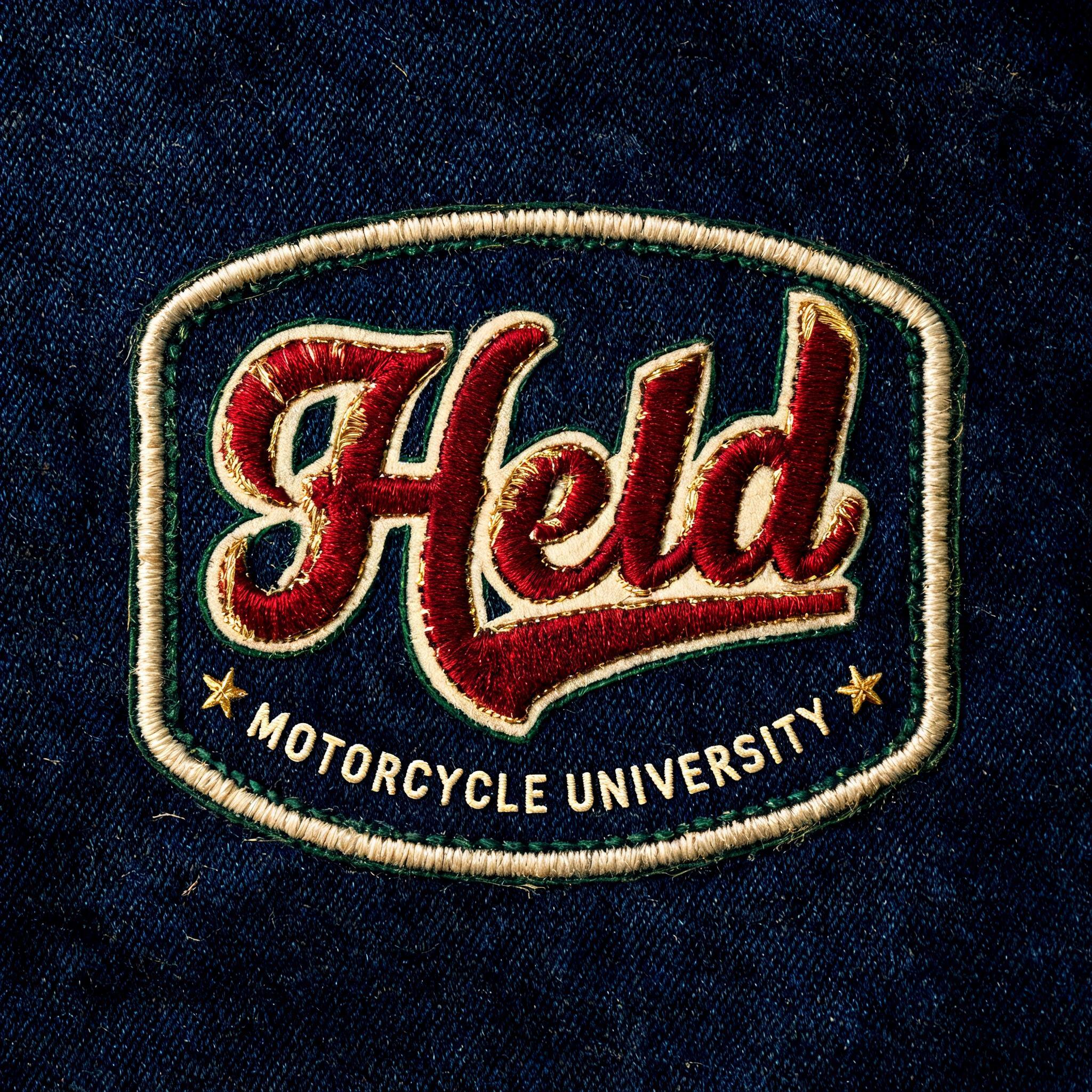
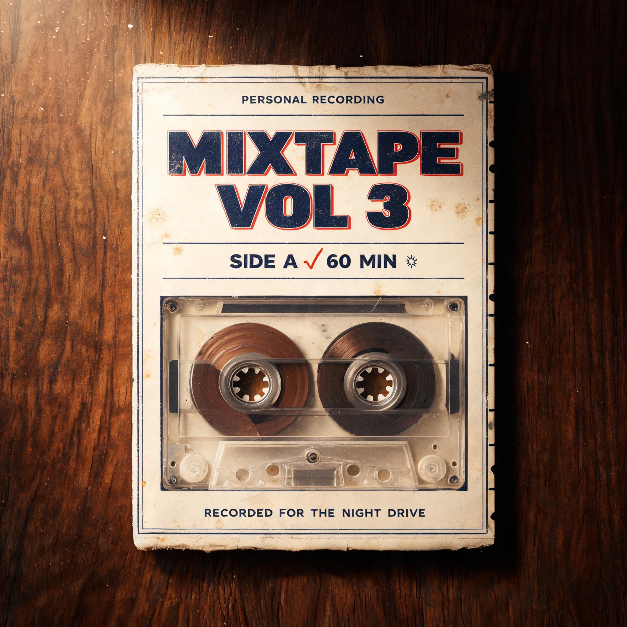
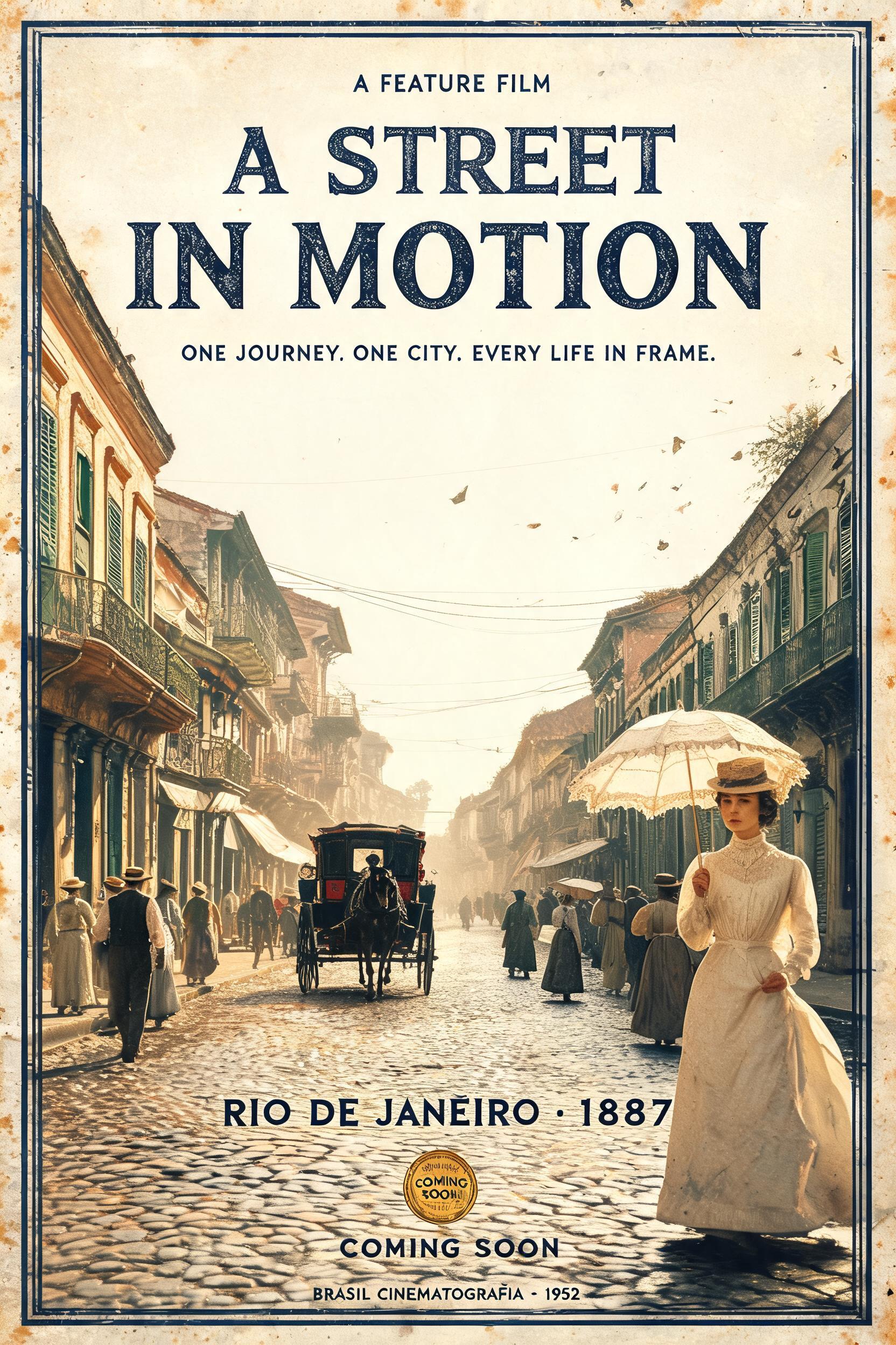
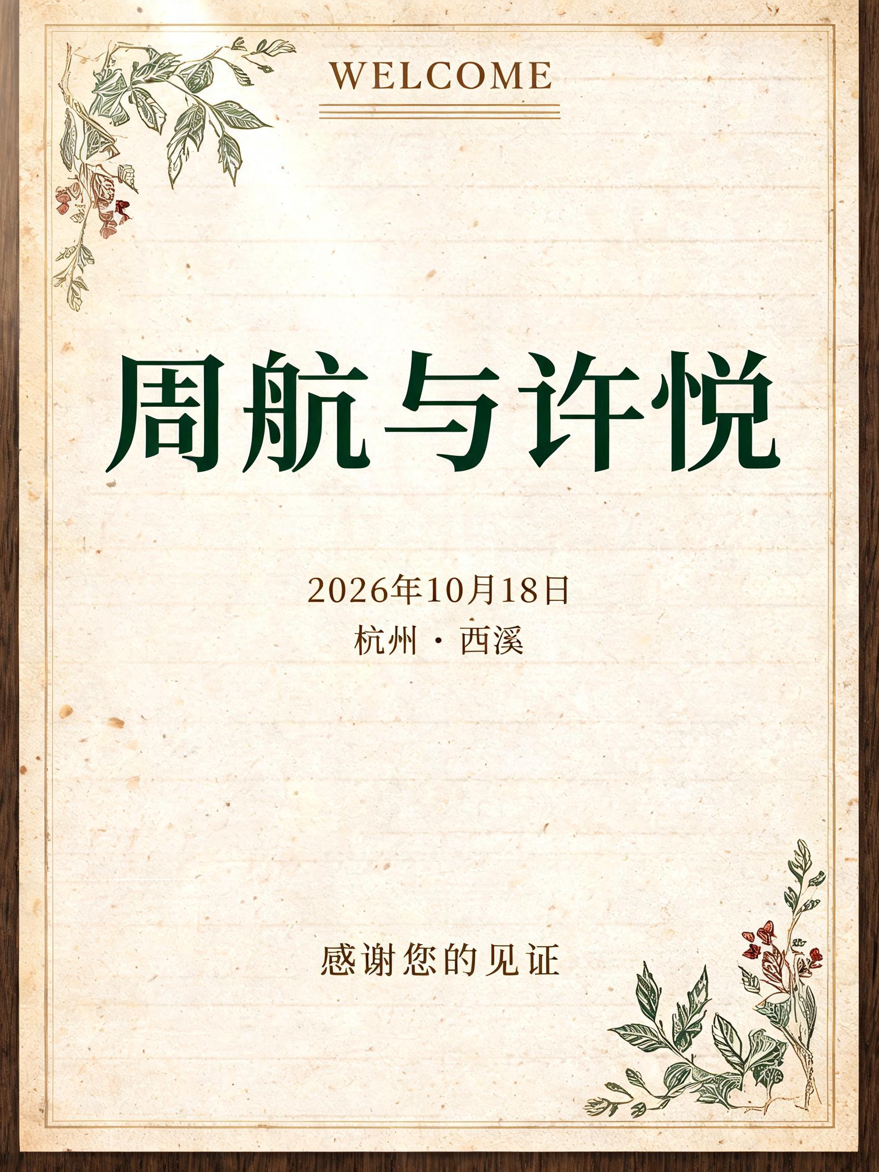
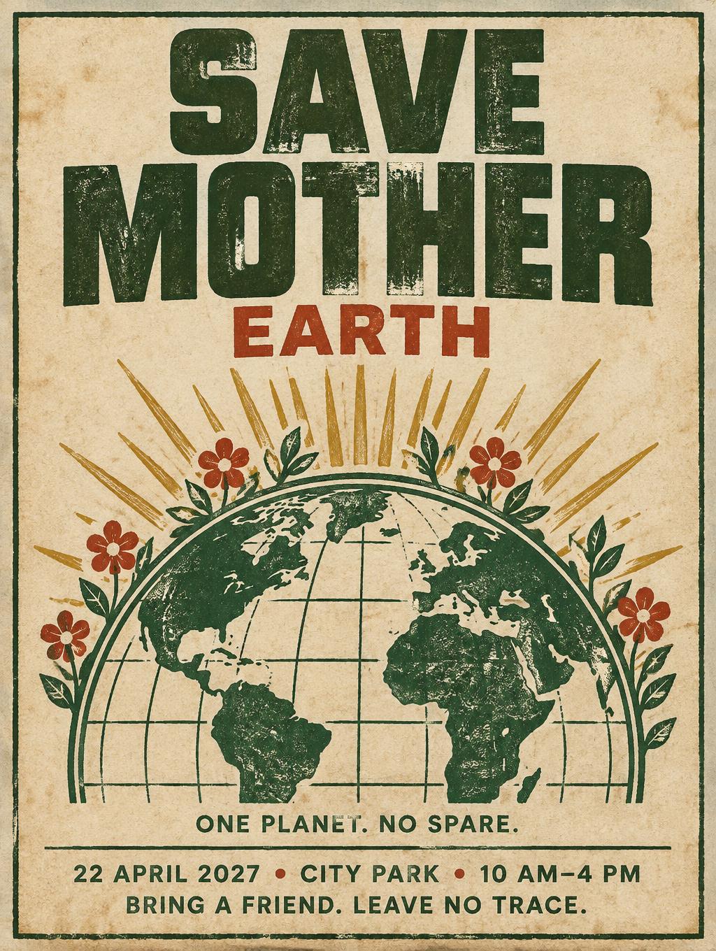
„Private Dining AN INTIMATE TABLE A considered dining experience A SEASONAL MENU · MADE FOR SHARING“ ist ein Vintage-Texteffekt, erstellt mit FontVibe KI. Serifenversalien im Buchdruck in cremefarbenen Baumwollkarton gepresst, mit leicht ausbrechender Farbe, auf dem Fundament einer alten Presse zwischen verstreuten Bleilettern.
Create a finished, portrait menu card cover for a luxe private dining experience. Use a warm, aged cream cotton-paper background with subtle foxing, visible paper grain, and a soft amber wash of light. Frame the card with a fine, understated antique-gold rule, gently worn at the corners. Set the exact headline “Private Dining” as the clear dominant element, centered in the upper-middle. Draw it in large, distinctive display capitals and lowercase with the heavily worn rubber-stamp character of an old archival impression: hardened rubber edges with irregular chips, occasional missing ink, slight letter-to-letter compression, dry chalky forest-green ink, faint ghost outlines, and a few naturally pooled ink patches. Keep every letter unmistakably readable; the headline should feel authentically aged, not digitally distressed. Let the stamp’s visible wear own the lettering, while the surrounding card remains refined and carefully composed. Above it, set the small uppercase eyebrow “AN INTIMATE TABLE” in a crisp, restrained classic serif. Beneath the headline, set “A considered dining experience” in a smaller elegant serif. Below that, place a small, finely engraved line illustration of a covered serving dish and two place settings, like an antique menu ornament, with restrained forest-green lines and tiny antique-gold accents. Near the bottom, set “A SEASONAL MENU · MADE FOR SHARING” in small, widely tracked uppercase serif lettering. Use generous margins, precise centered alignment, and clear breathing room between each tier. Keep the antique cream, deep forest-green, warm sepia, and muted antique-gold palette quiet and luxurious. The result is a tactile heritage menu card: polished in its layout, warmly aged in its paper and light, and unmistakably worn in its stamped headline. Render only the specified text, spelled exactly as written.
Gemacht für Luxus-Schrift-Generator
Generiert am 18. Oktober 2026 · 1024 × 1360 · JPEG · OpenAI GPT-Image-2.5 Sunburst · Layout: Heritage Menu Stack · Von der erstellenden Person geteilt · Kostenlos kommerziell nutzbar (CC BY 4.0)


