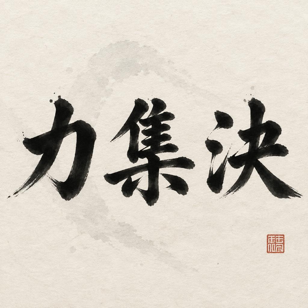
力集決 - Japanische Tuschepinsel-Schrift Text Effect


Nutzt OpenAI GPT-Image-2.5 Sunburst, das Modell dieses Werks · 15 Credits
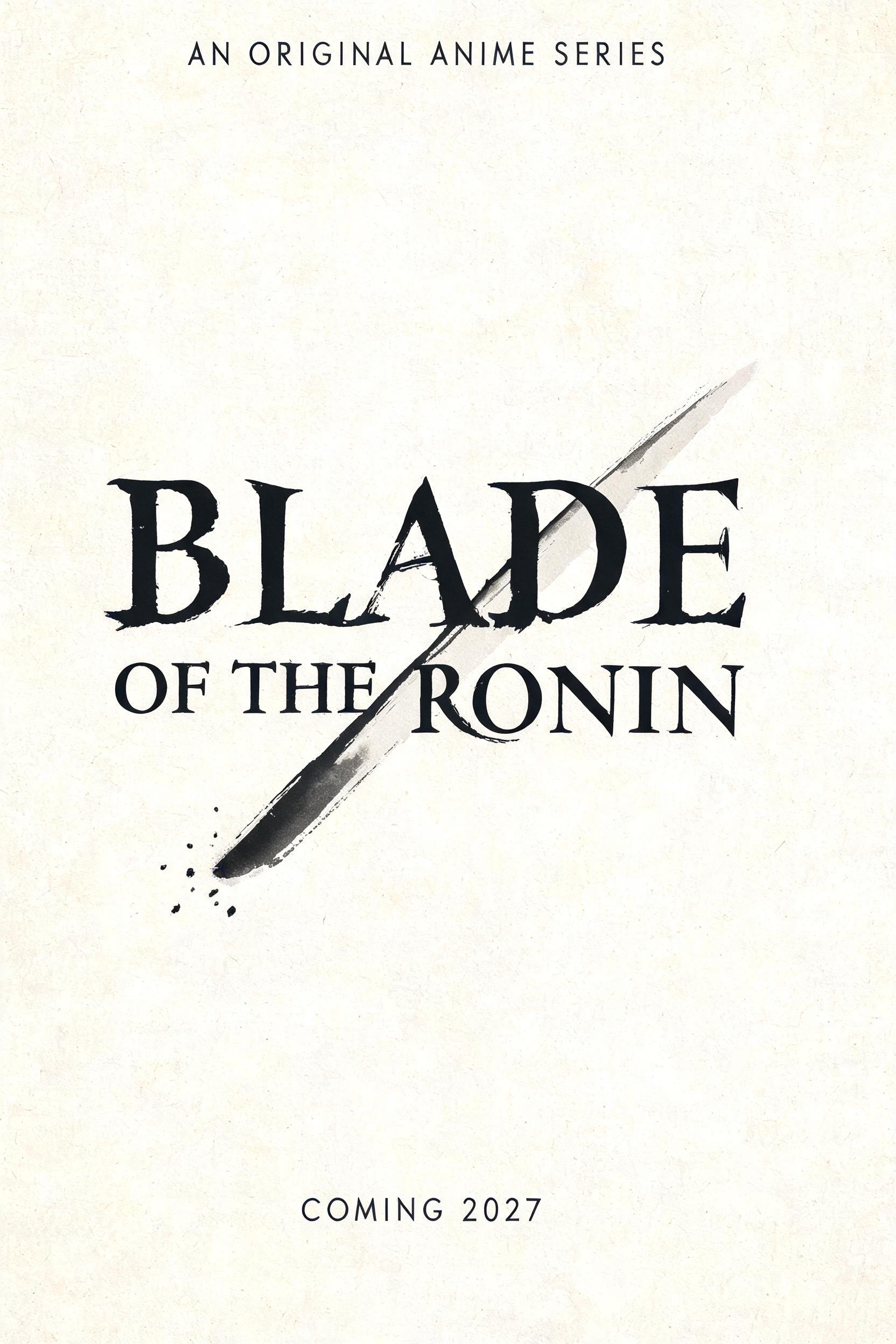


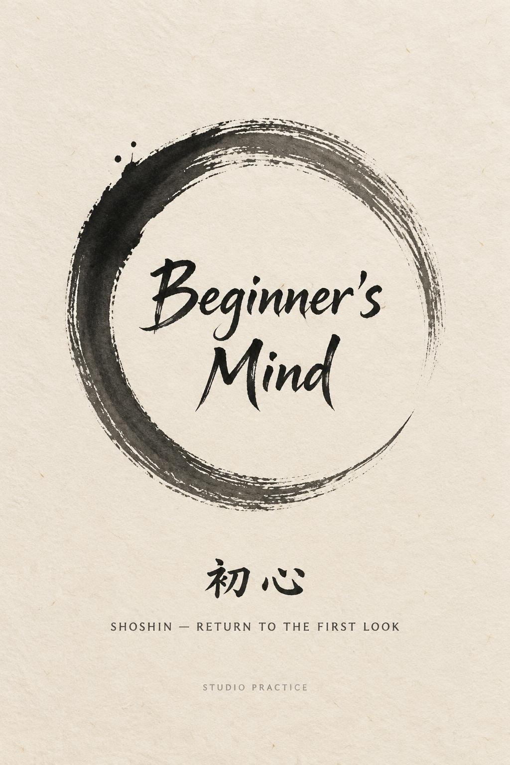
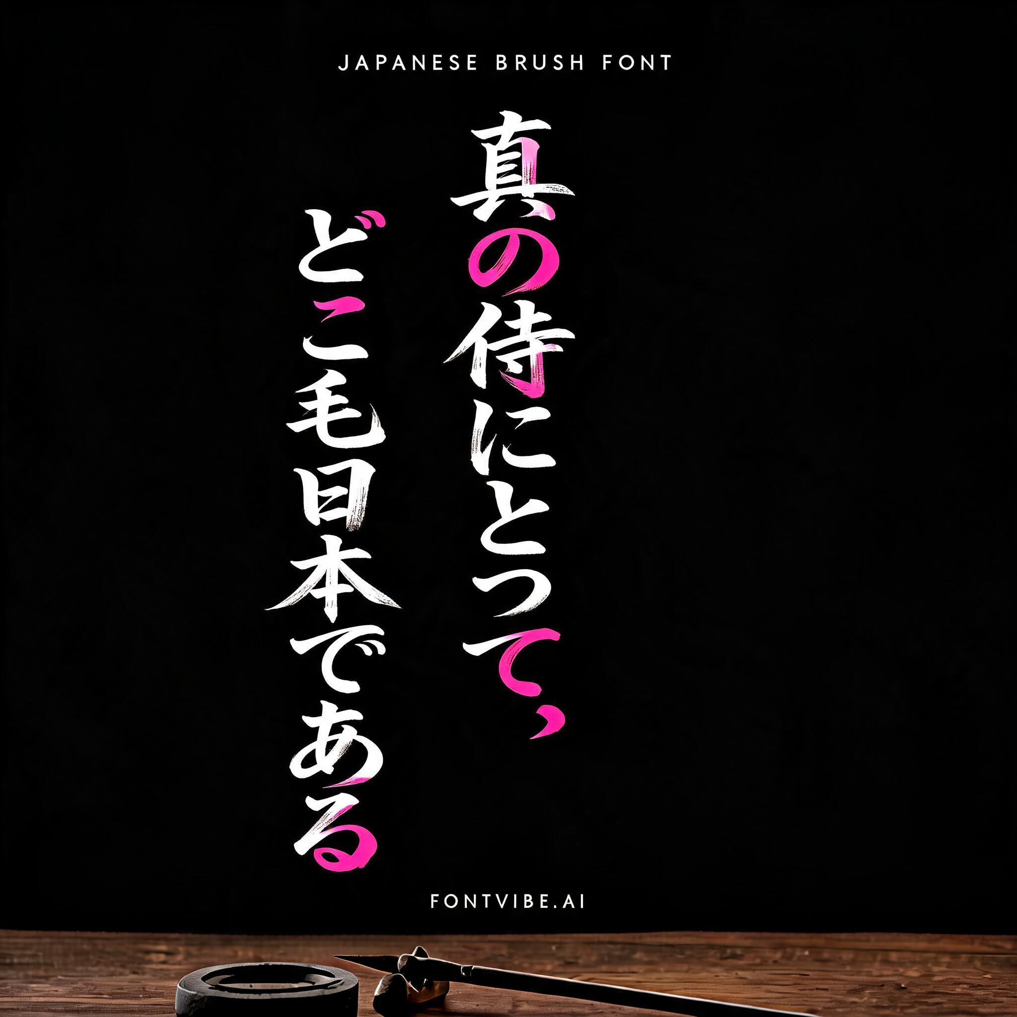


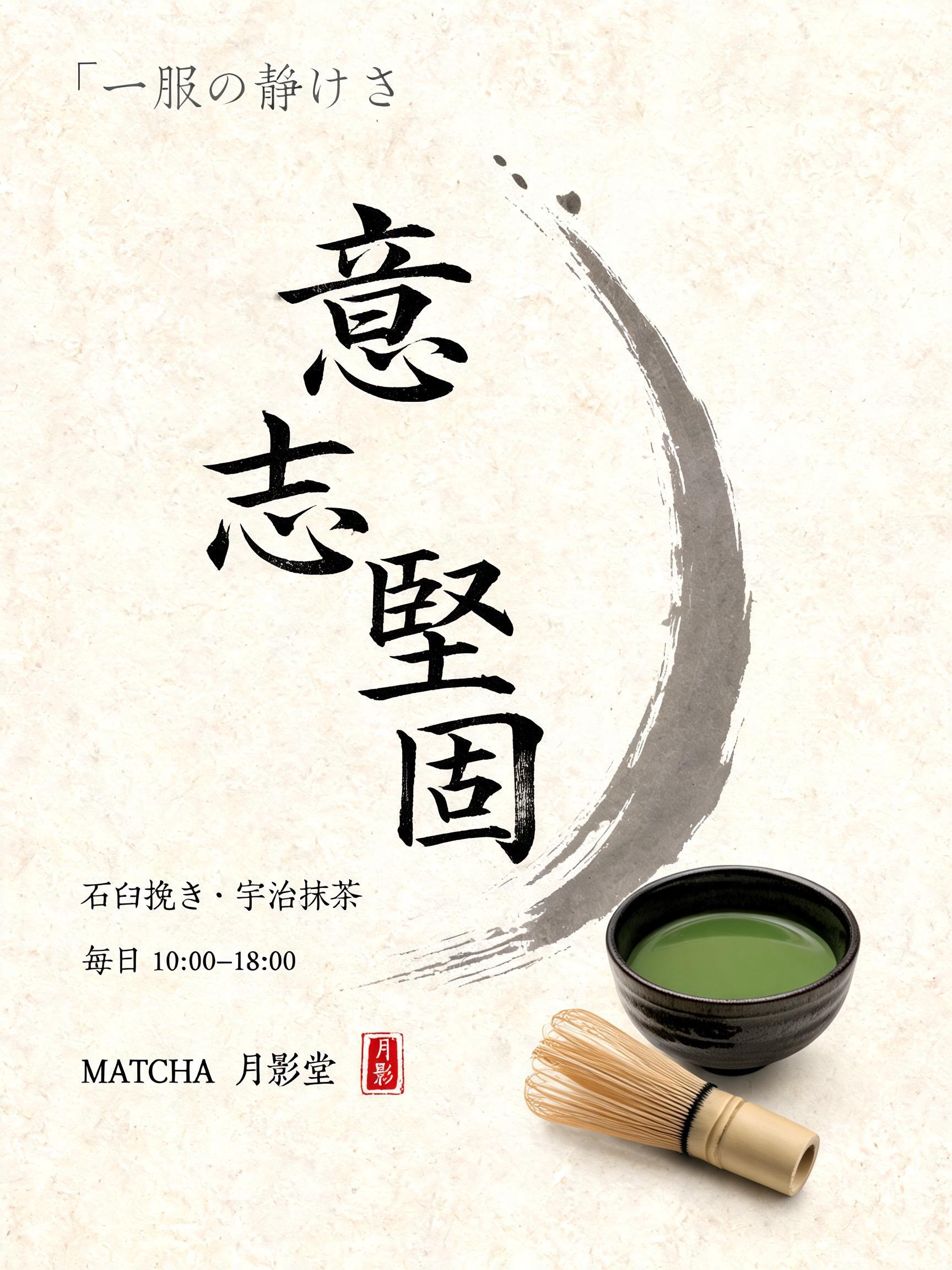


„力集決“ ist ein Japanische Tuschepinsel-Schrift-Texteffekt, erstellt mit FontVibe KI. Japanischer Shodo-Tuschepinsel-Kalligrafiestil, angewendet auf lateinische Buchstaben. Tiefes Sumi-Schwarz mit authentischer Fude-Pinselenergie, kontrollierten Strichen in eine Richtung und Washi-Papier-Atmosphäre. Perfekt für das Branding japanischer Restaurants, Tattoo-Design, Anime, Kampfkunst und kulturelle Projekte.
Japanese ink brush aesthetic — the visual language of sumi calligraphy on washi paper. INK MEDIUM: sumi pigment in deep black to charcoal range — richest density at mark centers, naturally transitioning outward as ink supply depletes. Fully matte, absorbed into paper surface, producing a tonal range from dense opaque black to transparent grey depending on dilution and brush load. PAPER SURFACE: natural washi — warm cream-white base with visible paper fiber structure giving slight texture. The absorbent surface creates the characteristic soft border quality of East Asian brush work at all mark edges. LIGHT ATMOSPHERE: soft diffuse north-facing studio light — the traditional calligrapher's light source. Even, shadowless, allowing the full tonal range of ink marks to read clearly. Warm cream paper tone contrasts against deep sumi black. AESTHETIC REGISTER: the ma principle — the space between and around marks is as considered as the marks themselves. Compositions have breathing room and deliberate quietness. When no specific material is defined by the font: default environment — deep sumi black marks on warm cream washi paper, soft diffuse overhead light, meditative studio atmosphere. Square 1:1 composition. Render the three characters 力集決 as a commanding, tightly balanced central triad on warm cream-white handmade washi. Each character carries a distinct surge of sumi energy: dense near-black brush entries, broad loaded centers, then controlled dry-brush pullaways that fracture into charcoal and translucent gray along visible paper fibers. The marks feel decisive rather than decorative, with force concentrated in the first impacts and a disciplined release at every stroke ending. Arrange the characters with measured spacing so the silence of the paper gives each dark form authority; no crowding, no incidental ornament. A faint irregular pale-gray ink wash sits far behind the text like the residue of a single breath, subtle enough to preserve the clean field. Fine feathered ink bleed softens selected edges where pigment absorbs into the washi, while a few restrained microscopic specks gather near the strongest stroke entries. Soft diffuse studio light keeps the paper’s natural fibers and the full black-to-gray tonal range visible, without cast shadows. Add one small square vermilion artist seal low in the composition, offset and quiet. Overall feeling: united strength, concentrated resolve, and ceremonial stillness.
Gemacht für Shodo-Schrift
Generiert am 21. Oktober 2026 · 1024 × 1024 · JPEG · OpenAI GPT-Image-2.5 Sunburst · Von der erstellenden Person geteilt · Kostenlos kommerziell nutzbar (CC BY 4.0)