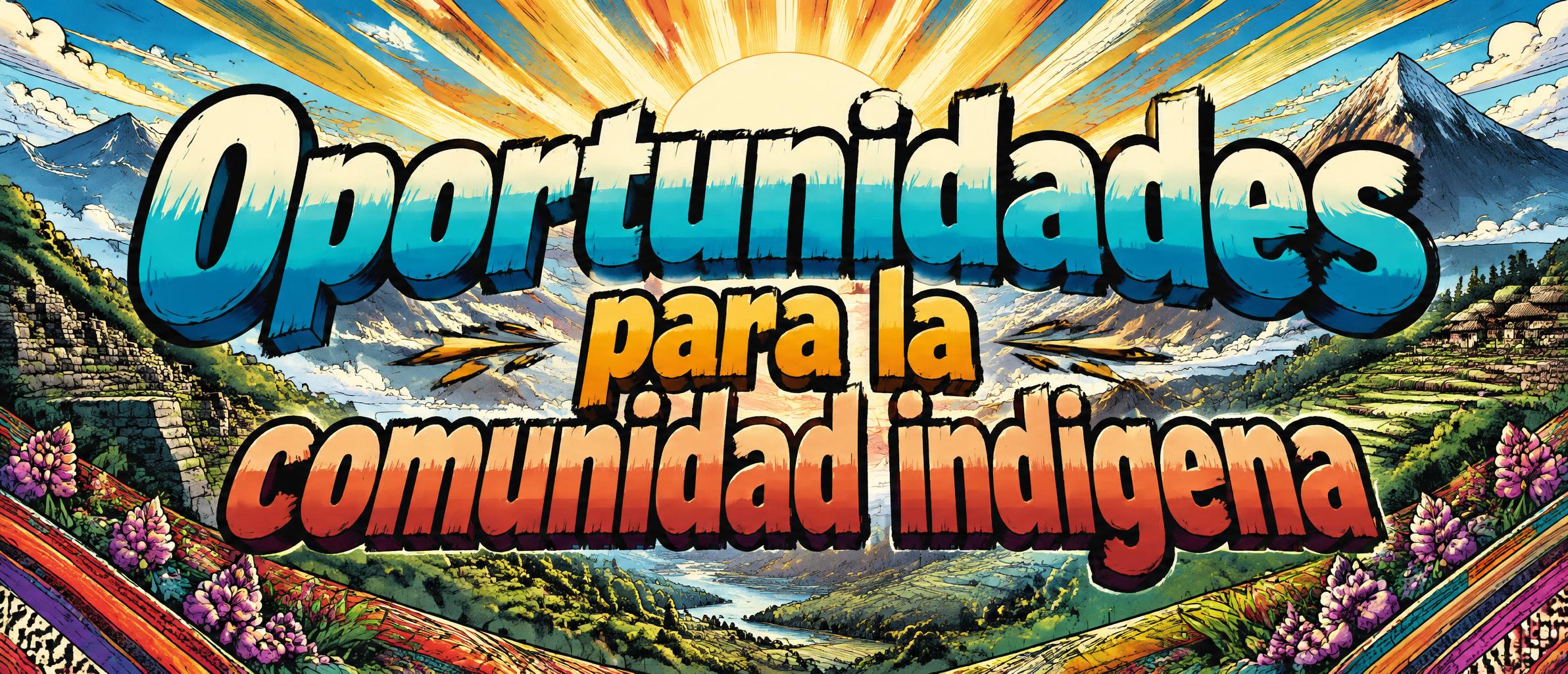
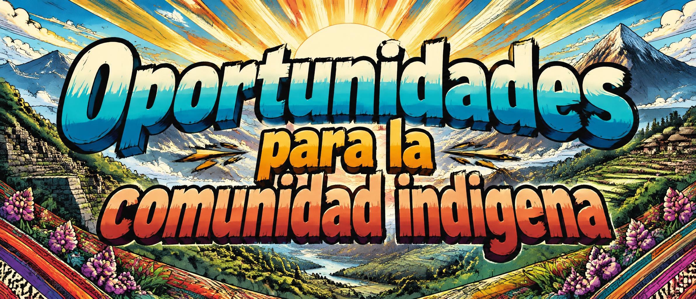
Oportunidades para la comunidad indigena - Anime Text Effect


Nutzt OpenAI GPT-Image-2.5 Sunburst, das Modell dieses Werks · 15 Credits
„Oportunidades para la comunidad indigena“ ist ein Anime-Texteffekt, erstellt mit FontVibe KI. Shōnen-Manga-Titelschrift: dicke, von Hand getuschte schwarze Konturen, flaches Cel-Shading in harten Licht- und Schattenbändern, schräg gestellte, dynamische Buchstaben auf Weiß mit strahlenförmigen Speedlines.
rendered as Japanese shounen anime title treatment — bold hand-inked manga lettering with authentic cel-shaded visual energy. Letter construction follows classic Shonen Jump title card standards: thick black ink outline with natural brush-weight variation defining each letter boundary; flat cel-shading fill with three hard-edge zones — bright highlight zone on upper letter face, highly saturated primary color zone at center, deep shadow zone at lower edge; all zone boundaries knife-edge hard, zero gradient blur, pure flat offset-print ink physics. Energy signature: high-contrast color + thick ink outline = letters that look physically printed on manga paper. The typographic language of Dragon Ball, Naruto, One Piece, Demon Slayer, Jujutsu Kaisen title cards — maximum manga kinetic energy, iconic and immediately recognizable as Japanese anime title typography. LETTERFORM PRIORITY: when the chosen font carries its own treatment, that font's letterform shapes take priority and own the letters; this style governs the inked manga outline, the three-zone cel-shading and the kinetic energy. FALLBACK MATERIAL: if the font carries no material of its own, render the letters as bold hand-inked shounen title lettering with a thick black brush outline and hard three-zone cel-shading. COLOR PRIORITY: keep the font's own colors if specified; otherwise a high-saturation primary fill with hard highlight and shadow zones. Wide community empowerment title card featuring the exact text “Oportunidades para la comunidad indigena” arranged across three balanced lines, with “Oportunidades” as the dominant upper line and the remaining words in a clear supporting hierarchy beneath. The title occupies the central 78% of a cinematic 21:9 frame, reading immediately from a distance. Render the lettering with thick expressive black ink contours, varied hand-inked edge weight, and crisp three-zone cel shading: sunlit cream highlights across upper faces, saturated turquoise and warm marigold mid-tones, and deep indigo shadows at the lower edges, all separated by sharp flat boundaries. Behind it, create a respectful illustrated sunrise over layered mountain silhouettes, fertile green terraces, woven textile-inspired geometric bands, and subtle native wildflowers along the lower frame. Golden morning rays burst outward in manga speed-line geometry from behind the text, suggesting opportunity and collective momentum without obscuring readability. Add small inked spark marks, paper-grain texture, and a bold chapter-title energy. Keep the palette hopeful, communal, and vibrant: turquoise, marigold, terracotta, leaf green, indigo, and warm ivory. Clean negative space around the lettering, no extra words, no logos.
Gemacht für Anime-Schrift-Generator
Generiert am 23. Oktober 2026 · 2384 × 1024 · JPEG · OpenAI GPT-Image-2.5 Sunburst · Von der erstellenden Person geteilt · Kostenlos kommerziell nutzbar (CC BY 4.0)