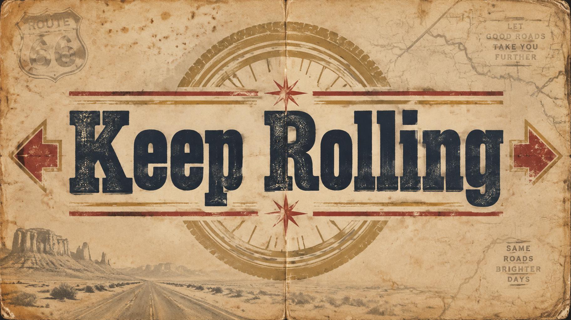
Keep Rolling - Vintage Text Effect


Nutzt OpenAI GPT-Image-2.5 Sunburst, das Modell dieses Werks · 15 Credits

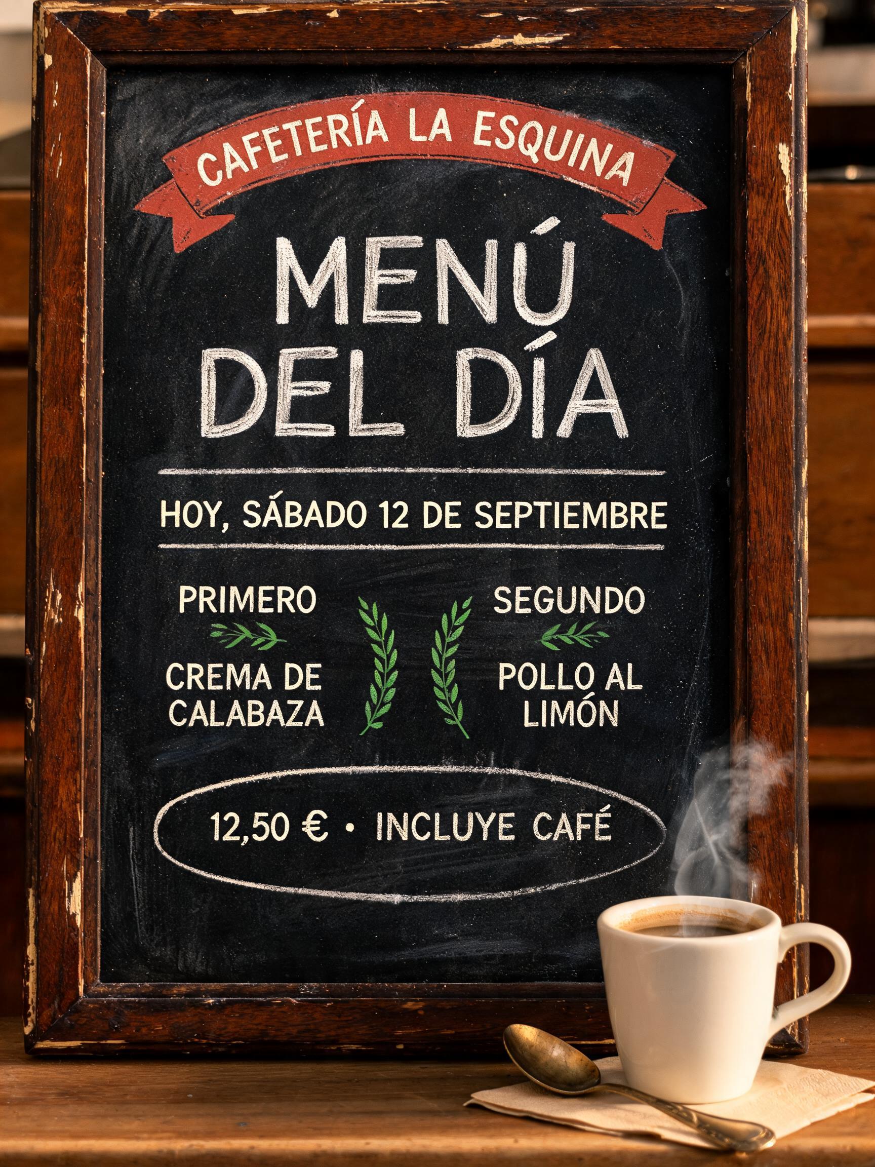
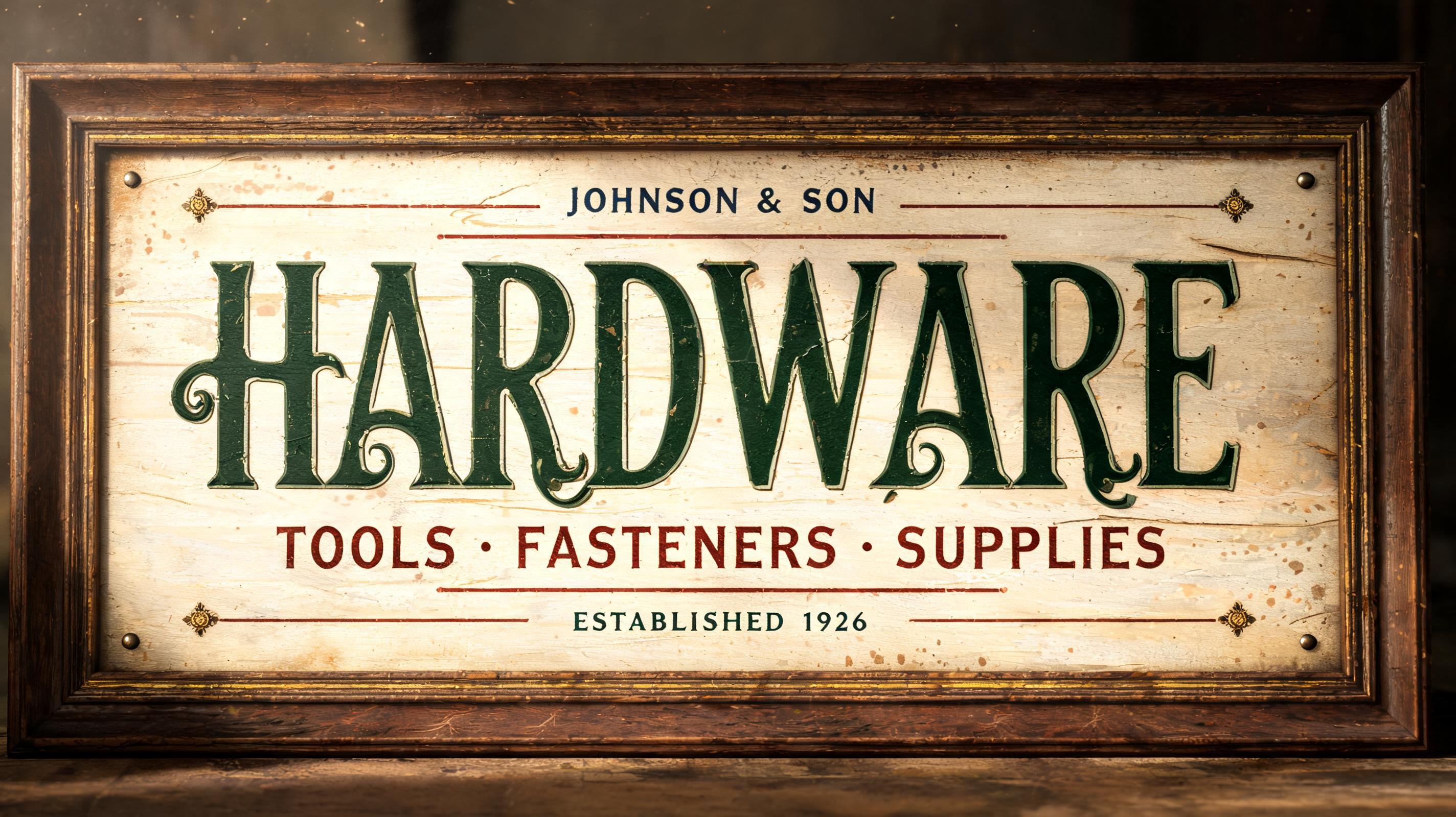
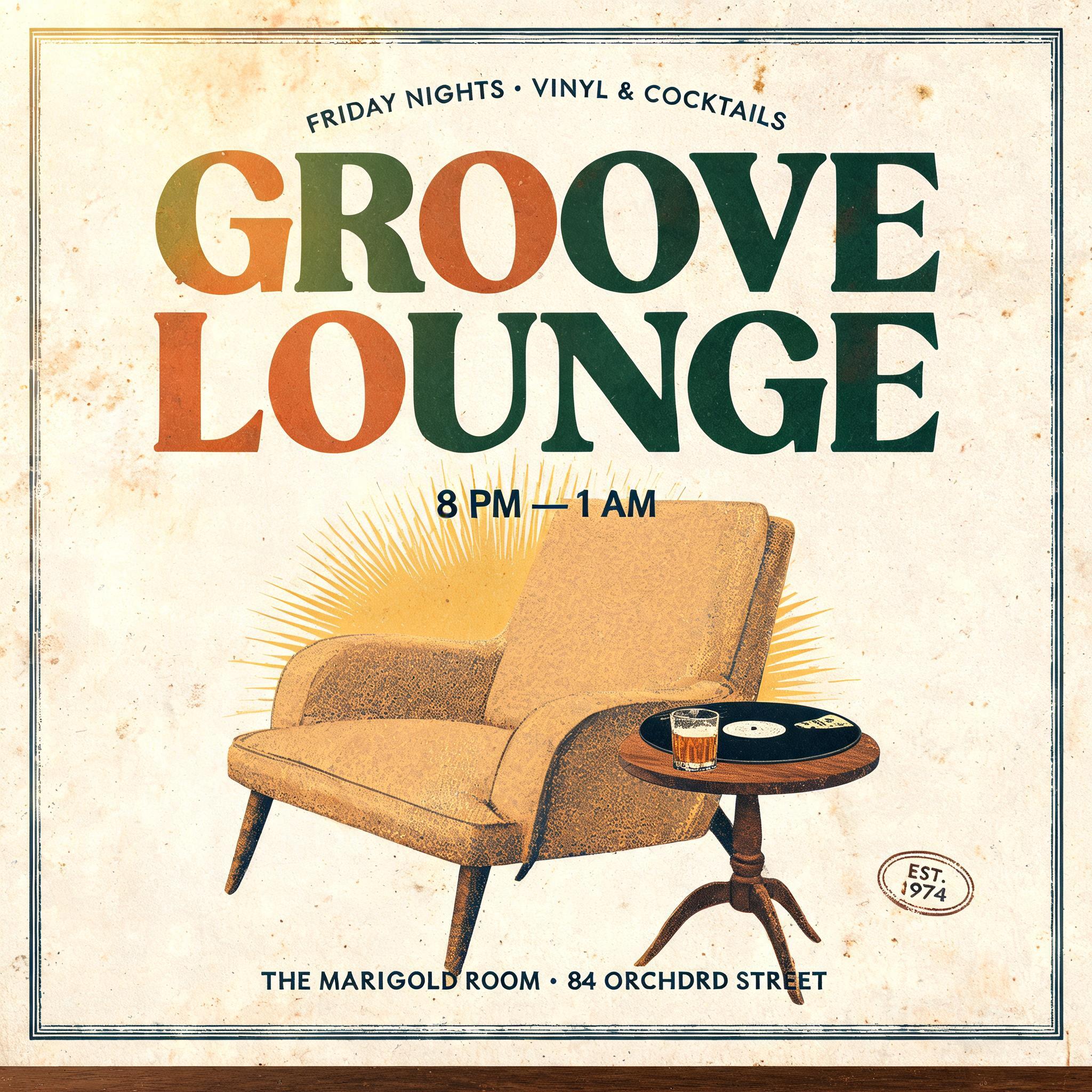
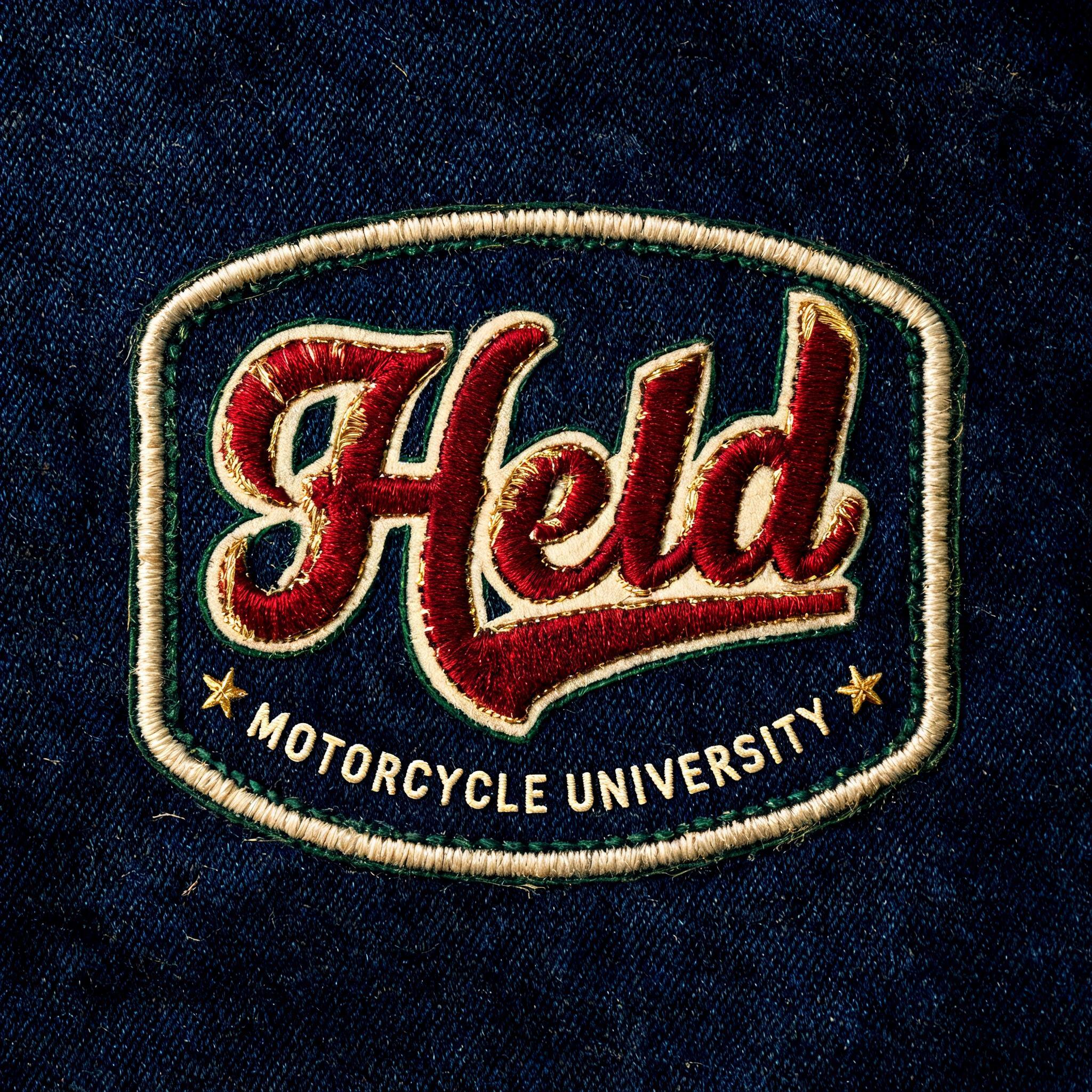
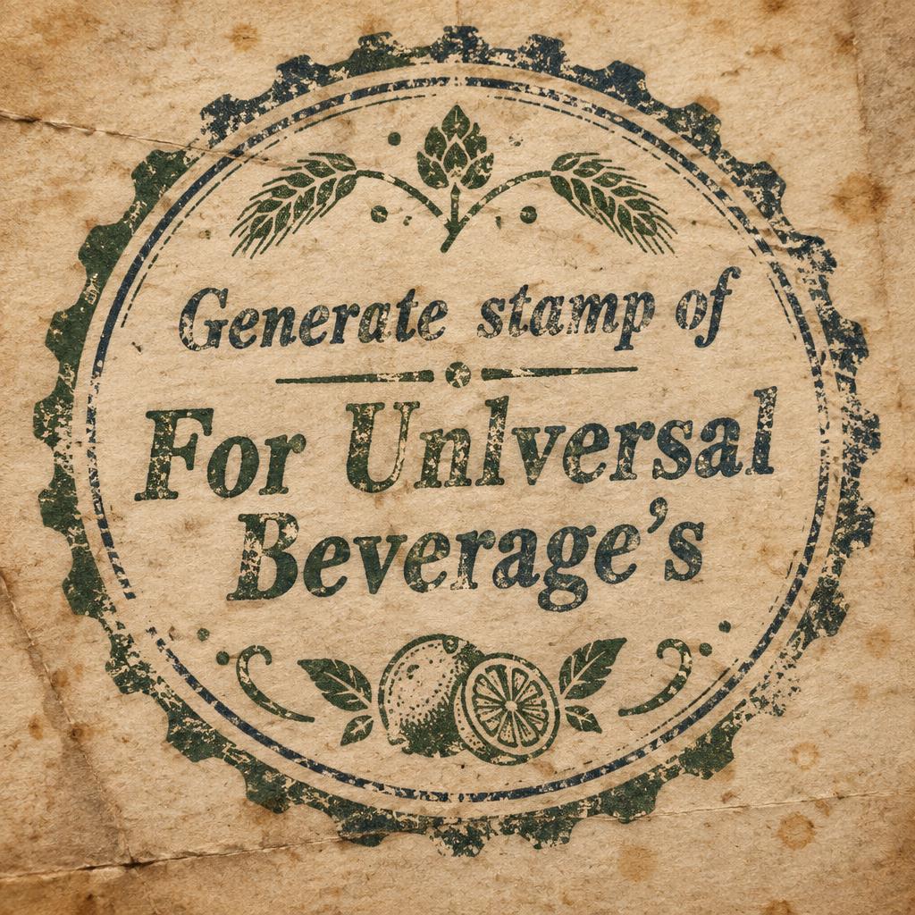
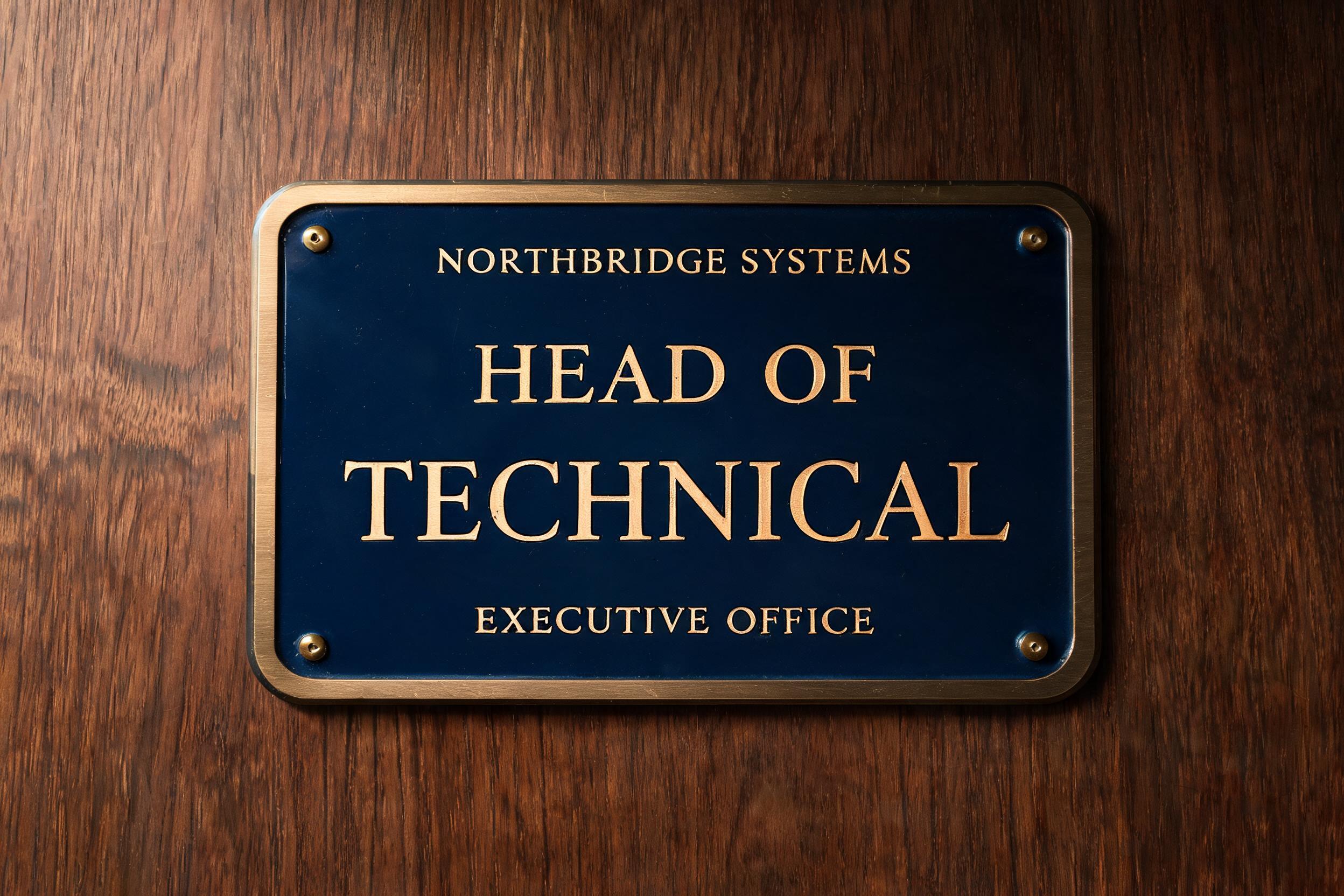
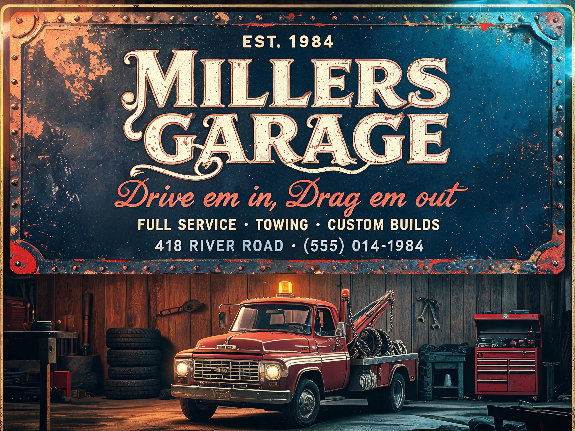
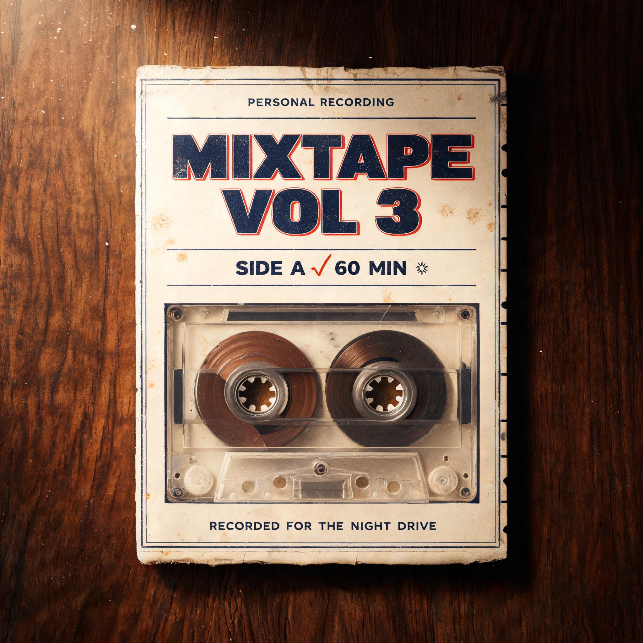
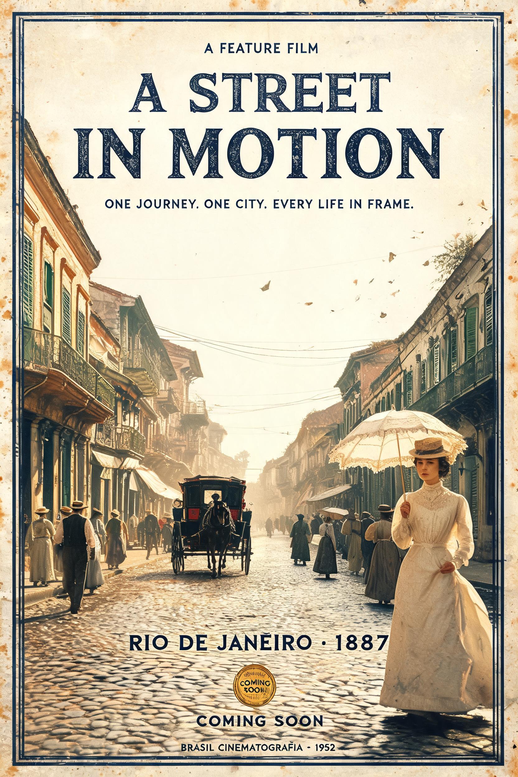
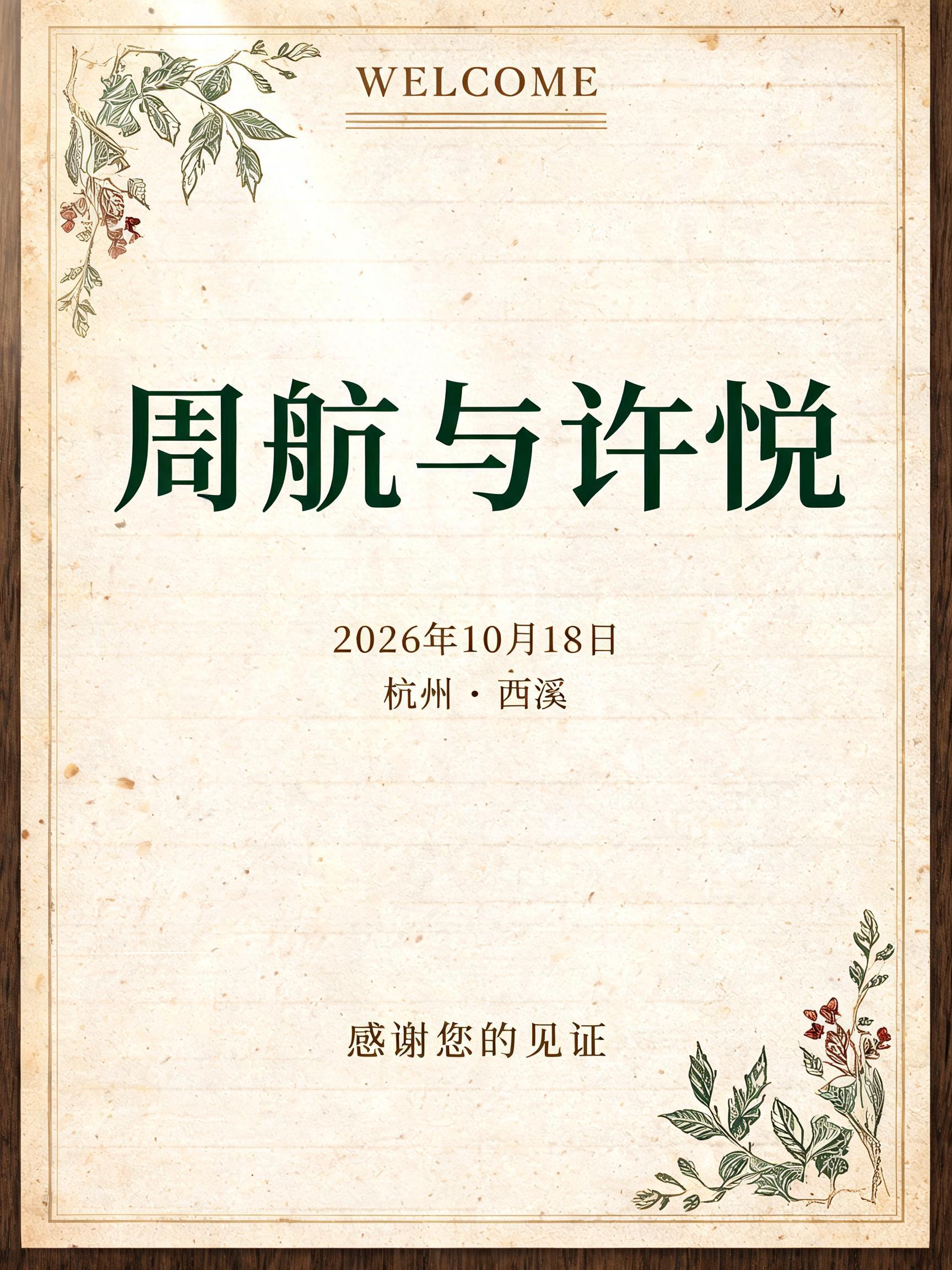
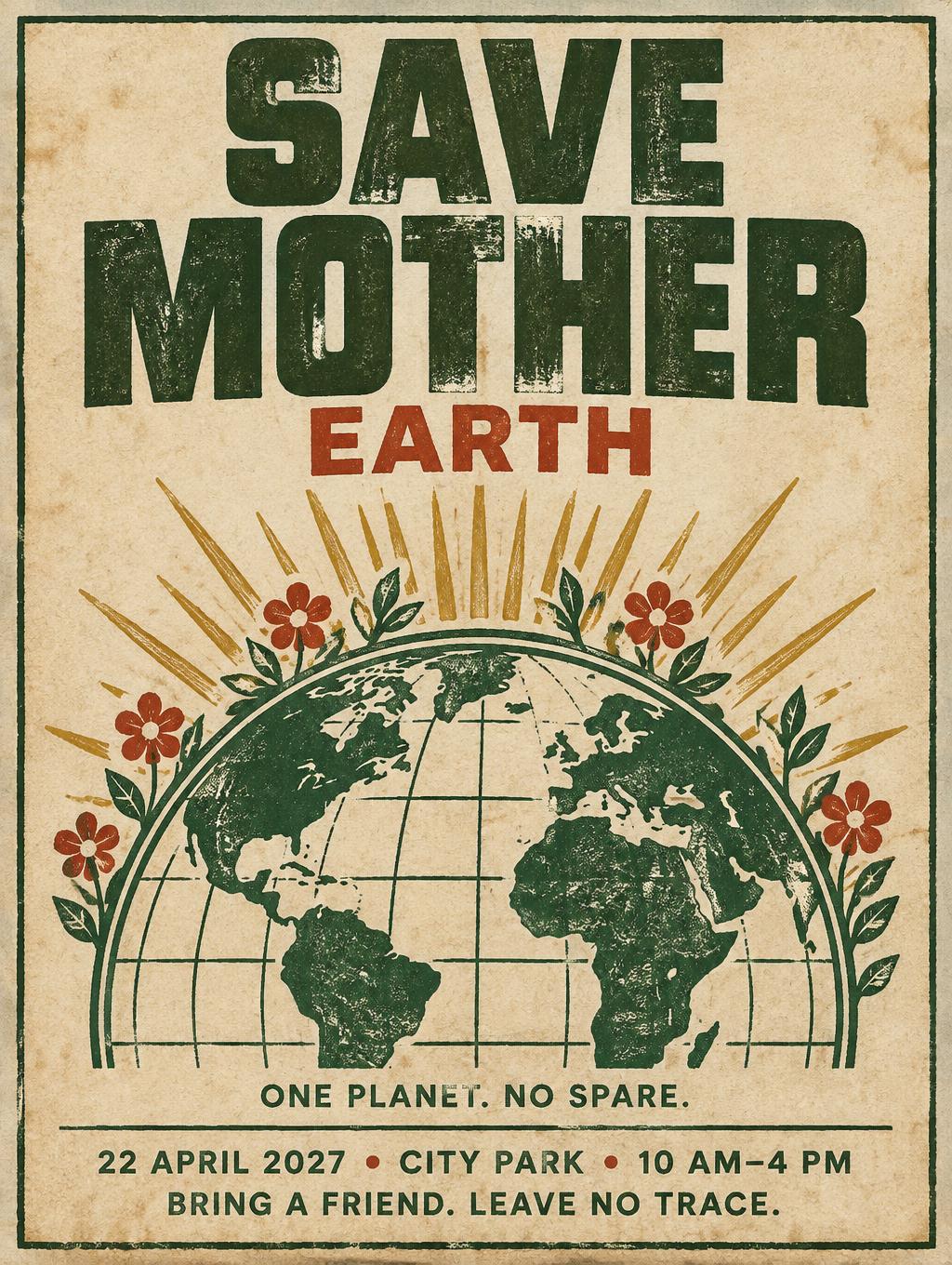
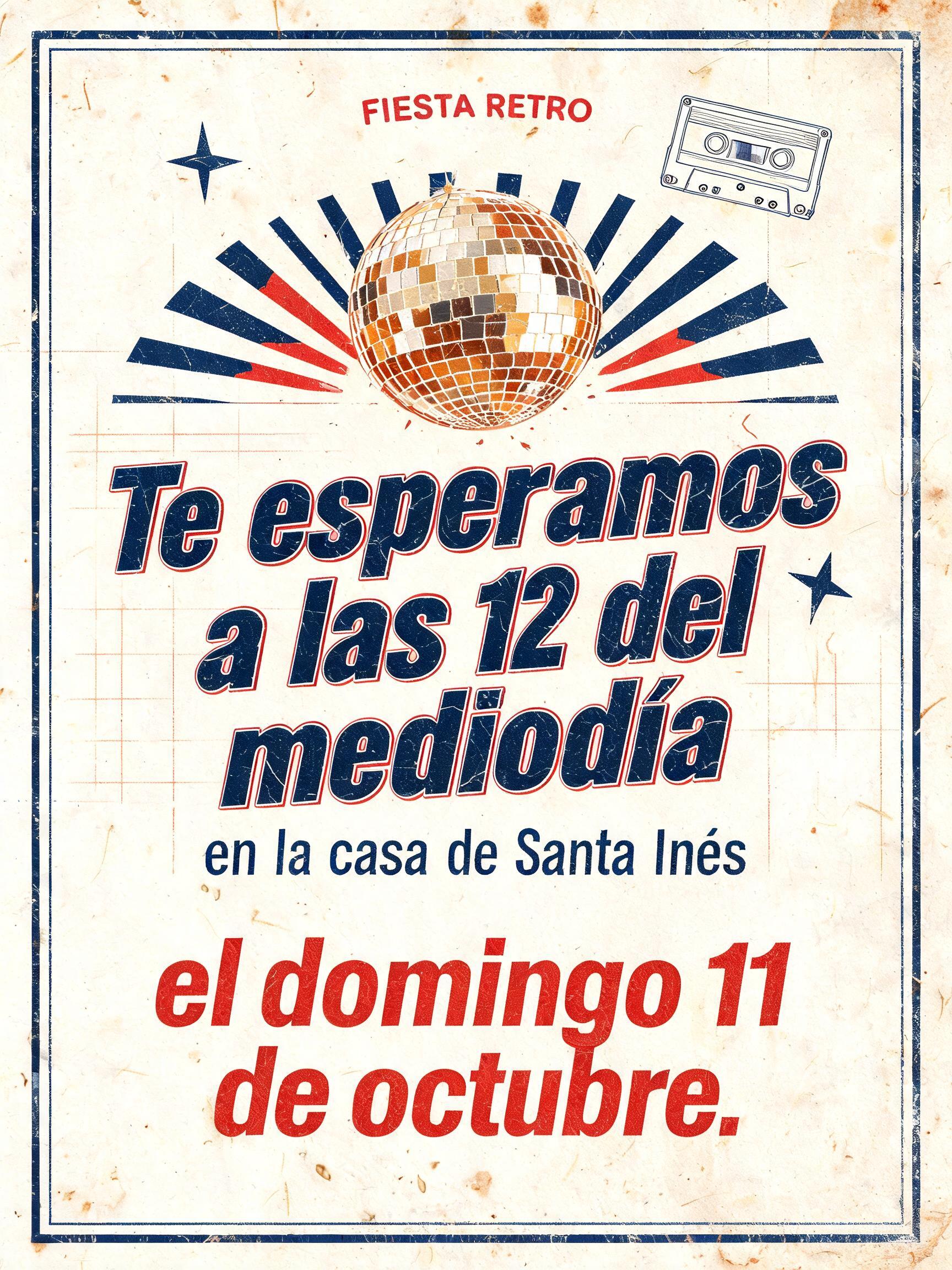
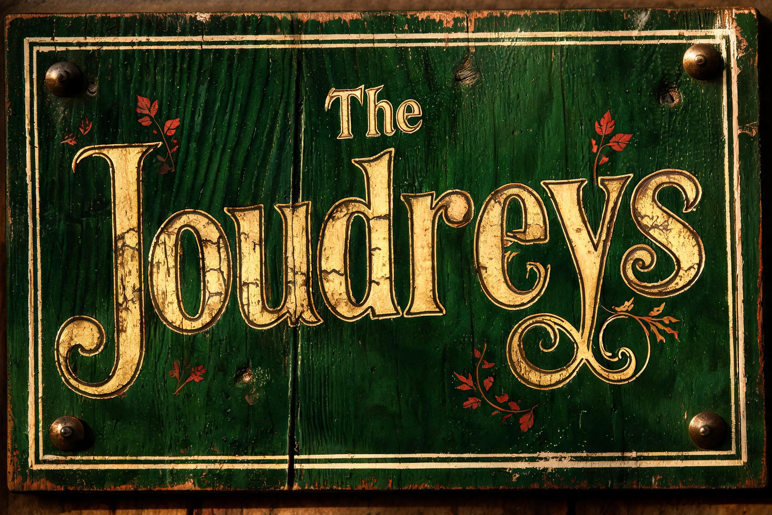
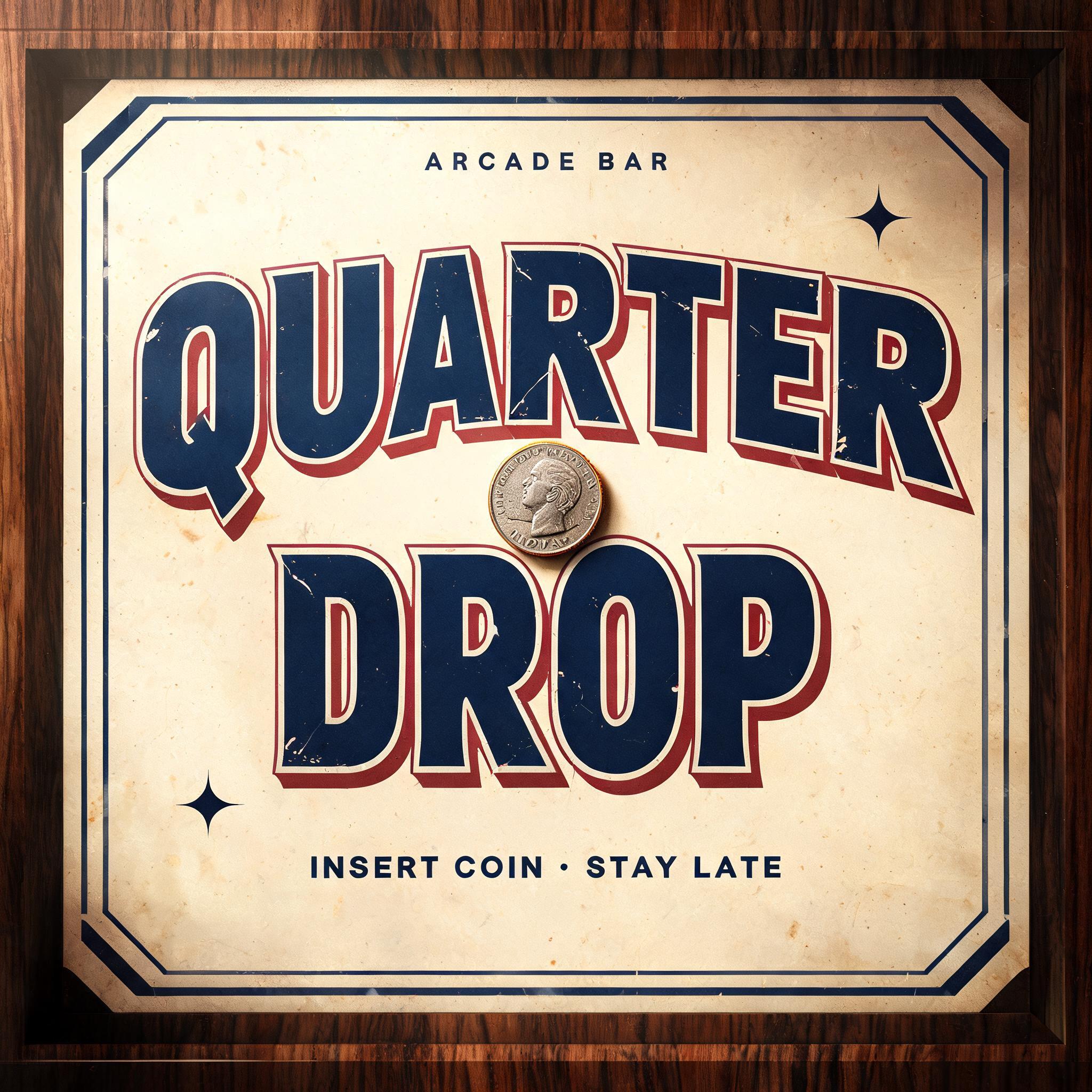
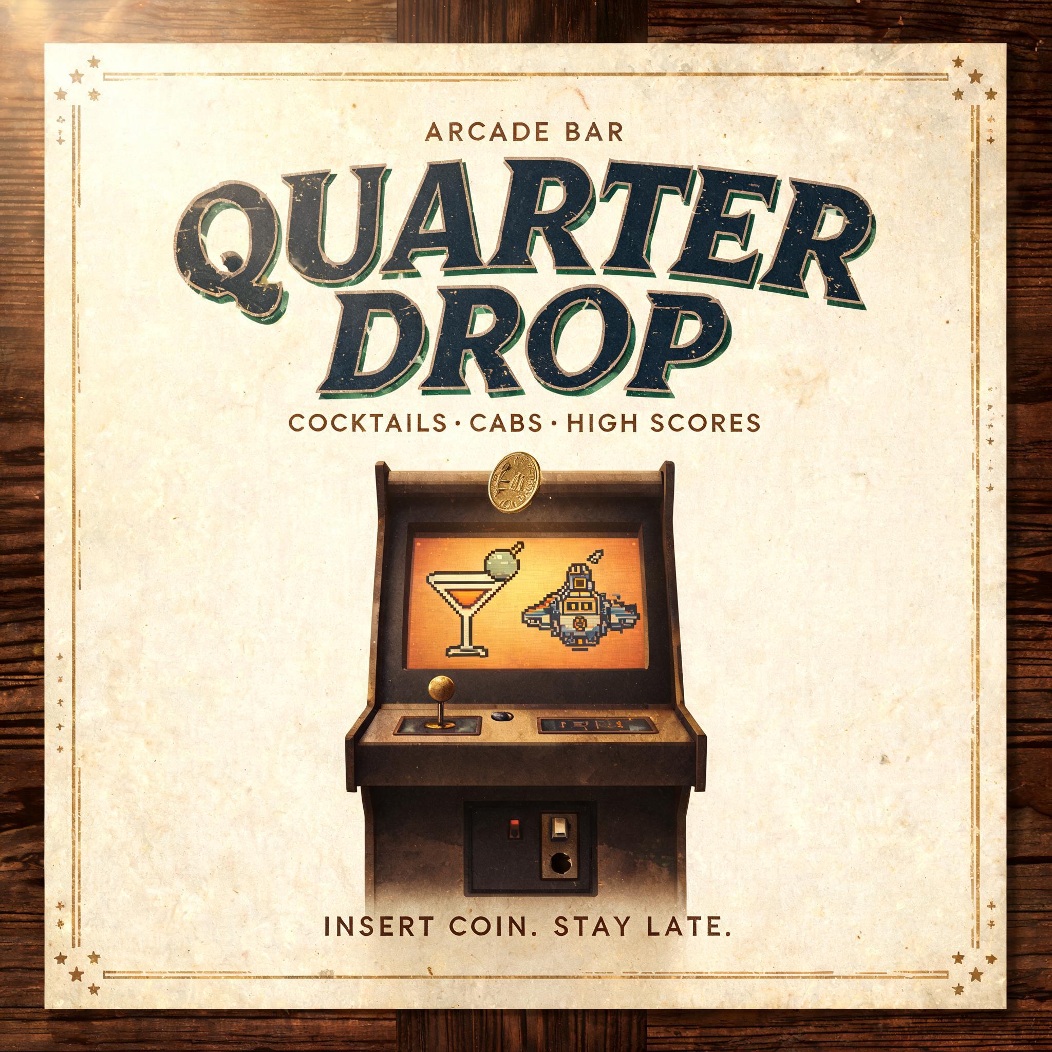
„Keep Rolling“ ist ein Vintage-Texteffekt, erstellt mit FontVibe KI. Serifenversalien im Buchdruck in cremefarbenen Baumwollkarton gepresst, mit leicht ausbrechender Farbe, auf dem Fundament einer alten Presse zwischen verstreuten Bleilettern.
a timeless vintage piece carrying the physical evidence of an older making — warm, aged and classic. SURFACE / STYLE: the lettering looks produced by a heritage craft and softened by time — a letterpress impression bitten into cotton paper with ink slightly broken up, weathered paint on aged metal or wood, a worn rubber-stamp or postal imprint, or warm gold leaf — carrying patina, foxing, grain and gentle wear. SCENE ATMOSPHERE: a warm nostalgic setting — aged cream or kraft paper, dark wood, soft amber light, faint dust and a faded heritage feel. PALETTE: warm aged tones — cream, kraft, sepia, faded red, forest green, navy, tan and antique gold — muted and time-softened, never neon-bright. LETTERFORM PRIORITY: when the chosen font carries its own treatment (western slab, art deco, art nouveau, letterpress, postal or rubber stamp, gold leaf, typewriter, hand-lettered script, grunge chalk), that font treatment takes absolute priority and owns the letters; this style supplies the warm aged tone, the time-worn surface and the nostalgic heritage scene. FALLBACK MATERIAL: if the font carries no material of its own, render the letters as a classic serif printed in warm faded ink on aged cream paper with a soft letterpress impression and gentle wear, so the timeless vintage feel always reads. A wide vintage roadside badge built around the exact words “Keep Rolling,” centered as the dominant message across roughly 72% of the frame. The lettering carries faded navy ink with a gently broken letterpress texture, pressed into thick warm-cream cotton paper; shallow embossed edges and tiny irregularities make the handmade print tactile. Behind it, a sun-softened field of dusty tan paper shows faint road-map linework, scattered foxing, softened fold marks, and a barely visible circular wheel-track motif framing the words without competing. Add restrained accents in weathered faded red and antique gold: a thin double rule, two small starbursts, and a worn directional-arrow ornament at each side. Low amber light falls from the upper left, revealing paper grain, soft shadows within the impression, and a few floating dust motes. The composition feels like a well-loved mid-century travel poster or garage sign—steady, optimistic, durable, and warmly aged. Keep generous cream negative space around the headline; no modern objects, no neon, no glossy finish. 16:9 horizontal.
Gemacht für Retro-Text-Generator
Generiert am 26. Oktober 2026 · 1824 × 1024 · JPEG · OpenAI GPT-Image-2.5 Sunburst · Von der erstellenden Person geteilt · Kostenlos kommerziell nutzbar (CC BY 4.0)


