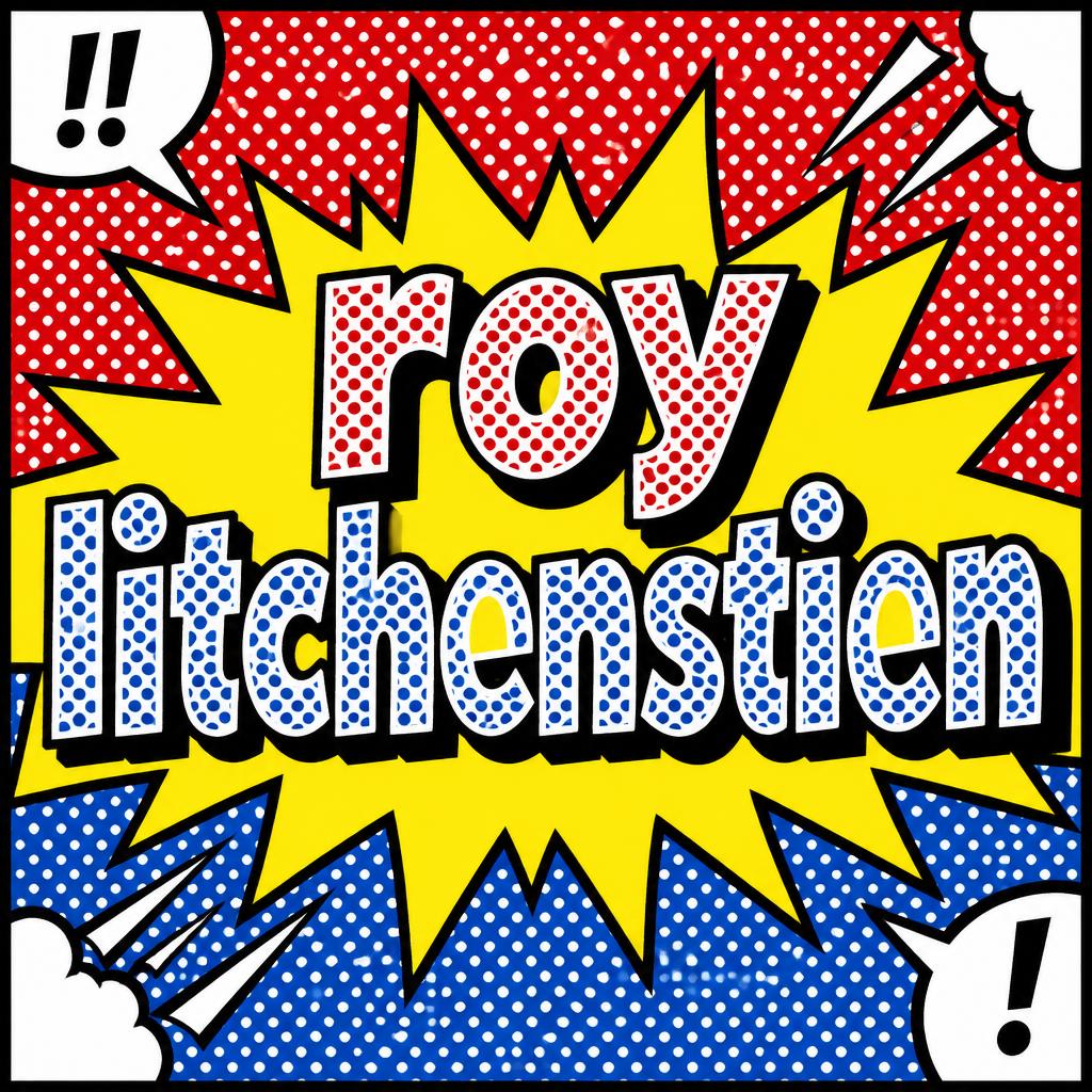
roy litchenstien - Pop Art Text Effect


Nutzt OpenAI GPT-Image-2.5 Sunburst, das Modell dieses Werks · 15 Credits


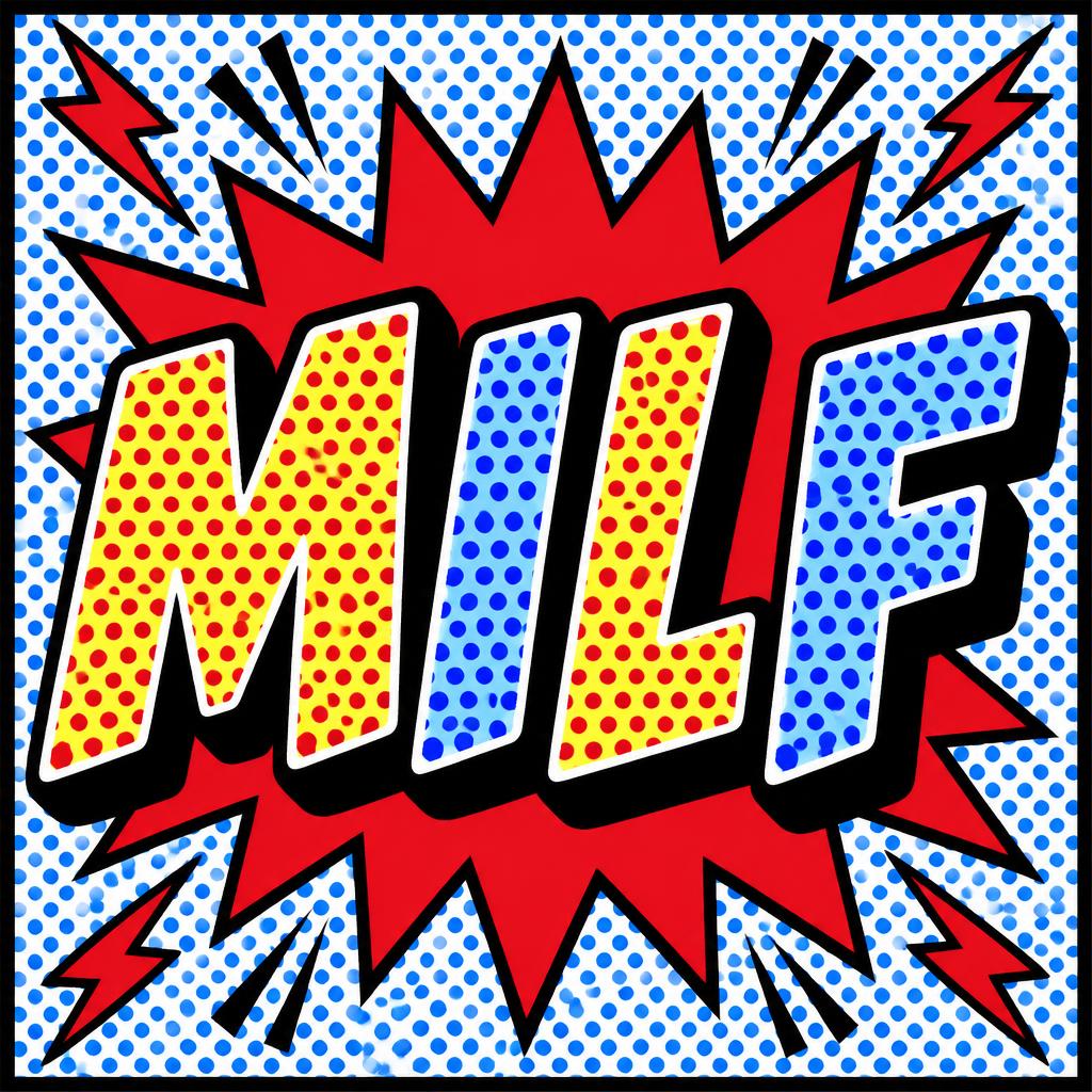

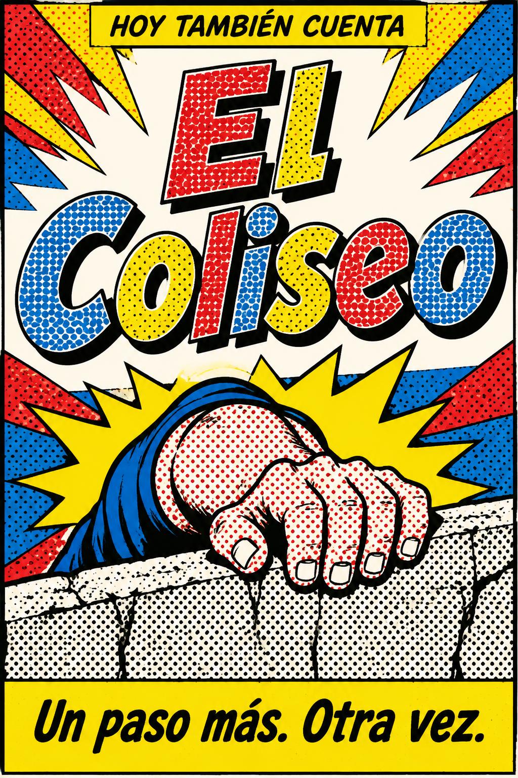


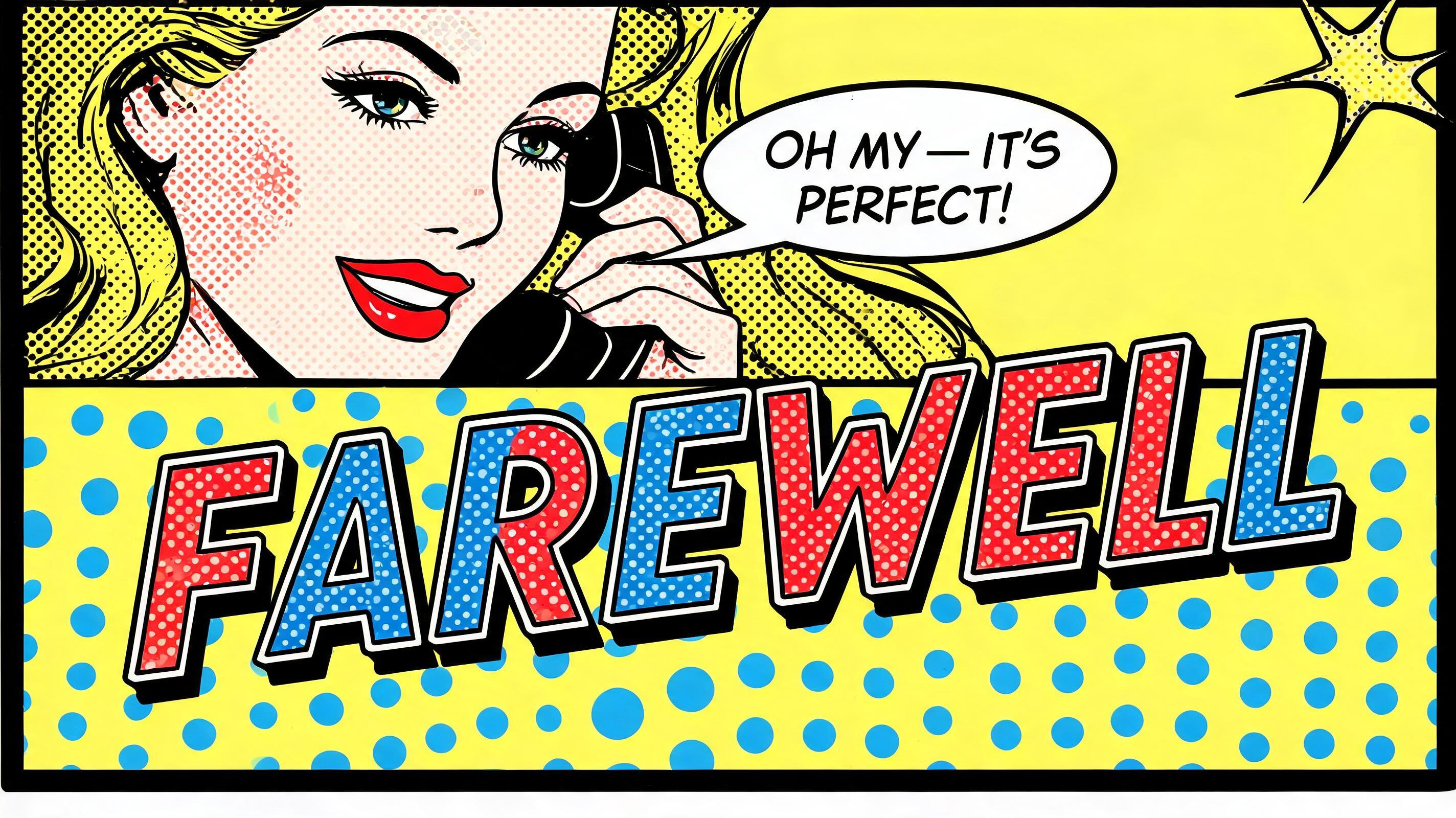


„roy litchenstien“ ist ein Pop Art-Texteffekt, erstellt mit FontVibe KI. Comic-Versalien im Stil Lichtensteins, gefüllt mit Ben-Day-Punkten in flachem Rot und Gelb, dicke schwarze Konturen und harter Schlagschatten, aus einem Explosionsstern auf blau gepunktetem Grund.
rendered in Roy Lichtenstein pop art style. Thick uniform black outline traces every letter contour and inner stroke — consistent weight, hard edge, zero softness. Letter fills use large Ben-Day halftone dots: dots individually visible, primary colors only (flat red, flat yellow, flat blue, flat white — no gradients, no metallics, no pastels). Graphic drop shadow offset 45° lower-right, solid black, hard edge. Entire image: zero blending, zero photographic realism, flat silk-screen aesthetic. High contrast, comic book energy. Ben-Day dots never touch the outline — always a bare white gap between dot fill and outline inner edge. No CMYK color mixing. LETTERFORM PRIORITY: when the chosen font carries its own treatment, that font's letterform shapes take priority and own the letters; this style governs the thick black outline, the Ben-Day halftone fill and the graphic drop shadow. FALLBACK MATERIAL: if the font carries no material of its own, render the letters with a thick uniform black outline, flat Ben-Day dot fills in primary colors and a hard 45-degree black drop shadow. COLOR PRIORITY: keep the font's own colors if specified; otherwise flat primary red, yellow, blue and white only. Square pop-art tribute composition with the exact text “roy litchenstien” arranged in two dominant centered lines: “roy” above, “litchenstien” below, occupying 74% of the frame width. The lettering is the unquestioned focal point, with thick uniform black contour lines around every outer and inner edge, a clean bare white inset gap, then large individually visible Ben-Day dots on a precise 45-degree grid. “roy” uses flat red dot fields over white; “litchenstien” uses flat blue dot fields over white, with select flat yellow counter-shapes for rhythmic contrast. Every letter throws a solid black hard-edged shadow down-right at 45 degrees. Behind the words, an oversized jagged yellow explosion burst pushes outward from the center, enclosed by a uniform black outline. Background is divided like a vintage comic panel: saturated red upper field, blue lower field, both covered with evenly spaced contrasting white Ben-Day dots. Add small black-outlined white speech-bubble fragments and sharp action marks at the corners, never competing with the title. Thick black rectangular panel border. Flat primary red, yellow, blue, white, and black only; no gradients, no texture softness, no photographic elements, pure vintage silk-screen comic energy.
Generiert am 26. Oktober 2026 · 1024 × 1024 · JPEG · OpenAI GPT-Image-2.5 Sunburst · Von der erstellenden Person geteilt · Kostenlos kommerziell nutzbar (CC BY 4.0)


