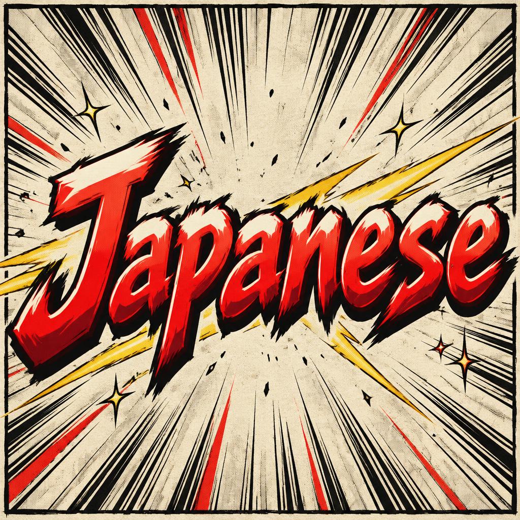
Japanese - Anime Text Effect


Nutzt OpenAI GPT-Image-2.5 Sunburst, das Modell dieses Werks · 15 Credits

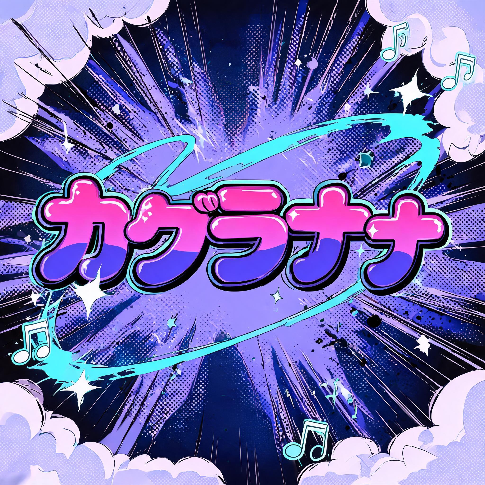
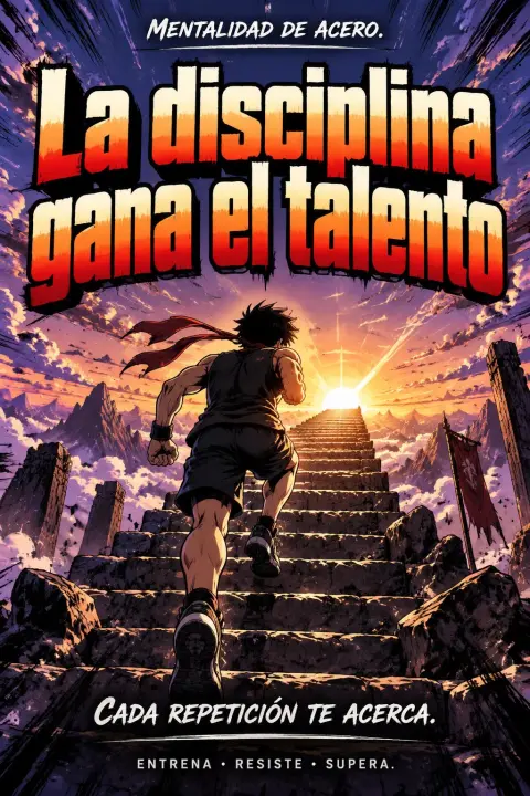
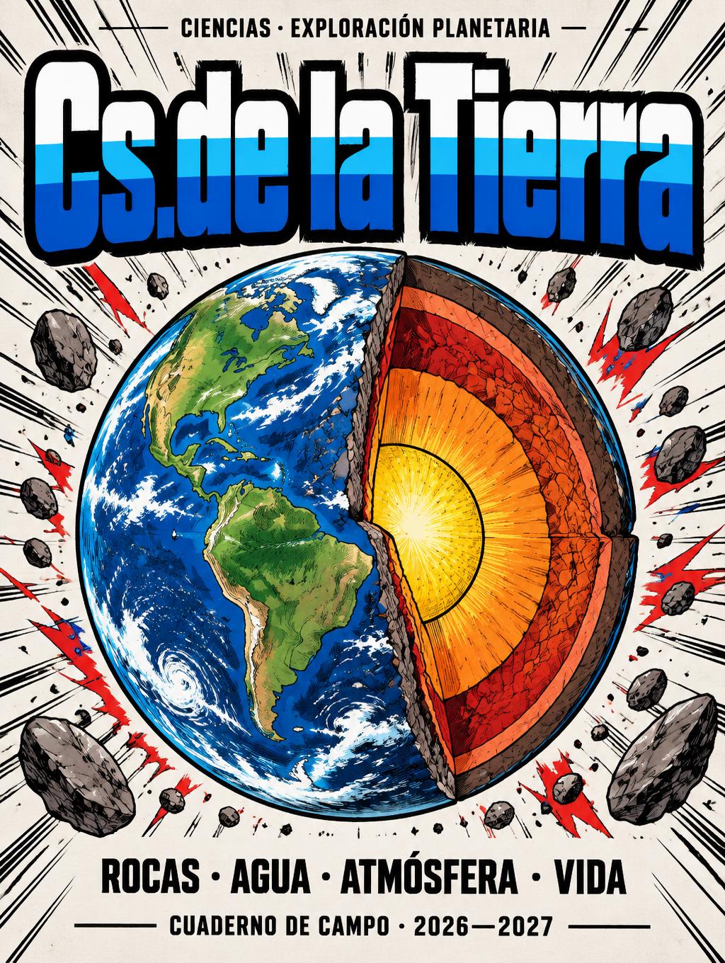
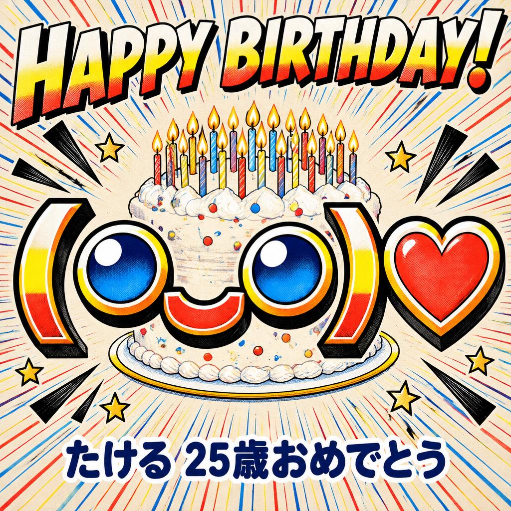
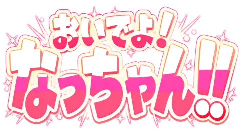
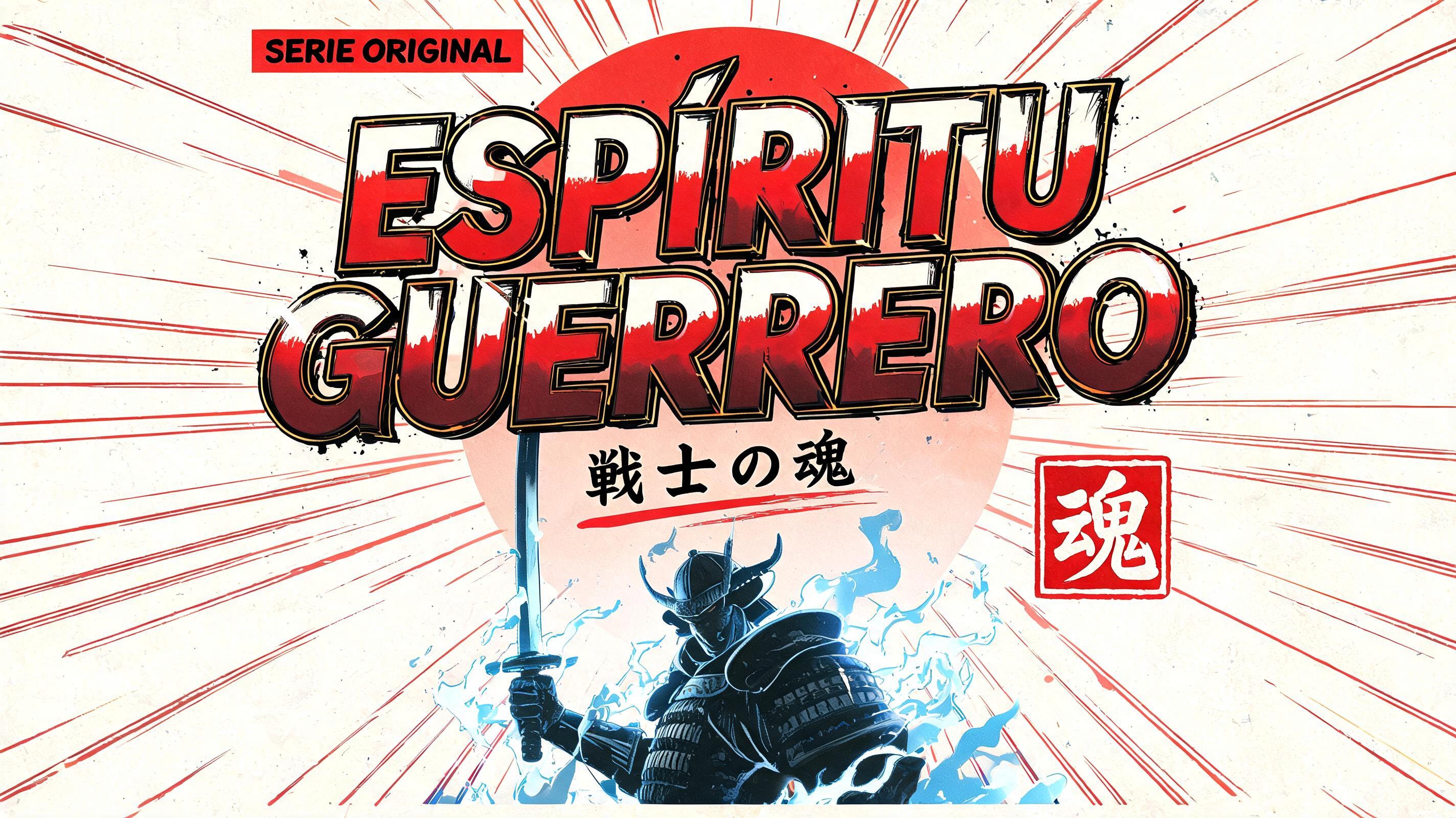

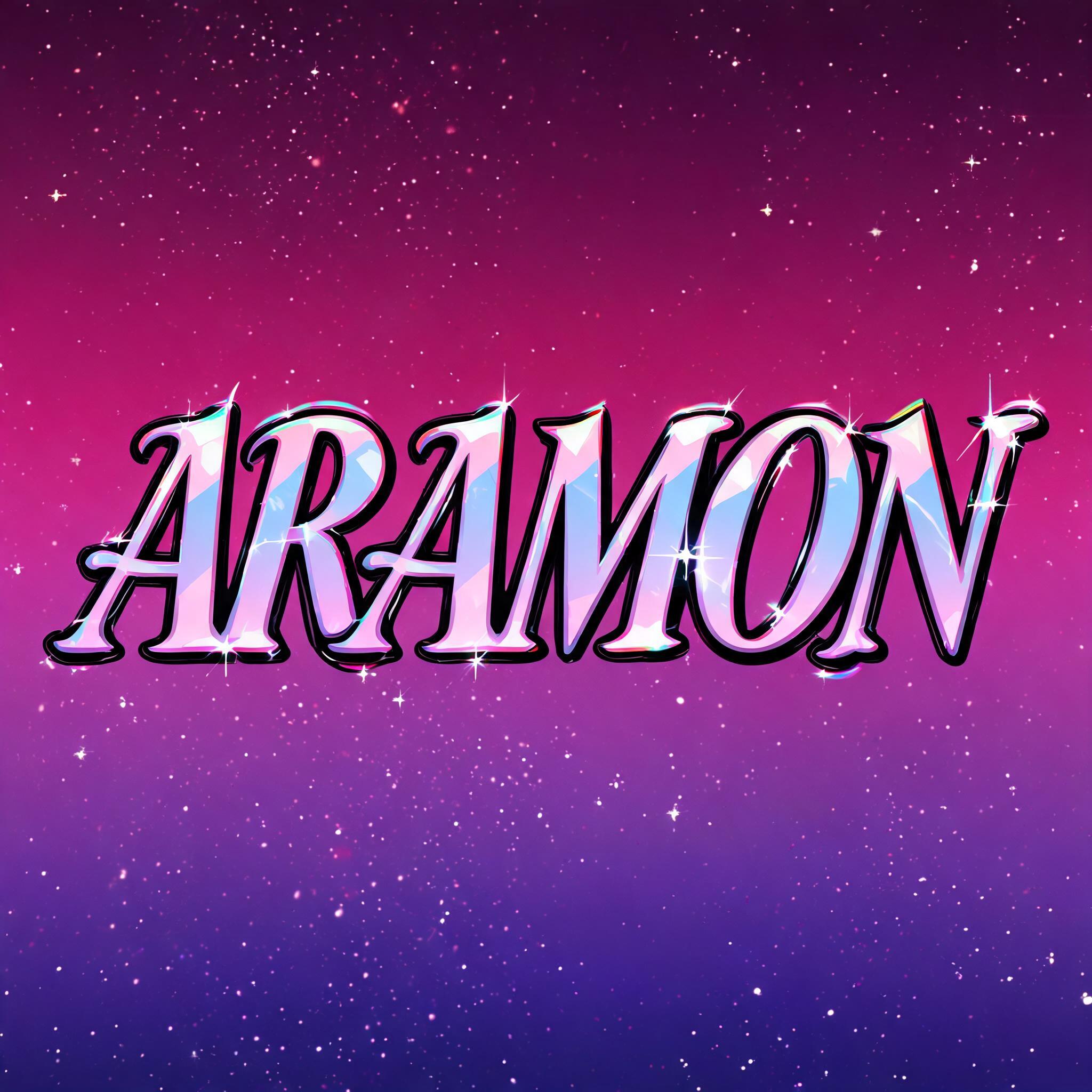
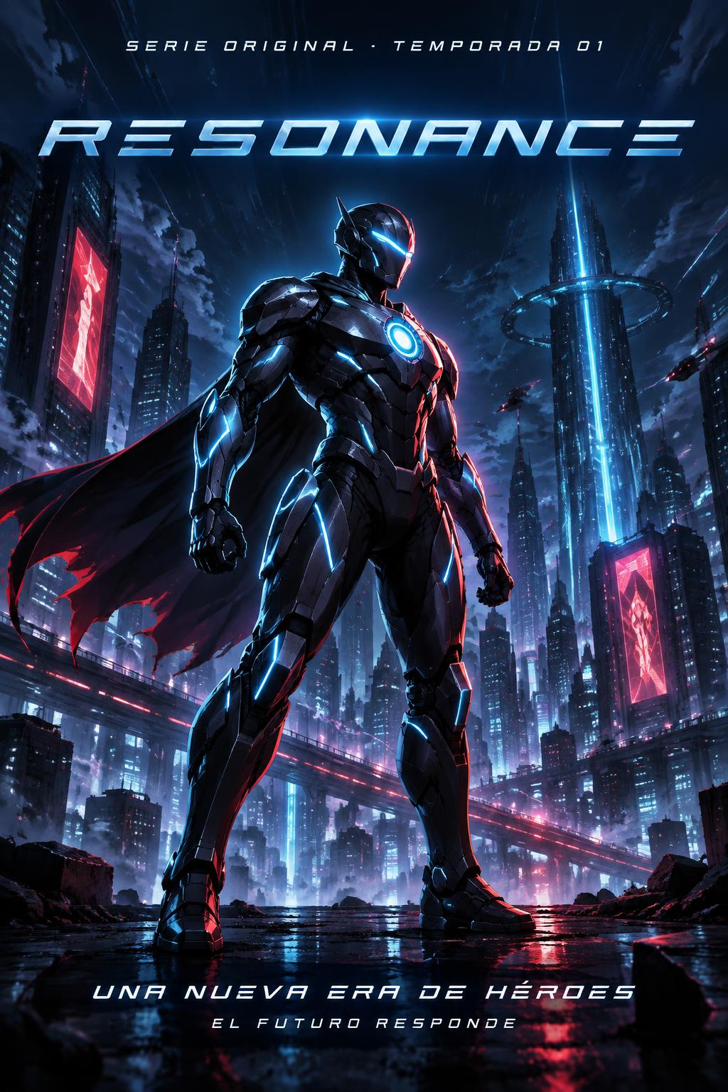
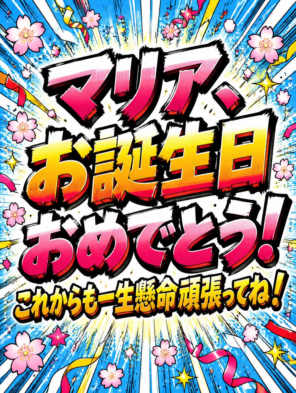
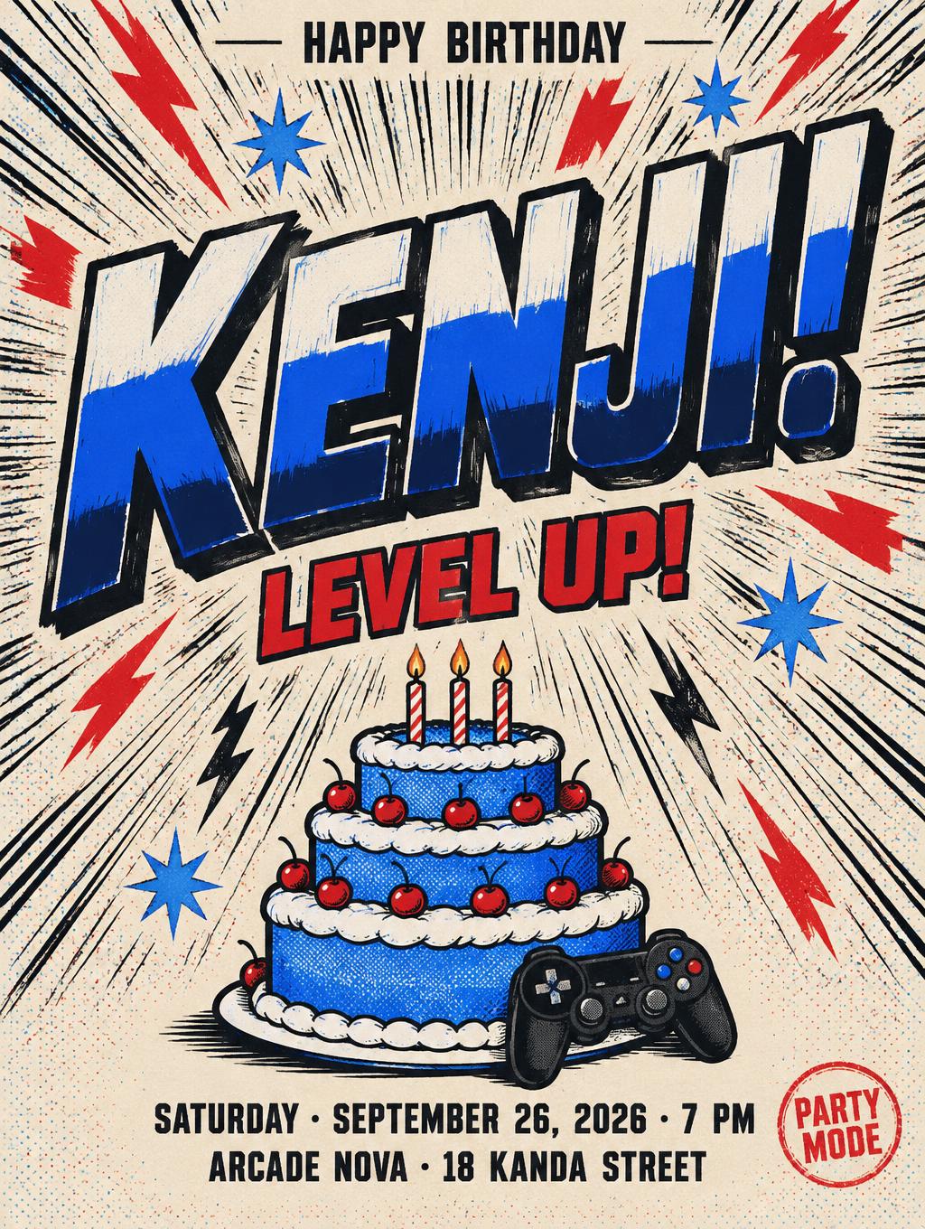
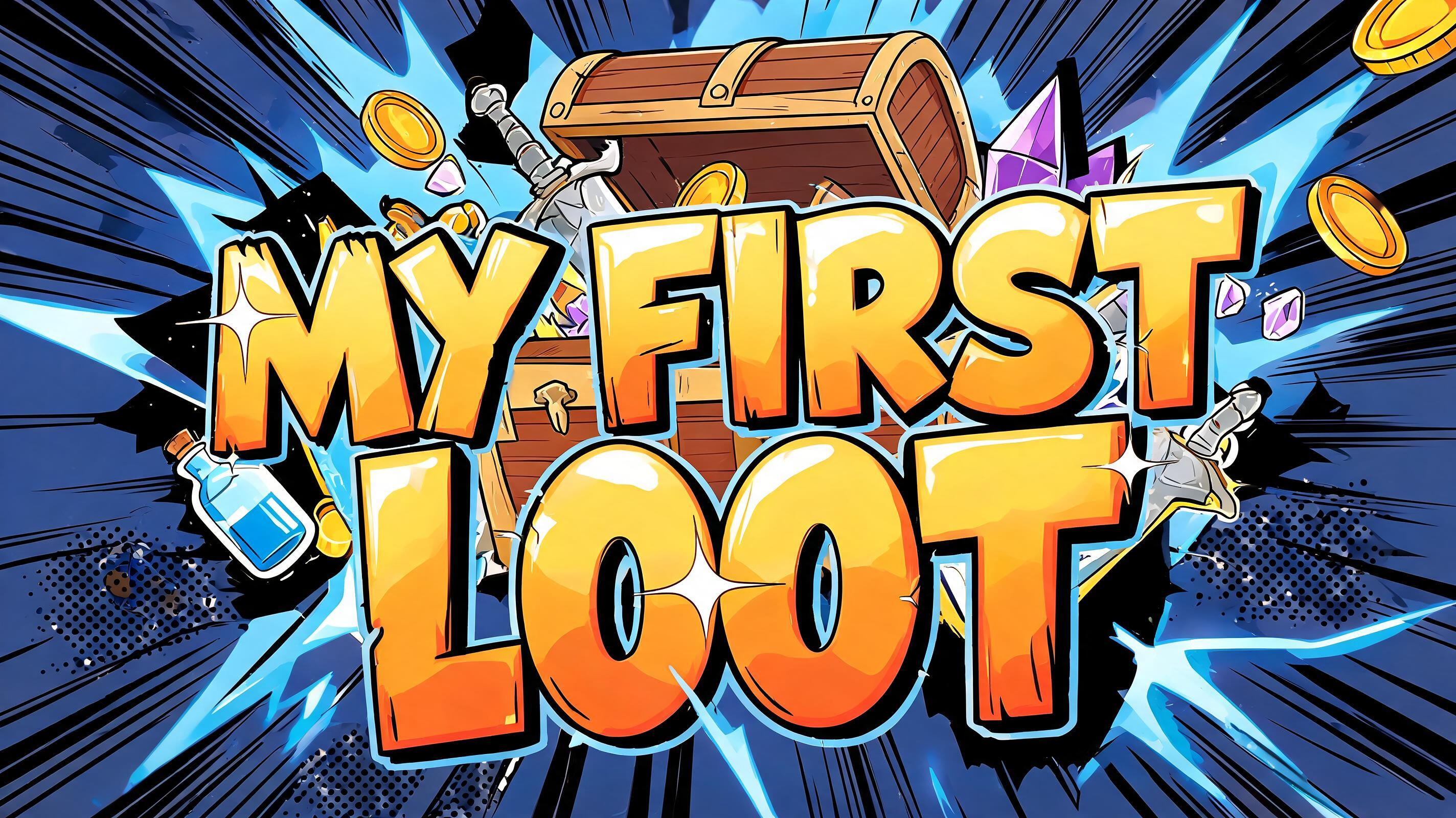
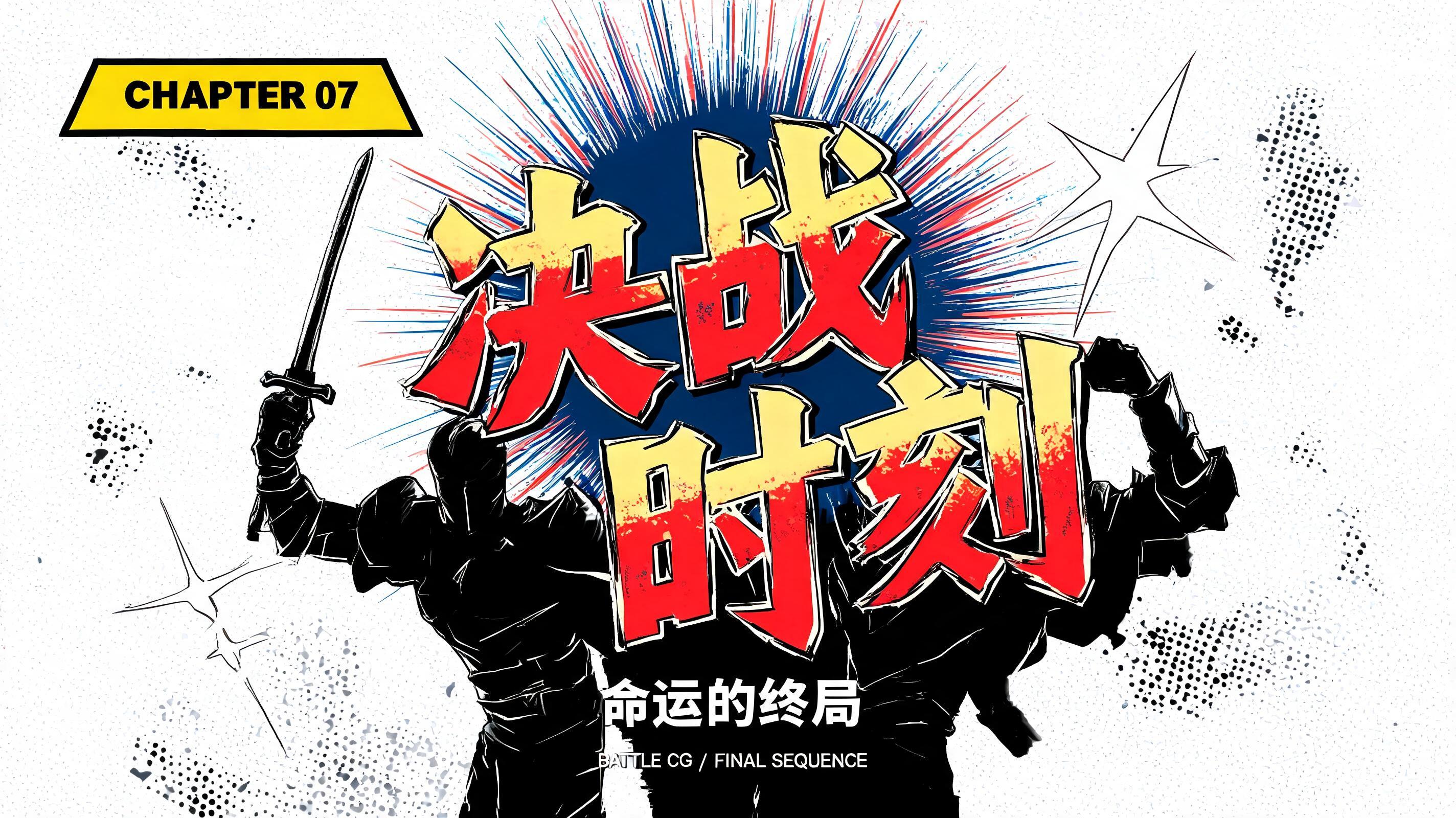
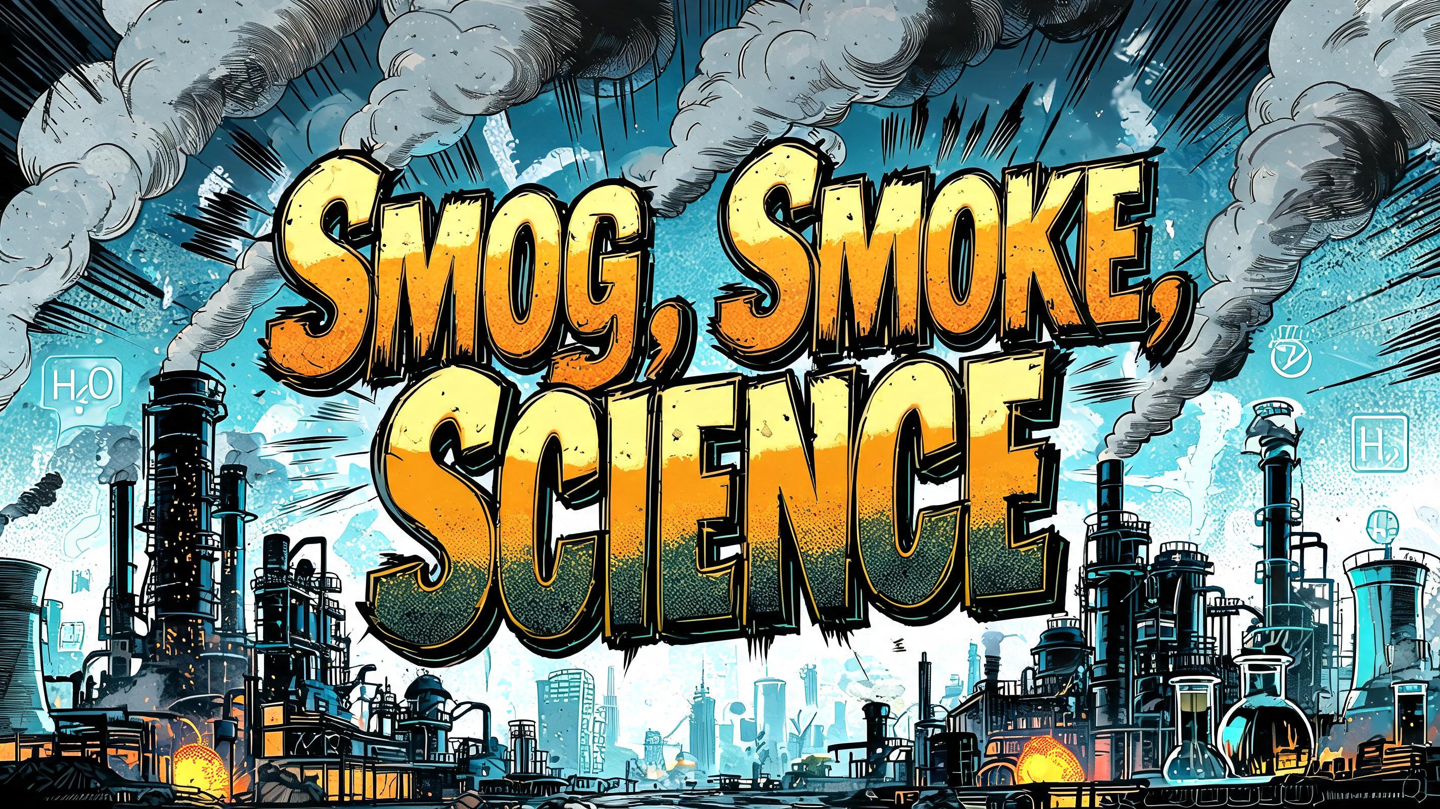
„Japanese“ ist ein Anime-Texteffekt, erstellt mit FontVibe KI. Shōnen-Manga-Titelschrift: dicke, von Hand getuschte schwarze Konturen, flaches Cel-Shading in harten Licht- und Schattenbändern, schräg gestellte, dynamische Buchstaben auf Weiß mit strahlenförmigen Speedlines.
rendered as Japanese shounen anime title treatment — bold hand-inked manga lettering with authentic cel-shaded visual energy. Letter construction follows classic Shonen Jump title card standards: thick black ink outline with natural brush-weight variation defining each letter boundary; flat cel-shading fill with three hard-edge zones — bright highlight zone on upper letter face, highly saturated primary color zone at center, deep shadow zone at lower edge; all zone boundaries knife-edge hard, zero gradient blur, pure flat offset-print ink physics. Energy signature: high-contrast color + thick ink outline = letters that look physically printed on manga paper. The typographic language of Dragon Ball, Naruto, One Piece, Demon Slayer, Jujutsu Kaisen title cards — maximum manga kinetic energy, iconic and immediately recognizable as Japanese anime title typography. LETTERFORM PRIORITY: when the chosen font carries its own treatment, that font's letterform shapes take priority and own the letters; this style governs the inked manga outline, the three-zone cel-shading and the kinetic energy. FALLBACK MATERIAL: if the font carries no material of its own, render the letters as bold hand-inked shounen title lettering with a thick black brush outline and hard three-zone cel-shading. COLOR PRIORITY: keep the font's own colors if specified; otherwise a high-saturation primary fill with hard highlight and shadow zones. ‘Japanese’ as a single dominant shounen anime title, centered large across a square 1:1 composition with a slight upward thrust and generous breathing room around the word. Every letter carries a thick, expressive black ink contour with imperfect brush-weight variation, plus small ink flicks at the outer corners. Fill the lettering in three razor-sharp cel-shaded zones: hot white highlights across the upper faces, saturated vermilion red through the broad middle planes, and deep maroon-red shadow along the lower edges; no soft gradients anywhere. Add narrow golden-yellow accent slashes cutting behind selected letters, like a sudden heroic transformation flare. Background: aged warm ivory manga paper with faint halftone texture, bordered by a loose black panel frame. Dense black radial speed lines burst outward from behind the central letters, interspersed with a few red impact streaks and tiny star-shaped ink sparks. Keep the title completely legible and clean in front of the explosion, with a compact dark shadow offset down-right to lift it from the paper. The finished image feels like an iconic chapter-opening title card: loud, kinetic, printed, and celebratory.
Gemacht für Kawaii-Schriftgenerator
Generiert am 27. Oktober 2026 · 1024 × 1024 · JPEG · OpenAI GPT-Image-2.5 Sunburst · Von der erstellenden Person geteilt · Kostenlos kommerziell nutzbar (CC BY 4.0)


