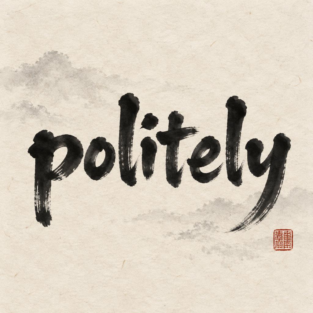
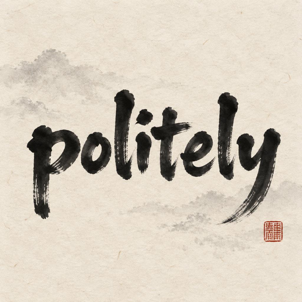
politely - Chinesischer Tuschepinsel Text Effect


Nutzt OpenAI GPT-Image-2.5 Sunburst, das Modell dieses Werks · 15 Credits
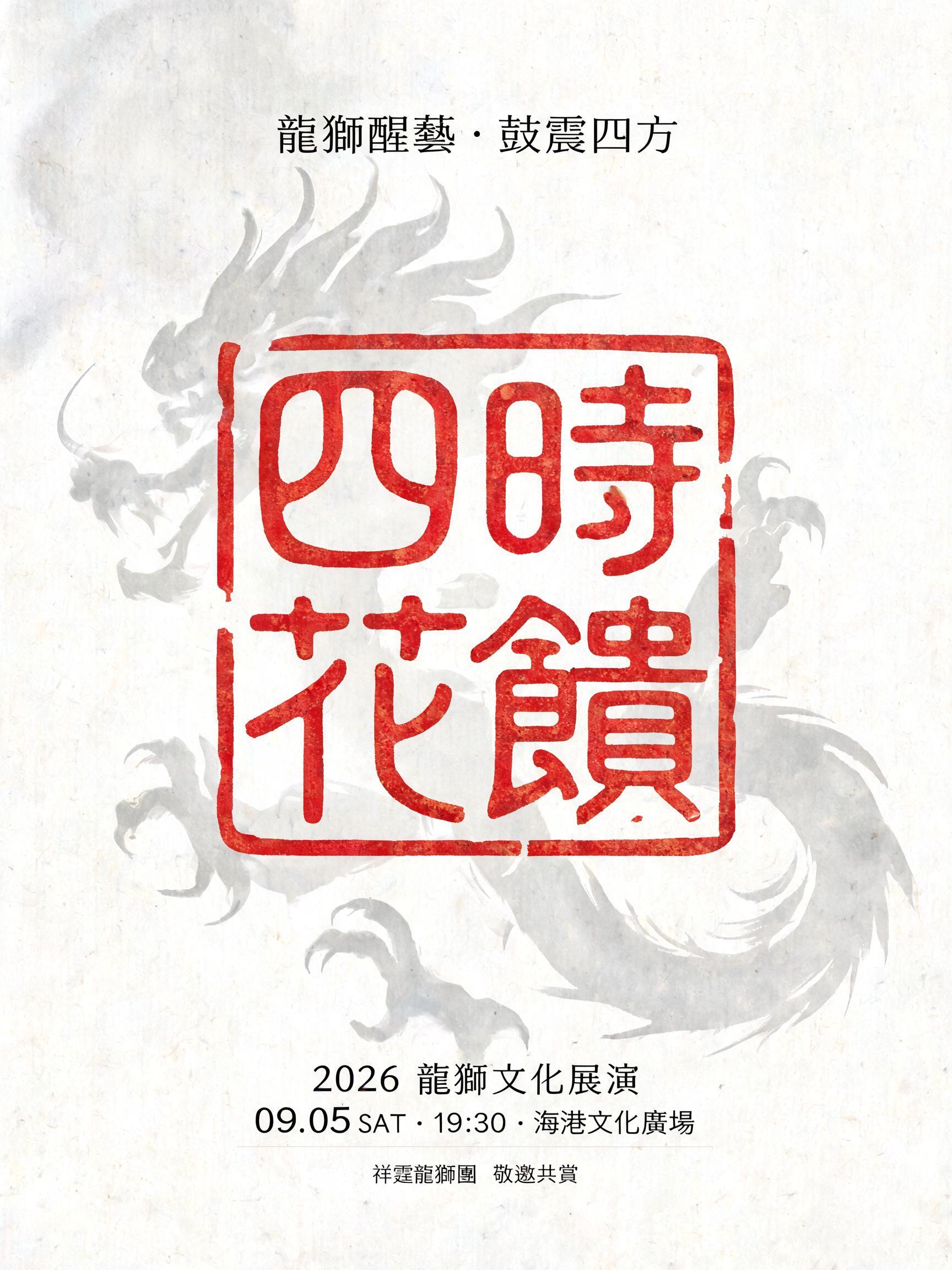
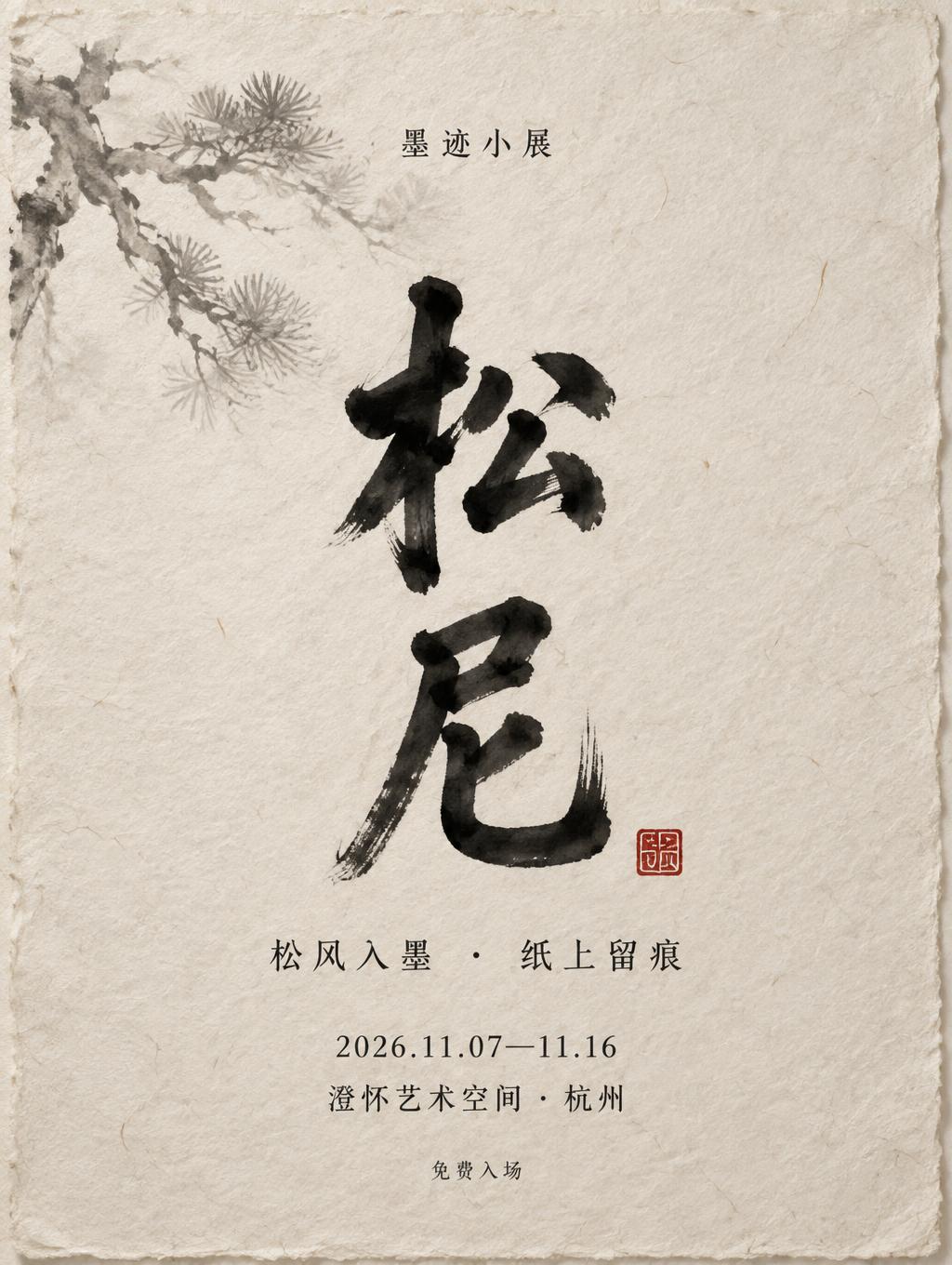


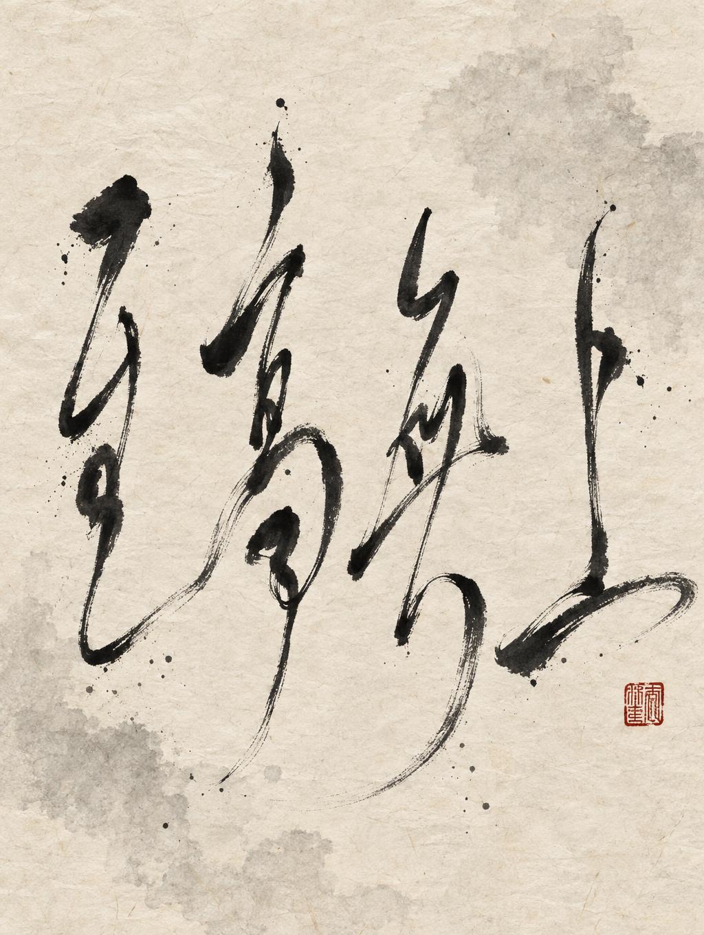

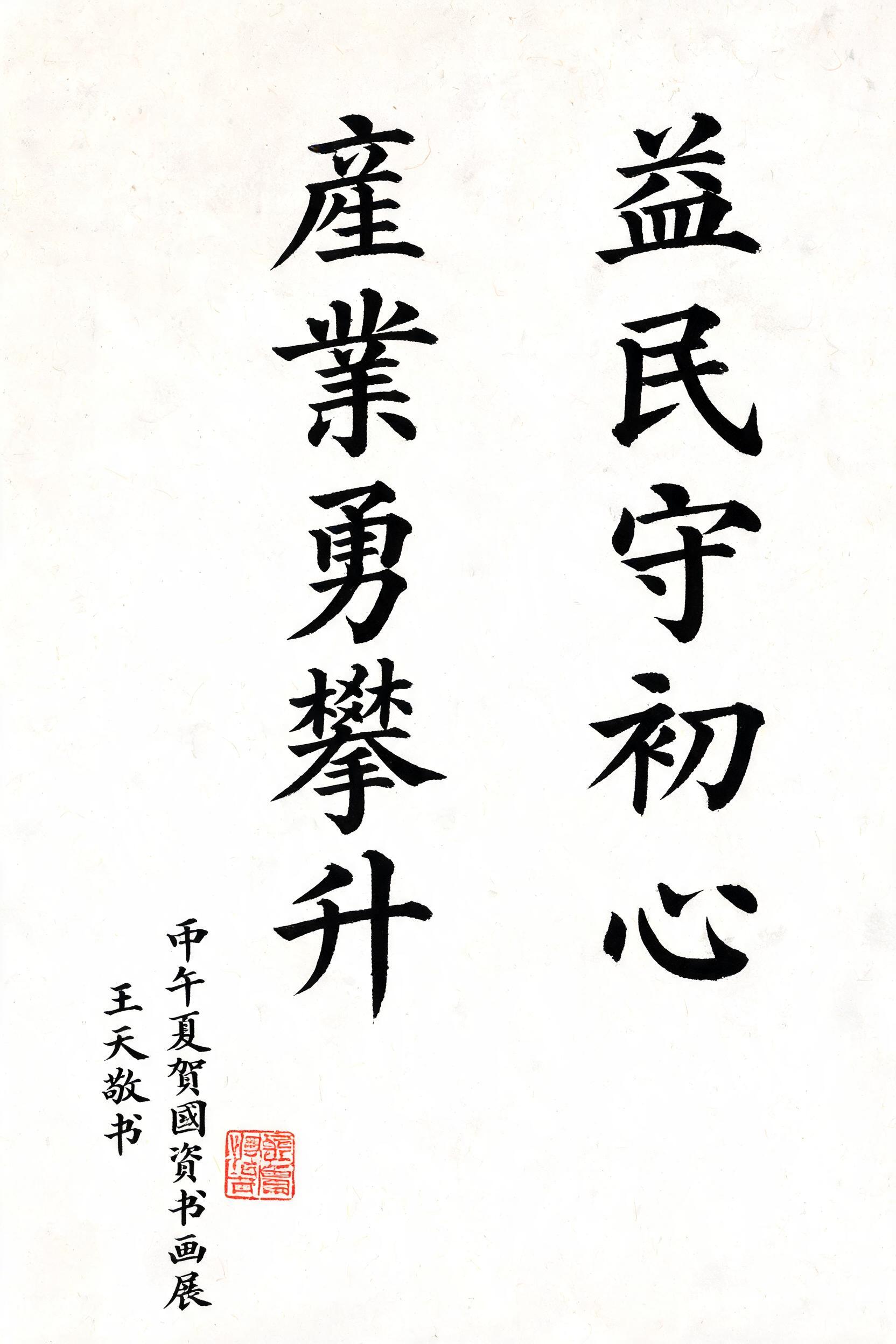
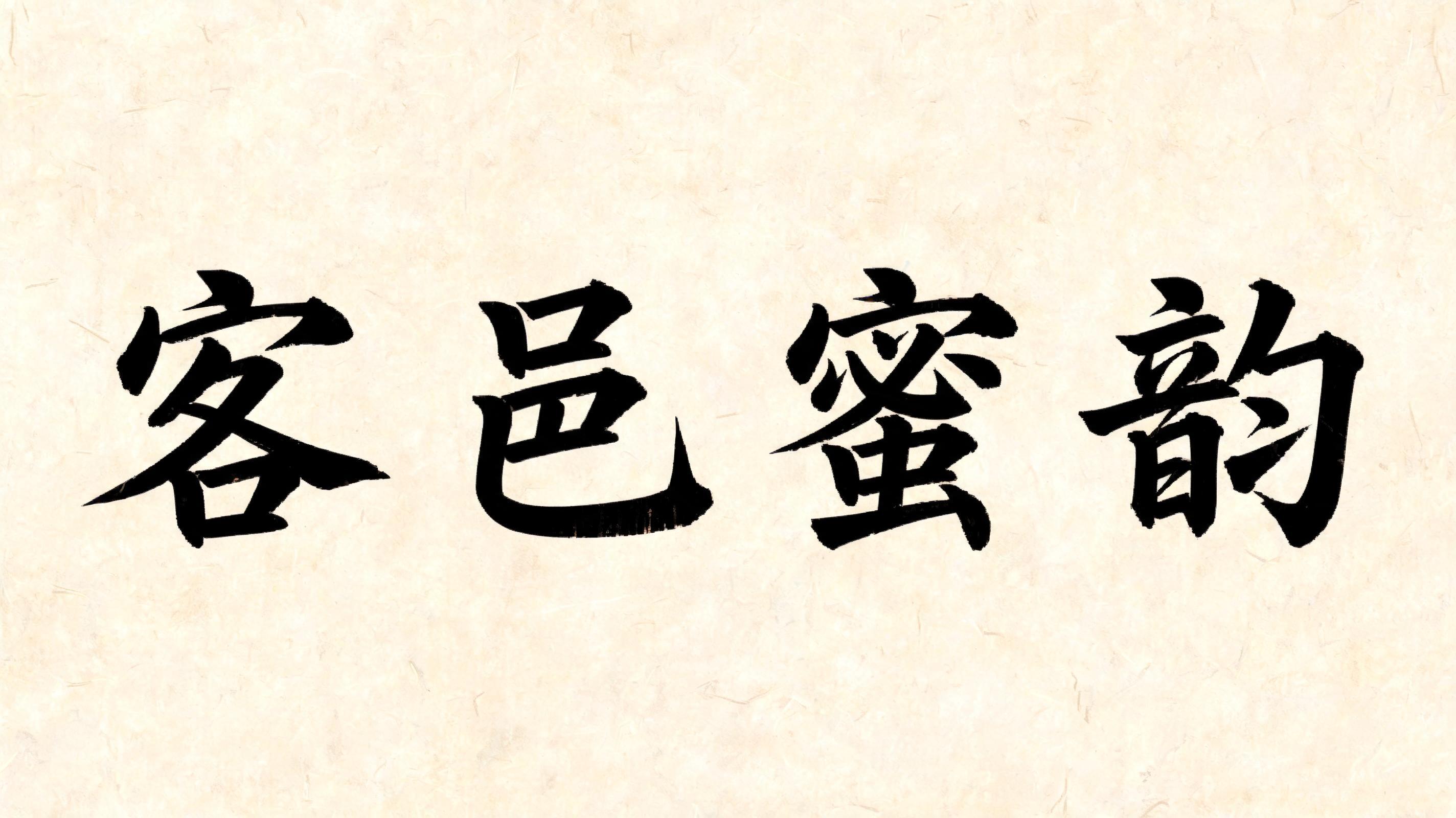

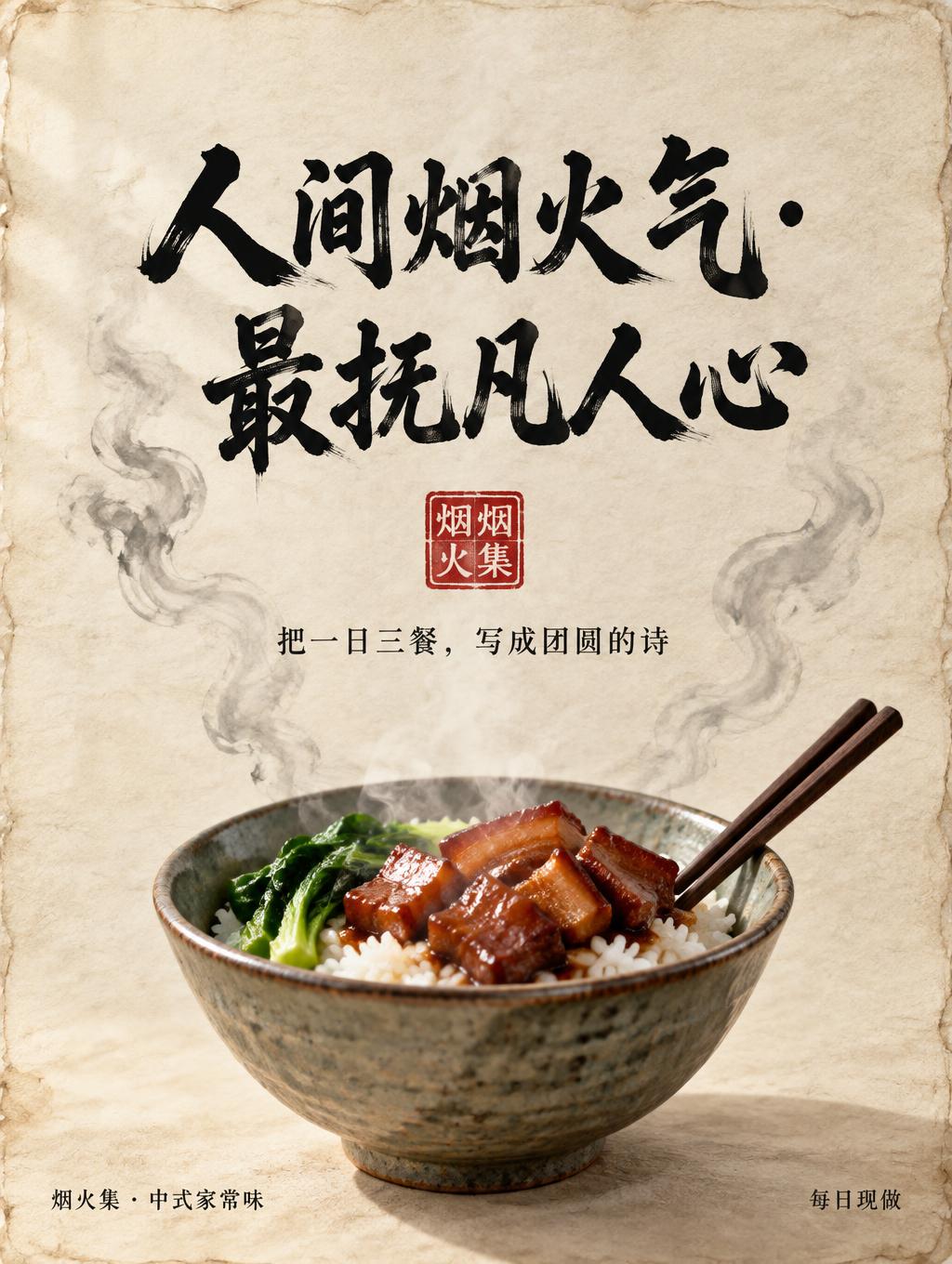
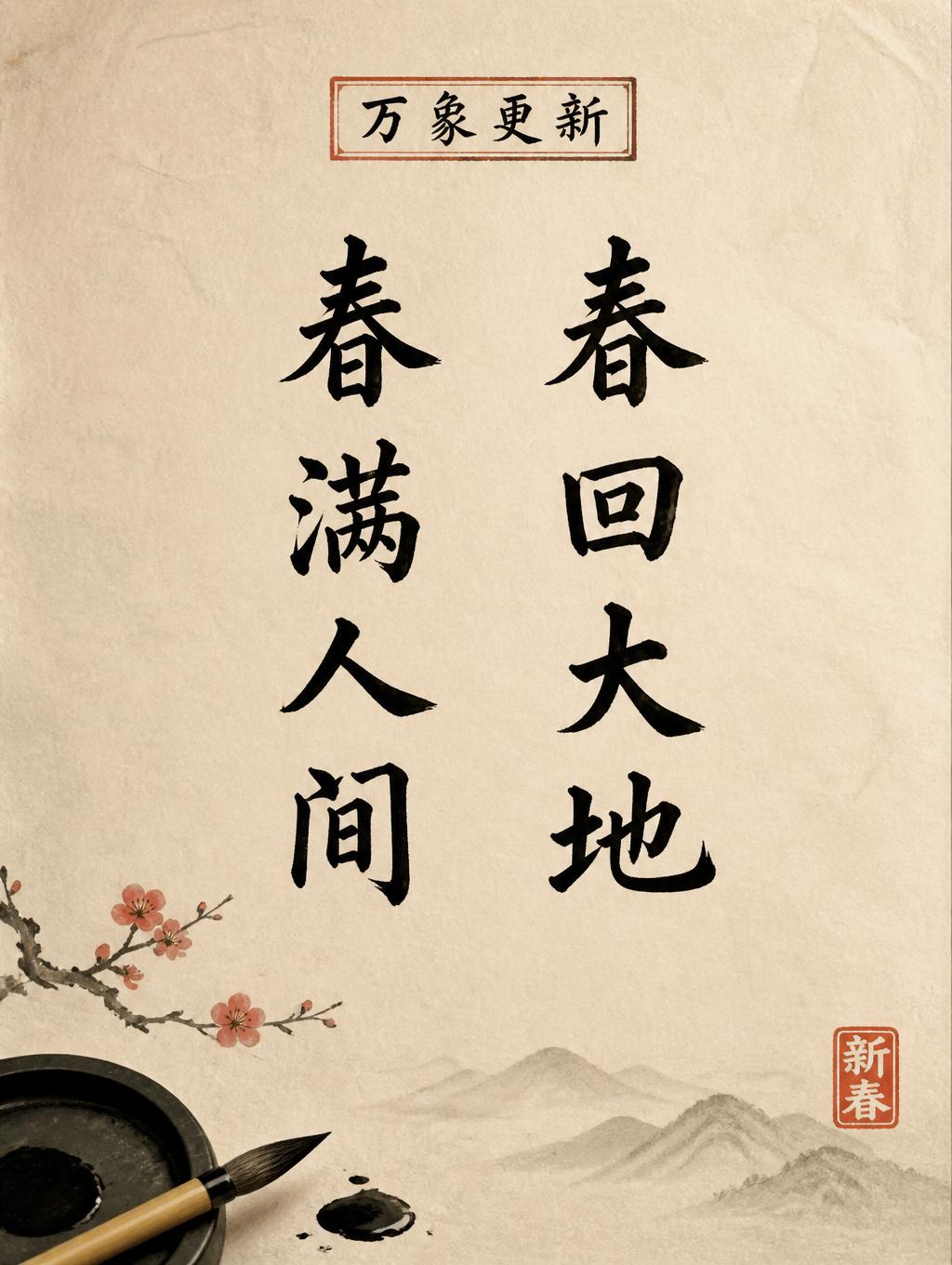


„politely“ ist ein Chinesischer Tuschepinsel-Texteffekt, erstellt mit FontVibe KI. Chinesische Sumi-Tuschekalligrafie im Pinselstil, übertragen auf lateinische Buchstaben. Tiefschwarze Tusche mit authentischer Borstentextur, von dick zu dünn variierenden Strichen und Reispapier-Atmosphäre. Perfekt für das Branding chinesischer Restaurants, Kampfkunst, Wellness und kulturelles Design.
rendered in Chinese ink brush calligraphy style. Letterforms painted with a fully loaded sumi ink brush — deep black ink, visible bristle marks along stroke edges, wet ink pooling at stroke starts, feathered dry-brush trailing ends. Authentic ink density variation: thick rich black cores fading to grey at thin passages. Rice paper texture visible behind. Traditional Chinese calligraphy energy — each stroke confident, intentional, irreversible. LETTERFORM PRIORITY: when the chosen font carries its own treatment, that font's letterform shapes take priority and own the letters; this style governs the sumi ink medium, the bristle and ink-density behavior and the rice-paper ground. FALLBACK MATERIAL: if the font carries no material of its own, render the letters as deep black sumi brush strokes with visible bristle marks, wet ink pooling at stroke starts and feathered dry-brush trails on rice paper. COLOR PRIORITY: keep the font's own colors if specified; otherwise rich black ink fading to grey at thin passages. Square composition, 1:1. Render the exact word “politely” as the sole hero text, centered with generous breathing room and a calm, graceful rhythm. The letters are painted in expressive Chinese sumi ink brushwork: deep black ink with rich, wet pools at stroke beginnings, visible bristle traces along irregular edges, and tapered dry-brush trails fading toward soft grey. Let subtle xuan paper fibers show through the thinnest passages, with delicate feathering where damp ink meets the paper. Use a warm ivory rice-paper ground, lightly varied with natural fibers and faint tonal clouds; keep the surrounding space mostly empty. A restrained pale ink wash sits behind the word, barely visible and never competing with its legibility. Add one small vermilion seal impression near the lower right as a quiet accent. The overall feeling is courteous and composed, carried by generous negative space, gentle ink transitions, and a single deliberate sweep of black. Avoid digital-clean edges, uniform ink density, extra lettering, or decorative clutter.
Gemacht für Chinesischer Schrift-Generator
Generiert am 27. Oktober 2026 · 1024 × 1024 · JPEG · OpenAI GPT-Image-2.5 Sunburst · Von der erstellenden Person geteilt · Kostenlos kommerziell nutzbar (CC BY 4.0)


