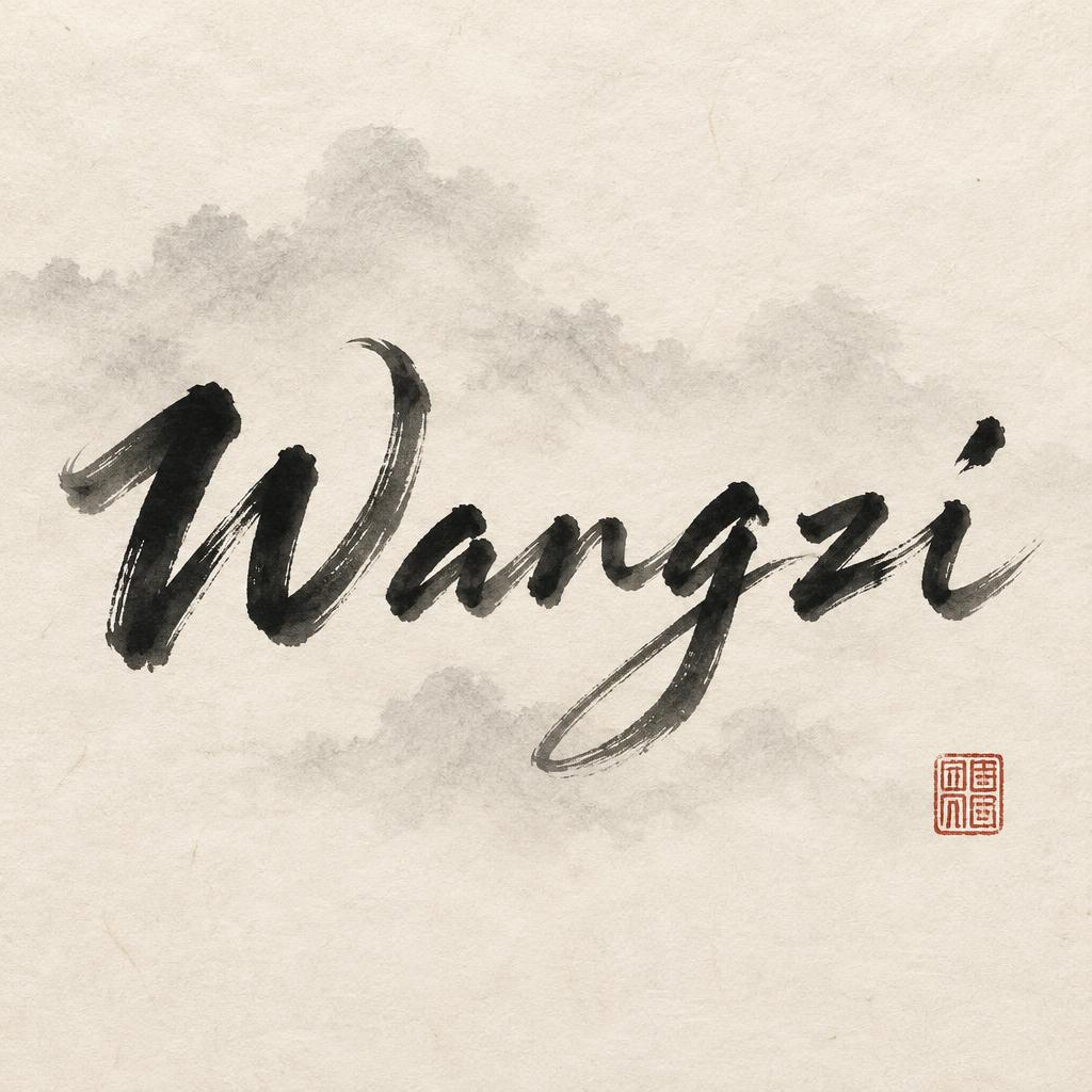
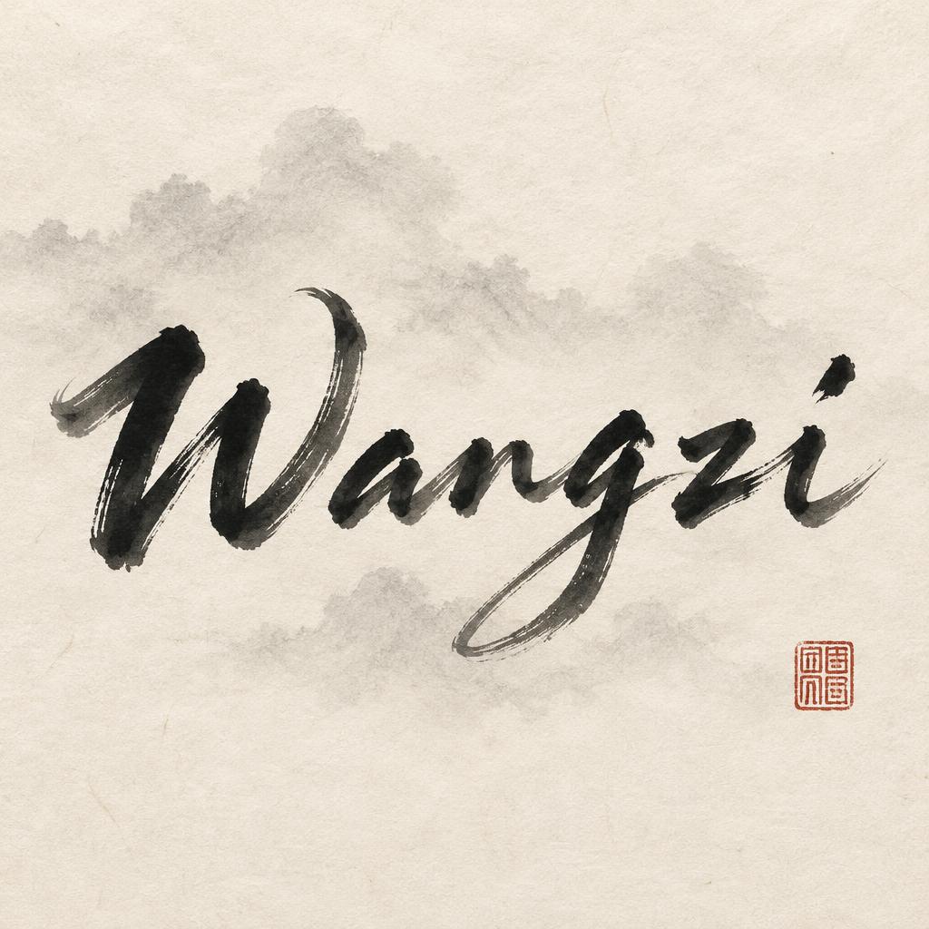
Wangzi - Chinesischer Tuschepinsel Text Effect


Nutzt OpenAI GPT-Image-2.5 Sunburst, das Modell dieses Werks · 15 Credits
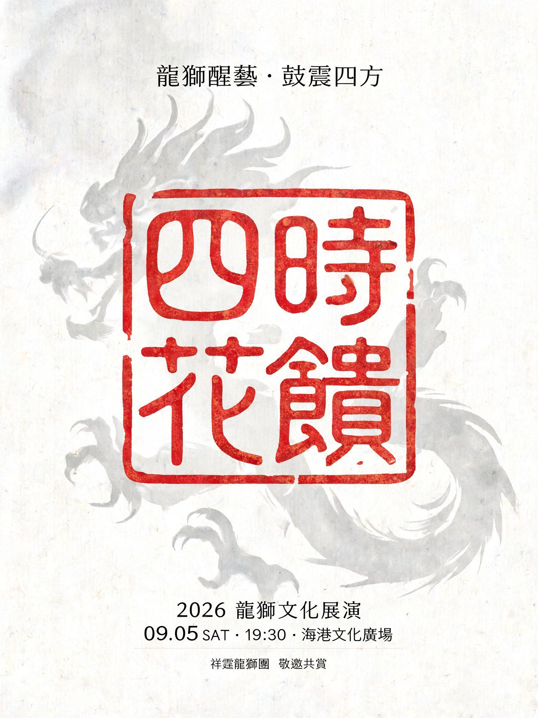
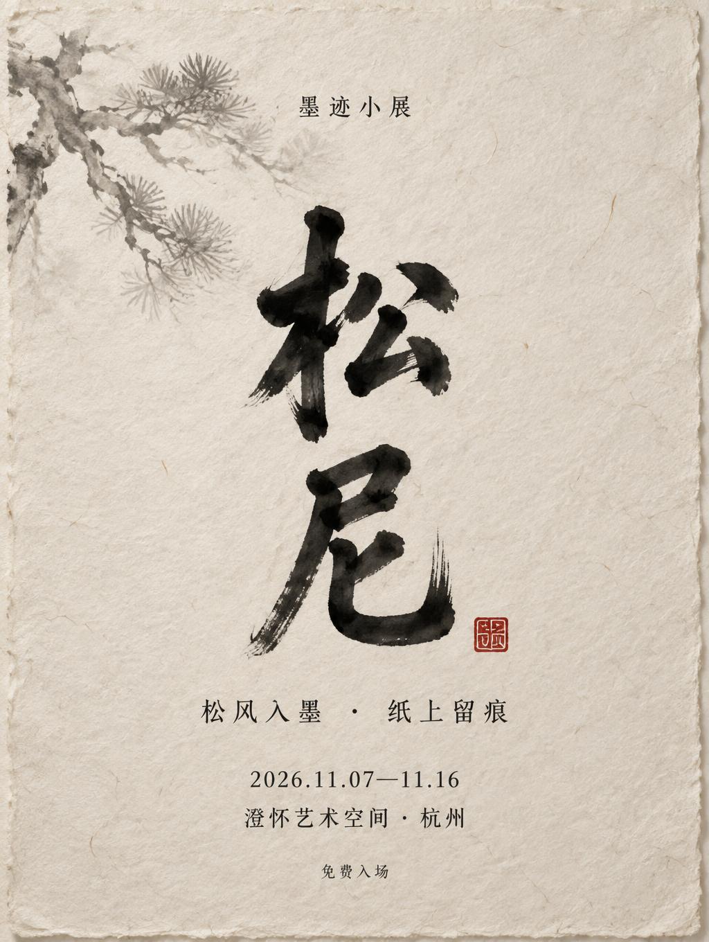
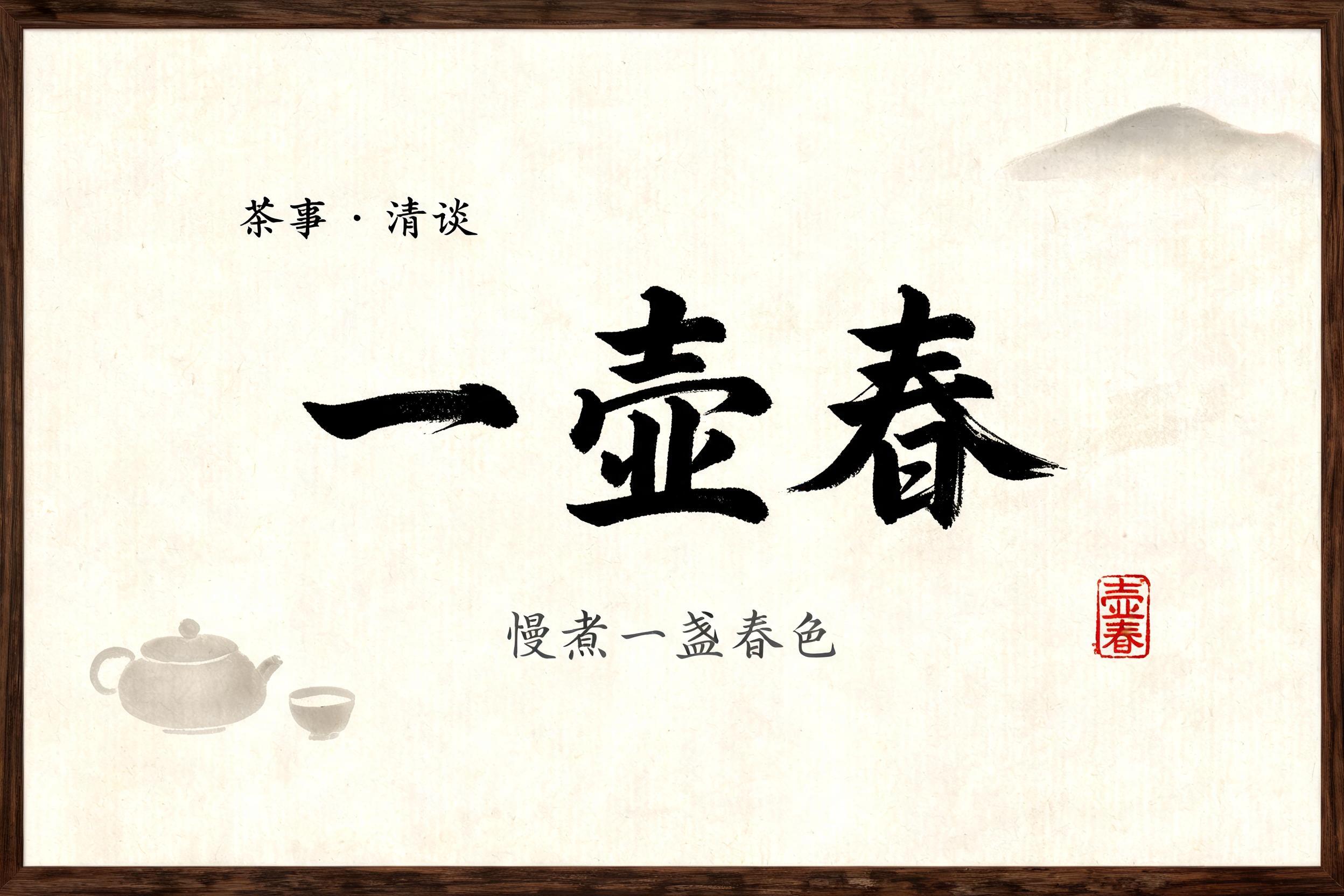


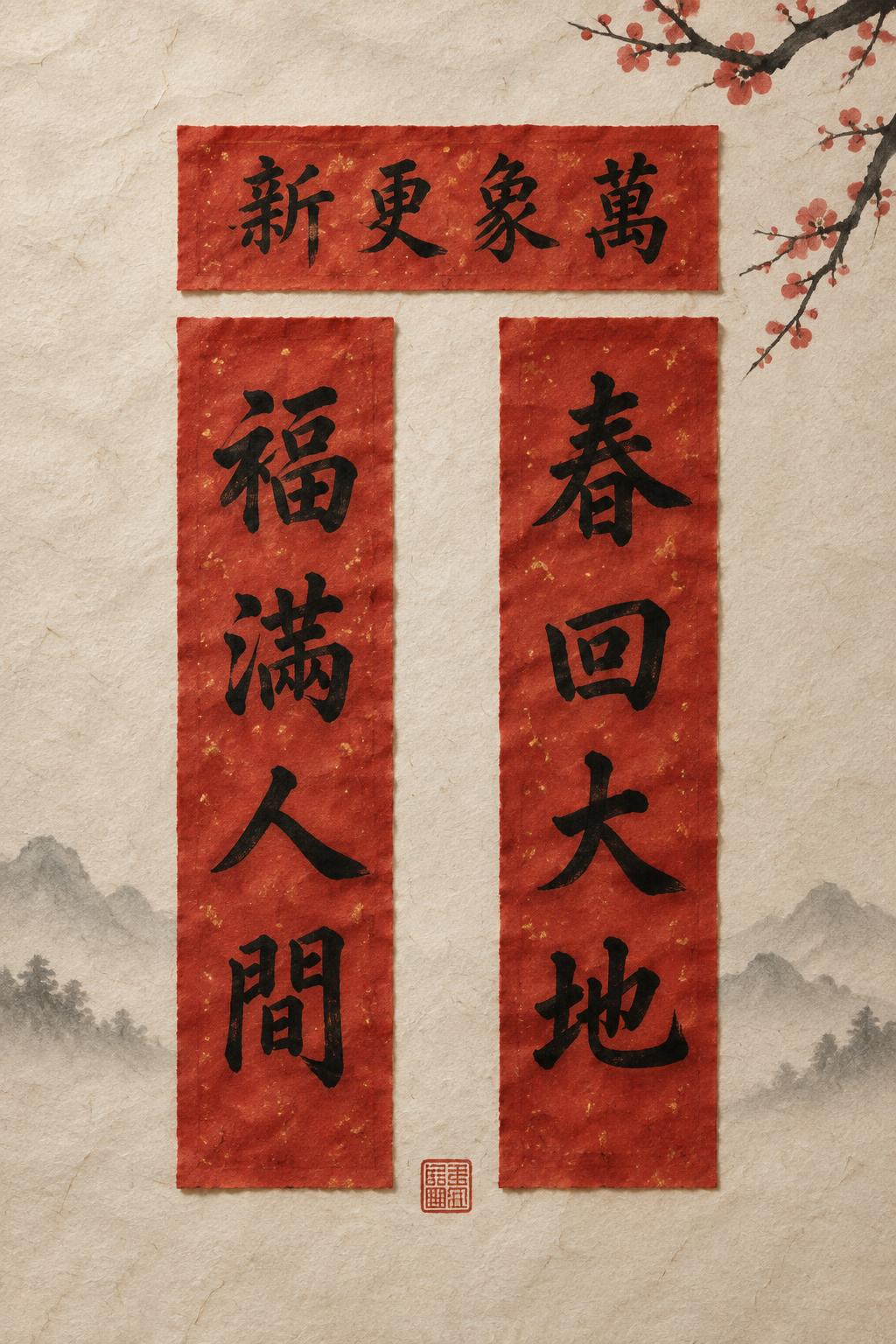
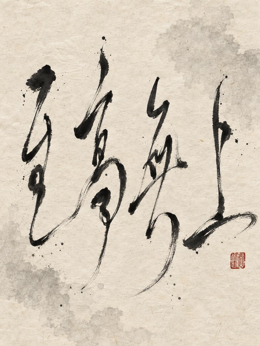
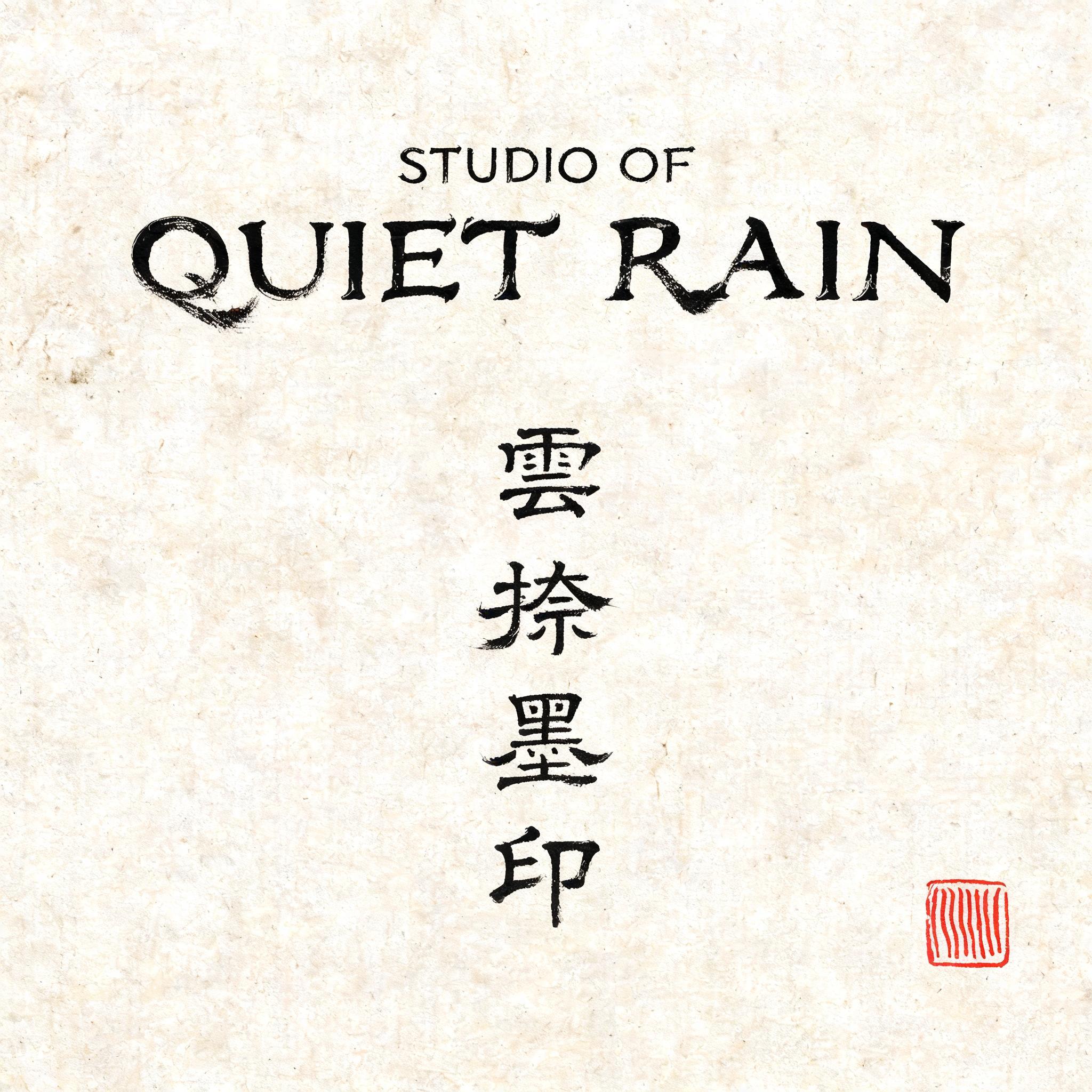

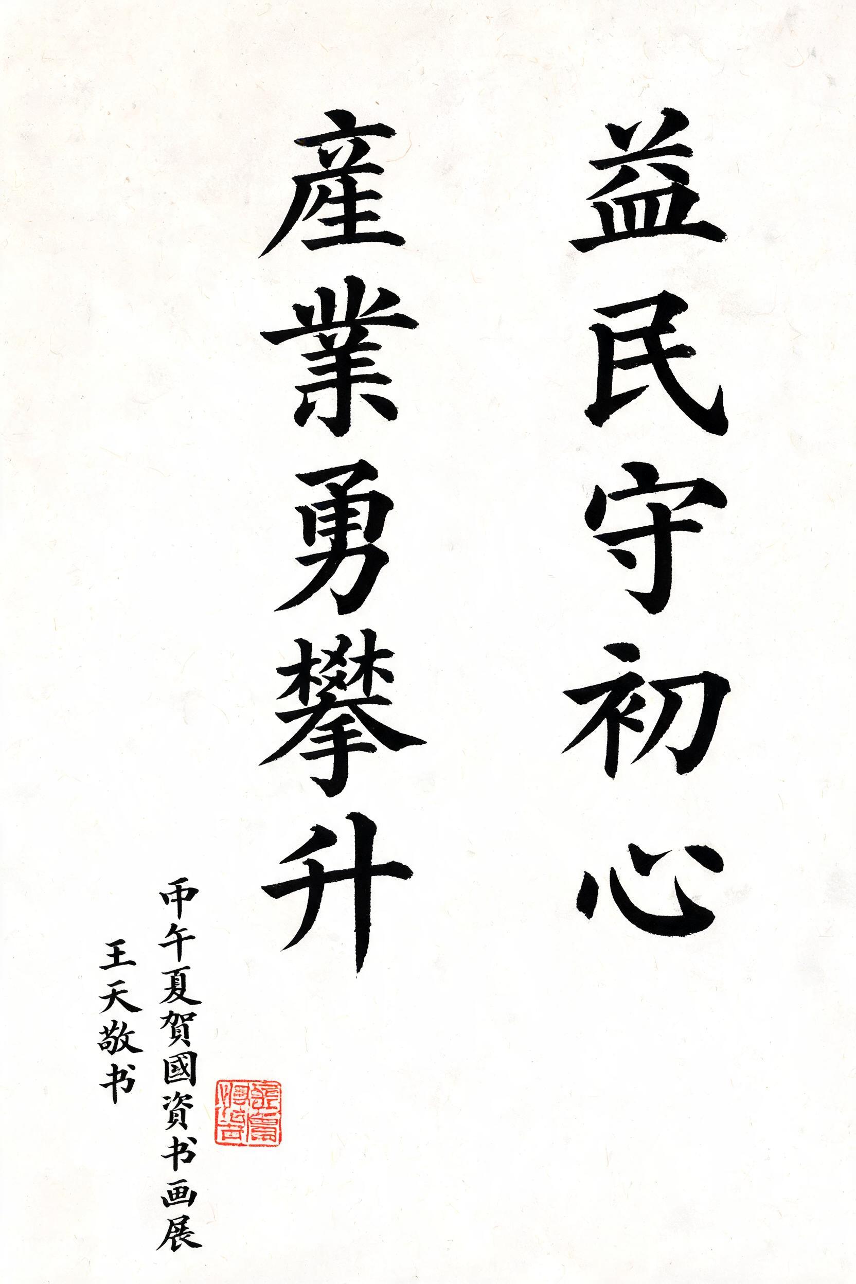
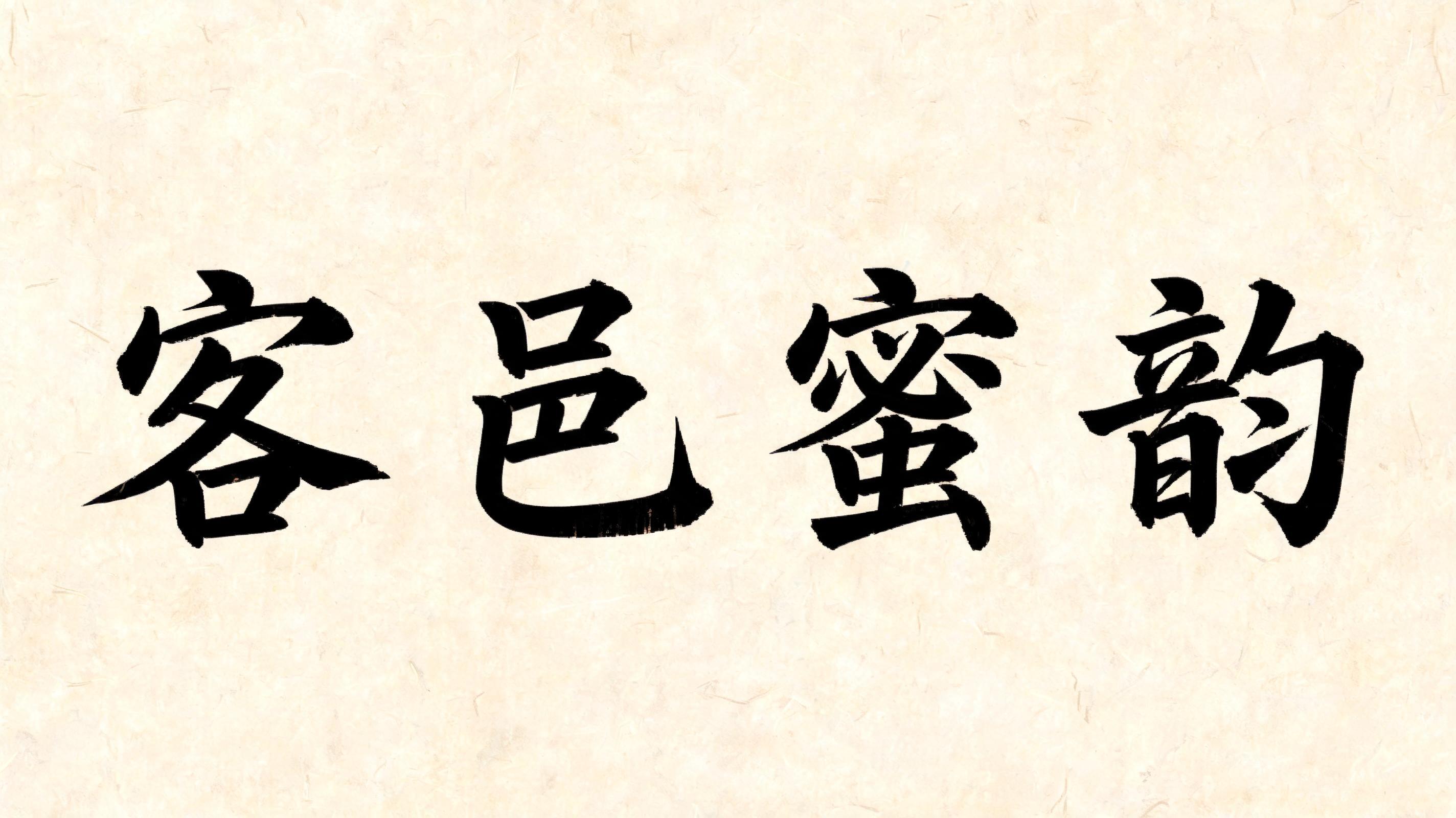

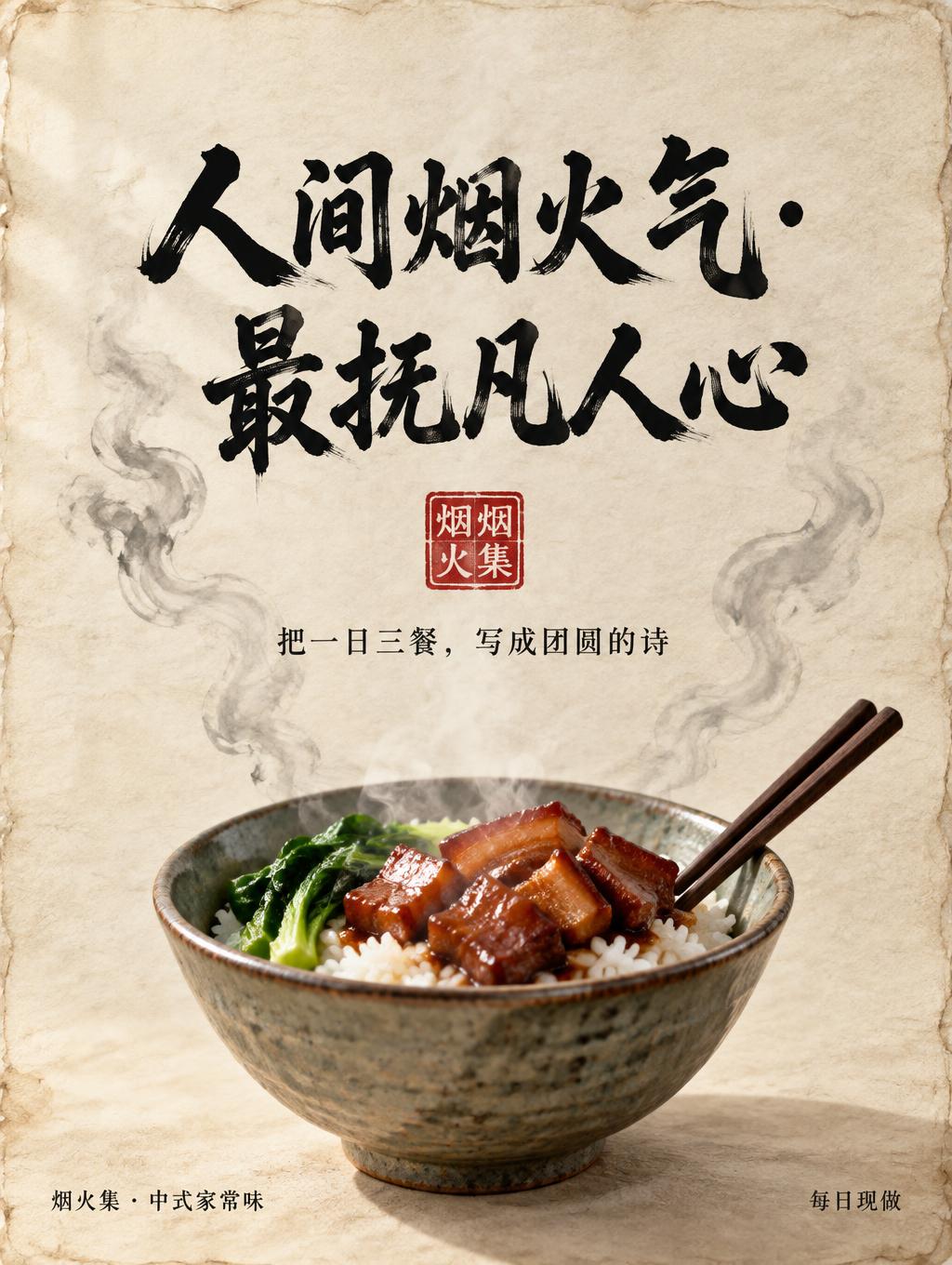
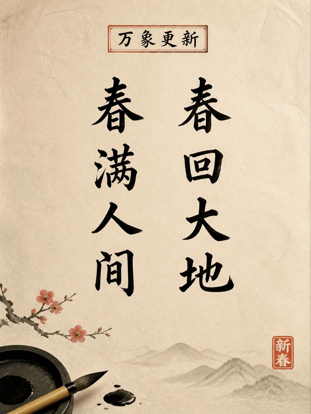


„Wangzi“ ist ein Chinesischer Tuschepinsel-Texteffekt, erstellt mit FontVibe KI. Chinesische Sumi-Tuschekalligrafie im Pinselstil, übertragen auf lateinische Buchstaben. Tiefschwarze Tusche mit authentischer Borstentextur, von dick zu dünn variierenden Strichen und Reispapier-Atmosphäre. Perfekt für das Branding chinesischer Restaurants, Kampfkunst, Wellness und kulturelles Design.
rendered in Chinese ink brush calligraphy style. Letterforms painted with a fully loaded sumi ink brush — deep black ink, visible bristle marks along stroke edges, wet ink pooling at stroke starts, feathered dry-brush trailing ends. Authentic ink density variation: thick rich black cores fading to grey at thin passages. Rice paper texture visible behind. Traditional Chinese calligraphy energy — each stroke confident, intentional, irreversible. LETTERFORM PRIORITY: when the chosen font carries its own treatment, that font's letterform shapes take priority and own the letters; this style governs the sumi ink medium, the bristle and ink-density behavior and the rice-paper ground. FALLBACK MATERIAL: if the font carries no material of its own, render the letters as deep black sumi brush strokes with visible bristle marks, wet ink pooling at stroke starts and feathered dry-brush trails on rice paper. COLOR PRIORITY: keep the font's own colors if specified; otherwise rich black ink fading to grey at thin passages. A square composition centered on the exact word “Wangzi,” arranged as one clear, prominent line with generous breathing room around it. Render the lettering as expressive sumi ink calligraphy: dense black ink with visible bristle traces along irregular edges, glossy pools where the brush first meets the surface, and dry, feathered tails that dissolve into soft gray. Let individual strokes vary in ink density so warm ivory xuan paper shows through in fine, luminous passages. Subtle paper fibers and restrained ink bleed give the surface an authentic handmade texture. Add a faint, pale ink-wash cloud behind the word, kept delicate enough to preserve strong contrast and open negative space. A small vermilion seal impression rests near the lower right, separate from the lettering and without additional readable text. The overall image feels deliberate and contemplative, balancing the word’s confident black weight against quiet, untouched paper.
Generiert am 30. Oktober 2026 · 1024 × 1024 · JPEG · OpenAI GPT-Image-2.5 Sunburst · Von der erstellenden Person geteilt · Kostenlos kommerziell nutzbar (CC BY 4.0)


