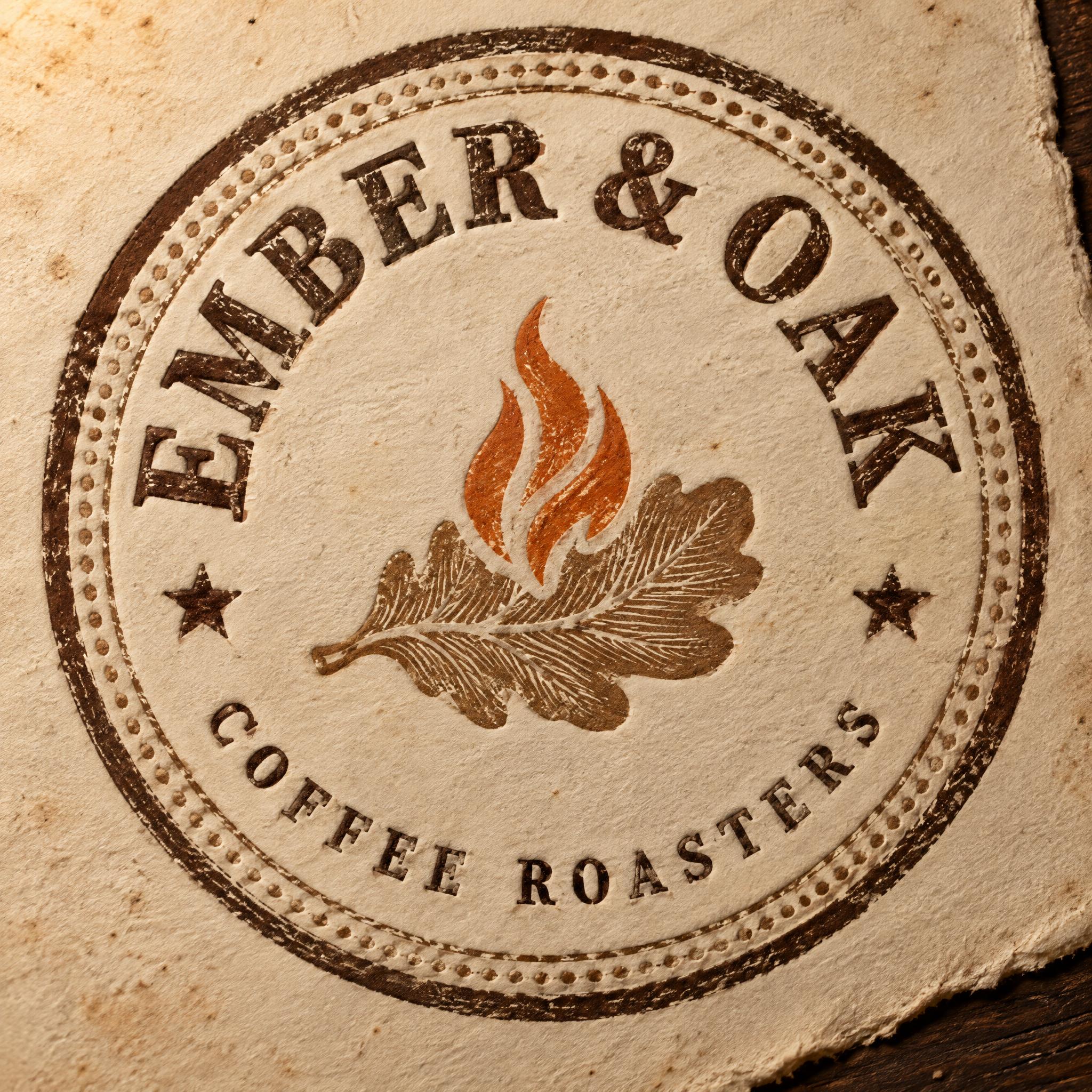
EMBER & OAK COFFEE ROASTERS EST. {{year_founded}} {{city}} - Vintage Text Effect


Nutzt OpenAI GPT-Image-2.5 Sunburst, das Modell dieses Werks · 32 Credits



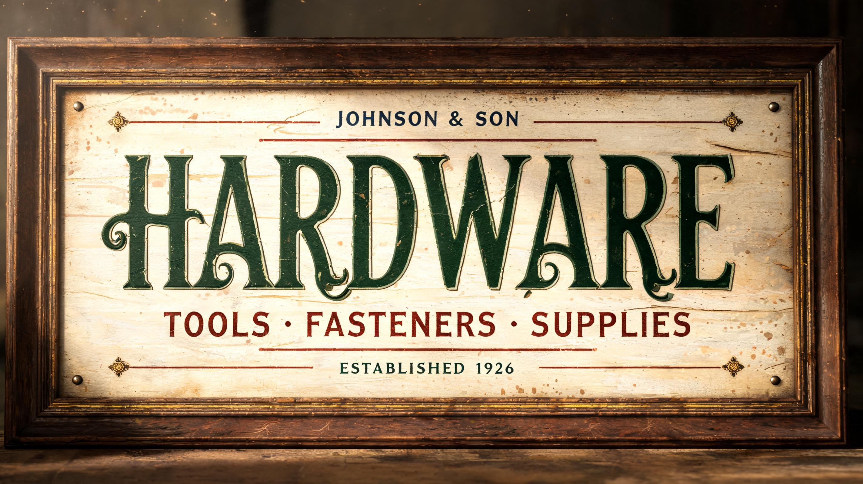
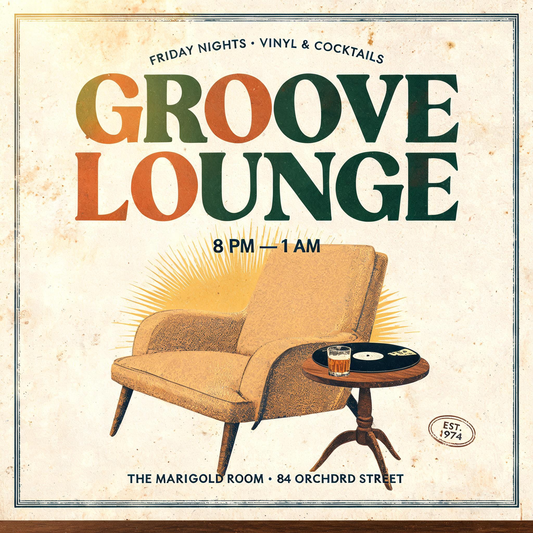
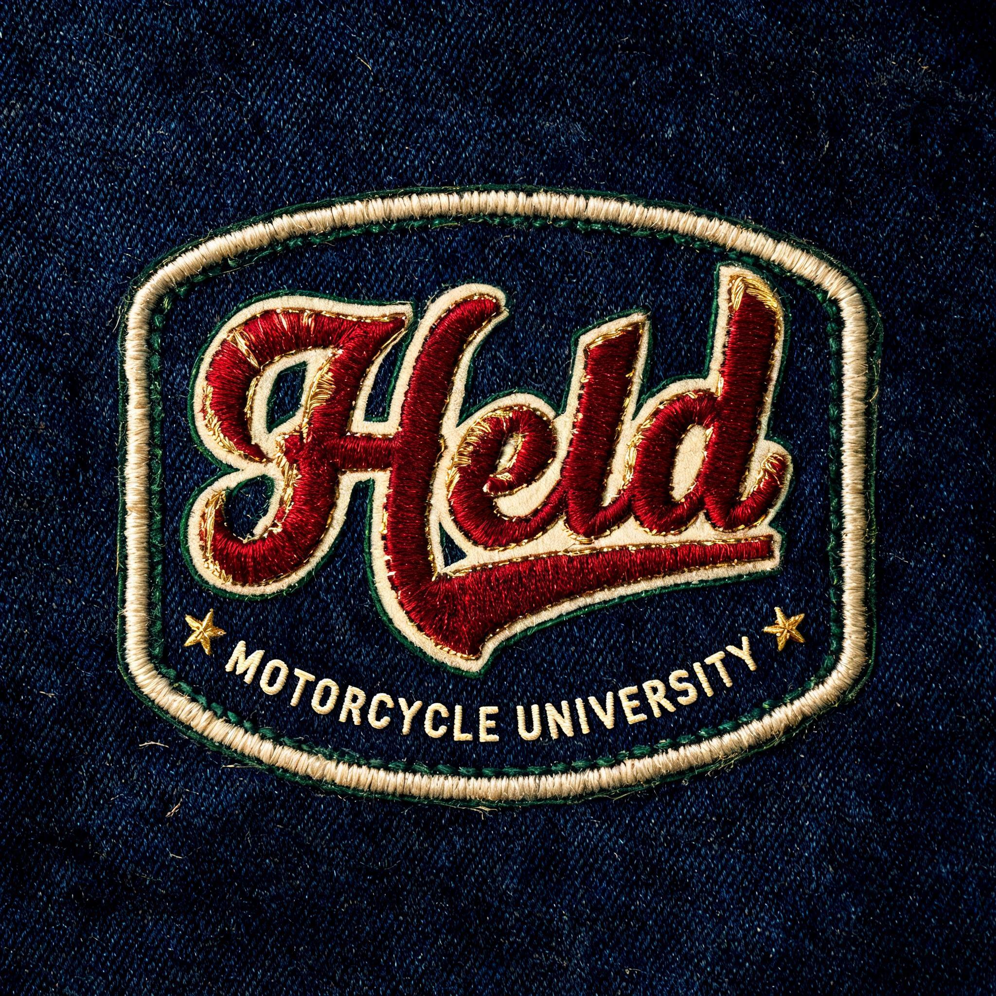
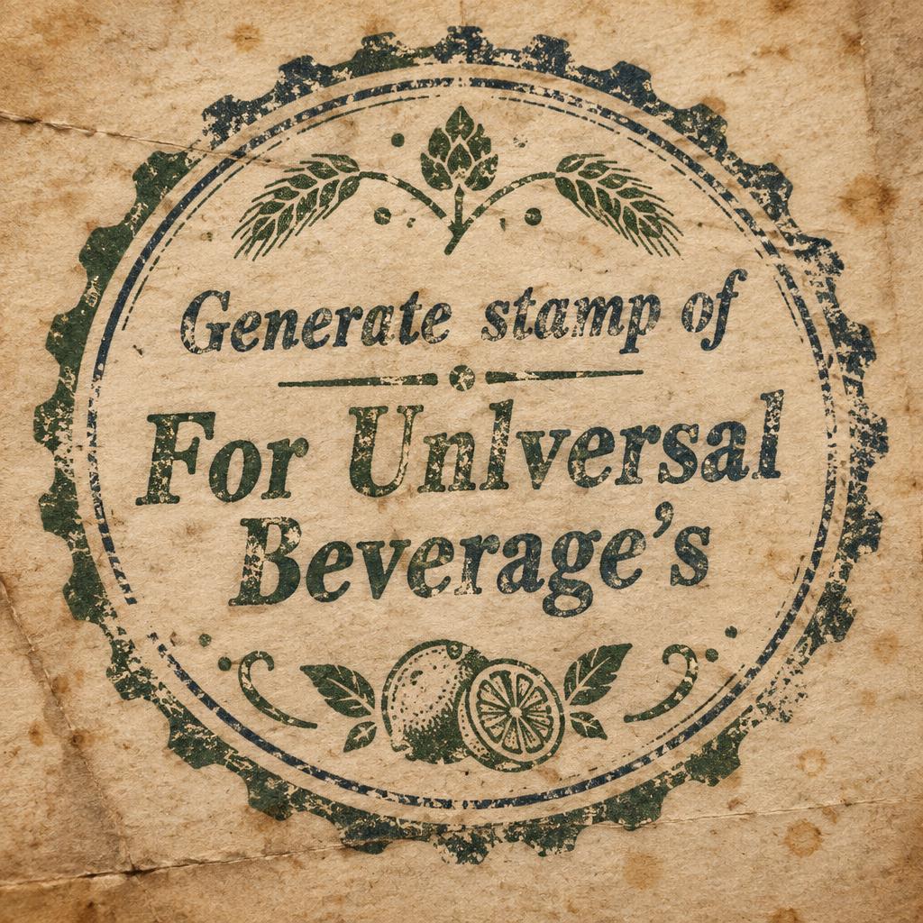




„EMBER & OAK COFFEE ROASTERS EST. {{year_founded}} {{city}}“ ist ein Vintage-Texteffekt, erstellt mit FontVibe KI. Serifenversalien im Buchdruck in cremefarbenen Baumwollkarton gepresst, mit leicht ausbrechender Farbe, auf dem Fundament einer alten Presse zwischen verstreuten Bleilettern.
A round heritage roastery seal, printed letterpress in espresso-brown ink on thick warm cream cotton paper (#F1E6D2), shown flat and square-on, filling a 1:1 square. It looks like an old coffee-roaster's rubber-stamp-turned-press-plate: the kind of mark struck onto a kraft bag a century ago. FRAME: A circular badge border fills nearly the entire square with only a slim margin of paper around it. It is an outer thick espresso ring, a fine oak-tan (#A9824F) keyline inside it, and a delicate beaded dot ring between them. This forms one complete, perfectly round seal. TOP ARC, the dominant text: "EMBER & OAK" in large refined serif capitals, set along an upward arc that hugs the inside of the ring across the whole upper part of the seal. The arc starts low on the left and ends low on the right. Letters are evenly spaced and fan outward with the curve, with generous tracking and a confident ampersand. The serifs are bracketed with moderate stroke contrast. This is where the eye lands first. CENTRE MARK: A compact emblem sits in the middle with clear air around it, roughly a third of the seal's width. A single oak leaf in oak tan (#A9824F) is drawn as a woodcut with fine engraved veins, lying horizontally. A small three-tongued flame rises from it, printed as a second ink pass in Ember Orange (#C8501E). The flame is the only orange anywhere, slightly misregistered against the leaf like a real two-colour press run. FLANKS: To the left and right of the centre mark, at mid-height, sit two small espresso five-point stars. They hold the classic seal's side positions and balance the circle. BOTTOM ARC: "COFFEE ROASTERS" in smaller serif capitals, set along a downward arc that mirrors the top one. It is slightly narrower and more widely tracked, reading upright along the lower inside of the ring. No other words, numbers or letters anywhere on the piece. LETTERPRESS MATERIAL (all type and rings): Every stroke is physically debossed into the soft cotton stock. A subtle shadow rim runs around each letter where the type bit in. A thin darker halo of ink squash sits at every edge where pressure spread the ink. The paper's fine laid lines show through the ink film. In thin hairlines the ink turns slightly translucent so cream warms the tone. Edges have the tiny irregularity of metal type meeting paper, with a few spots of broken, starved ink. None of it is digitally clean. LIGHT AND SCENE: Warm low amber light comes from the upper left, raking across the sheet so the deboss casts soft shadows and catches highlights on the raised paper. The paper is aged and time-softened, with faint foxing freckles, a soft deckle at one edge and gentle grain. A sliver of dark oiled wood shows at the bottom-right corner, and faint dust motes drift in the warm light. The palette stays muted: espresso, cream, oak tan and the single ember flame, never bright or glossy. The seal stays crisp and legible enough to read at stamp size on a bag and bold enough to hang as a sign.
Generiert am 30. Oktober 2026 · 2048 × 2048 · JPEG · OpenAI GPT-Image-2.5 Sunburst · Layout: Bogen-Emblem · Von der erstellenden Person geteilt · Kostenlos kommerziell nutzbar (CC BY 4.0)