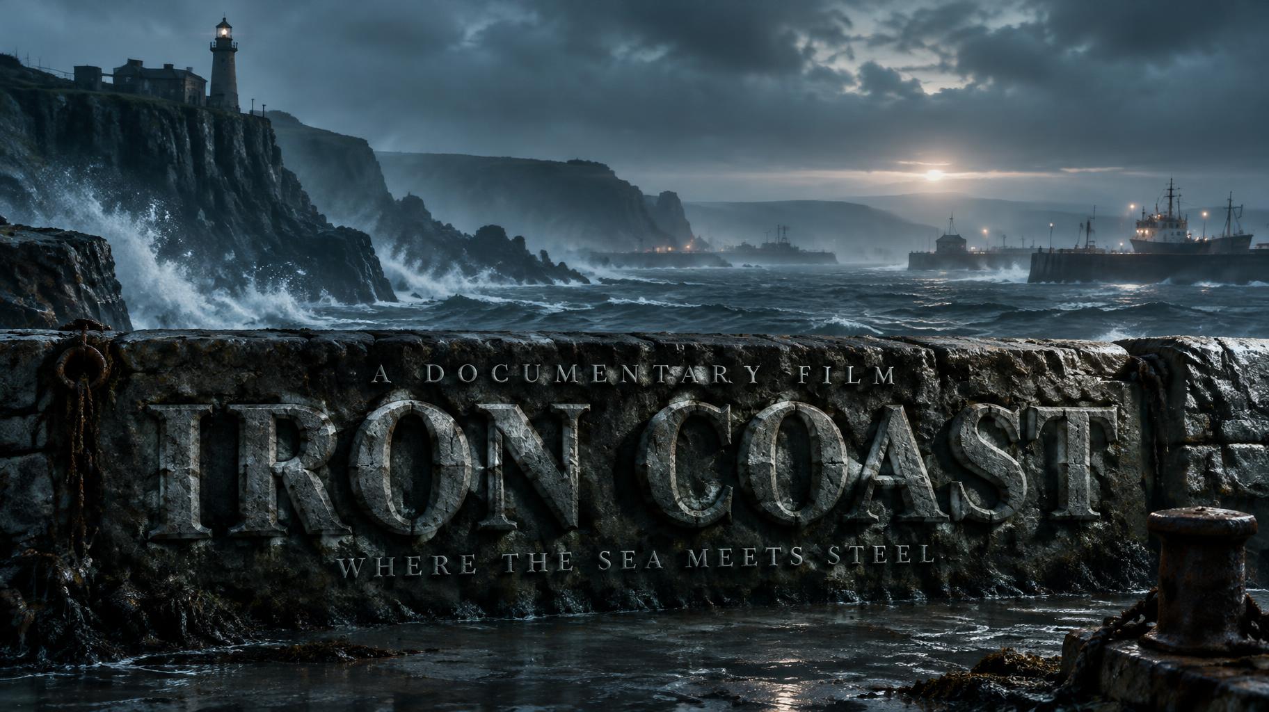
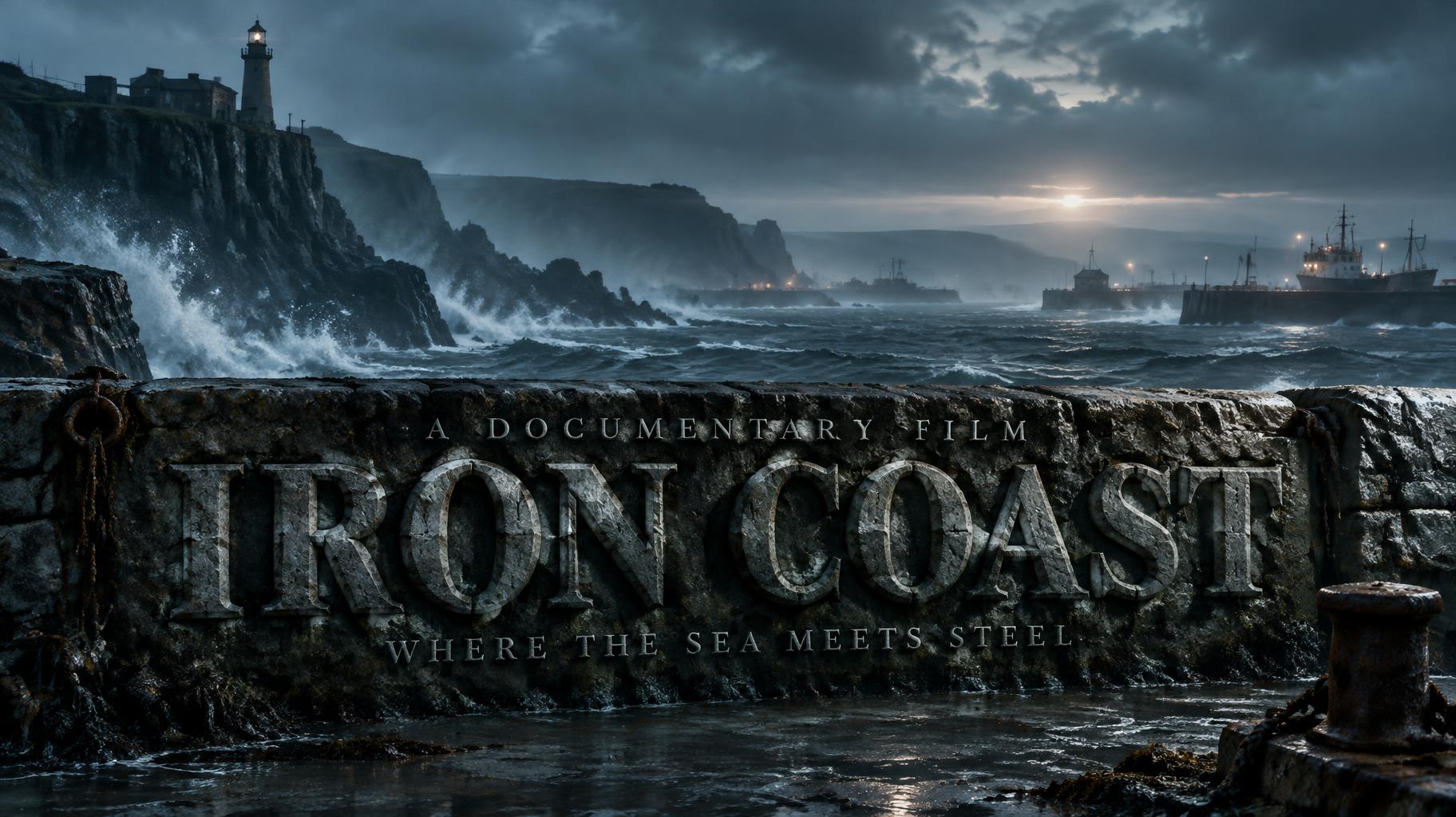
IRON COAST A DOCUMENTARY FILM WHERE THE SEA MEETS STEEL - Netflix & Streaming Text Effect


Nutzt OpenAI GPT-Image-2.5 Sunburst, das Modell dieses Werks · 15 Credits
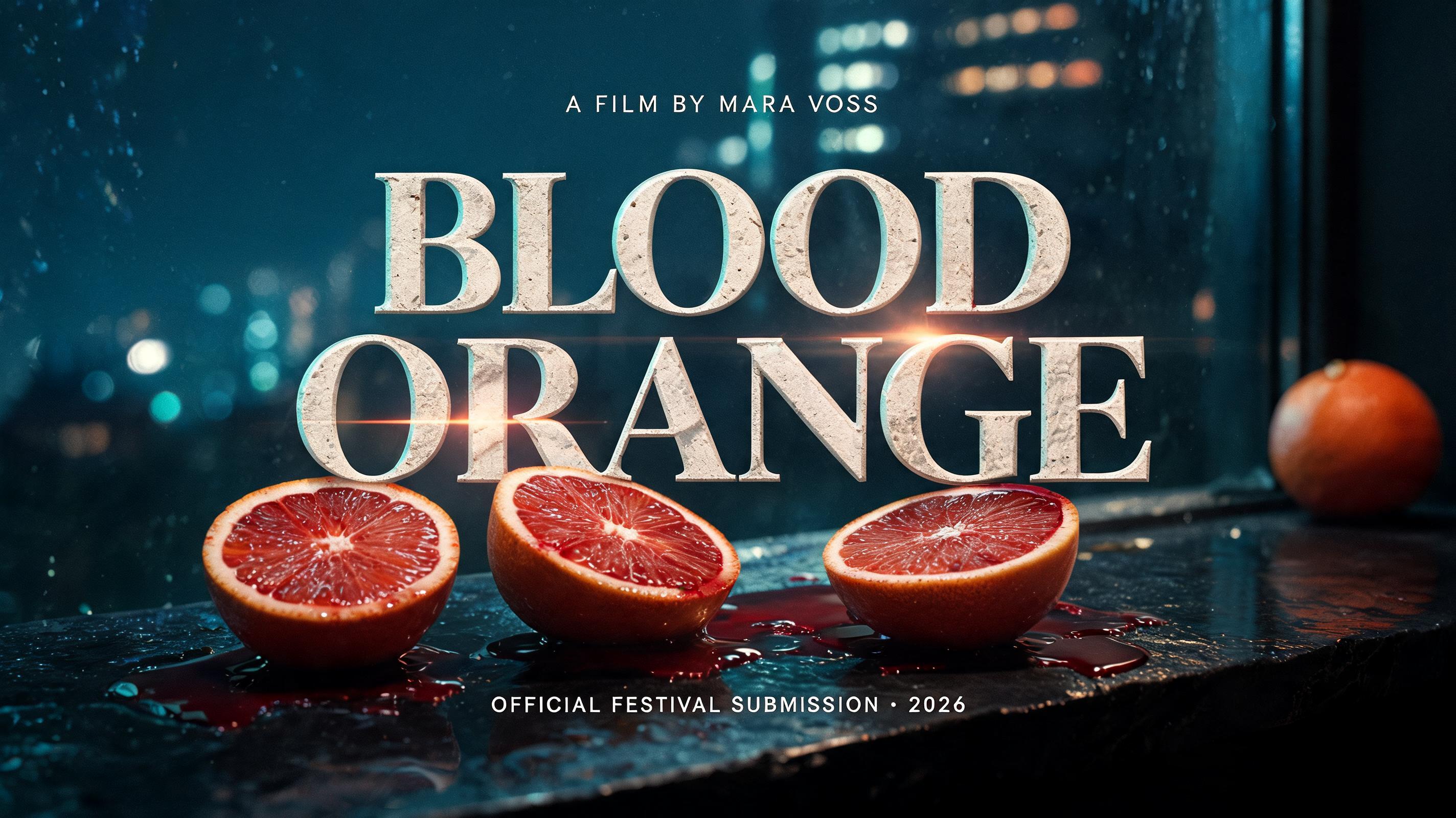
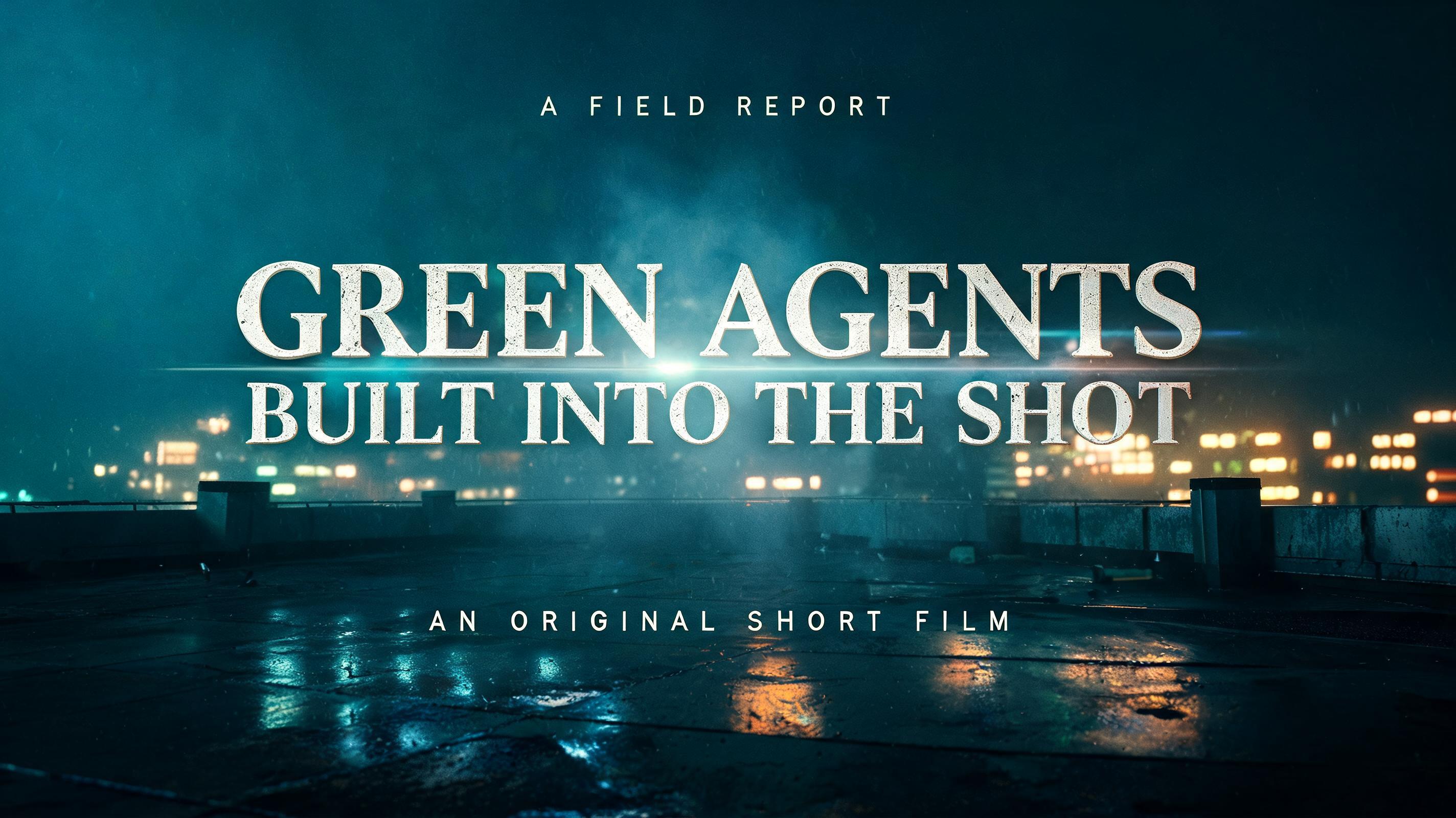


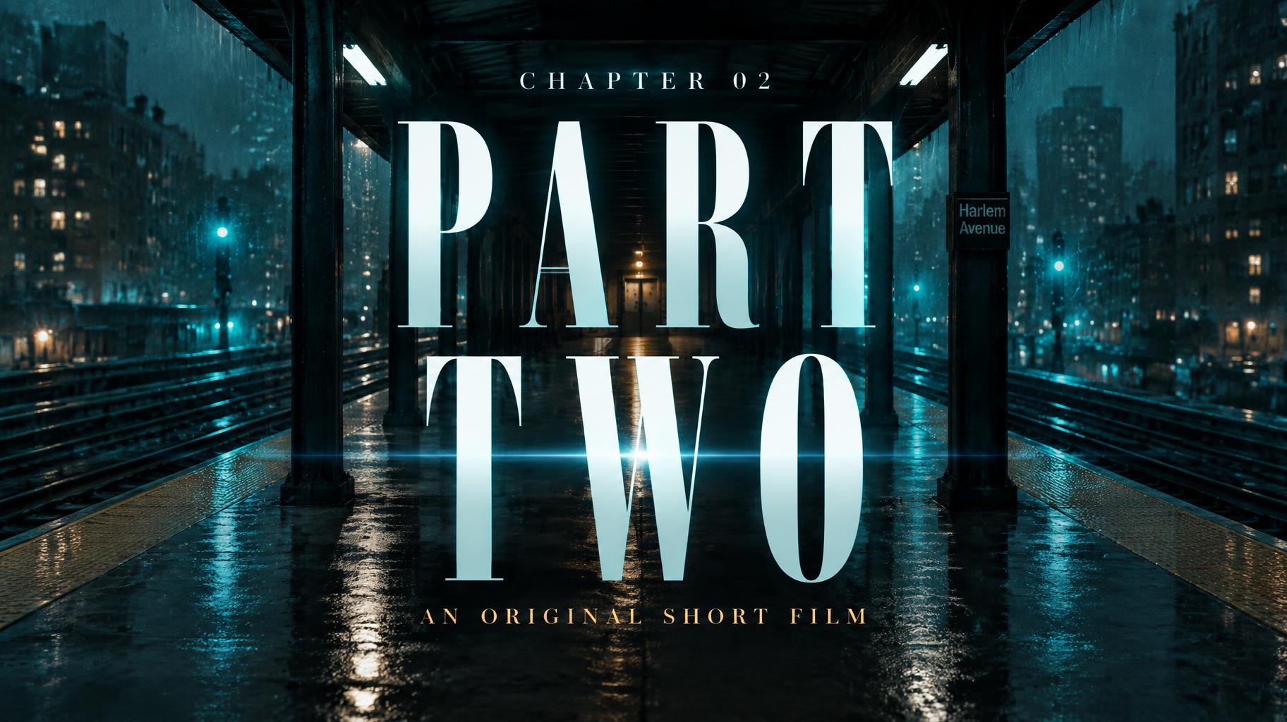
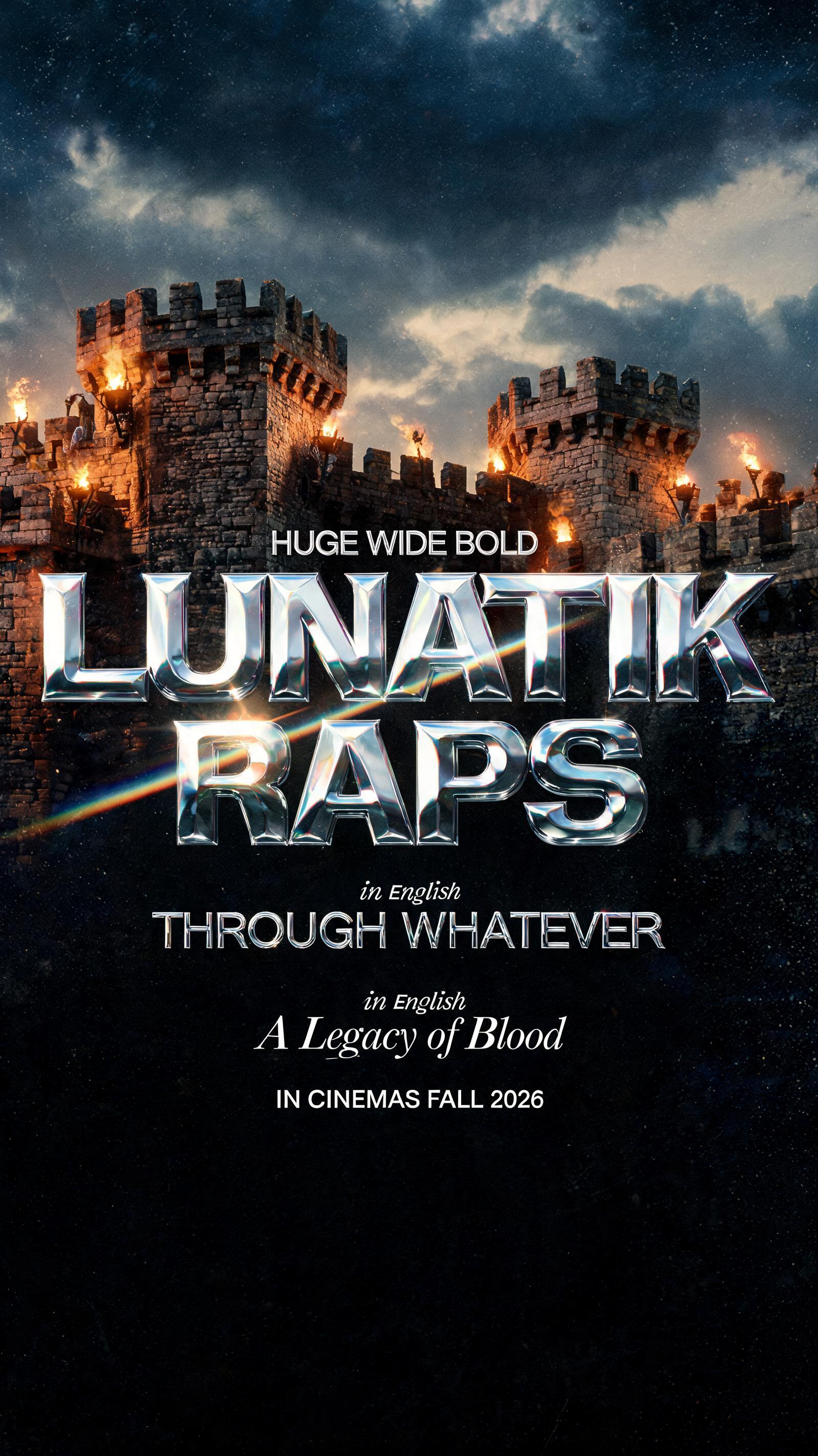


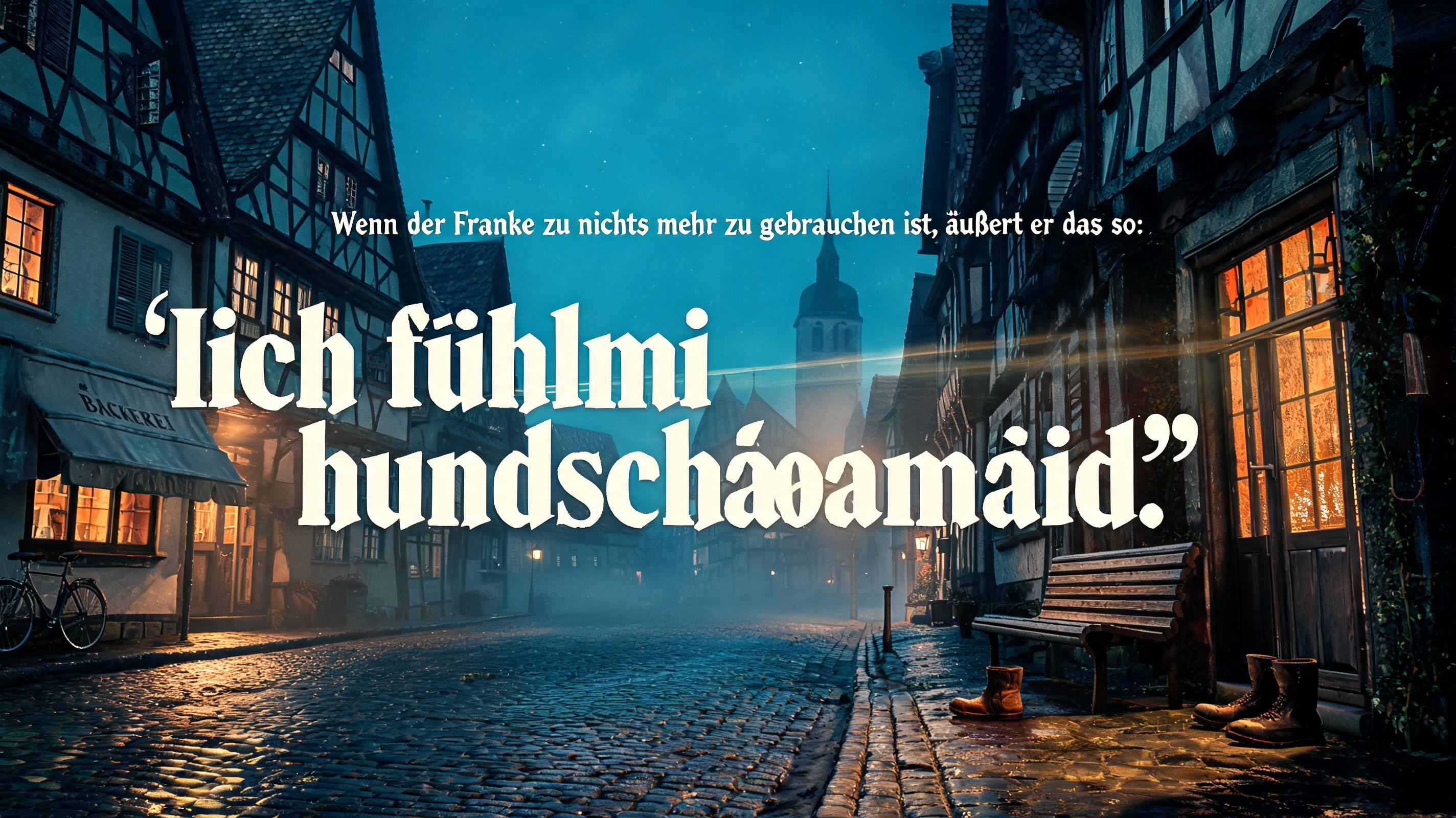
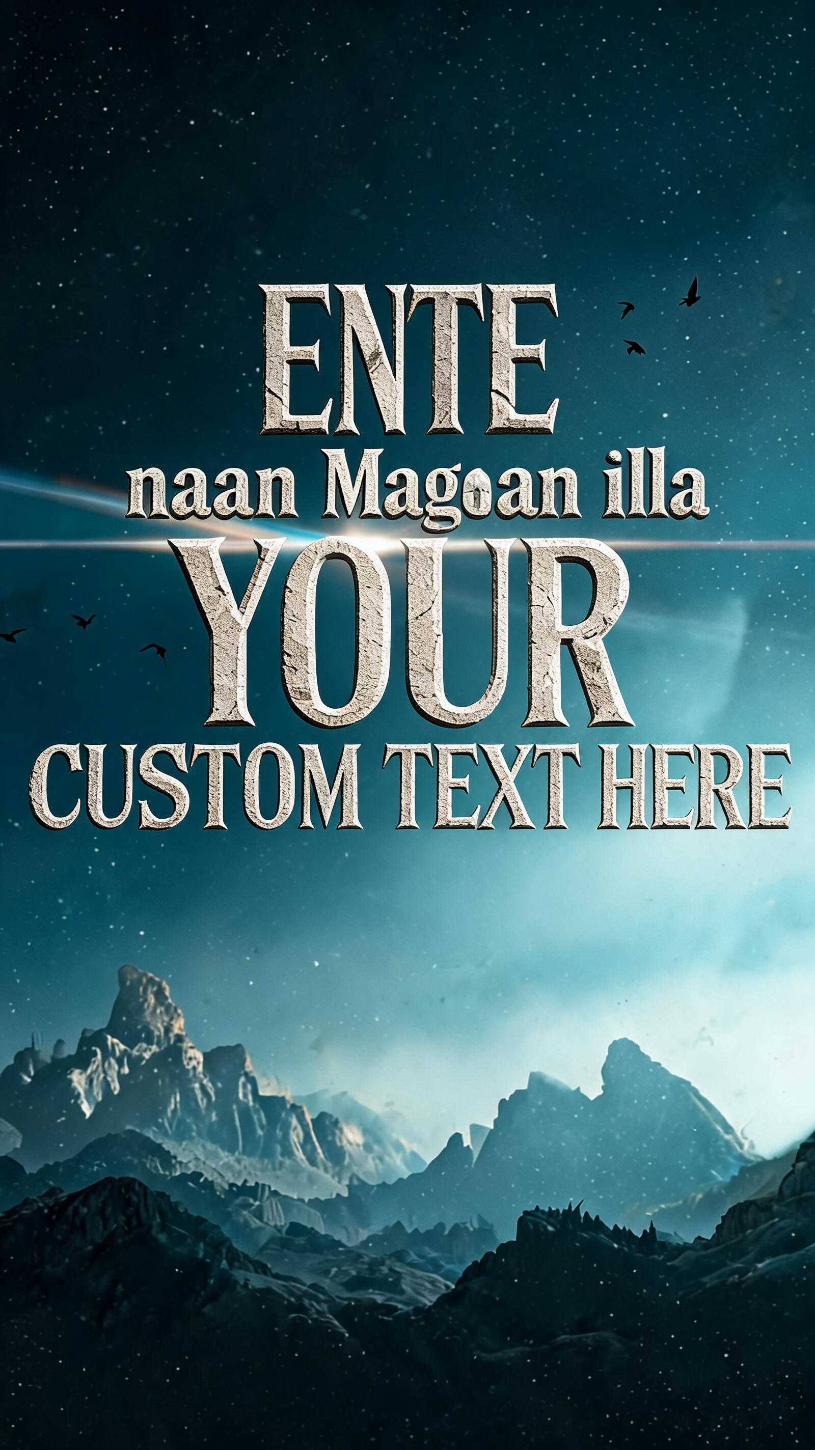


„IRON COAST A DOCUMENTARY FILM WHERE THE SEA MEETS STEEL“ ist ein Netflix & Streaming-Texteffekt, erstellt mit FontVibe KI. Kräftige serifenlose Serientitel mit kaltem petrolfarbenem Leuchten und anamorphem Flare über einer regennassen Nachtstadt, mit kleinem Slogan und Staffelangabe.
Create a finished, cinematic opening title frame for a documentary. Wide 16:9 composition, with an atmospheric working coastline at blue hour: a dark, weathered stone breakwater and jagged headland above restless cold water, faint skeletal harbor structures receding into sea haze, low cloud, sea spray, and distant lights. Keep the environmental scene immersive and dominant in the upper frame; teal-blue shadows fall toward near-black, with subtle pale silver light along the horizon. Fine film grain throughout, atmospheric depth haze, shallow softness at the far edges, and one restrained horizontal anamorphic flare near the horizon. No flat black backdrop. In the lower third, make the title the unmistakable focal point, spanning about 82% of the frame width. Render the exact words “IRON COAST” in broad, weighty classical serif capitals with generous width, strong thick-thin contrast, deep V-cut wedge serifs, and clean cut-angle terminals. The letters are monumental, deeply chiseled stone, with crisp carved facets and narrow shadowed cuts; cold directional light catches the cut edges while teal ambient light settles into the grooves. Make the material legible without obscuring the words. Integrate the lettering into the face of the breakwater so it belongs to the scene, not as a floating overlay. The font’s carved stone surface takes precedence over plain, untextured title lettering. Above the title, set the small, refined, widely tracked words “A DOCUMENTARY FILM”. Below it, set “WHERE THE SEA MEETS STEEL” as a smaller, clean, restrained supporting line. Keep all three lines exactly as written, with no additional text. Strong size contrast, careful spacing, centered alignment, and a clear reading order. The flare must not cross or reduce the title’s legibility. Do not add logos, badges, borders, or decorative graphics.
Gemacht für Filmtitel-Generator
Generiert am 31. Oktober 2026 · 1824 × 1024 · JPEG · OpenAI GPT-Image-2.5 Sunburst · Layout: Coastal Title Frame · Von der erstellenden Person geteilt · Kostenlos kommerziell nutzbar (CC BY 4.0)


