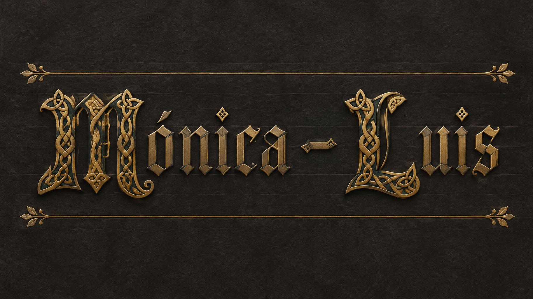
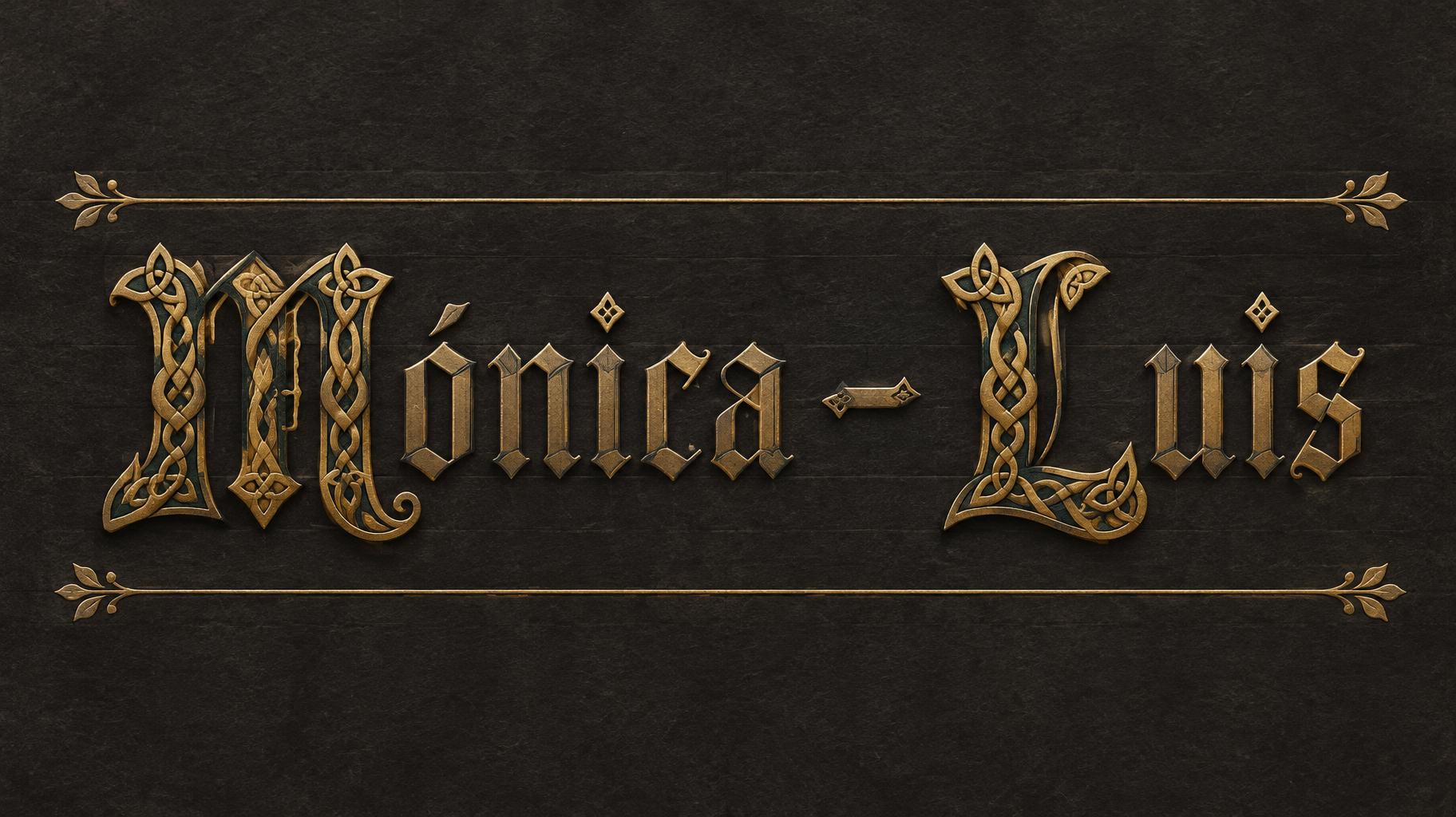
Mónica - Luis - Gotische Schrift Text Effect


Nutzt OpenAI GPT-Image-2.5 Sunburst, das Modell dieses Werks · 15 Credits




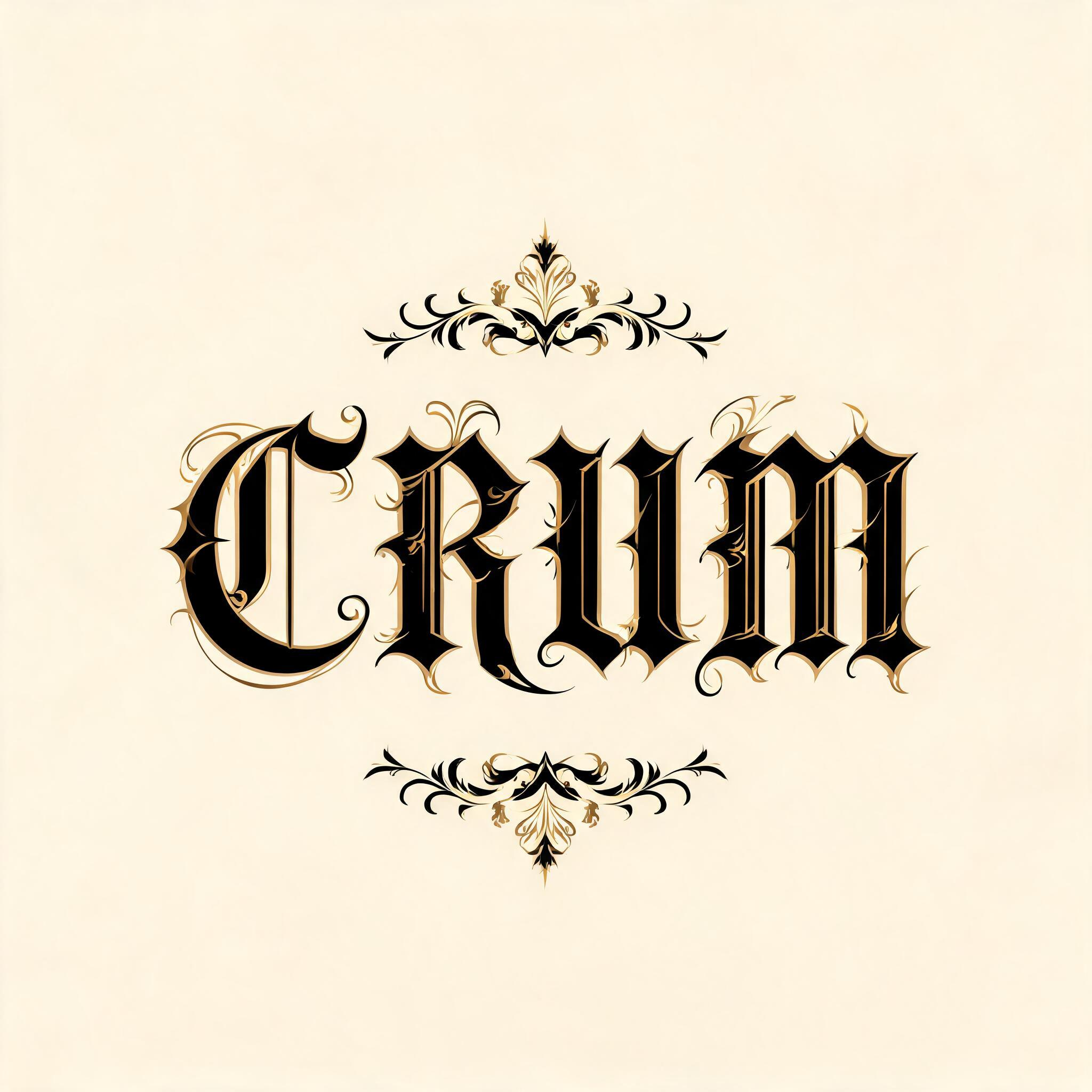

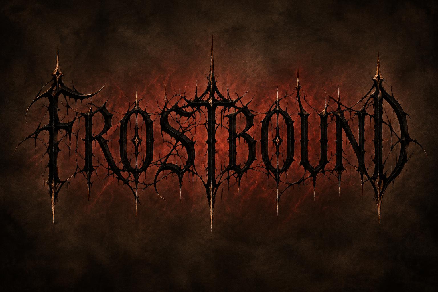
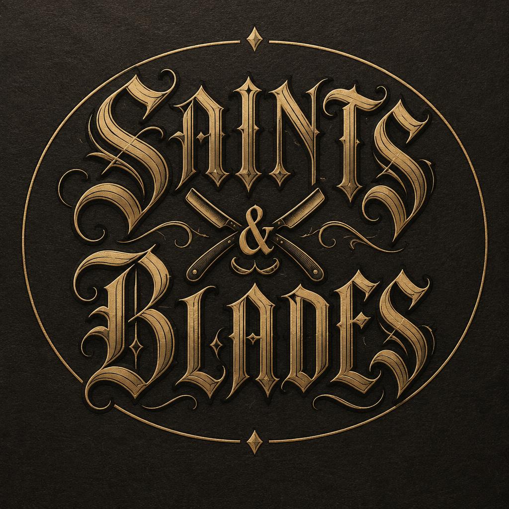
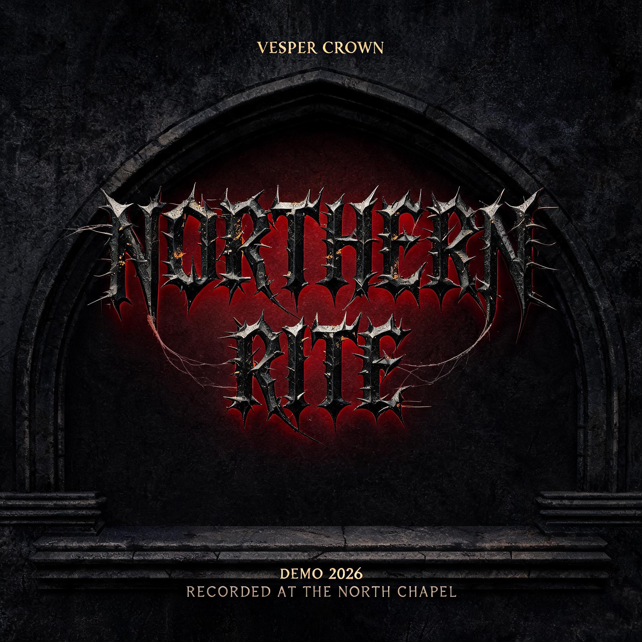


„Mónica - Luis“ ist ein Gotische Schrift-Texteffekt, erstellt mit FontVibe KI. Präzise Textura-Fraktur: schmale, gebrochene Striche, rautenförmige Enden und starker Kontrast von dick und dünn, in schwarzer Tinte mit Goldakzenten auf dunklem, altem Pergament.
rendered in precise gothic blackletter letterforms with authentic calligraphic construction — diamond-shaped stroke terminals, strong thick-thin contrast, pointed arch counters. Rich black ink with warm depth on dark parchment or deep charcoal background. Subtle gold ink highlights on serifs and capitals. Medieval scribal precision. No cobwebs, no rust, no atmospheric fog — pure typographic craft. LETTERFORM PRIORITY: when the chosen font carries its own treatment, that font's letterform shapes take priority and own the letters; this style governs the rich ink, the parchment ground and the subtle gold highlights. FALLBACK MATERIAL: if the font carries no material of its own, render the letters as precise gothic blackletter in rich black ink with subtle gold highlights on dark parchment — pure typographic craft, no cobwebs, rust or fog. COLOR PRIORITY: keep the font's own colors if specified; otherwise black ink with warm gold accents. Create a refined, finished manuscript-style dedication with the exact text “Mónica - Luis,” preserving the accent and hyphen. Set it as one centered line, with generous breathing room around the words and a clear, elegant visual hierarchy; keep the text highly legible and dominant. Place the lettering on a single sheet of deep charcoal parchment, subtly textured with fine natural fibres and faint, restrained page ruling. Treat the initial M and L as illuminated capitals with delicate gold leaf accents, echoed by tiny gold touches at select edges of the remaining lettering. Keep the ornament precise and sparse: a pair of fine gold hairline rules above and below the inscription, with small balanced leaf-like flourishes at their outer ends. The composition should feel personal and ceremonial, like a carefully preserved dedication in a medieval manuscript, without becoming a crowded book page. Use soft, even, warm illumination across the text and ground, with gentle paper shading that keeps every word clear. Maintain clean negative space and crisp ink edges. No extra writing, dates, symbols, figures, scenery, cobwebs, rust, fog, or horror imagery.
Gemacht für Keltische Gotik
Generiert am 2. November 2026 · 1824 × 1024 · JPEG · OpenAI GPT-Image-2.5 Sunburst · Von der erstellenden Person geteilt · Kostenlos kommerziell nutzbar (CC BY 4.0)


