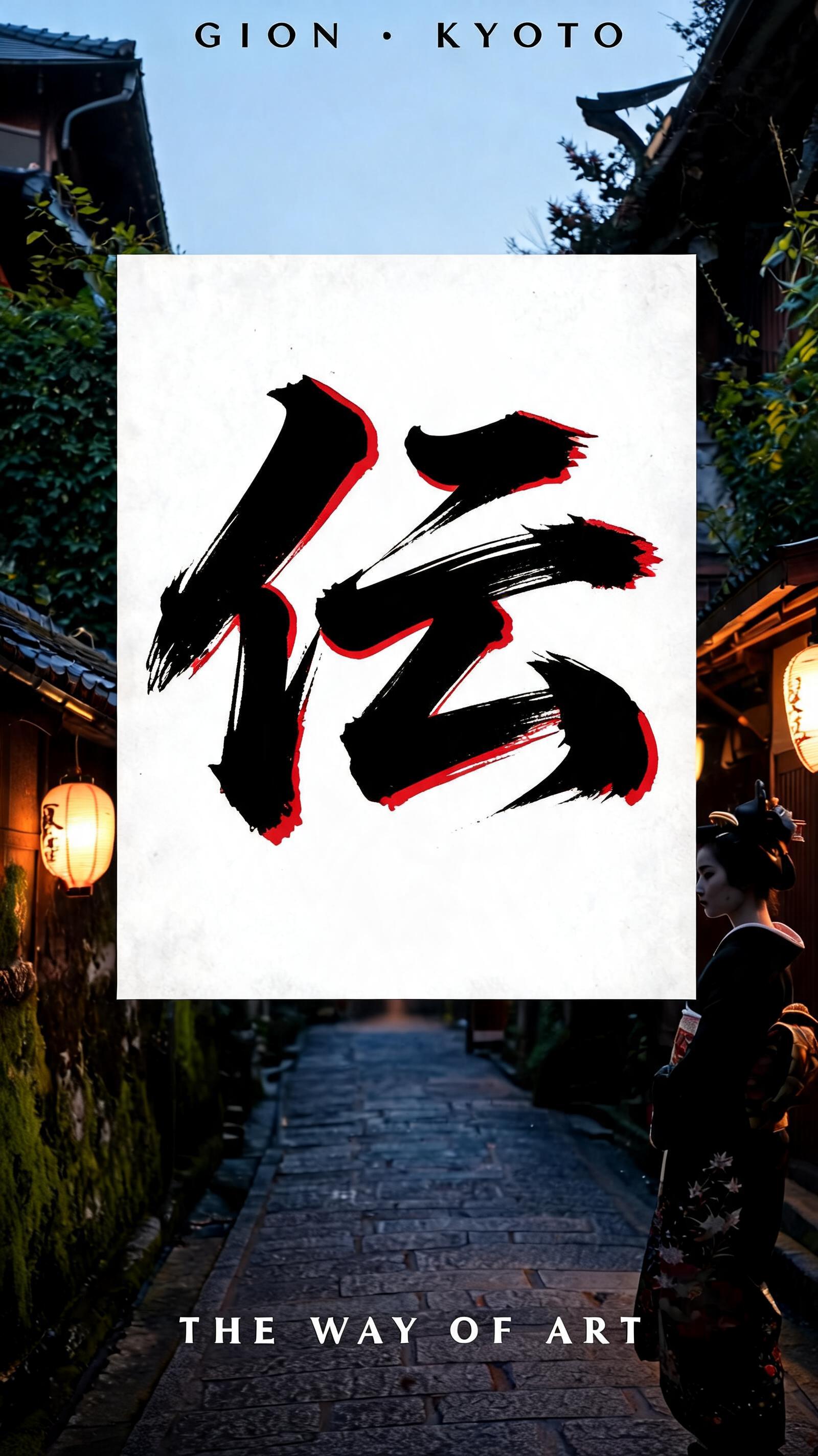
摩 - Pincel de Tinta Japonés Text Effect


Usa BytePlus Seedream 5.0, el modelo de esta obra · 15 créditos











“摩” is a Brush Japanese Ink text effect efecto de texto creado con FontVibe IA. El estilo de caligrafía con pincel de tinta del shodo japonés llevado a las letras latinas. Tinta sumi negra y profunda con la energía auténtica del pincel fude, trazos controlados en una sola dirección y atmósfera de papel washi. Perfecto para marcas de restaurantes japoneses, diseño de tatuajes, anime, artes marciales y proyectos culturales.
Japanese Shodo ink brush calligraphy with geisha theatrical color drama. Latin letterforms painted with confident heavy fude brush strokes on pure white washi — deep sumi black ink primary strokes, with traditional geisha crimson-red (bengara lacquer red) as a secondary ink accent appearing at select stroke entries and endings. High contrast: pure white background, black ink body strokes, red accent marks. The crimson follows the same brush discipline as the black — no decoration, no flourish, just the structural marks of the letterform rendered in theater-red. Background: fine white washi, minimal texture. The aesthetic: a geisha's makeup palette translated to calligraphy — the stark contrast of white face, black ink liner, vermillion red lips. Every letterform is a performance. Kyoto geisha district (Gion) at twilight — a vertical 9:16 atmospheric poster composition. Background: a traditional ochaya (teahouse) lantern-lit alleyway, stone path, moss-covered walls. Warm paper lantern light in deep amber and crimson. A silhouetted maiko figure partially visible at the edge. The "摩" calligraphy displayed on a horizontal signboard above the teahouse entrance — deep sumi black ink primary strokes with traditional crimson-red as a secondary ink wash, the color interplay suggesting theatrical drama and traditional beauty. Top tier: "GION · KYOTO" — tiny refined caps at 35% canvas width, upper-center, location marker. Middle tier: "摩" — massive dominant brush letter at 65% canvas width, centered — confident heavy fude brush stroke, painted with precision and grace, each stroke carrying weight and intentionality. Bottom tier: "THE WAY OF ART" — small refined caps at 30% canvas width. Vertical spacing ratio approximately 1:5:1.5. The composition reads as a Kyoto cultural tourism poster — theatrical, elegant, unmistakably Japanese.
Hecho para Generador de Letras Geisha
Generada el 8 de julio de 2026 · 1600 × 2848 · JPEG · BytePlus Seedream 5.0 · Compartida por el creador · Uso comercial gratuito (CC BY 4.0)