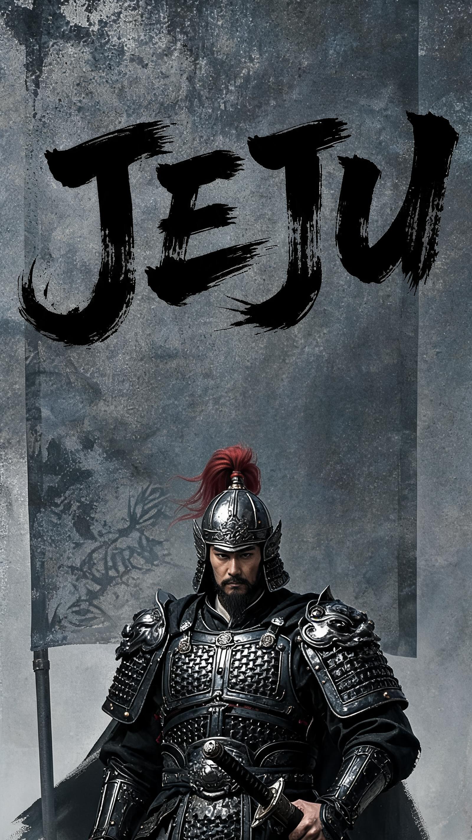
𝐽𝐸𝐽𝑈 - Pincel de Tinta Japonés Text Effect


Usa BytePlus Seedream 5.0, el modelo de esta obra · 15 créditos
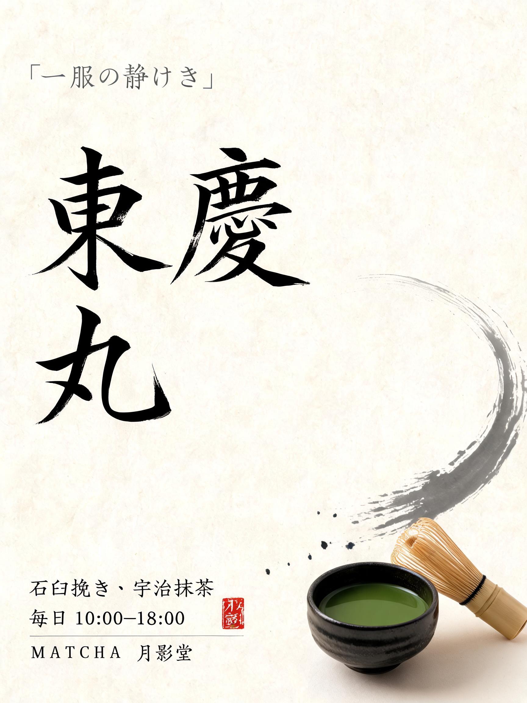
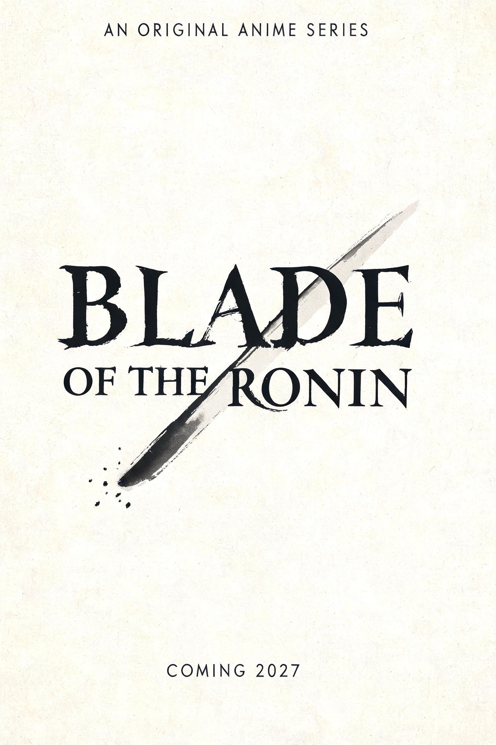


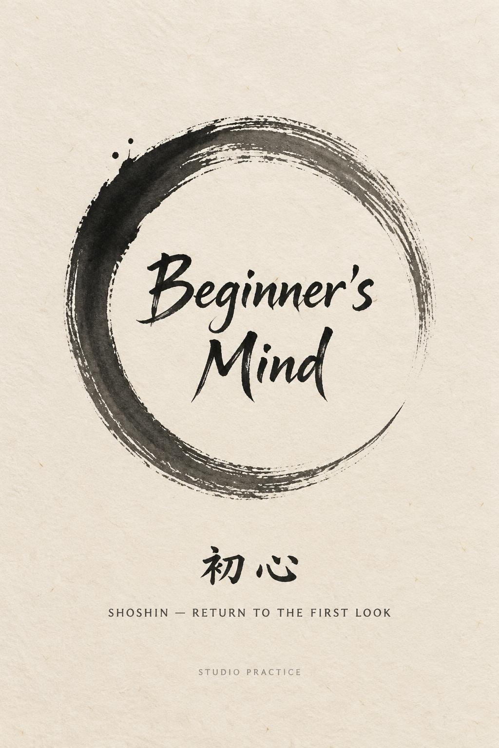
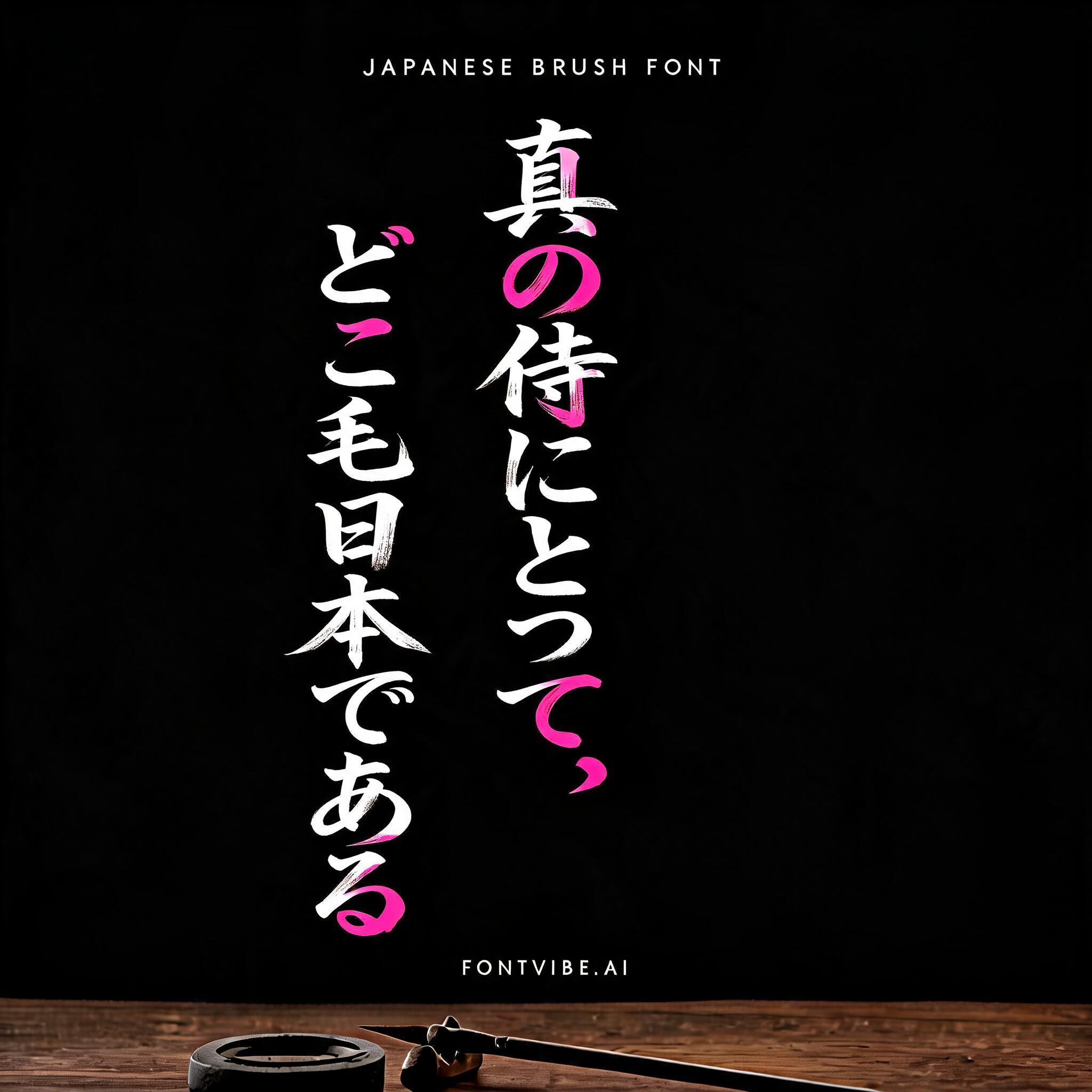


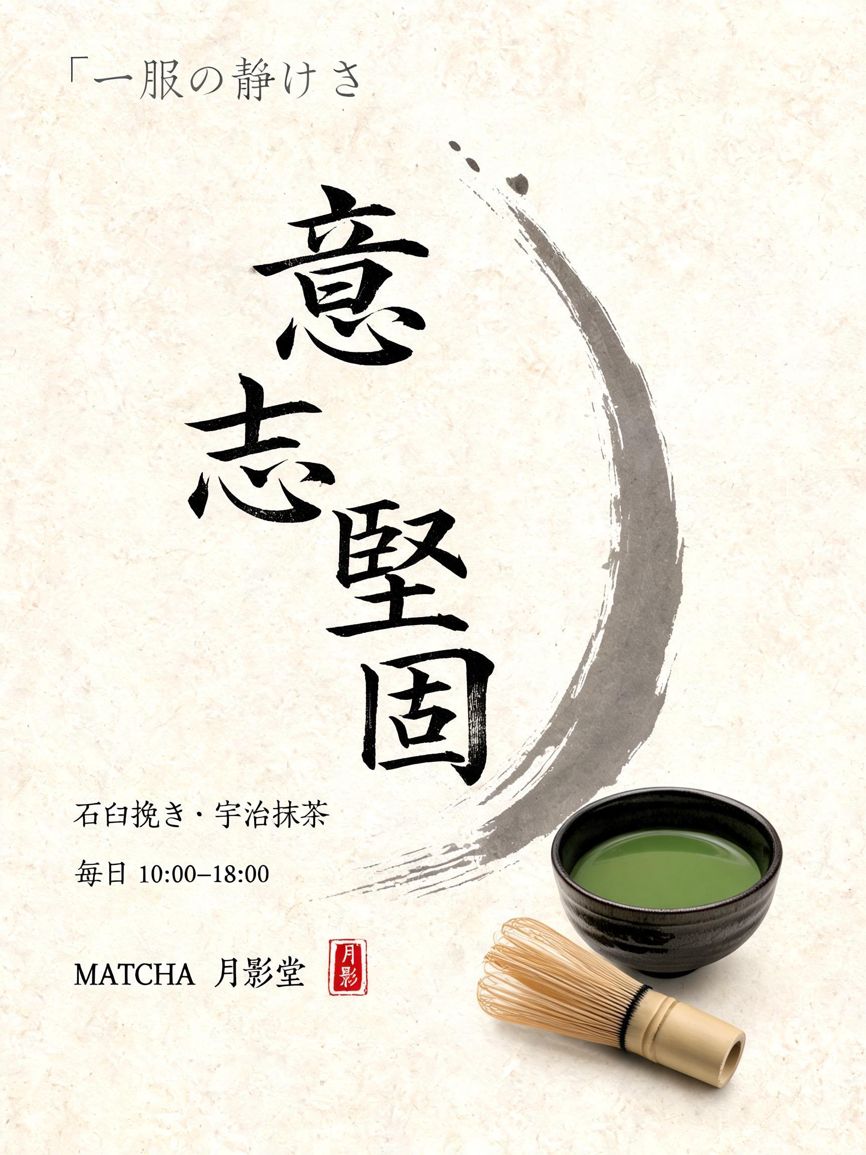


“𝐽𝐸𝐽𝑈” es un efecto de texto Pincel de Tinta Japonés creado con FontVibe IA. El estilo de caligrafía con pincel de tinta del shodo japonés llevado a las letras latinas. Tinta sumi negra y profunda con la energía auténtica del pincel fude, trazos controlados en una sola dirección y atmósfera de papel washi. Perfecto para marcas de restaurantes japoneses, diseño de tatuajes, anime, artes marciales y proyectos culturales.
Japanese Shodo ink brush calligraphy in the tradition of mid-century Japanese poster and graphic design. Latin letterforms painted with the bold graphic clarity of Japanese commercial art — fude brush strokes with the decisive precision of designed marks, not spontaneous expression. Each stroke is placed like an element in a composition: intentional, structural, contributing to the whole. Deep sumi black ink, consistent weight throughout. Background: off-white aged paper with slight grain — the texture of a vintage Japanese print or exhibition poster. The aesthetic: the energy of Japanese Olympic, World's Fair, and cultural poster design from the Showa era — where calligraphy and graphic design merged into something entirely new. A mid-century Japanese design exhibition — the National Museum of Modern Art, Tokyo. The exhibition opens with a large centerpiece graphic panel: "𝐽𝐸𝐽𝑈" in bold Shodo-graphic calligraphy — the aesthetic of the Tokyo Olympics, World's Fair posters, and Showa-era cultural design. Deep sumi black on off-white exhibition paper, decisive structural marks. Top tier: "SHOWA ERA GRAPHIC DESIGN" — tiny exhibition label at 38% canvas width, upper-left. Middle tier: "𝐽𝐸𝐽𝑈" — massive dominant poster letters at 65% canvas width, centered — calligraphy with the decisive precision of designed marks, each stroke placed like a composition element. Bottom tier: "WHERE CALLIGRAPHY MEETS GRAPHIC DESIGN" — small caps at 35% canvas width. Vertical spacing ratio approximately 1:5:1.5. The composition reads as a prestige Japanese design exhibition piece — Showa era poster mastery, calligraphy elevated to graphic design.
Hecho para Generador de Letras de Póster Japonés
Generada el 9 de julio de 2026 · 2848 × 1600 · JPEG · BytePlus Seedream 5.0 · Compartida por el creador · Uso comercial gratuito (CC BY 4.0)