

我也有,不能输的理由 - Pincel de Tinta Japonés Text Effect


Usa BytePlus Seedream 5.0, el modelo de esta obra · 15 créditos


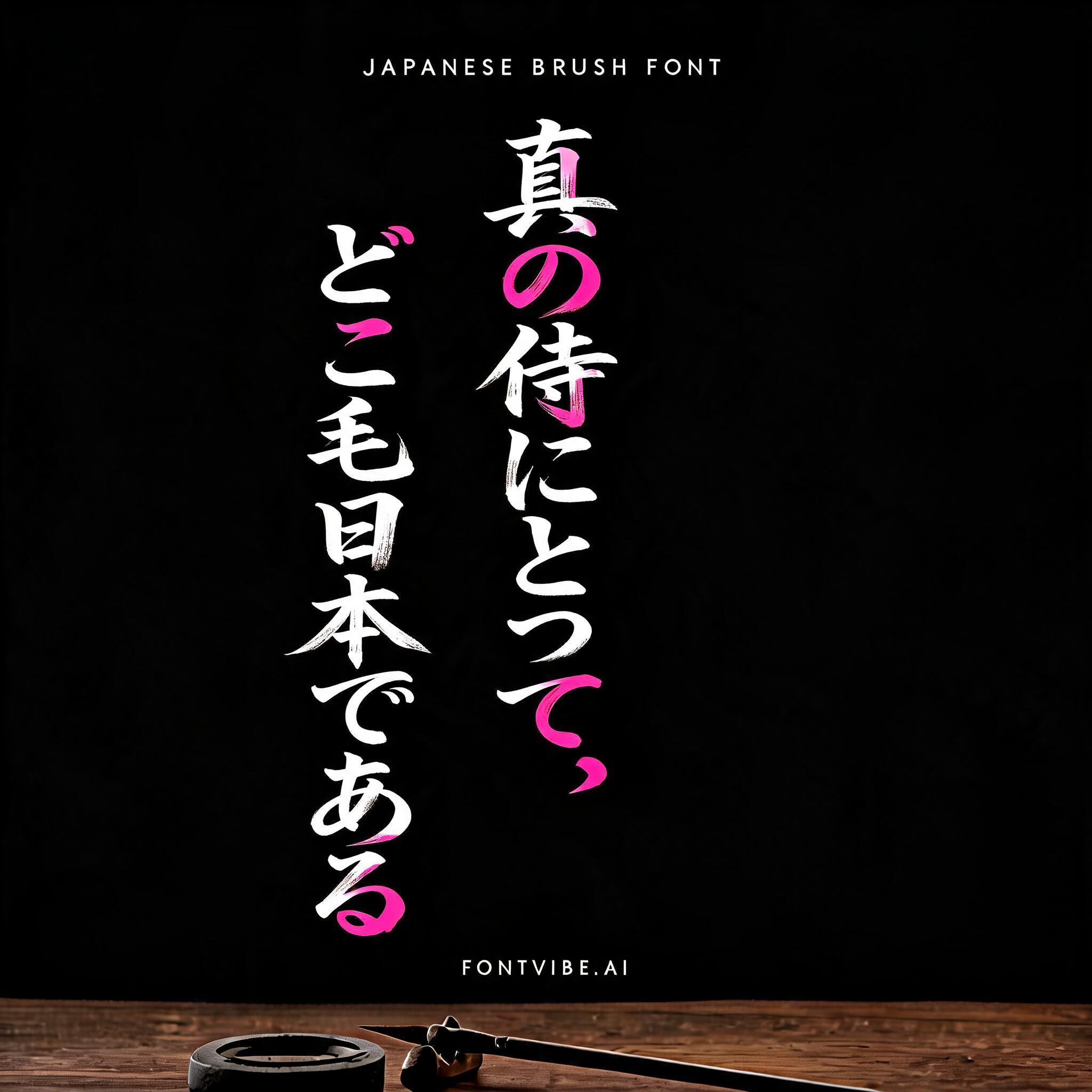




“我也有,不能输的理由” es un efecto de texto Pincel de Tinta Japonés creado con FontVibe IA. El estilo de caligrafía con pincel de tinta del shodo japonés llevado a las letras latinas. Tinta sumi negra y profunda con la energía auténtica del pincel fude, trazos controlados en una sola dirección y atmósfera de papel washi. Perfecto para marcas de restaurantes japoneses, diseño de tatuajes, anime, artes marciales y proyectos culturales.
Japanese ink brush aesthetic; sumi calligraphy letterforms with luminous ivory-white, pale silver-gray, and warm cream-white pigment replacing dark ink for screen-safe compositing. Fully matte absorbed-ink character, with dense opaque mark centers transitioning into translucent diluted gray at depleted brush tails. Visible washi-fiber-like texture is embedded only within the strokes: dry-brush striations, split bristle marks, irregular pigment pooling, soft absorbent feathered borders, and subtle warm-white fiber flecks. Soft diffuse, even, shadowless illumination reveals the complete tonal range of each mark. Apply the ma principle through deliberate breathing room between glyphs and controlled spatial rhythm. Power and stillness coexist through bold decisive entry strokes, firm pressure changes, and restrained pull-away tails. Avoid uniform fill, hesitant marks, decorative embellishment, dark pixels, and black lettering. Render the exact Chinese text “我也有,不能输的理由” as monumental sumi-brush calligraphy, arranged in two balanced lines with “不能输的理由” slightly larger and denser. Build every stroke from luminous ivory-white and pale silver-gray ink, preserving the physical behavior of loaded sumi: brightest opaque cores, diluted translucent feathering, dry-brush skips, split bristle striations, pooled pigment at turning points, and decisive tapering pull-away tails. The glyph edges carry soft absorbent bleeding rendered as a fine halo of warm white fibers, while internal stroke texture shows irregular paper-grain-like flecks without any paper sheet or rectangle. Use bold entry strokes, compressed heavy pressure, and controlled negative space between characters. Add only a few tiny white ink droplets directly clinging to stroke terminals; no ornamental motifs. Even shadowless diffuse illumination reveals the full white-to-silver tonal range, with every visible pixel bright enough for screen compositing. The background is a perfectly flat pure BLACK #000000 void with nothing else.
Hecho para Generador de Letras Japonesas
Generada el 6 de septiembre de 2026 · 2496 × 1664 · PNG · PNG transparente · BytePlus Seedream 5.0 · Compartida por el creador · Uso comercial gratuito (CC BY 4.0)


