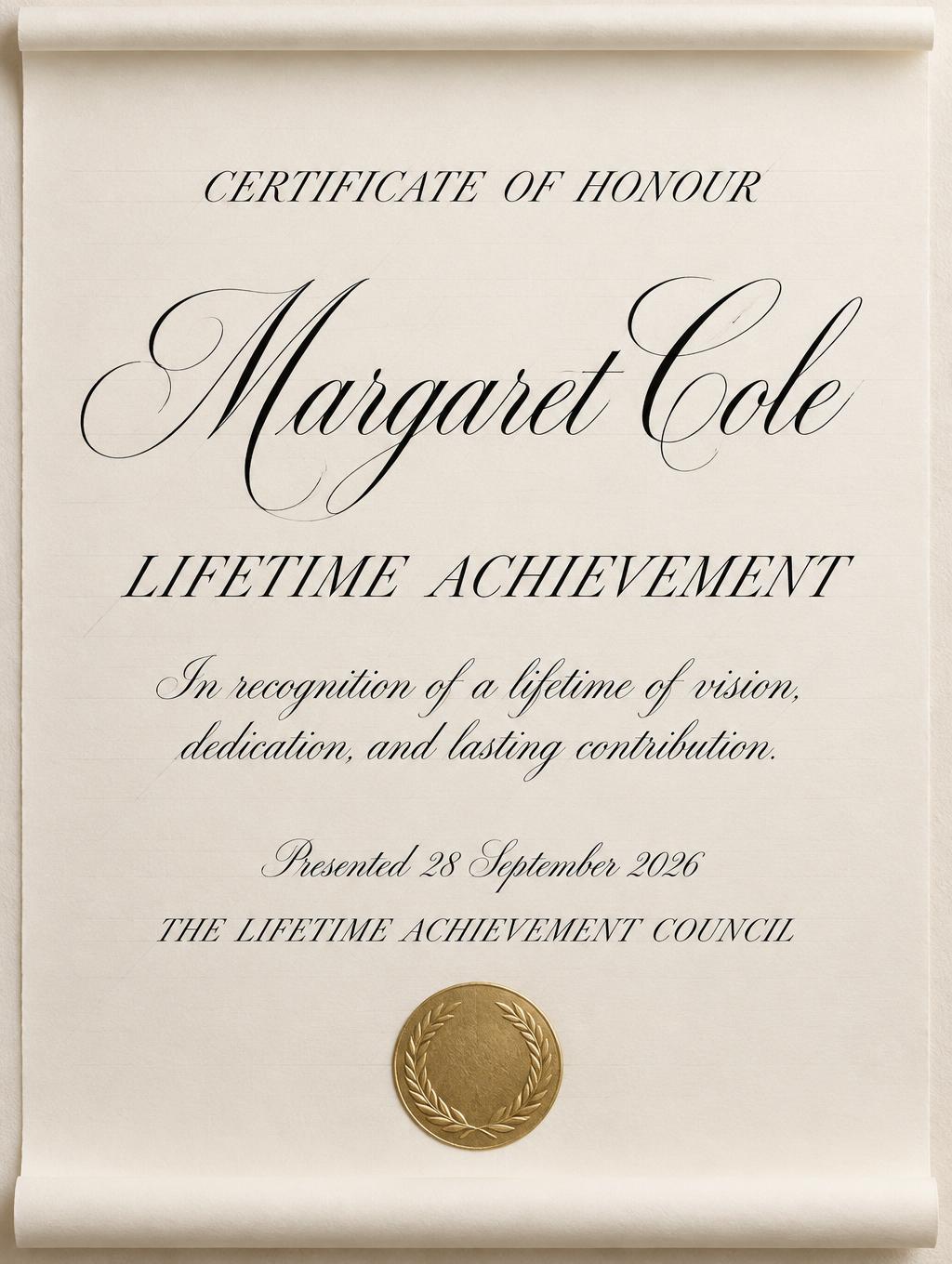
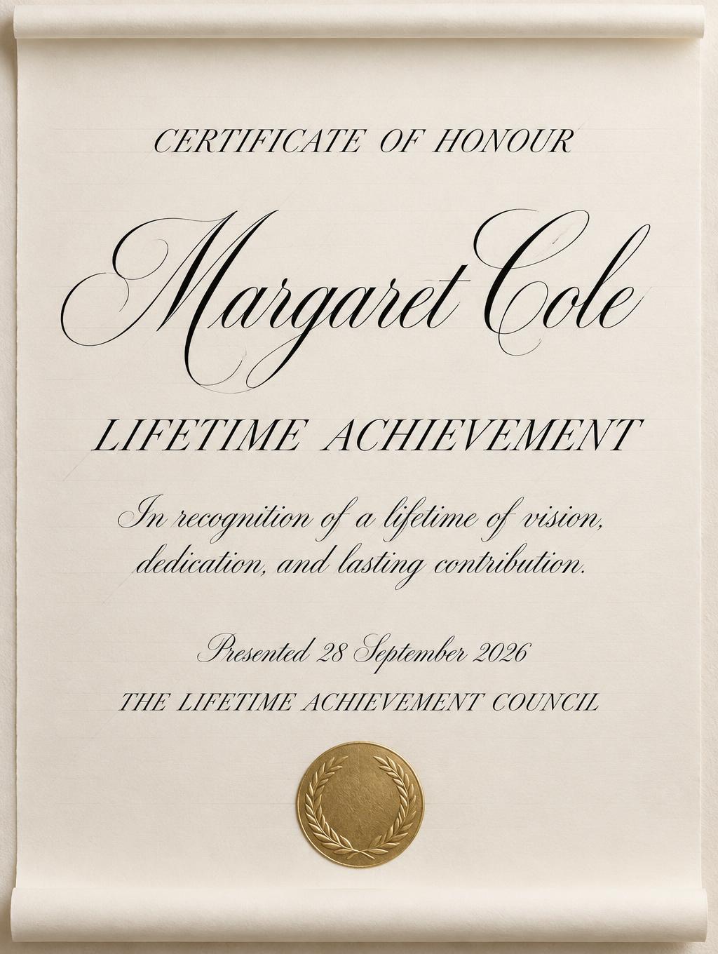
Margaret Cole LIFETIME ACHIEVEMENT CERTIFICATE OF HONOUR In recognition of a lifetime of vision, dedication, and lasting contribution. Presented 28 September 2026 THE LIFETIME ACHIEVEMENT COUNCIL - Caligrafía Script Text Effect


Usa OpenAI GPT-Image-2.5 Sunburst, el modelo de esta obra · 15 créditos
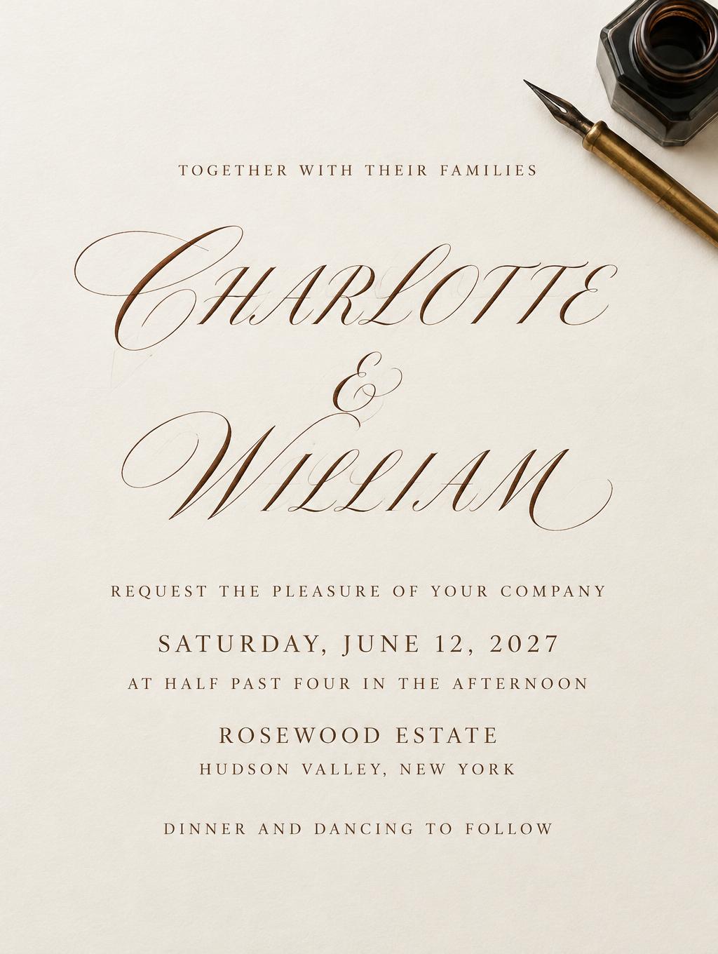
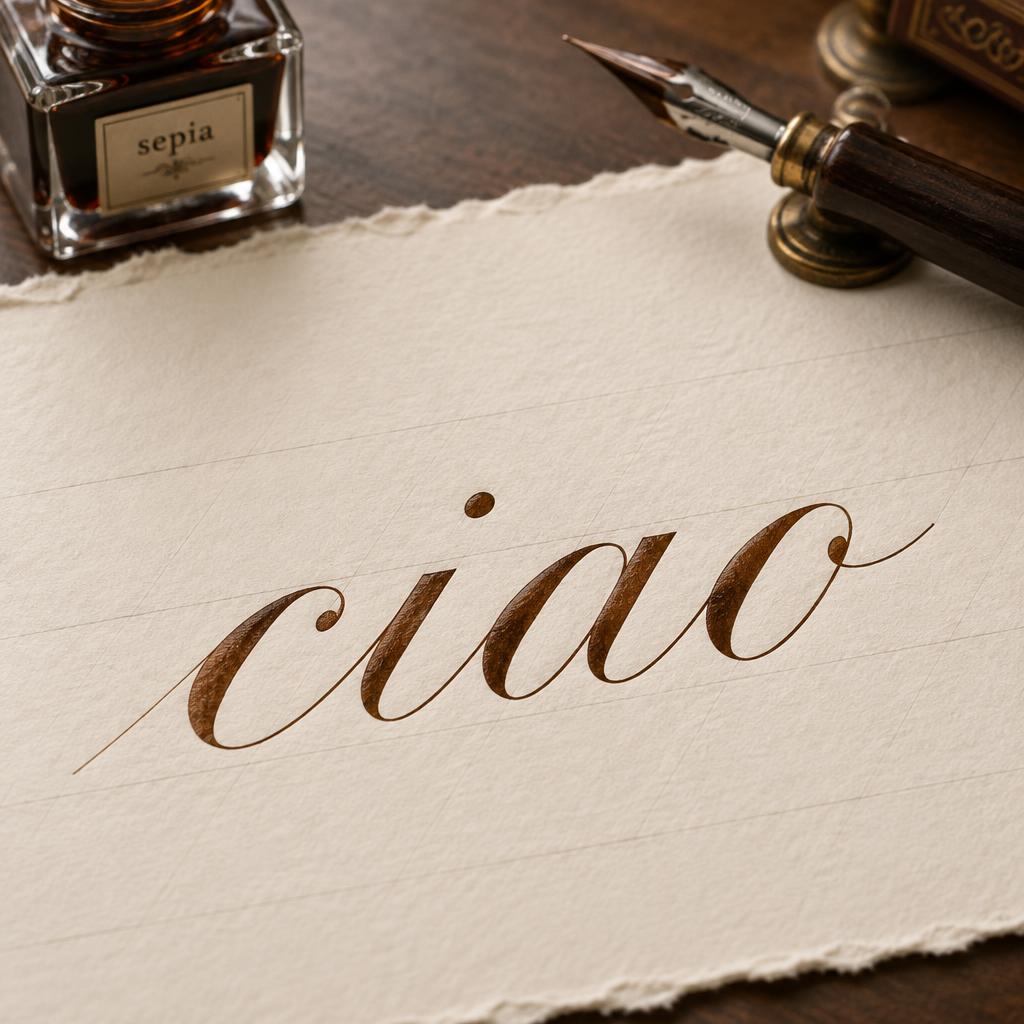
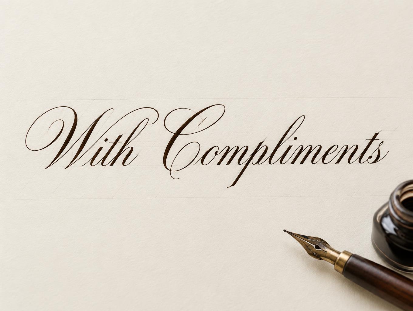
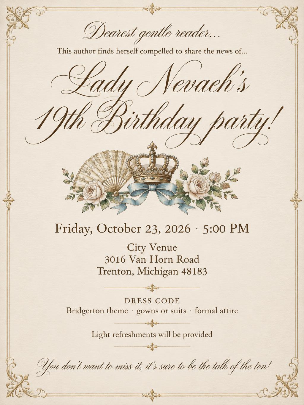
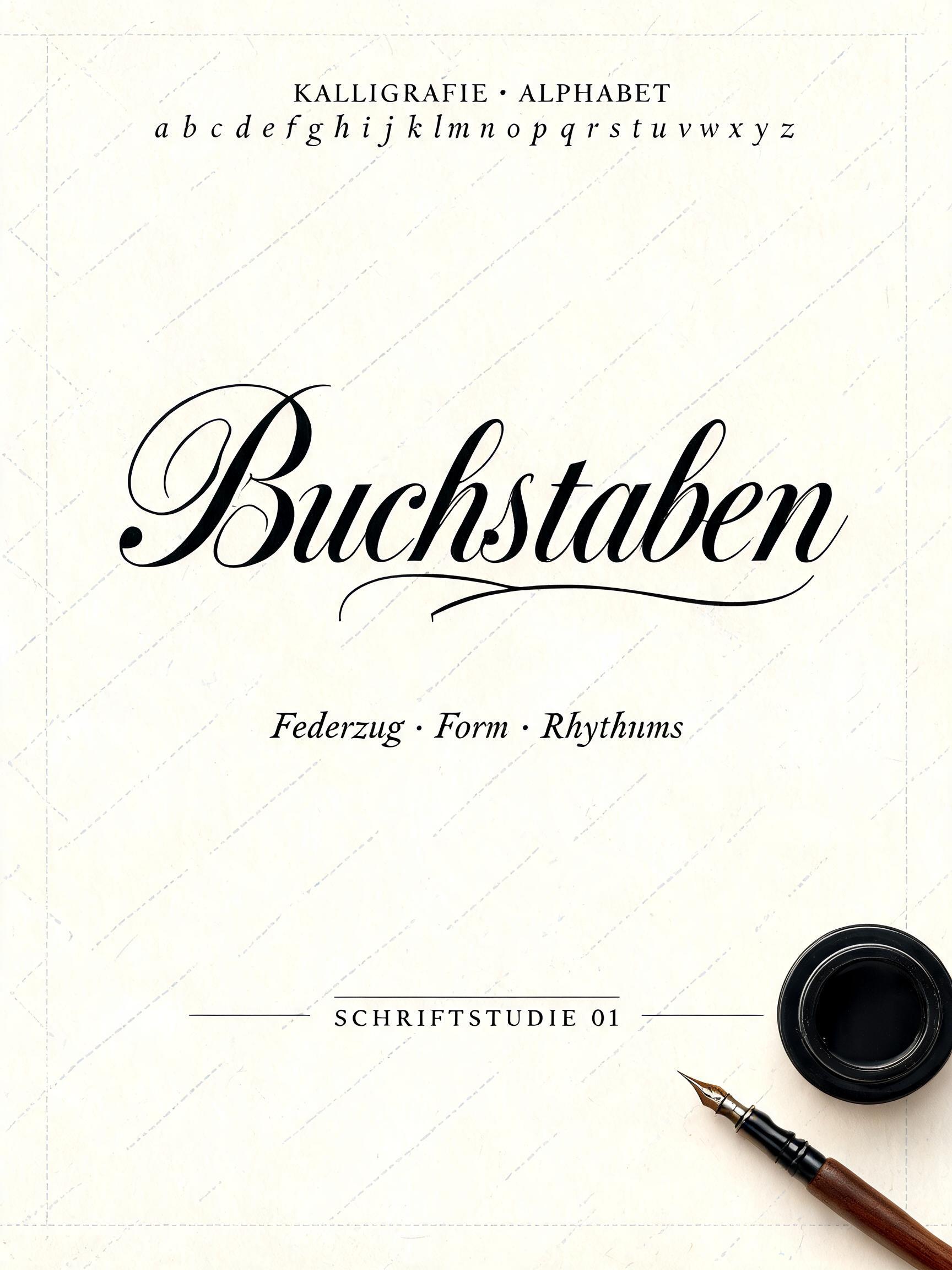
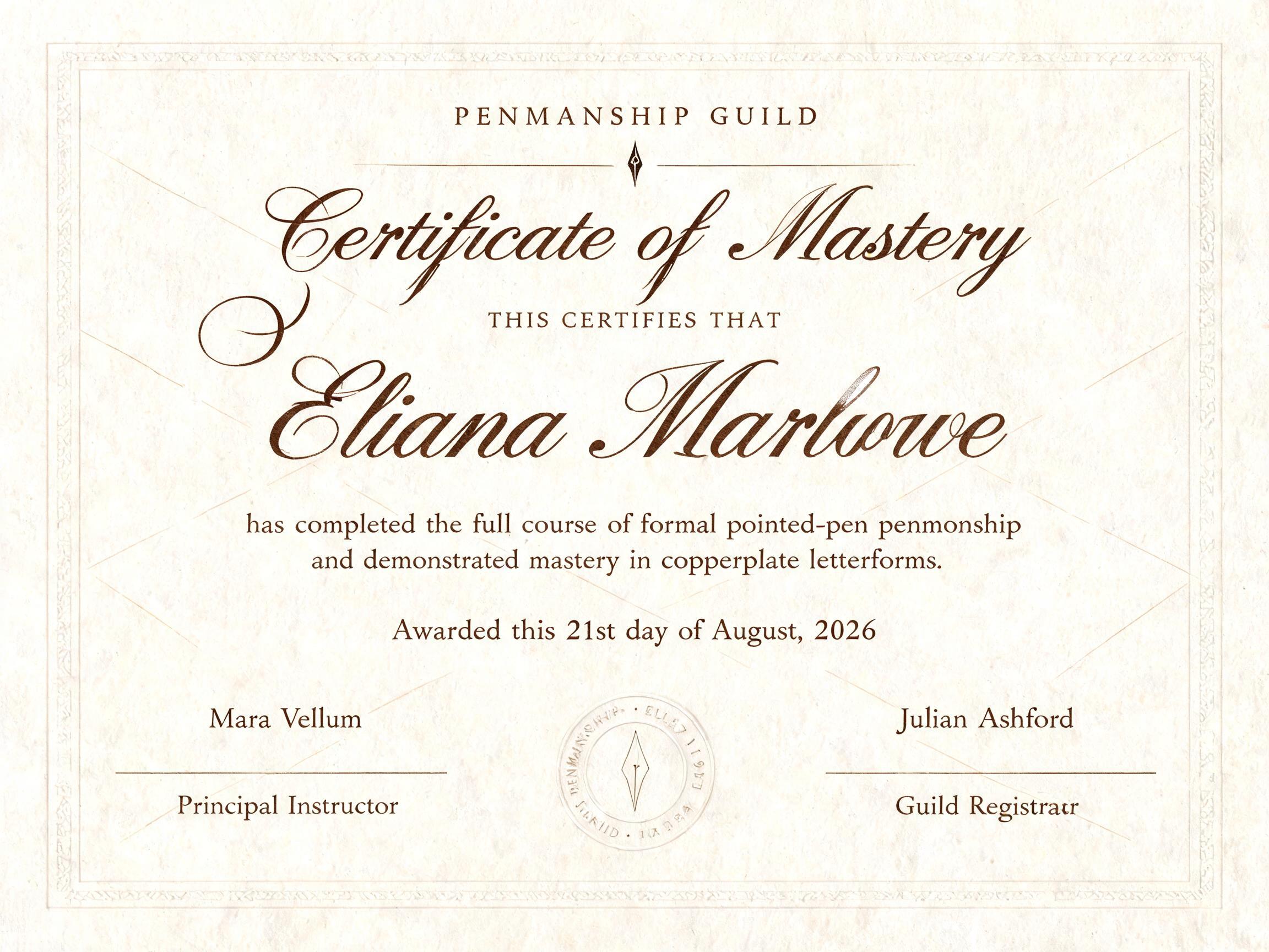
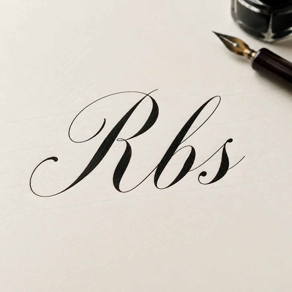
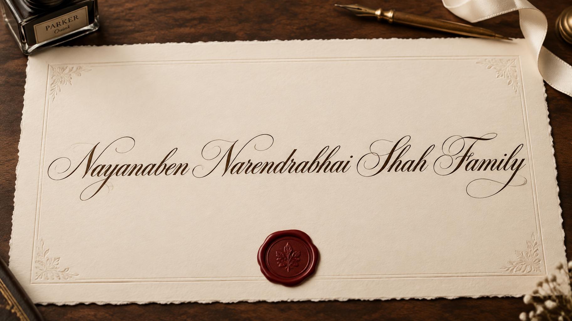


“Margaret Cole LIFETIME ACHIEVEMENT CERTIFICATE OF HONOUR In recognition of a lifetime of vision, dedication, and lasting contribution. Presented 28 September 2026 THE LIFETIME ACHIEVEMENT COUNCIL” is a Cursive Calligraphy text effect efecto de texto creado con FontVibe IA. Copperplate formal de pluma puntiaguda: fuerte contraste grueso-fino, letras ovaladas inclinadas y mayúsculas con remates, tinta negra nítida sobre papel crema con tenues líneas guía.
Create a complete formal award scroll for the Lifetime Achievement of Margaret Cole, in portrait 3:4 format. Show a single unrolled sheet of smooth ivory hot-press cotton paper filling most of the frame, generous clean margins, lightly curled scroll ends, faint diagonal calligraphy guidelines, and a small embossed gold laurel seal near the lower edge. The paper and ornament are secondary to the text. Render only these exact lines, spelled exactly, with no extra words or lettering: “CERTIFICATE OF HONOUR”; “Margaret Cole”; “LIFETIME ACHIEVEMENT”; “In recognition of a lifetime of vision, dedication, and lasting contribution.”; “Presented 28 September 2026”; “THE LIFETIME ACHIEVEMENT COUNCIL”. Set “Margaret Cole” as the largest line and primary focal point, centered in formal pointed-pen copperplate calligraphy. Set “LIFETIME ACHIEVEMENT” as the second tier, clearly readable beneath the name; place the small uppercase certificate label above, the recognition sentence below, then the presentation date and issuing body as compact closing lines. Give all lettering the disciplined 55-degree slant, oval-based forms, rhythmic spacing, dramatic but controlled hairline upstrokes and broad shaded downstrokes, crisp entry and exit strokes, and restrained capital flourishes of master-trained copperplate penmanship. Use deep black ink with precise edges and a faint wet-ink sheen on every line. Keep small text clean and legible, not densely flourished. Even, soft studio illumination reveals the paper grain and ink edges without dramatic shadows. Keep the gold seal as a discreet embossed accent, with no text or numerals on it. Balanced centered certificate composition, precise alignment, ample negative space, no extra props, no watermark, no illegible pseudo-writing.
Generada el 29 de septiembre de 2026 · 1024 × 1360 · JPEG · OpenAI GPT-Image-2.5 Sunburst · Diseño: Certificate Column · Compartida por el creador · Uso comercial gratuito (CC BY 4.0)