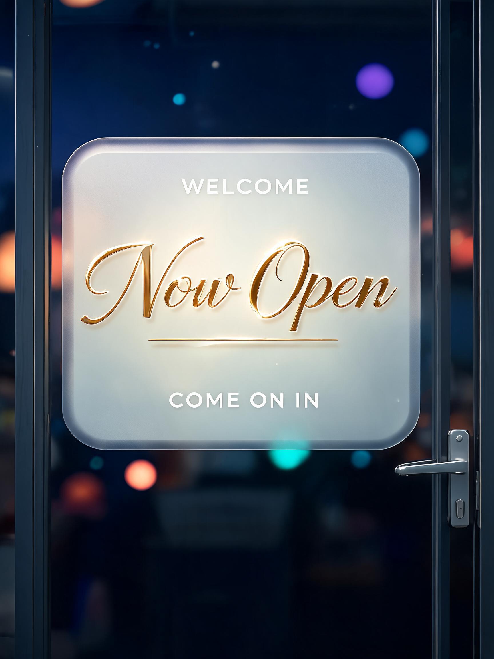
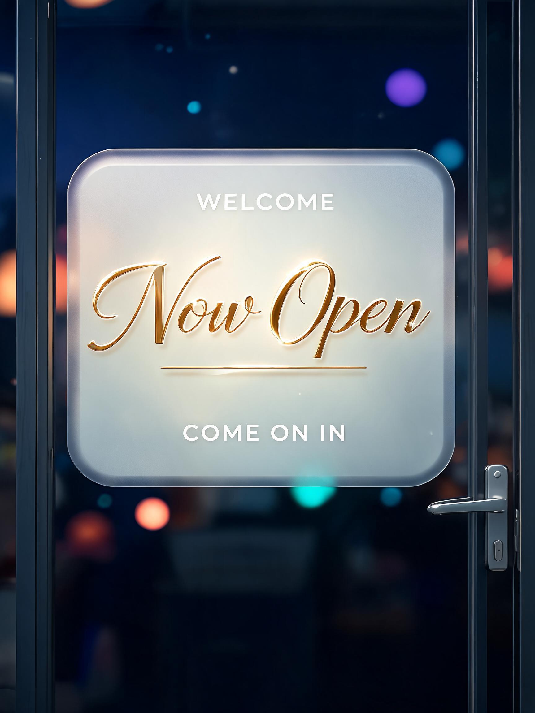
Now Open WELCOME COME ON IN - Vidrio Esmerilado Text Effect


Usa BytePlus Seedream 5.0, el modelo de esta obra · 15 créditos





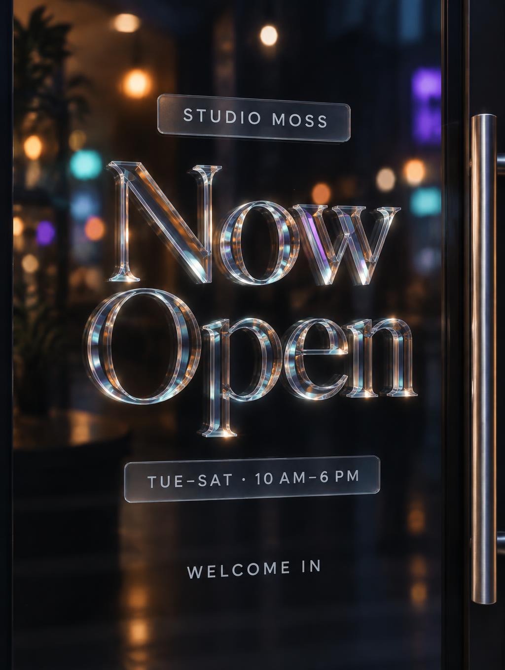


“Now Open WELCOME COME ON IN” is a Glass Morphism text effect efecto de texto creado con FontVibe IA. Paneles de vidrio esmerilado semitransparentes y lechosos, con desenfoque suave y estética glassmorphism: borde fino de vidrio y un fondo colorido y difuminado que se ve a través de la superficie. Calidad de UI moderna.
Create a finished vertical shop-door sign, 3:4 composition, viewed straight-on as a designed piece of storefront signage. The main title must read exactly “Now Open”. Render it as a single unbroken, left-handed calligraphic autograph stroke, sweeping from lower left to upper right. Use a deep italic lean and natural pointed-brush thick-to-thin variation: broad downstrokes, extremely fine upstrokes and connecting arcs. The strokes are polished 24k liquid gold, with a sharp white-gold highlight along the top face, warm deep-gold sides, and amber underside shadows. Add one needle-thin straight gold underline beneath the full title, tapering to a sharp point. Mount the lettering on a translucent frosted-glass plaque attached to a clear shop door. Plaque is a rounded rectangular glass slab with layered depth, a razor-thin white perimeter highlight, milky semi-transparent face revealing blurred color behind it, soft internal center glow, subtle dark inner edge shadow, and a diffuse halo. Keep the gold lettering clearly in front of the glass plaque; do not turn the lettering itself into glass. Behind the door, show a dim midnight-blue shop interior with softly defocused coral-orange, electric-violet, and cyan-teal bokeh lights. Include a restrained visible door edge and simple metal handle near one side to establish the shop-door setting; keep these secondary and out of the text area. Composition: centered vertical plaque occupying roughly 72% of canvas height and 84% of width. Put the small uppercase line “WELCOME” above the main title, the dominant “Now Open” across the plaque center, and the smaller uppercase line “COME ON IN” below it. Keep generous spacing between all text tiers; all supporting text is clean, high-contrast, compact sans serif and straight, not script. Ensure the title is instantly readable at door distance, with no extra words, logos, hours, or invented shop details. Crisp sign lettering, realistic layered glass refraction and reflections, ray-traced highlights, controlled bloom, high detail.
Hecho para Letras de Vidrio Transparente
Generada el 6 de octubre de 2026 · 1728 × 2304 · JPEG · BytePlus Seedream 5.0 · Diseño: Centrado · Compartida por el creador · Uso comercial gratuito (CC BY 4.0)