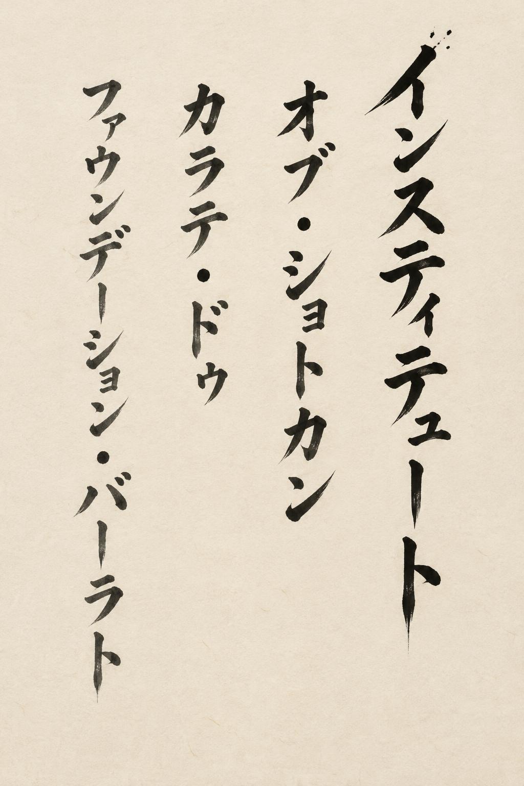
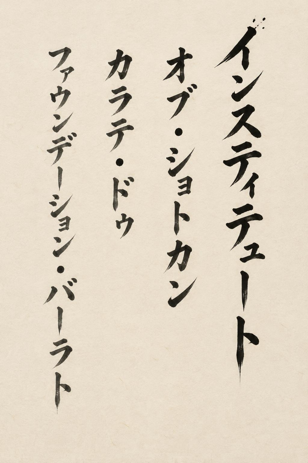
インスティテュート・オブ・ショトカン・カラテ・ドゥ・ファウンデーション・バーラト - Pincel de Tinta Japonés Text Effect


Usa OpenAI GPT-Image-2.5 Sunburst, el modelo de esta obra · 15 créditos






“インスティテュート・オブ・ショトカン・カラテ・ドゥ・ファウンデーション・バーラト” es un efecto de texto Pincel de Tinta Japonés creado con FontVibe IA. El estilo de caligrafía con pincel de tinta del shodo japonés llevado a las letras latinas. Tinta sumi negra y profunda con la energía auténtica del pincel fude, trazos controlados en una sola dirección y atmósfera de papel washi. Perfecto para marcas de restaurantes japoneses, diseño de tatuajes, anime, artes marciales y proyectos culturales.
A finished vertical shodo calligraphy artwork on warm cream handmade washi paper with visible paper fibres, lit by soft shadowless north-window light. The lettering is the Japanese katakana text 「インスティテュート・オブ・ショトカン・カラテ・ドゥ・ファウンデーション・バーラト」, written exactly in this order, character by character, with no added or missing characters. It is set in four tall vertical columns that read right to left, broken at the nakaguro dots: column 1 「インスティテュート」, column 2 「オブ・ショトカン」, column 3 「カラテ・ドゥ」, column 4 「ファウンデーション・バーラト」. The columns have different lengths, staggered and slightly off-axis in the manner of a hanging scroll, and a wide margin of empty paper surrounds them. The letterforms are classical master-hand shodo brush katakana, upright and authoritative. Thick-to-thin stroke contrast is about 5:1. Each stroke begins with a loaded-brush entry where the ink compresses, holds its energy through the middle, and exits in a precise harai taper to a fine point or a hane flick. Every stroke is made once and with full commitment. The long vowel marks ー are bold, confident vertical pulls with tapered tails. The nakaguro dots are round, dense ink presses. Stroke cores are dense matte sumi black. Slight dry-brush streaking appears only at the outermost stroke edges. The ink is absorbed into the paper, with soft feathered borders and a gradation from opaque black through charcoal to transparent grey where the brush runs dry. The first column carries the heaviest, blackest strokes, and the later columns lighten slightly in tone and size. A few fine ink splatter specks mark the entry of the first stroke at the upper right. Spacing between characters is generous and harmonious. No other decoration, no border, no frame. Quiet, meditative and powerful, with deliberate ma in the empty cream space. Palette: sumi black, charcoal grey and warm cream washi only.
Hecho para Generador de Texto Japonés
Generada el 31 de octubre de 2026 · 1024 × 1536 · JPEG · OpenAI GPT-Image-2.5 Sunburst · Diseño: Zen · Compartida por el creador · Uso comercial gratuito (CC BY 4.0)