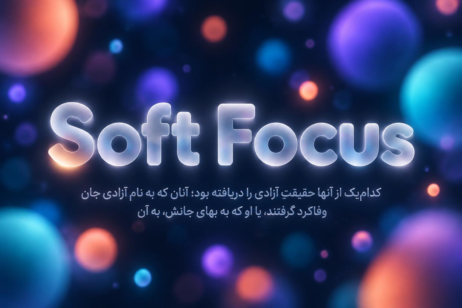
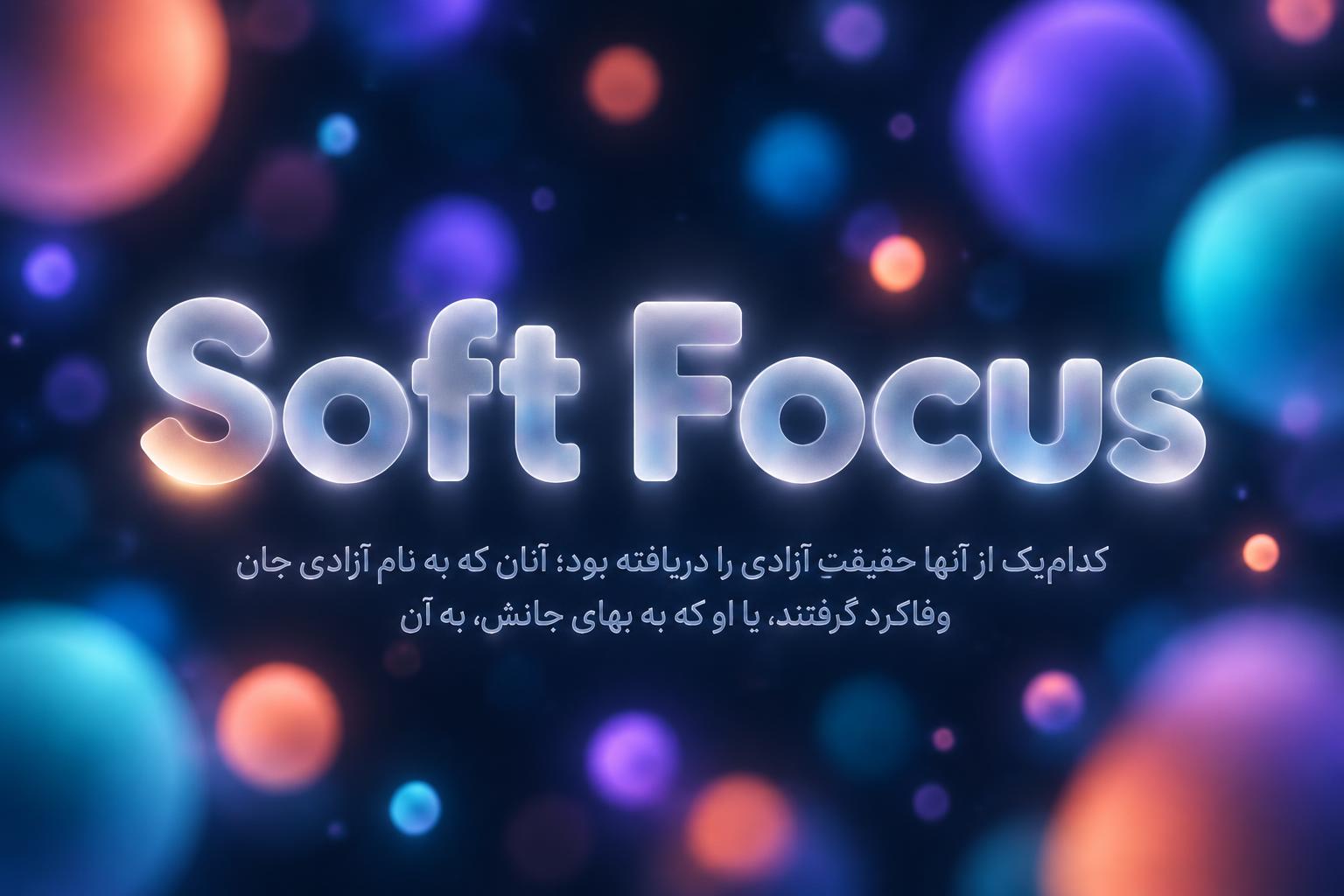
Soft Focus کدامیک از آنها حقیقتِ آزادی را دریافته بود؛ آنان که به نام آزادی، جان وفاکرد گرفتند، یا او که به بهای جانش، به آن - Vidrio Esmerilado Text Effect


Usa OpenAI GPT-Image-2.5 Sunburst, el modelo de esta obra · 15 créditos
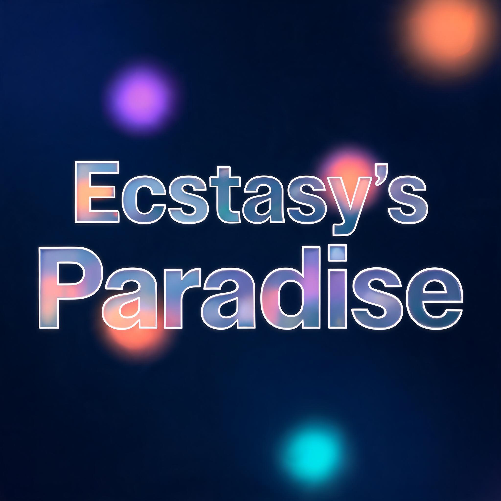


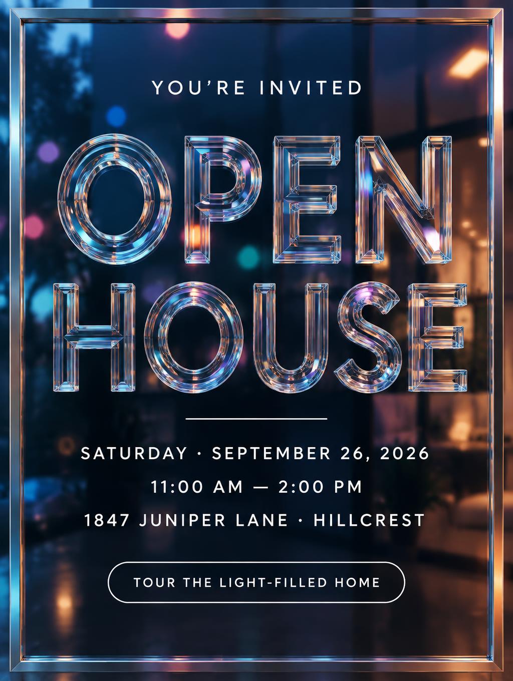
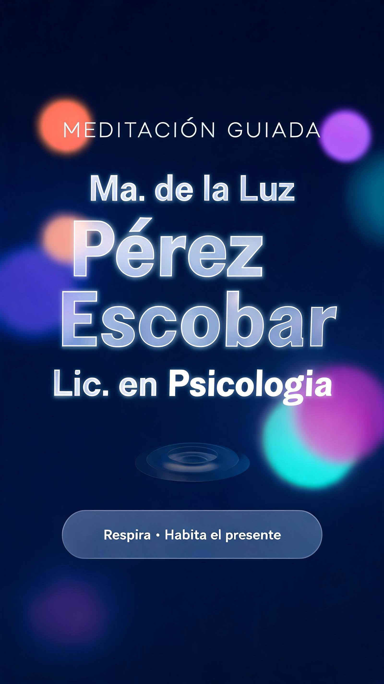




“Soft Focus کدامیک از آنها حقیقتِ آزادی را دریافته بود؛ آنان که به نام آزادی، جان وفاکرد گرفتند، یا او که به بهای جانش، به آن” es un efecto de texto Vidrio Esmerilado creado con FontVibe IA. Paneles de vidrio esmerilado semitransparentes y lechosos, con desenfoque suave y estética glassmorphism: borde fino de vidrio y un fondo colorido y difuminado que se ve a través de la superficie. Calidad de UI moderna.
A premium glassmorphism brand graphic on a deep midnight blue background filled with vivid, softly out-of-focus floating bokeh orbs in coral-orange, electric violet and cyan-teal, varied in size, some large and blurred, some small and crisp. The main lettering reads "Soft Focus", centred, filling about 65% of the frame width, set in bold geometric sans-serif display letterforms with rounded terminals. Each letter is a slab of acid-etched, sandblasted frosted glass: a uniform micro-granular milky white surface, semi-translucent, with the blurred bokeh colours bleeding through at 15-20% opacity. A razor-thin bright white specular highlight line traces the full perimeter of every letter. There is a soft dark inner shadow along the top edge for tactile depth, a gentle glow brightest at the centre of each letter face, and a soft diffuse halo scattering outward beyond the edges. There are no rainbow dispersion effects and no hard caustics. Below the title, small and refined, sits a two-line Persian quotation, right-to-left, centred, in a clean medium-weight Arabic-script sans, in the same milky frosted glass with a thin white rim and a faint halo, at about 45% of frame width: "کدامیک از آنها حقیقتِ آزادی را دریافته بود؛ آنان که به نام آزادی، جان" and the second line "وفاکرد گرفتند، یا او که به بهای جانش، به آن". The Persian script is rendered exactly, with connected letterforms and correct diacritics. Vertical spacing is roughly 5:1.5, with generous dark space around the type. The mood is airy, layered and premium, in the style of an Apple iOS glass panel, with a clear contrast between the dominant brand name and the quiet quotation.
Hecho para Efecto de Texto de Vidrio
Generada el 2 de noviembre de 2026 · 1536 × 1024 · JPEG · OpenAI GPT-Image-2.5 Sunburst · Diseño: Póster · Compartida por el creador · Uso comercial gratuito (CC BY 4.0)


