
🧪 Design something with Football Retro 70s
Transparent Effect
✦ Transparent Effect
Generates a PNG with the background removed — only the text and its visual effects remain. The AI automatically selects the optimal background color for clean removal based on your style.
Output is always PNG for lossless transparency.

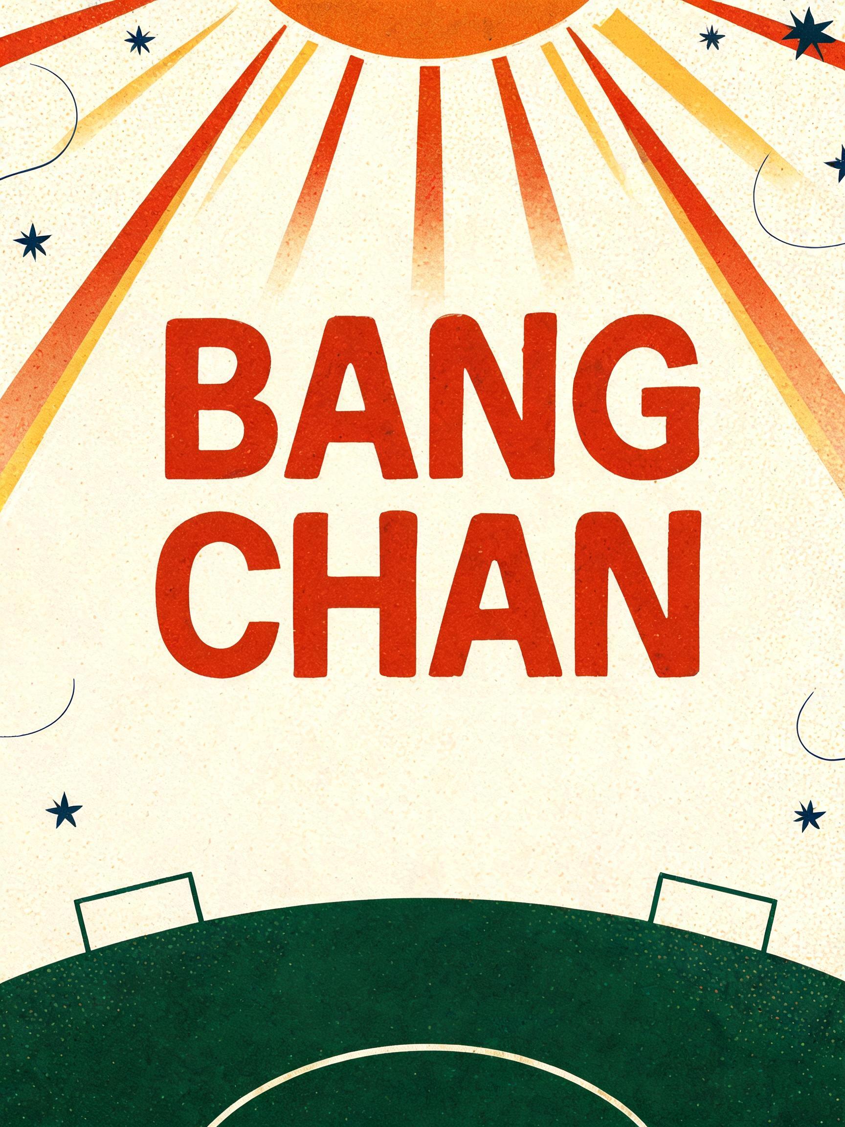
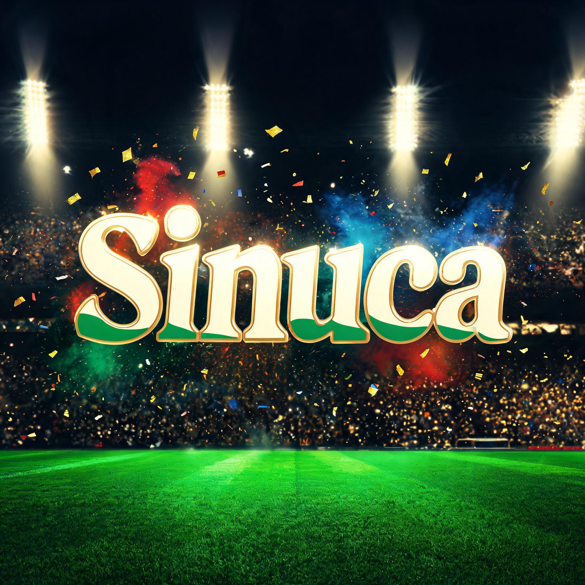
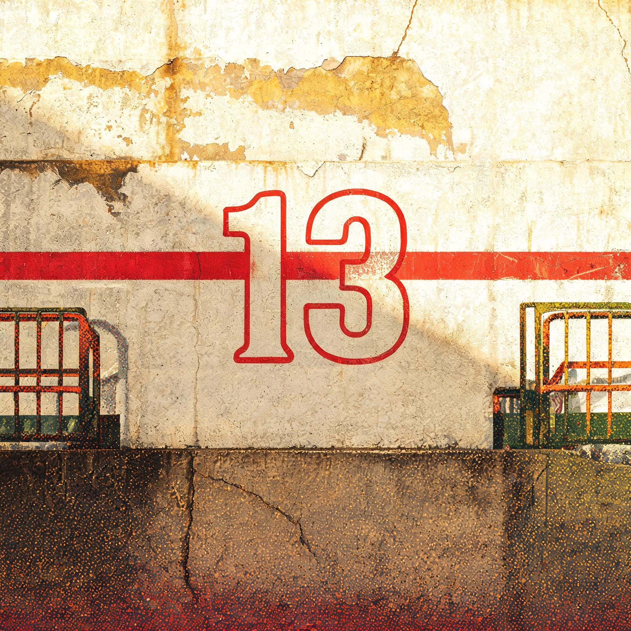


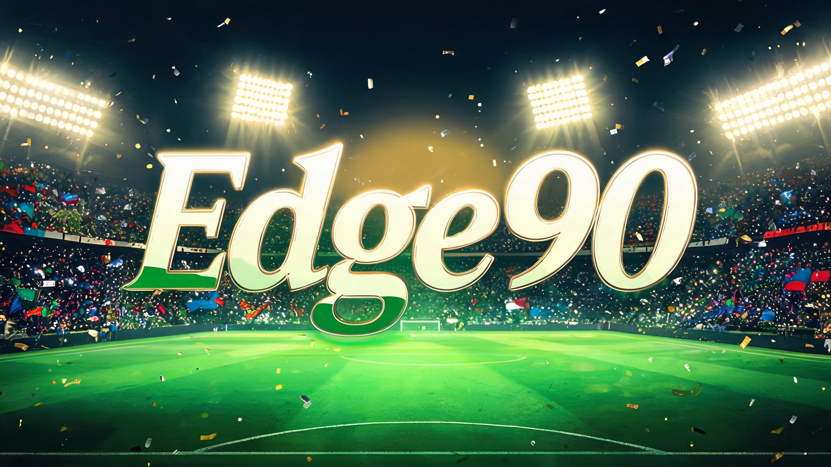
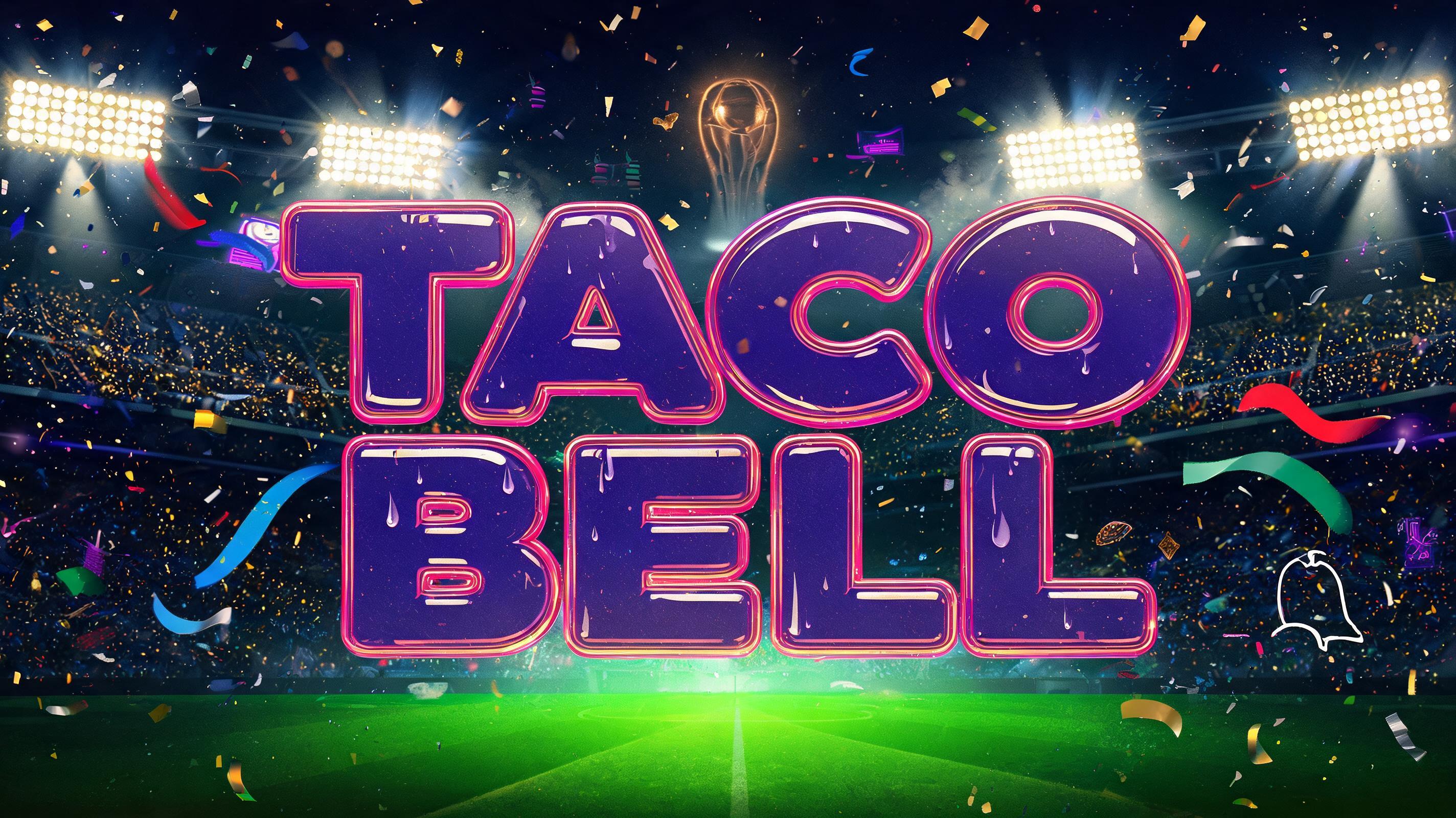
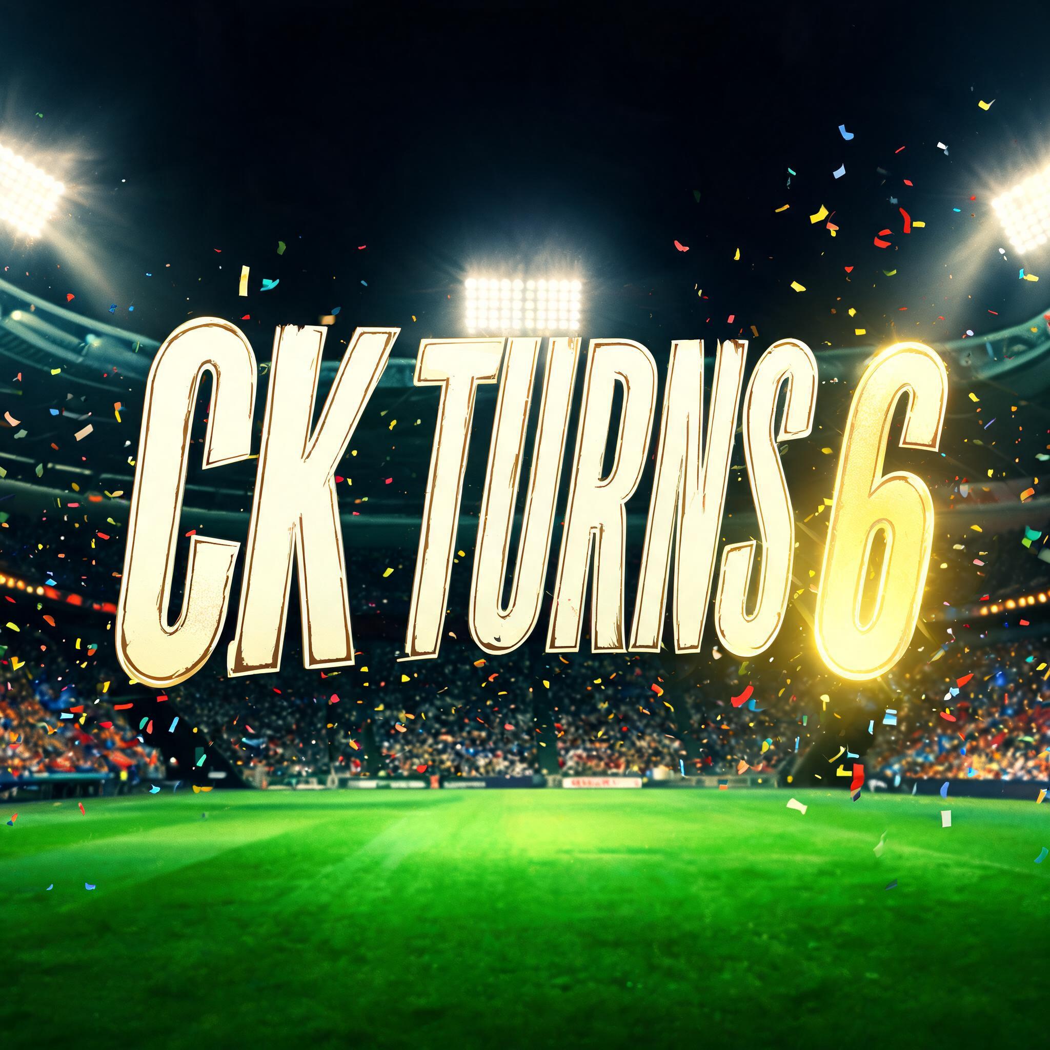
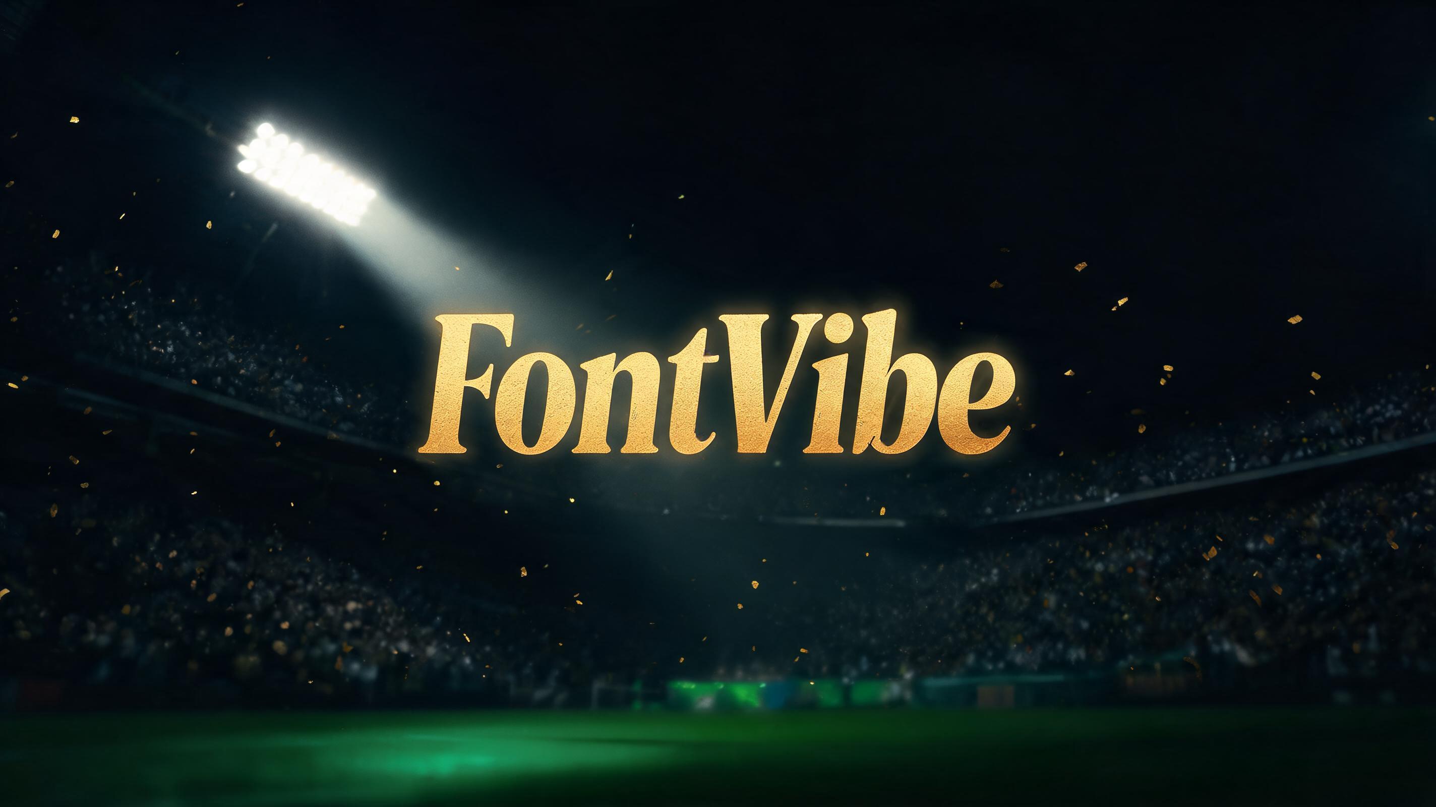


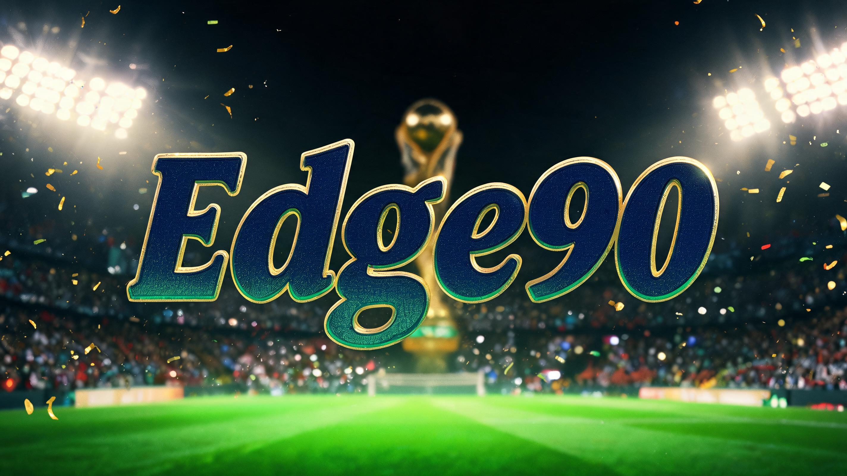


More AI fonts like Football Retro 70s


Looking for copy-paste fancy text? Try our free Font Generator Tools — cursive, gothic, bubble & 30+ styles.
FAQ
What is the Football Retro 70s font?
Football Retro 70s is warm vintage World Cup poster typography in the spirit of the 1970 Mexico and 1978 Argentina tournaments — organic, bold display letterforms with a rounded, sunny, hand-drawn character. It reads as festive, nostalgic and unmistakably 1970s.
Can I download Football Retro 70s?
There is no installable file. You type your text and the generator sets the warm retro letters fitted to your actual shapes, and returns a high-resolution image.
Where does this style work best?
Retro football and supporter graphics, 70s-themed sports posters, watch-party and event décor, nostalgic sports branding, fan content, poster headlines. Set it large and short.
Can I use it for commercial work?
Yes. Generated images may be used commercially, including posters, merch and print. Avoid reproducing a specific tournament's official logo — the retro style is general, official marks are protected.
Why do 1970s World Cup posters use these warm, rounded, organic letters?
Because they fuse the graphic taste of the decade with the host cultures, and both pulled in the same warm, festive direction. The 1970s had a distinctive design language: soft, rounded, slightly psychedelic forms, warm earthy and sunny colour palettes, and a hand-drawn organic feel that had moved on from the hard geometry of the 60s. Set that against the two host nations of these tournaments — Mexico and Argentina — and the poster art naturally leaned into vivid, celebratory, sun-soaked warmth to capture the spirit of a festival in the Americas. The result is bold display lettering that is chunky and rounded rather than sharp, glowing with the era's palette, and drawn with a friendly, human hand rather than machined precision. So the style is a specific fingerprint of a time and a place, which is exactly why it reads instantly as 70s World Cup nostalgia rather than generic sports type.
What fonts look similar?
For a 90s striped kit-lettering face, see Football Germany Retro. For the wider psychedelic 70s groove, try Groovy 70s.