
🧪 Design something with Gold Gradient
Transparent Effect
✦ Transparent Effect
Generates a PNG with the background removed — only the text and its visual effects remain. The AI automatically selects the optimal background color for clean removal based on your style.
Output is always PNG for lossless transparency.

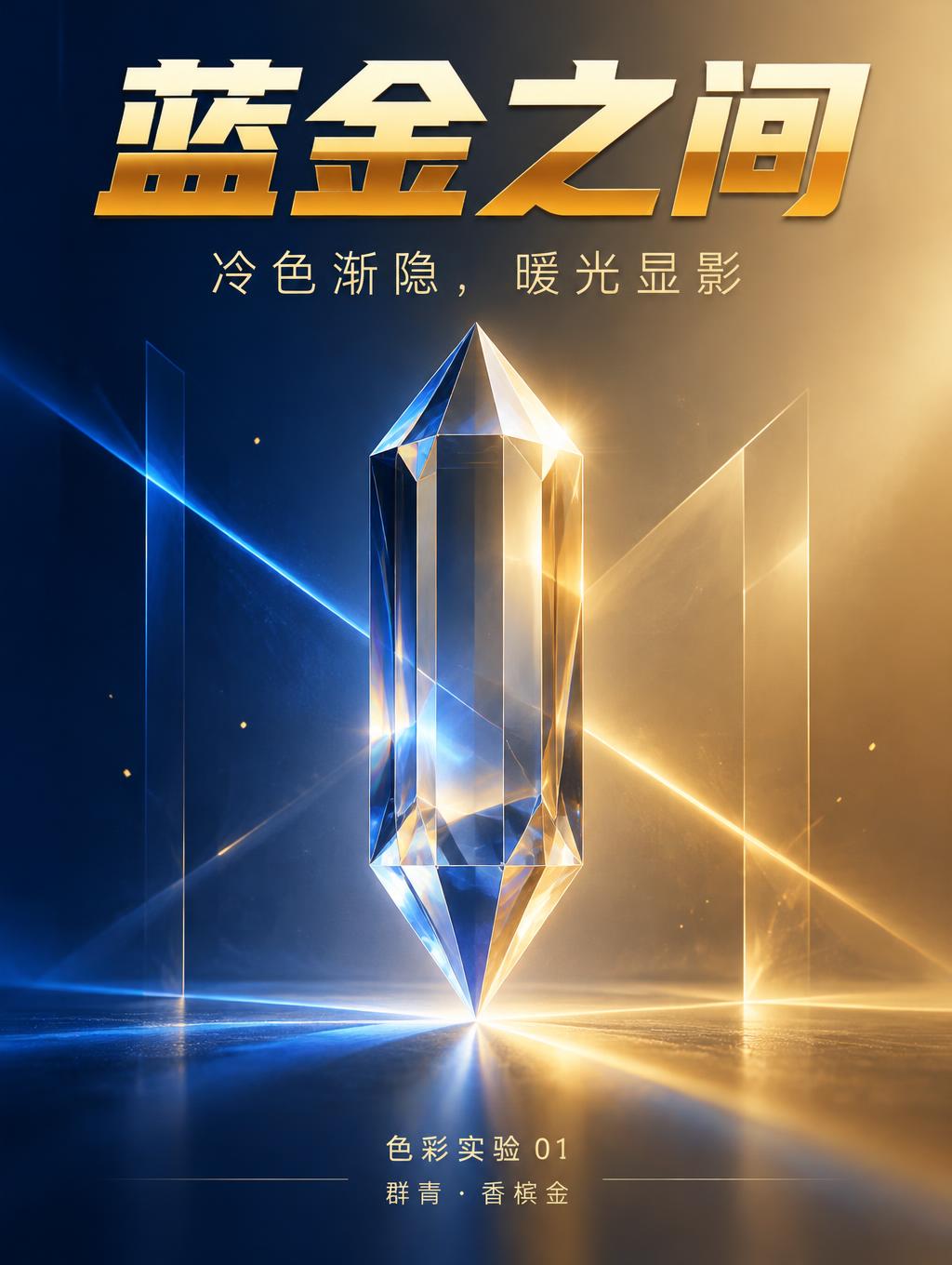
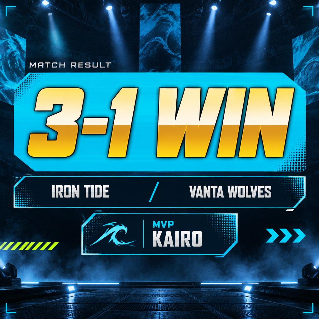

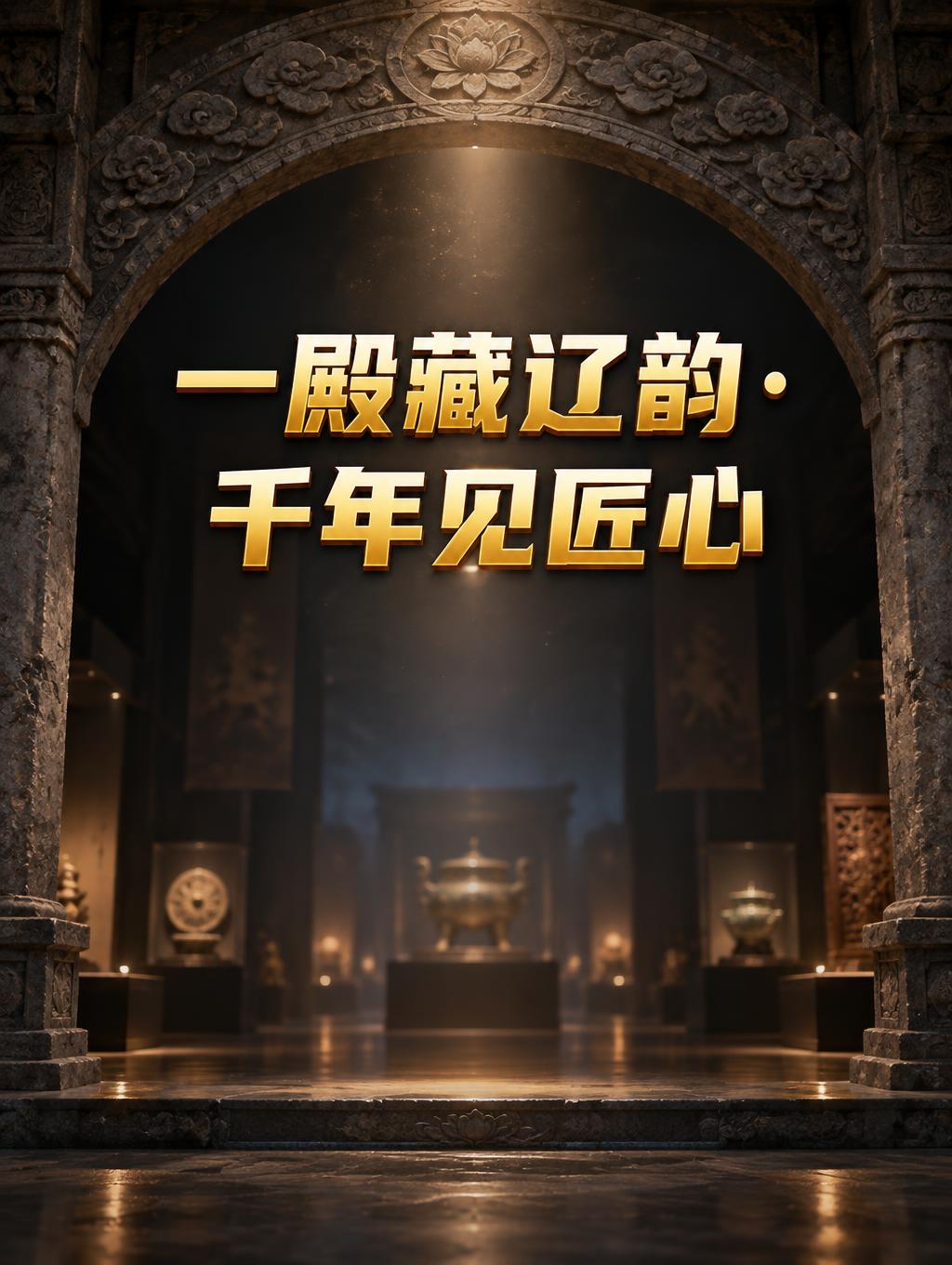
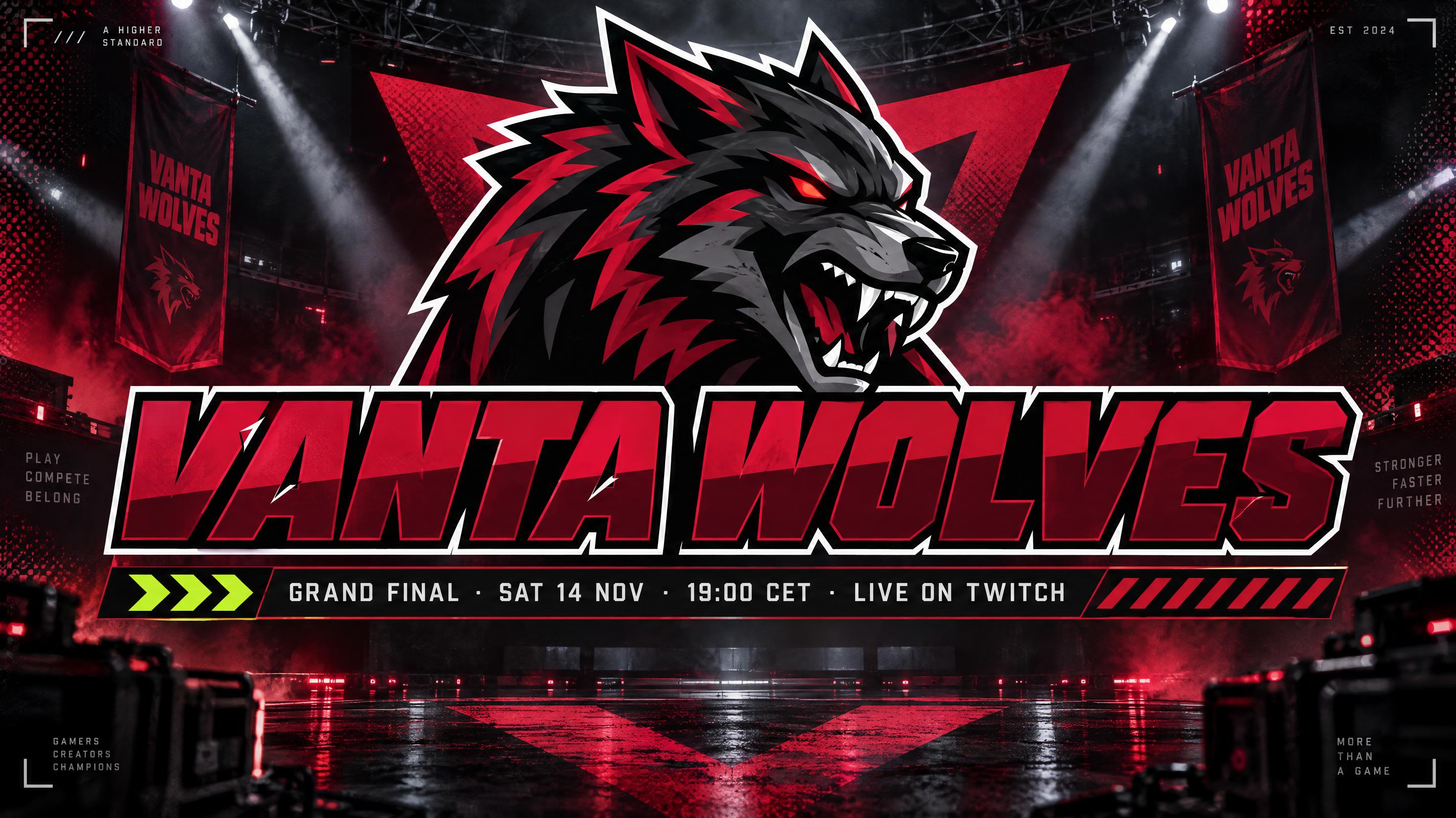
More AI fonts like Gold Gradient


Looking for copy-paste fancy text? Try our free Font Generator Tools — cursive, gothic, bubble & 30+ styles.
About Gold Gradient AI font
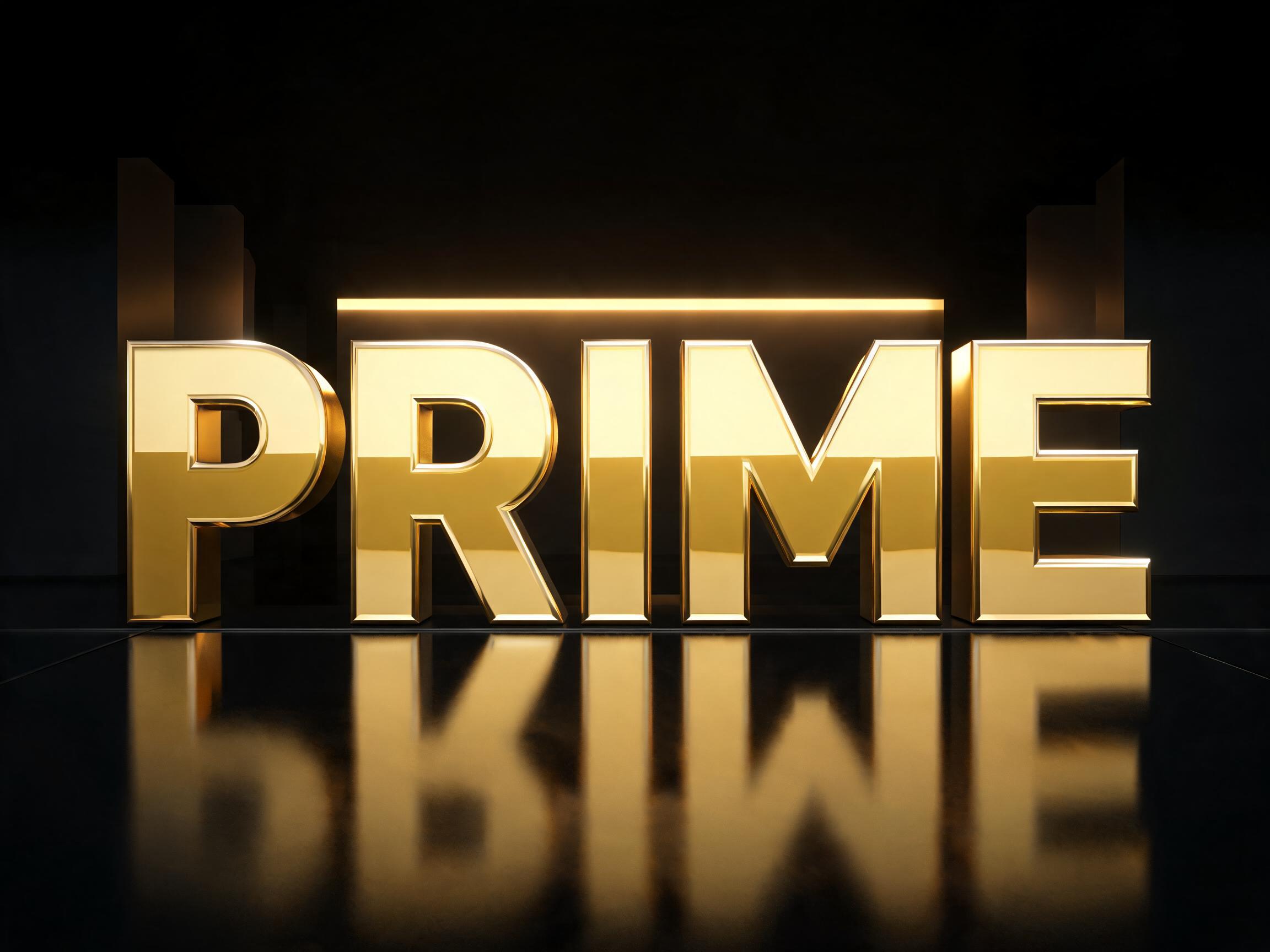
A heavy forward-leaning sans display typeface finished as flat vector artwork rather than photographed metal — a smooth vertical gold gradient runs from pale champagne at the top through near-white above the midline, breaks at a hard horizontal line, then drops to deep amber and warms back to bright yellow at the foot. A thin dark outline closes the letter and a slim highlight line rides the top edge. Built for gold gradient text, esports and sports lettering, certificates and Y2K graphics.
Lettering
FAQ
What is the Gold Gradient font?
Gold Gradient is finished as flat vector artwork rather than photographed metal. A smooth vertical gradient runs from pale champagne at the top through near-white above the middle, breaks at a hard horizontal line straight across the letter, then drops to deep amber and warms back to bright yellow at the foot. A thin dark outline closes the letter and a slim highlight line rides the top edge.
Why is there a hard line across the middle?
That break is the whole trick. In flat artwork a smooth blend reads as plastic; a sudden hard step between a light band and a dark band is what the eye reads as polished metal. It is the defining feature of this style, not an artefact.
How is it different from the other gold styles?
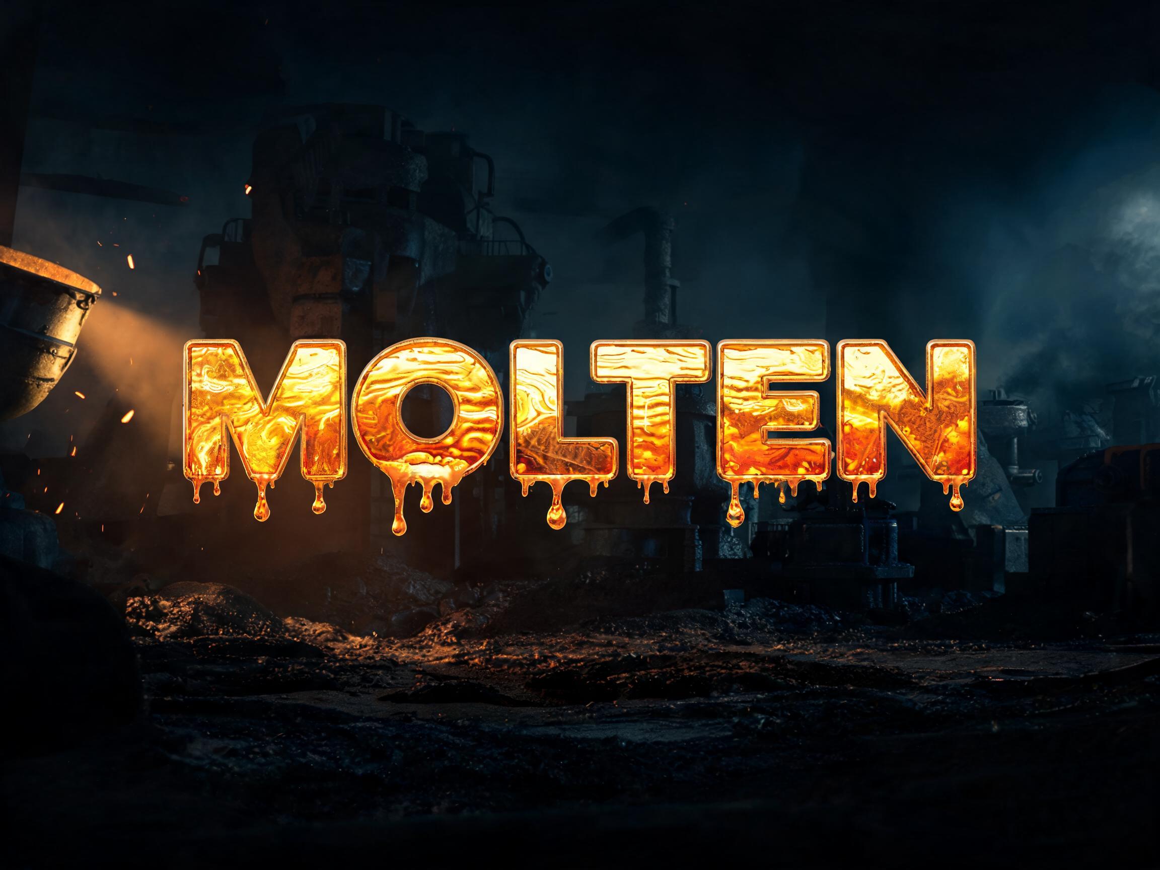
Every other gold style here is a photographed material — cast, mirrored, molten, foiled, stone. This one is deliberately graphic: perfectly flat colour, no texture, no reflections, no grain. It is the gold you would build in a vector editor, not photograph in a studio.
Can I download Gold Gradient?
There's no installable font file. You type your text and the generator builds the lettering fitted to your actual wording, then returns a high-resolution image you can download and use straight away.
Can I use it for commercial work?
Yes. Generated images can be used commercially, including team logos, jerseys, certificates, overlays and posters. No license or attribution required.
What fonts look similar?
For photoreal mirror-polished gold see Mirror Gold. For flat hot-stamped foil with real texture see Gold Foil Flat, and for solid cast gold see 3D Gold Luxury.