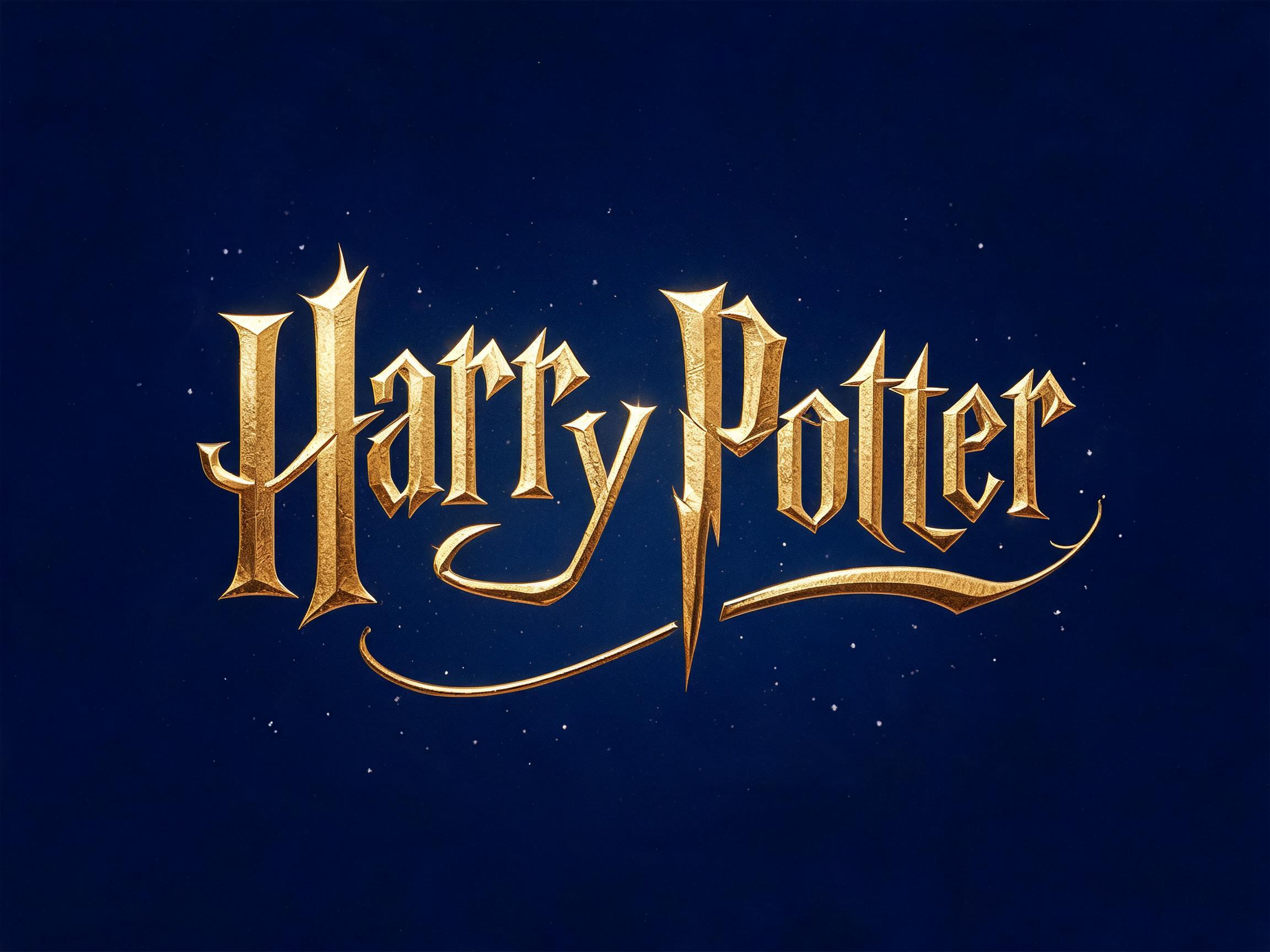
🧪 Design something with Harry Potter Style
Transparent Effect
✦ Transparent Effect
Generates a PNG with the background removed — only the text and its visual effects remain. The AI automatically selects the optimal background color for clean removal based on your style.
Output is always PNG for lossless transparency.


More fonts like Harry Potter Style


Looking for copy-paste fancy text? Try our free Font Generator Tools — cursive, gothic, bubble & 30+ styles.
About Harry Potter Style Font
Hand-lettered display letterforms in gold leaf: strokes that swell at the middle and close to a point, capitals that tower over the letters beside them, and a long swash sweeping back beneath each word.
Emotions
enchantedceremonialstorybookgrand
Best For
fantasy book titlefilm or series title cardmagic academy crest letteringspell name posterfantasy game logothemed party invitation
Vibes
calligraphicluxurymetalliccinematic
Visual Traits
hand-letteredtapered-strokespointed-terminalsbaseline-spikesextreme-contrastuneven-cap-heightunderswashgold-leaffine-grainsoft-bloom
FAQ
What is the Harry Potter Style font?
A hand-lettered display style finished in gold leaf. Every stroke is widest across its middle and narrows to a point at each end rather than stopping in a flat cut, and the capitals stand well above the letters beside them, so the top of a word steps up and down instead of running level. The last letter of a word carries a long stroke that sweeps back underneath the letters before it. The leaf surface holds a fine grain along each stroke, with a soft bloom sitting close around the letters.
Is this the official Harry Potter font?
No. The lettering in the Harry Potter books and films is a custom logotype drawn by hand for that title, and it is not sold or distributed as a font. This is an original AI lettering style in the same broad tradition — tapered strokes, pointed terminals and hand-drawn irregularity — generated fresh for whatever words you type.
What makes the letterforms distinctive?
Three things show up in every render. The contrast is extreme: where a wide stroke meets a narrow one, the narrow one thins to about the width of a drawn pen line. Terminals close to sharp points, and on letters built from diagonals those points can carry on below the line the other letters sit on. And the height varies letter to letter, so the word never reads as an even row.
What is it best used for?
Fantasy book titles, film and series title cards, magic academy crest lettering, spell name posters, fantasy game logos and themed party invitations. It is a display face — it is built for a few words at large size, not for body copy.
Can I change the colour?
Yes. Gold leaf on a dark ground is the default because that is where the grain and the bloom read best, but you can describe any finish you want in your prompt — silver, bronze, ink on parchment — and the letterform construction stays the same.
Which other fonts here are similar?
If you want the same old-world feeling with a more regular, manuscript-like structure, try Medieval Serif. For dense broken-pen blackletter, try Gothic Textura or Blackletter Gothic. For gold without the hand-drawn irregularity, try Black & Gold or Gold Filigree.