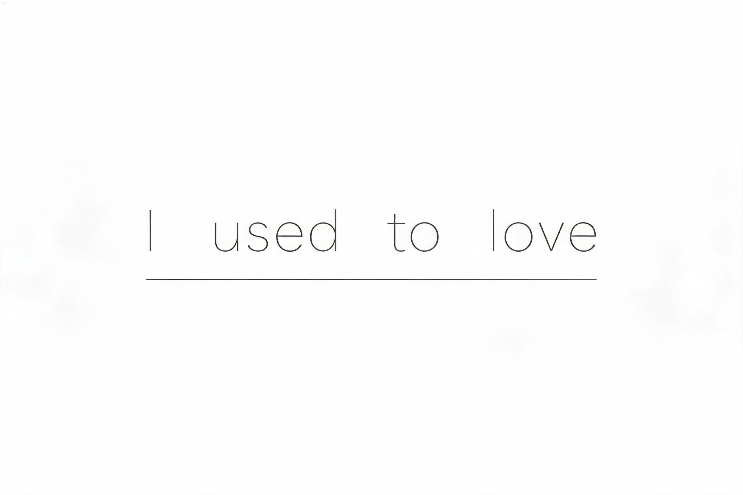
I used to love - ミニマル Text Effect


この作品と同じ BytePlus Seedream 5.0 を使用 · 15 クレジット












“I used to love” is a Minimal text effect FontVibe AIで作成した文字エフェクト. 字間をたっぷり取ったダークグレーの幾何学サンセリフに、下に一本の細い罫線。フラットでマット、ほぼ何もないオフホワイトの地に.
a clean, minimal, spacious piece — restrained and modern, defined by what is left out. SURFACE / STYLE: refined typography with generous letterspacing and abundant negative space, a flat matte finish and at most a single fine accent rule or hairline detail — no texture, no gloss, no ornament. SCENE ATMOSPHERE: a calm, bright, uncluttered setting — clean white or soft neutral ground, even diffuse light, architectural emptiness, the luxury of breathing room. PALETTE: a sophisticated monochrome — soft white, light warm grey, charcoal and black, with at most a single muted accent — quiet and tonal, never loud. LETTERFORM PRIORITY: when the chosen font carries its own treatment (clean geometric sans, neutral grotesque, condensed sans, zen minimal, fine monoline), that font's letterform takes priority and owns the letters; this style governs the generous spacing, the negative space, the matte monochrome finish and the calm bright scene. FALLBACK MATERIAL: if the font carries no material of its own, render the letters in a clean thin modern sans in soft charcoal on a bright white ground with wide letterspacing, abundant negative space and a single fine accent rule, so the minimal elegance always reads. A calm, uncluttered composition where 'I used to love' is set in soft charcoal letterforms with generous letterspacing against a clean, bright white ground. The phrase carries a quiet emotional weight — a faint warmth at its edges, offset by cool architectural emptiness around it. Abundant negative space breathes through every side, underscoring the sense of distance and restraint. Flat matte finish throughout, no gloss, no texture, no ornament. Even diffuse light falls uniformly across the surface, casting no shadow, no drama — only stillness. A single fine hairline rule, no heavier than 0.5pt, traces a delicate horizontal line as the sole graphic accent, its presence subtle enough to feel like punctuation rather than decoration. The palette is tonal and monochrome: near-white ground, light warm grey midtones, and a soft deep charcoal for the letterforms — with the faintest whisper of warm ivory suggesting something once held, now absent. Typography is wide-tracked, the words spaced to let silence sit between them. The composition has the spare quality of an editorial fashion caption or a minimalist gallery wall — words as objects in a white room, meaning carried as much by the surrounding emptiness as by the letters themselves.
2026年7月18日に生成 · 2496 × 1664 · JPEG · BytePlus Seedream 5.0 · 制作者がシェア · 商用利用無料(CC BY 4.0)


