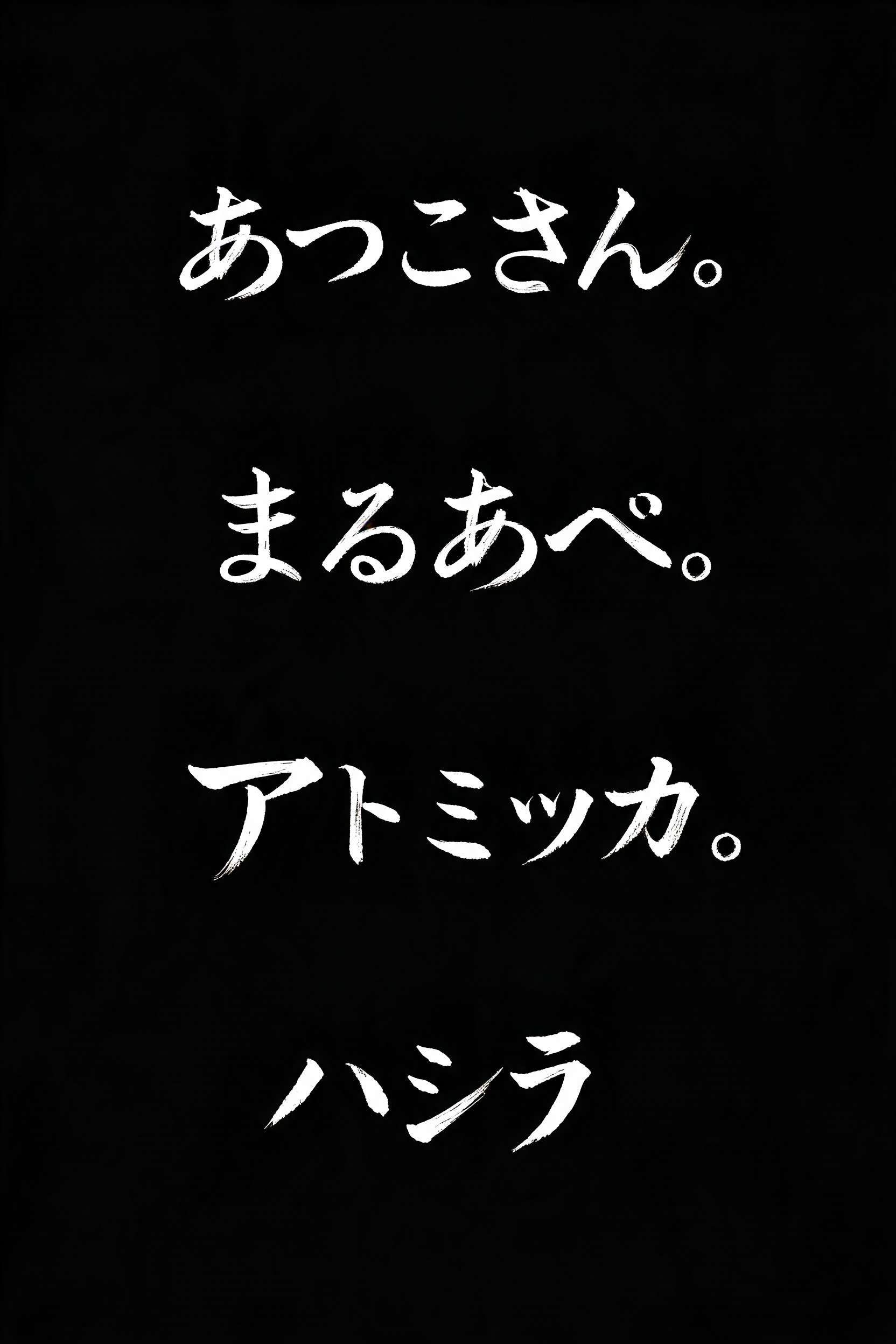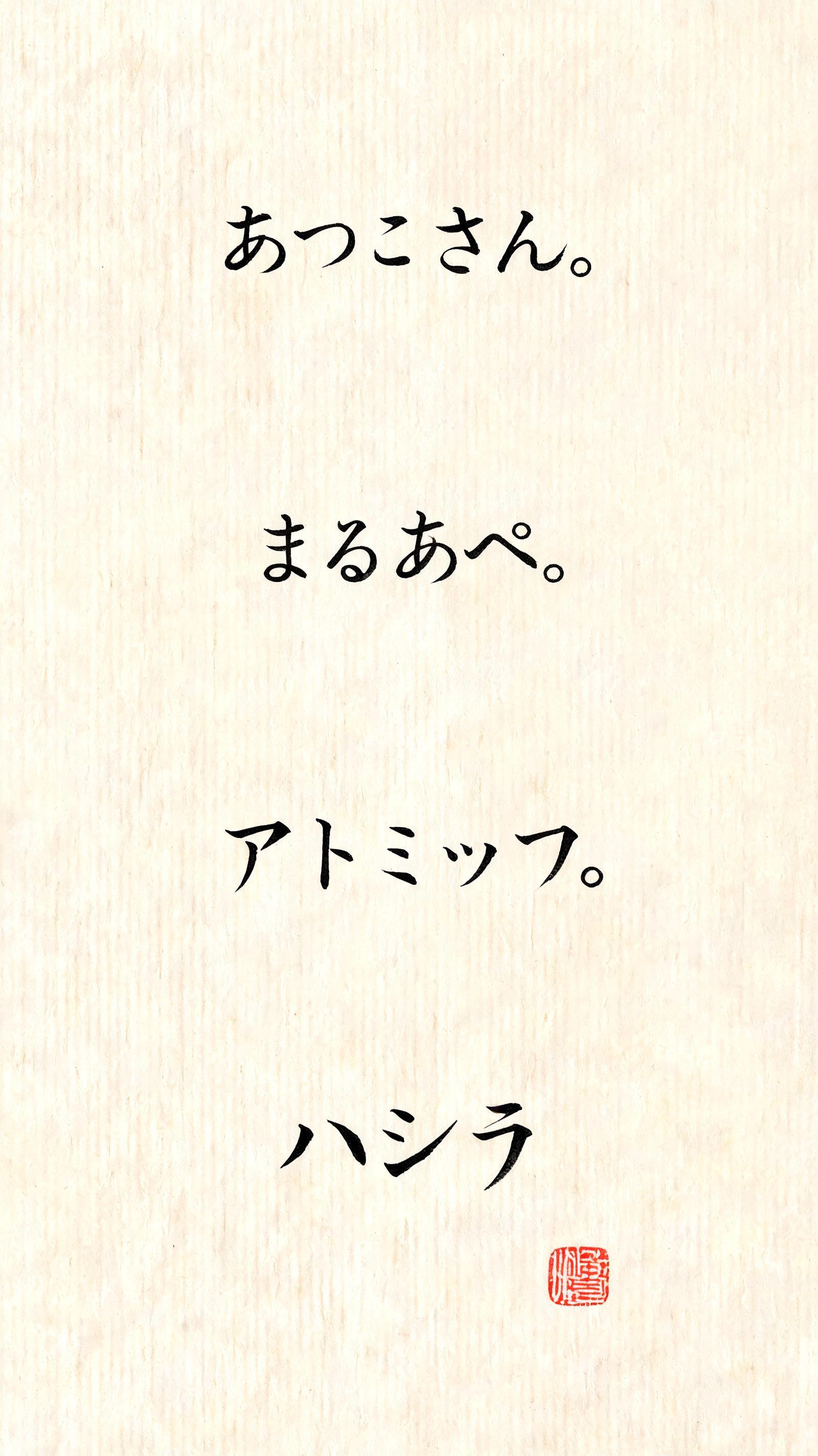
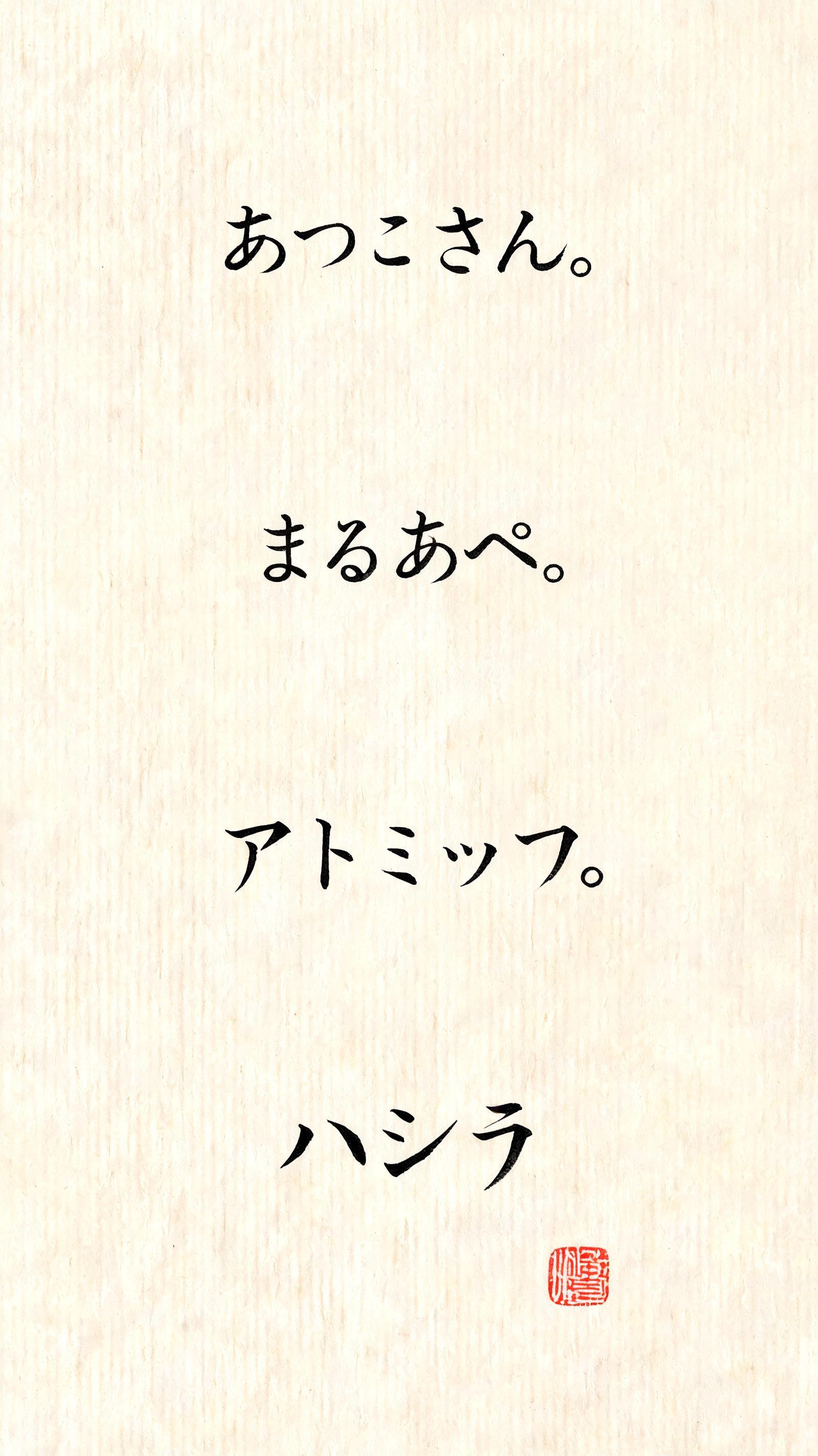
あつこさん。 まるあべ。 アトミック。 ハシラ - Japanische Tuschepinsel-Schrift Text Effect


Nutzt BytePlus Seedream 5.0, das Modell dieses Werks · 15 Credits











“あつこさん。 まるあべ。 アトミック。 ハシラ” is a Brush Japanese Ink text effect Texteffekt erstellt mit FontVibe KI. Japanischer Shodo-Tuschepinsel-Kalligrafiestil, angewendet auf lateinische Buchstaben. Tiefes Sumi-Schwarz mit authentischer Fude-Pinselenergie, kontrollierten Strichen in eine Richtung und Washi-Papier-Atmosphäre. Perfekt für das Branding japanischer Restaurants, Tattoo-Design, Anime, Kampfkunst und kulturelle Projekte.
Japanese ink brush aesthetic — the visual language of sumi calligraphy on washi paper. INK MEDIUM: sumi pigment in deep black to charcoal range — richest density at mark centers, naturally transitioning outward as ink supply depletes. Fully matte, absorbed into paper surface, producing a tonal range from dense opaque black to transparent grey depending on dilution and brush load. PAPER SURFACE: natural washi — warm cream-white base with visible paper fiber structure giving slight texture. The absorbent surface creates the characteristic soft border quality of East Asian brush work at all mark edges. LIGHT ATMOSPHERE: soft diffuse north-facing studio light — the traditional calligrapher's light source. Even, shadowless, allowing the full tonal range of ink marks to read clearly. Warm cream paper tone contrasts against deep sumi black. AESTHETIC REGISTER: the ma principle — the space between and around marks is as considered as the marks themselves. Compositions have breathing room and deliberate quietness. When no specific material is defined by the font: default environment — deep sumi black marks on warm cream washi paper, soft diffuse overhead light, meditative studio atmosphere. Four distinct Japanese phrases rendered as a meditative sequence in sumi calligraphy on aged washi paper — あつこさん、まるあべ、アトミック、ハシラ — each phrase carrying its own brushwork character and tonal personality. Warm cream washi ground with visible longitudinal paper fibers running beneath the ink. Each phrase treated as an individual breath: あつこさん in fluid hiragana cursive flow, ink supply generous at entry strokes and thinning into the trailing honorific さん with a soft lift; まるあべ with round compact strokes, ink pooling slightly at curve apexes giving a plush density; アトミック in katakana angularity, entry strikes sharp and decisive with geometric cross-strokes thinning toward their ends; ハシラ bold and architectural, vertical pillar strokes dominant and near-black, horizontal connectors pulling thin. Sumi ink ranges from dense opaque charcoal at stroke centers to translucent mid-gray at peripheries. Controlled micro-bleed along paper fibers at all mark edges — the characteristic soft border of absorbed sumi. A single weathered vermilion hanko seal placed quietly near the composition's lower region. Soft diffuse north-facing studio light bathes the piece evenly — no cast shadows, the full tonal spectrum of ink legible against the warm cream ground. Ma principle: generous negative breathing space surrounds each phrase cluster, the silence between marks as weighted as the marks themselves.
Generiert am 25. Juli 2026 · 1600 × 2848 · JPEG · BytePlus Seedream 5.0 · Von der erstellenden Person geteilt · Kostenlos kommerziell nutzbar (CC BY 4.0)