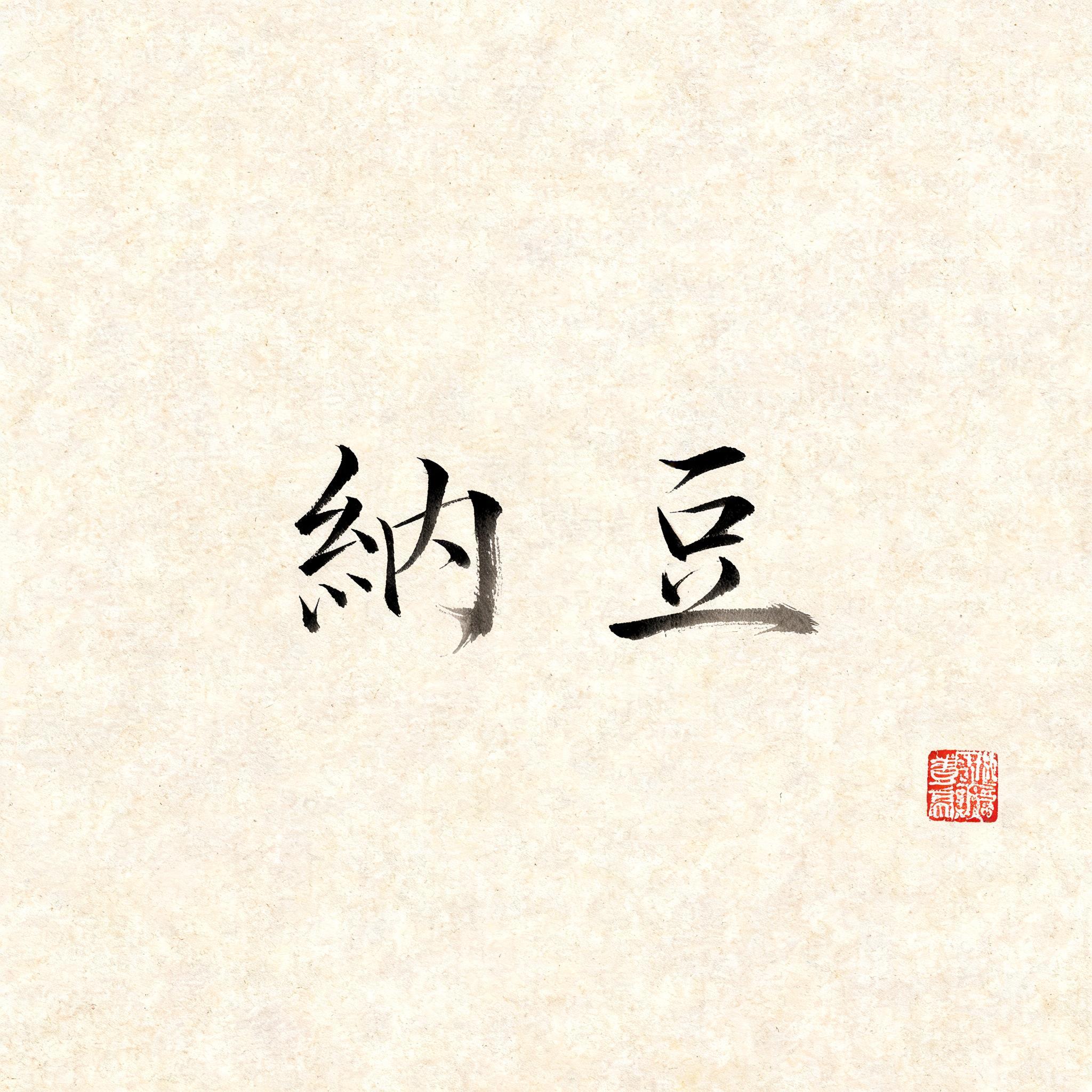
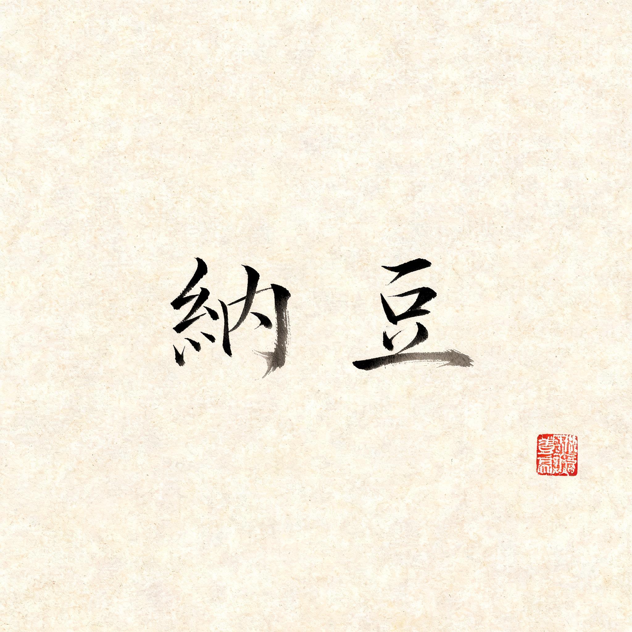
纳豆 - Pincel de Tinta Japonés Text Effect


Usa BytePlus Seedream 5.0, el modelo de esta obra · 15 créditos











“纳豆” is a Brush Japanese Ink text effect efecto de texto creado con FontVibe IA. El estilo de caligrafía con pincel de tinta del shodo japonés llevado a las letras latinas. Tinta sumi negra y profunda con la energía auténtica del pincel fude, trazos controlados en una sola dirección y atmósfera de papel washi. Perfecto para marcas de restaurantes japoneses, diseño de tatuajes, anime, artes marciales y proyectos culturales.
Japanese ink brush aesthetic — the visual language of sumi calligraphy on washi paper. INK MEDIUM: sumi pigment in deep black to charcoal range — richest density at mark centers, naturally transitioning outward as ink supply depletes. Fully matte, absorbed into paper surface, producing a tonal range from dense opaque black to transparent grey depending on dilution and brush load. PAPER SURFACE: natural washi — warm cream-white base with visible paper fiber structure giving slight texture. The absorbent surface creates the characteristic soft border quality of East Asian brush work at all mark edges. LIGHT ATMOSPHERE: soft diffuse north-facing studio light — the traditional calligrapher's light source. Even, shadowless, allowing the full tonal range of ink marks to read clearly. Warm cream paper tone contrasts against deep sumi black. AESTHETIC REGISTER: the ma principle — the space between and around marks is as considered as the marks themselves. Compositions have breathing room and deliberate quietness. When no specific material is defined by the font: default environment — deep sumi black marks on warm cream washi paper, soft diffuse overhead light, meditative studio atmosphere. Two characters 纳豆 rendered in sumi ink on warm cream washi paper with visible cellulose fiber texture beneath the marks. Brush entry strokes carry maximum ink load — dense near-black pigment fully absorbed into the paper surface, producing a slightly bloomed edge where fibers draw the ink outward. As the brush lifts and pulls away, pigment depletes naturally, transitioning through charcoal mid-gray to a near-transparent whisper at stroke tails. The square radical components of 纳 hold structural weight while the simplified geometry of 豆 anchors the composition with a broad horizontal base stroke sweeping in one decisive gesture, ink thinning perceptibly toward the right terminus. Soft diffuse north-facing studio light illuminates the paper evenly — no cast shadows, allowing the full tonal range from dense opaque black to dilute transparent gray to read with clarity against the warm cream ground. Deliberate negative space breathes around each character, honoring the ma principle. A single small vermilion hanko seal pressed lightly nearby, its ink slightly dry and textured, provides the only chromatic accent against the monochromatic sumi palette. No decorative embellishment beyond the brushwork itself.
Generada el 26 de julio de 2026 · 2048 × 2048 · JPEG · BytePlus Seedream 5.0 · Compartida por el creador · Uso comercial gratuito (CC BY 4.0)


