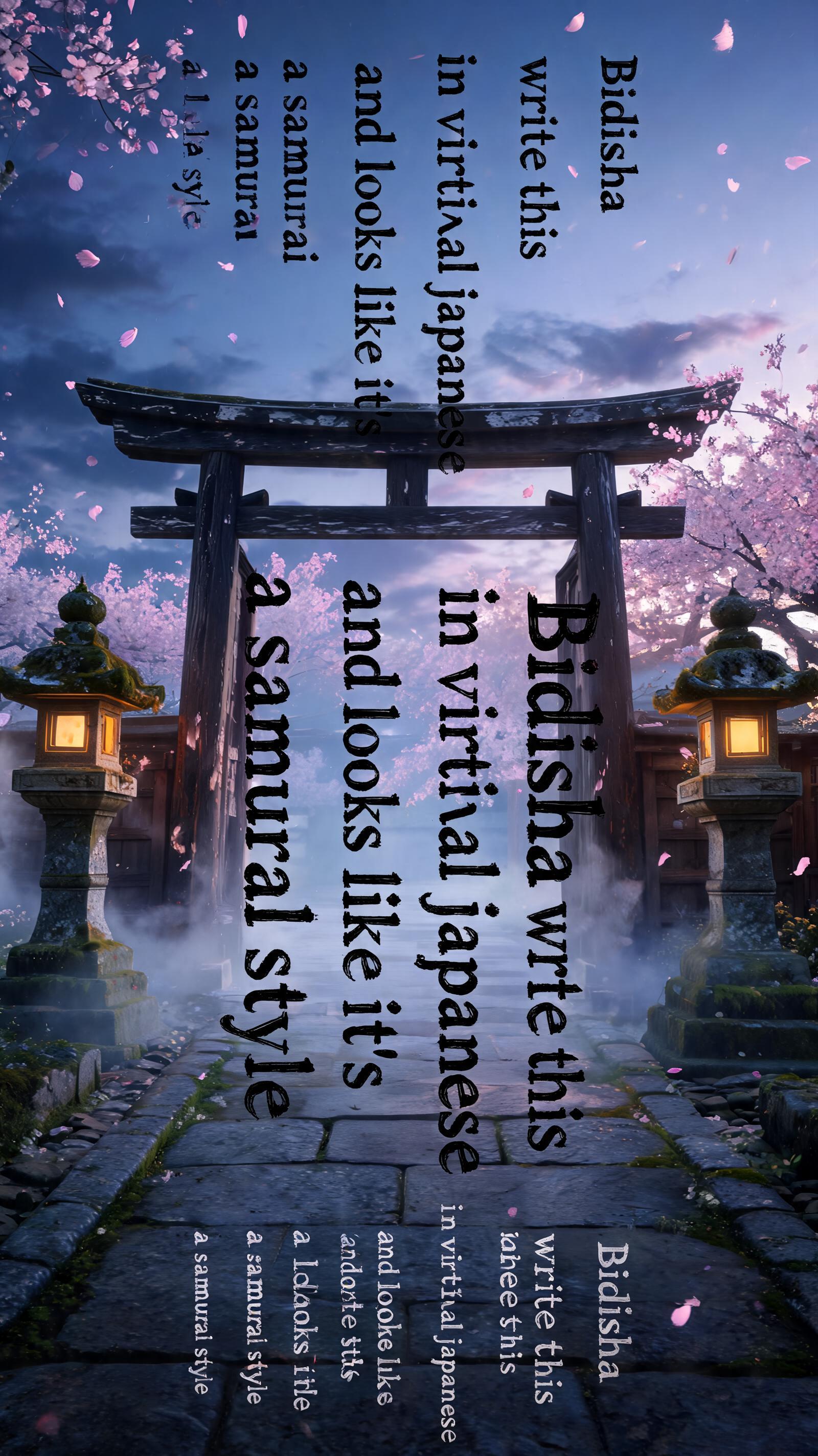
Bidisha write this in vertical japanese and looks like it's a samurai style - Japanische Tuschepinsel-Schrift Text Effect


Nutzt BytePlus Seedream 5.0, das Modell dieses Werks · 15 Credits











“Bidisha write this in vertical japanese and looks like it's a samurai style” is a Brush Japanese Ink text effect Texteffekt erstellt mit FontVibe KI. Japanischer Shodo-Tuschepinsel-Kalligrafiestil, angewendet auf lateinische Buchstaben. Tiefes Sumi-Schwarz mit authentischer Fude-Pinselenergie, kontrollierten Strichen in eine Richtung und Washi-Papier-Atmosphäre. Perfekt für das Branding japanischer Restaurants, Tattoo-Design, Anime, Kampfkunst und kulturelle Projekte.
Rendered in Japanese ink brush style channeling samurai warrior energy. Letterforms executed with sword-like precision and decisive force — each stroke purposeful, controlled, final. Deep sumi black ink, maximum pressure on key strokes creating bold intense marks. Brush endings sharp and clean like a blade edge. Washi paper background slightly aged or textured. The aesthetic: the discipline of the bushido code expressed through calligraphy. Powerful, uncompromising, carrying the weight of warrior tradition. Ancient Japanese temple gate at dusk — weathered dark timber pillars, stone lanterns flanking the path, cherry blossom petals drifting in slow motion. Deep indigo sky at the transition between day and night, warm amber lantern light from below contrasting with cool dusk. Brushed stone ground with moss at the edges, mist curling at the base of the pillars. Top tier: "Bidisha write this in vertical japanese and looks like it's a samurai style" — tiny refined ink caps at 40% canvas width, upper-center, delicate presence. Middle tier: "Bidisha write this in vertical japanese and looks like it's a samurai style" — massive dominant sumi ink brush letters stacked in vertical columns reading top-to-bottom, right-to-left at 65% canvas width, centered, commanding — each stroke powerful and decisive, thick pressure at entry tapering to sharp exit, arranged as three vertical columns: column one "Bidisha" / column two "write this" / column three "in vertical japanese" / column four "and looks like it's" / column five "a samurai style" — the vertical columns unified as a single centered composition. Bottom tier: "Bidisha write this in vertical japanese and looks like it's a samurai style" — small caps at 30% canvas width, below the main title, balanced weight. Vertical spacing ratio approximately 1:5:1.5. The composition reads as a cinematic Japanese film title card — austere, honorable, timeless.
Gemacht für Samurai-Schrift
Generiert am 2. August 2026 · 1600 × 2848 · JPEG · BytePlus Seedream 5.0 · Von der erstellenden Person geteilt · Kostenlos kommerziell nutzbar (CC BY 4.0)


