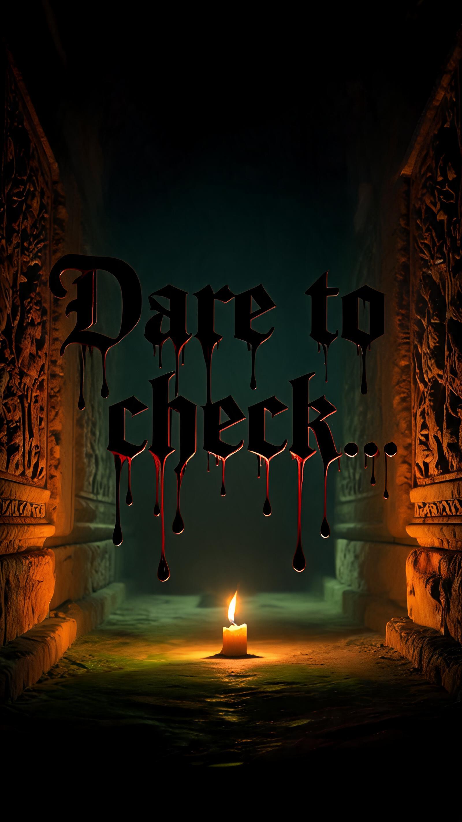
"Dare to check... - Horror Text Effect

Consumer Halloween horror typography. Graphic, bold, and immediately readable as "spooky" -- the visual language of seas...


“"Dare to check...” is a Horror text effect text effect created with FontVibe AI. Halloween spooky horror, dripping blood effect, eerie dark atmosphere. Consumer Halloween horror typography. Graphic, bold, and immediately readable as "spooky" -- the visual language of seasonal design: T-shirts, party invites, phone cases, social media posts. HALLOWEEN HORROR RULES (apply to every shot): - Underlighting by default. Warm amber-orange key from directly below, deep shadow filling the upper two-thirds. Candle-beneath-the-face. - Extreme contrast, no mid-tones. Lit surfaces near-maximum brightness, shadow zones near-black. Nothing gradual, nothing soft. - Background always dark. Near-black with warm amber or sickly yellow-green secondary fill at very low opacity. No neutral grays. - Color regime: blood is deep candy-red to dark crimson; fire is amber-orange with bright core; decay is dark brown, rust, mold green. - Graphic and immediate. If the effect reads clearly on a printed T-shirt or party poster, it is correct. FORBIDDEN: cinematic framing rules, single-light psychological analysis, desaturated fog atmospherics, flat studio lighting. When no specific material is defined by the font: default lighting environment -- warm amber-orange underlighting from directly below, deep shadow above, near-black background with sickly yellow-green secondary fill at 8% opacity at ground level. A limestone crypt corridor, narrow stone archway receding into absolute black. Single candle flame positioned at floor level, directly below frame center, casting warm amber-orange underlighting upward — maximum brightness on lower surfaces, deep shadow consuming the upper two-thirds entirely. Near-black background with sickly yellow-green secondary fill bleeding at ground level at 8% opacity. Carved stone walls flanking both sides, surface texture catching amber light on sharp edges, falling immediately to blackness in the recesses. '"Dare to check..."' rendered as the dominant text element, the quotation marks treated as typographic horns — slightly oversized relative to the letterforms, catching the upward candlelight on their curved tops while their undersides burn amber-gold. The ellipsis at the tail trails into shadow, each dot progressively darker, the final dot disappearing entirely into the near-black void. Extreme contrast — no gradients, no soft transitions, lit surfaces near-maximum brightness, shadow zones absolute. The open quotation mark and close quotation mark frame the phrase with an implicit threat, as if something spoken by something unseen. Graphic weight and immediate legibility. Halloween party poster ready. Warm amber key from below, cold void above.
Generated on Aug 2 · 1600 × 2848 · JPG · Shared by the creator


