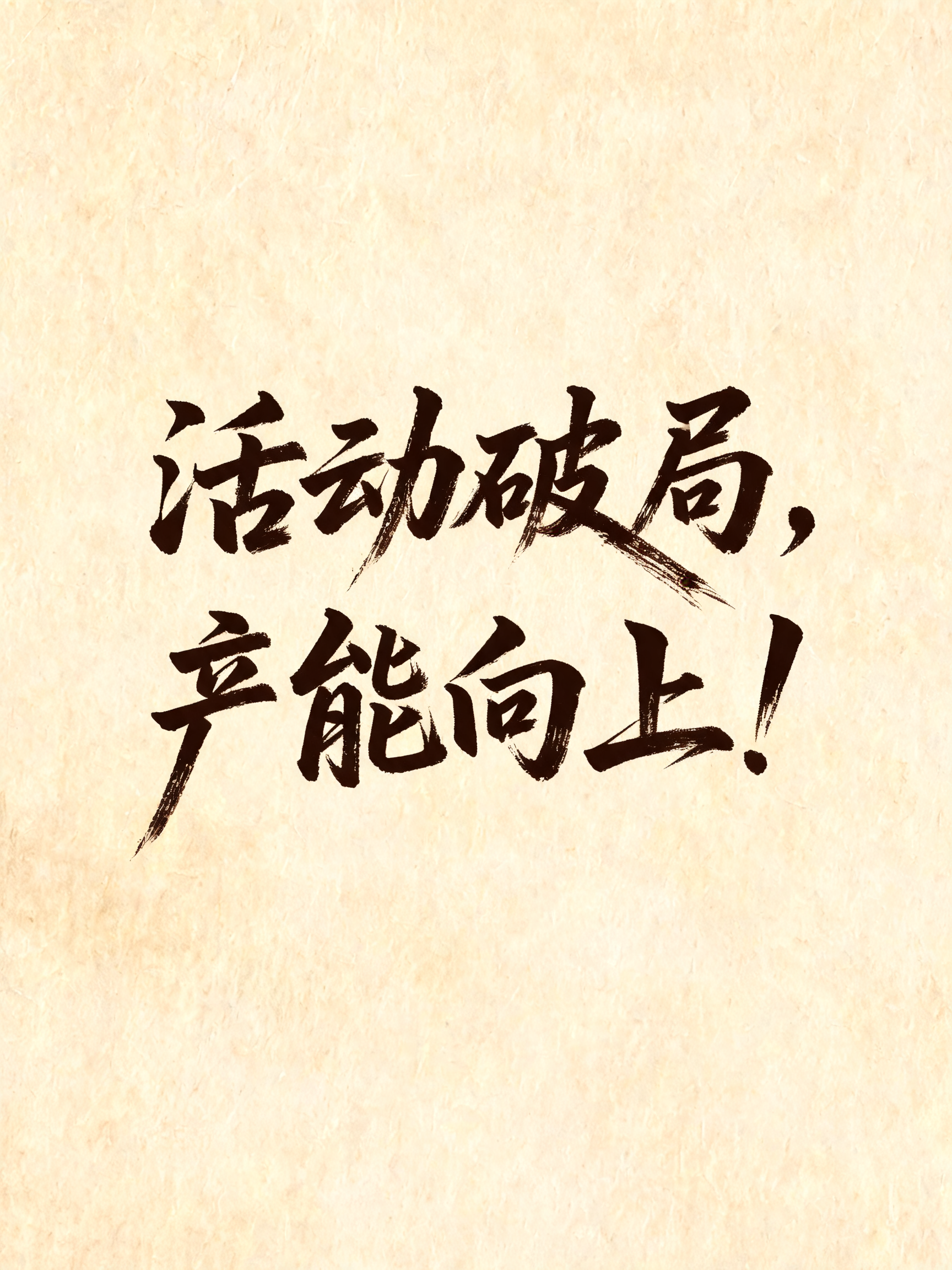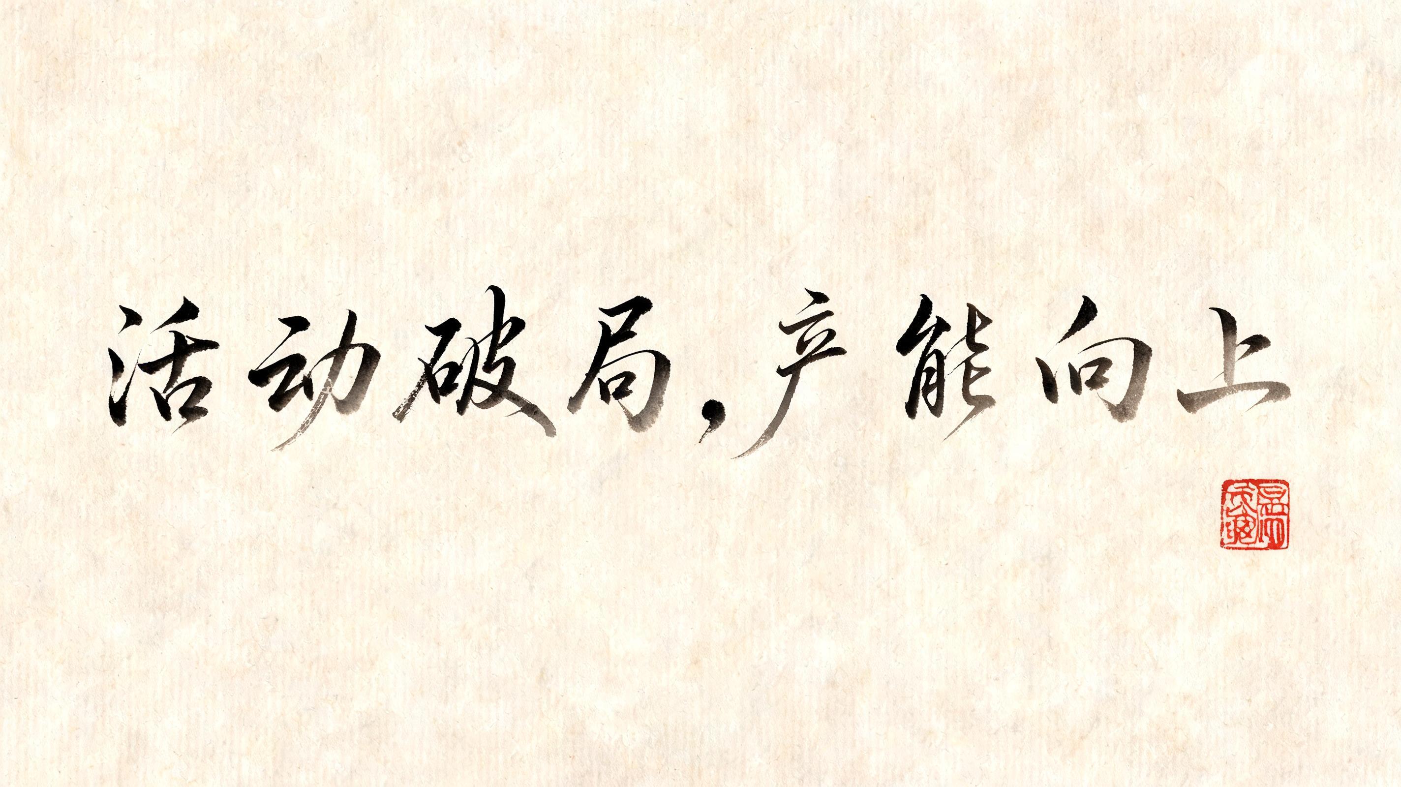
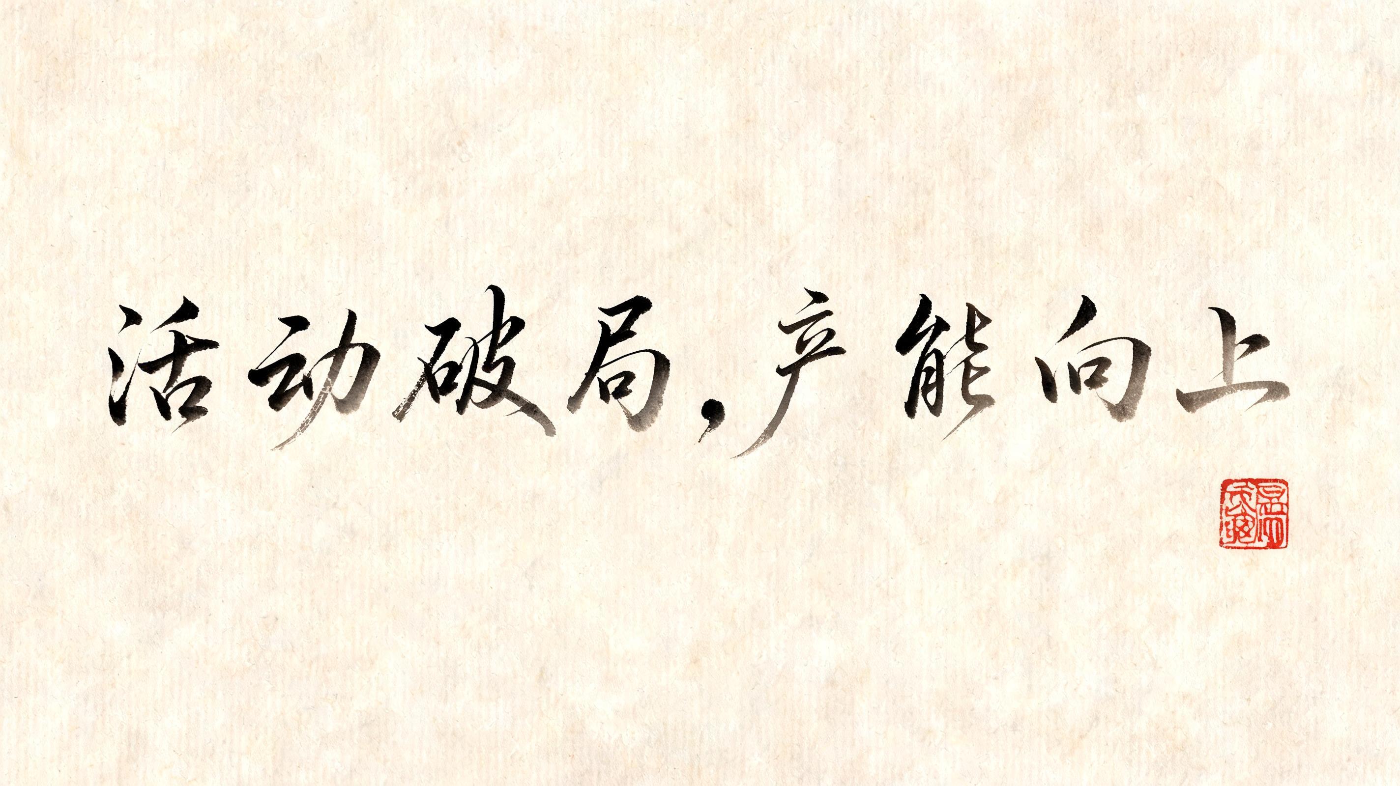
活 动 破 局 , 产 能 向 上 - Chinesischer Tuschepinsel Text Effect


Nutzt BytePlus Seedream 5.0, das Modell dieses Werks · 15 Credits
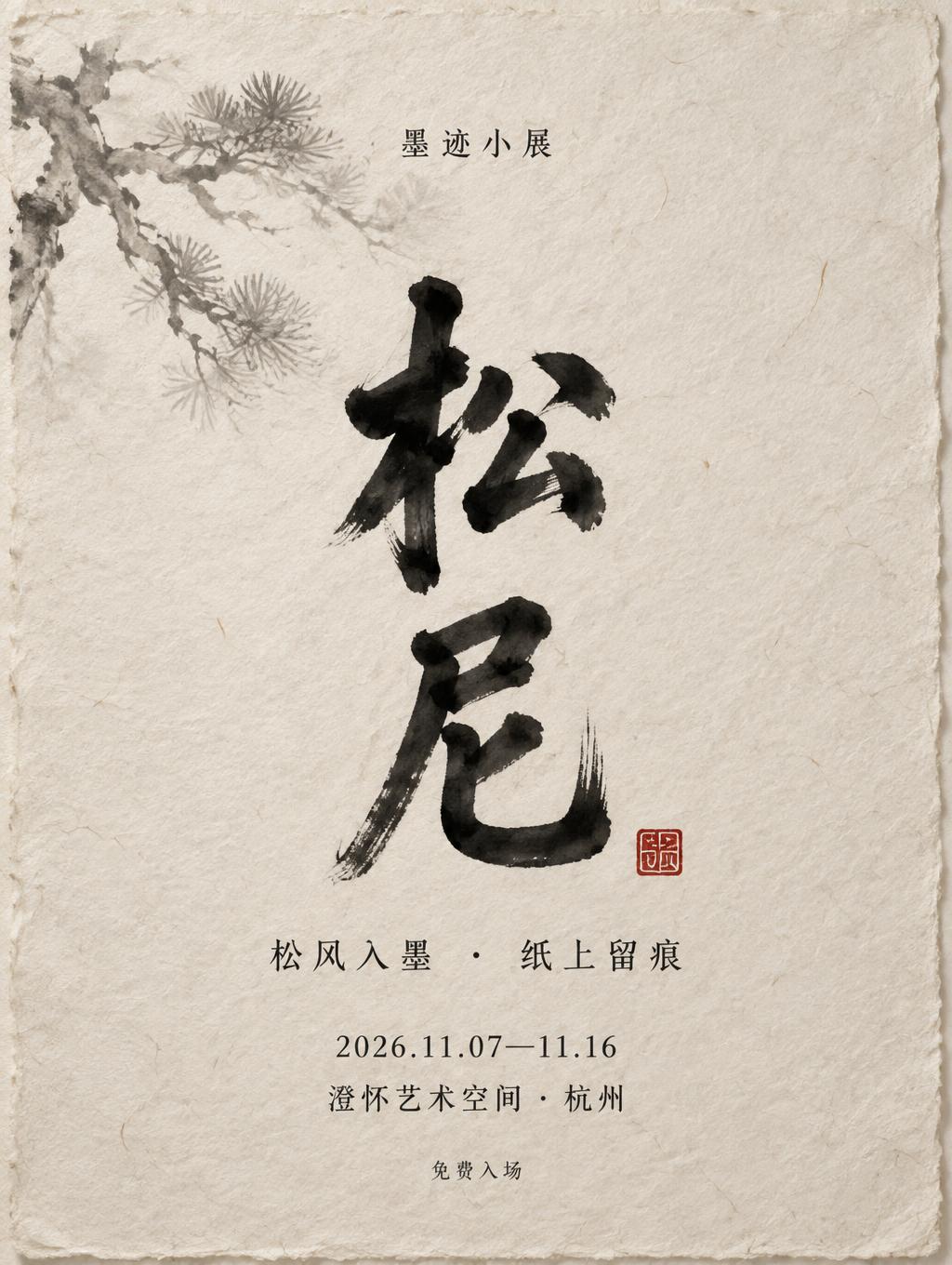
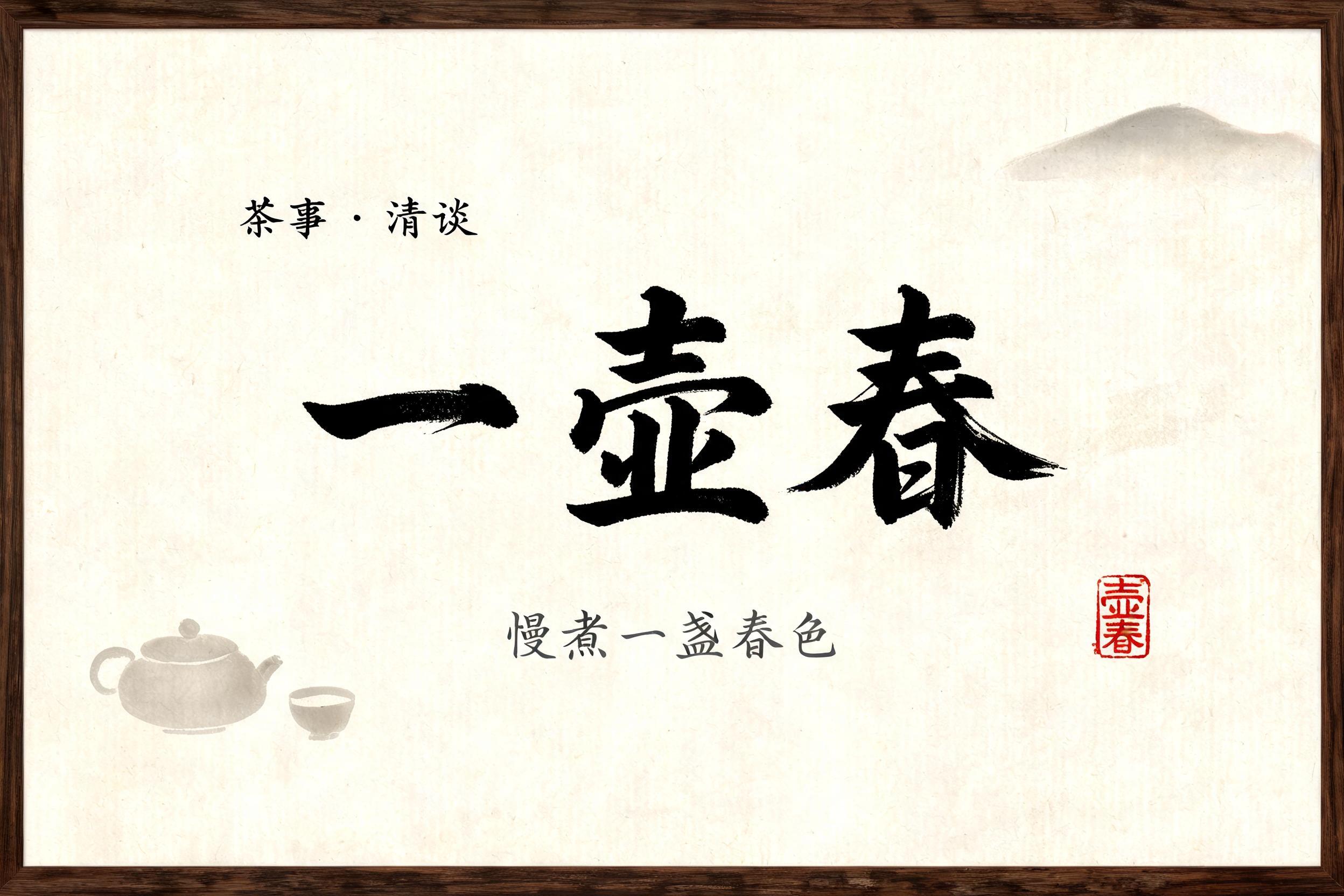


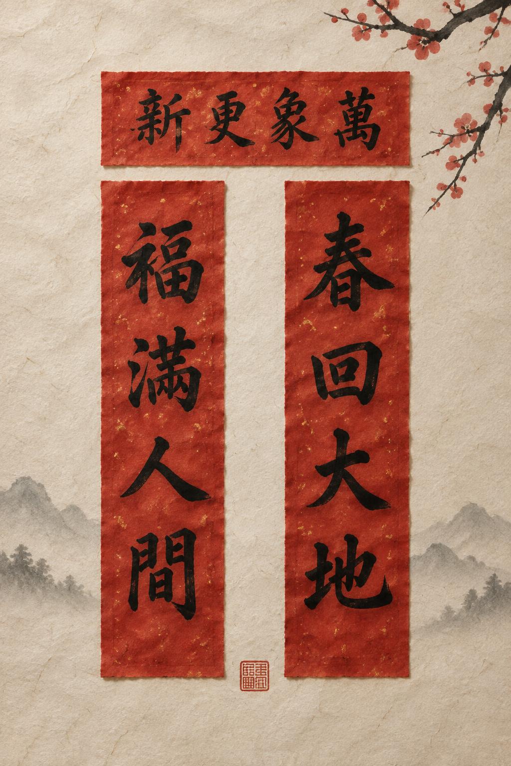
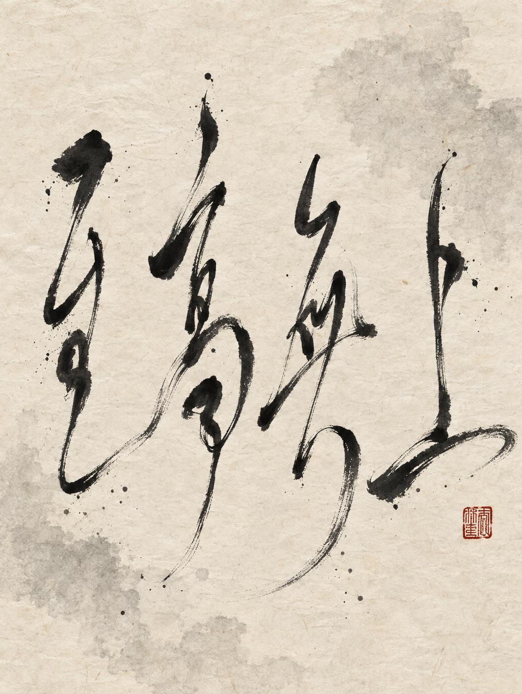

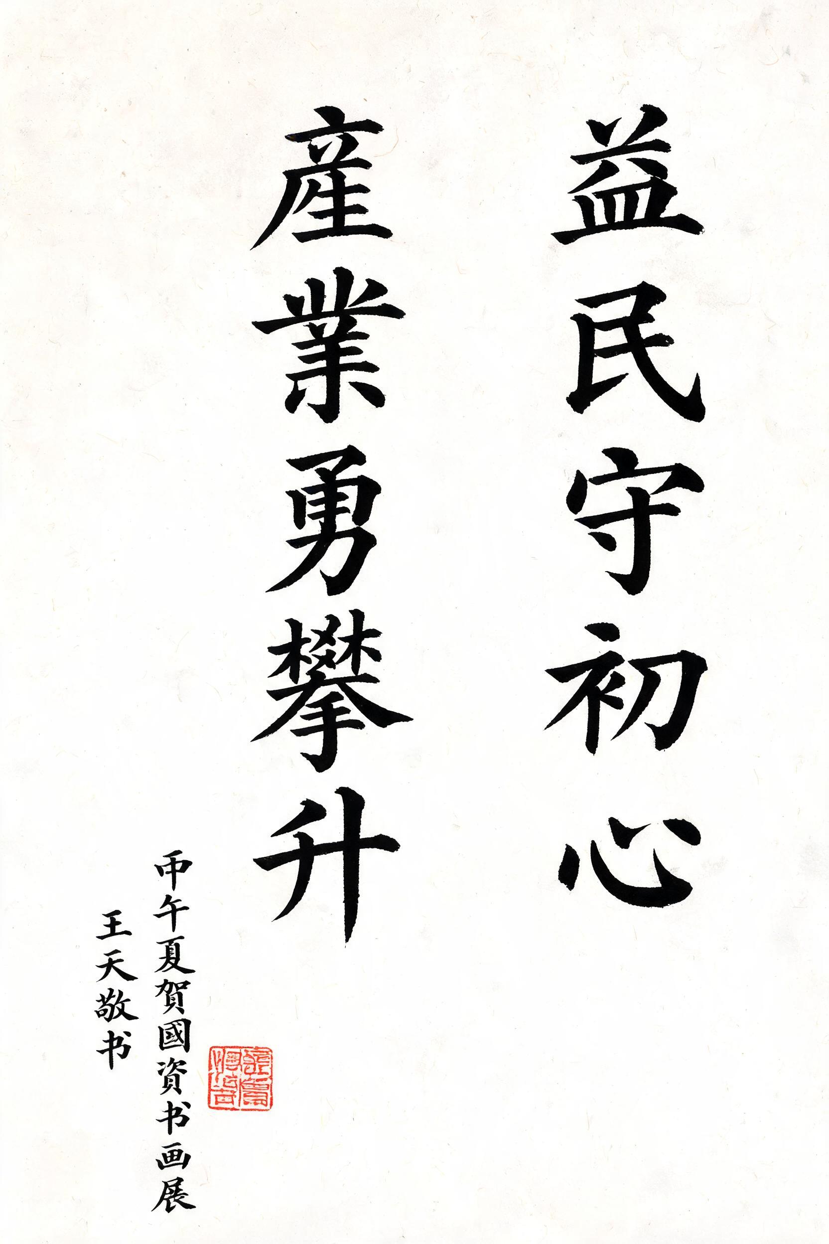

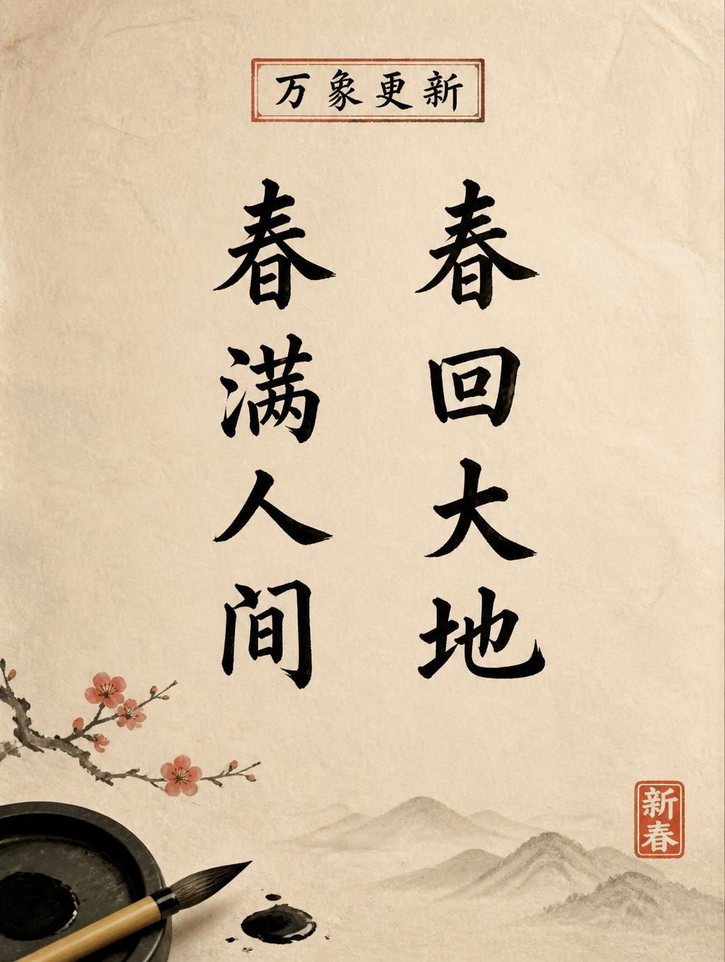
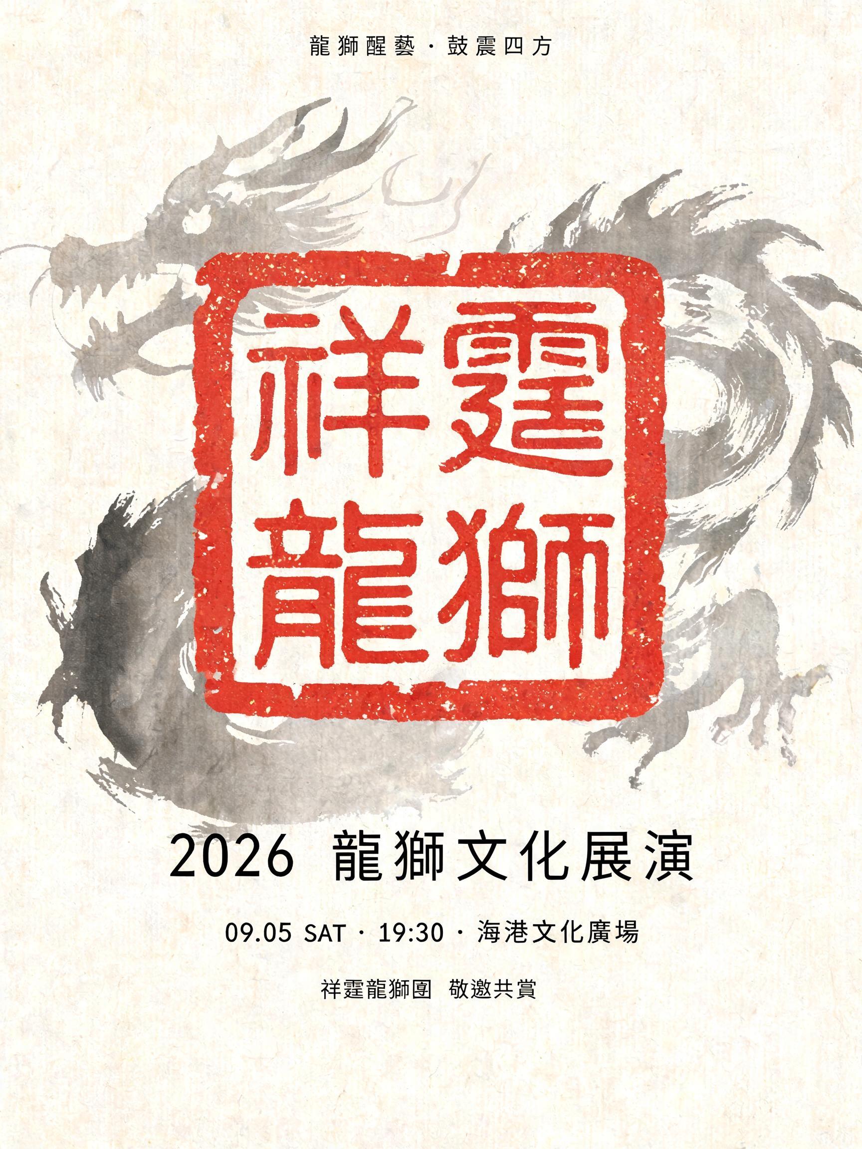


“活 动 破 局 , 产 能 向 上” is a Brush Chinese Ink text effect Texteffekt erstellt mit FontVibe KI. Chinesische Sumi-Tuschekalligrafie im Pinselstil, übertragen auf lateinische Buchstaben. Tiefschwarze Tusche mit authentischer Borstentextur, von dick zu dünn variierenden Strichen und Reispapier-Atmosphäre. Perfekt für das Branding chinesischer Restaurants, Kampfkunst, Wellness und kulturelles Design.
rendered in Chinese ink brush calligraphy style. Letterforms painted with a fully loaded sumi ink brush — deep black ink, visible bristle marks along stroke edges, wet ink pooling at stroke starts, feathered dry-brush trailing ends. Authentic ink density variation: thick rich black cores fading to grey at thin passages. Rice paper texture visible behind. Traditional Chinese calligraphy energy — each stroke confident, intentional, irreversible. LETTERFORM PRIORITY: when the chosen font carries its own treatment, that font's letterform shapes take priority and own the letters; this style governs the sumi ink medium, the bristle and ink-density behavior and the rice-paper ground. FALLBACK MATERIAL: if the font carries no material of its own, render the letters as deep black sumi brush strokes with visible bristle marks, wet ink pooling at stroke starts and feathered dry-brush trails on rice paper. COLOR PRIORITY: keep the font's own colors if specified; otherwise rich black ink fading to grey at thin passages. Eight characters 活动破局,产能向上 rendered across the composition with commanding presence, each character expressing the physical momentum encoded in its meaning — 活 (vitality) with wet ink pooling and energetic bristle flare, 破 (break through) with a forceful split-stroke where dry brush tears apart, 局 (situation) tight and dense, 向上 (upward) with ascending stroke energy that trails into feathered lightness at the tip. Aged xuan paper ground, warm ivory with subtle fiber grain visible beneath translucent passages. Ink density swings dramatically across each character: thick saturated black cores at stroke entry points, ink load visibly depleting into silver-grey dry-brush trails at stroke exits. Individual bristle separations caught mid-stroke on the horizontal sweeps. Micro ink-bleed halos seep into paper fibers at the heaviest black areas, softening the boundary between ink and ground. A diluted ink-wash shadow — near-transparent grey — breathes behind the character cluster, adding atmospheric depth without competing with the letterforms. Comma punctuation rendered as a small gestural flick, ink-loaded and spontaneous. Vermilion seal impression, square-carved, pressed with slight uneven ink distribution in the lower compositional area. High-contrast interplay of dense black and pale xuan paper creates luminous negative space between strokes. No digital-clean edges anywhere — every boundary is bristle, bleed, or fiber.
Generiert am 18. August 2026 · 2848 × 1600 · JPEG · BytePlus Seedream 5.0 · Von der erstellenden Person geteilt · Kostenlos kommerziell nutzbar (CC BY 4.0)