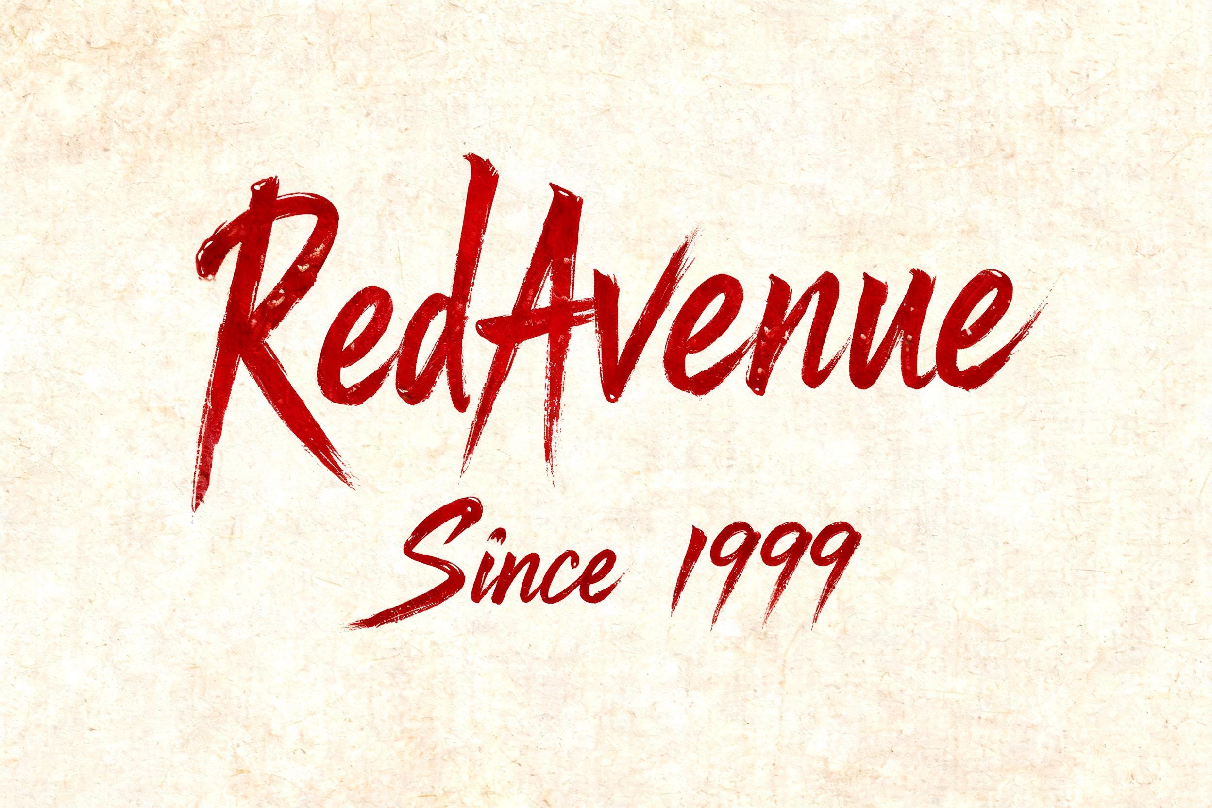
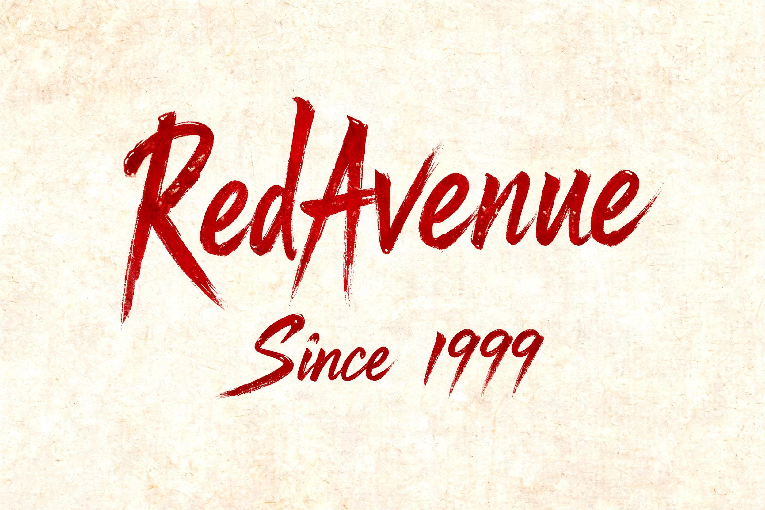
RedAvenue Since 1999 - Pinselschrift Text Effect


Nutzt BytePlus Seedream 5.0, das Modell dieses Werks · 15 Credits
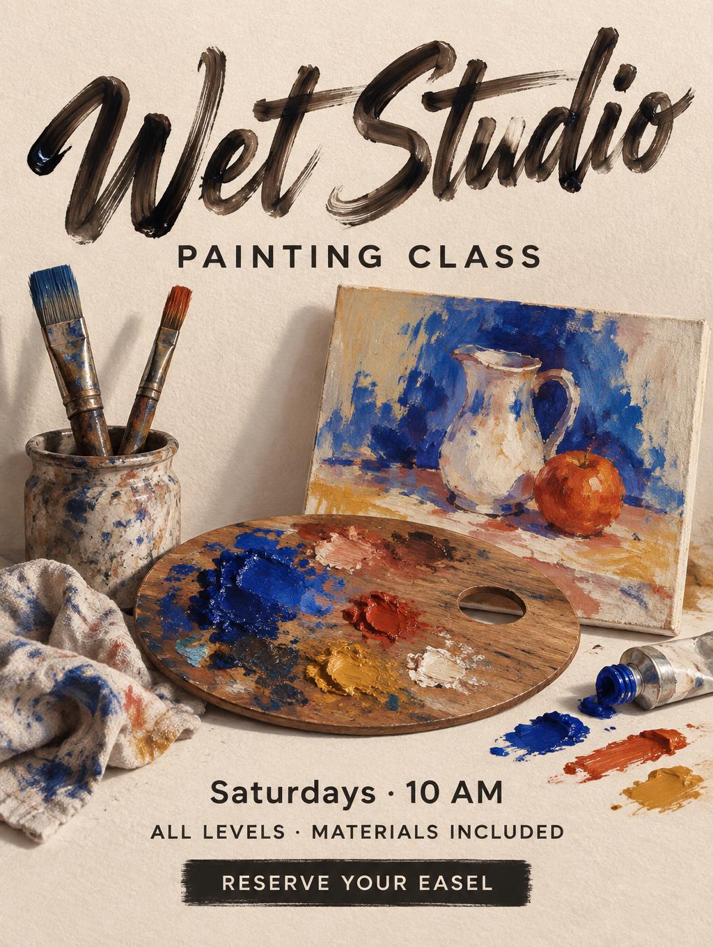
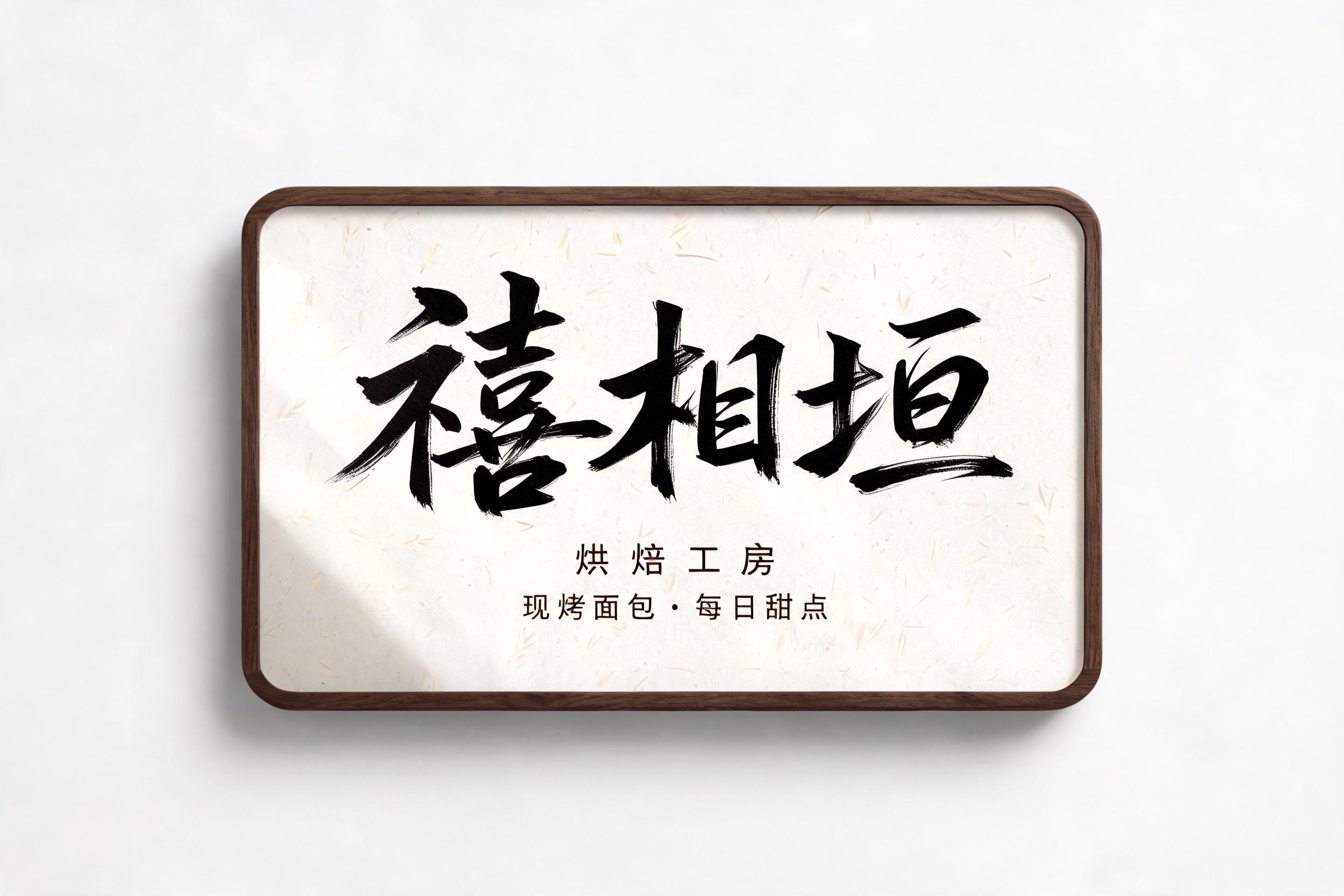
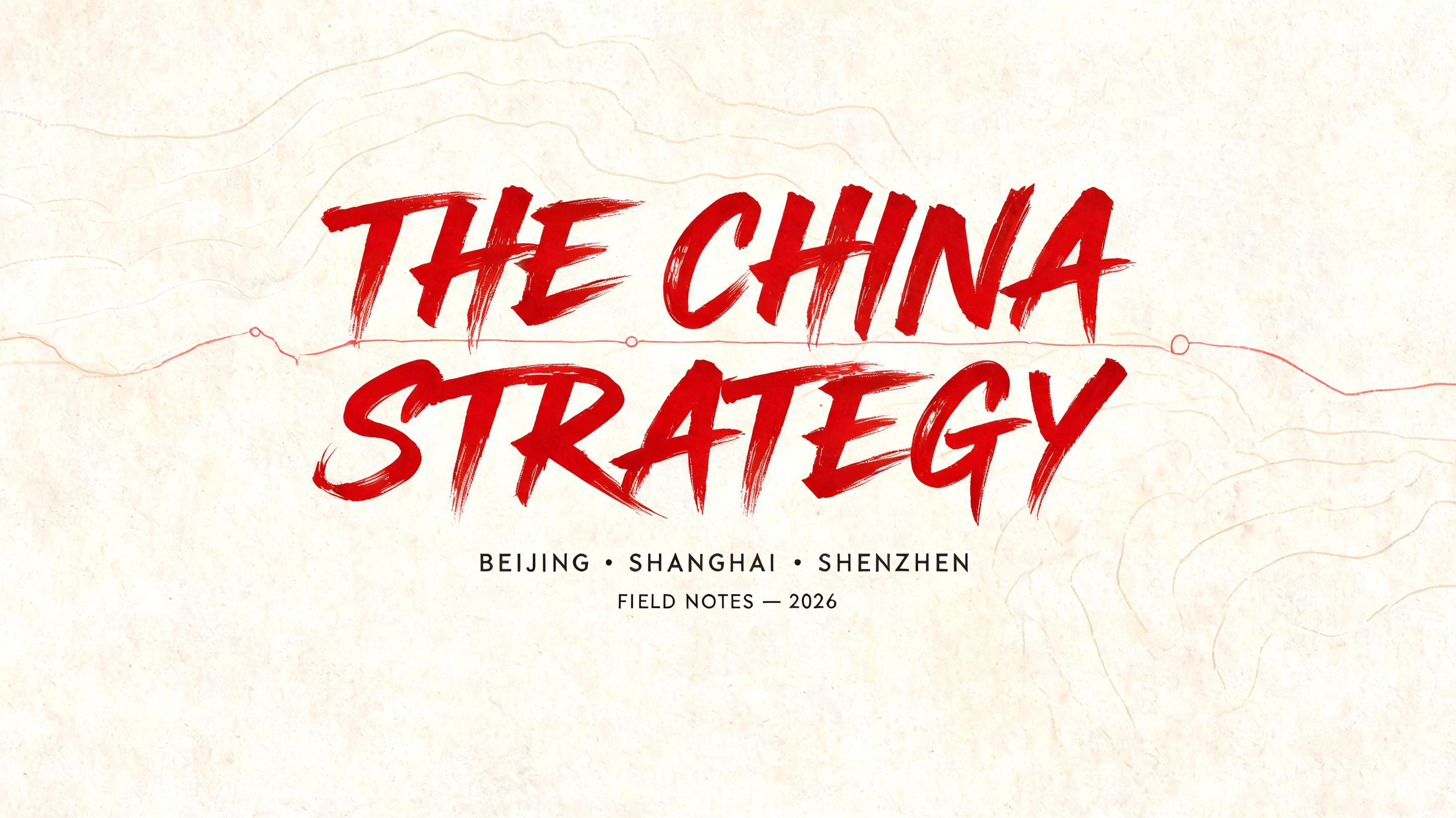
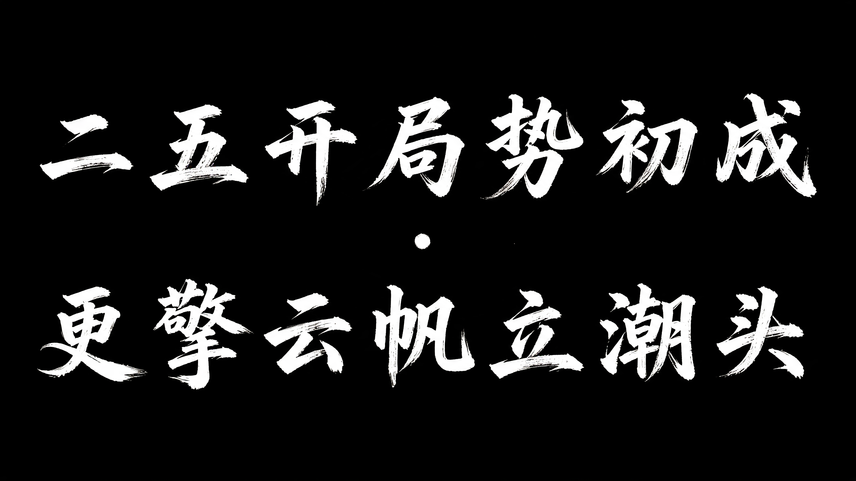



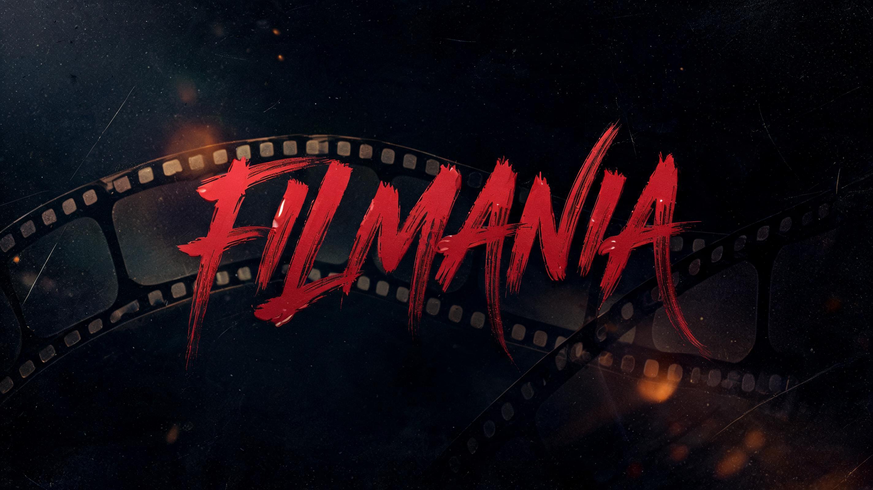


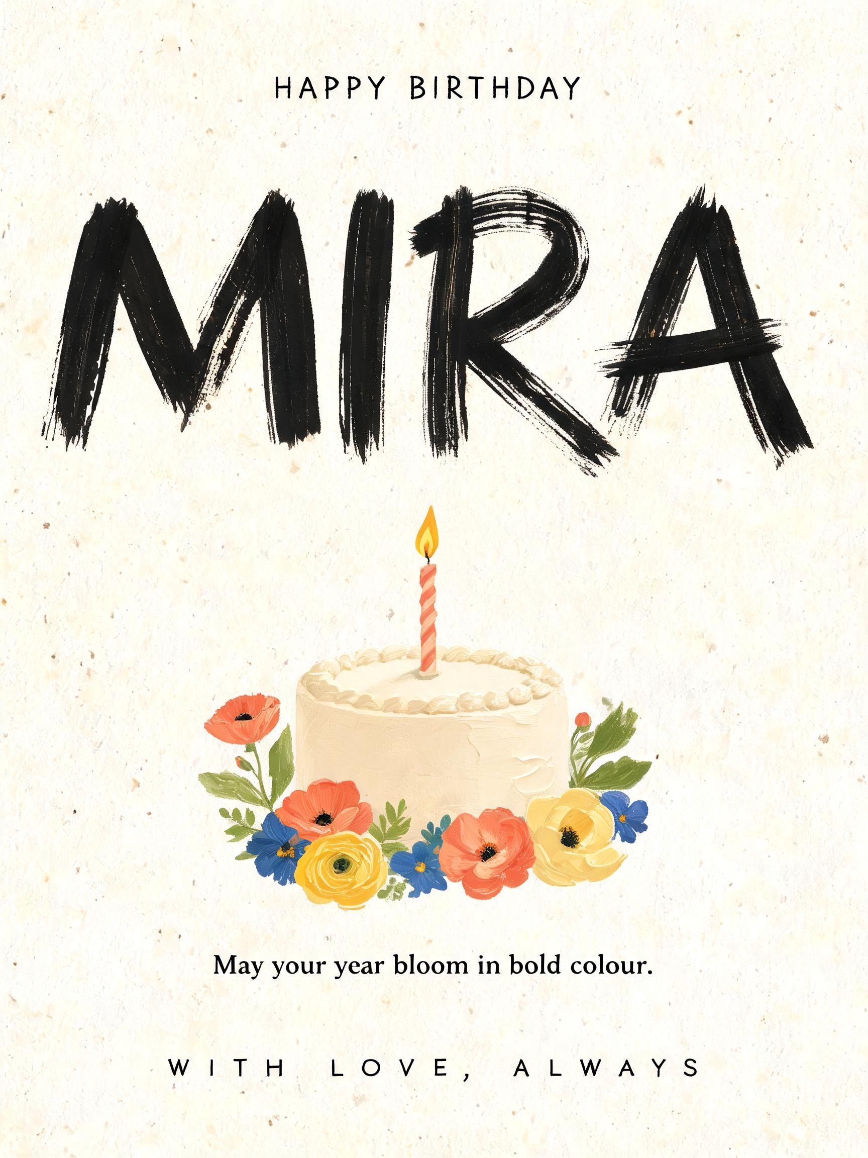


“RedAvenue Since 1999” is a Brush Stroke text effect Texteffekt erstellt mit FontVibe KI. Westliche Pinselschrift mit verbundenen Buchstaben: kräftige Abstriche durch Druck, haarfeine Aufstriche, sichtbare Borstenspuren und Trockenpinsel-Ausläufe in warmer schwarzer Tinte auf strukturiertem Papier.
rendered as expressive Western brush script lettering with fluid connected strokes. Visible bristle texture with authentic thick-to-thin pressure variation — thick downstrokes, thin upstrokes, just like a loaded calligraphy brush. Ink slightly wet and glistening. Natural ink pooling at stroke starts, feathered dry-brush ending trails. Warm off-black ink on visible surface texture. Hand-crafted artisan energy with real brush imperfection. LETTERFORM PRIORITY: when the chosen font carries its own treatment, that font's letterform shapes take priority and own the letters; this style governs the brush-script medium, the thick-to-thin pressure variation and the ink wetness. FALLBACK MATERIAL: if the font carries no material of its own, render the letters as fluid connected brush-script strokes with thick downstrokes, thin upstrokes, wet pooling at starts and feathered dry-brush trails in warm off-black ink. COLOR PRIORITY: keep the font's own colors if specified; otherwise warm off-black ink on a textured surface. RedAvenue in dominant hero lettering with bold expressive brush strokes, ink saturated in deep arterial crimson — a rich red with slight warmth and depth, not flat scarlet. Thick downstrokes swell with loaded-brush weight, upstrokes taper to hairline threads. Wet ink catches specular glints along the heaviest passages, pooling at entry points and stroke junctions. Bristle texture fans visibly at the terminals of sweeping tails. Below, Since 1999 rendered in a noticeably smaller weight — same wet brush medium, same crimson ink family but slightly cooler and denser, lending a secondary-tier gravitas. The two text units establish clear typographic hierarchy through dramatic size contrast and vertical spatial breath between them. Background is aged parchment-white with faint laid-paper fiber grain, giving the ink warmth and natural absorption bleed at feathered stroke ends. A shallow shadow blooms beneath the thickest strokes — soft, diffuse, not cast. The entire composition breathes with hand-crafted imperfection: no digital smoothness, no uniform weight, no mechanical symmetry. Ink is unambiguously fresh — glistening, alive, just set.
Generiert am 19. August 2026 · 2496 × 1664 · JPEG · BytePlus Seedream 5.0 · Von der erstellenden Person geteilt · Kostenlos kommerziell nutzbar (CC BY 4.0)