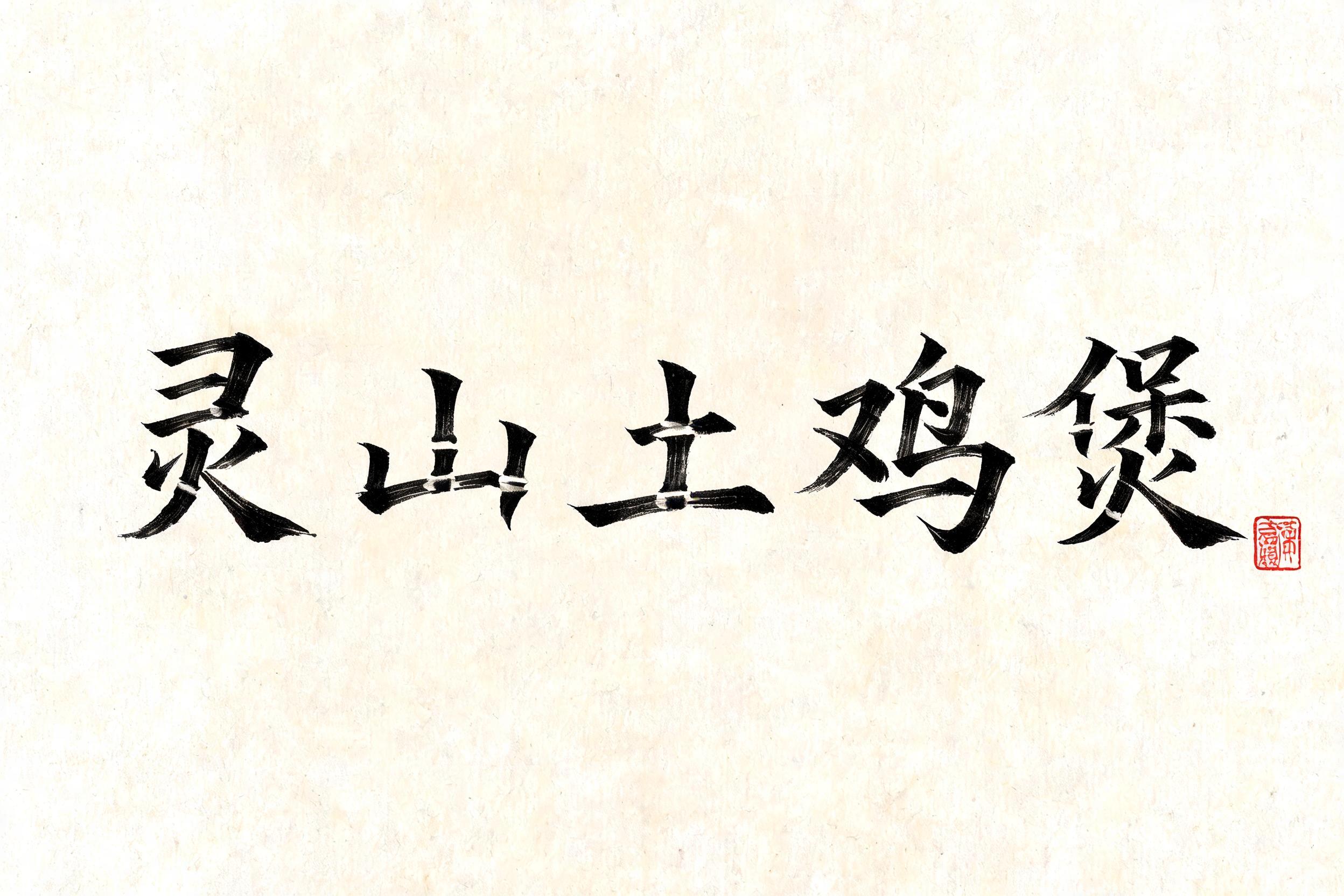
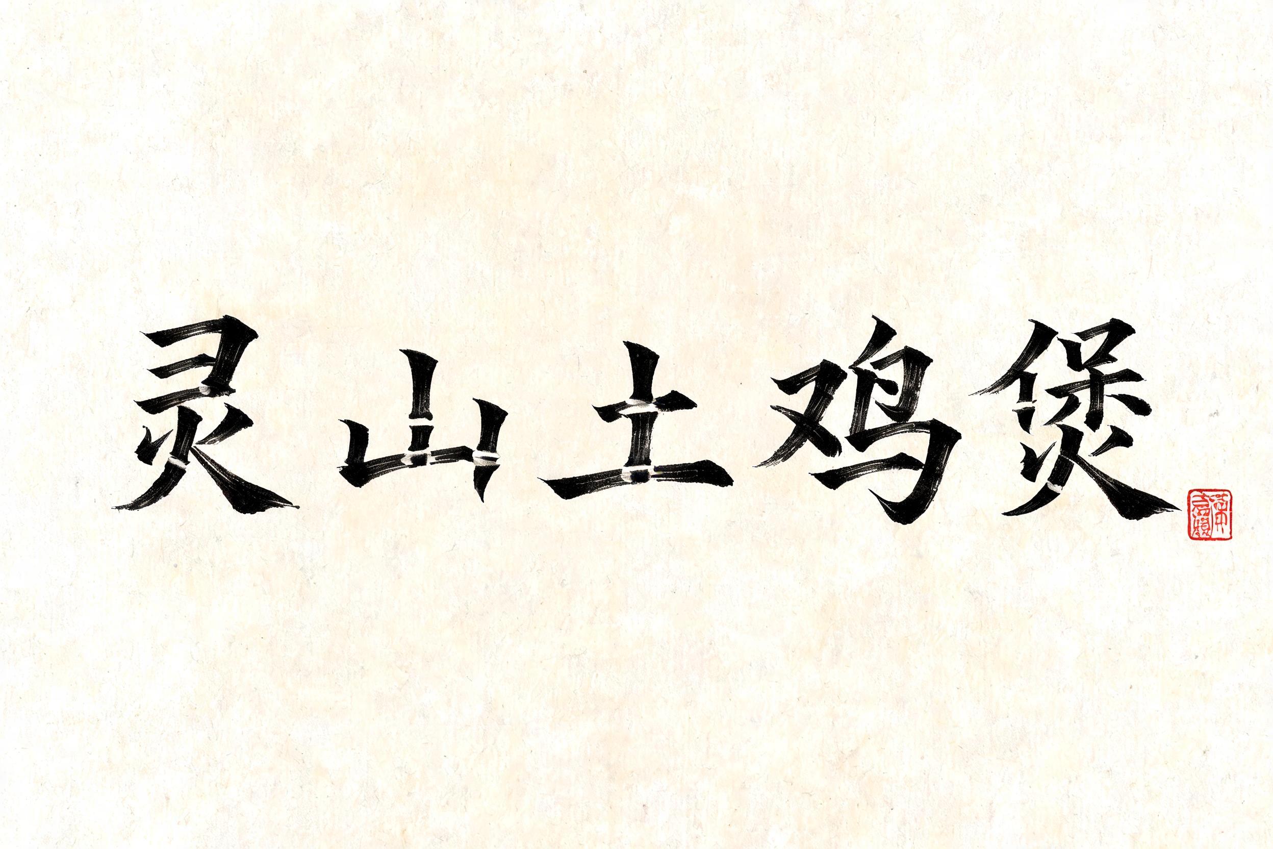
灵山土鸡煲 - Japanische Tuschepinsel-Schrift Text Effect


Nutzt BytePlus Seedream 5.0, das Modell dieses Werks · 15 Credits











“灵山土鸡煲” is a Brush Japanese Ink text effect Texteffekt erstellt mit FontVibe KI. Japanischer Shodo-Tuschepinsel-Kalligrafiestil, angewendet auf lateinische Buchstaben. Tiefes Sumi-Schwarz mit authentischer Fude-Pinselenergie, kontrollierten Strichen in eine Richtung und Washi-Papier-Atmosphäre. Perfekt für das Branding japanischer Restaurants, Tattoo-Design, Anime, Kampfkunst und kulturelle Projekte.
Japanese ink brush aesthetic — the visual language of sumi calligraphy on washi paper. INK MEDIUM: sumi pigment in deep black to charcoal range — richest density at mark centers, naturally transitioning outward as ink supply depletes. Fully matte, absorbed into paper surface, producing a tonal range from dense opaque black to transparent grey depending on dilution and brush load. PAPER SURFACE: natural washi — warm cream-white base with visible paper fiber structure giving slight texture. The absorbent surface creates the characteristic soft border quality of East Asian brush work at all mark edges. LIGHT ATMOSPHERE: soft diffuse north-facing studio light — the traditional calligrapher's light source. Even, shadowless, allowing the full tonal range of ink marks to read clearly. Warm cream paper tone contrasts against deep sumi black. AESTHETIC REGISTER: the ma principle — the space between and around marks is as considered as the marks themselves. Compositions have breathing room and deliberate quietness. When no specific material is defined by the font: default environment — deep sumi black marks on warm cream washi paper, soft diffuse overhead light, meditative studio atmosphere. Five Chinese characters 灵山土鸡煲 rendered in full-bodied shodo brushwork on warm cream washi paper with clearly visible longitudinal fiber grain running across the surface. Sumi ink loads densely at each stroke entry point — near-black at the thrust of each mark — then depletes naturally outward, transitioning through rich charcoal to mid-gray at stroke tails and hairline exits. Brush speed is vigorous and assured: horizontal sweeps thin dramatically at their right ends, vertical descenders carry full ink weight with slight edge feathering where bristles splay against the absorbent surface. Controlled ink bleed traces outward along paper fibers at high-pressure contact zones, creating soft halos of translucent gray that integrate into the washi ground. The five characters carry a hearty, grounded energy — the visual weight of each glyph suggests substance and warmth, appropriate to a dish name evoking clay pots and mountain-raised poultry. Negative space between and around each character breathes with the ma principle — unhurried, deliberate spacing that gives each mark room to settle. A single small vermilion hanko seal pressed in aged cinnabar paste anchors the composition with a rectangular stamp impression, its interior showing worn seal-script detail. Soft diffuse north-facing studio light falls evenly across the scene, rendering every tonal gradation from dense opaque sumi to near-transparent gray wash with full clarity. No background decoration beyond the washi surface texture itself.
Generiert am 25. August 2026 · 2496 × 1664 · JPEG · BytePlus Seedream 5.0 · Von der erstellenden Person geteilt · Kostenlos kommerziell nutzbar (CC BY 4.0)


