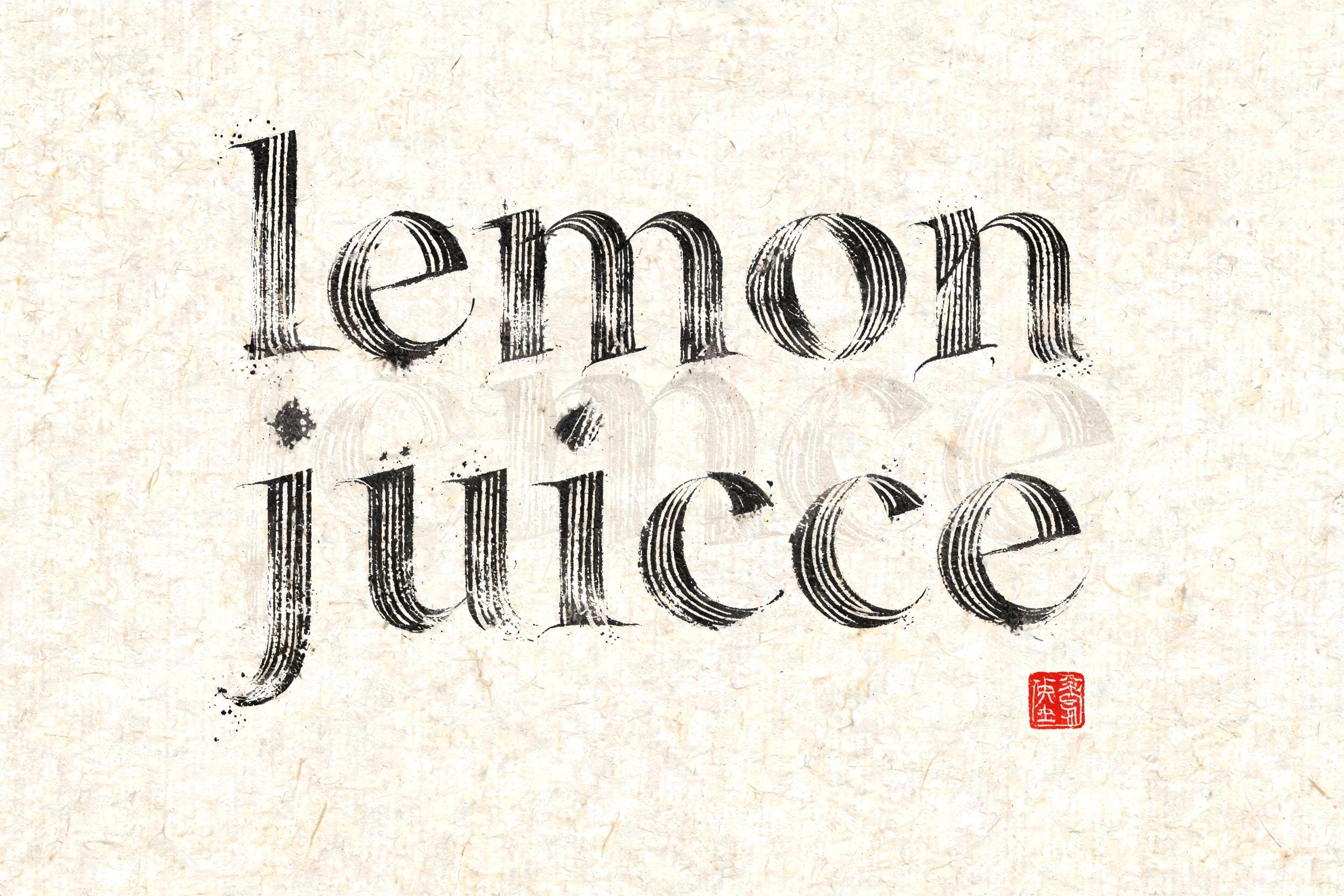
𝓵𝓮𝓶𝓸𝓷 𝓳𝓾𝓲𝓬𝓮 - Chinesischer Tuschepinsel Text Effect


Nutzt BytePlus Seedream 5.0, das Modell dieses Werks · 15 Credits


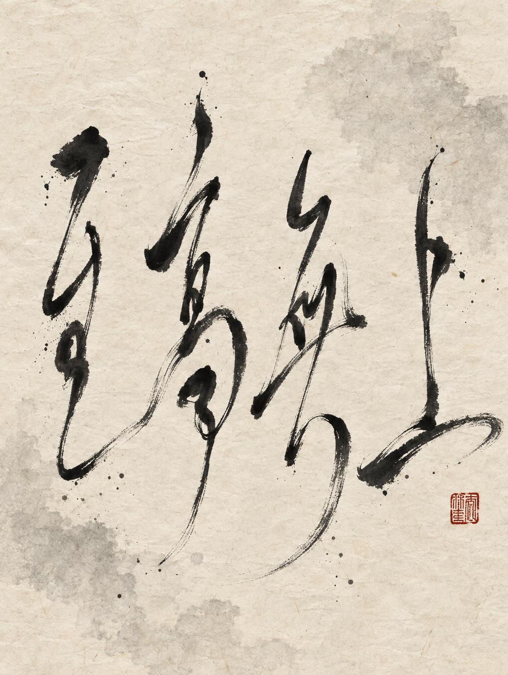

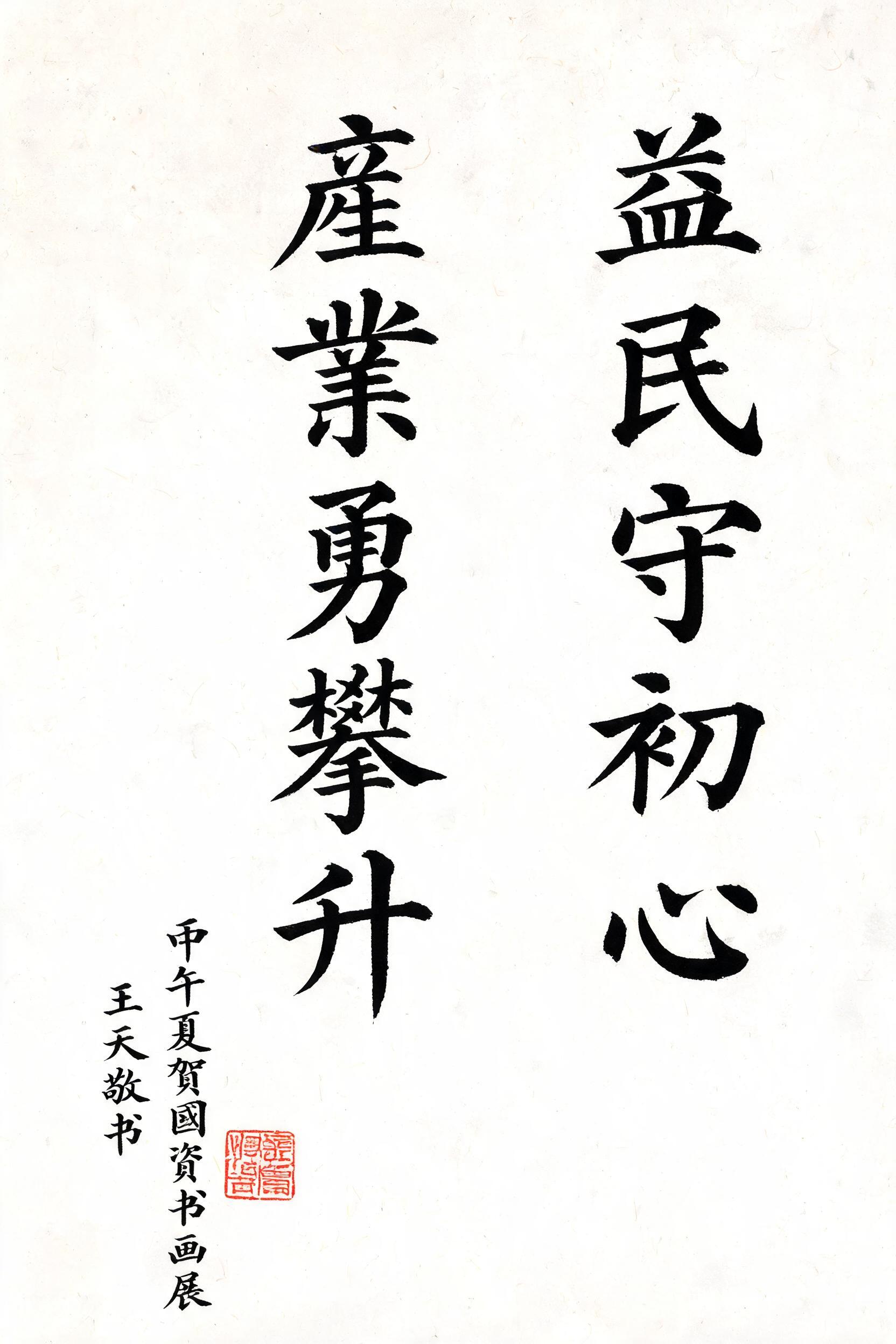
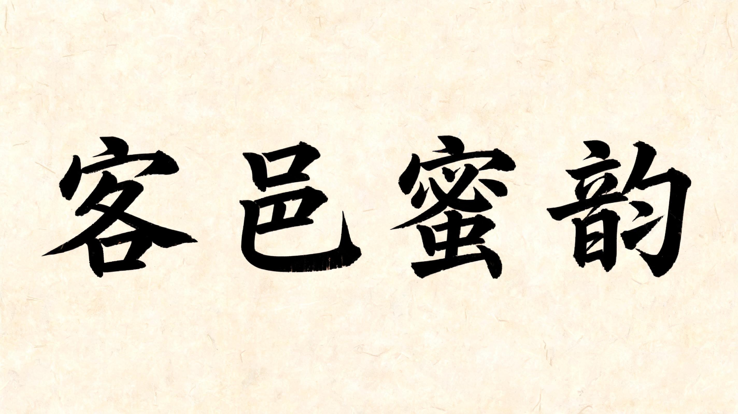

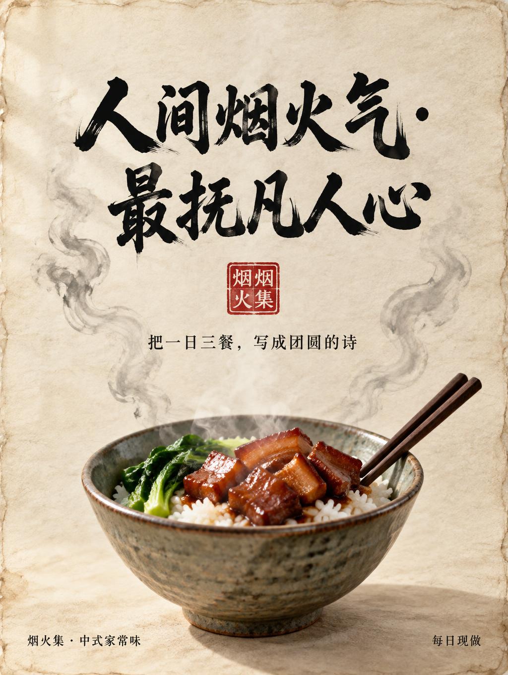
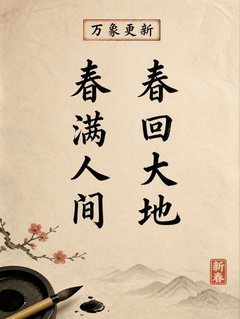


“𝓵𝓮𝓶𝓸𝓷 𝓳𝓾𝓲𝓬𝓮 ” is a Brush Chinese Ink text effect Texteffekt erstellt mit FontVibe KI. Chinesische Sumi-Tuschekalligrafie im Pinselstil, übertragen auf lateinische Buchstaben. Tiefschwarze Tusche mit authentischer Borstentextur, von dick zu dünn variierenden Strichen und Reispapier-Atmosphäre. Perfekt für das Branding chinesischer Restaurants, Kampfkunst, Wellness und kulturelles Design.
rendered in Chinese ink brush calligraphy style. Letterforms painted with a fully loaded sumi ink brush — deep black ink, visible bristle marks along stroke edges, wet ink pooling at stroke starts, feathered dry-brush trailing ends. Authentic ink density variation: thick rich black cores fading to grey at thin passages. Rice paper texture visible behind. Traditional Chinese calligraphy energy — each stroke confident, intentional, irreversible. LETTERFORM PRIORITY: when the chosen font carries its own treatment, that font's letterform shapes take priority and own the letters; this style governs the sumi ink medium, the bristle and ink-density behavior and the rice-paper ground. FALLBACK MATERIAL: if the font carries no material of its own, render the letters as deep black sumi brush strokes with visible bristle marks, wet ink pooling at stroke starts and feathered dry-brush trails on rice paper. COLOR PRIORITY: keep the font's own colors if specified; otherwise rich black ink fading to grey at thin passages. The phrase 𝓵𝓮𝓶𝓸𝓷 𝓳𝓾𝓲𝓬𝓮 painted in Chinese ink brush calligraphy style on aged xuan paper with a warm ivory-cream tone and subtle visible fiber grain. The letterforms carry their own bold script character — flowing, looped strokes — while the sumi ink medium governs all surface behavior: deep wet-black ink pools at each stroke entry point, bristle marks fan out along curved sweeps, and ink density fades from saturated black cores to translucent grey at trailing tails. Wet ink bleed halos softly into the xuan paper fibers, especially at loop closures and descending flourishes. The two-word phrase reads as a pair — the first word slightly more dominant in ink weight, the second word trailing with a drier, feathered finish that suggests a single exhale of the brush. A faint ink-wash ghost stroke — pale diluted grey — drifts behind the letters like a half-dried underpainting, adding atmospheric depth. Micro ink-splatter dots scatter near the most energetic stroke entries. A small vermilion seal stamp with a square border sits quietly near the lower edge of the composition, adding a warm red accent against the monochromatic ink work. The overall material atmosphere is raw, organic, hand-made — rice paper luminosity showing through thin ink passages, high tonal contrast between saturated blacks and near-white paper.
Generiert am 25. August 2026 · 2496 × 1664 · JPEG · BytePlus Seedream 5.0 · Von der erstellenden Person geteilt · Kostenlos kommerziell nutzbar (CC BY 4.0)


