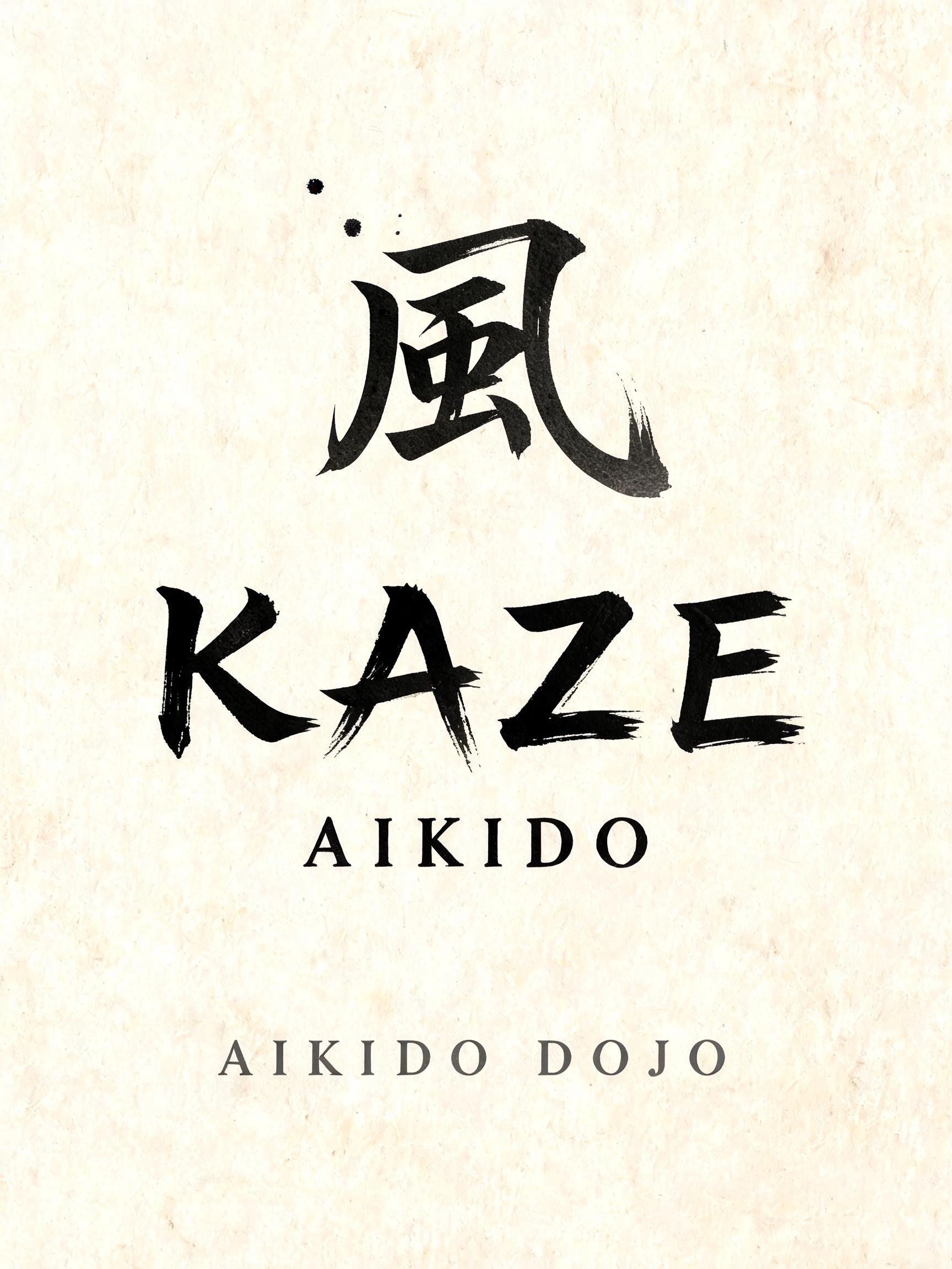
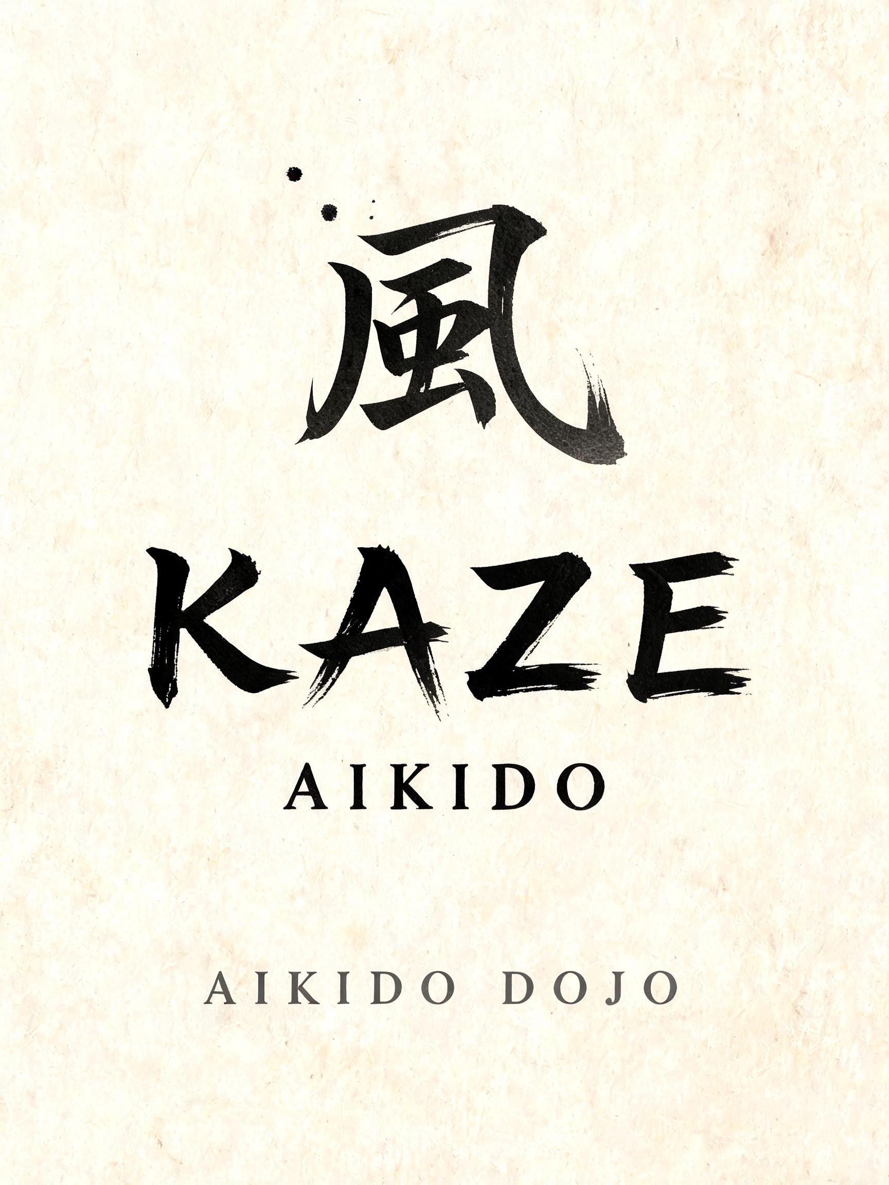
風 KAZE AIKIDO AIKIDO DOJO - Japanische Tuschepinsel-Schrift Text Effect


Nutzt BytePlus Seedream 5.0, das Modell dieses Werks · 15 Credits











“風 KAZE AIKIDO AIKIDO DOJO” is a Brush Japanese Ink text effect Texteffekt erstellt mit FontVibe KI. Japanischer Shodo-Tuschepinsel-Kalligrafiestil, angewendet auf lateinische Buchstaben. Tiefes Sumi-Schwarz mit authentischer Fude-Pinselenergie, kontrollierten Strichen in eine Richtung und Washi-Papier-Atmosphäre. Perfekt für das Branding japanischer Restaurants, Tattoo-Design, Anime, Kampfkunst und kulturelle Projekte.
Create a finished vertical dojo wall-poster composition, 3:4 ratio, on warm cream handmade washi paper with visible natural fibers. Soft, even north-facing studio light; no cast shadows, no frame, no seal, no ornamental border. The entire image follows Japanese sumi calligraphy material logic: fully matte absorbed ink, near-black pigment at the centers of loaded strokes, controlled charcoal-to-pale-gray dilution at pull-away tails, soft feathering where ink enters the paper. At the upper center, set the exact text “風” as one large Japanese shodo character, approximately 22% of canvas height. Use a decisive, dense sumi-black brush structure with a few restrained gray dry-brush edge breaks and a fine fading tail; preserve wide cream negative space around it. Centered beneath, the dominant exact text “KAZE” occupies 20% of canvas height. Draw it as custom Latin lettering made by a master Japanese shodo calligrapher: upright harmonious proportions, very bold 5:1 thick-to-thin contrast, controlled loaded-brush compression at stroke entries, dense black cores, smooth energetic mid-strokes, fine harai exit tapers and occasional upward hane terminal hooks. Every stroke appears executed once with precision; no casual handwriting, no revisions, no decorative flourishes. Directly below with a quiet gap, set exact text “AIKIDO” in matching custom shodo Latin capitals at 12% of canvas height, slightly narrower and lighter in visual weight than KAZE. Keep each word cleanly readable from a distance. At the lower center, set the small exact text “AIKIDO DOJO” in restrained charcoal-gray brush lettering with more open tracking. Add only two tiny, controlled ink splatters near the initial entry of the large 風 character, never around the smaller copy. Use deliberate ma: expansive untouched paper, centered axial alignment, calm vertical rhythm. No red ink, no gold, no gradients outside ink dilution, no martial-arts figures, no weapons, no torii, no faux parchment, no digital paint texture. High-resolution scanned-washi realism, crisp authentic brush-fiber detail.
Gemacht für Japanische Kalligrafie-Schrift
Generiert am 4. September 2026 · 1728 × 2304 · JPEG · BytePlus Seedream 5.0 · Von der erstellenden Person geteilt · Kostenlos kommerziell nutzbar (CC BY 4.0)


