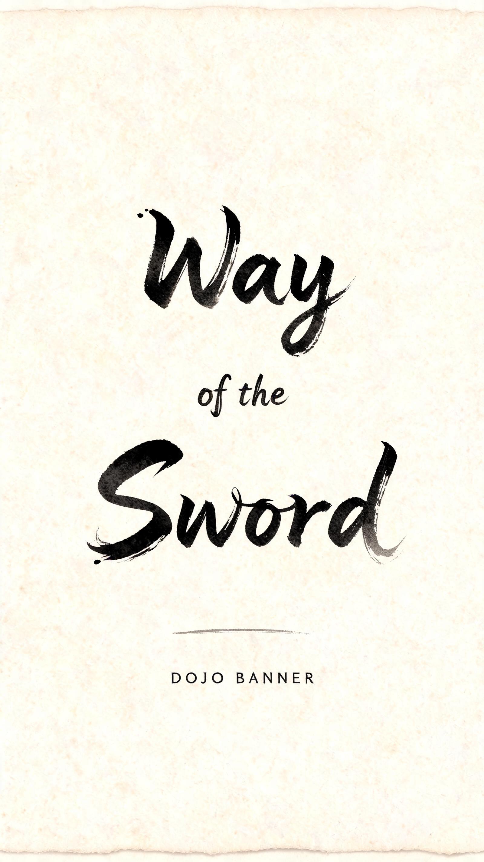
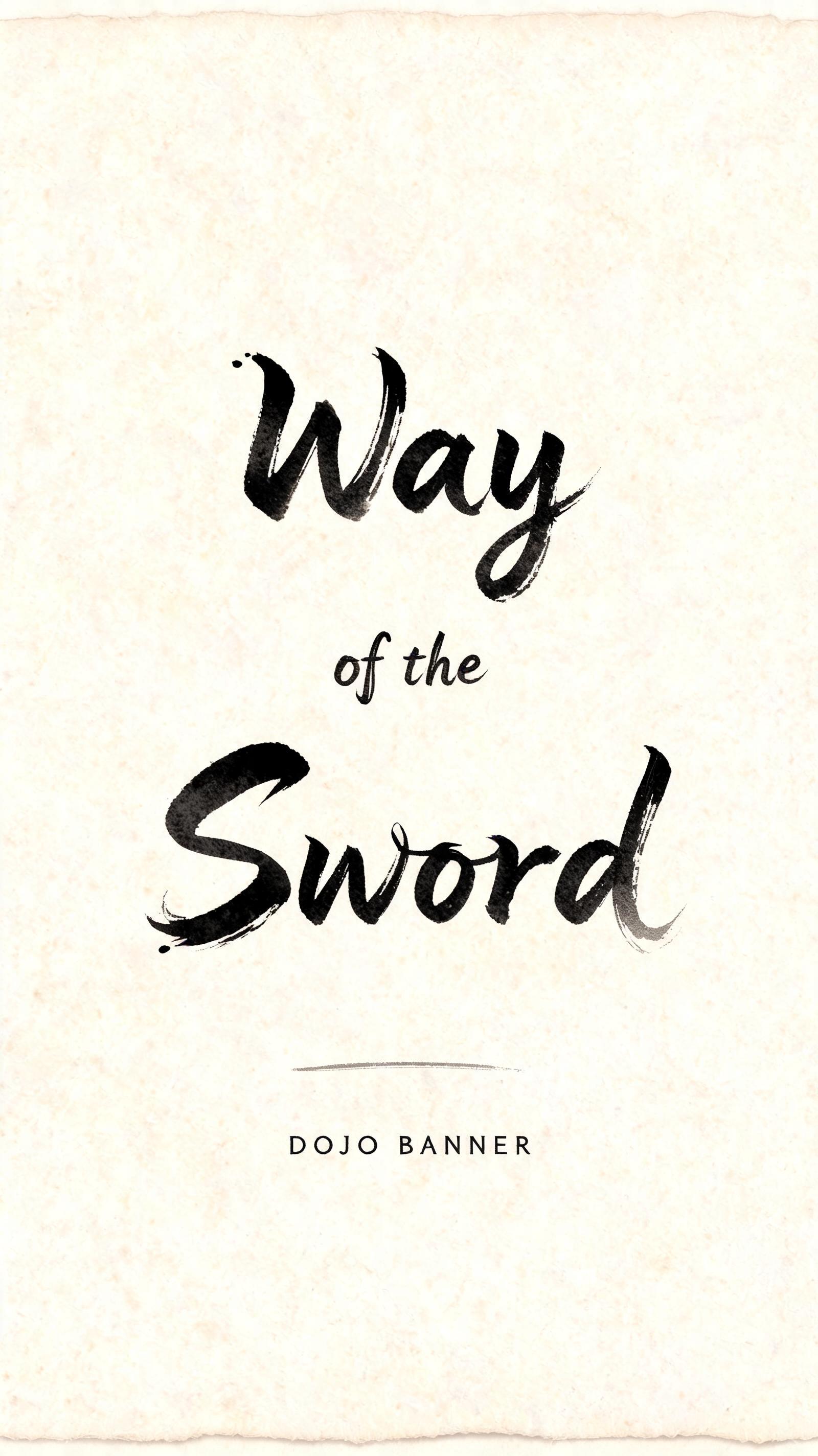
Way of the Sword DOJO BANNER - Pincel de Tinta Japonés Text Effect


Usa BytePlus Seedream 5.0, el modelo de esta obra · 15 créditos











“Way of the Sword DOJO BANNER” is a Brush Japanese Ink text effect efecto de texto creado con FontVibe IA. El estilo de caligrafía con pincel de tinta del shodo japonés llevado a las letras latinas. Tinta sumi negra y profunda con la energía auténtica del pincel fude, trazos controlados en una sola dirección y atmósfera de papel washi. Perfecto para marcas de restaurantes japoneses, diseño de tatuajes, anime, artes marciales y proyectos culturales.
Create a vertical 9:16 dojo banner, portrait orientation, designed as a physical hanging sheet of warm cream-white handmade washi paper. Preserve wide, deliberate negative space; no border, no seal, no decorative illustration, no Japanese characters, no weapons or scenery. Set the exact headline text “Way of the Sword” in three centered lines: “Way” “of the” “Sword” The words occupy the central 62% of the banner, with “Way” and “Sword” large and dominant, “of the” reduced to one-third scale. Render every Latin letter as original classical Japanese shodo master-calligraphy display lettering: upright harmonious posture, bold 5:1 thick-to-thin brush pressure, a single committed stroke logic per form, gradual loaded-brush entries with ink compression, firm energetic middles, precise harai pull-away tails tapering to hairline points, and restrained upward hane terminal hooks. Ink is absorbed matte sumi pigment: near-black dense cores transition through charcoal gray at the stroke edges; slight dry-brush breakup appears only at the outermost rims, never uniform black or glossy ink. At the lower center, small widely spaced uppercase text reads “DOJO BANNER”, in restrained hand-brushed charcoal capitals, with a thin horizontal dry-brush rule above it. This line remains secondary and quietly readable. Paper surface: natural uneven washi fiber texture, warm #F3E9D1 base, faint deckled-edge shadow just beyond the crop, subtle pale-gray diluted-ink traces near a few stroke exits, and two or three tiny ink droplets only near the initial stroke entries. Soft diffuse north-facing studio light, completely shadowless and even; preserve paper texture and the full tonal range of the absorbed ink. Museum-flat frontal composition, tactile high-resolution paper scan, controlled composition, exact legible spelling.
Hecho para Letras Samurái
Generada el 4 de septiembre de 2026 · 1600 × 2848 · JPEG · BytePlus Seedream 5.0 · Compartida por el creador · Uso comercial gratuito (CC BY 4.0)


