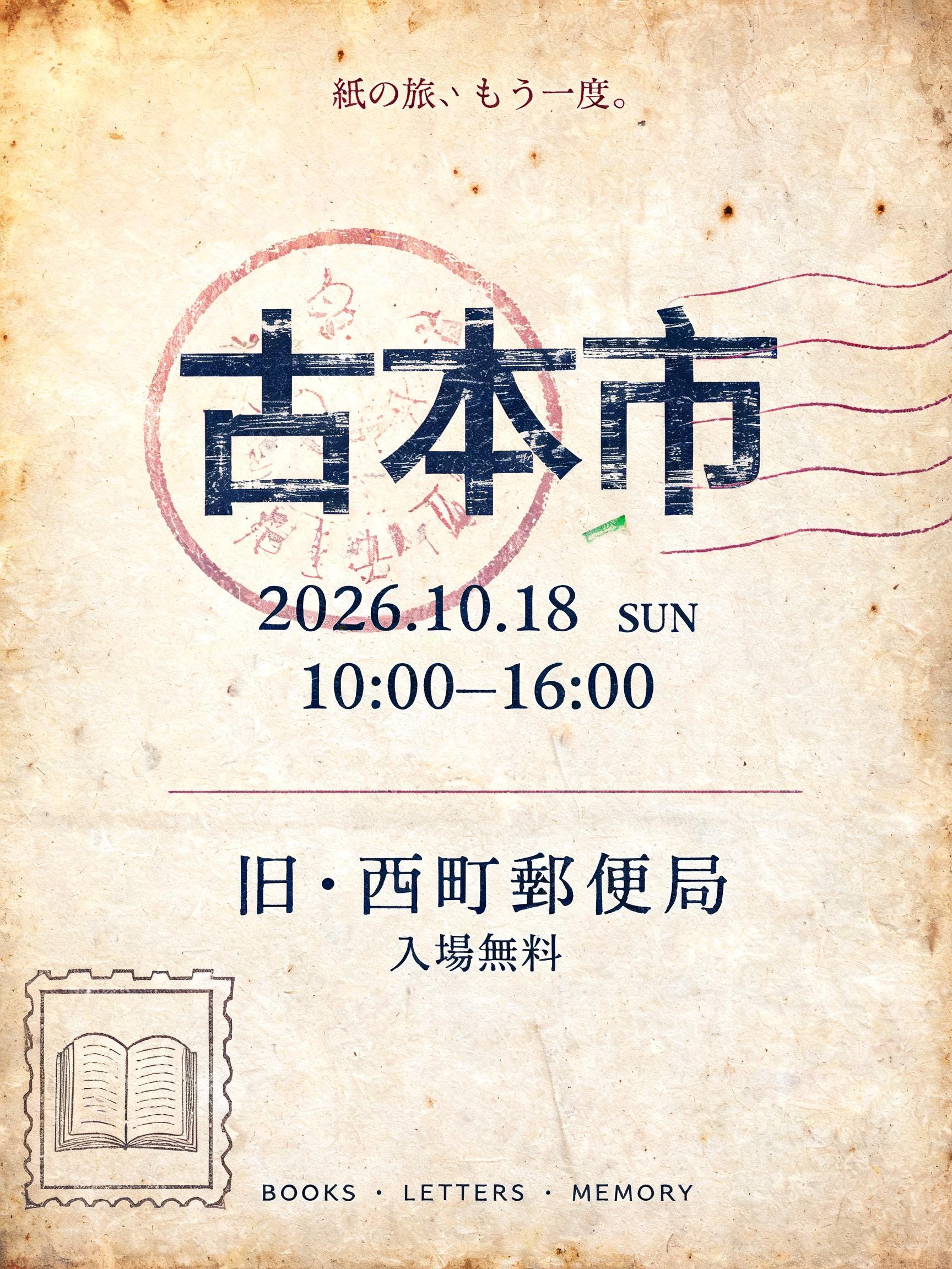
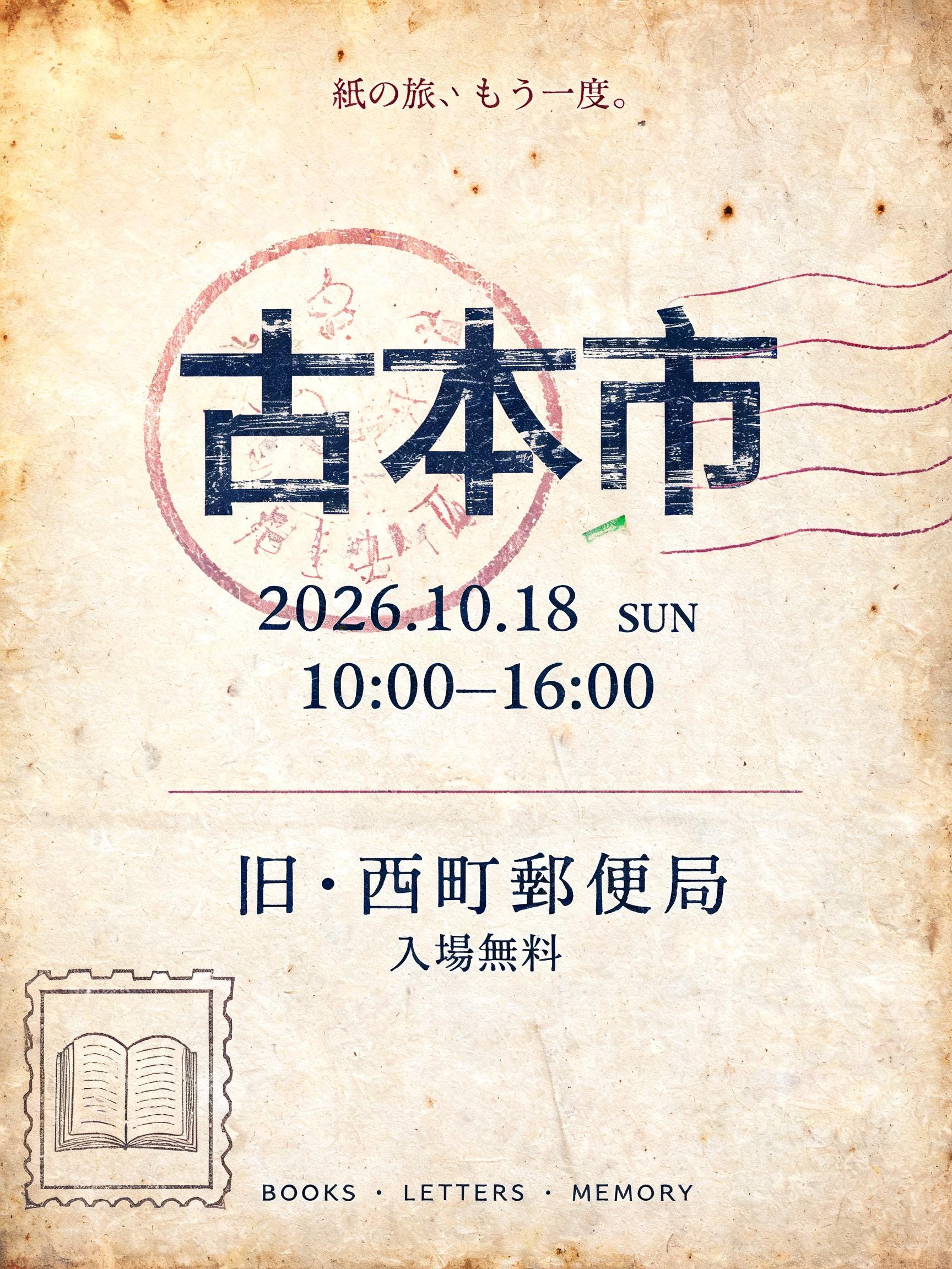
古本市 紙の旅、もう一度。 2026.10.18 SUN 10:00–16:00 旧・西町郵便局 入場無料 BOOKS · LETTERS · MEMORY - Vintage Text Effect


Nutzt BytePlus Seedream 5.0, das Modell dieses Werks · 15 Credits






“古本市 紙の旅、もう一度。 2026.10.18 SUN 10:00–16:00 旧・西町郵便局 入場無料 BOOKS · LETTERS · MEMORY” is a Vintage text effect Texteffekt erstellt mit FontVibe KI. Serifenversalien im Buchdruck in cremefarbenen Baumwollkarton gepresst, mit leicht ausbrechender Farbe, auf dem Fundament einer alten Presse zwischen verstreuten Bleilettern.
Create a finished Japanese vertical poster for a used-book market, 3:4 ratio. Exact readable Japanese typography is essential; render every quoted string verbatim. Background: warm aged cream cotton paper, visible long paper fibers, faint brown foxing clusters, softly darkened sepia edges, small handling creases; warm amber light from upper left. No modern devices, no photographic bookshelves, no glossy effects. Centered composition with generous margins. At the top, small narrow official postal-marking type in faded red-violet ink: "紙の旅、もう一度。" Beneath it, the dominant headline "古本市" spans 70% of the width. Build each Japanese character as a narrow upright postal-cancellation display form, blue-black translucent ink with slight broken coverage, fine paper grain visible through the strokes, and a restrained horizontal rolling-stamp smear. Behind and partially crossing the headline: one large faded red-violet circular postmark ring, incomplete around the edges, containing tiny ornamental postal marks only, plus three thin wavy cancellation lines extending toward the right. The circle must frame the title without reducing legibility. Below the headline, centered in compact blue-black postal type: "2026.10.18 SUN" then "10:00–16:00". A thin faded-red divider rule. Lower section: "旧・西町郵便局" in slightly larger condensed postmark type, followed by "入場無料" in small tracked characters. Bottom center, tiny worn postal imprint: "BOOKS · LETTERS · MEMORY". Add a small outlined airmail-style corner label at lower left containing a miniature open-book icon, visibly printed rather than illustrated. Use a limited heritage palette: aged cream, sepia, blue-black, faded red-violet, and a barely visible forest-green registration fleck. Flat letterpress and stamp-print physicality: imperfect ink edges, pressed fibers, gentle wear. Precise centered hierarchy, no extra text, no logos, no neon, no contemporary sans-serif.
Gemacht für Antik-Schriftgenerator
Generiert am 6. September 2026 · 1728 × 2304 · JPEG · BytePlus Seedream 5.0 · Von der erstellenden Person geteilt · Kostenlos kommerziell nutzbar (CC BY 4.0)


