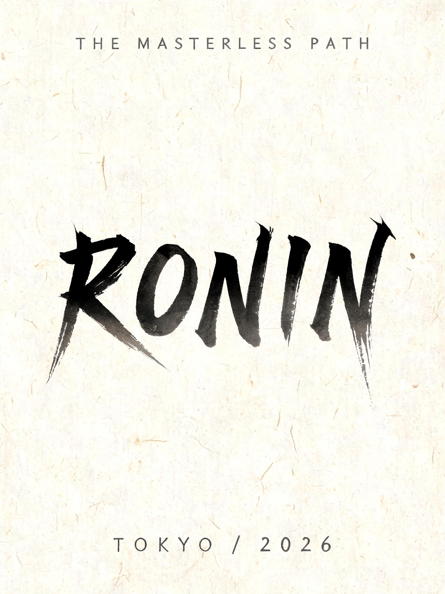
RONIN THE MASTERLESS PATH TOKYO / 2026 - Japanische Tuschepinsel-Schrift Text Effect


Nutzt BytePlus Seedream 5.0, das Modell dieses Werks · 15 Credits











“RONIN THE MASTERLESS PATH TOKYO / 2026” is a Brush Japanese Ink text effect Texteffekt erstellt mit FontVibe KI. Japanischer Shodo-Tuschepinsel-Kalligrafiestil, angewendet auf lateinische Buchstaben. Tiefes Sumi-Schwarz mit authentischer Fude-Pinselenergie, kontrollierten Strichen in eine Richtung und Washi-Papier-Atmosphäre. Perfekt für das Branding japanischer Restaurants, Tattoo-Design, Anime, Kampfkunst und kulturelle Projekte.
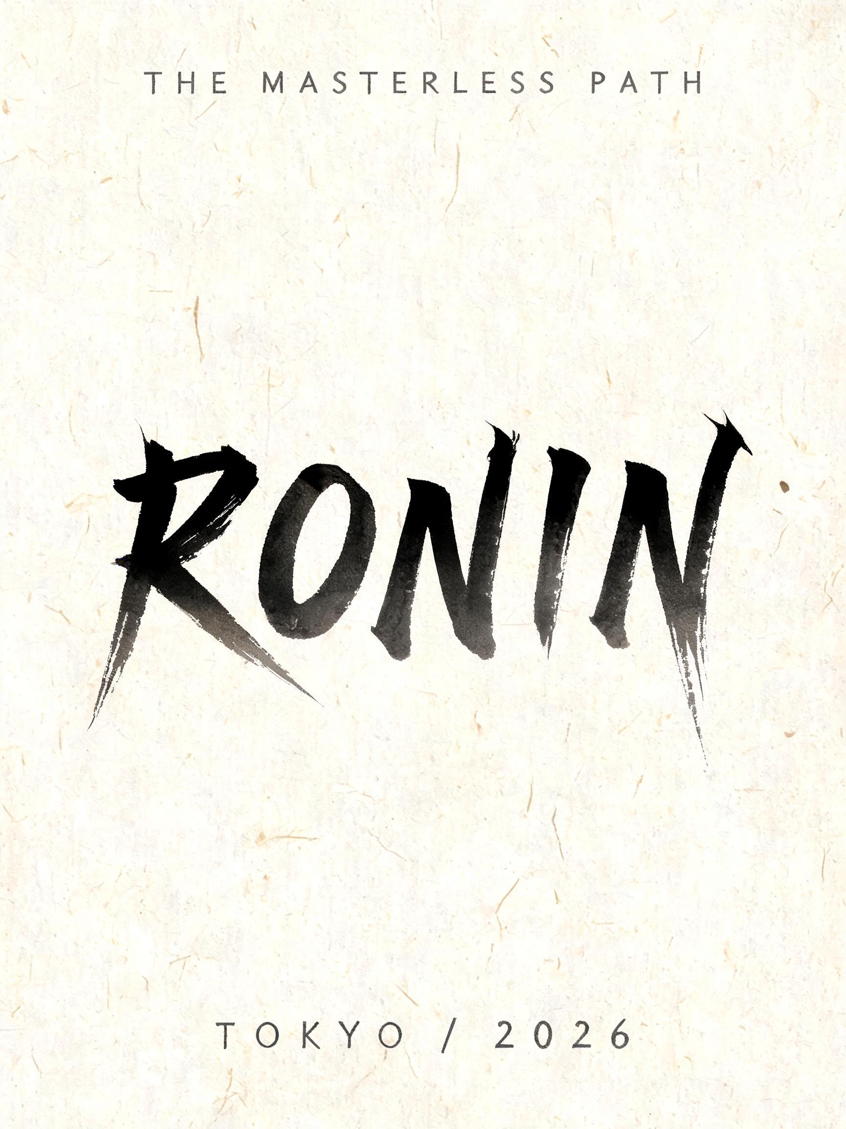
Create a finished vertical typographic art poster, 3:4, not a logo sheet. Natural warm cream Japanese washi paper fills the canvas, clearly visible irregular fibers and subtle absorbent grain, flat paper surface under soft diffuse north-facing studio light with no cast shadows. Exact rendered text, preserve spelling and punctuation: Small top line: “THE MASTERLESS PATH” Dominant headline: “RONIN” Small bottom line: “TOKYO / 2026” Composition: vast quiet margins. Set “THE MASTERLESS PATH” at upper center, small, widely spaced, thin hand-brushed Roman capitals in diluted charcoal-gray ink. Center “RONIN” across the middle 62% of the page width, the largest element. Each western letter is custom-drawn as a definitive classical Japanese shodo calligraphy form: upright harmonic posture, bold 5:1 thick-to-thin stroke ratio, loaded-brush entry compressed into near-black cores, deliberate stable mid-strokes, a single uncorrected stroke per mark. Dense black sumi pigment transitions through charcoal gray at the edges as it sinks into the washi. Let the R leg and N diagonal end in sharp, long harai pull-away tails; let the I finish with a concise upward hane hook; let the final N exit into the longest fine-pointed rightward ink tail. The tails must be controlled and blade-sharp, not chaotic; only two or three tiny ink flecks appear at the heaviest stroke entries. Place “TOKYO / 2026” at lower center in small restrained charcoal-gray brush capitals, with generous tracking. No icons, no warrior illustration, no red sun, no seals, no border, no digital glow, no glossy ink, no ornamental pattern. Preserve strong ma negative space around every line. Fully matte absorbed ink, uneven tonal gradation from near-black to transparent gray, soft feathering where pigment meets paper fibers. Crisp legible Latin text, editorial Japanese calligraphy poster, high-resolution print texture.
Gemacht für Japanische Pinsel-Schrift
Generiert am 9. September 2026 · 1728 × 2304 · JPEG · BytePlus Seedream 5.0 · Von der erstellenden Person geteilt · Kostenlos kommerziell nutzbar (CC BY 4.0)


