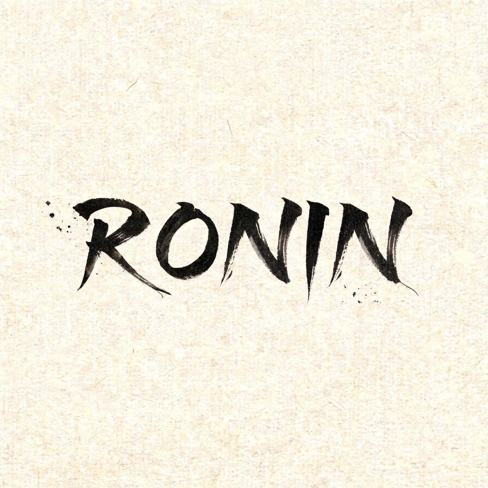
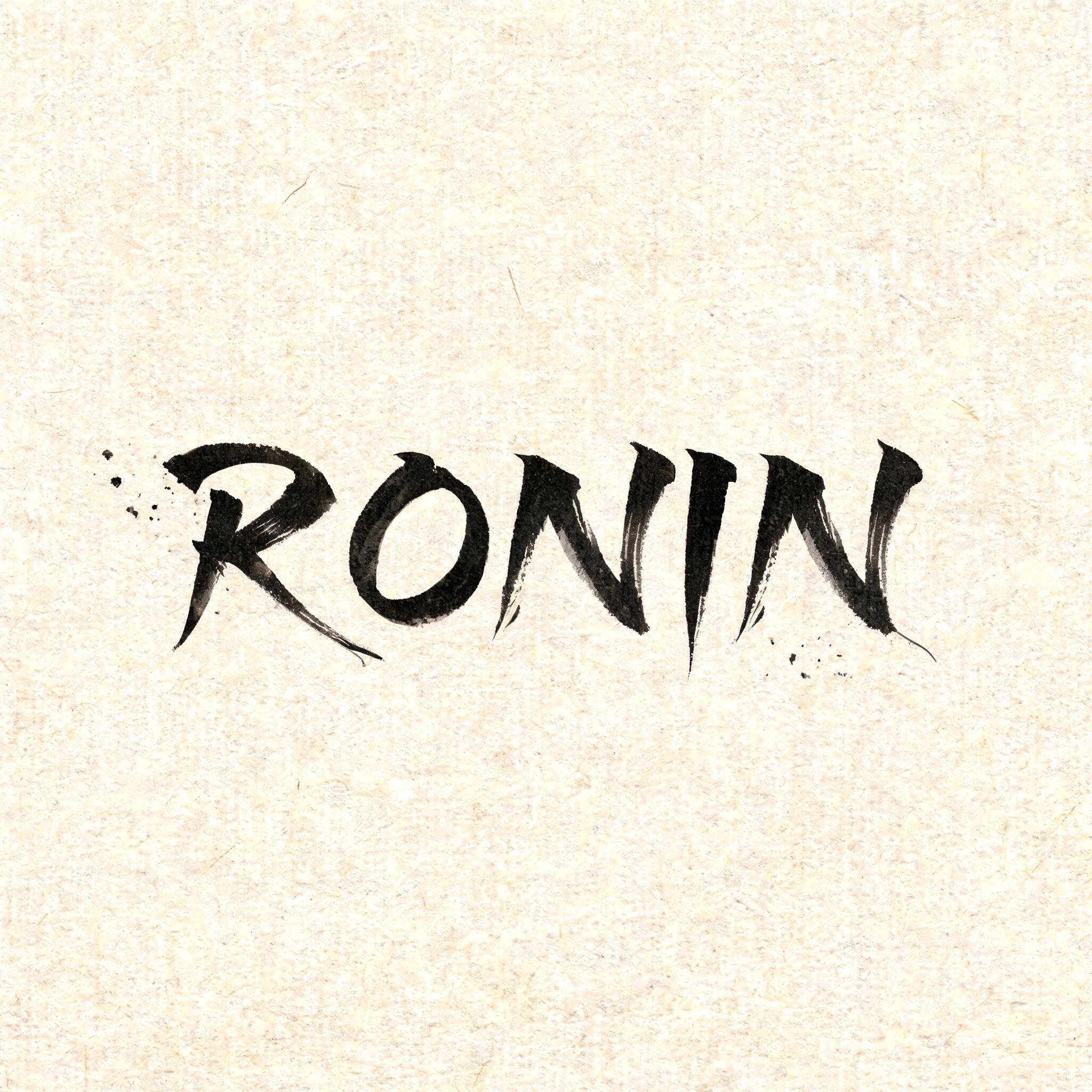
RONIN - Japanische Tuschepinsel-Schrift Text Effect


Nutzt BytePlus Seedream 5.0, das Modell dieses Werks · 15 Credits











“RONIN” is a Brush Japanese Ink text effect Texteffekt erstellt mit FontVibe KI. Japanischer Shodo-Tuschepinsel-Kalligrafiestil, angewendet auf lateinische Buchstaben. Tiefes Sumi-Schwarz mit authentischer Fude-Pinselenergie, kontrollierten Strichen in eine Richtung und Washi-Papier-Atmosphäre. Perfekt für das Branding japanischer Restaurants, Tattoo-Design, Anime, Kampfkunst und kulturelle Projekte.
Create a square Japanese brush-lettering title card, viewed straight-on. Natural warm cream-white washi paper fills the entire frame, with clearly visible long paper fibers and subtle absorbent grain. Set only the exact word “RONIN” at the visual center, occupying about 62% of the canvas width and 25% of its height. Render “RONIN” in original classical Japanese shodo-inspired Western display letterforms, upright and widely spaced: definitive master-calligraphy construction, bold 5:1 thick-to-thin stroke contrast, rounded loaded-brush entries compressed into the paper, dense near-black pigment at each stroke core, controlled charcoal-grey dilution at the edges. Every letter is one decisive, uncorrected mark. Give the R, N, and final N long razor-sharp harai ink tails that pull outward and taper to hairline points; add restrained upward hane hooks on selected terminals. The O is a deliberate, slightly asymmetric enclosed brush loop with a rich black inner edge and pale grey dry-brush release on its outermost edge. The letters remain legible and separate, with generous quiet gaps between them. Sumi pigment is fully matte and visibly absorbed into washi: no gloss, no foil, no digital glow, no drop shadow. Place three to five tiny, sparse ink flecks near the left stroke entry and below the final tail only, as physical brush-load splatter; no decorative border, no symbols, no additional text. Preserve at least 55% open paper around the lettering. Soft diffuse north-facing studio light, even exposure, no cast shadows, crisp 8k paper texture. The visual priority is the black ink anatomy and sharp brush-tail geometry.
Gemacht für Japanische Pinsel-Schrift
Generiert am 10. September 2026 · 2048 × 2048 · JPEG · BytePlus Seedream 5.0 · Layout: Zen · Von der erstellenden Person geteilt · Kostenlos kommerziell nutzbar (CC BY 4.0)


