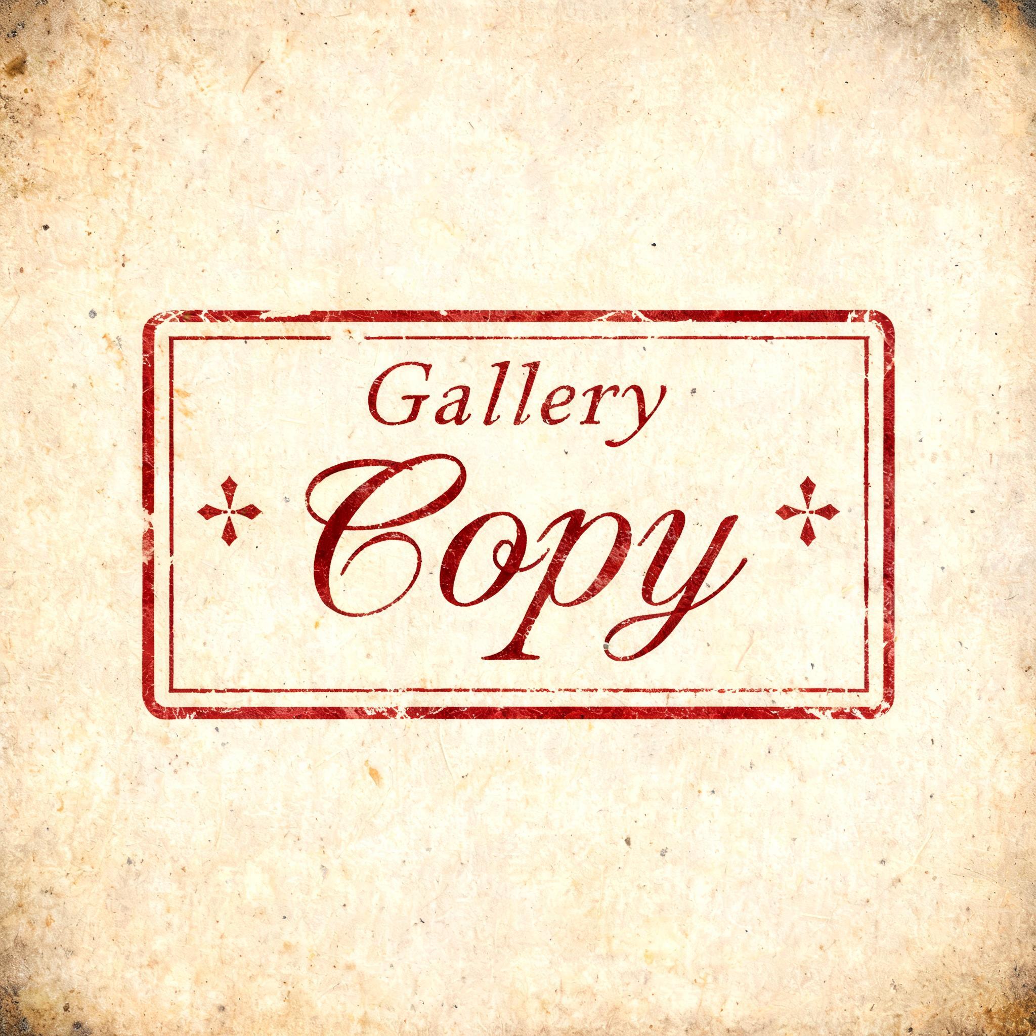
Gallery Copy - Vintage Text Effect


Nutzt BytePlus Seedream 5.0, das Modell dieses Werks · 15 Credits



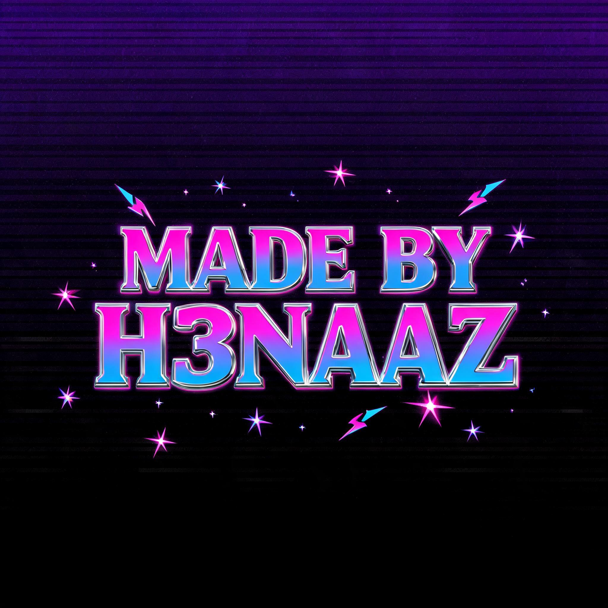
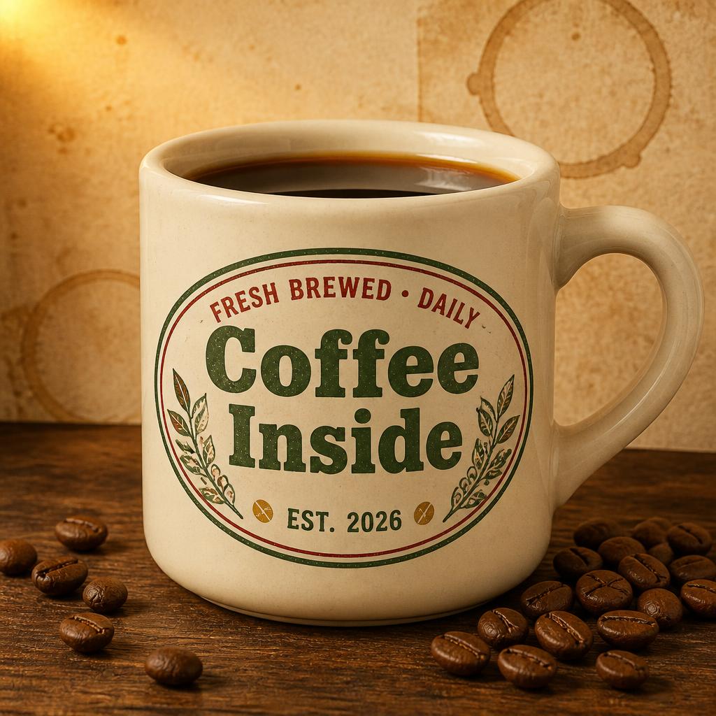
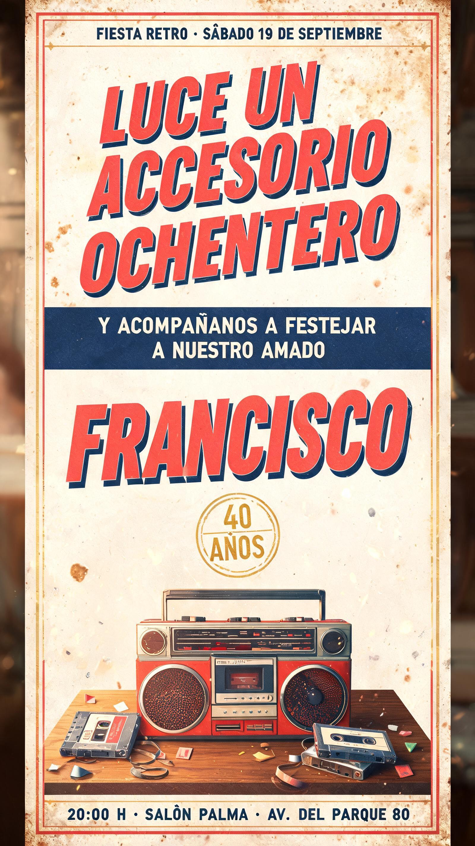
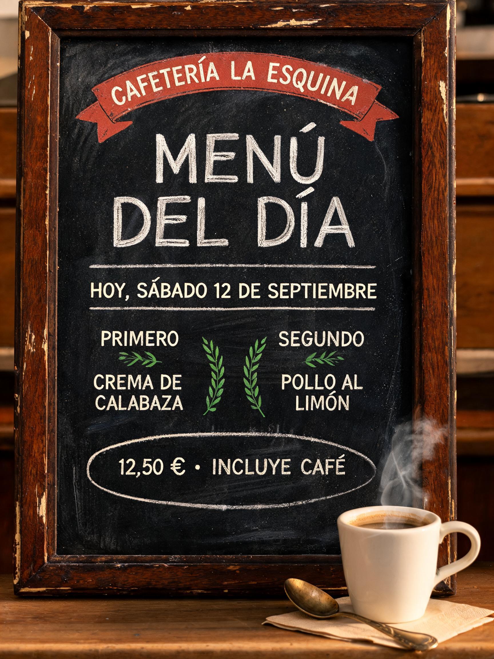
“Gallery Copy” is a Vintage text effect Texteffekt erstellt mit FontVibe KI. Serifenversalien im Buchdruck in cremefarbenen Baumwollkarton gepresst, mit leicht ausbrechender Farbe, auf dem Fundament einer alten Presse zwischen verstreuten Bleilettern.
Create a finished square stamped-mark artwork, 1:1. Centered on warm cream cotton paper with visible long fibers, faint tan foxing, softly uneven deckled-paper grain, and a few tiny dust specks. The only rendered wording is exactly: “FIRST EDITION”. Build it as a single vintage rubber-stamp seal, not a digital logo. Composition: a horizontal rounded-rectangle stamp frame centered in the canvas, occupying 76% width and 34% height. Two imperfect oxblood-red border rules follow the rectangle: an outer thin rule with chipped gaps and a thicker inner rule with uneven pressure. Small four-point ornamental separators sit left and right of the text. Inside, “FIRST” is small and tracked wide above; “EDITION” is dominant below, both centered. Custom uppercase serif handwriting display letterforms based on loose copperplate penmanship: narrow proportions, flexible steel-nib contrast, thick pressure-built downstrokes, hairline upstrokes and crossbars, subtle inconsistent baseline, natural ink pooling at terminal ends. The text is physically pressed faded oxblood ink, with broken pigment, softened edges, minute paper-fiber interruptions, and a shallow debossed impression visible along the lower-right edge of each stroke. Use a restrained palette: aged cream paper, sepia fibers, faded oxblood ink, and small antique-gold warmth in the paper shadows only. Warm amber light from upper left, shallow grazing light reveals the stamp indentation; soft vignette at corners. Flat overhead archival-print photograph, no objects, no hands, no wax seal, no modern gradients, no neon, no extra words, no mockup. Create a finished square stamped-mark artwork, 1:1. Centered on warm cream cotton paper with visible long fibers, faint tan foxing, softly uneven deckled-paper grain, and a few tiny dust specks. The only rendered wording is exactly: “Gallery Copy”. Build it as a single vintage rubber-stamp seal, not a digital logo. Composition: a horizontal rounded-rectangle stamp frame centered in the canvas, occupying 76% width and 34% height. Two imperfect oxblood-red border rules follow the rectangle: an outer thin rule with chipped gaps and a thicker inner rule with uneven pressure. Small four-point ornamental separators sit left and right of the text. Inside, “Gallery” is small and tracked wide above; “Copy” is dominant below, both centered. Custom uppercase serif handwriting display letterforms based on loose copperplate penmanship: narrow proportions, flexible steel-nib contrast, thick pressure-built downstrokes, hairline upstrokes and crossbars, subtle inconsistent baseline, natural ink pooling at terminal ends. The text is physically pressed faded oxblood ink, with broken pigment, softened edges, minute paper-fiber interruptions, and a shallow debossed impression visible along the lower-right edge of each stroke. Use a restrained palette: aged cream paper, sepia fibers, faded oxblood ink, and small antique-gold warmth in the paper shadows only. Warm amber light from upper left, shallow grazing light reveals the stamp indentation; soft vignette at corners. Flat overhead archival-print photograph, no objects, no hands, no wax seal, no modern gradients, no neon, no extra words, no mockup.
Generiert am 13. September 2026 · 2048 × 2048 · JPEG · BytePlus Seedream 5.0 · Von der erstellenden Person geteilt · Kostenlos kommerziell nutzbar (CC BY 4.0)


