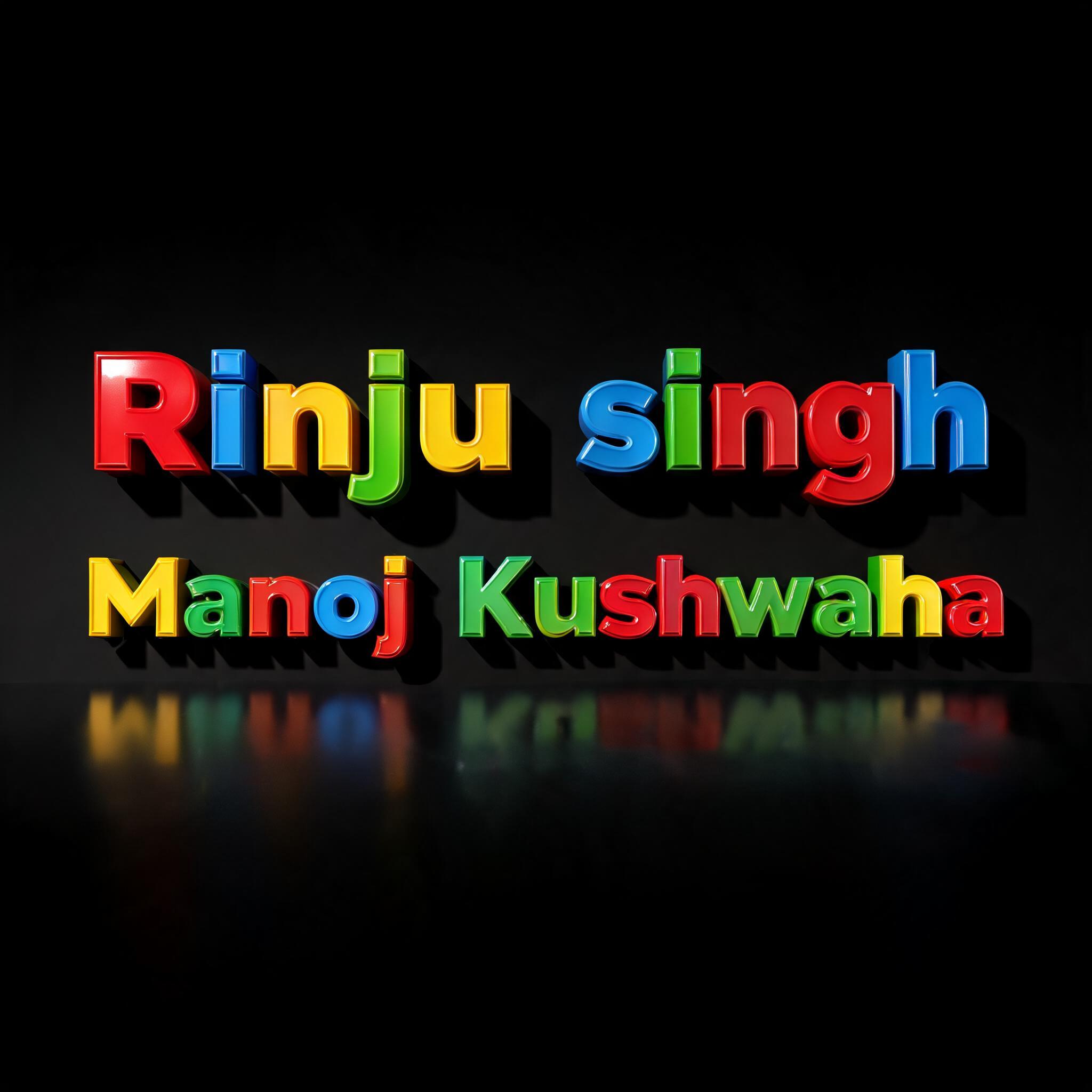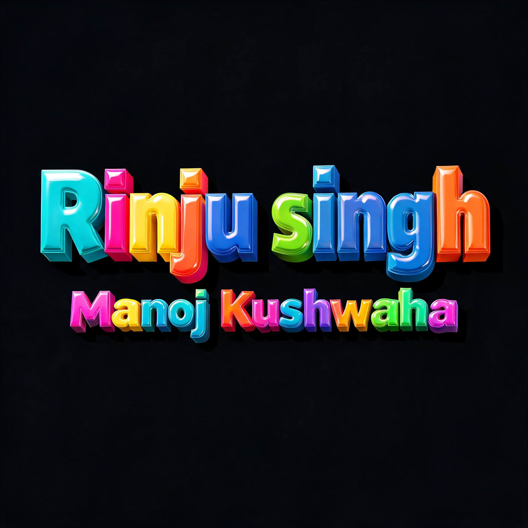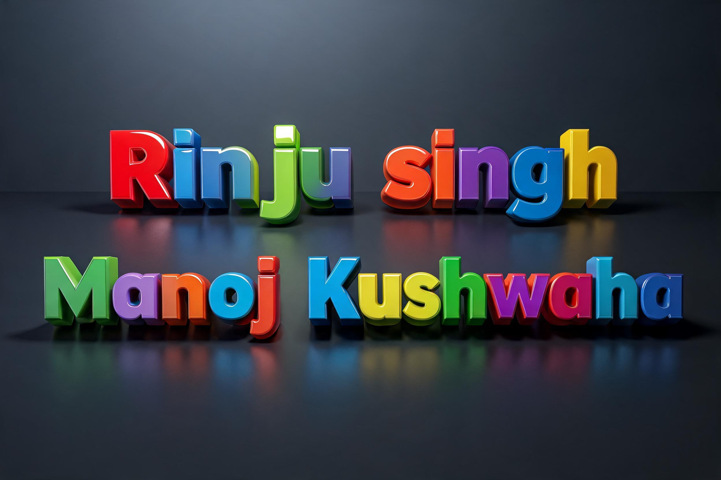
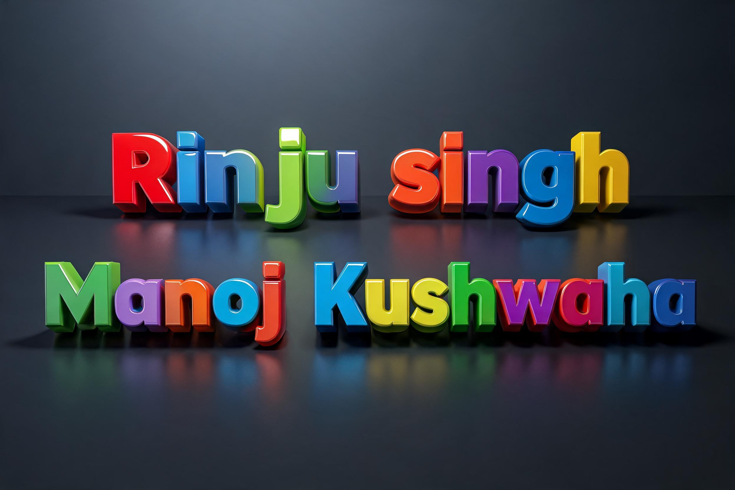
Rinju singh Manoj Kushwaha - 3D Fett Text Effect


Nutzt BytePlus Seedream 5.0, das Modell dieses Werks · 15 Credits

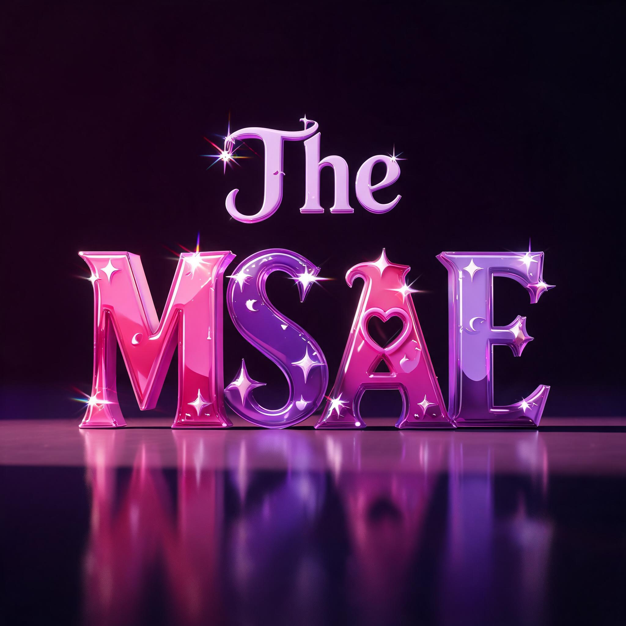
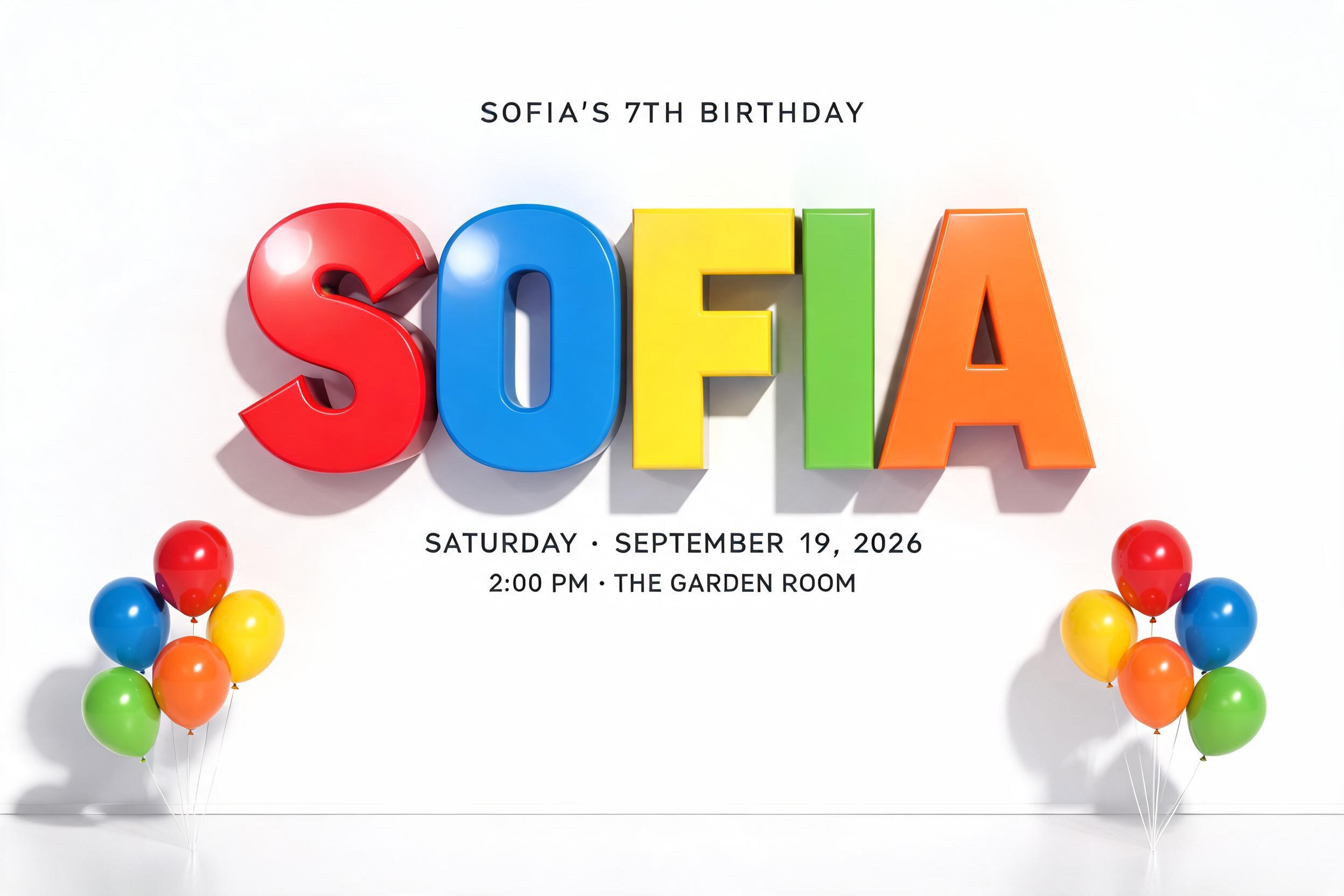
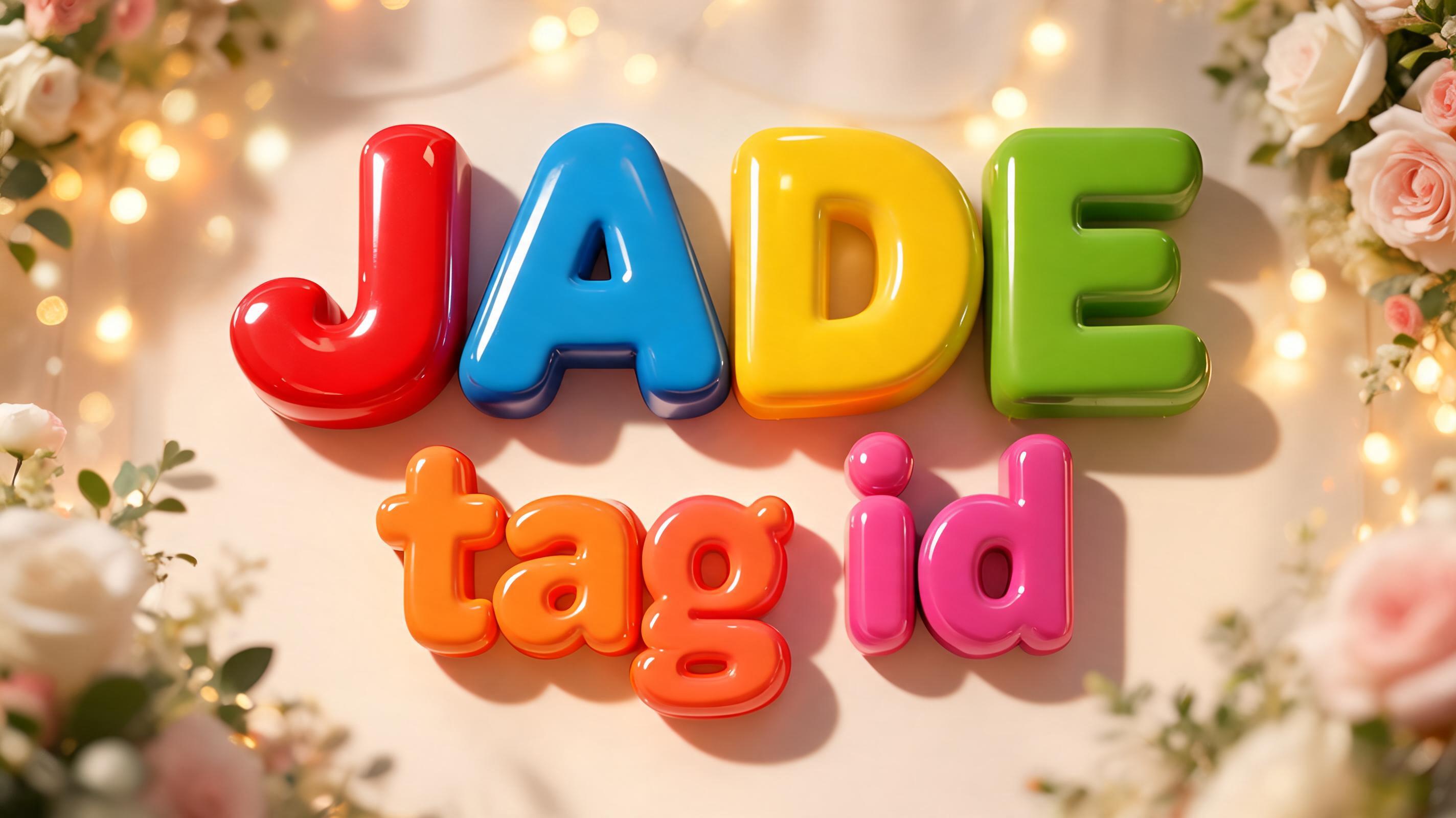
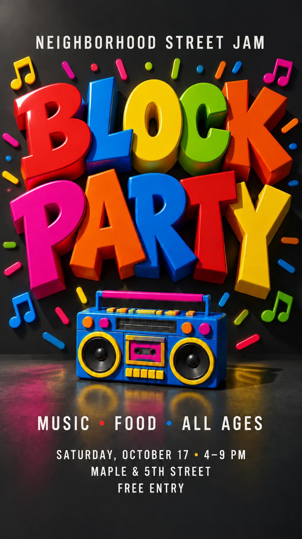
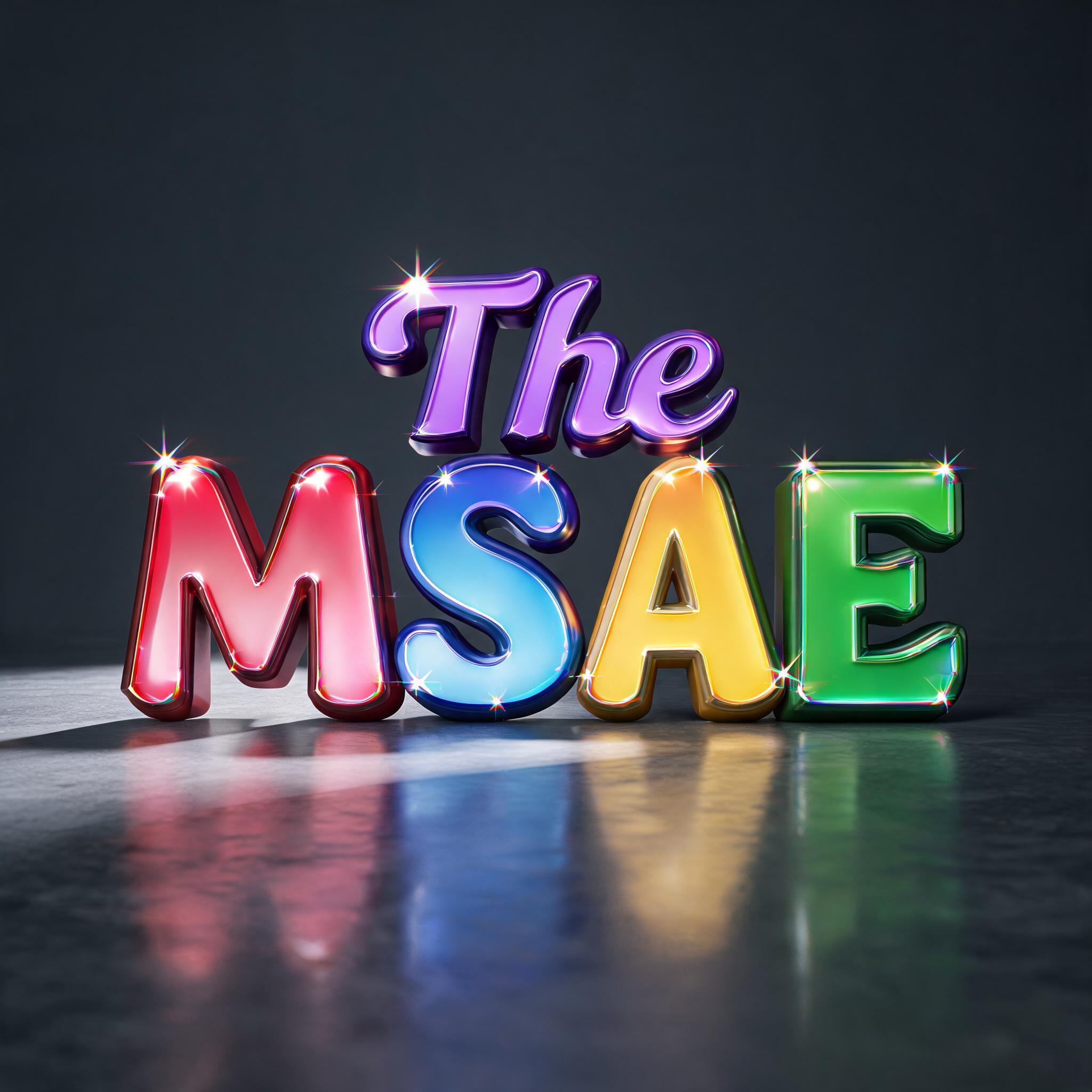
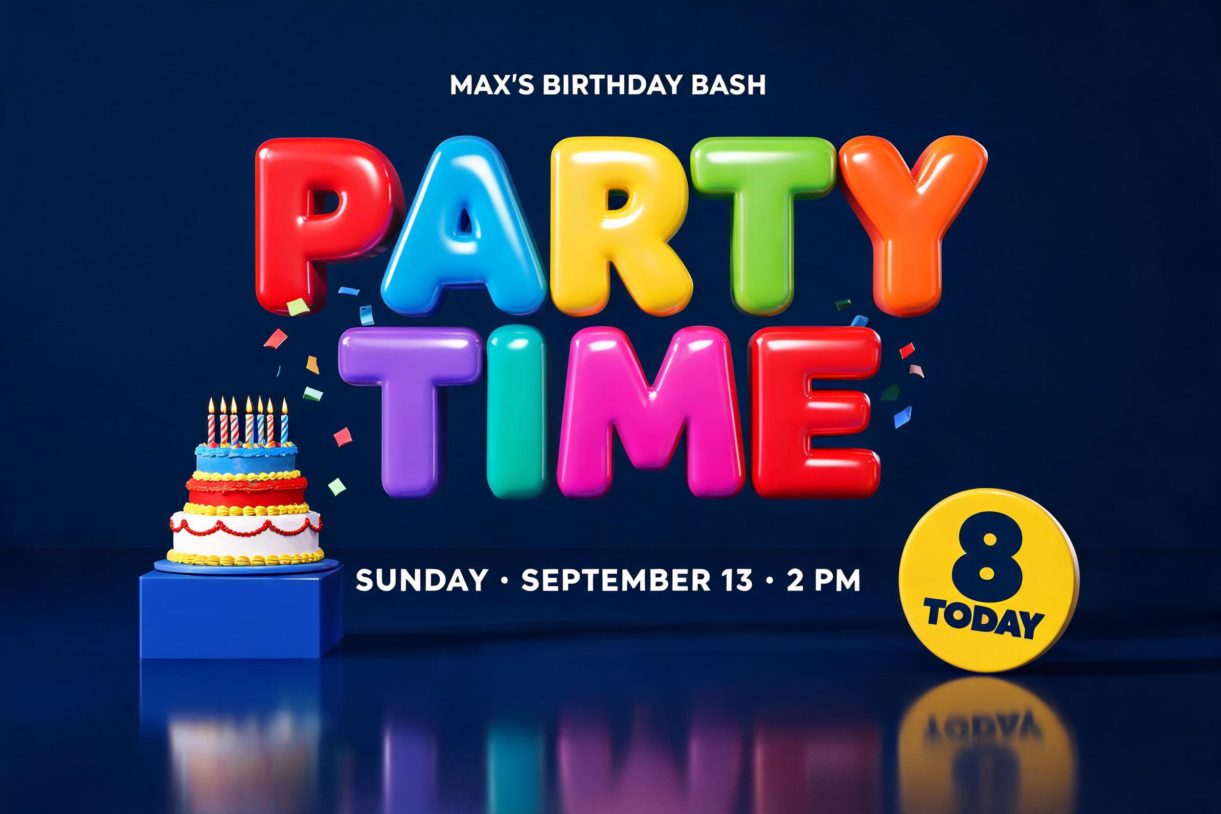
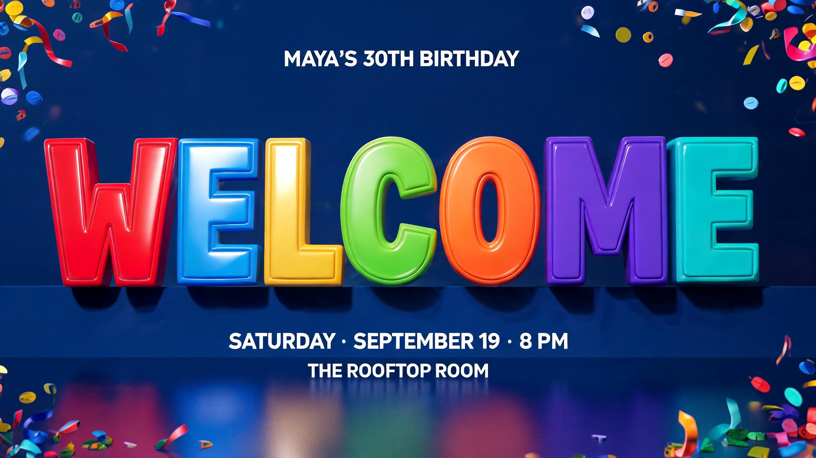
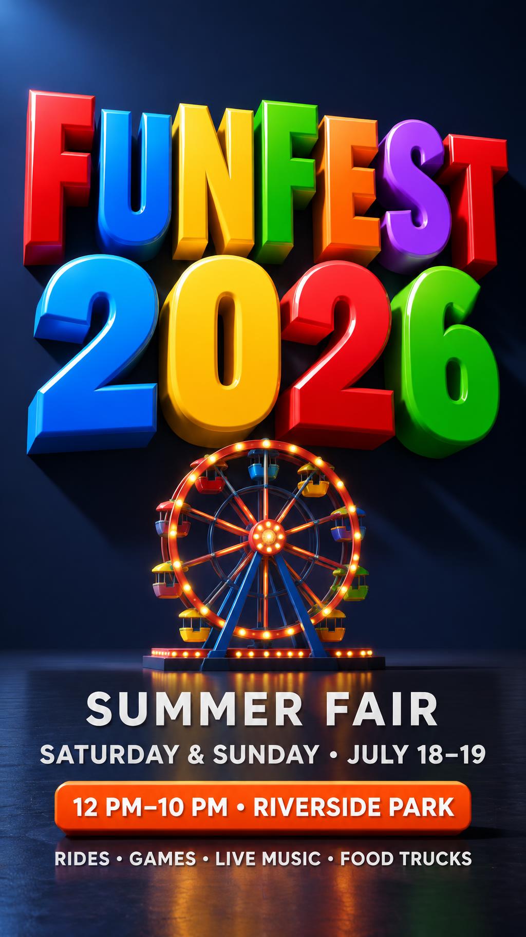
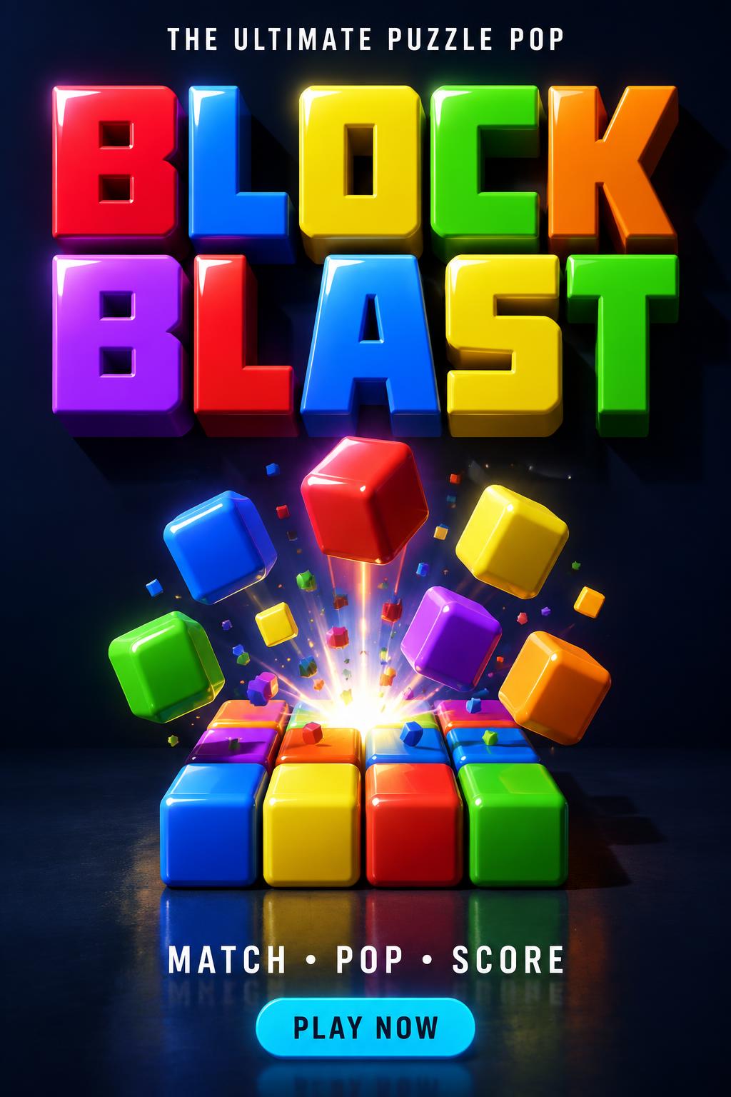

“Rinju singh Manoj Kushwaha” is a 3d Bold text effect Texteffekt erstellt mit FontVibe KI. Wuchtige Blockversalien mit tiefer Extrusion, jeder Buchstabe in einer anderen glänzenden Bonbonfarbe, von oben beleuchtet, sodass Glanzlichter über die runden Kanten laufen und farbige Spiegelungen auf dem Boden liegen.
Massive chunky 3D block letters with heavyweight extruded presence — thick uniform extrusion depth of 50-60% of letter height. Front face finished in ultra-glossy lacquer, catching directional key light with natural specular reflections that graduate from bright highlight to deep saturated color — the surface quality of hard candy coating or high-gloss toy paint. Side extrusion planes in a noticeably darker shade of the same hue, creating crisp face-to-depth contrast that reads immediately as three-dimensional volume. Adjacent letters each carry a different vivid saturated color, maximizing chromatic contrast across the word — no two adjacent letters share the same hue family. Hard sharp corner edges where face meets extrusion, no beveling. Long dramatic cast shadows at consistent 45-degree angle, shadow depth approximately 40-50% of letter height. Strong directional key light from upper left. Bold, high-contrast, maximum visual impact. LETTERFORM PRIORITY: when the chosen font carries its own treatment, that font's letterform shapes take priority and own the letters; this style governs the glossy 3D extrusion, the directional lighting and the multi-color scheme. FALLBACK MATERIAL: if the font carries no material of its own, render the letters as thick glossy extruded 3D blocks with hard candy-lacquer faces and darker extrusion sides. COLOR PRIORITY: if the font specifies its own colors, keep them; otherwise give each adjacent letter a different vivid saturated hue. The rendered text reads exactly “Rinju singh” and “Manoj Kushwaha,” treated as two substantial name elements with clear visual separation and balanced hierarchy. Each character becomes an independent heavyweight 3D object with a thick, uniform extrusion depth around 55% of its letter height. Use a strictly alternating sequence of vivid saturated hues across adjacent letters—cherry red, electric blue, sunshine yellow, lime green, violet, orange, cyan—with no neighboring characters sharing a hue family. Front faces are coated in ultra-glossy hard-candy lacquer, showing crisp directional specular streaks and bright white highlight bands; extrusion side planes use a deeper shade of the corresponding face color. Preserve hard, sharp face-to-depth edges without bevels. A strong upper-left studio key light produces long, clean 45-degree diagonal shadows extending across a polished deep-charcoal studio floor, with softened mirror reflections beneath the colored forms. Minimal dark backdrop, faint cool-gray depth gradient, restrained atmospheric haze, no decorative objects, no extra words, no logos. High-contrast ray-traced 3D render, precise contact shadows, saturated color separation, clean commercial title-card finish.
Gemacht für 3D-Text-Design
Generiert am 13. September 2026 · 2496 × 1664 · JPEG · BytePlus Seedream 5.0 · Von der erstellenden Person geteilt · Kostenlos kommerziell nutzbar (CC BY 4.0)