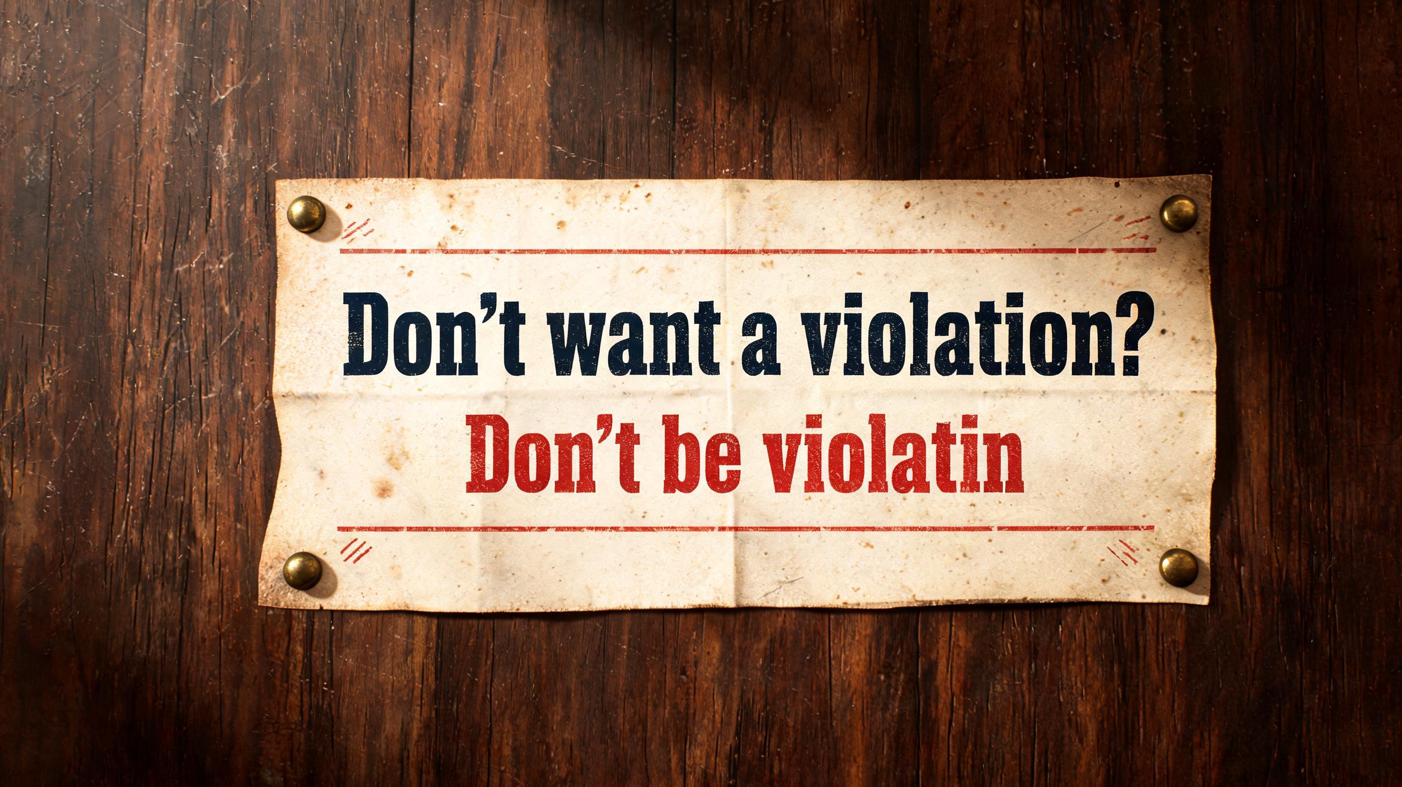
Don't want a violation? Don't be violatin - Vintage Text Effect


Nutzt BytePlus Seedream 5.0, das Modell dieses Werks · 15 Credits













“Don't want a violation? Don't be violatin” is a Vintage text effect Texteffekt erstellt mit FontVibe KI. Serifenversalien im Buchdruck in cremefarbenen Baumwollkarton gepresst, mit leicht ausbrechender Farbe, auf dem Fundament einer alten Presse zwischen verstreuten Bleilettern.
a timeless vintage piece carrying the physical evidence of an older making — warm, aged and classic. SURFACE / STYLE: the lettering looks produced by a heritage craft and softened by time — a letterpress impression bitten into cotton paper with ink slightly broken up, weathered paint on aged metal or wood, a worn rubber-stamp or postal imprint, or warm gold leaf — carrying patina, foxing, grain and gentle wear. SCENE ATMOSPHERE: a warm nostalgic setting — aged cream or kraft paper, dark wood, soft amber light, faint dust and a faded heritage feel. PALETTE: warm aged tones — cream, kraft, sepia, faded red, forest green, navy, tan and antique gold — muted and time-softened, never neon-bright. LETTERFORM PRIORITY: when the chosen font carries its own treatment (western slab, art deco, art nouveau, letterpress, postal or rubber stamp, gold leaf, typewriter, hand-lettered script, grunge chalk), that font treatment takes absolute priority and owns the letters; this style supplies the warm aged tone, the time-worn surface and the nostalgic heritage scene. FALLBACK MATERIAL: if the font carries no material of its own, render the letters as a classic serif printed in warm faded ink on aged cream paper with a soft letterpress impression and gentle wear, so the timeless vintage feel always reads. A weathered municipal safety poster from the late 1970s, printed on thick sun-faded cream stock with dark navy and oxidized faded-red ink. Render the exact text: "Don't want a violation? Don't be violatin" as the dominant message, with the question carrying heavier visual weight and the final phrase treated as a blunt stamped instruction. Deep letterpress bite, uneven ink transfer, dry speckling inside the strokes, softened edges, small paper fibers caught in the impression, scattered brown foxing and fold-wear along the sheet. A thin faded-red rule, tiny distressed inspection marks, and fragments of worn official-print ornament sit around the message without competing with it. The paper is pinned against a scratched dark walnut notice board, with a few tarnished brass tack heads and a narrow strip of shadow at the paper edge. Warm amber side light reveals the cotton-paper tooth, shallow embossing, dust particles, and rubbed corners. Restrained heritage palette of parchment cream, sepia, navy, faded red, and dull brass; no neon, no contemporary devices, no extra readable words. Vintage public-notice print, tactile ink, aged civic signage.
Gemacht für Vintage-Schrift-Generator
Generiert am 16. September 2026 · 2848 × 1600 · JPEG · BytePlus Seedream 5.0 · Von der erstellenden Person geteilt · Kostenlos kommerziell nutzbar (CC BY 4.0)


