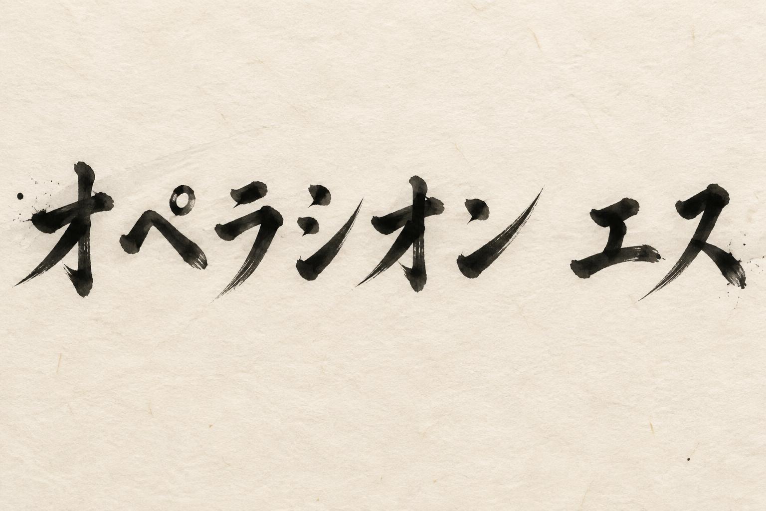
オペラシオン エス - Japanische Tuschepinsel-Schrift Text Effect


Nutzt OpenAI GPT-Image-2.5 Sunburst, das Modell dieses Werks · 15 Credits











“オペラシオン エス” is a Brush Japanese Ink text effect Texteffekt erstellt mit FontVibe KI. Japanischer Shodo-Tuschepinsel-Kalligrafiestil, angewendet auf lateinische Buchstaben. Tiefes Sumi-Schwarz mit authentischer Fude-Pinselenergie, kontrollierten Strichen in eine Richtung und Washi-Papier-Atmosphäre. Perfekt für das Branding japanischer Restaurants, Tattoo-Design, Anime, Kampfkunst und kulturelle Projekte.
Japanese ink brush aesthetic — the visual language of sumi calligraphy on washi paper. INK MEDIUM: sumi pigment in deep black to charcoal range — richest density at mark centers, naturally transitioning outward as ink supply depletes. Fully matte, absorbed into paper surface, producing a tonal range from dense opaque black to transparent grey depending on dilution and brush load. PAPER SURFACE: natural washi — warm cream-white base with visible paper fiber structure giving slight texture. The absorbent surface creates the characteristic soft border quality of East Asian brush work at all mark edges. LIGHT ATMOSPHERE: soft diffuse north-facing studio light — the traditional calligrapher's light source. Even, shadowless, allowing the full tonal range of ink marks to read clearly. Warm cream paper tone contrasts against deep sumi black. AESTHETIC REGISTER: the ma principle — the space between and around marks is as considered as the marks themselves. Compositions have breathing room and deliberate quietness. When no specific material is defined by the font: default environment — deep sumi black marks on warm cream washi paper, soft diffuse overhead light, meditative studio atmosphere. Japanese ink brush calligraphy rendering the exact text 「オペラシオン エス」 in deep sumi pigment across warm cream washi paper. Each katakana mark carries decisive, loaded brush entries with dense blue-black cores, pressure-sensitive widening, dry-brush striations, and tapered pull-away ends that dissolve from charcoal gray into transparent ink wash. Absorbent paper fibers interrupt the edges with controlled feathering and irregular capillary bleed; no glossy finish, no digital outlines, no decorative graphics. The long phrase is given spacious visual rhythm, with deliberate intervals of untouched paper acting as ma between the ink forms. A faint diluted gray ink wash sits behind selected stroke paths, resembling a single broad brush passed quickly over the sheet, while a few restrained micro-splashes remain near forceful stroke origins. Soft diffuse north-facing studio light reveals the warm cellulose grain, subtle deckle-like paper variation, and full tonal gradation inside the matte ink. Quiet traditional shodo presentation, high-resolution scanned-paper detail, clean unframed surface, ample cream negative space surrounding the calligraphic marks.
Gemacht für Japanische Pinsel-Schrift
Generiert am 23. September 2026 · 1536 × 1024 · JPEG · OpenAI GPT-Image-2.5 Sunburst · Von der erstellenden Person geteilt · Kostenlos kommerziell nutzbar (CC BY 4.0)


