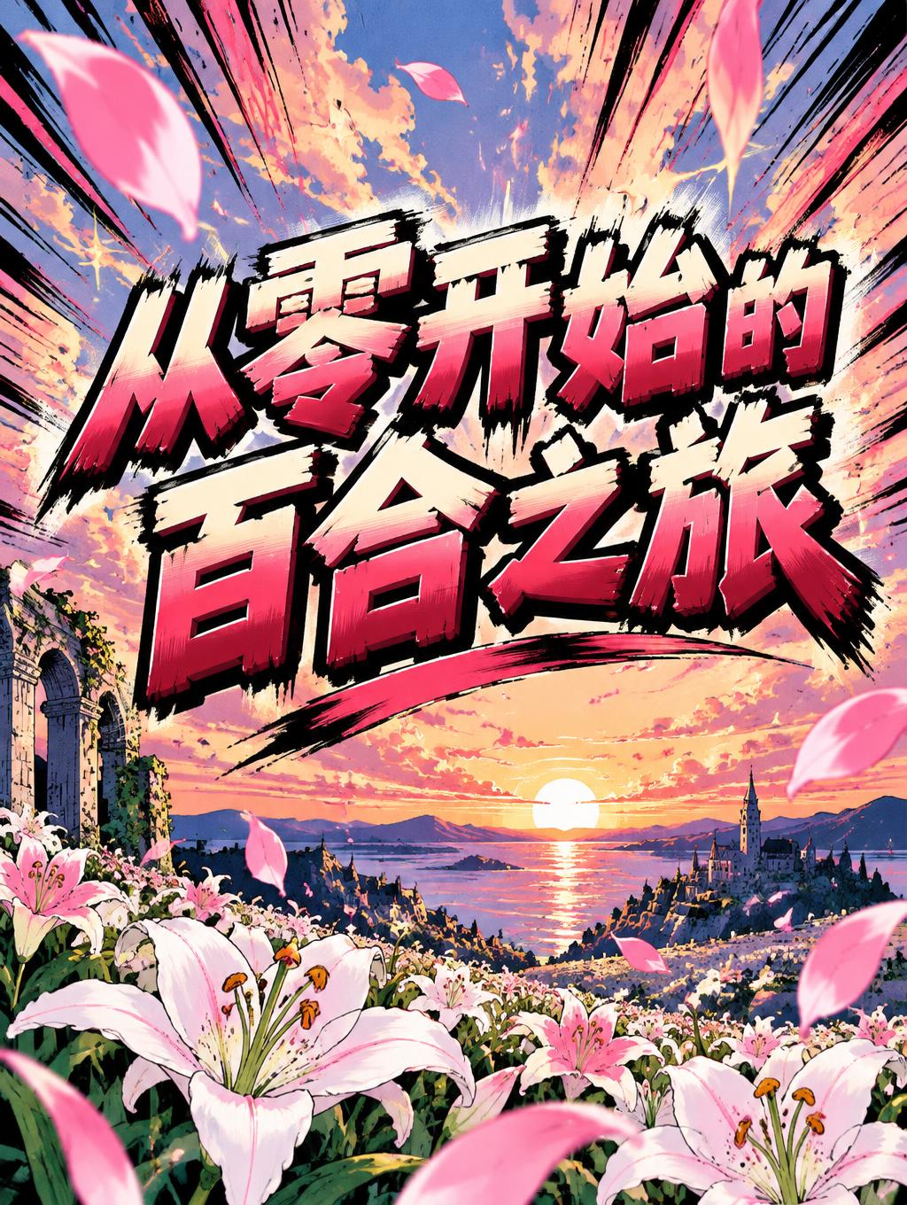
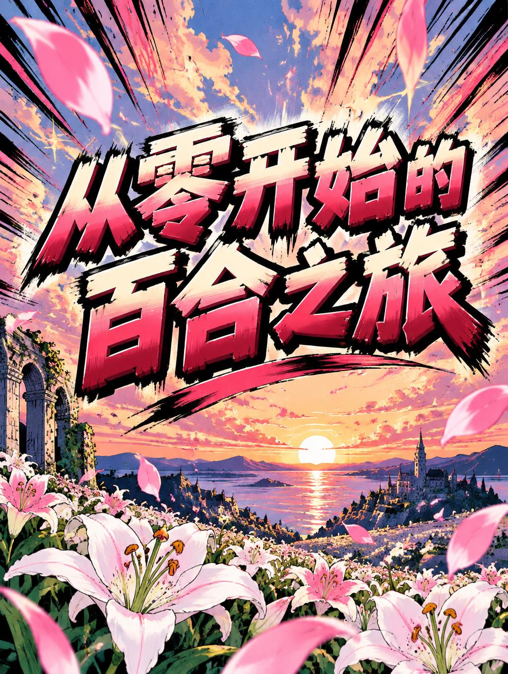
从零开始的百合之旅 - Anime Text Effect


Nutzt OpenAI GPT-Image-2.5 Sunburst, das Modell dieses Werks · 15 Credits


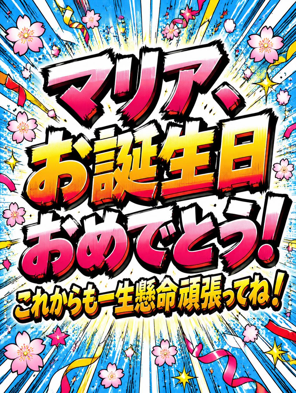
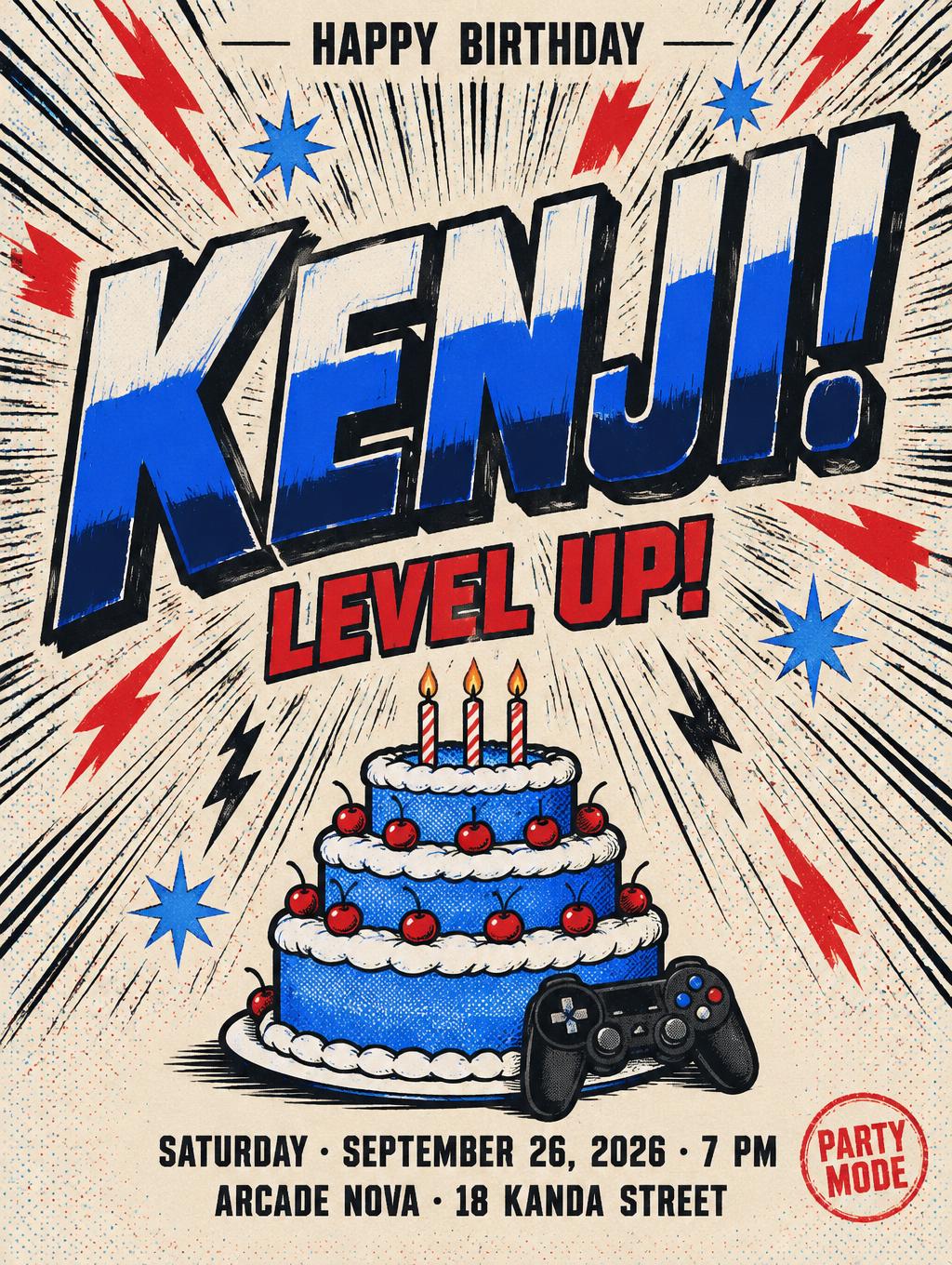
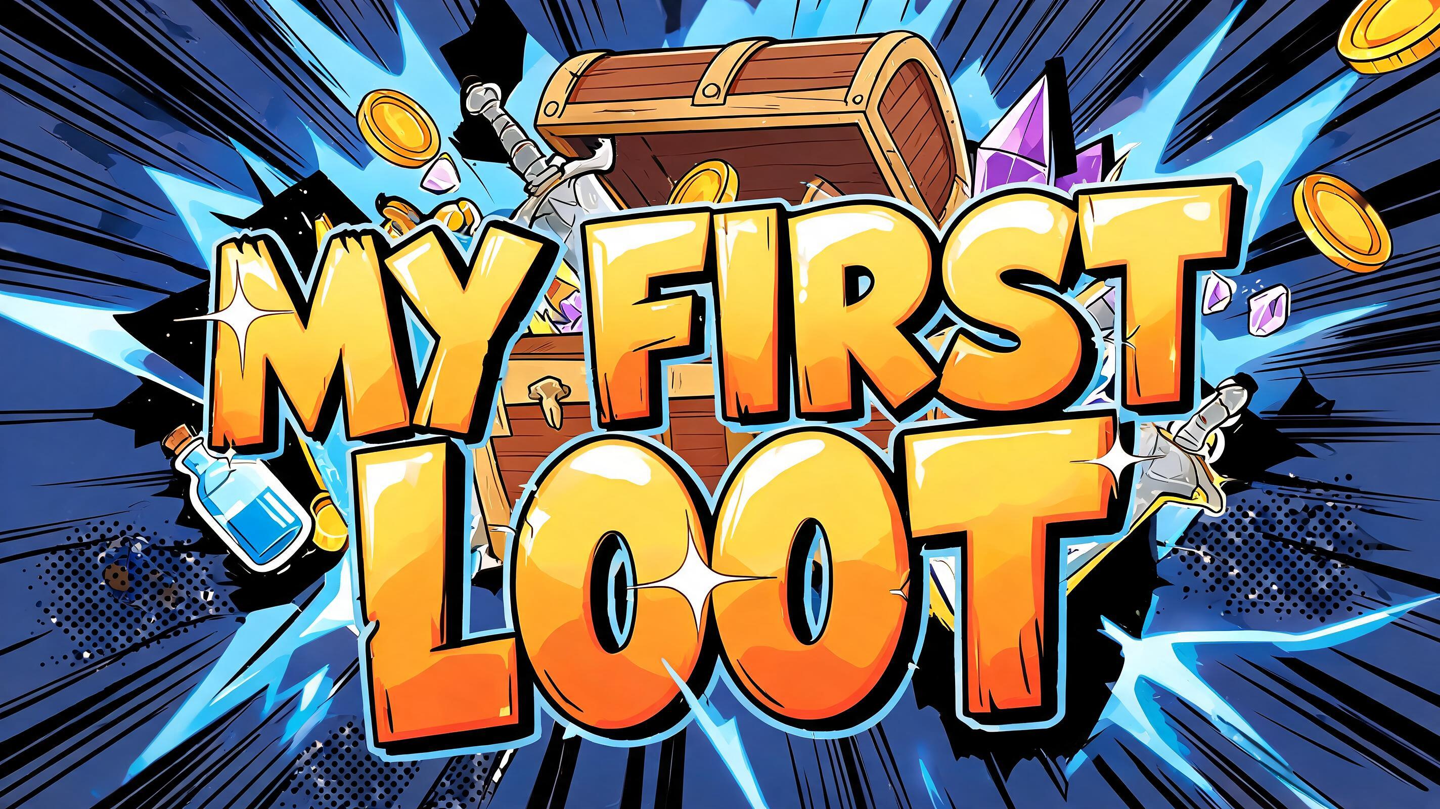
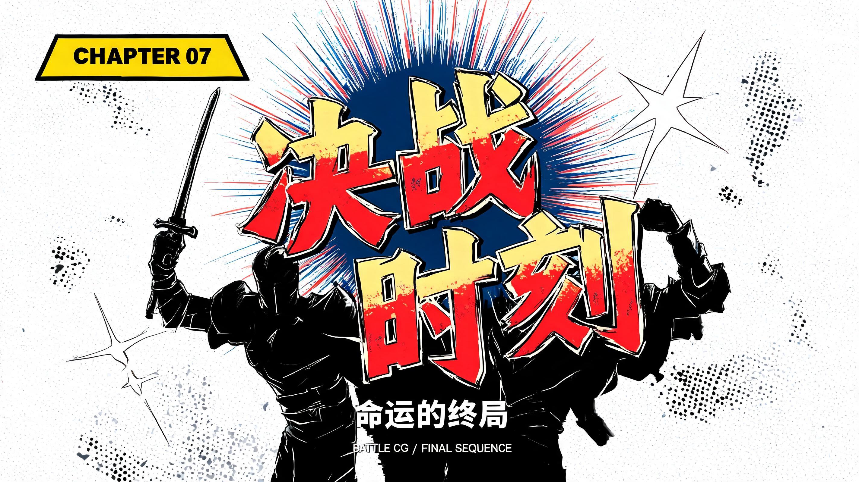
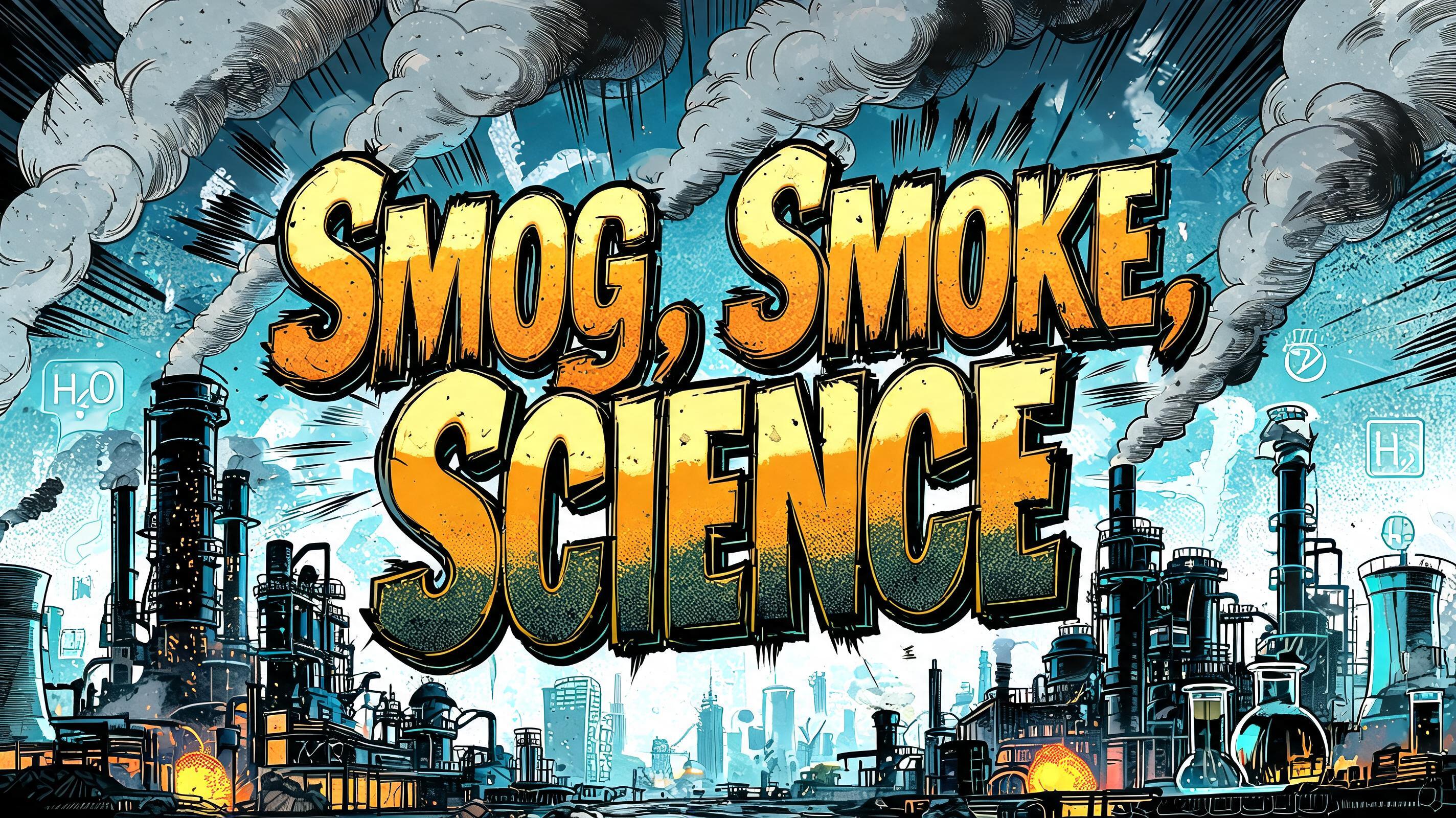




“从零开始的百合之旅” is a Anime text effect Texteffekt erstellt mit FontVibe KI. Shōnen-Manga-Titelschrift: dicke, von Hand getuschte schwarze Konturen, flaches Cel-Shading in harten Licht- und Schattenbändern, schräg gestellte, dynamische Buchstaben auf Weiß mit strahlenförmigen Speedlines.
rendered as Japanese shounen anime title treatment — bold hand-inked manga lettering with authentic cel-shaded visual energy. Letter construction follows classic Shonen Jump title card standards: thick black ink outline with natural brush-weight variation defining each letter boundary; flat cel-shading fill with three hard-edge zones — bright highlight zone on upper letter face, highly saturated primary color zone at center, deep shadow zone at lower edge; all zone boundaries knife-edge hard, zero gradient blur, pure flat offset-print ink physics. Energy signature: high-contrast color + thick ink outline = letters that look physically printed on manga paper. The typographic language of Dragon Ball, Naruto, One Piece, Demon Slayer, Jujutsu Kaisen title cards — maximum manga kinetic energy, iconic and immediately recognizable as Japanese anime title typography. LETTERFORM PRIORITY: when the chosen font carries its own treatment, that font's letterform shapes take priority and own the letters; this style governs the inked manga outline, the three-zone cel-shading and the kinetic energy. FALLBACK MATERIAL: if the font carries no material of its own, render the letters as bold hand-inked shounen title lettering with a thick black brush outline and hard three-zone cel-shading. COLOR PRIORITY: keep the font's own colors if specified; otherwise a high-saturation primary fill with hard highlight and shadow zones. Japanese shounen anime title treatment for the exact Chinese text “从零开始的百合之旅”. Dense CJK characters carry the visual weight of a full manga chapter title, rendered with thick irregular black ink contours, small dry-brush edge flecks, and crisp offset-print texture. The glyph faces use three hard cel-shading planes: pale ivory highlights across upper surfaces, saturated rose-pink and vermilion midtone fields, and deep wine-red shadow planes along lower edges; every color break is sharp and graphic with no soft gradients. Add thin white knockout highlights and selective black hatch marks inside the heavier strokes. Behind the title, a luminous dawn sky opens over a field of large white lilies and pink lily petals, with petals cutting through the surrounding negative space like manga action debris. Radial speed lines, ink burst marks, and tapered star-shaped impact flashes radiate outward from the title, alternating black, crimson, and cream ink. A distant horizon is reduced to flat cel-painted bands of coral, lavender, and deep indigo. Use high-contrast anime key art lighting, hard rim highlights, clean graphic silhouettes, printed manga-paper grain, sharp screen-tone dots, and energetic chapter-title-card density. Keep all rendered wording exactly as “从零开始的百合之旅”; no additional text, no Latin characters, no logos, no watermark.
Gemacht für Anime-Schrift-Generator
Generiert am 6. Oktober 2026 · 1024 × 1360 · JPEG · OpenAI GPT-Image-2.5 Sunburst · Von der erstellenden Person geteilt · Kostenlos kommerziell nutzbar (CC BY 4.0)


