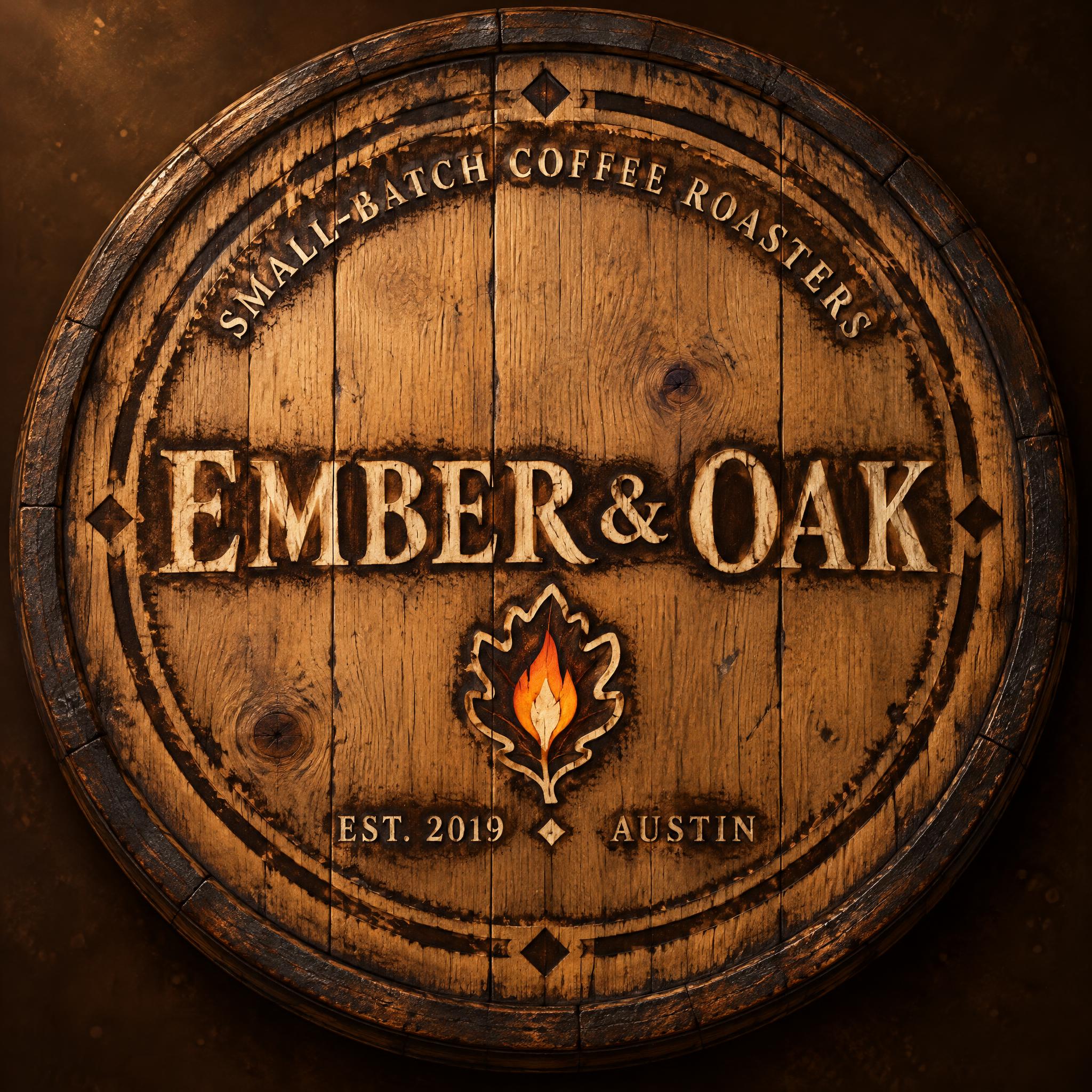
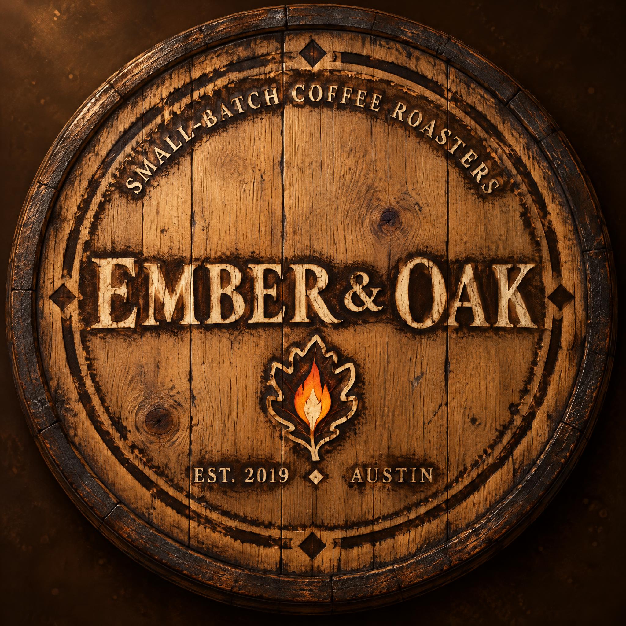
EMBER & OAK SMALL-BATCH COFFEE ROASTERS EST. {{founding_year}} {{city_name}} - Vintage Text Effect

Nutzt OpenAI GPT-Image-2.5 Sunburst, das Modell dieses Werks · 32 Credits









„EMBER & OAK SMALL-BATCH COFFEE ROASTERS EST. {{founding_year}} {{city_name}}“ ist ein Vintage-Texteffekt, erstellt mit FontVibe KI. Serifenversalien im Buchdruck in cremefarbenen Baumwollkarton gepresst, mit leicht ausbrechender Farbe, auf dem Fundament einer alten Presse zwischen verstreuten Bleilettern.
A square logo: a circular heritage cooperage seal that looks like a brand burned into the head of an old oak barrel. Craft and provenance lead. The seal fills nearly the whole canvas with a slim margin, centred on a dark Roasted Umber (#2B1A10) background with soft warm amber falloff and faint dust. The seal is a disc of Oak Honey (#C98A4B) wood with visible plank seams, fine grain, small knots, darker char at the rim and a few iron-hoop-like rings. Burned into it is a double-rule circular border, a thick ring inside a thin ring, with small diamond ornaments breaking the ring at the quarters. Everything is worn, with slightly broken edges, as a hot branding iron would leave it. TYPE: all lettering is old-style humanist serif capitals with diagonal stress from a broad-nib pen, bracketed serifs with soft curved transitions, moderate thick-thin contrast and a visible calligraphic entry angle. It is Parchment Cream (#E8D5B0), burned and inked into the oak with a slightly pressed, uneven edge. Thick strokes sit a little deeper than the thin ones, and the diagonal axis shows as a gentle tonal shift. Keep it legible at small size and workable in one or two colours. LAYOUT, centred and symmetrical: 1. Upper band: "SMALL-BATCH COFFEE ROASTERS" in small, widely tracked capitals, curved along the top arc of the inner ring. It spans a bit over half the seal width, with the letters fanning outward evenly. 2. Centre, dominant: "EMBER & OAK" in large capitals on one straight horizontal line across the middle of the seal, about two thirds of the width. The ampersand is a slightly smaller, calligraphic old-style ampersand that sits on the same baseline. This is the first thing the eye lands on, with generous air above and below. 3. Below the name, centred, small: a compact ember-and-leaf mark. It is a single oak leaf with rounded lobes, its centre vein replaced by a glowing flame teardrop. The flame is Ember Orange (#D9531E) with a pale hot core and is the only saturated colour in the piece. The leaf is outlined in Parchment Cream. It is about a fifth of the seal width. 4. Lower line, two small blocks sharing one baseline: "EST. {{founding_year}}" left of centre and "{{city_name}}" right of centre, separated by a small gap and a tiny diamond. Both are small tracked capitals, with the year block slightly wider than the city block. LIGHT AND MOOD: warm soft amber light from the upper left, giving the wood a gentle sheen, a darker rim and a faint char halo around the burned marks. The look is aged, nostalgic and trustworthy, with subtle patina and no neon. The palette is limited to umber, oak honey, parchment cream and the single ember orange accent. The logo is flat-on and centred with no perspective and no extra text.
Generiert am 30. Oktober 2026 · 2048 × 2048 · JPEG · OpenAI GPT-Image-2.5 Sunburst · Layout: Bogen-Emblem · Von der erstellenden Person geteilt · Kostenlos kommerziell nutzbar (CC BY 4.0)