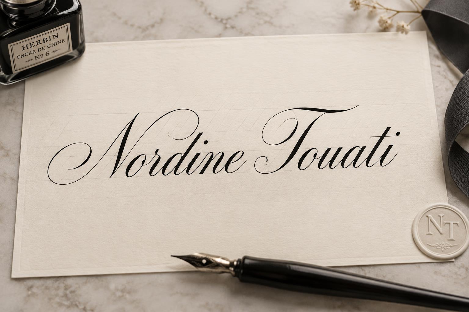
Nordine Touati - Kalligraphie-Schrift Text Effect


Nutzt OpenAI GPT-Image-2.5 Sunburst, das Modell dieses Werks · 15 Credits
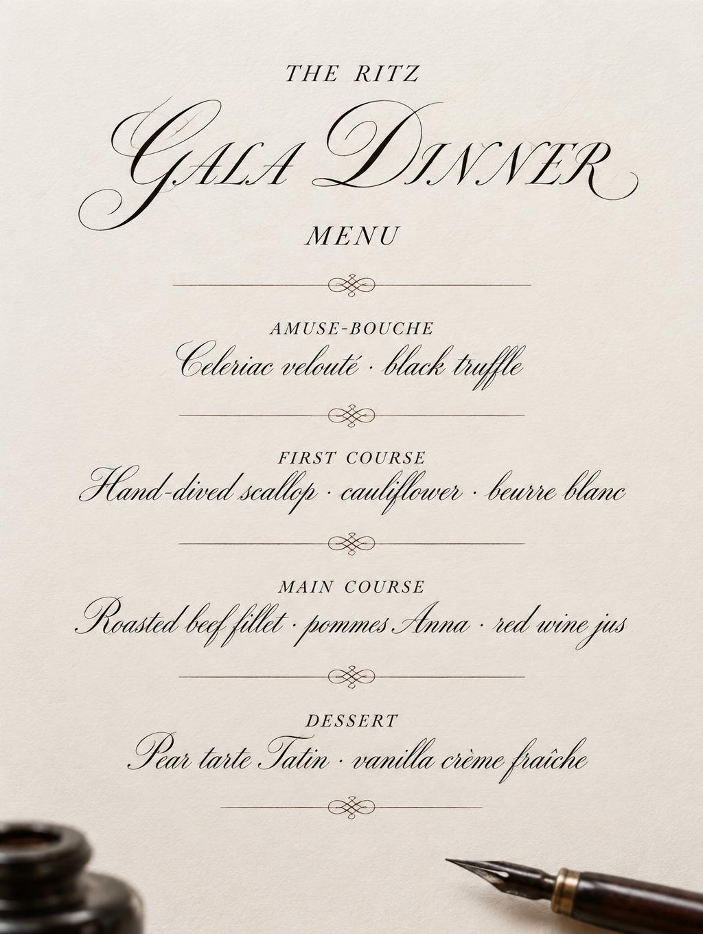
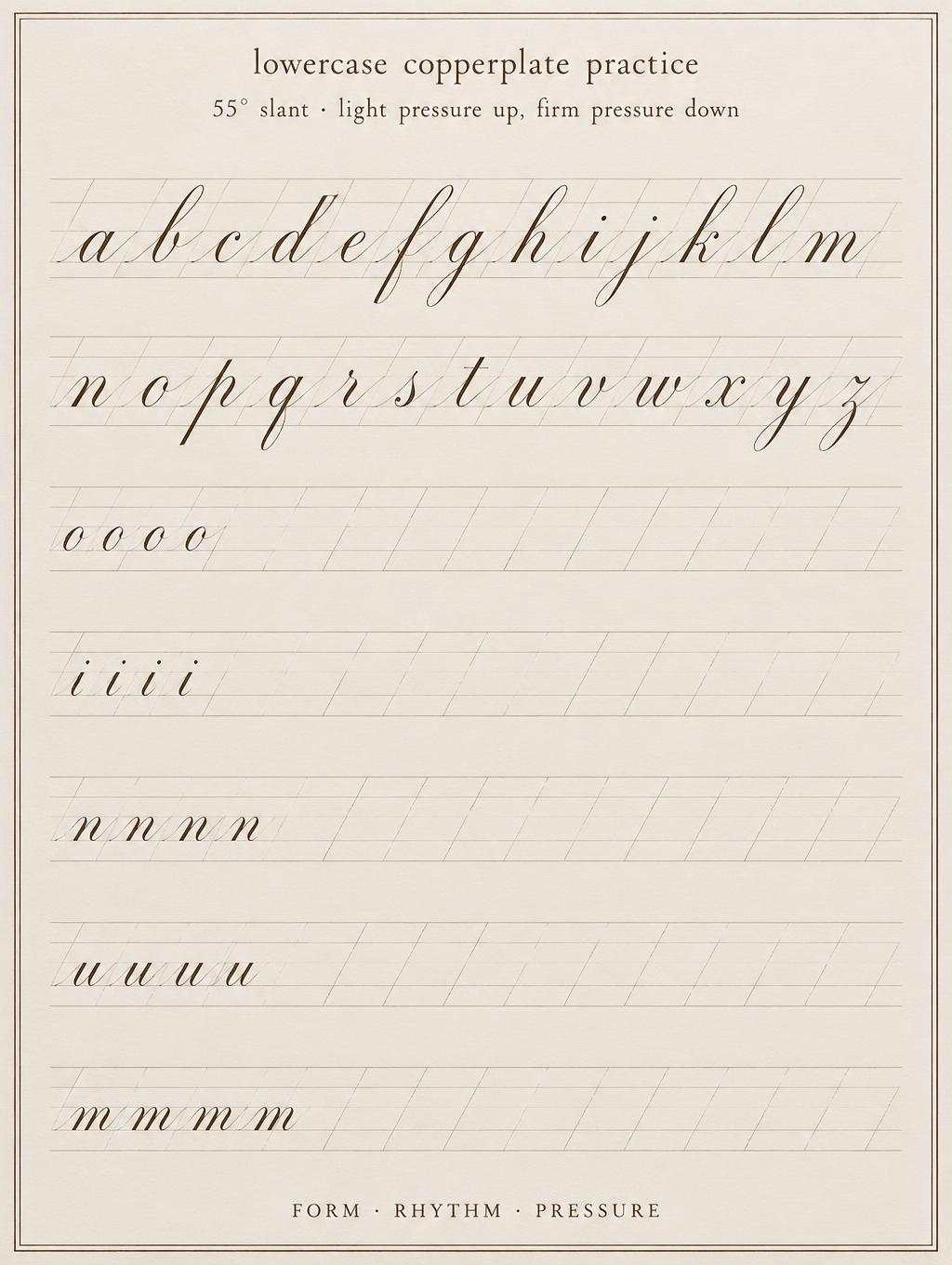
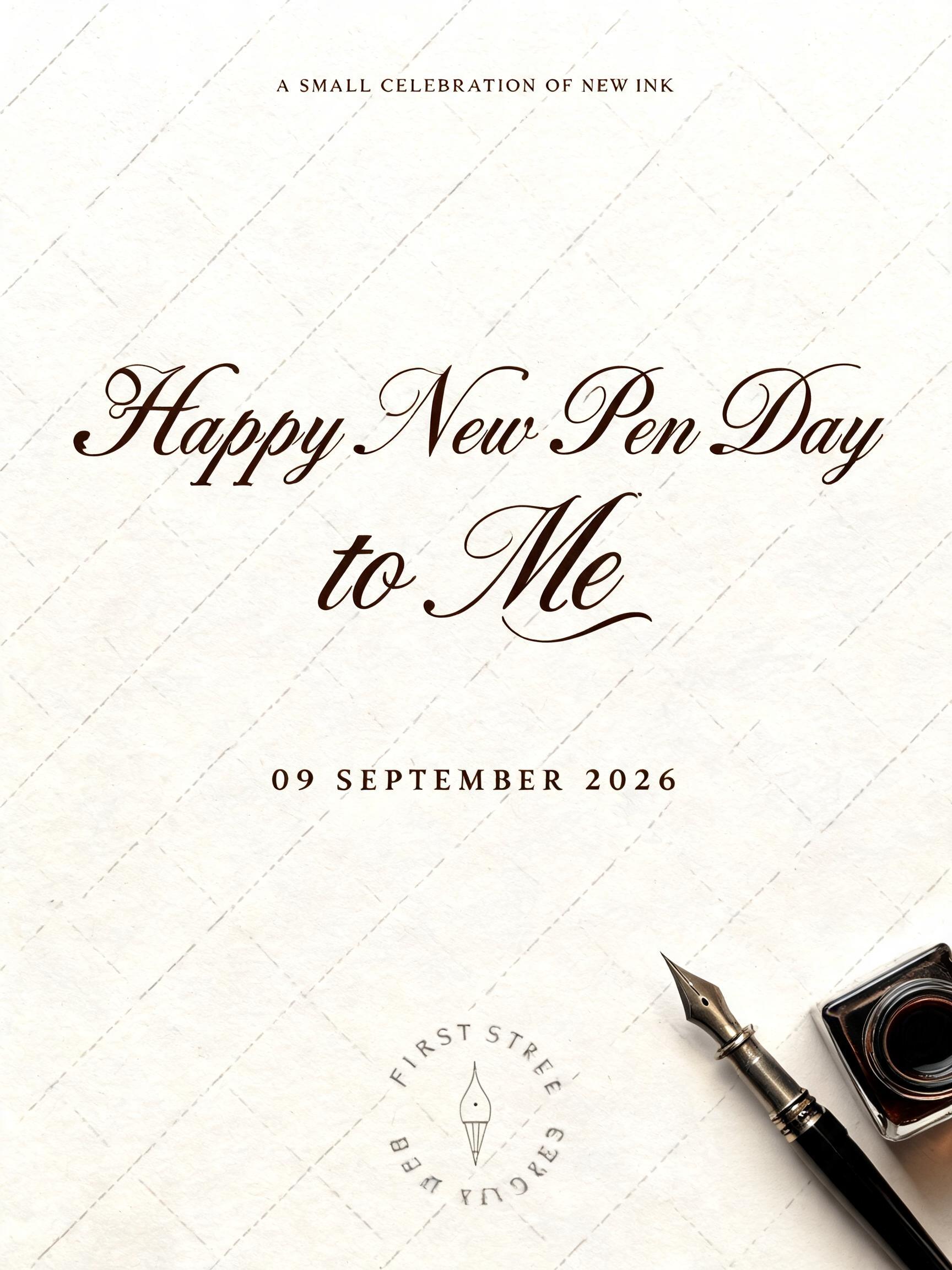
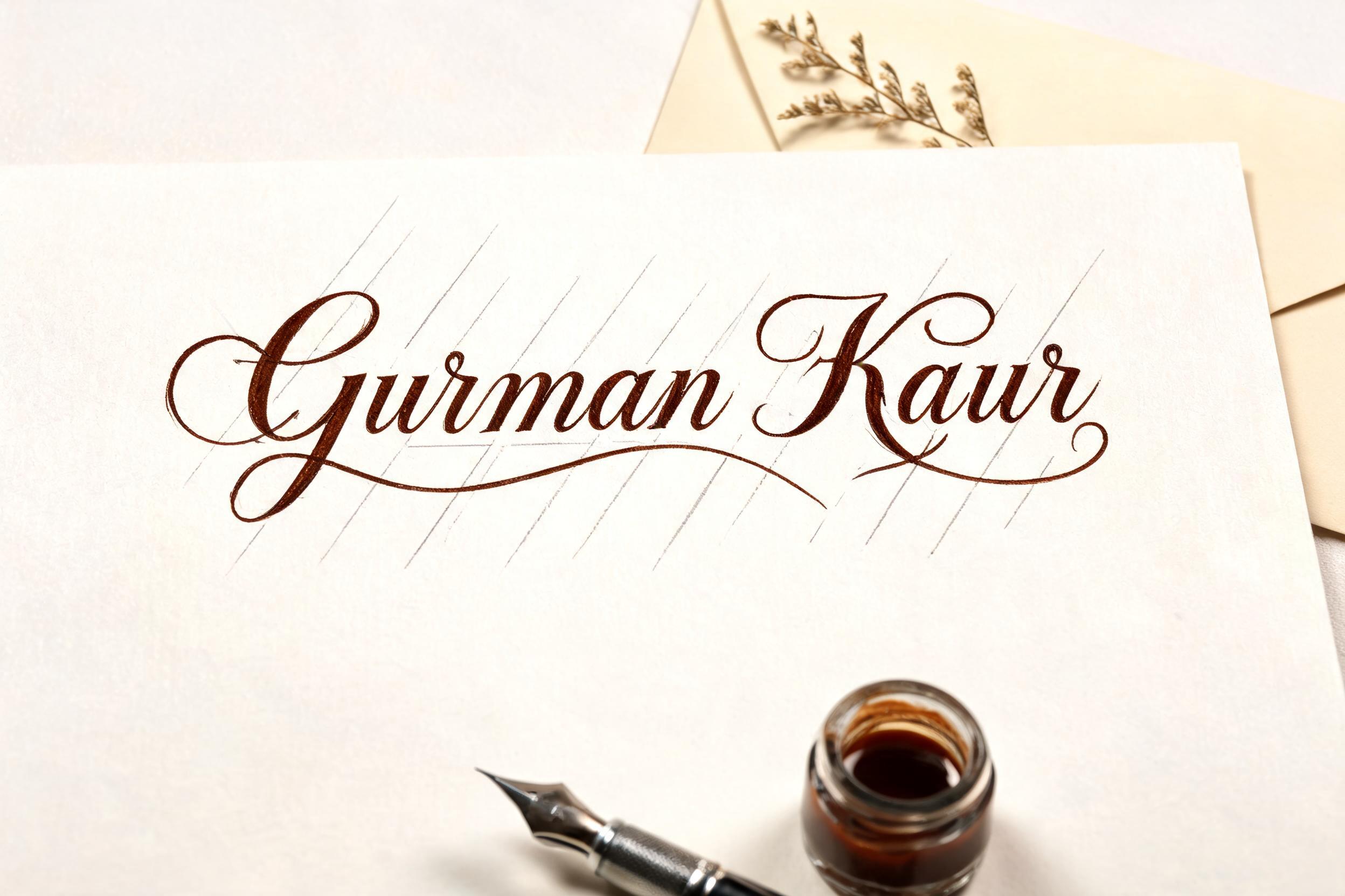
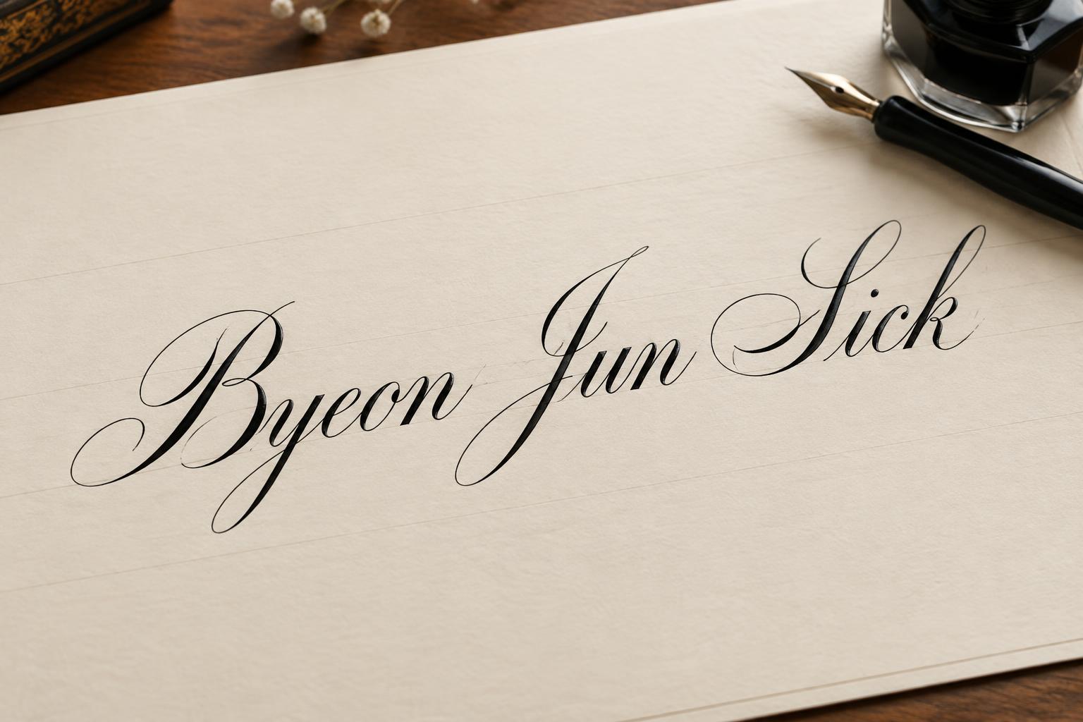
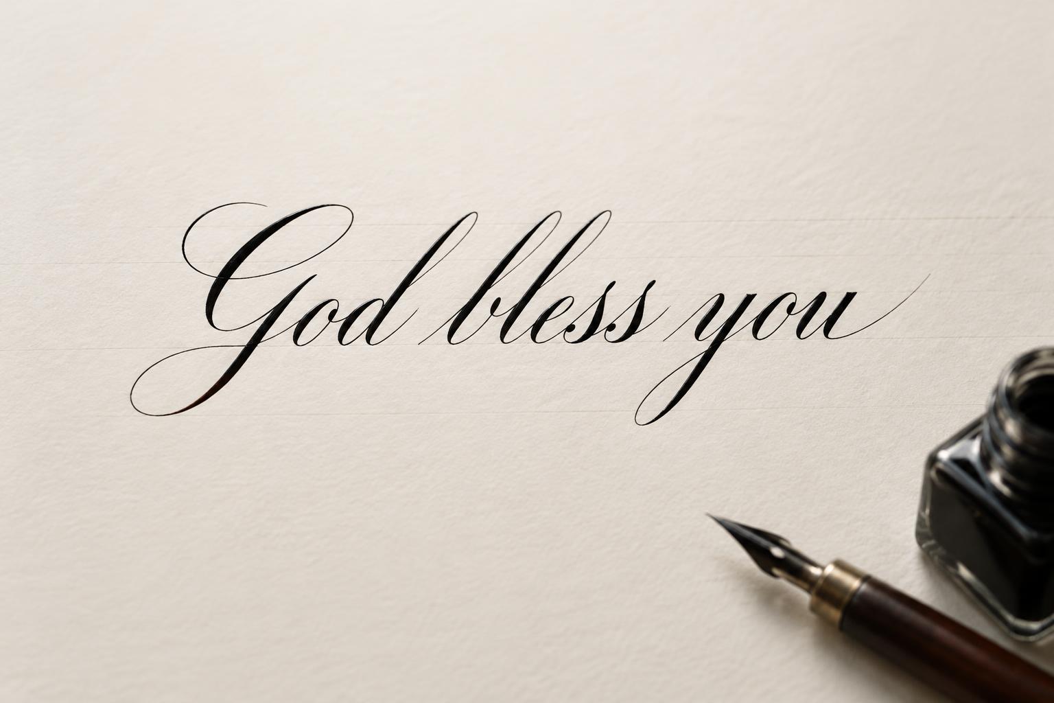
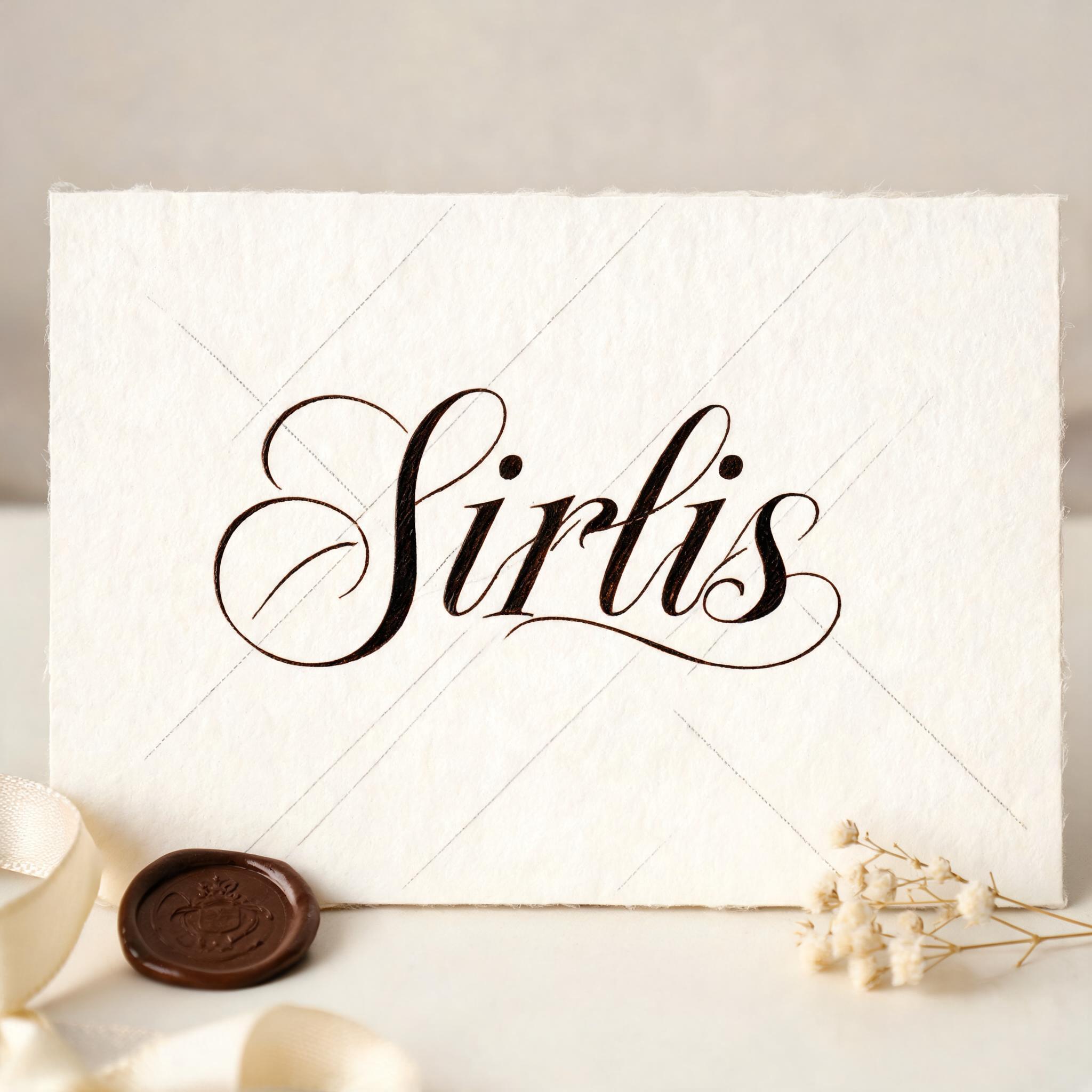
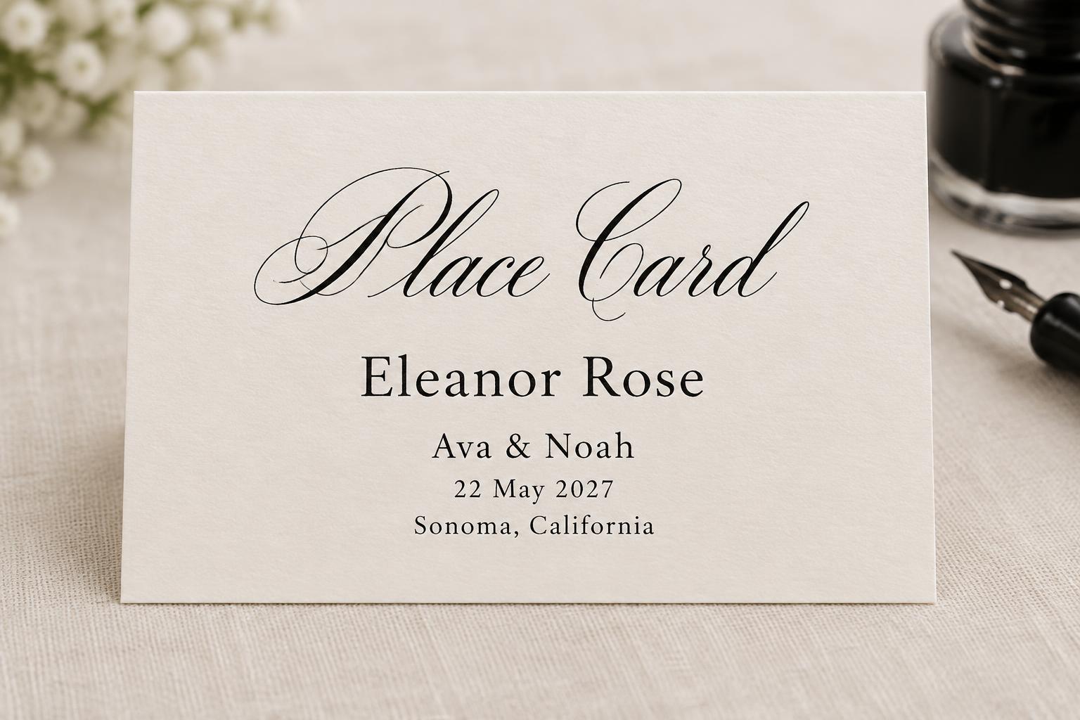
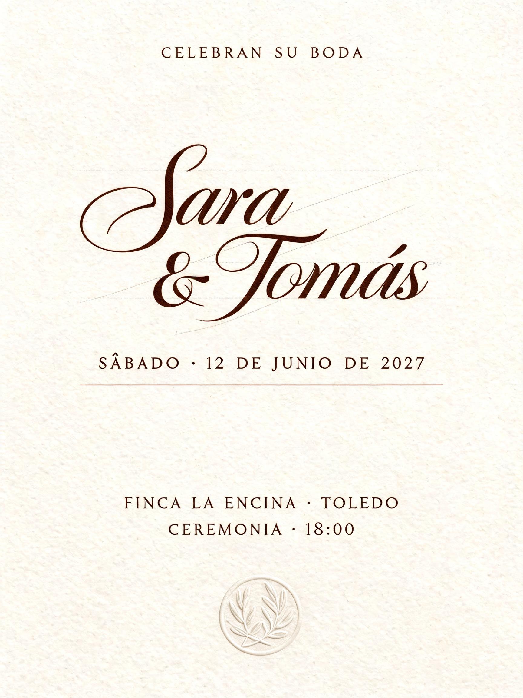
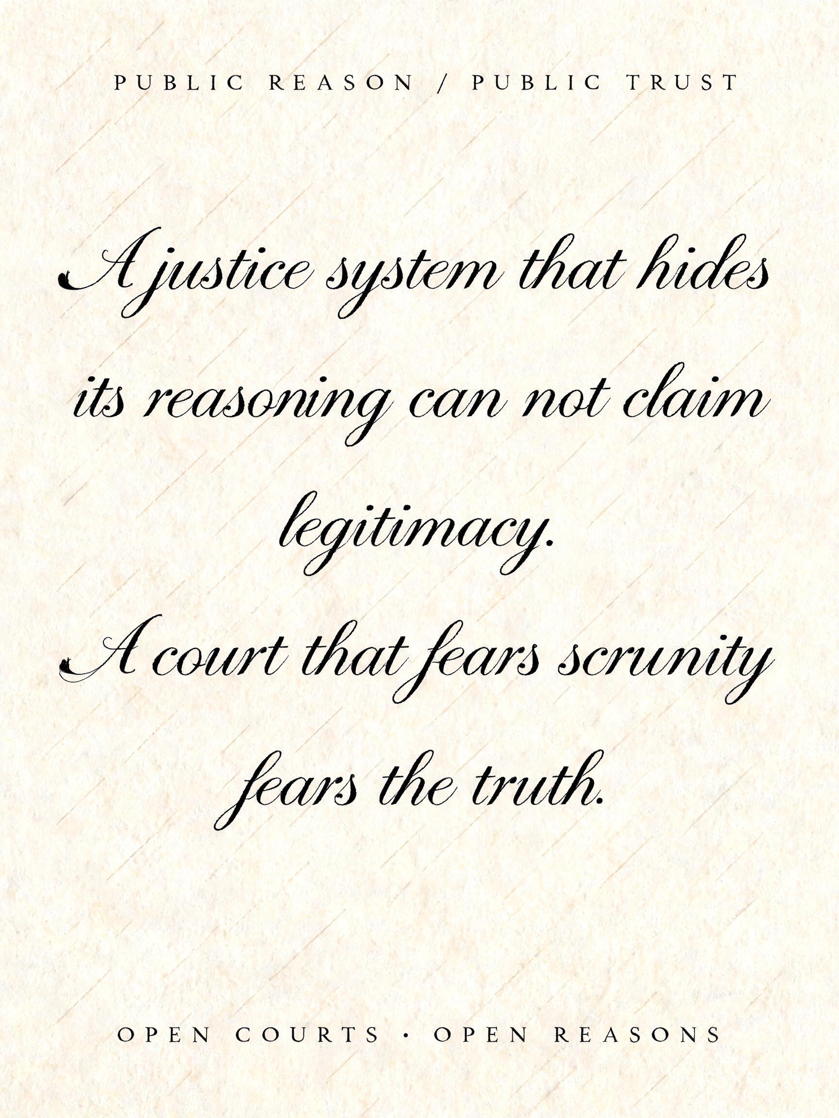
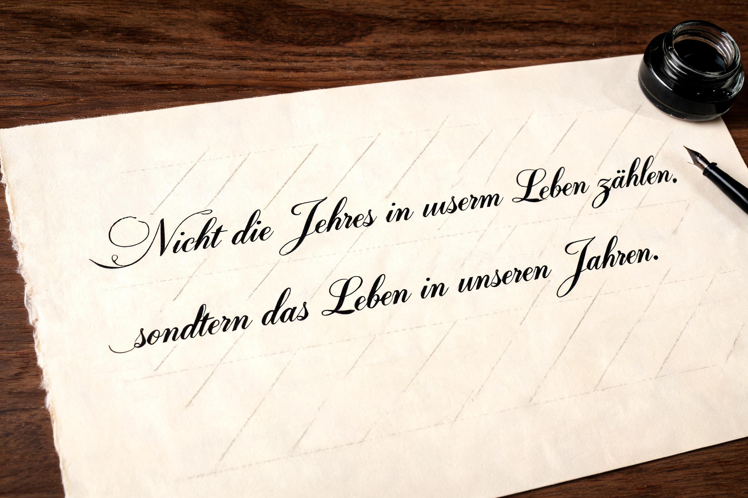
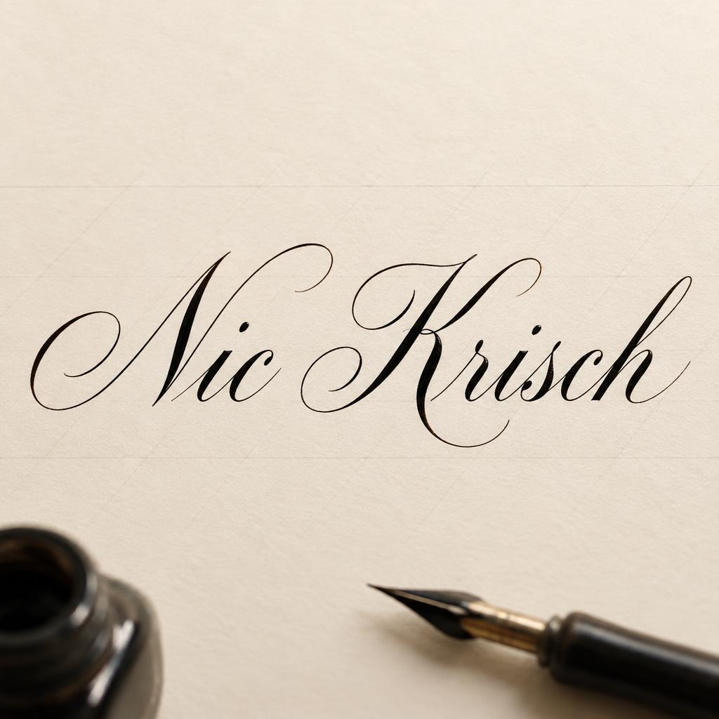
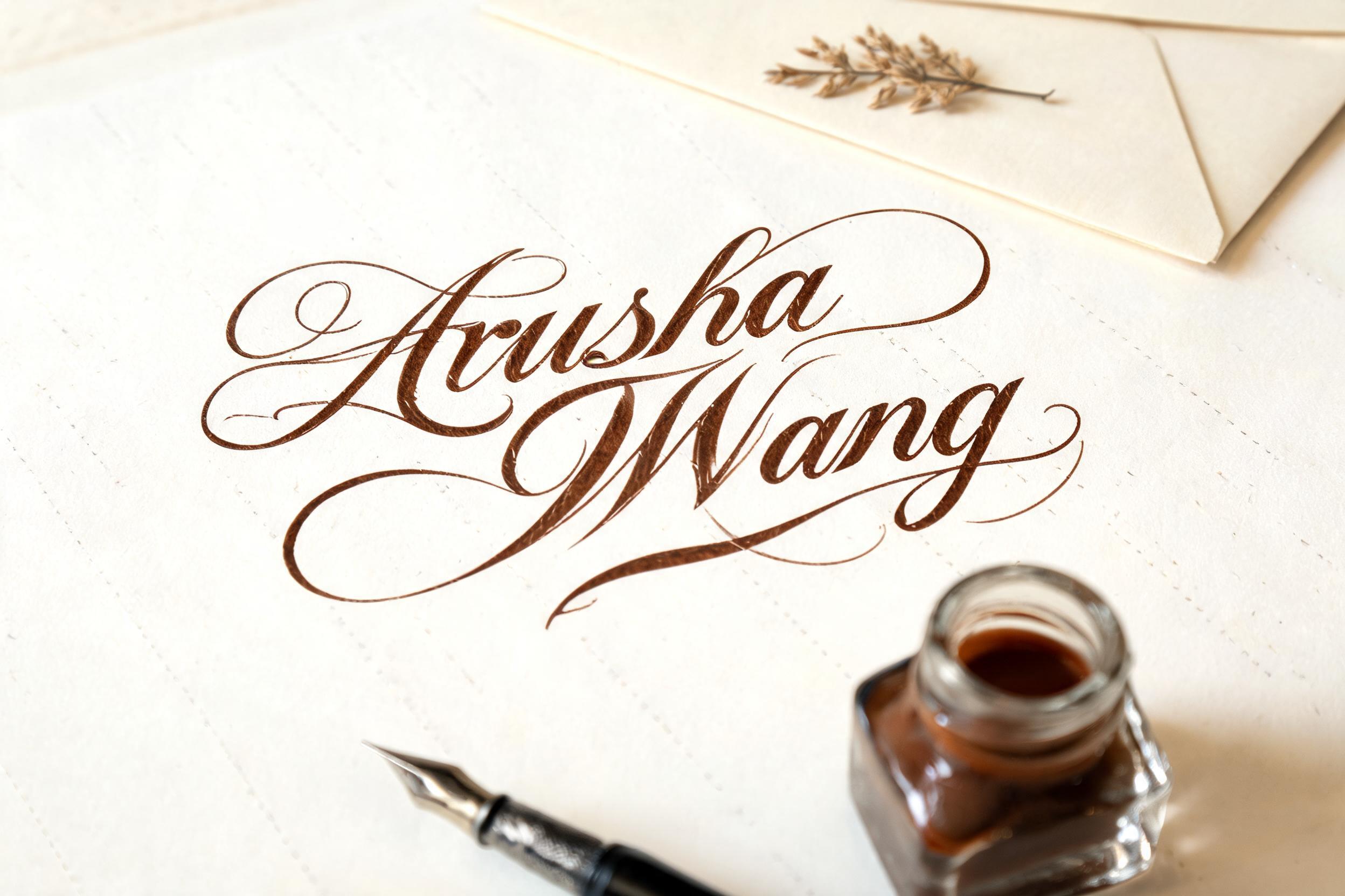
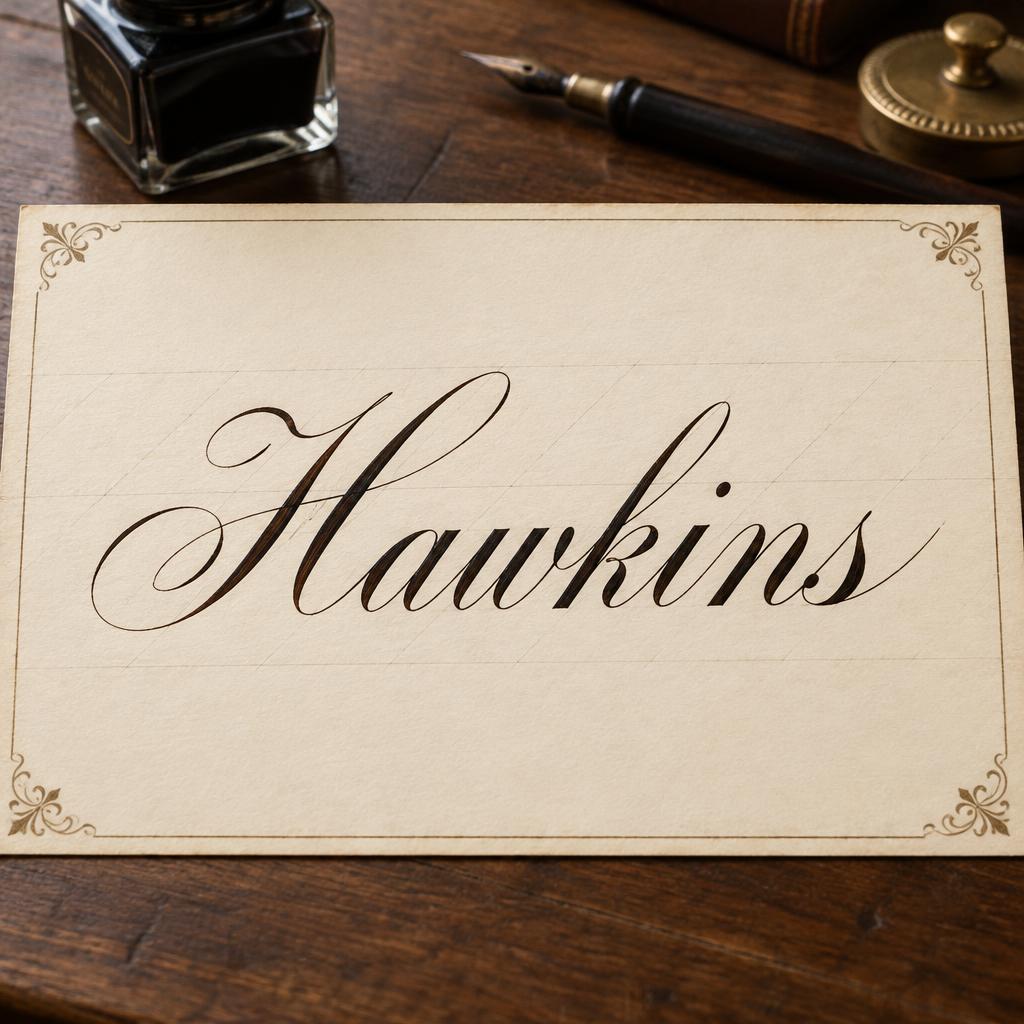
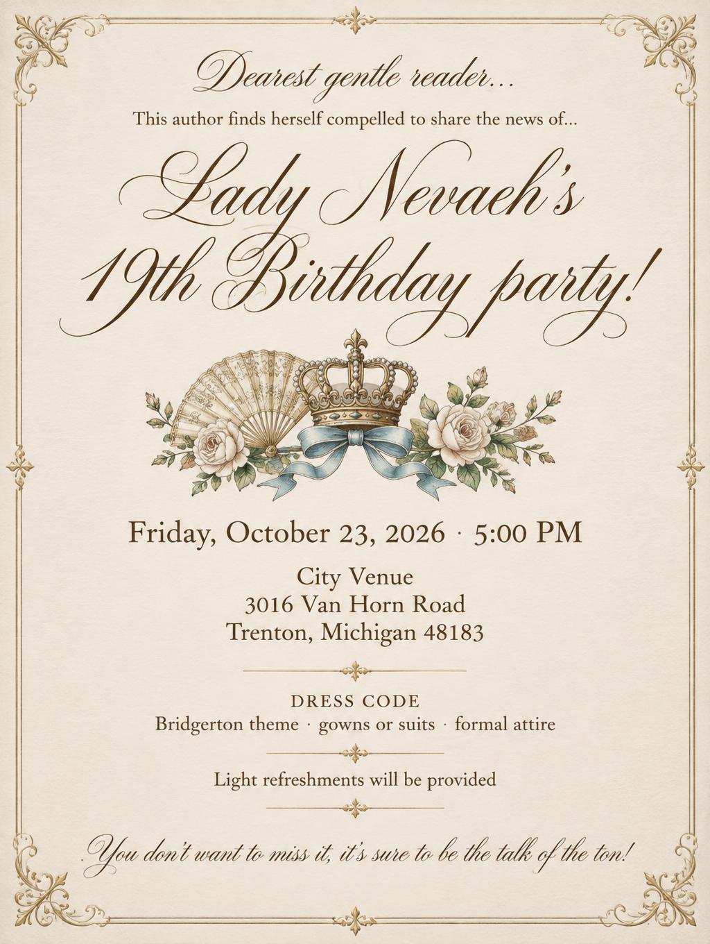
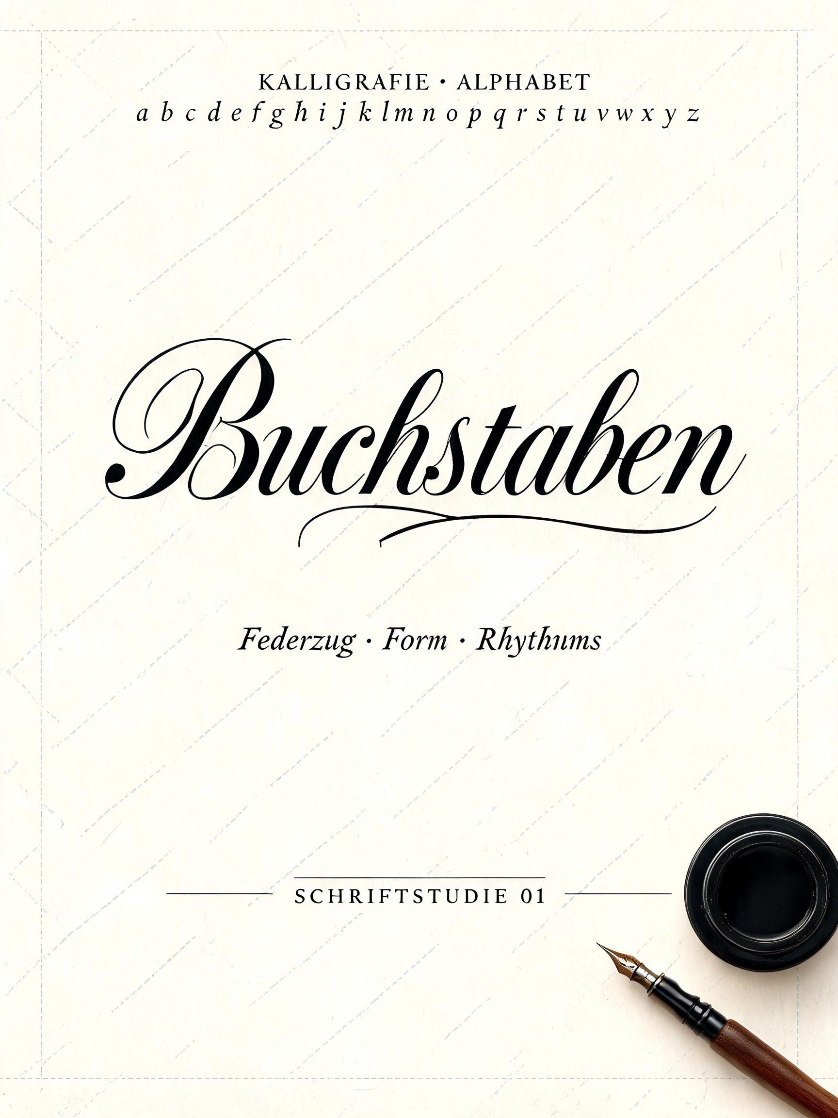
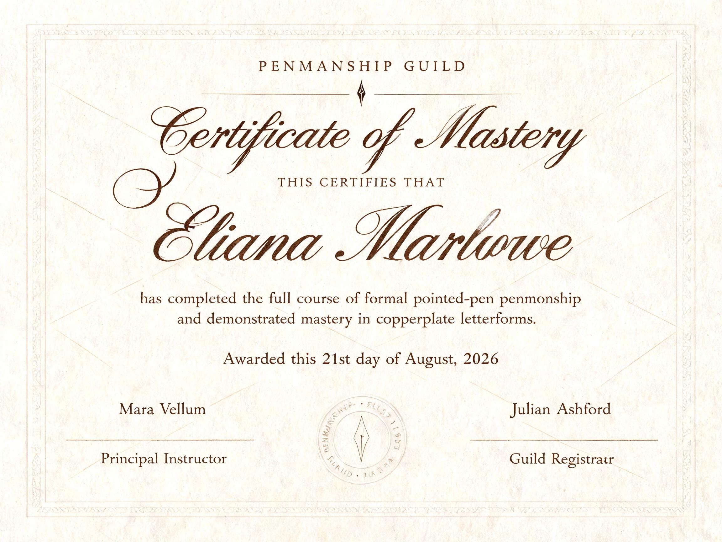
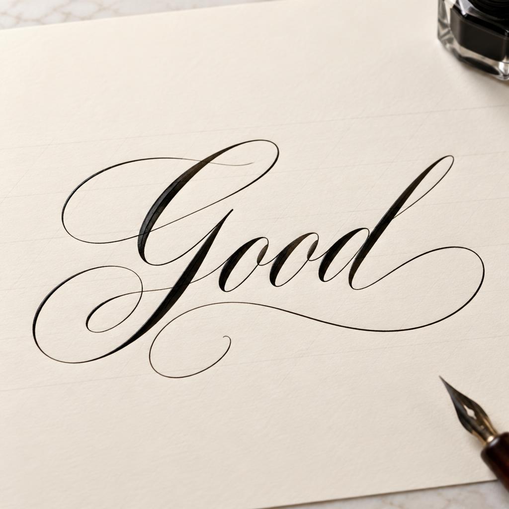
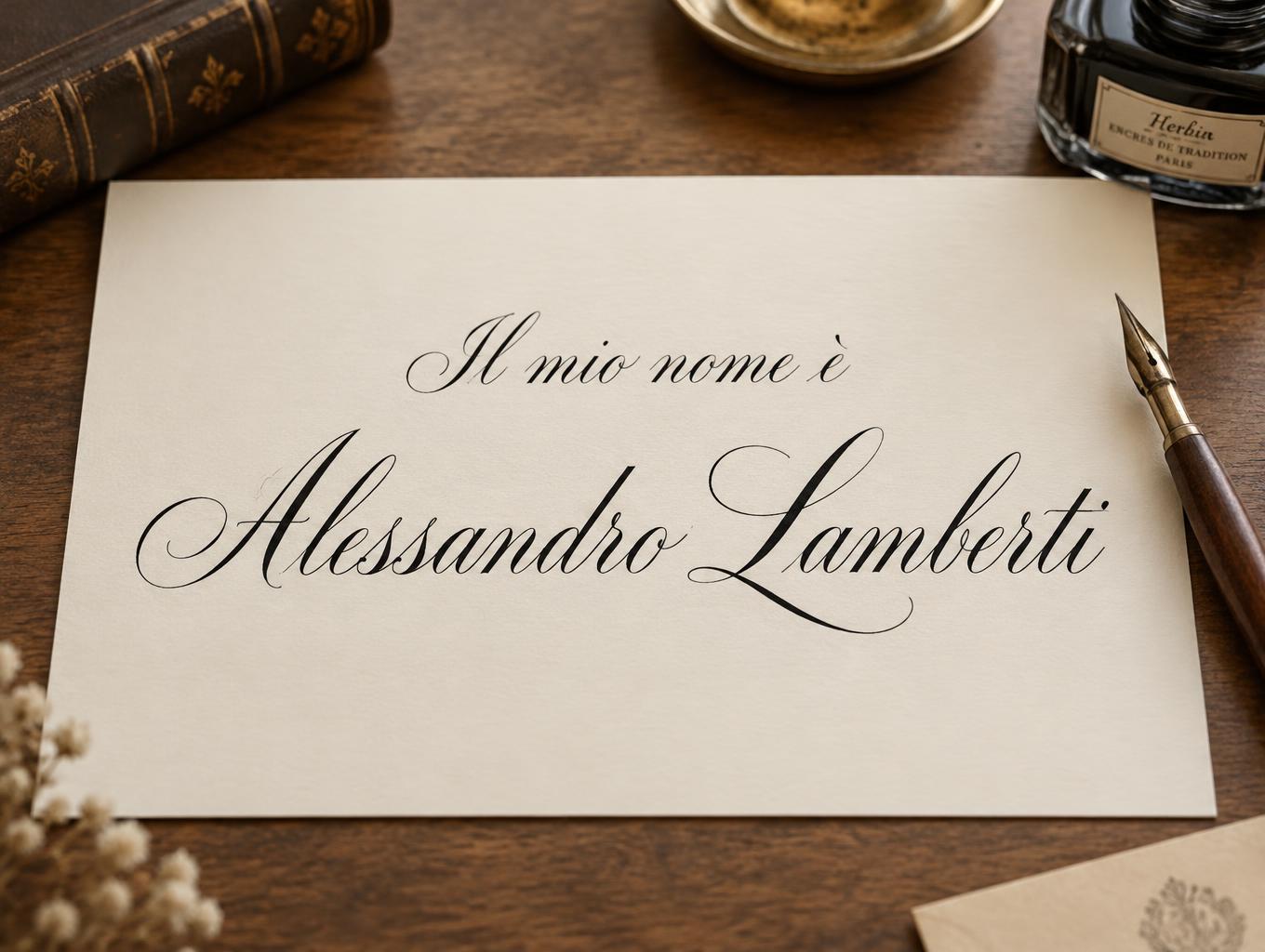
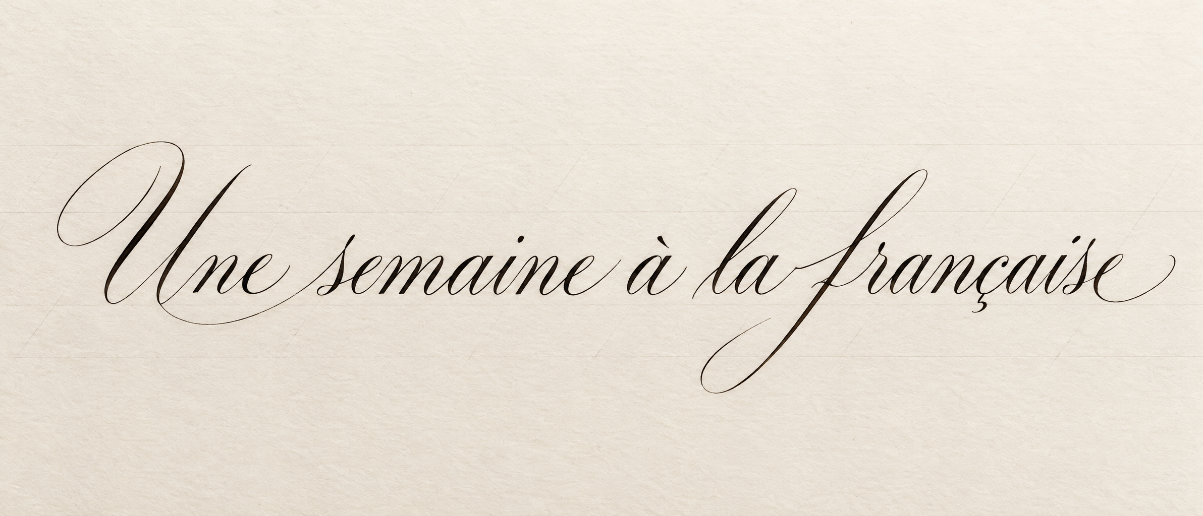
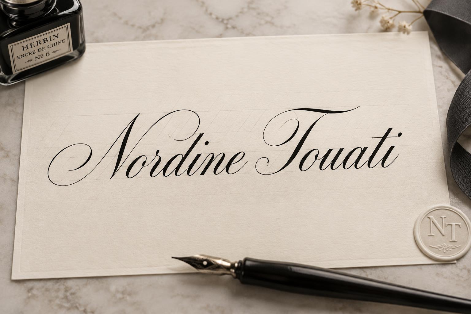
„Nordine Touati“ ist ein Kalligraphie-Schrift-Texteffekt, erstellt mit FontVibe KI. Formelle Copperplate mit Spitzfeder: starker Kontrast von dick und dünn, schräge ovale Buchstaben und geschwungene Versalien, klare schwarze Tinte auf cremefarbenem Papier mit feinen Hilfslinien.
laid down as the exacting art of formal pointed-pen calligraphy. SURFACE / INK: crisp, controlled ink — deep black or warm sepia — sitting cleanly on the page with fine wet-ink edges and a faint natural sheen where it catches the light, precise and disciplined rather than loose, the exacting hand of a master penman. GROUND: fine calligraphy paper — smooth hot-press cotton, cream or ivory practice stock, sometimes with faint ruled guideline slants, or a formal certificate or invitation ground — with generous margins so the lettering reads. LIGHT: even, clean studio light — soft and flat — showing the crisp ink edges and fine wet-ink detail, minimal drama. ATMOSPHERE: formal, timeless and disciplined — the tradition of copperplate and Spencerian penmanship, wedding invitations, diplomas and certificates, the poised craft of the calligrapher's desk. LETTERFORM PRIORITY: when the chosen font carries its own treatment, that font's letterform shapes and built-in flourishes take priority and own the letters; this style governs only the ink surface, ground and light, never the letter shapes. When no specific material is defined by the font: crisp controlled pointed-pen ink with fine wet edges and a faint sheen, in a single deep tone, on the calligraphy-paper ground. COLOR: if the font declares its own color keep it; otherwise the ink reads as a classic penmanship tone — deep black or warm sepia — on the pale paper ground. 'Nordine Touati' is centered prominently across an ivory formal correspondence card, occupying about 68% of the frame width with poised, generous breathing room around the name. The lettering appears in crisp deep-black pointed-pen ink, its controlled strokes showing fine wet-ink edges and a restrained natural sheen under clean, even studio light. The card is made from smooth hot-press cotton paper with a subtle warm grain and barely visible pale-gray diagonal practice guidelines beneath the ink, suggesting a master calligrapher's measured preparation. A slim black dip pen with a polished metal nib lies near the lower edge, accompanied by a small square ink bottle, both softly out of focus and kept secondary to the name. The paper sits on a calm pale stone desk surface; a narrow charcoal ribbon and a tiny embossed monogram seal rest quietly at one side. Minimal shadows, immaculate margins, balanced horizontal composition, and a timeless formal-stationery atmosphere evoke a bespoke certificate or refined personal invitation.
Gemacht für Kalligrafie-Alphabet
Generiert am 26. Oktober 2026 · 1536 × 1024 · JPEG · OpenAI GPT-Image-2.5 Sunburst · Von der erstellenden Person geteilt · Kostenlos kommerziell nutzbar (CC BY 4.0)


