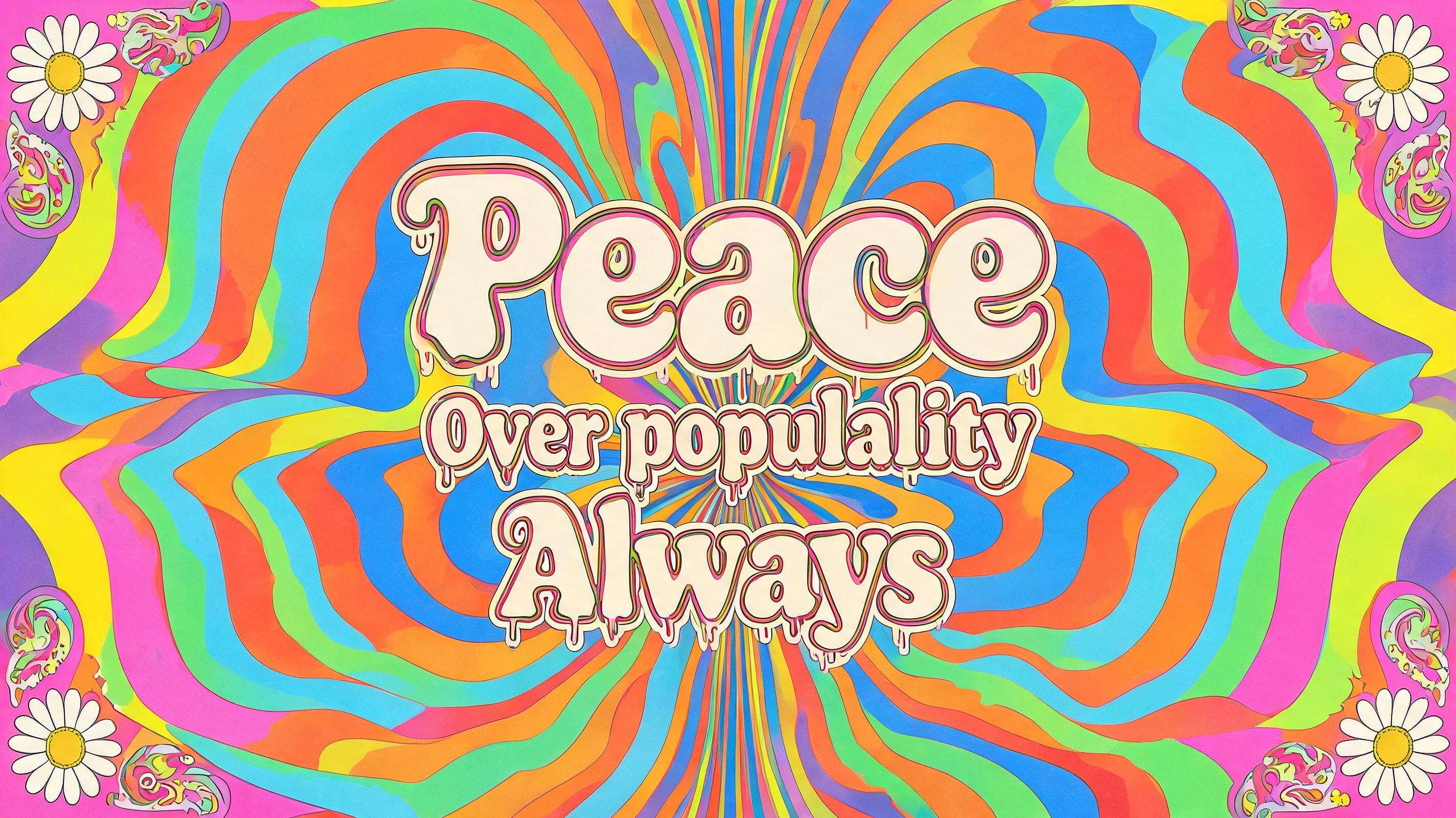
Peace Over popularity Always - Psychedelisch Text Effect


Nutzt ByteDance Seedream 5.0, das Modell dieses Werks · 15 Credits
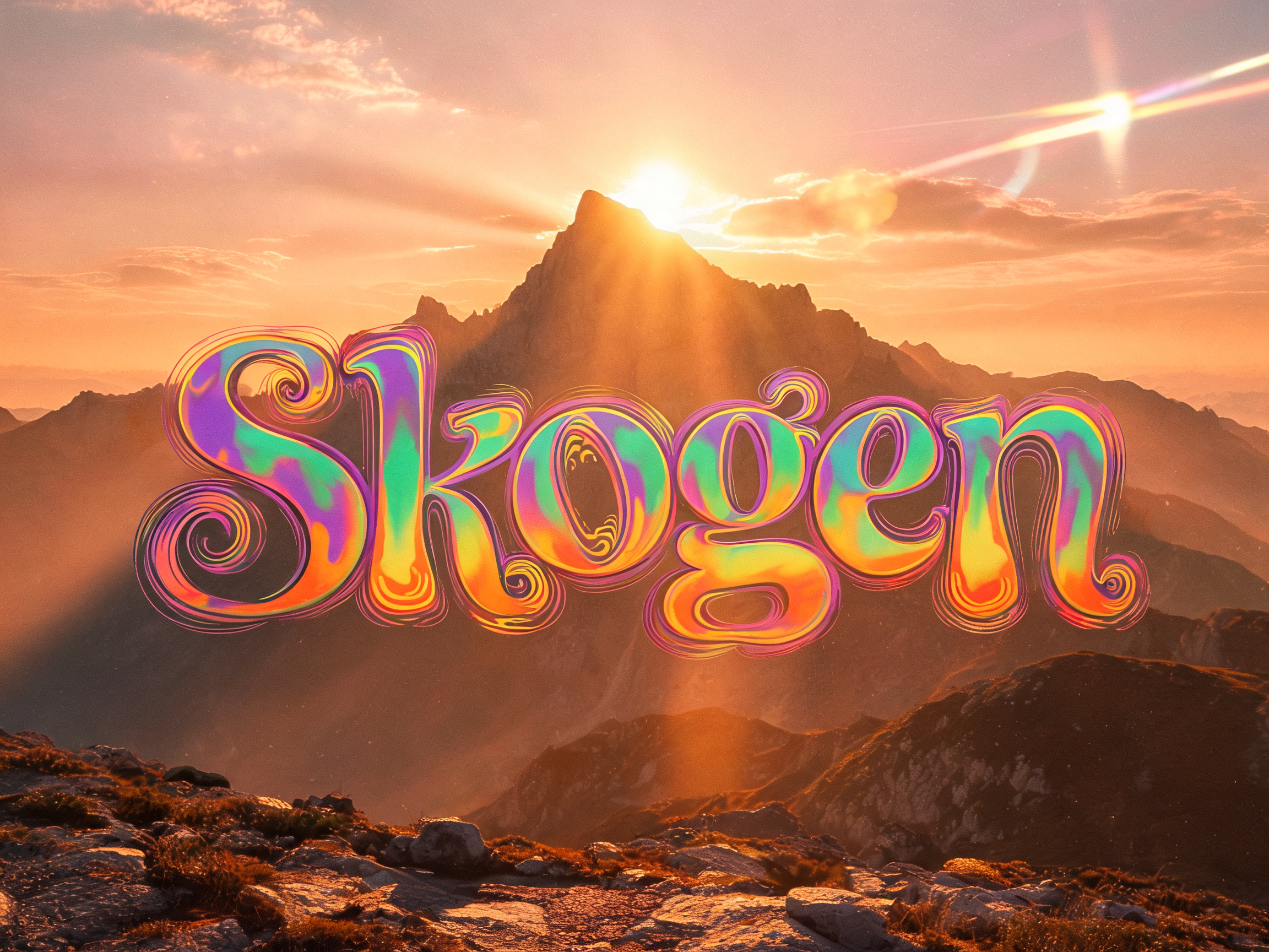

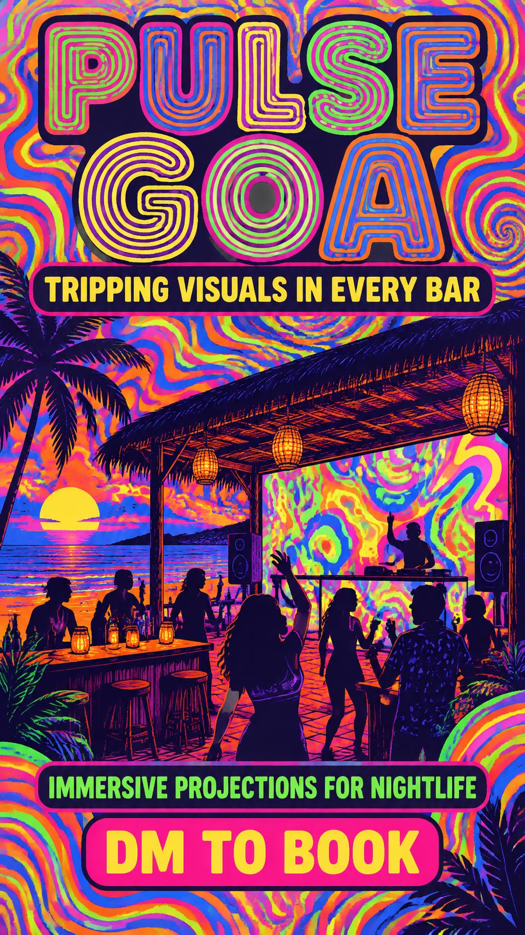
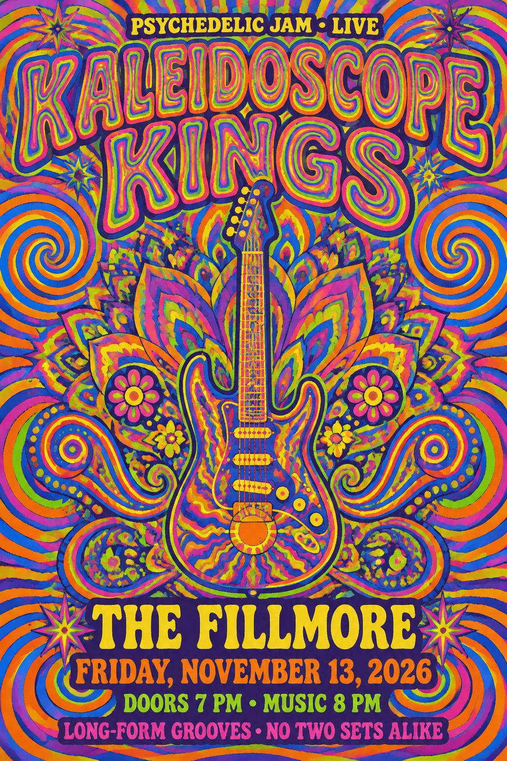
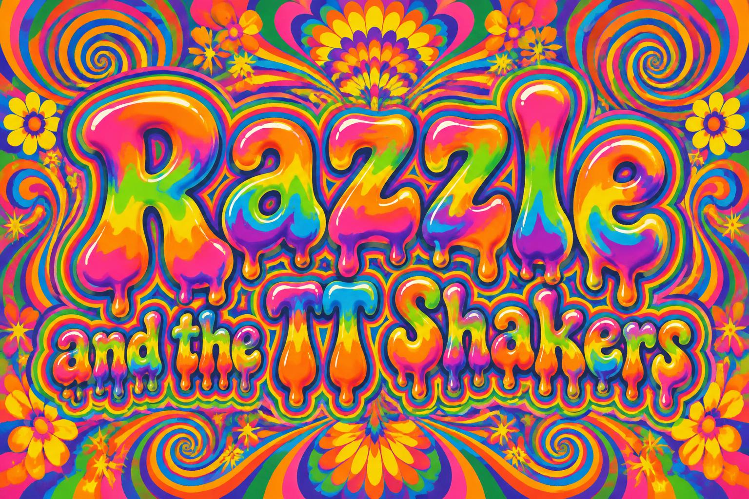
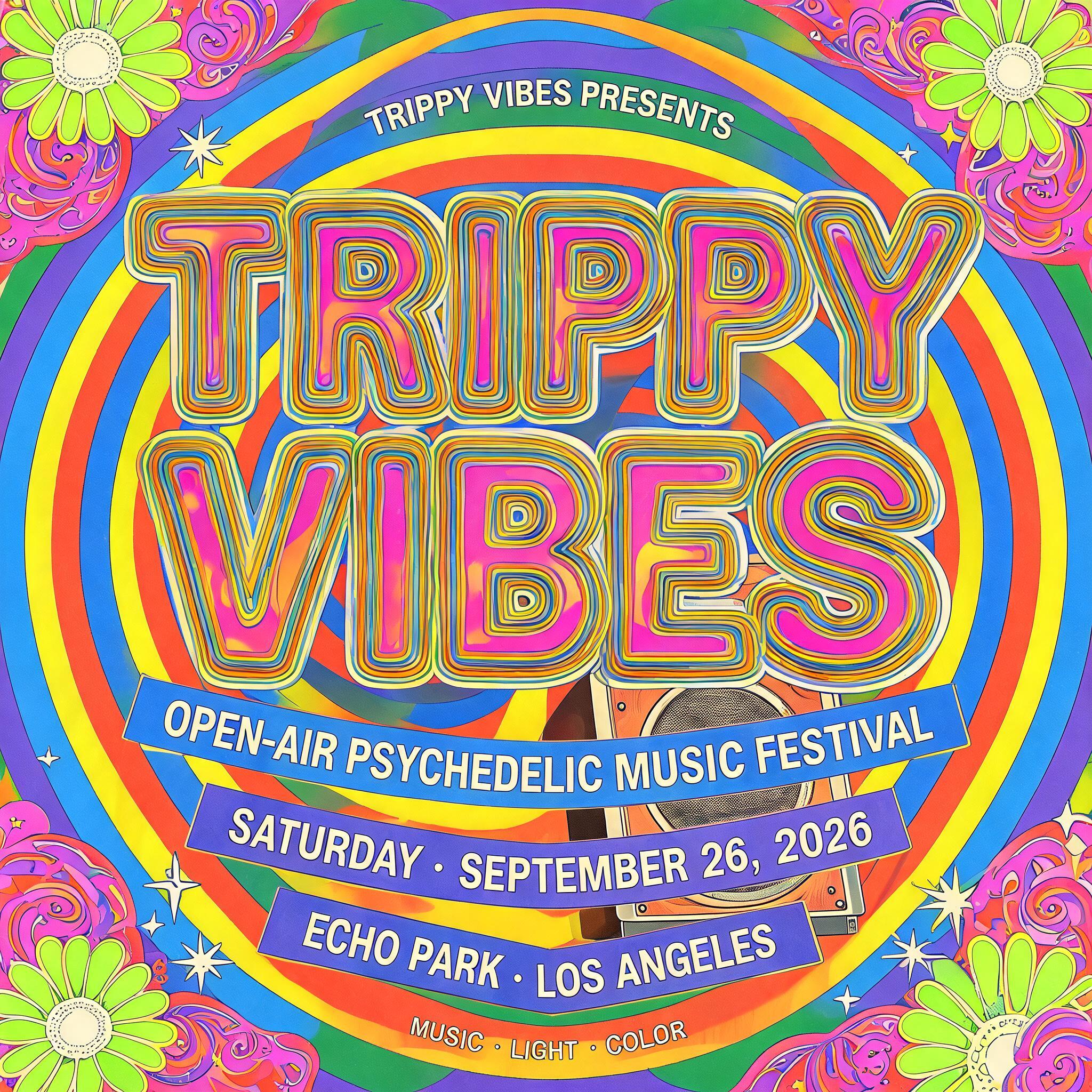
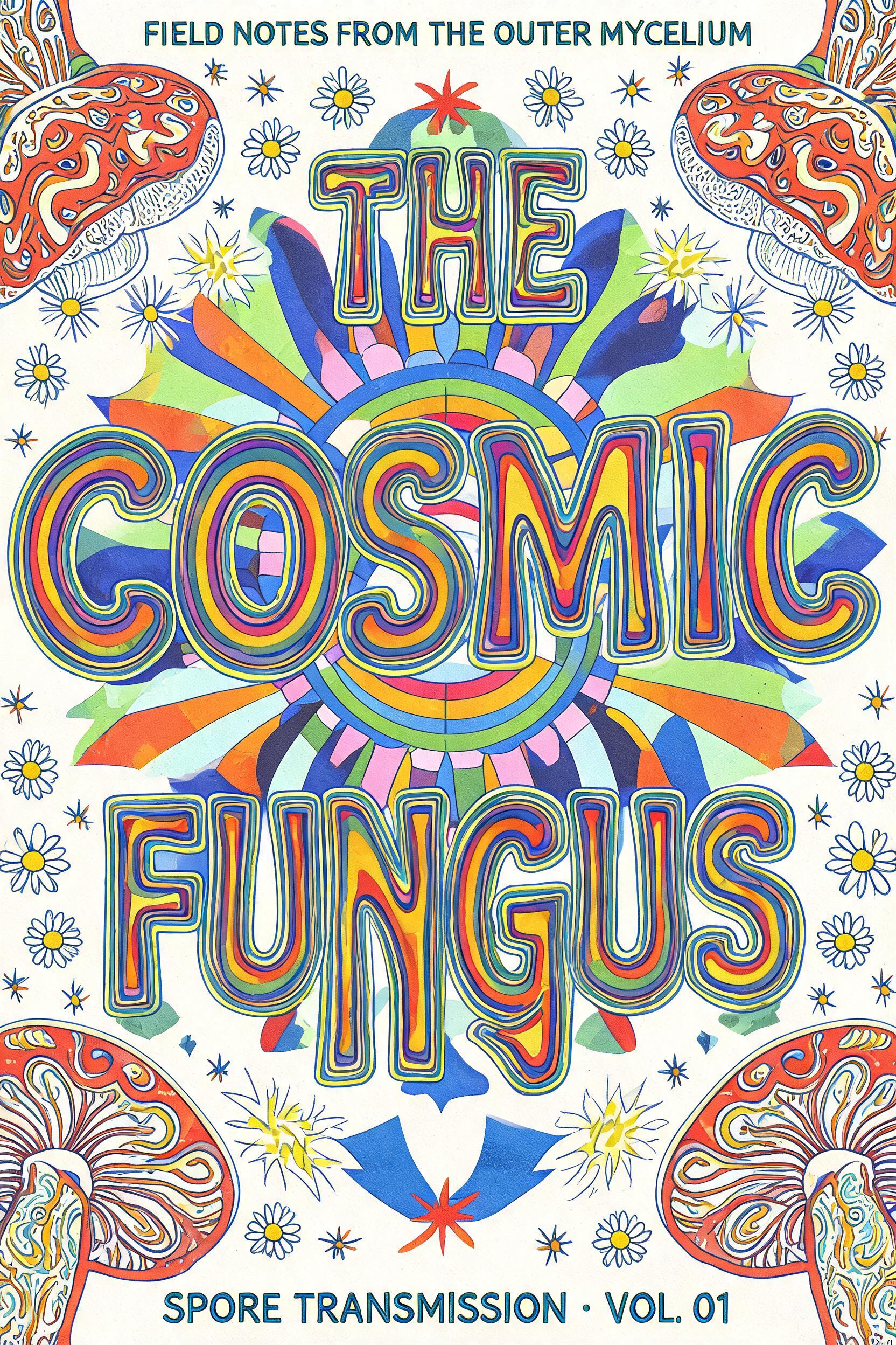

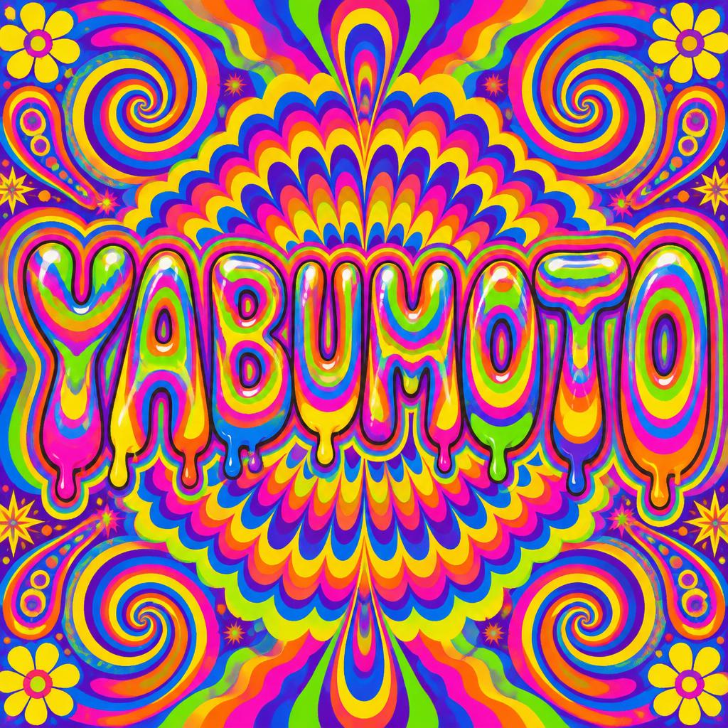
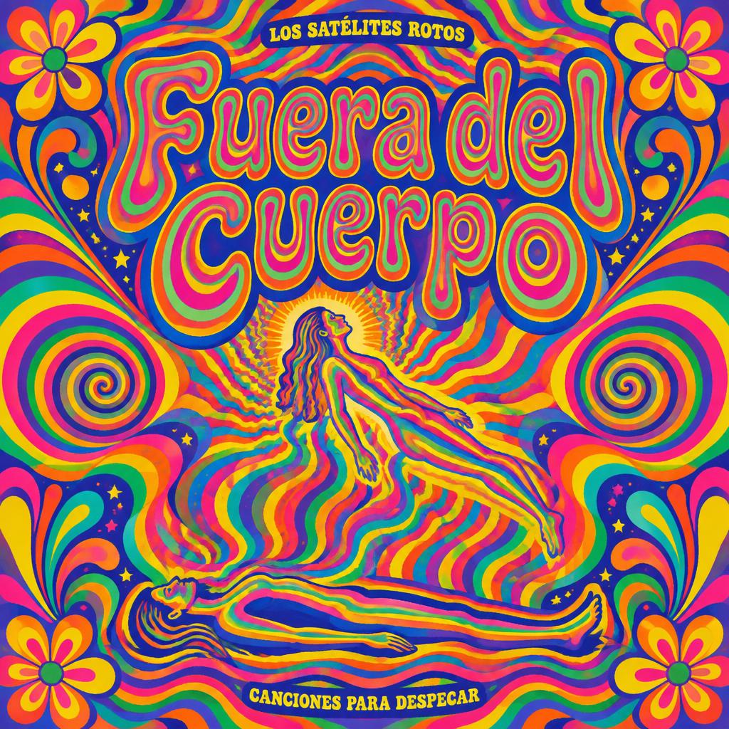
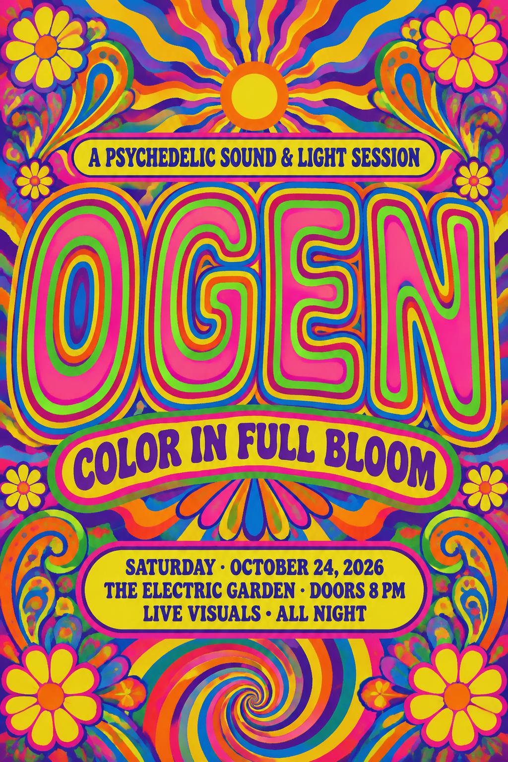
„ Peace Over popularity Always“ ist ein Psychedelisch-Texteffekt, erstellt mit FontVibe KI. Schmelzende, glänzende Bubble-Buchstaben in Pink, Orange und Gelb vor vibrierenden konzentrischen Regenbogenwellen mit Gänseblümchen und Spiralen.
a 1960s psychedelic poster world where saturated color is set vibrating. OPTICS / COLOR: maximum-saturation complementary pairs are placed edge to edge — hot magenta against acid green, electric orange against cobalt blue, cadmium yellow against violet — every boundary buzzing with simultaneous-contrast vibration, the defining Moscoso / Fillmore optical effect; color stays flat, hard-edged and screenprint-clean, never muddy or desaturated. LIGHT: flat, even, high-key illumination with no single hard source, so the whole frame hums at once like a backlit poster. FIELD: a kaleidoscopic field of concentric radiating rainbow waves, spirals and op-art ripples expands outward to every edge, framing the text. PALETTE: hot magenta, acid green, electric orange, cobalt blue, cadmium yellow, violet — full spectrum at peak saturation. LETTERFORM PRIORITY: when the chosen font defines its own surface (op-art contour bands, Day-Glo blacklight glow, tie-dye fabric dye, melting drips, etc.), that font treatment takes absolute priority and owns the glyph surface — this style then governs only the surrounding color atmosphere and the vibrating field. FALLBACK MATERIAL: if the chosen font carries no material of its own, render the letters in glossy candy-gloss with a soft wet melting quality, drips sliding from their lower edges and the surfaces filled with vibrating rainbow color, so the psychedelic identity always reads. A full 1960s psychedelic poster composition, with the exact words arranged in three lines: “Peace” dominant near the center, “Over popularity” smaller beneath it, and “Always” below, preserving the wording and capitalization. Keep the original line breaks and let the generous indents around “Peace” and “Always” create an airy, centered rhythm. The lettering owns the focal point, surrounded by a kaleidoscopic field of concentric rainbow waves, curling spirals, and op-art ripples radiating outward to every edge. Set maximum-saturation complementary colors directly against one another—hot magenta and acid green, electric orange and cobalt blue, cadmium yellow and violet—so every boundary has a vivid simultaneous-contrast shimmer. Keep the color flat, hard-edged, and screenprint-clean, with even high-key illumination across the whole frame and no single directional light source. Add a few groovy flower-power daisies and small paisley accents near the corners, leaving clear breathing room around the words. Hypnotic, warm, peaceful Summer-of-Love concert-poster atmosphere; the entire image hums like a backlit 1960s Fillmore poster.
Generiert am 29. Oktober 2026 · 2848 × 1600 · JPEG · ByteDance Seedream 5.0 · Von der erstellenden Person geteilt · Kostenlos kommerziell nutzbar (CC BY 4.0)


