

肯塔基华协中文学校 - Pincel de Tinta China Text Effect


Usa BytePlus Seedream 5.0, el modelo de esta obra · 15 créditos
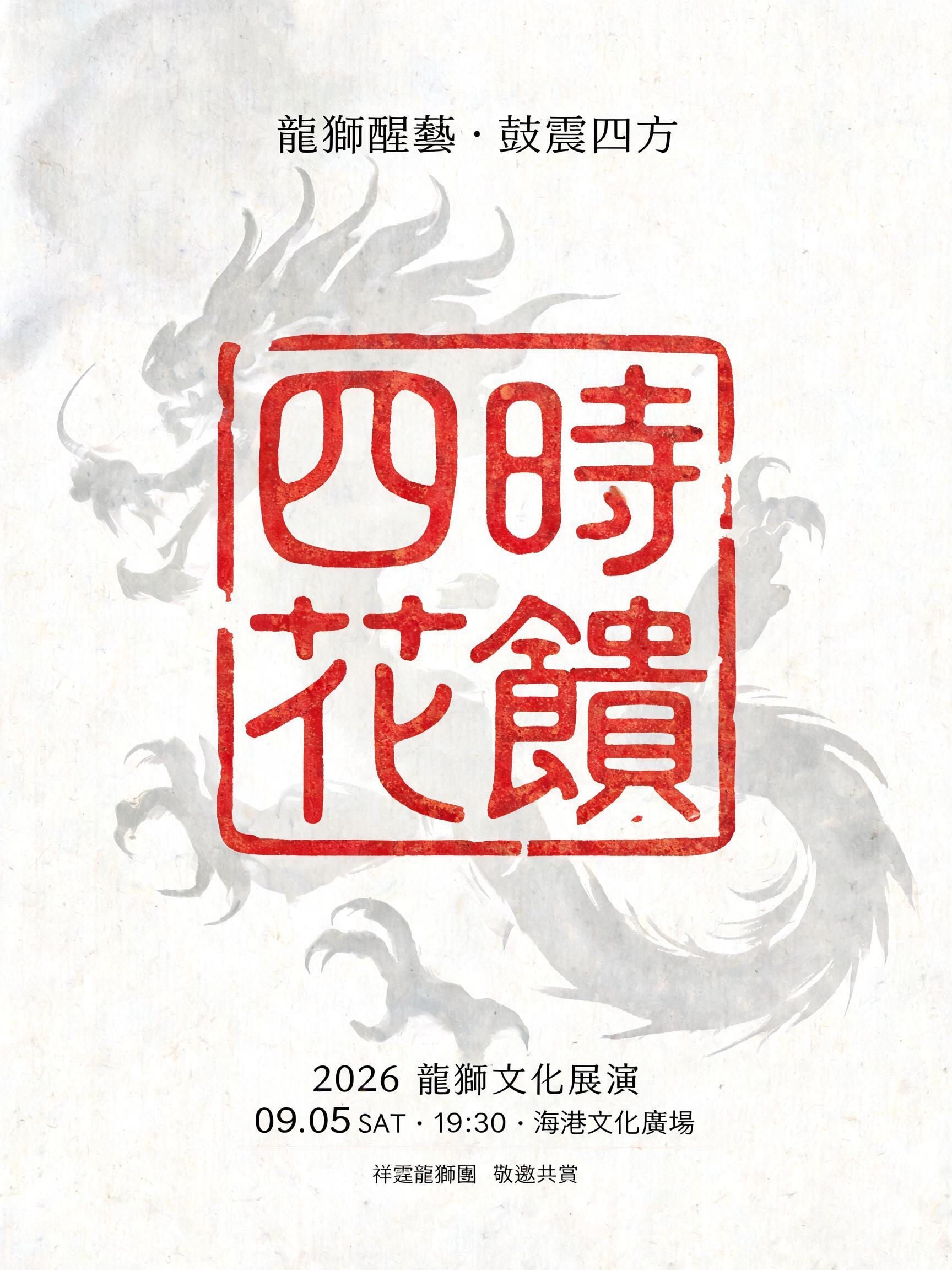
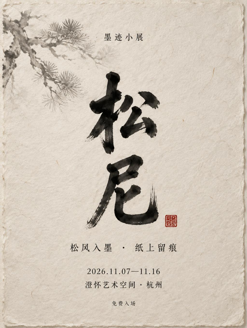
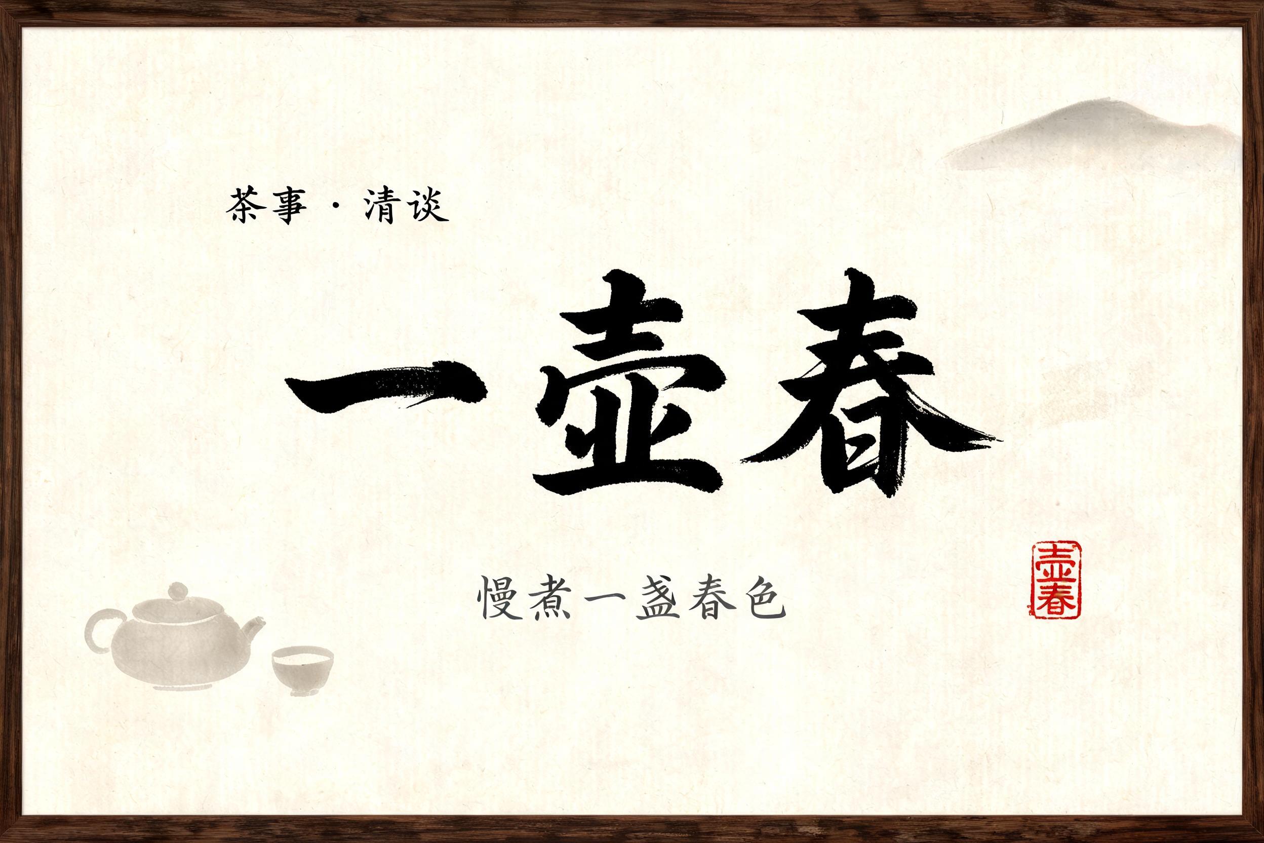


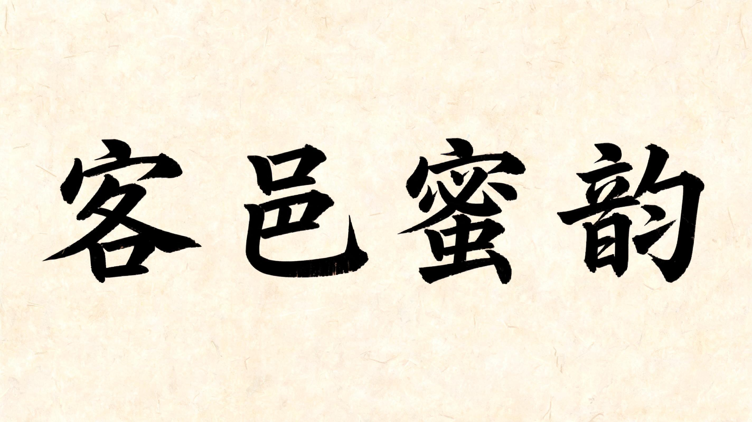

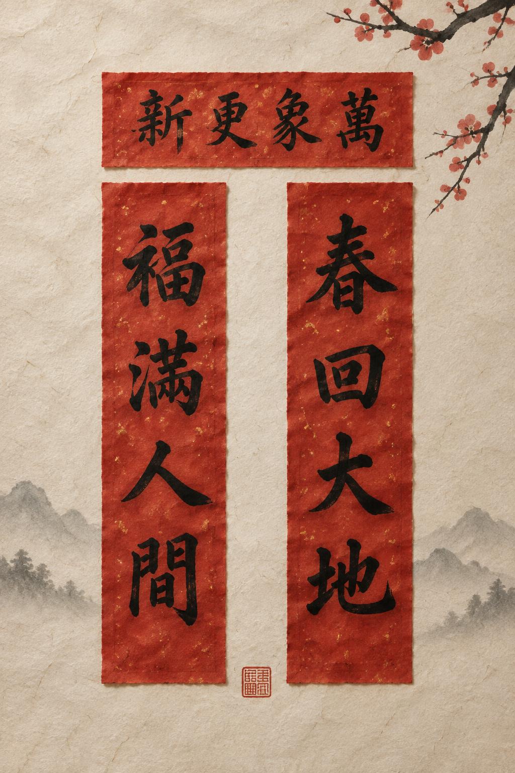
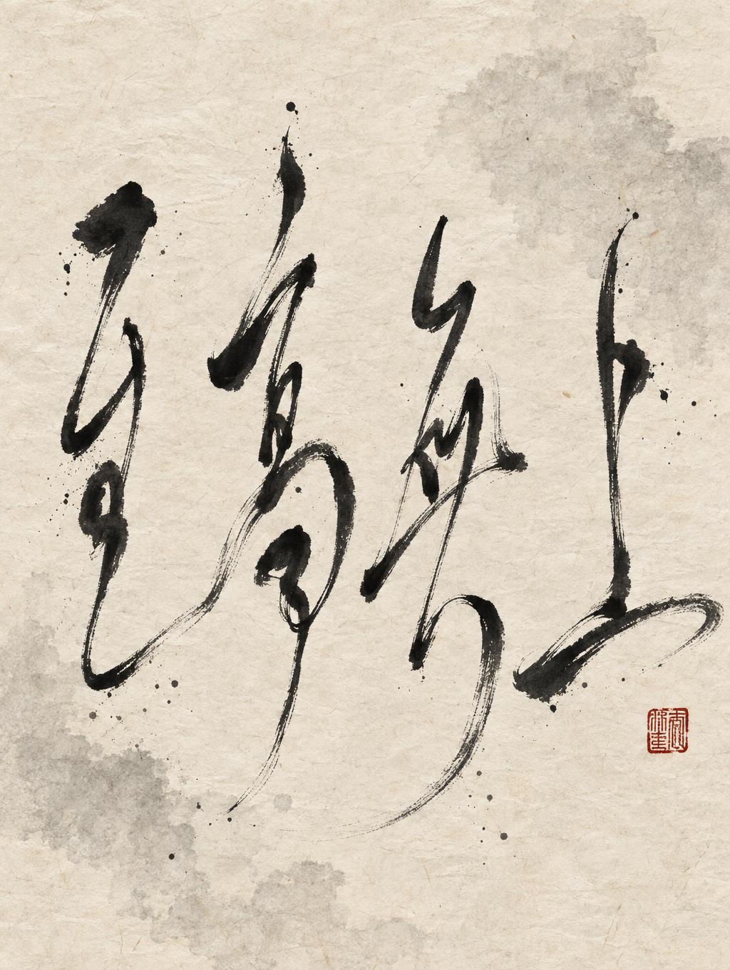

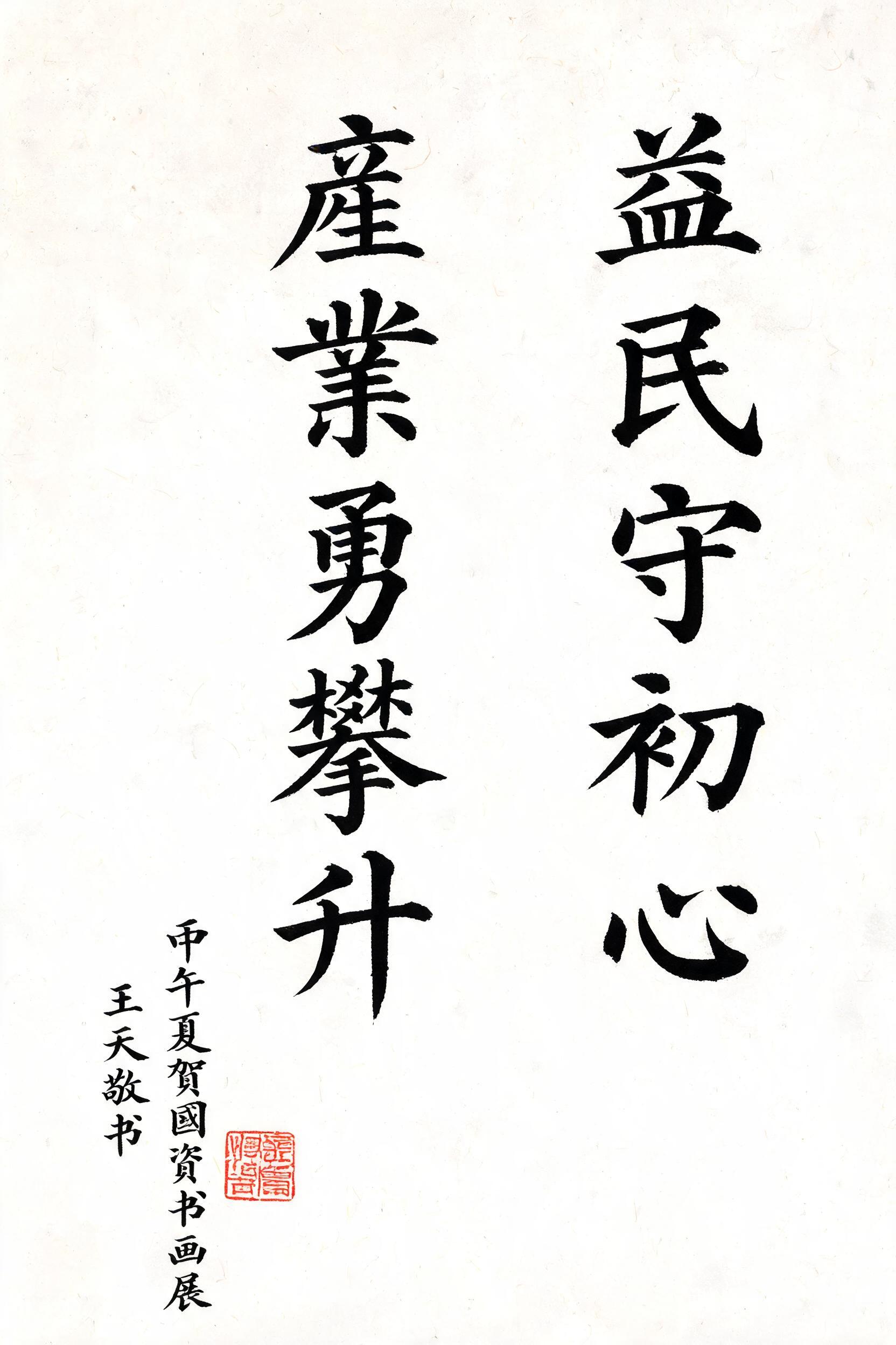




“肯塔基华协中文学校” is a Brush Chinese Ink text effect efecto de texto creado con FontVibe IA. El estilo de la caligrafía china con pincel de tinta sumi llevado a las letras latinas. Negro profundo con textura auténtica de cerdas, trazos que van de grueso a fino y ese aire de papel de arroz. Perfecto para marcas de restaurantes chinos, artes marciales, bienestar y diseño cultural.
rendered in Chinese ink brush calligraphy style. Letterforms painted with a fully loaded sumi ink brush — deep black ink, visible bristle marks along stroke edges, wet ink pooling at stroke starts, feathered dry-brush trailing ends. Authentic ink density variation: thick rich black cores fading to grey at thin passages. Rice paper texture visible behind. Traditional Chinese calligraphy energy — each stroke confident, intentional, irreversible. LETTERFORM PRIORITY: when the chosen font carries its own treatment, that font's letterform shapes take priority and own the letters; this style governs the sumi ink medium, the bristle and ink-density behavior and the rice-paper ground. FALLBACK MATERIAL: if the font carries no material of its own, render the letters as deep black sumi brush strokes with visible bristle marks, wet ink pooling at stroke starts and feathered dry-brush trails on rice paper. COLOR PRIORITY: keep the font's own colors if specified; otherwise rich black ink fading to grey at thin passages. Nine-character phrase 肯塔基华协中文学校 rendered in Chinese ink brush calligraphy style on aged xuan paper with warm ivory undertone. Sumi ink loaded heavily at each stroke origin — rich pooling black cores that feather outward into dry-brush grey at trailing ends, individual bristle filaments splitting apart at the tips of energetic strokes. Ink density shifts within each character: thick structural bones in deep obsidian black, lighter connective passages in translucent smoke grey, creating luminous negative space where the paper fiber breathes through the ink film. Subtle ink bleed halos seep into the xuan paper weave at high-pressure contact points, reinforcing the organic, irreversible quality of each mark. A small weathered vermilion seal impression anchors the lower corner, its carved relief partially worn, pressed in thick cinnabar paste. Faint ink-wash tonal gradient drifts across the background — a diluted sumi cloud that suggests depth without competing with the text. Micro-droplets of expelled ink scatter near the most energetic strokes, evidence of a swift, confident wrist. The paper surface shows subtle laid-line texture and occasional natural fiber inclusions. Composition carries the weight and gravitas of an institutional name — multiple characters sharing a unified rhythmic cadence, each stroke confident and irreversible. Rice paper grain catches diffused north-window light, casting micro-shadows in the paper valleys. 8k detail, archival photographic quality.
Generada el 31 de julio de 2026 · 1600 × 2848 · JPEG · BytePlus Seedream 5.0 · Compartida por el creador · Uso comercial gratuito (CC BY 4.0)


