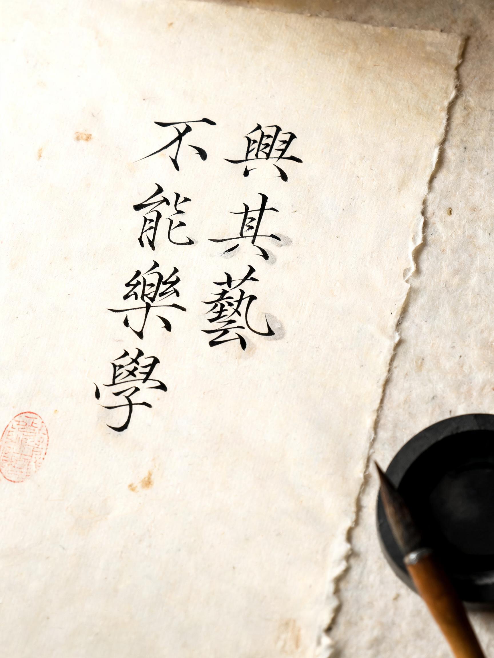
不興其藝, 不能樂學 - Pincel de Tinta China Text Effect


Usa BytePlus Seedream 5.0, el modelo de esta obra · 15 créditos
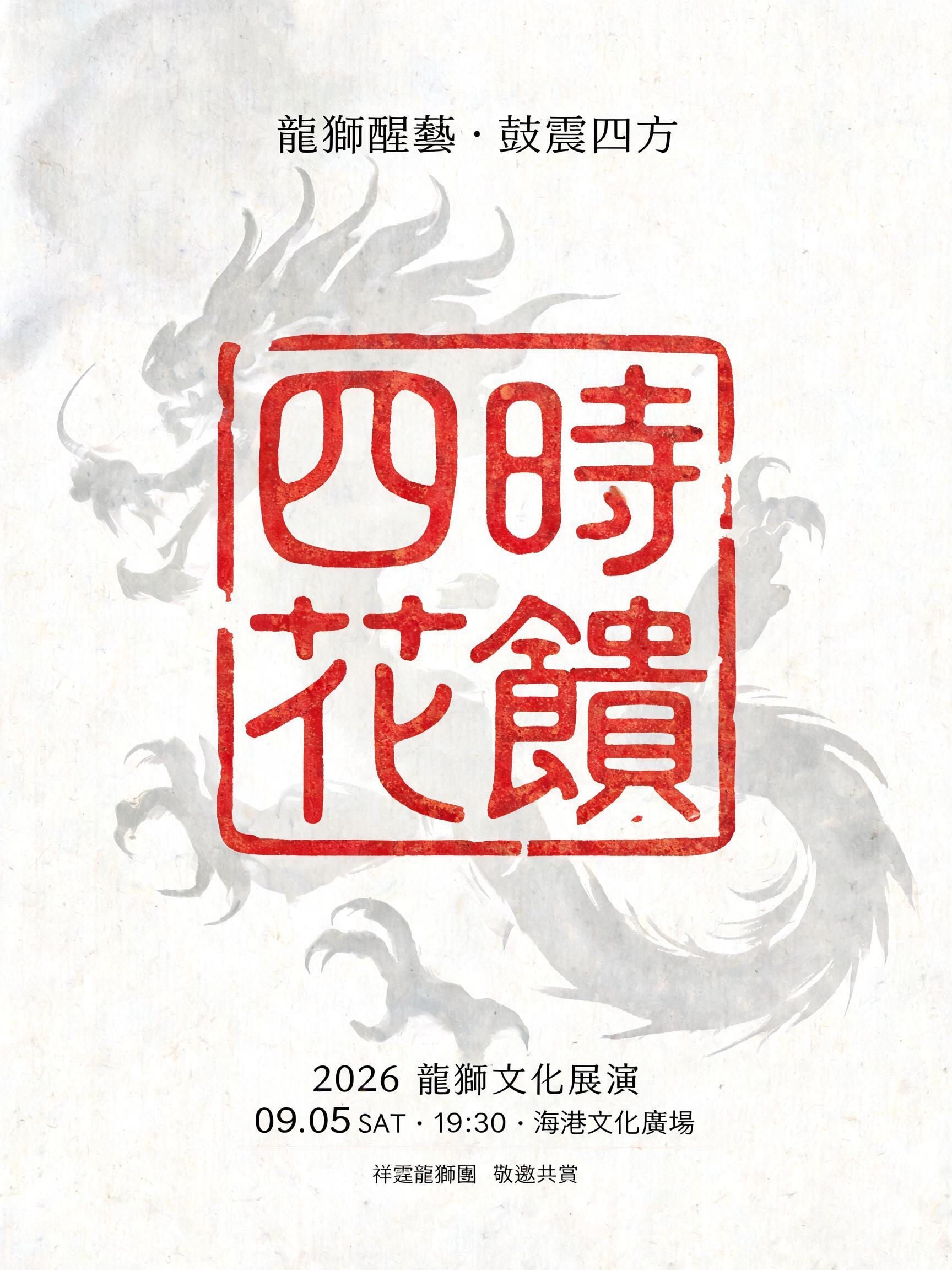
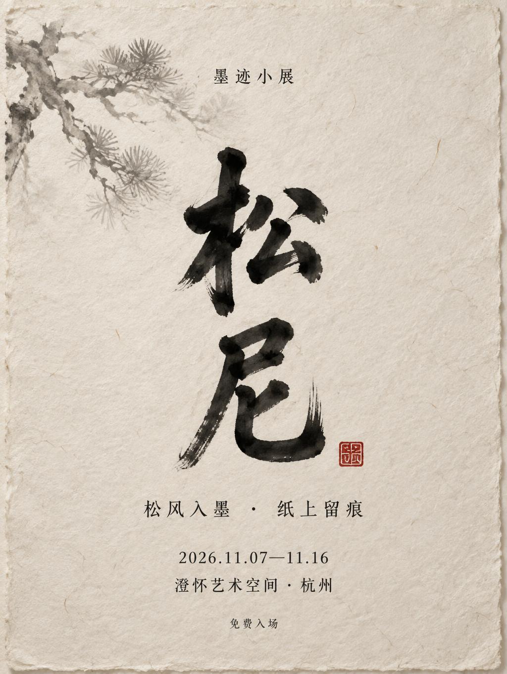
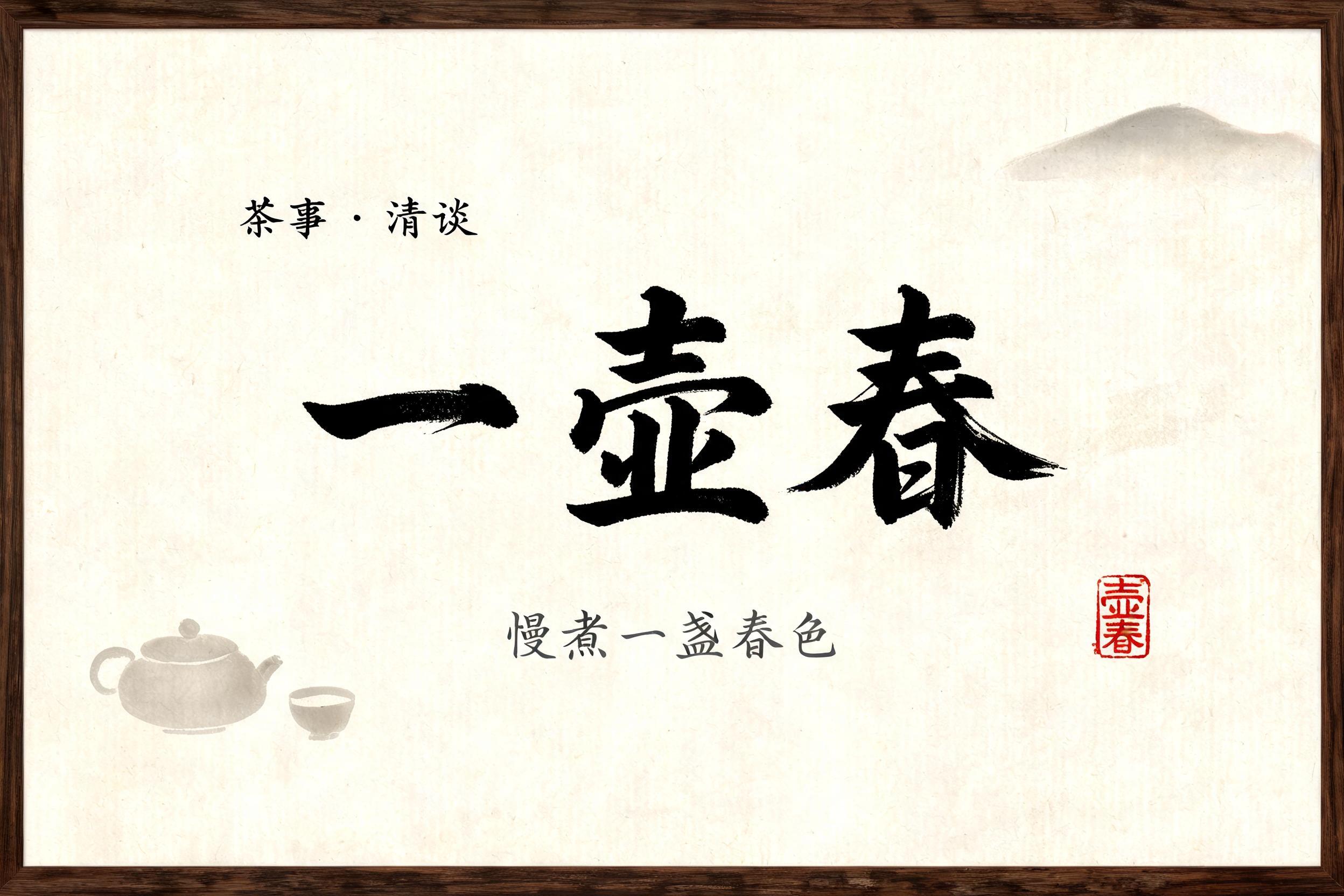

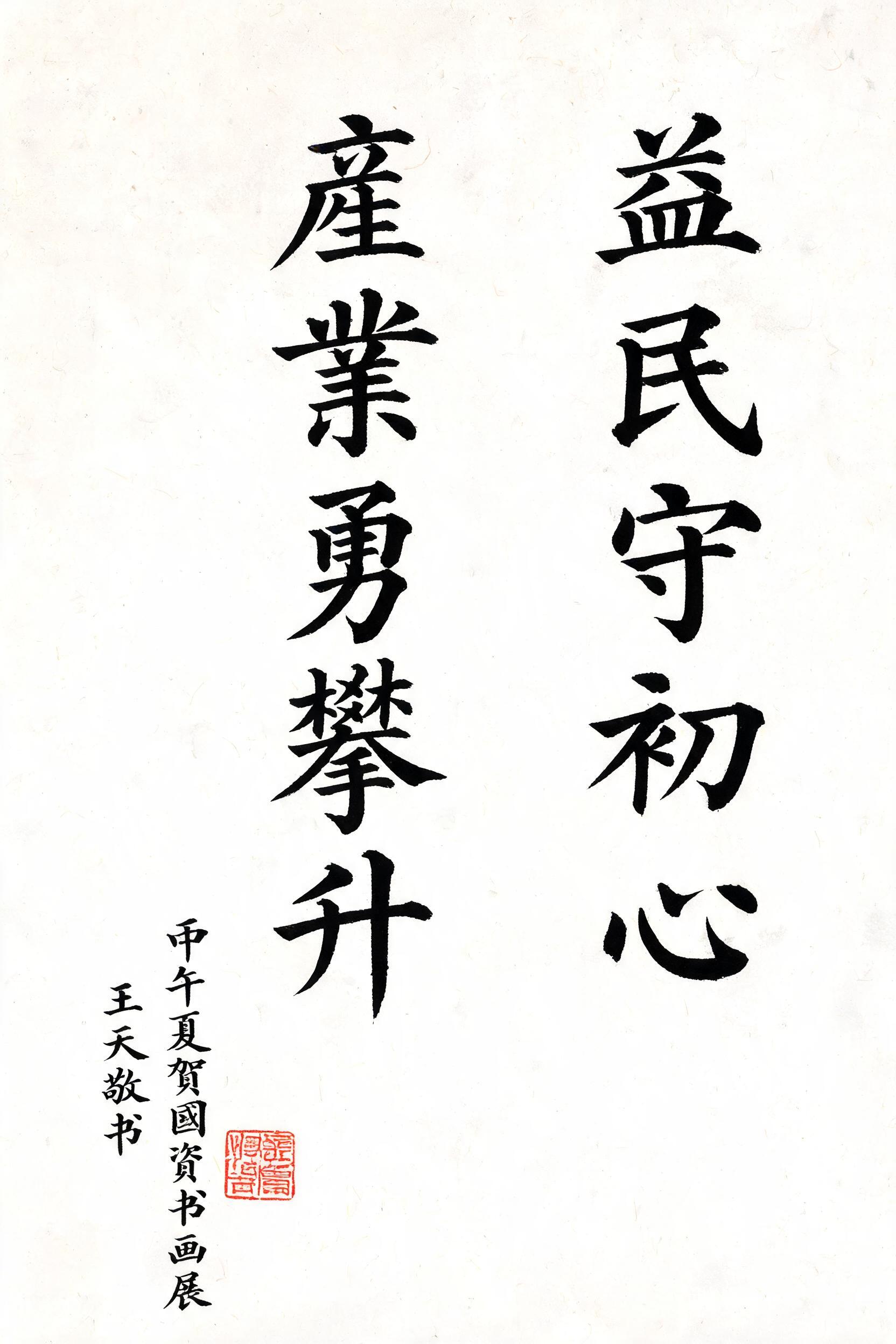
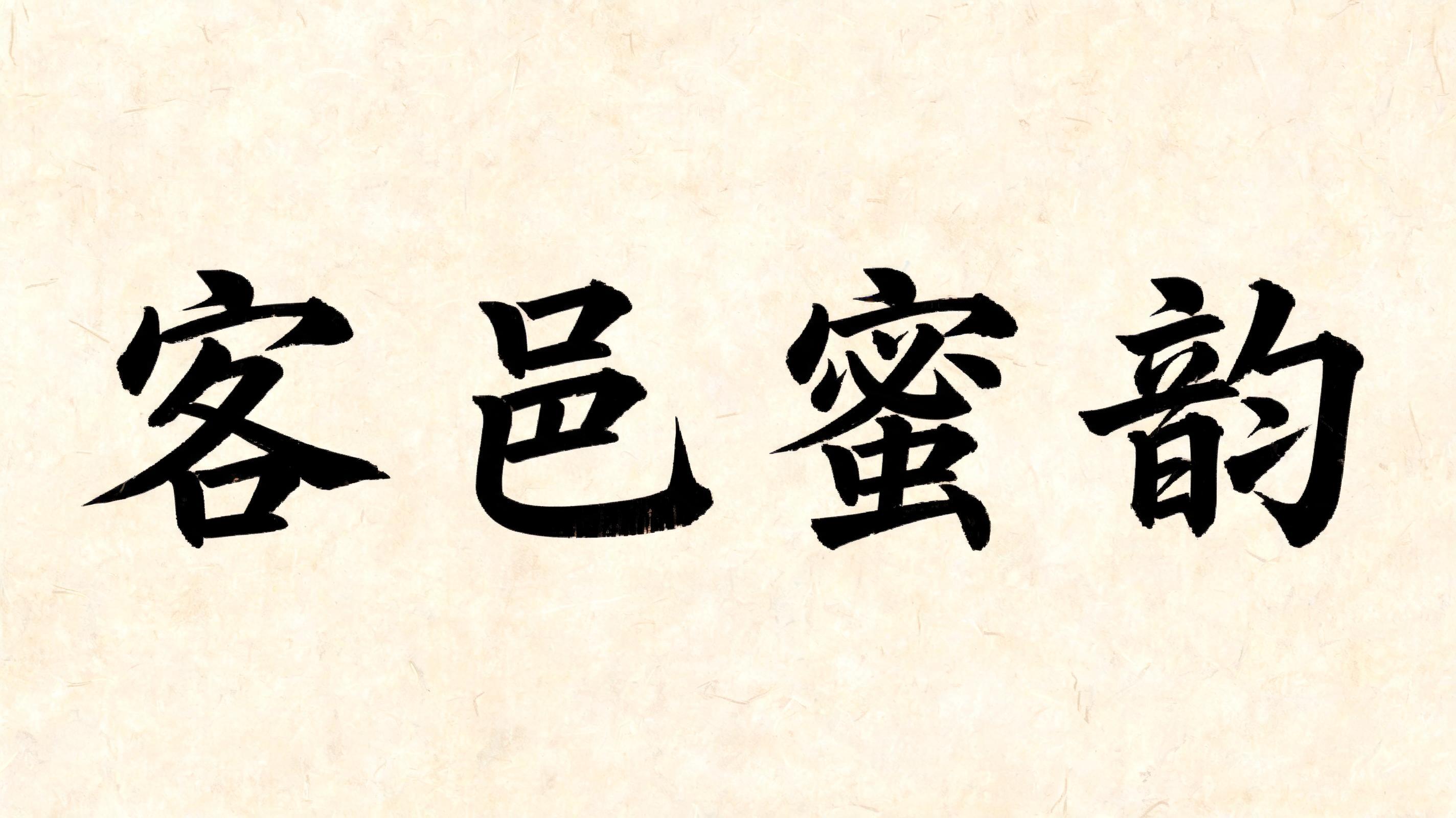

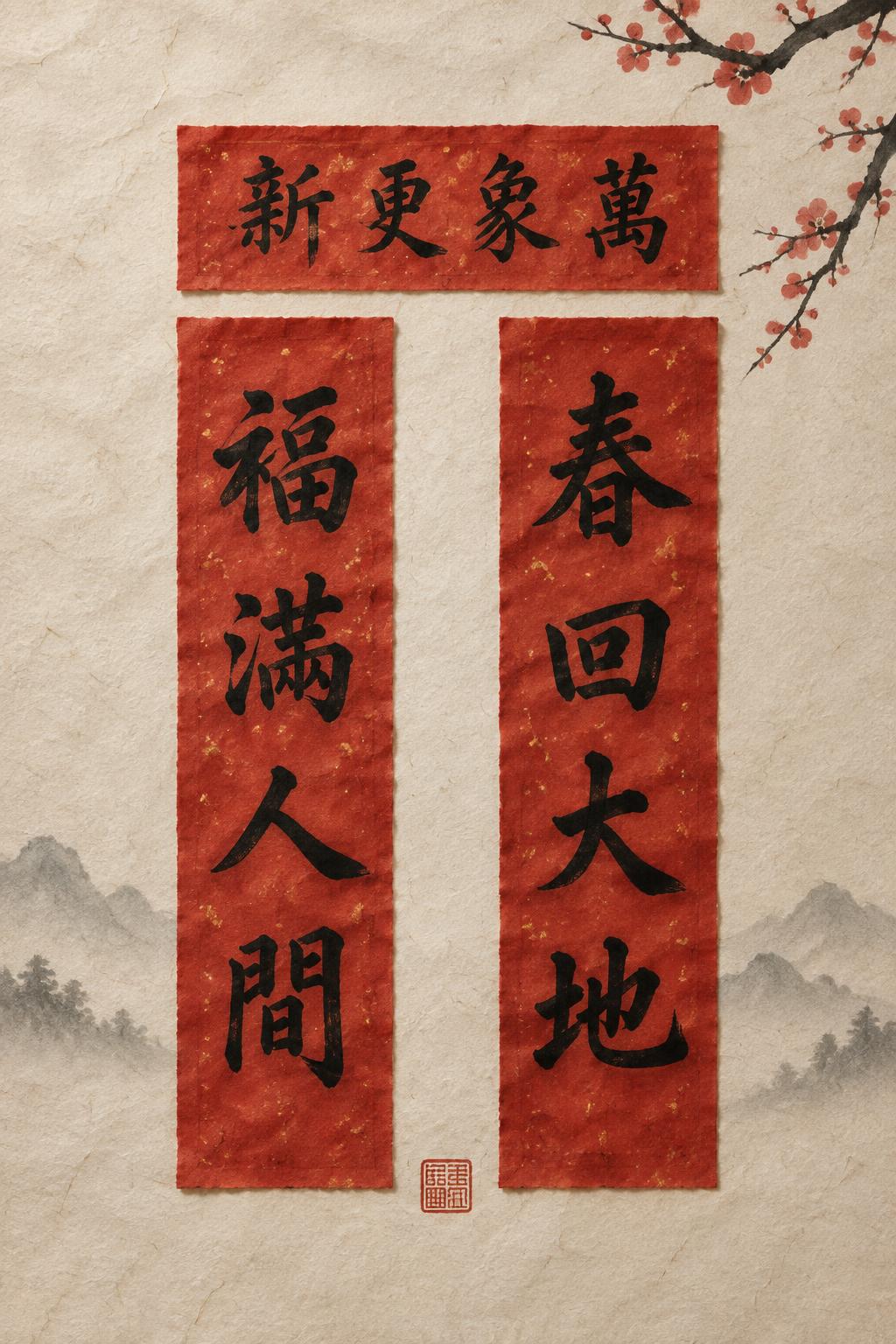
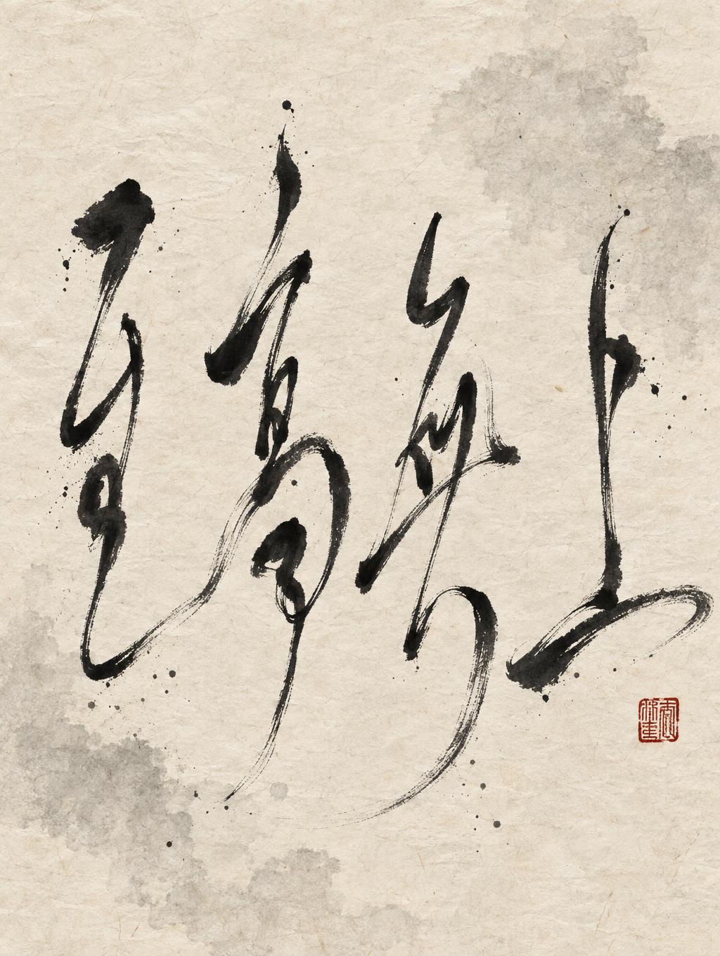
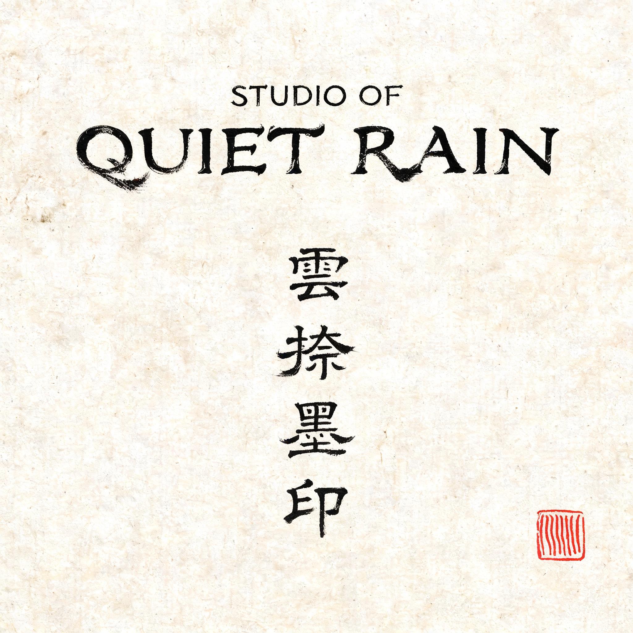


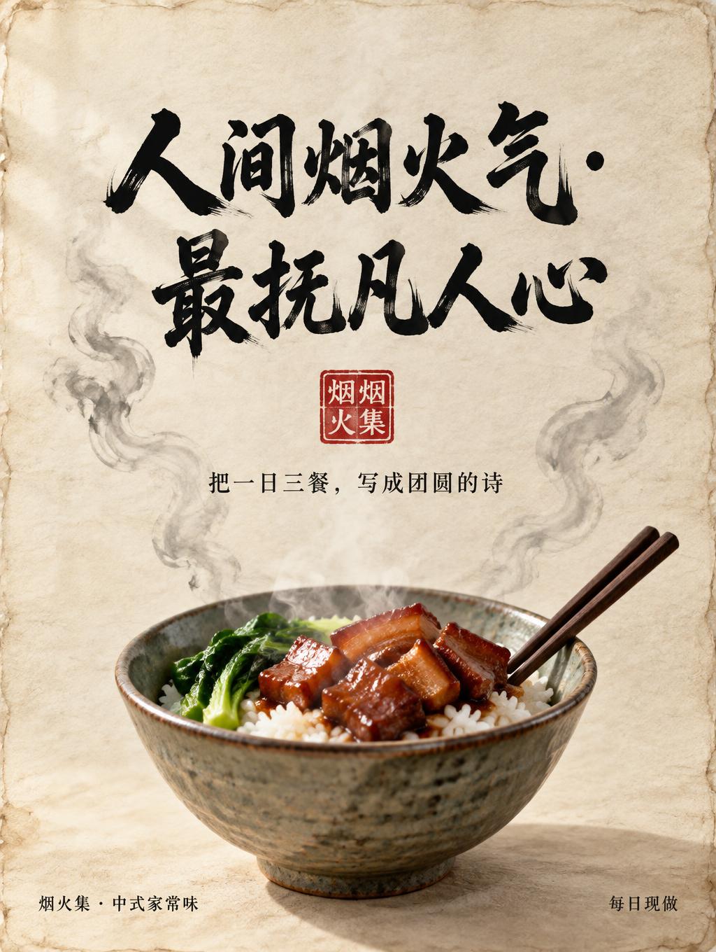
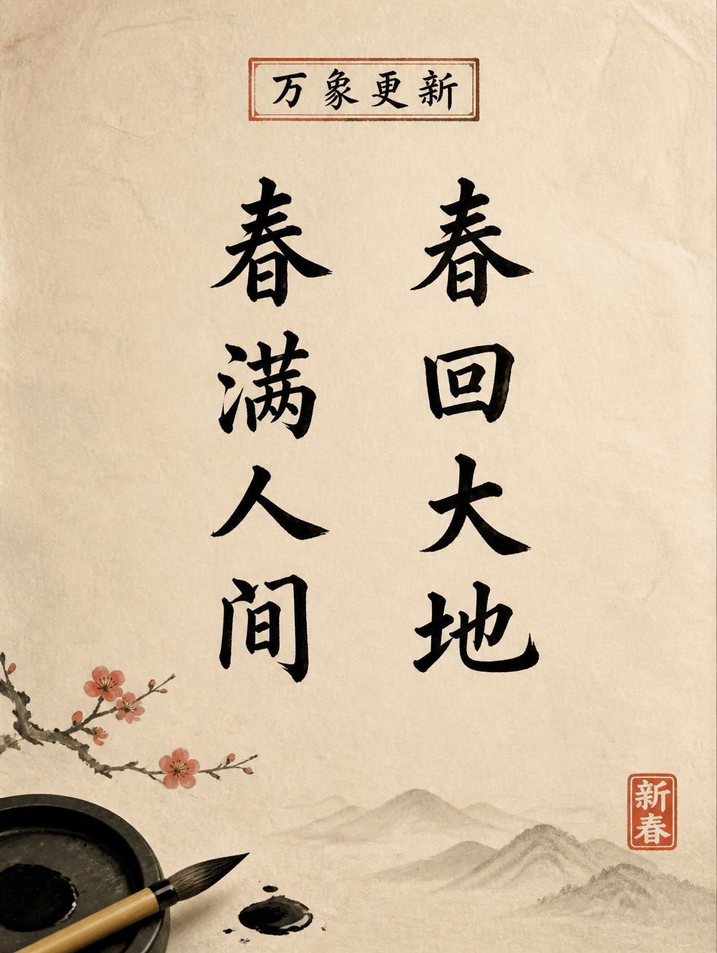
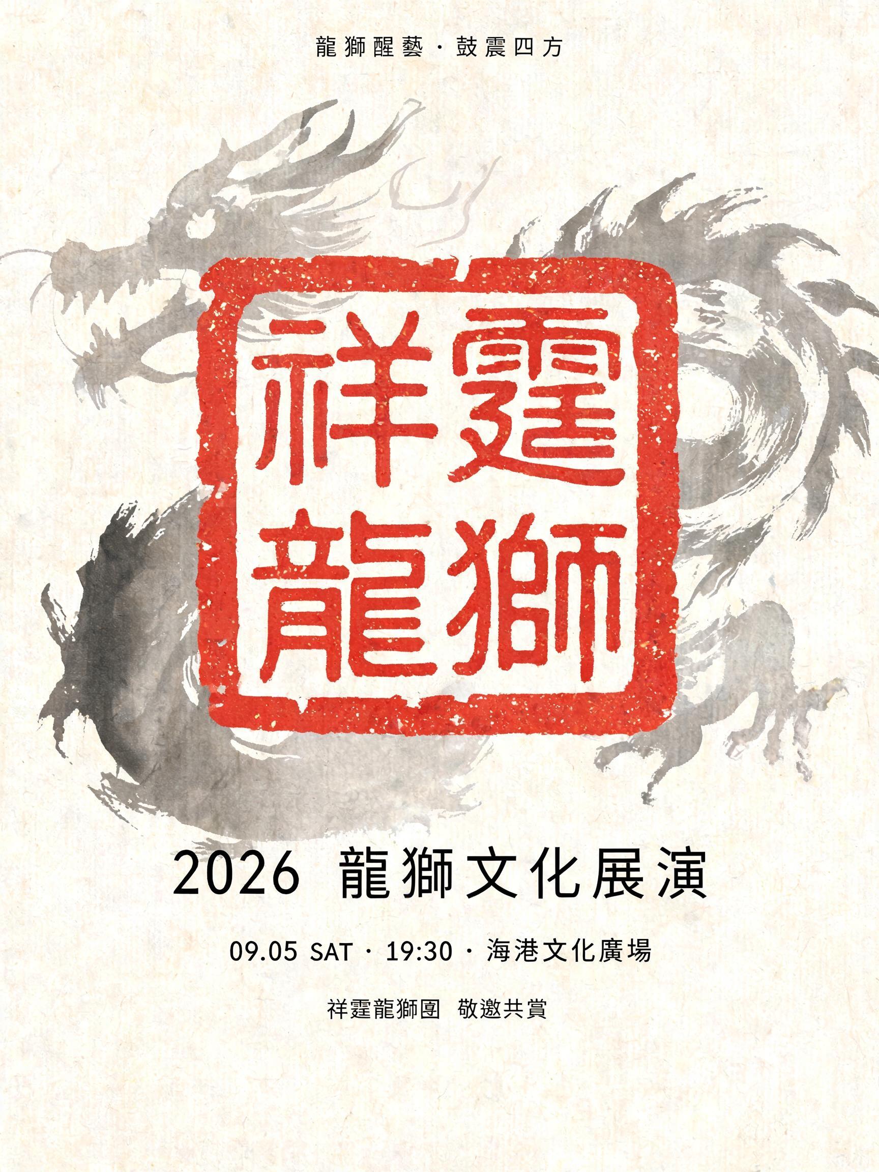


“不興其藝, 不能樂學” es un efecto de texto Pincel de Tinta China creado con FontVibe IA. El estilo de la caligrafía china con pincel de tinta sumi llevado a las letras latinas. Negro profundo con textura auténtica de cerdas, trazos que van de grueso a fino y ese aire de papel de arroz. Perfecto para marcas de restaurantes chinos, artes marciales, bienestar y diseño cultural.
rendered in Chinese ink brush calligraphy style. Letterforms painted with a fully loaded sumi ink brush — deep black ink, visible bristle marks along stroke edges, wet ink pooling at stroke starts, feathered dry-brush trailing ends. Authentic ink density variation: thick rich black cores fading to grey at thin passages. Rice paper texture visible behind. Traditional Chinese calligraphy energy — each stroke confident, intentional, irreversible. LETTERFORM PRIORITY: when the chosen font carries its own treatment, that font's letterform shapes take priority and own the letters; this style governs the sumi ink medium, the bristle and ink-density behavior and the rice-paper ground. FALLBACK MATERIAL: if the font carries no material of its own, render the letters as deep black sumi brush strokes with visible bristle marks, wet ink pooling at stroke starts and feathered dry-brush trails on rice paper. COLOR PRIORITY: keep the font's own colors if specified; otherwise rich black ink fading to grey at thin passages. Two-line phrase 不興其藝 · 不能樂學 rendered in Chinese ink brush calligraphy style, painted with a fully loaded sumi ink brush on aged xuan paper with warm ivory undertones and subtle paper-fiber grain visible through translucent ink passages. Each character carries dramatic wet-to-dry ink transition within individual strokes — dense jet-black pooling at brush-entry points, rich mid-stroke cores tapering into feathered dry-brush trails where bristle hairs splay apart and leave ghost-grey wisps dissolving into the paper. The eight-character composition breathes with generous negative space, allowing the luminous ivory ground to read as active visual mass between and around the letterforms. Ink density variation is pronounced: thick anchor strokes hold deep obsidian weight while crossing thin passages fade to translucent ash-grey wash, creating rhythmic light-and-dark interplay across the full composition. Micro ink-bleed halos soften stroke edges where moisture wicked into paper fibers, giving each character an organic, irreversible quality. A single worn vermilion seal impression — slightly off-square, edges ragged with age — appears at the lower corner, its red-oxide pigment cracked and patinated. The overall tone is contemplative and scholarly: high-contrast sumi ink against a muted warm-ivory xuan paper ground, with soft ambient light casting no hard shadows, letting ink texture and paper grain carry all visual weight. No decorative borders, no wash backgrounds — pure ink on raw paper.
Generada el 11 de agosto de 2026 · 2496 × 1664 · JPEG · BytePlus Seedream 5.0 · Compartida por el creador · Uso comercial gratuito (CC BY 4.0)