
🧪 Design something with Bauhaus Primary
Transparent Effect
✦ Transparent Effect
Generates a PNG with the background removed — only the text and its visual effects remain. The AI automatically selects the optimal background color for clean removal based on your style.
Output is always PNG for lossless transparency.
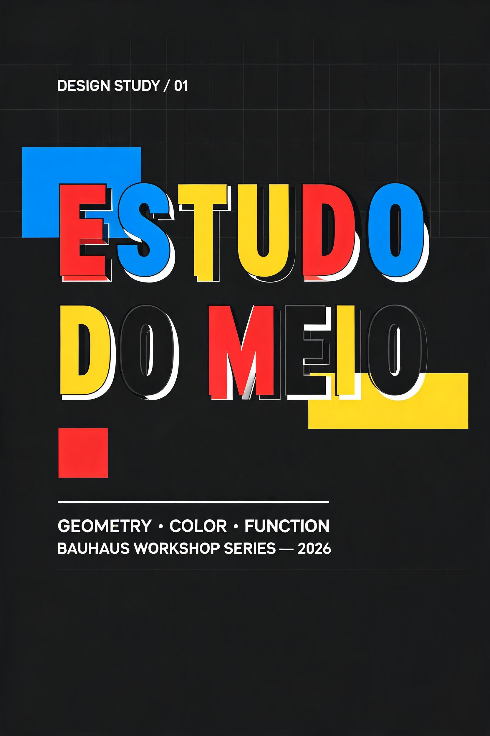

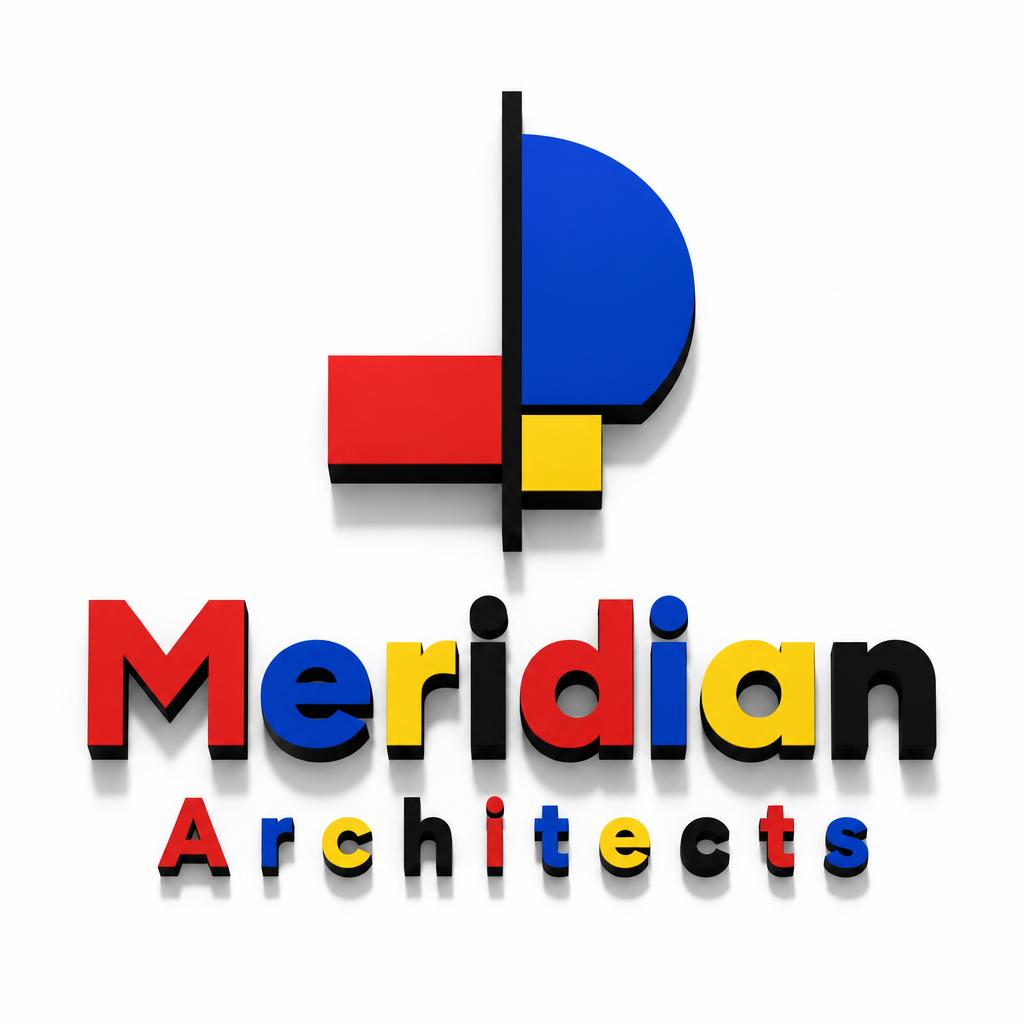
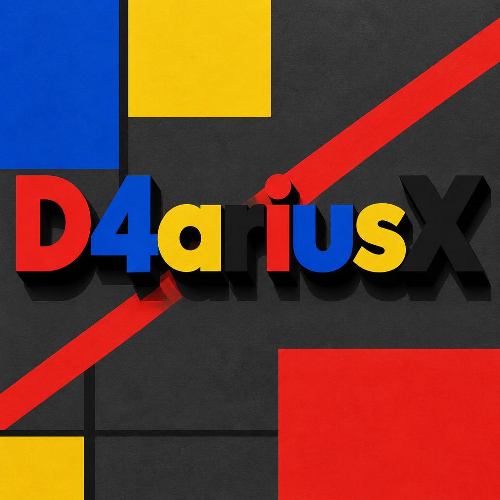
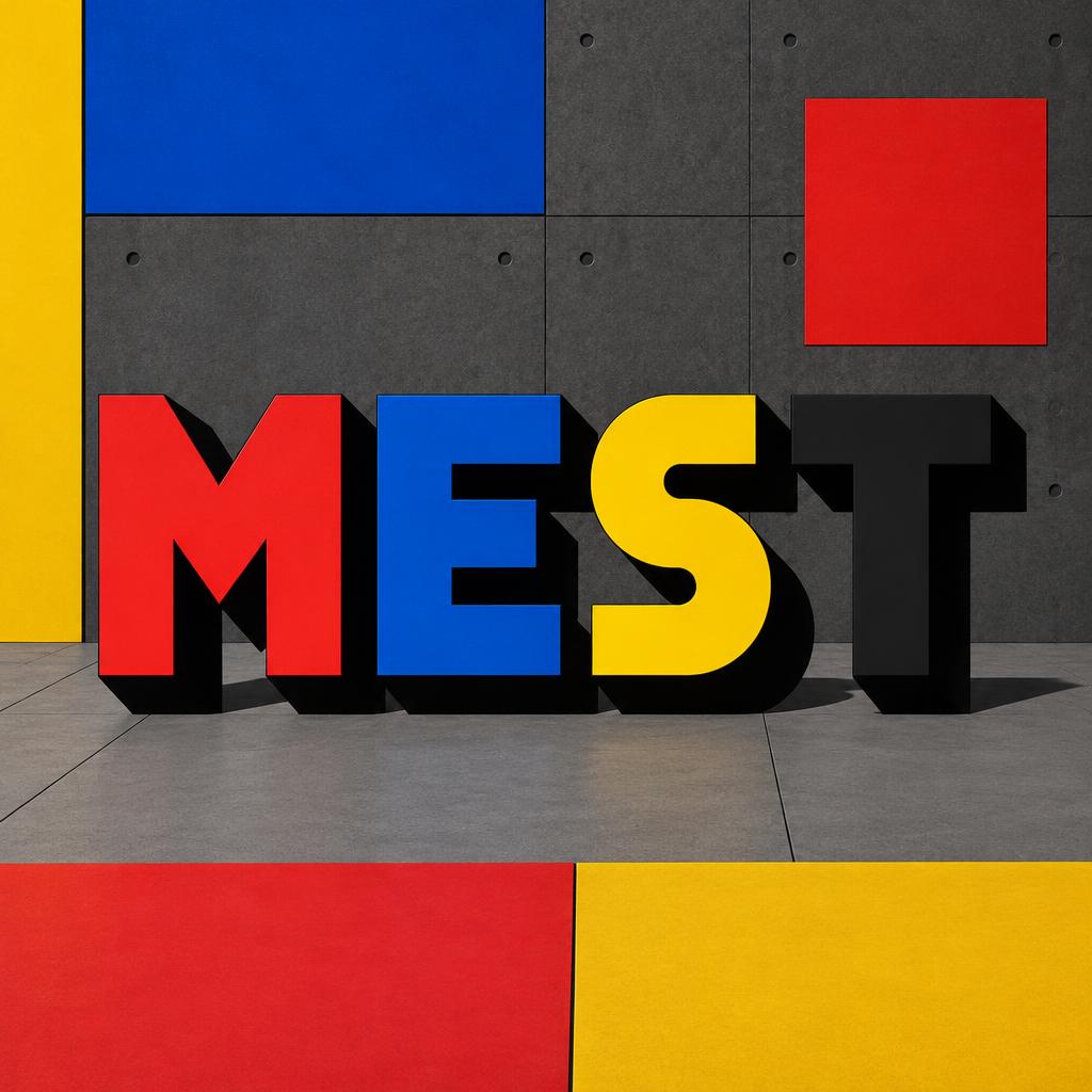
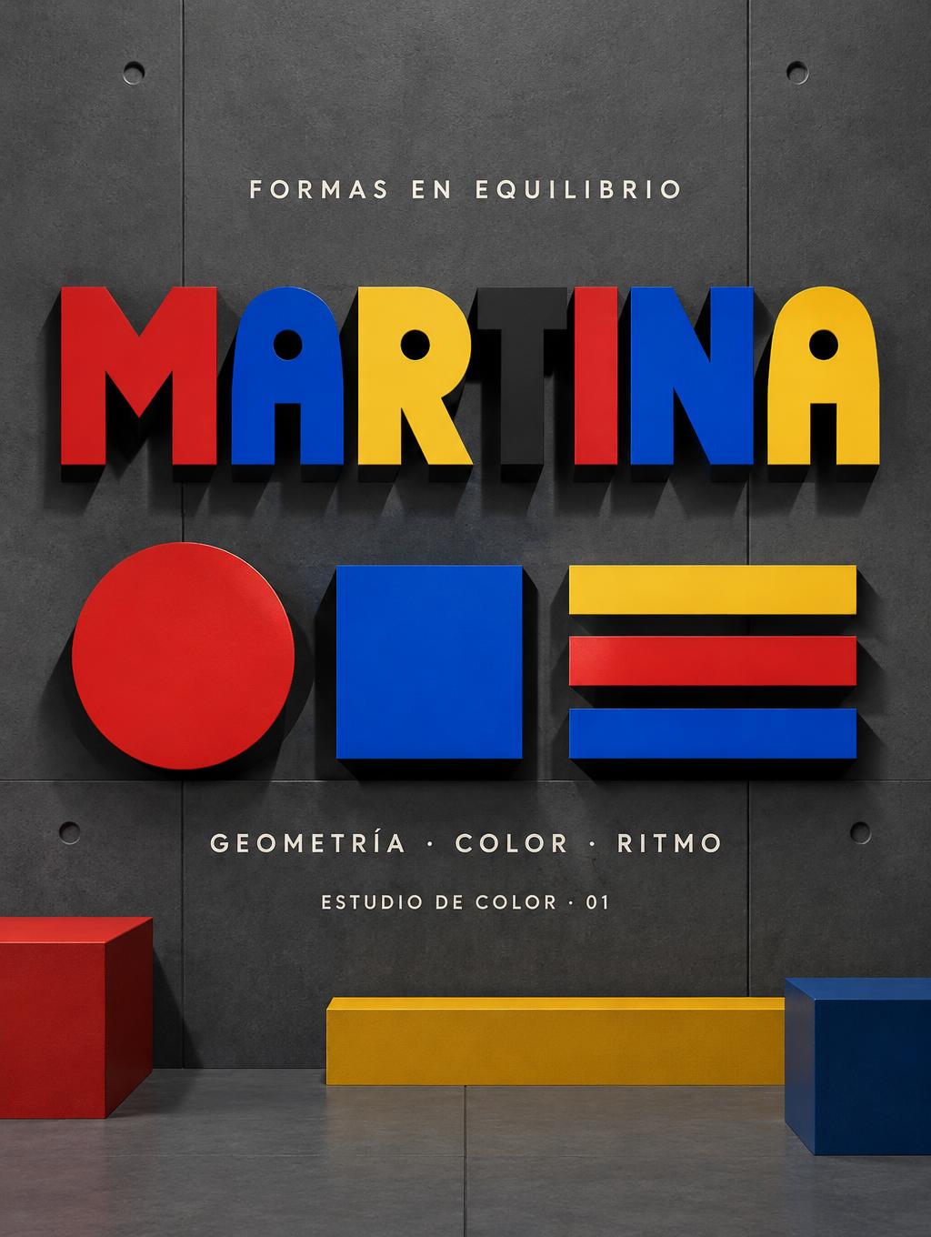
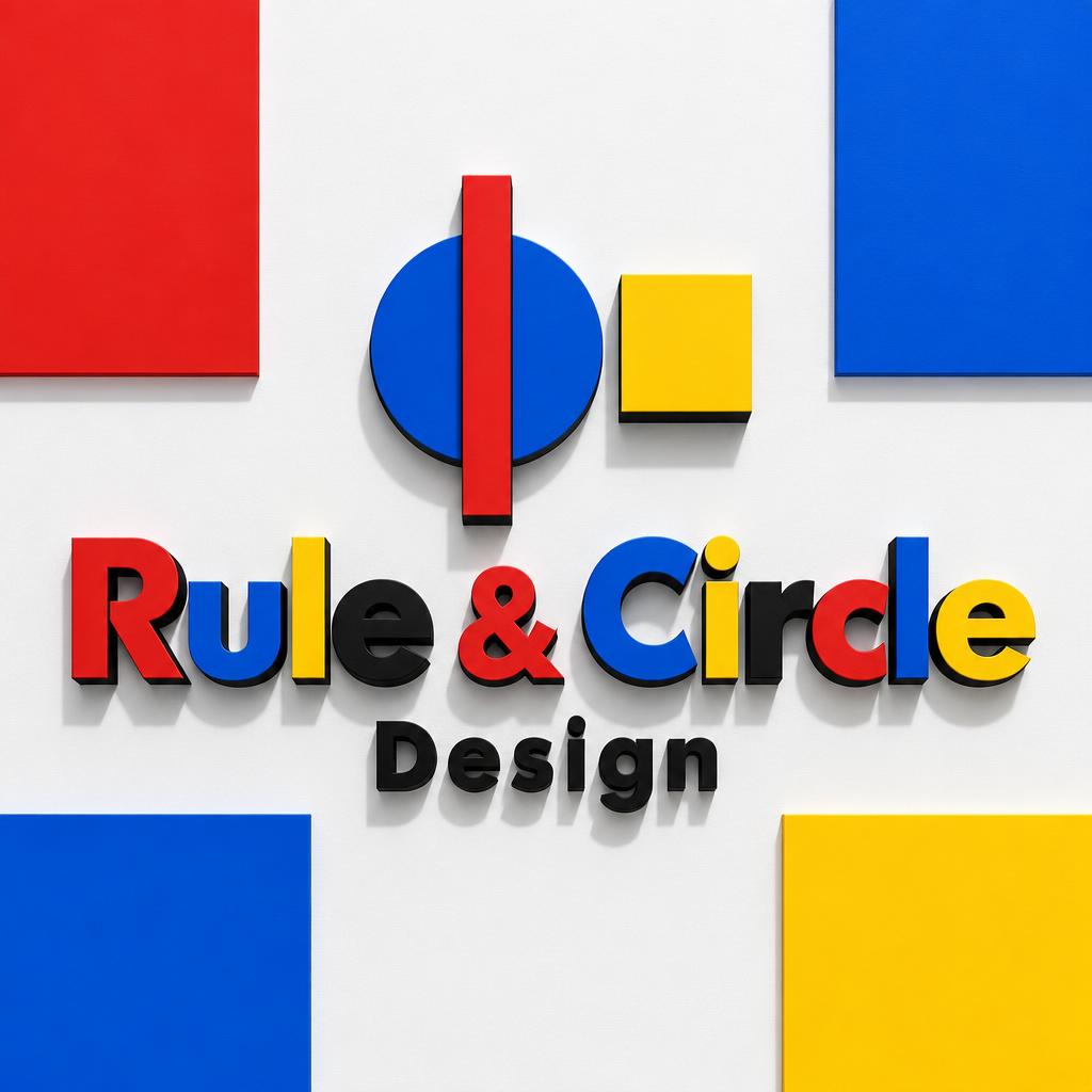
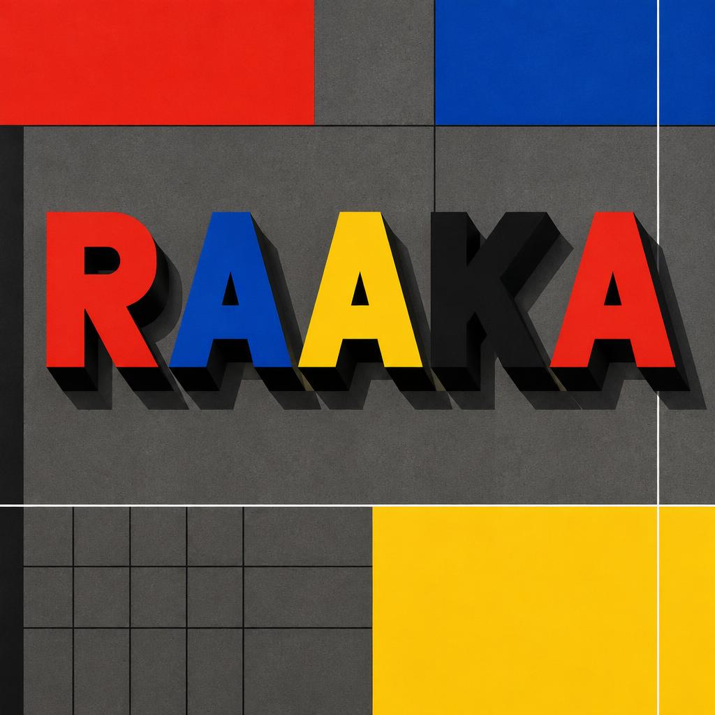

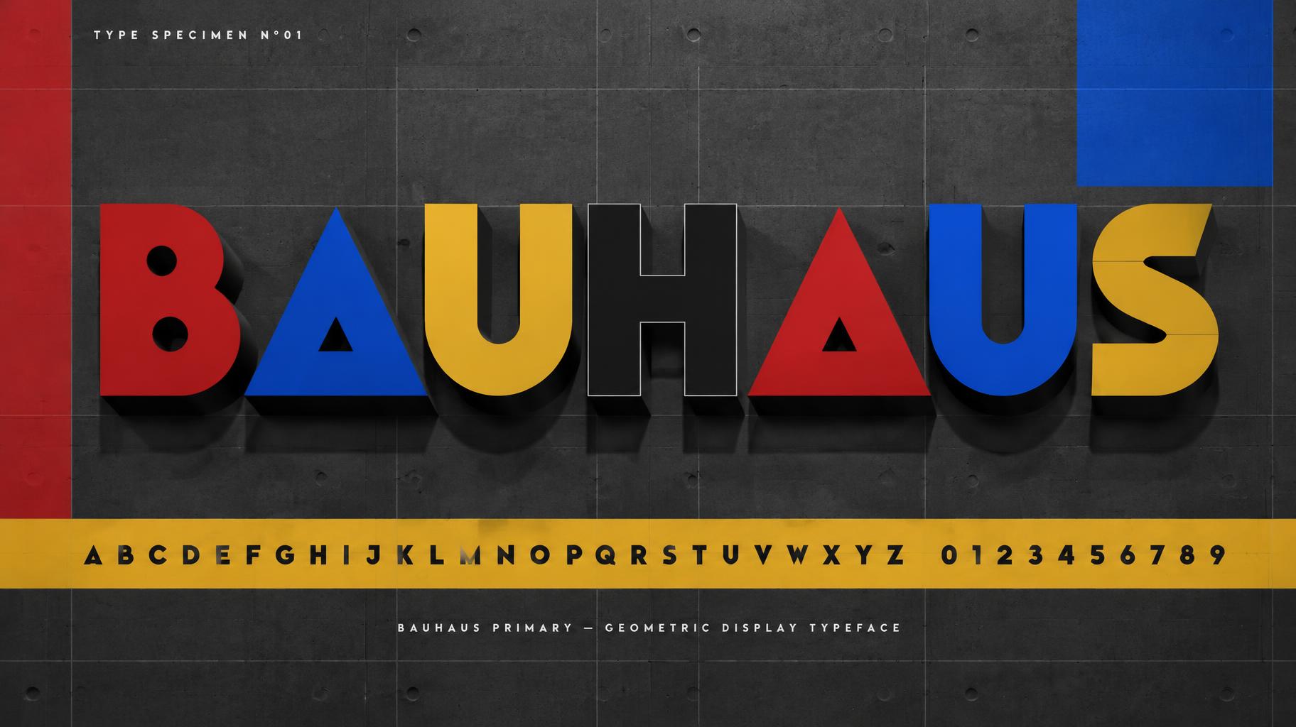
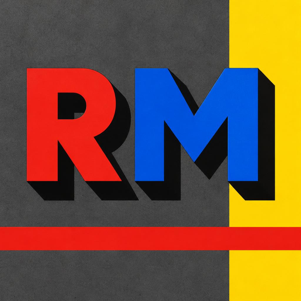
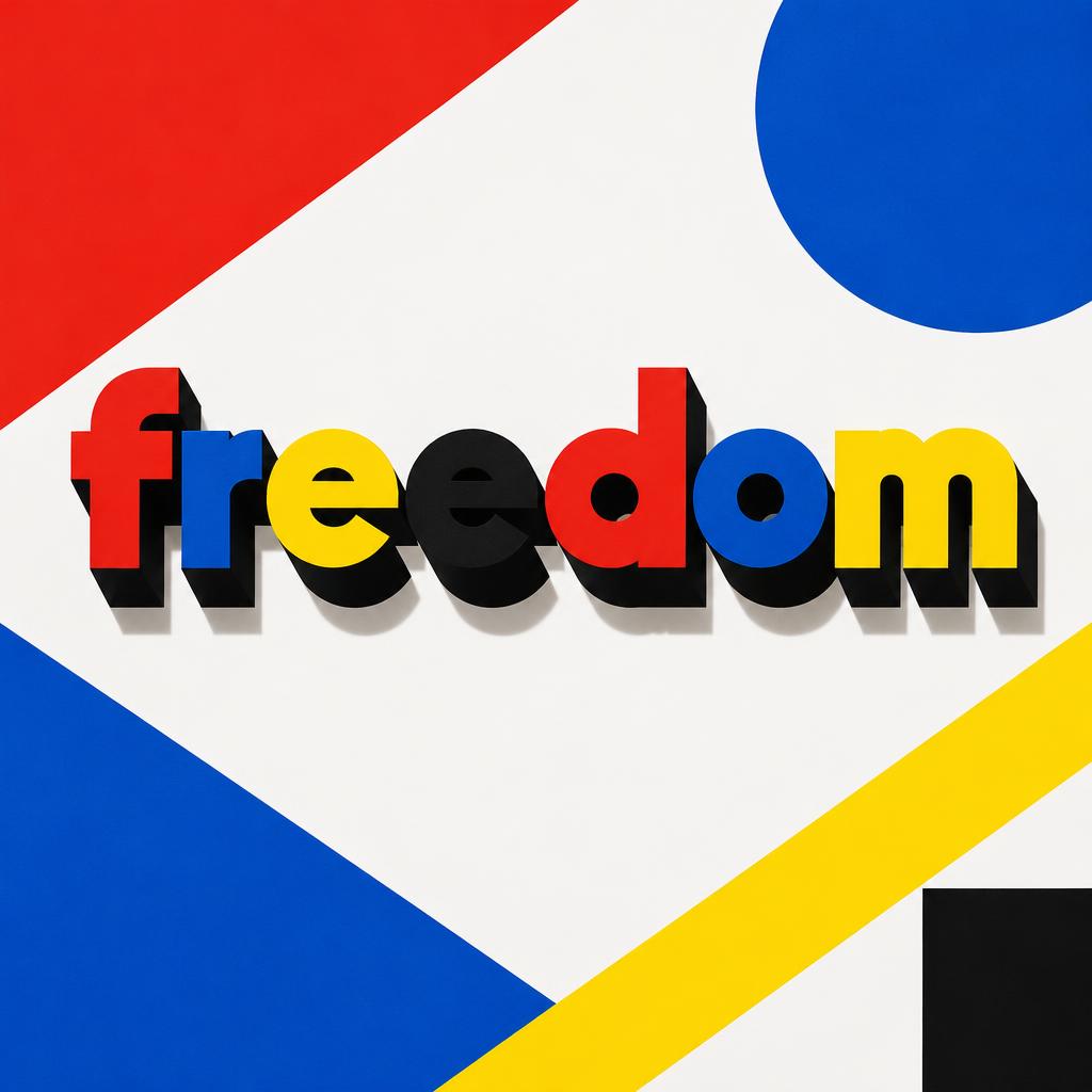
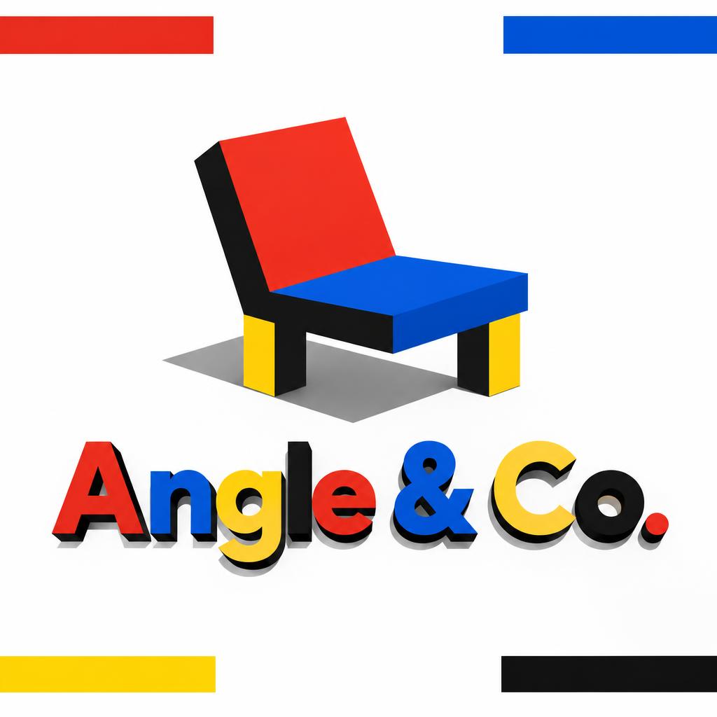
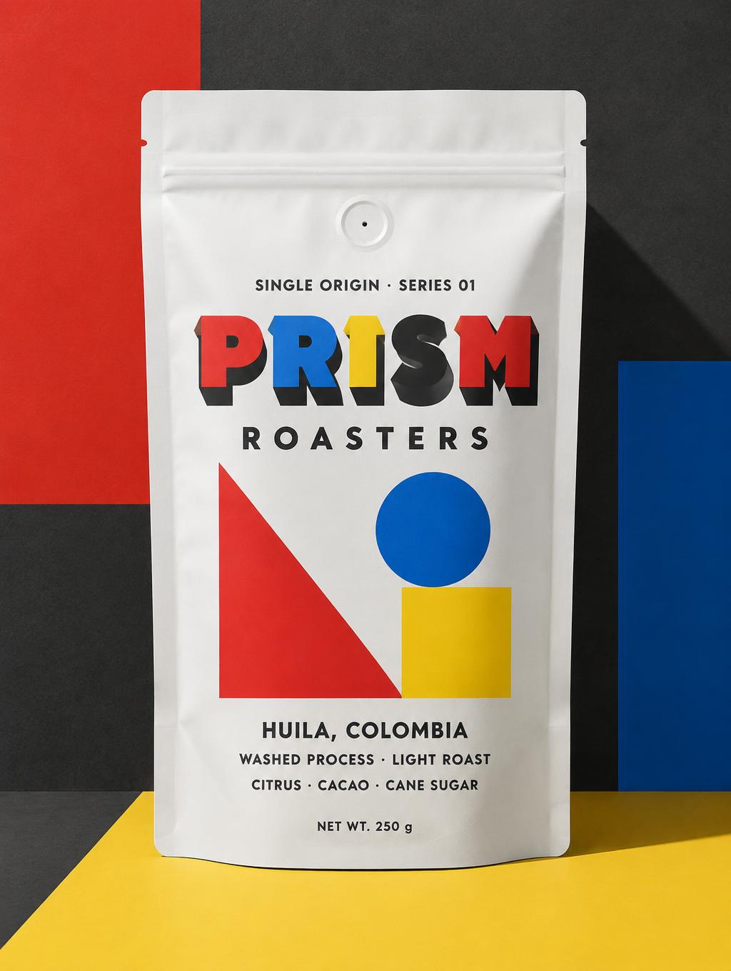

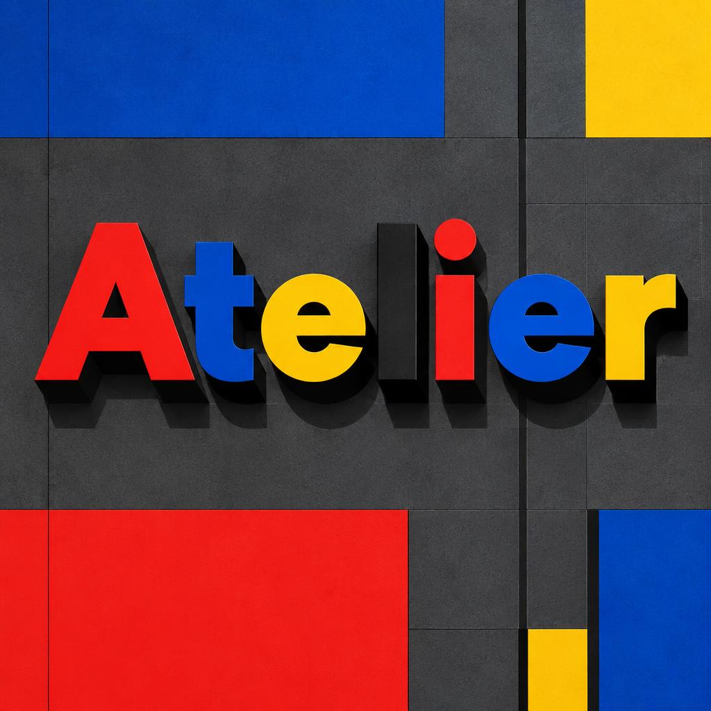

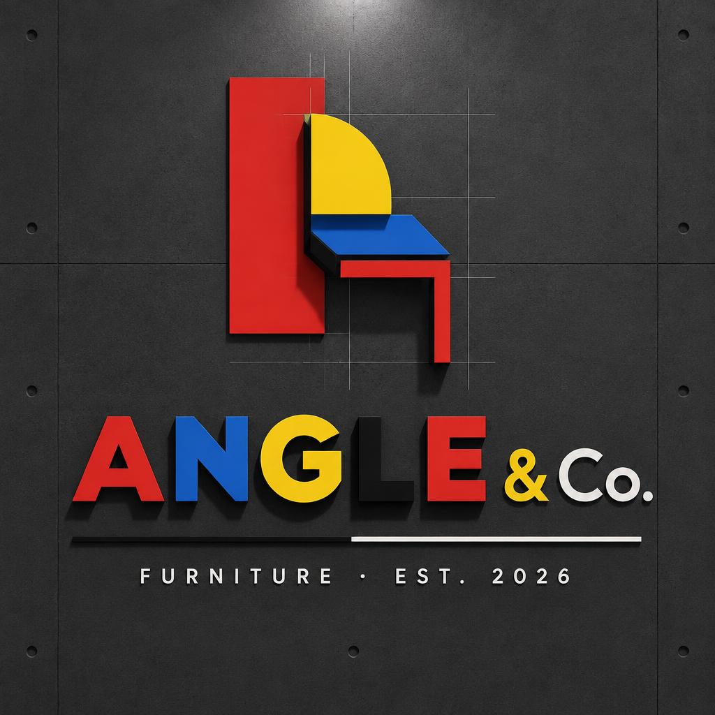
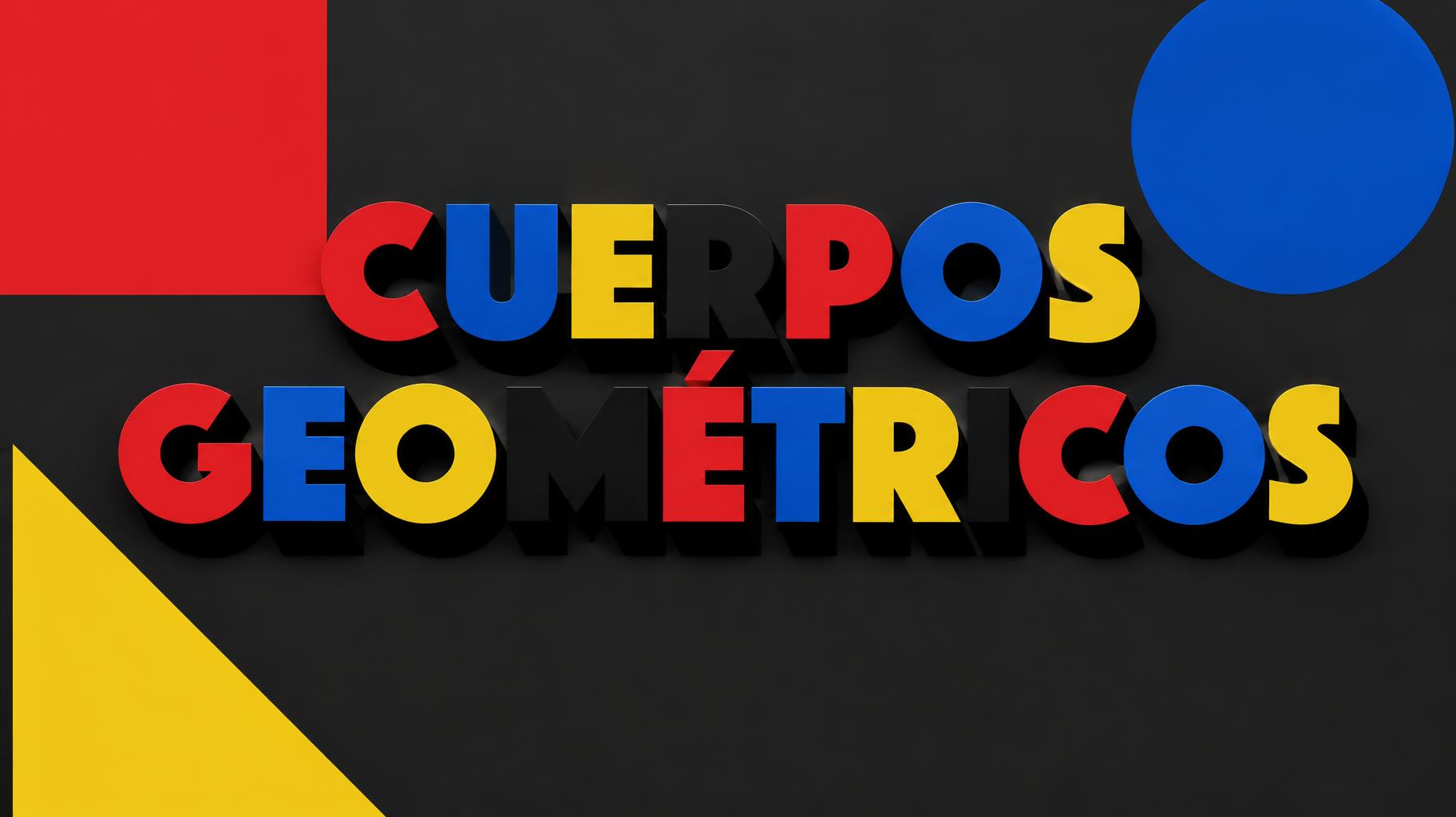
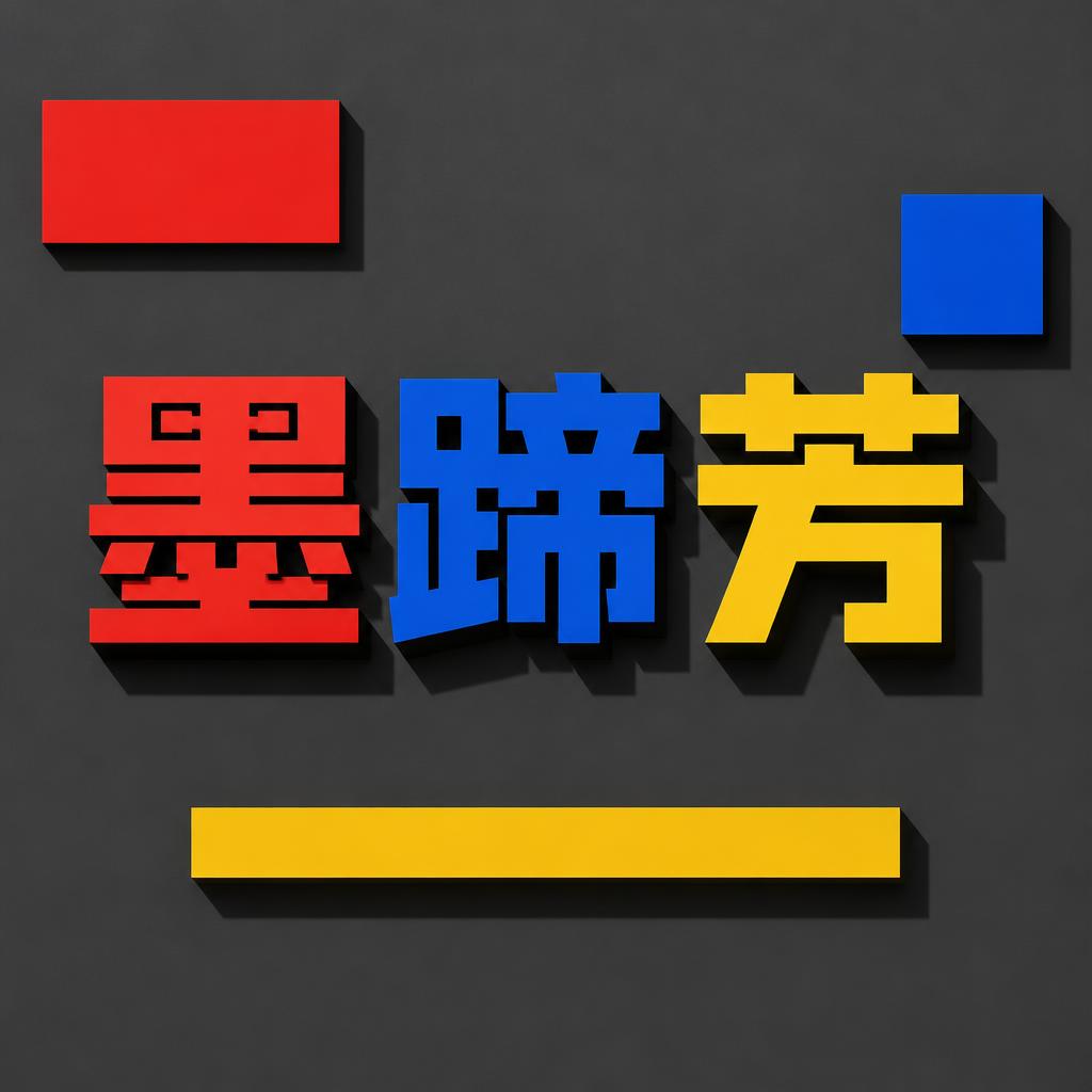
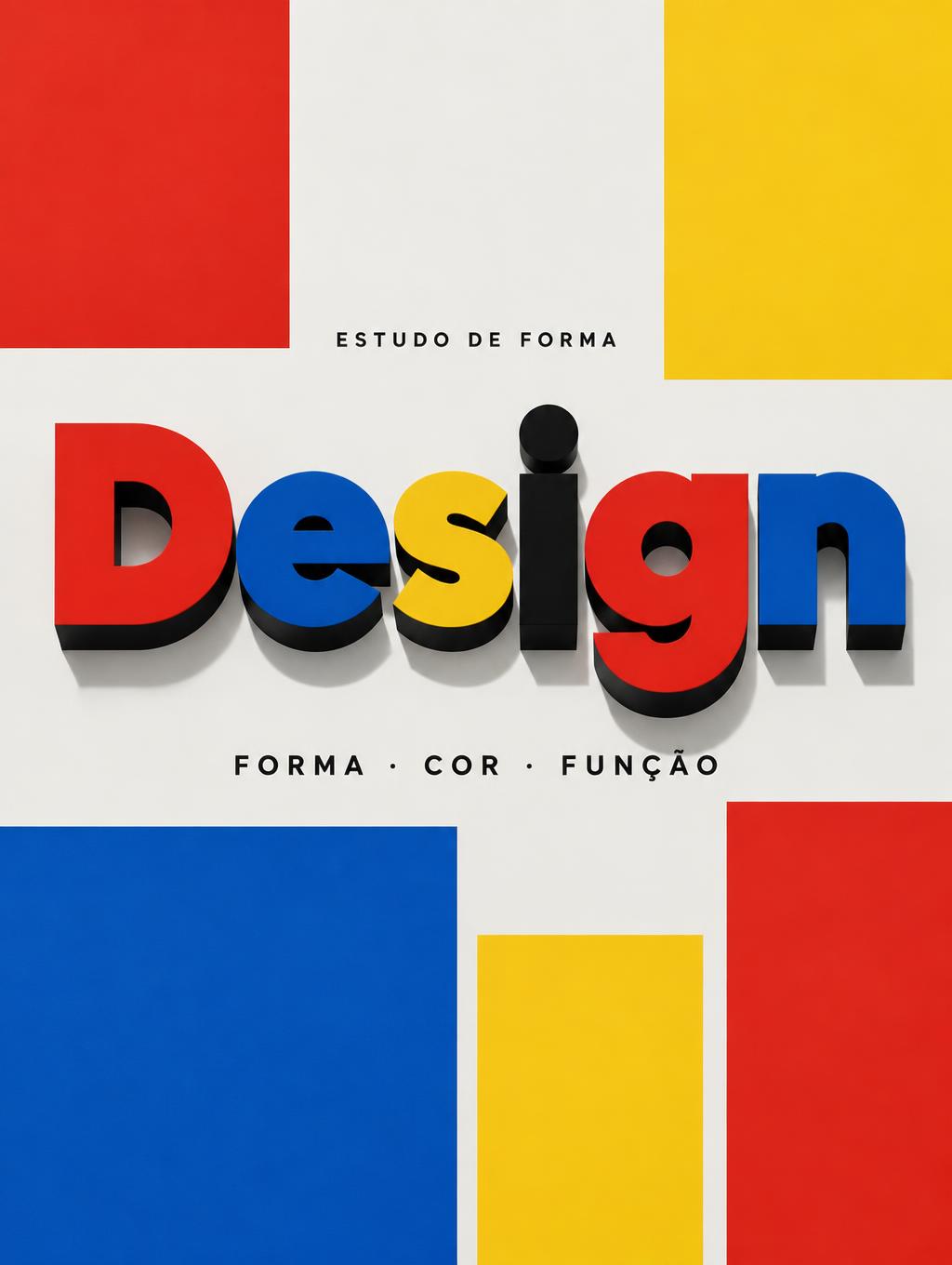
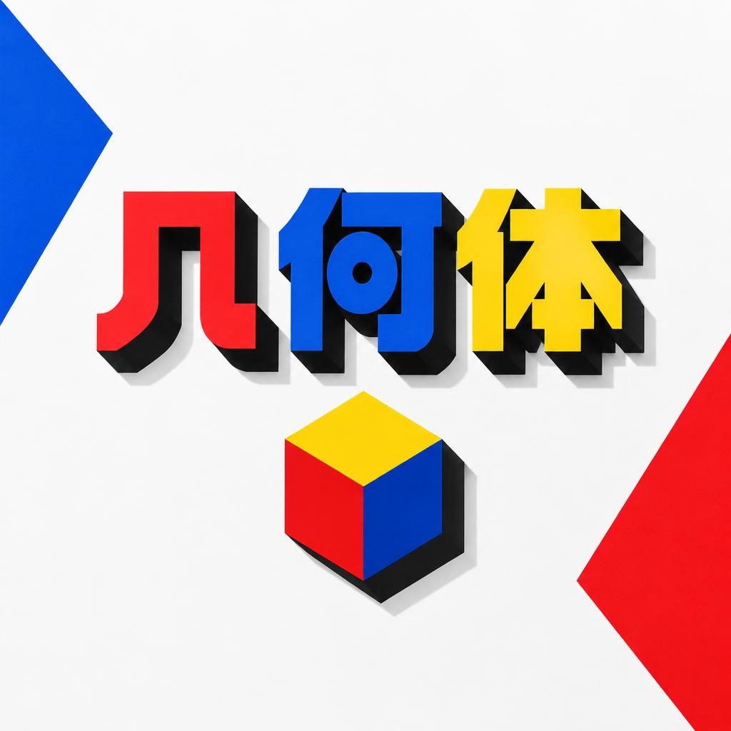
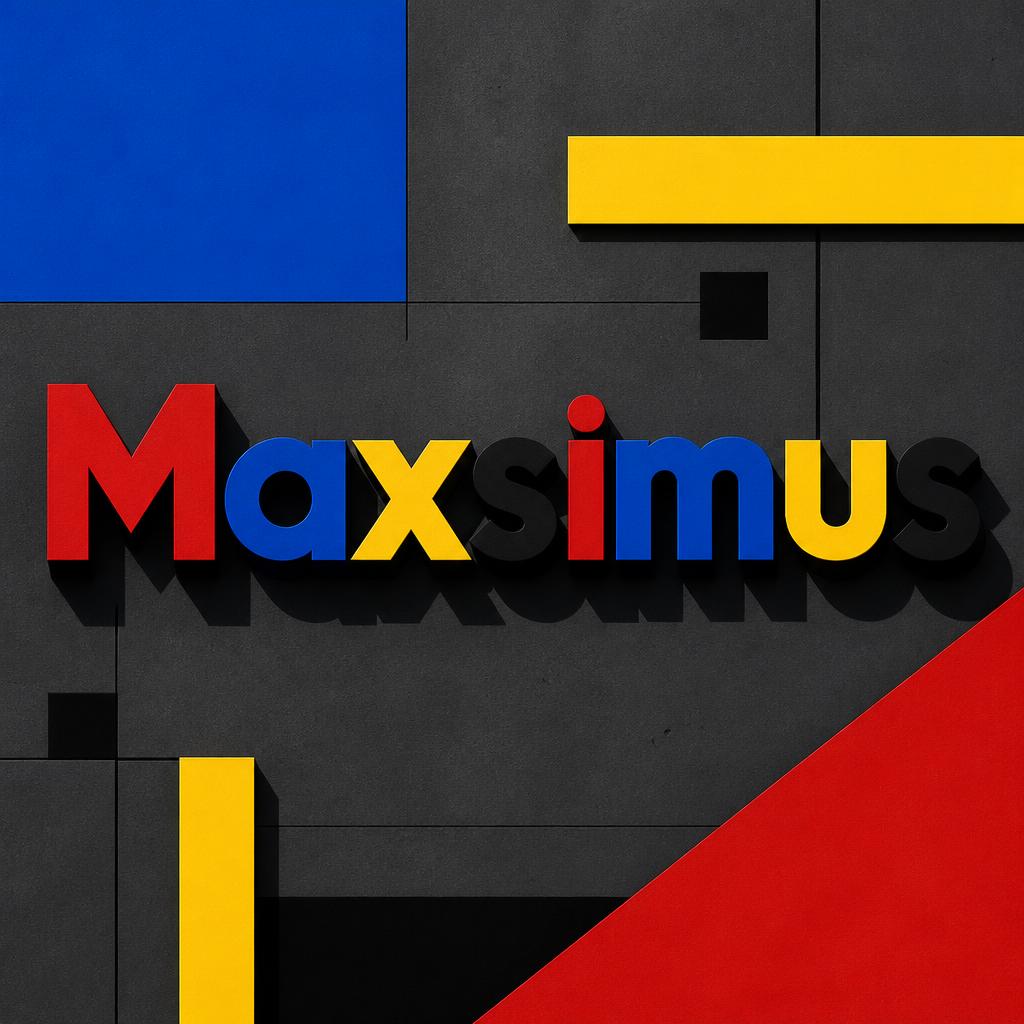
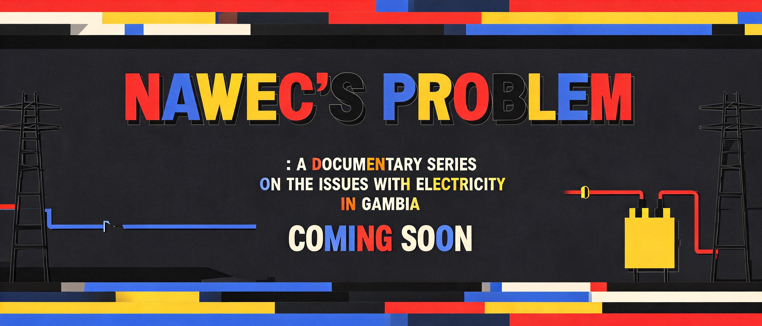

More AI fonts like Bauhaus Primary




Looking for copy-paste fancy text? Try our free Font Generator Tools — cursive, gothic, bubble & 30+ styles.
About Bauhaus Primary AI font
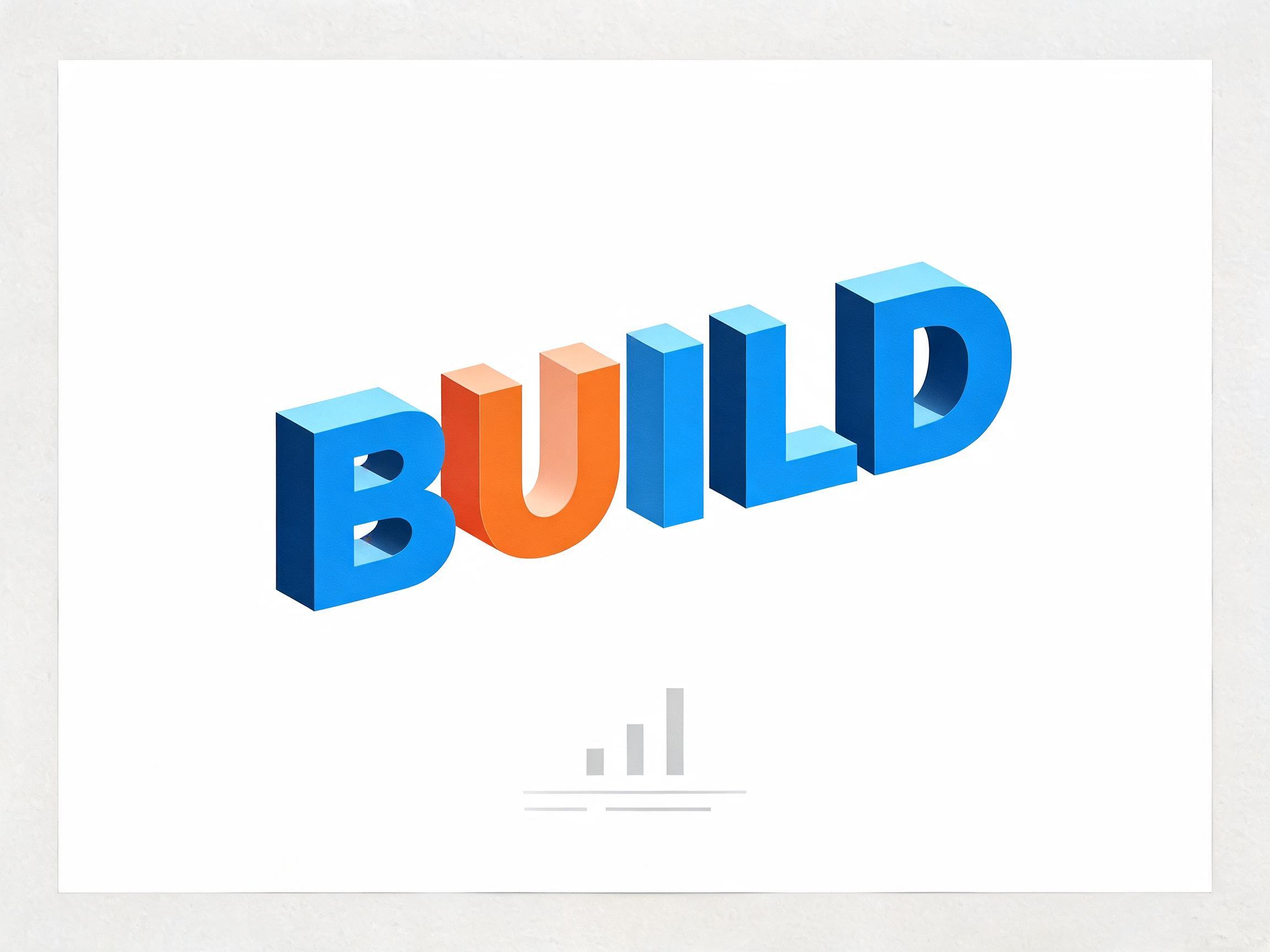
Bauhaus-constructed geometric sans-serif letterforms built from circular arcs and straight lines only — no optical corrections, no calligraphic compromise. Herbert Bayer's Universal alphabet vision brought to AI typography: every letter a geometric theorem, every curve a compass arc.
Lettering
Letterforms
Colors
FAQ
What is the Bauhaus Primary font?
Bauhaus Primary is a geometric sans built strictly from circular arcs and straight lines — no optical corrections, no calligraphic compromise. It follows Herbert Bayer's Universal alphabet vision: every letter a geometric theorem, every curve a compass arc. It reads as rational, modern and rigorously constructed. It follows the lettering logic Herbert Bayer proposed at the Bauhaus in Dessau in 1925: a lowercase-only alphabet built strictly from the compass and straightedge — a design study never actually cast as metal type, but one of the most influential alphabet proposals of the 20th century.
Can I download Bauhaus Primary?
There is no installable file. You type your text and the generator sets the constructed geometric letters fitted to your actual shapes, and returns a high-resolution image.
Where does this style work best?
Modernist and design-led branding, exhibition and cultural graphics, architecture and studio identity, editorial and poster work, tech and product design, anything wanting a clean constructivist authority. Best at display sizes.
Can I use it for commercial work?
Yes. Generated images may be used commercially, including logos, print and packaging. No licence or attribution is required.
Why does the Bauhaus alphabet use a single case instead of capitals and lowercase?
Because the Bauhaus designers argued that having two separate forms of every letter was an irrational leftover, and a modern alphabet should shed it. Herbert Bayer, who drew the Universal alphabet this style follows, pointed out that speech has no audible difference between a capital and a lowercase letter — you cannot hear a capital B — so maintaining two whole sets of shapes, and two ways of drawing and learning them, was wasted effort inherited from history rather than a real communicative need. His answer was a single simplified alphabet, built from the same handful of geometric parts, that dropped capitals entirely. That same logic of stripping away everything not functionally necessary is why the letters also refuse optical correction and ornament: the style is an argument that type should be reduced to pure, rational geometry, and the single case is that argument taken to the alphabet itself.
What fonts look similar?
For the geometric sans with the optical corrections the Bauhaus refused, see Futura Bold. For a heavier geometric display, try Bold Geo Sans.