


AI Geometric Text Effect Generator
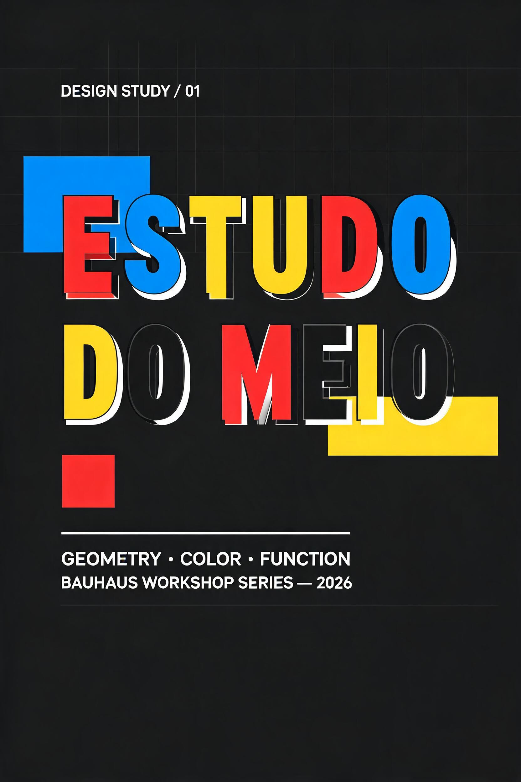
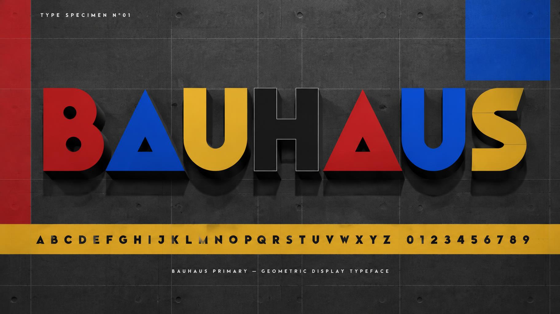
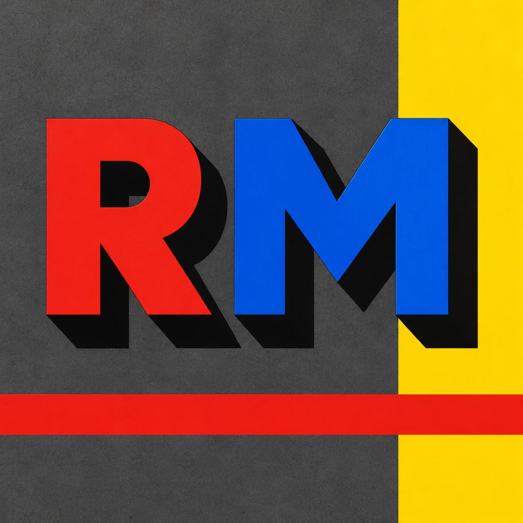
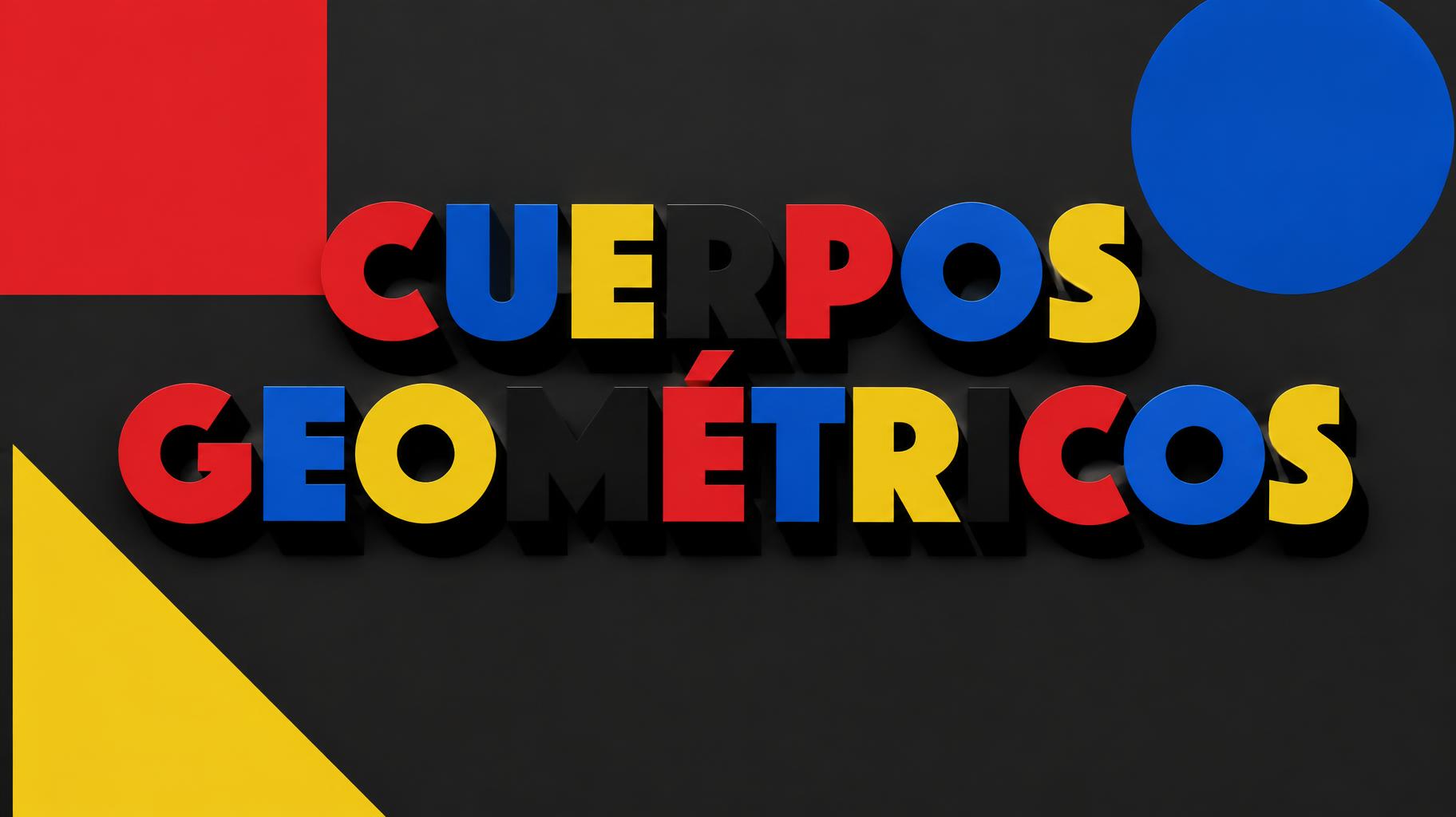
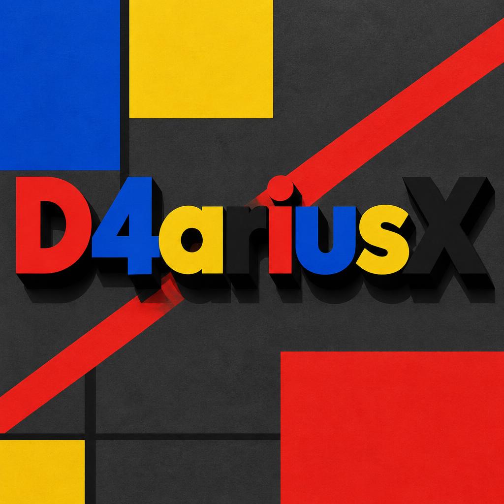
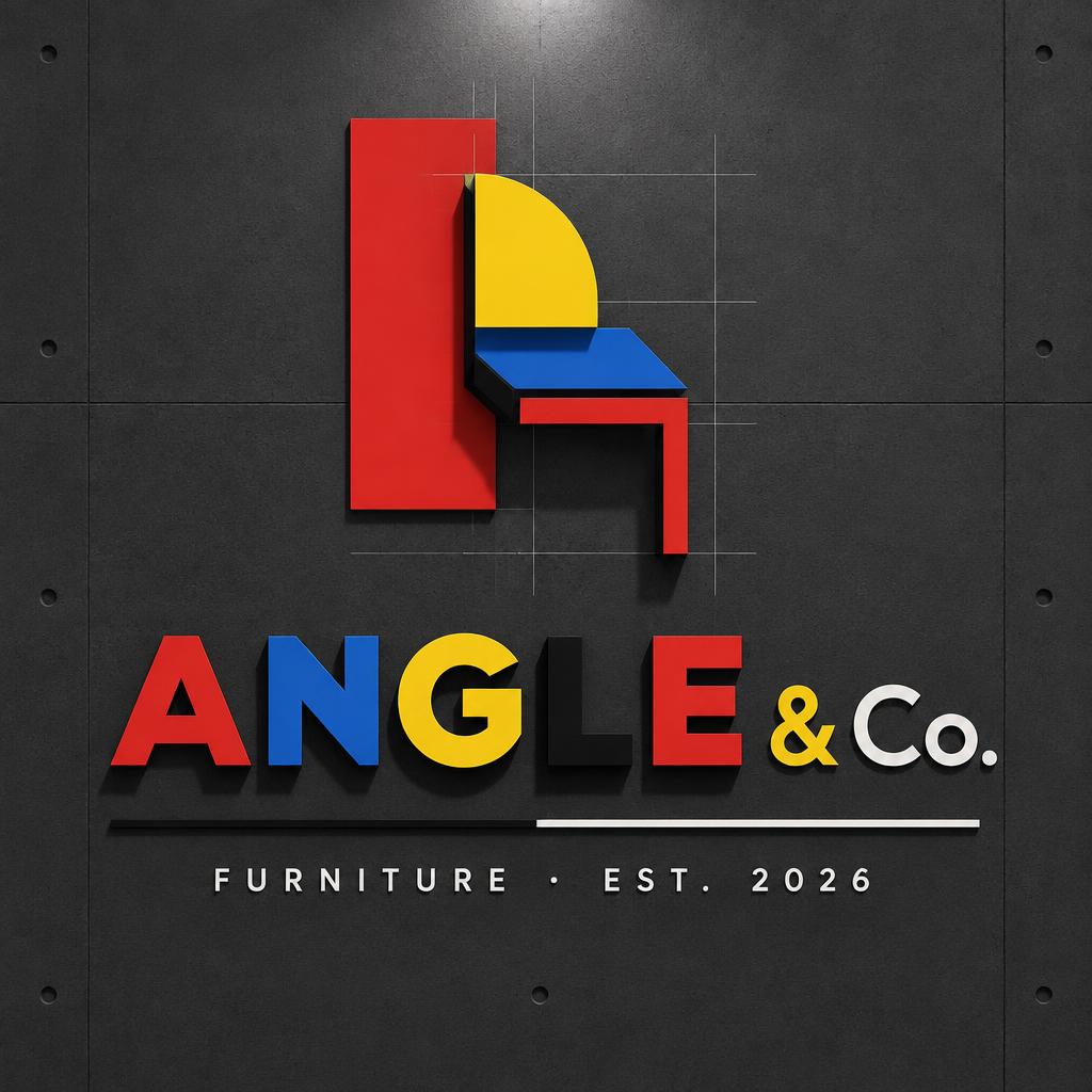
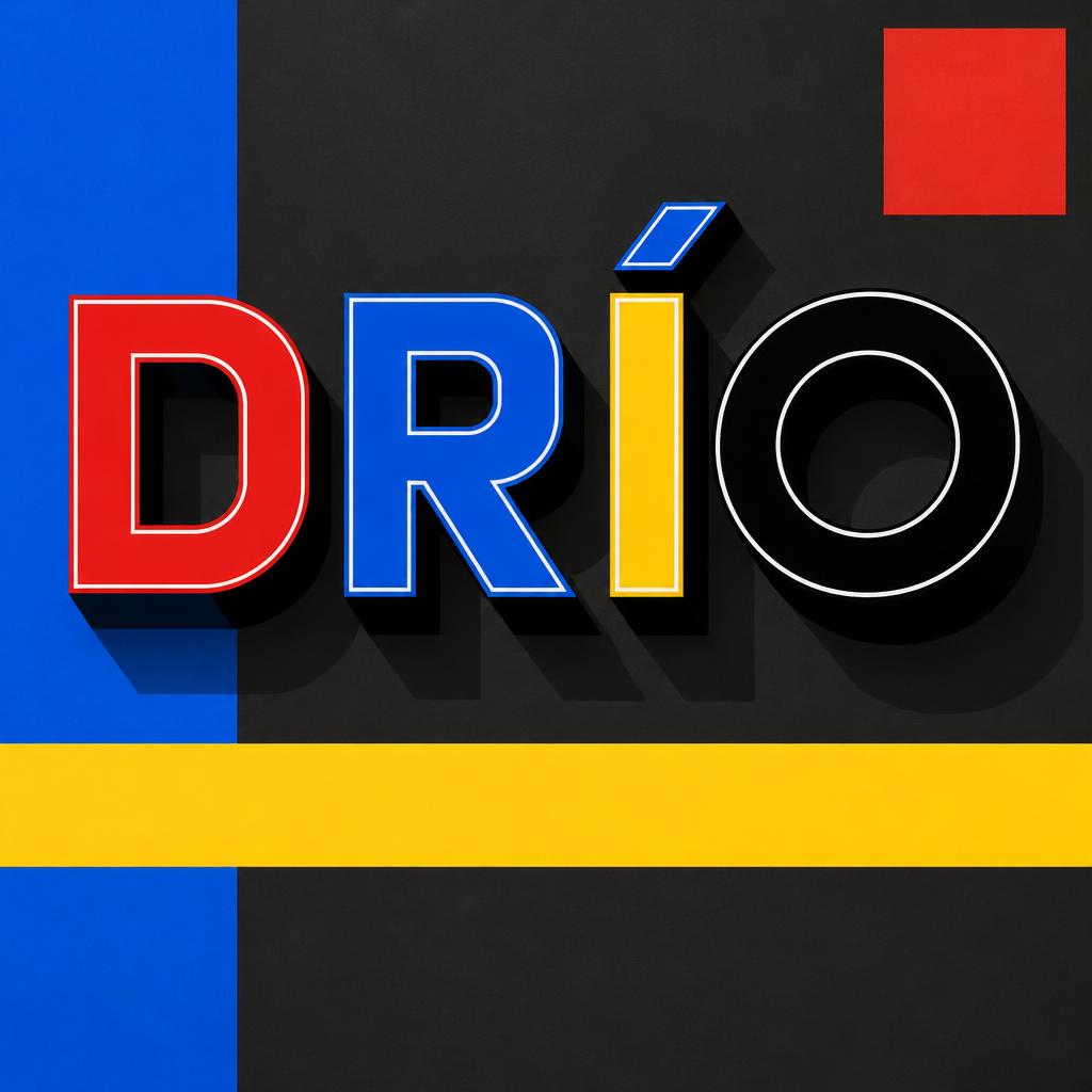
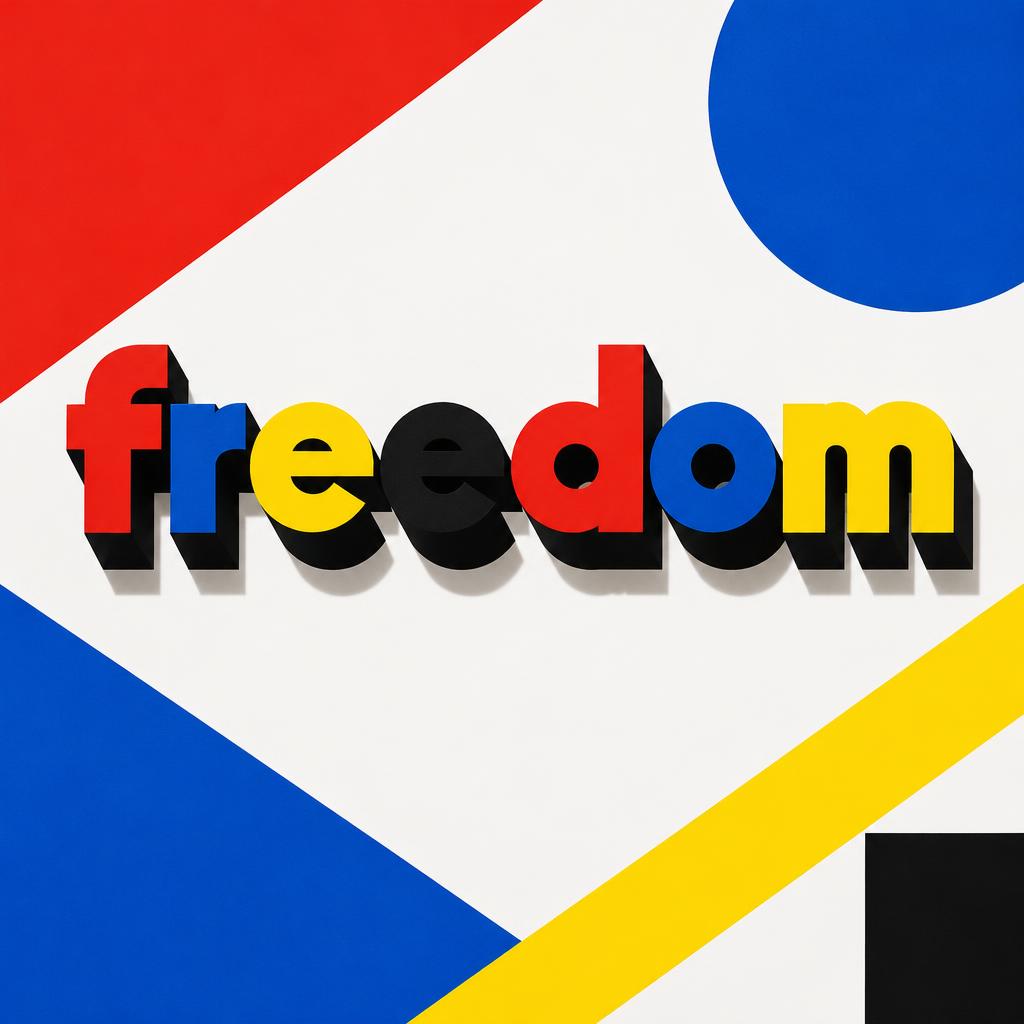
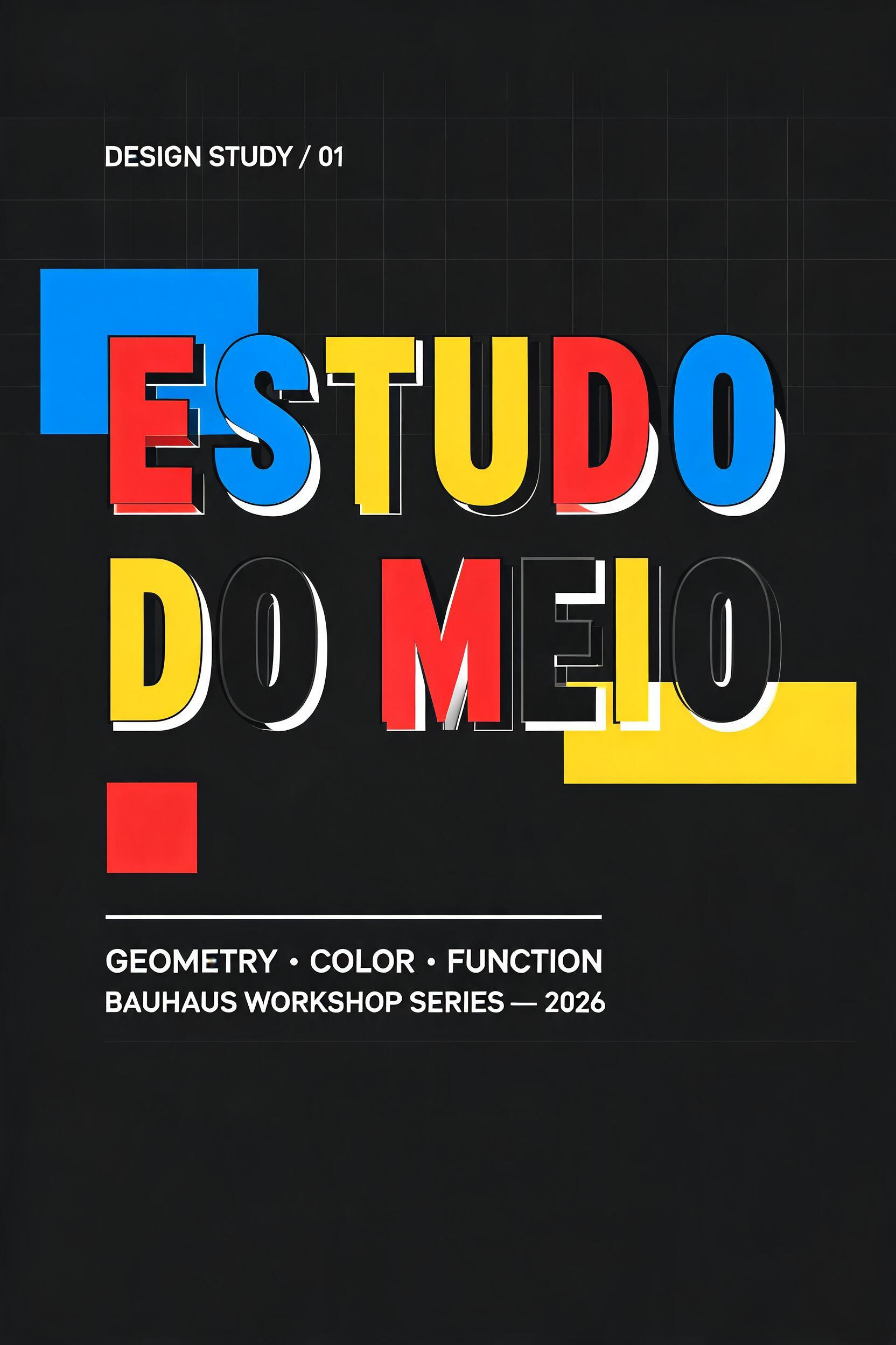
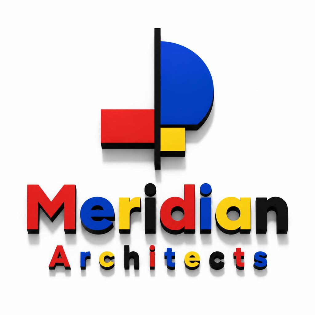
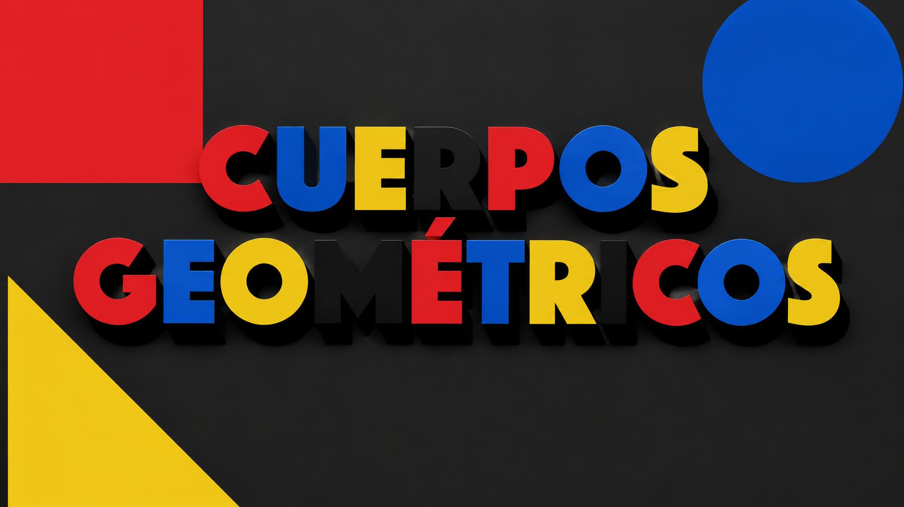
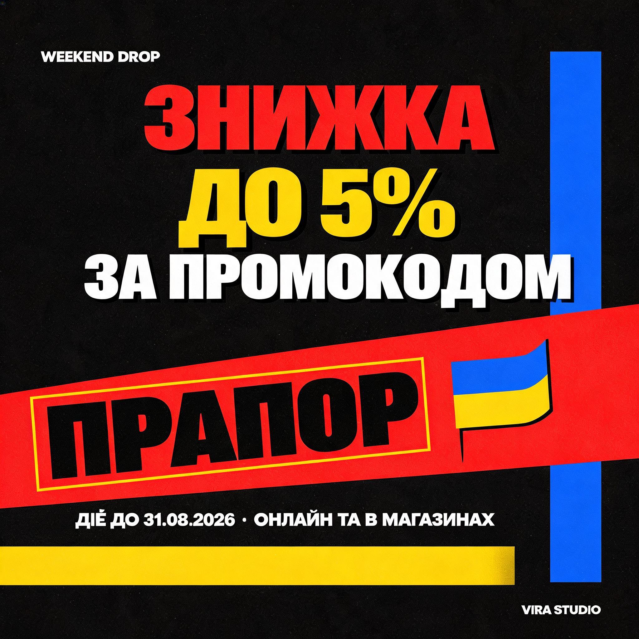
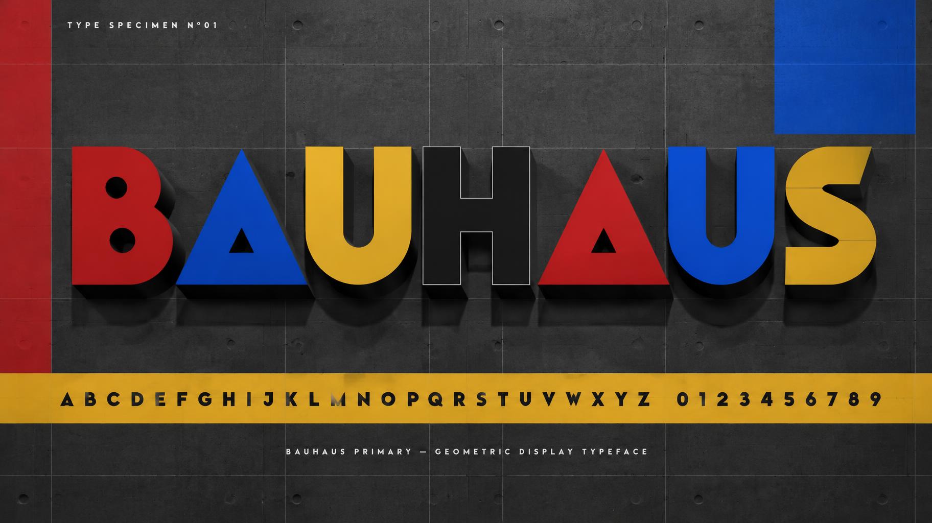
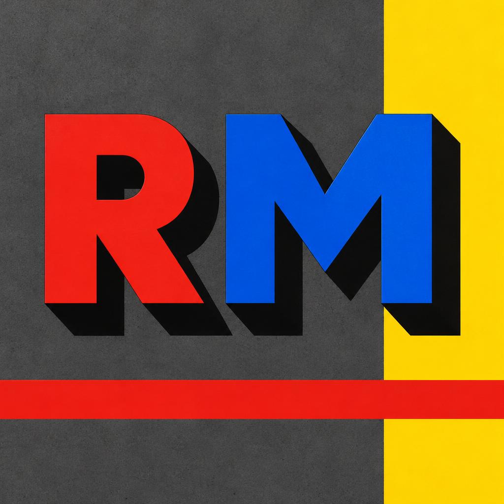
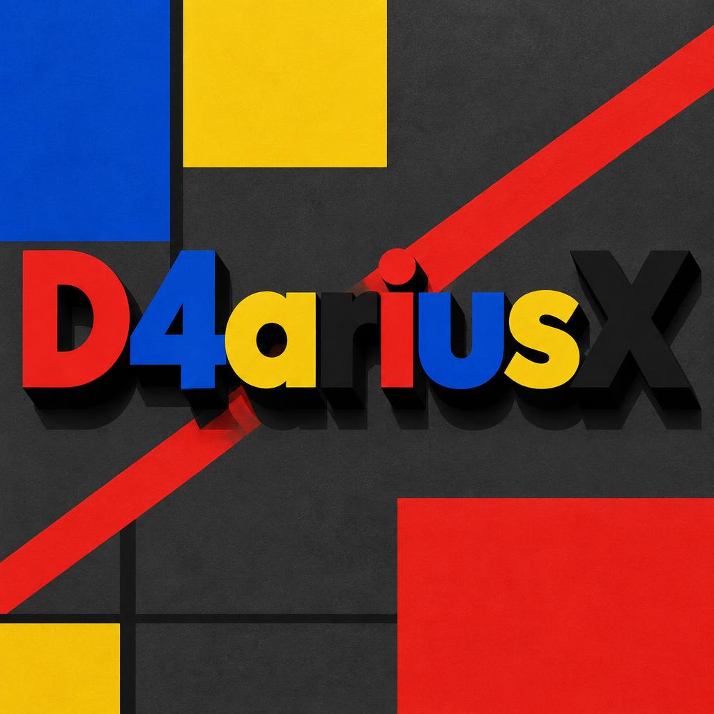
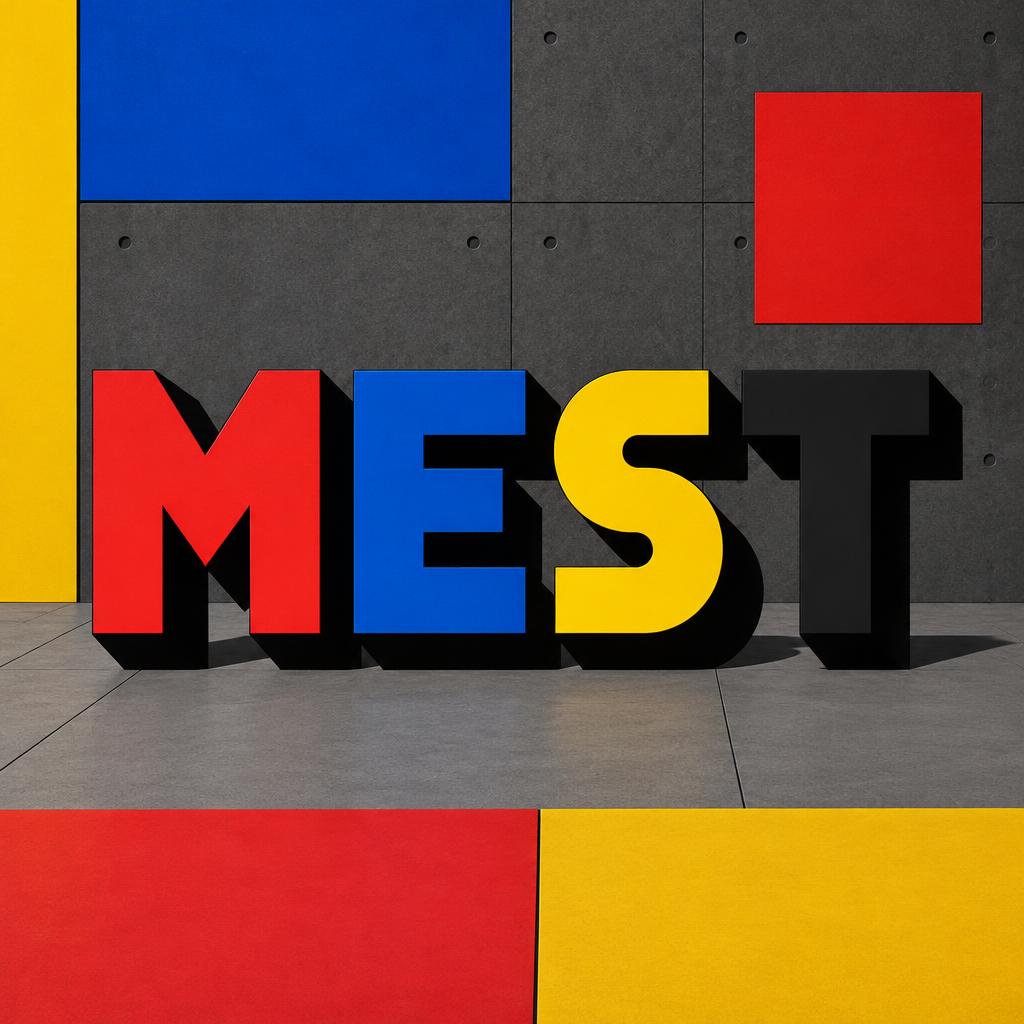
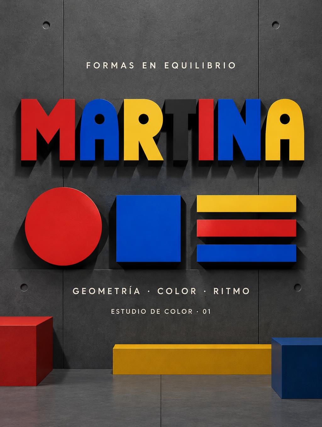
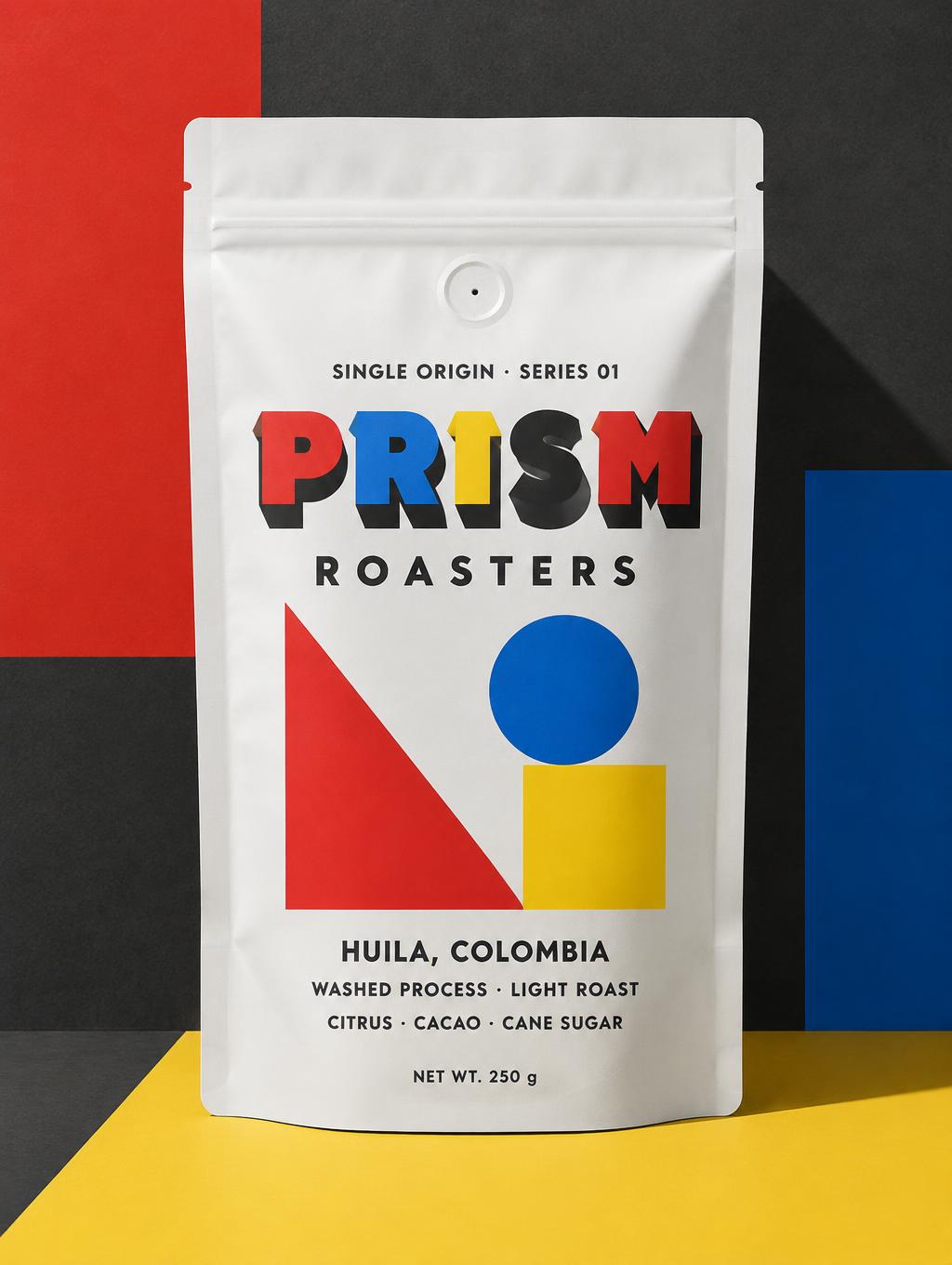
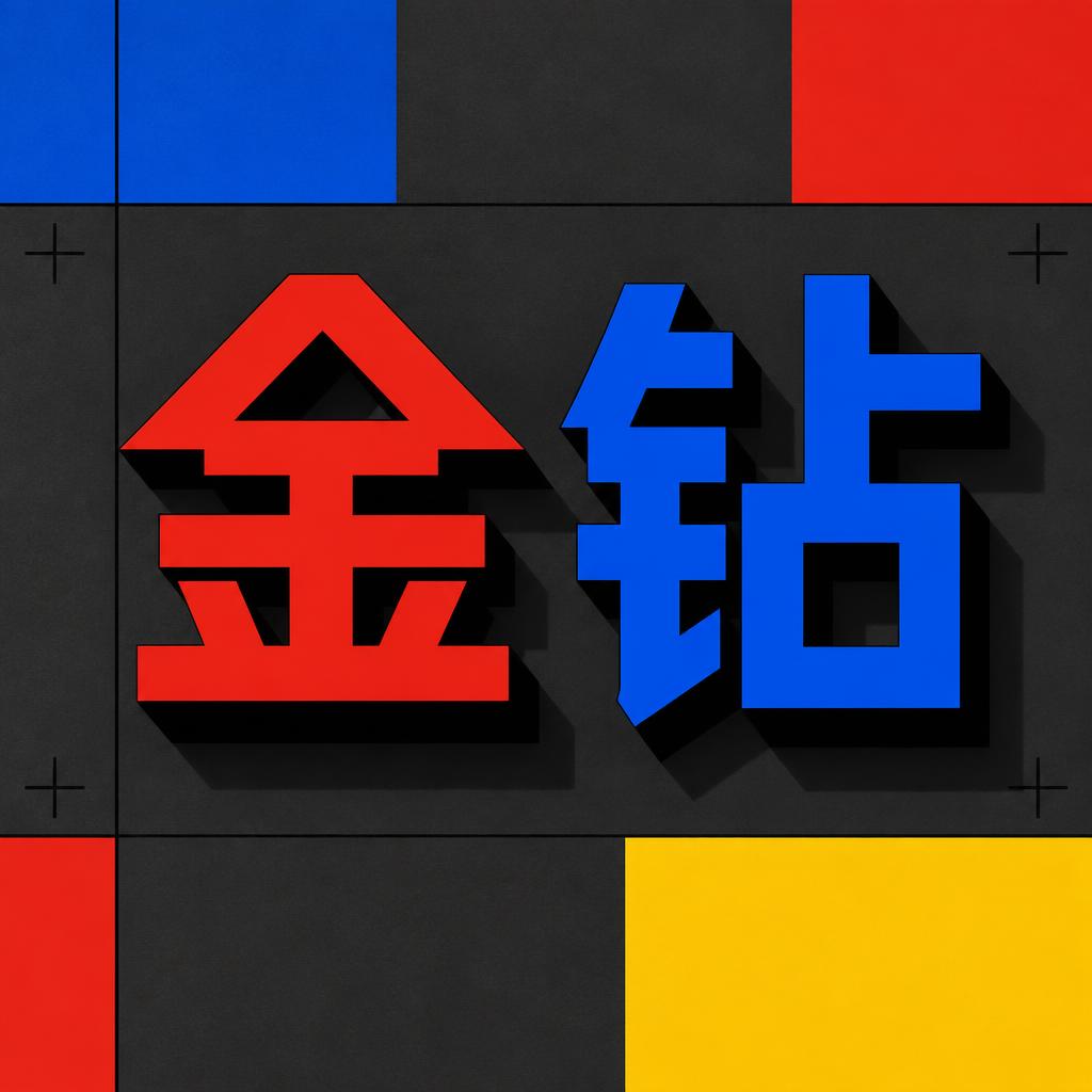
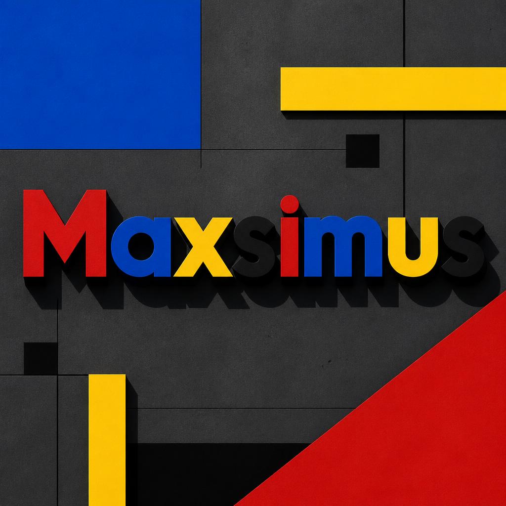
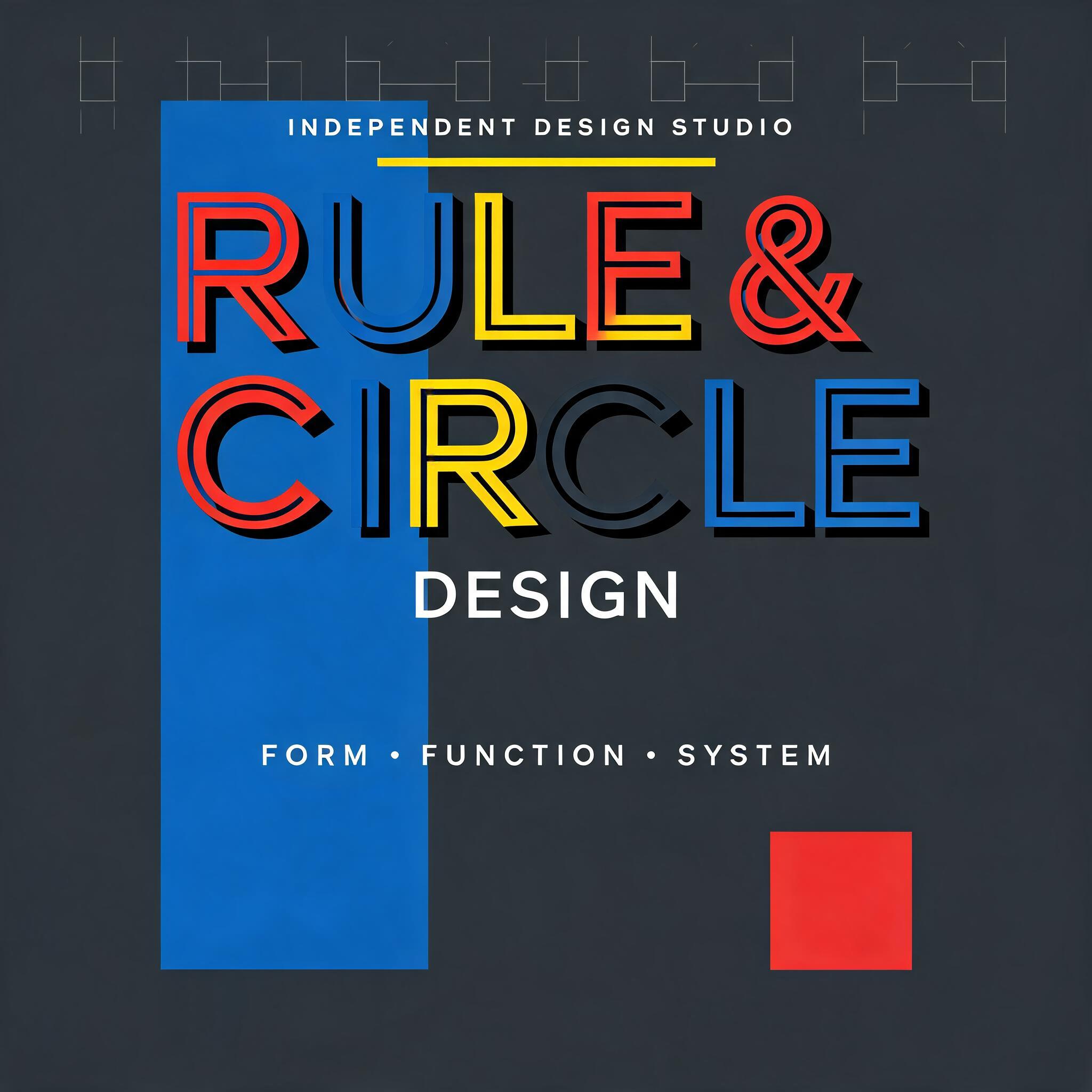
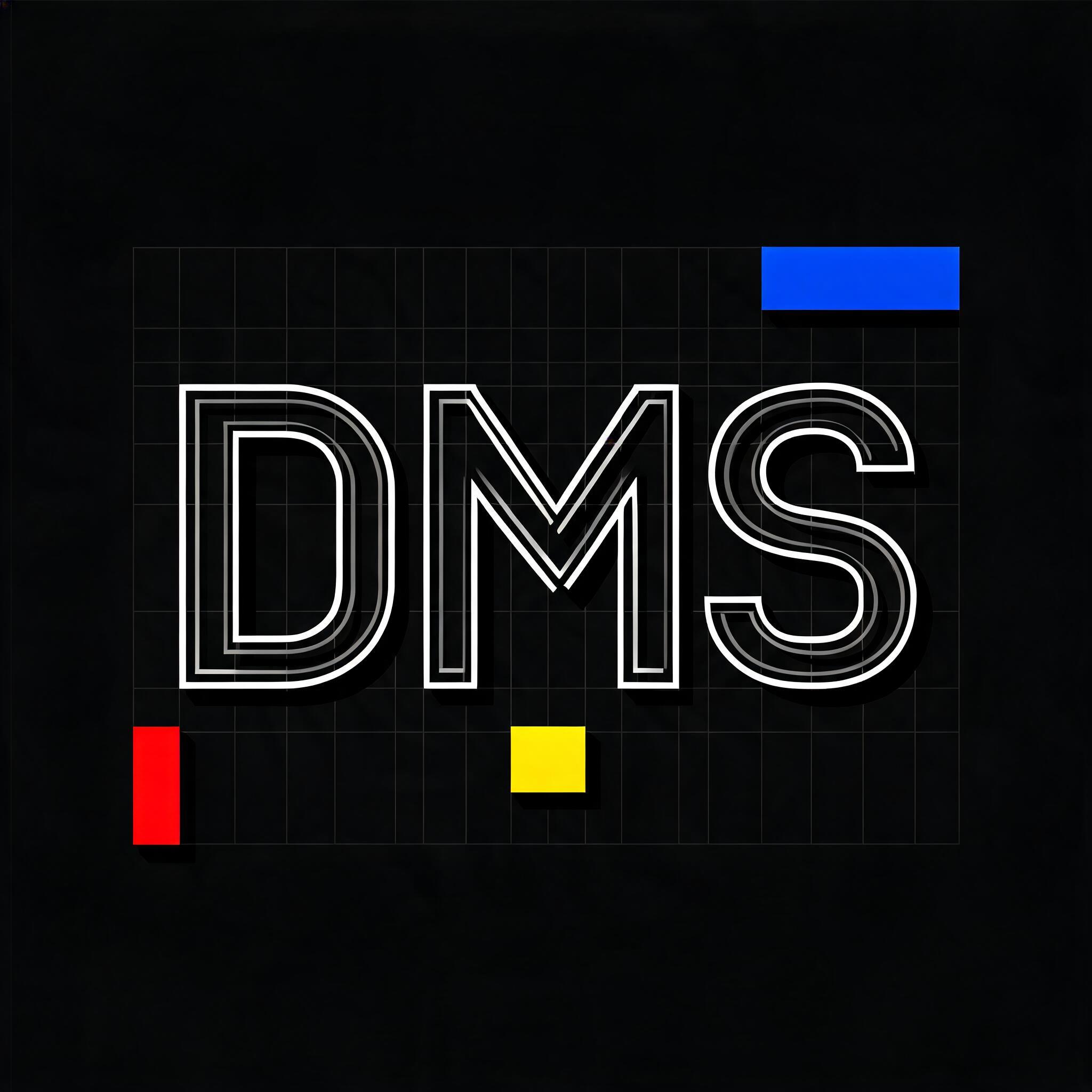
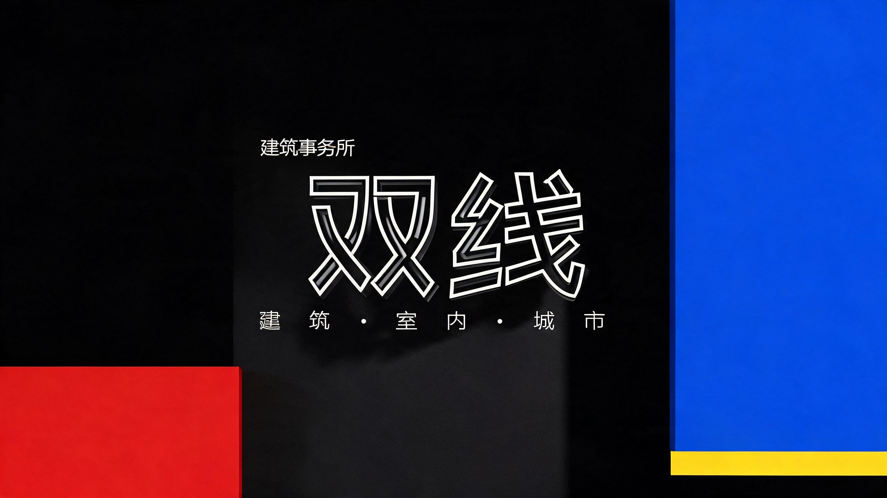
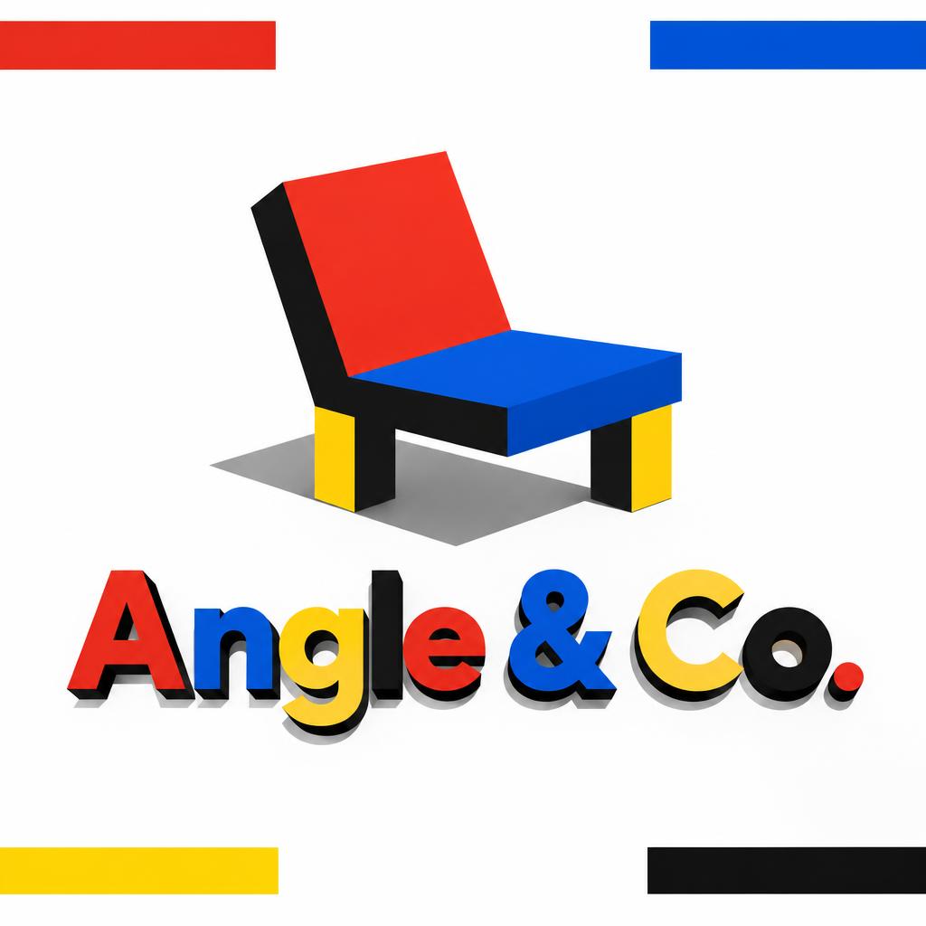
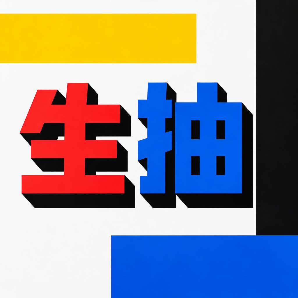
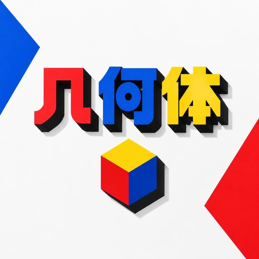
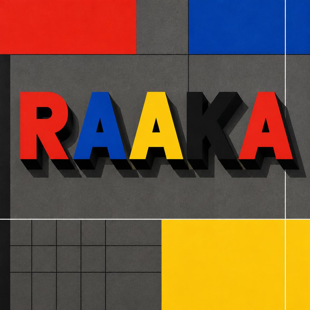
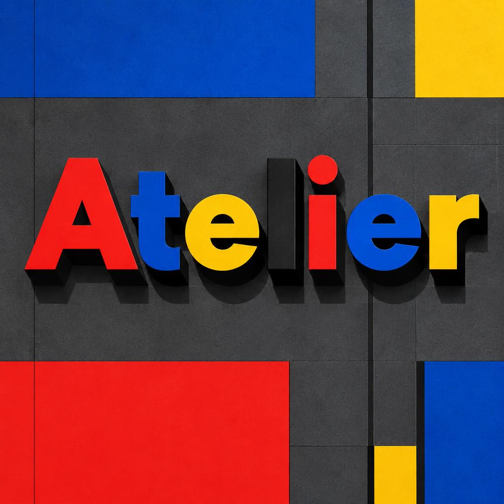
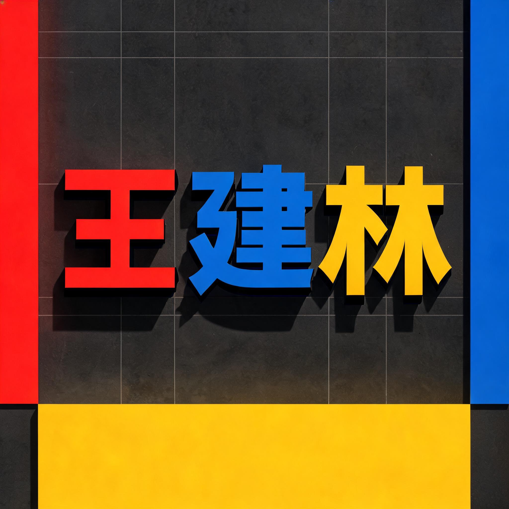
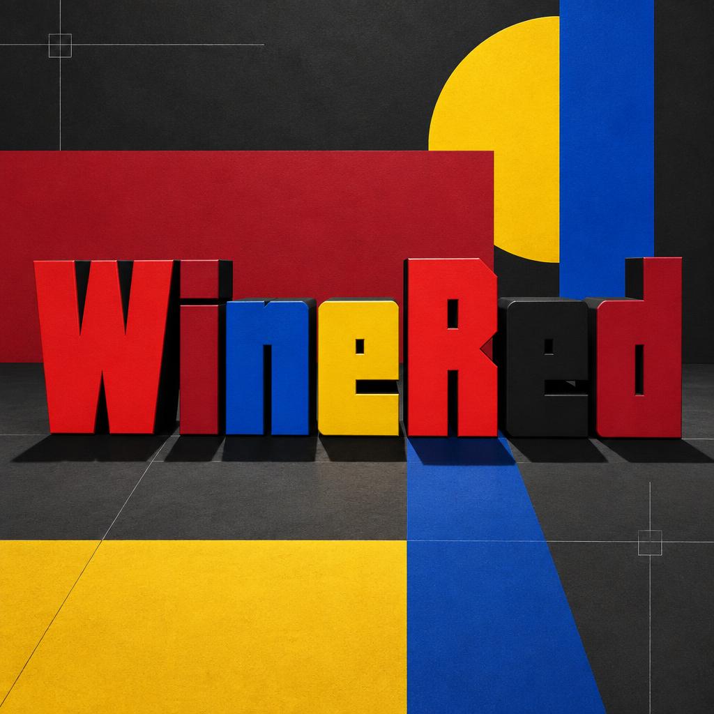
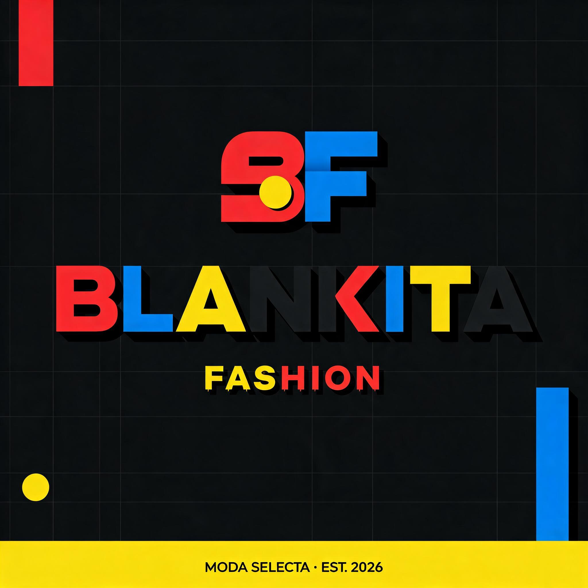
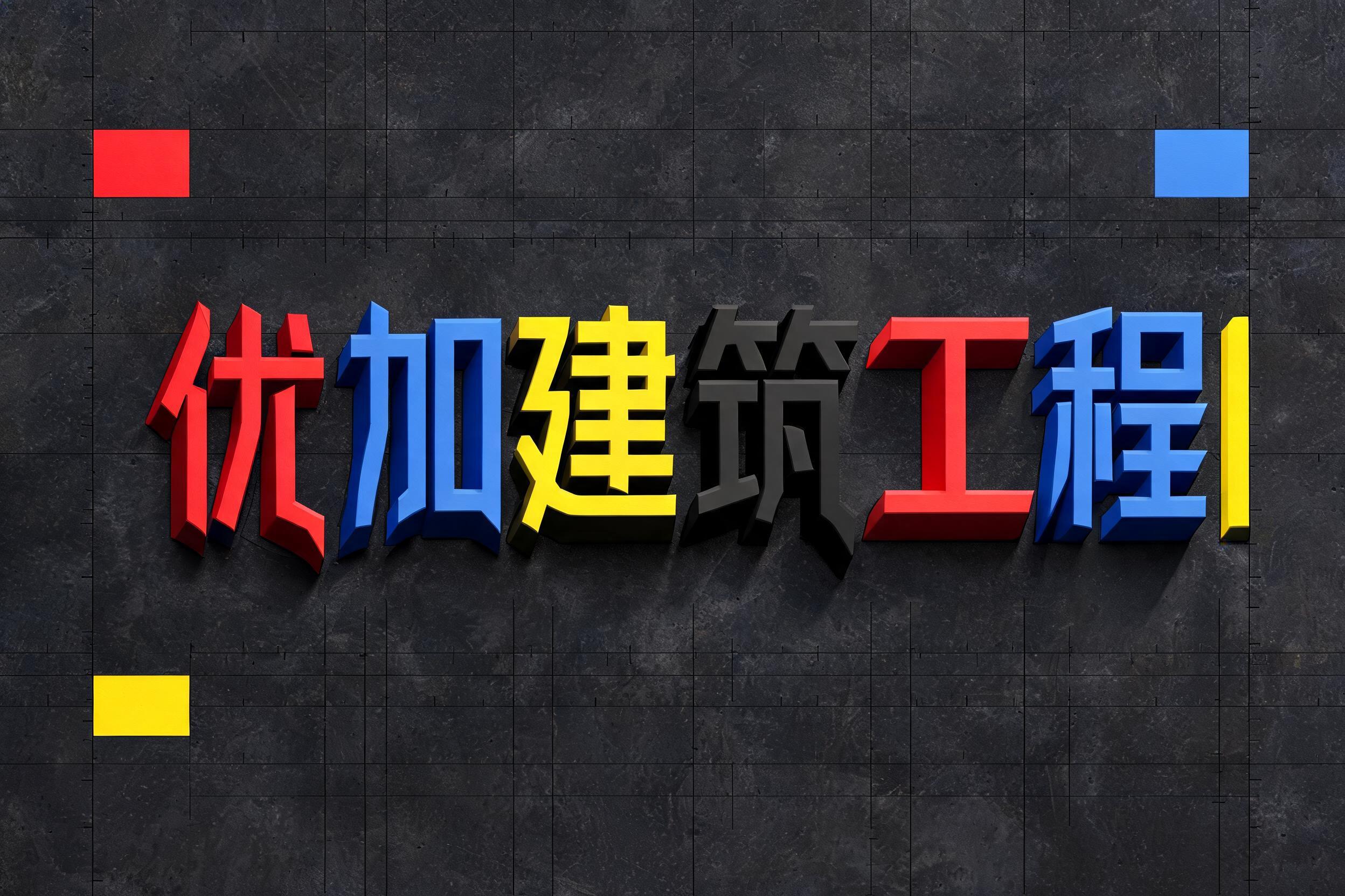
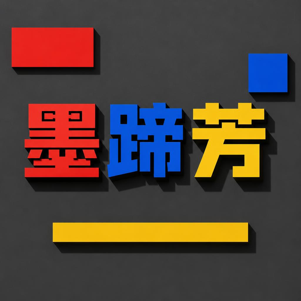
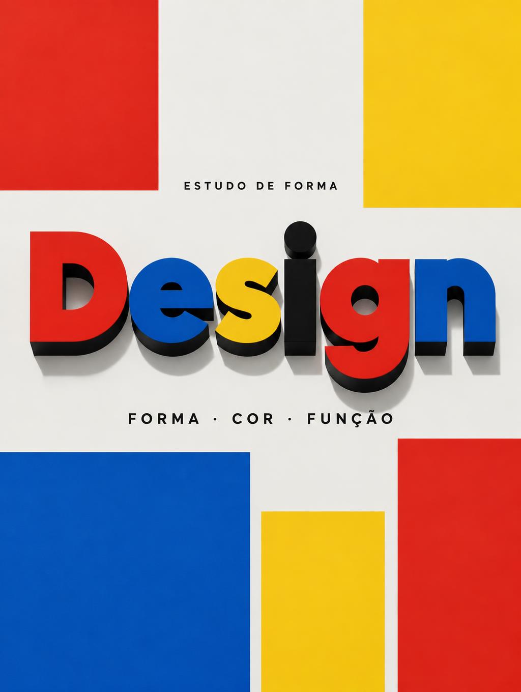
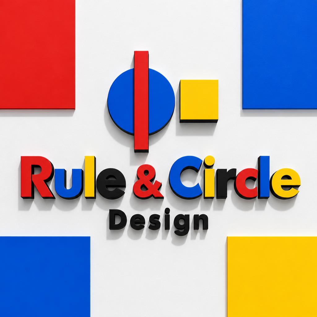
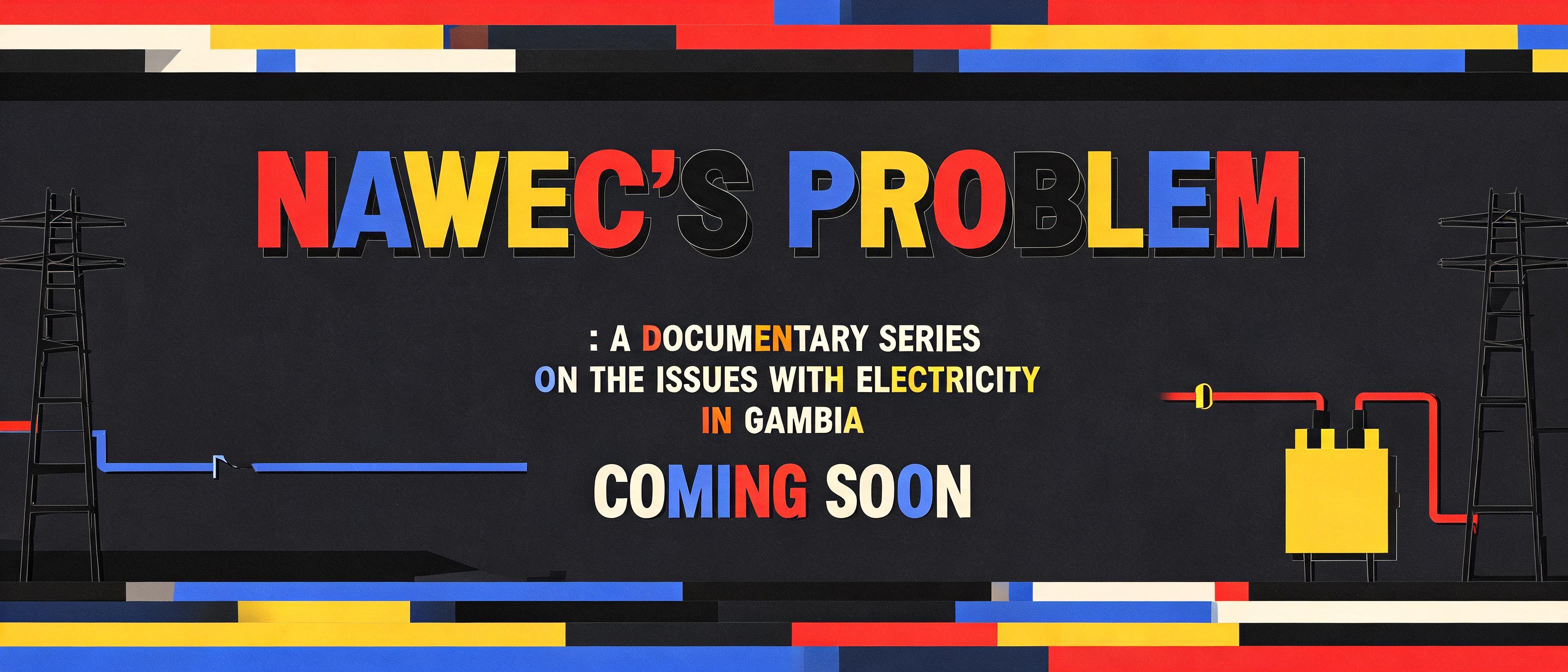
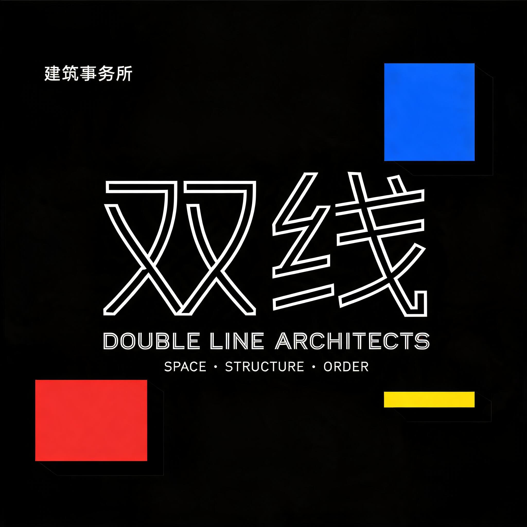
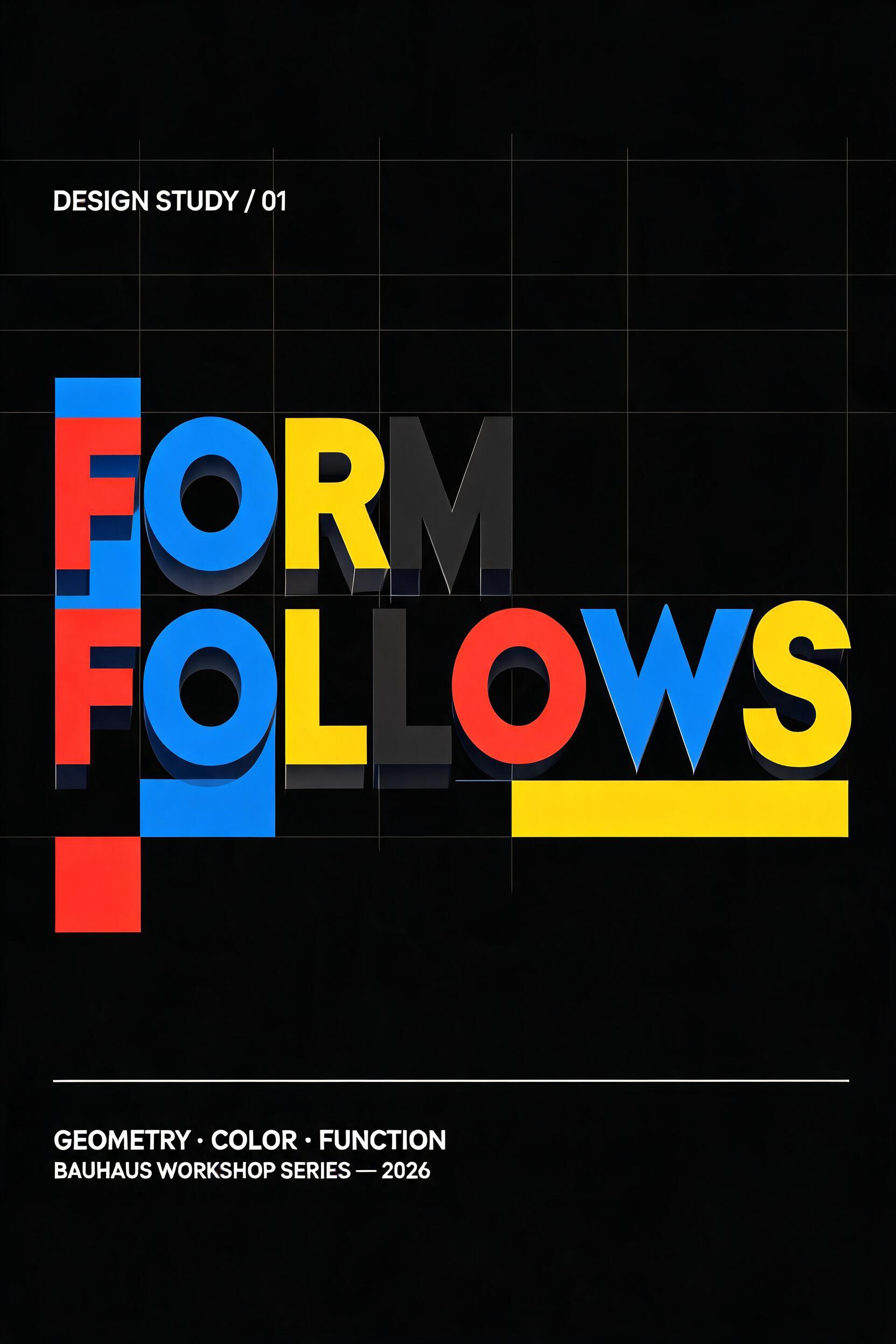
Bauhaus capitals built from circles, squares and straight strokes in flat red, blue, yellow and black, standing as solid blocks under hard overhead light. — no font license needed.
Geometric in different AI fonts




Geometric Gallery
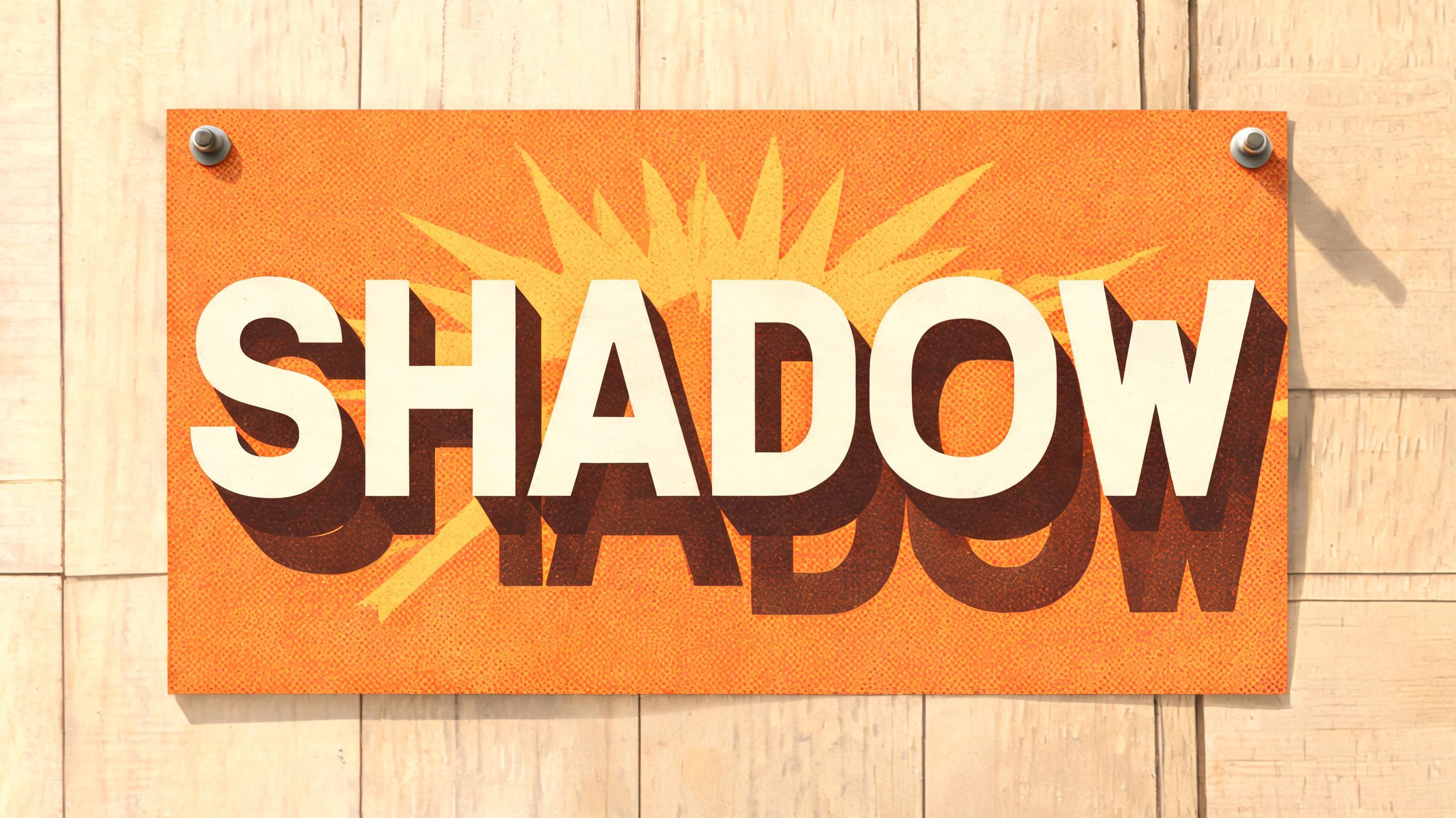
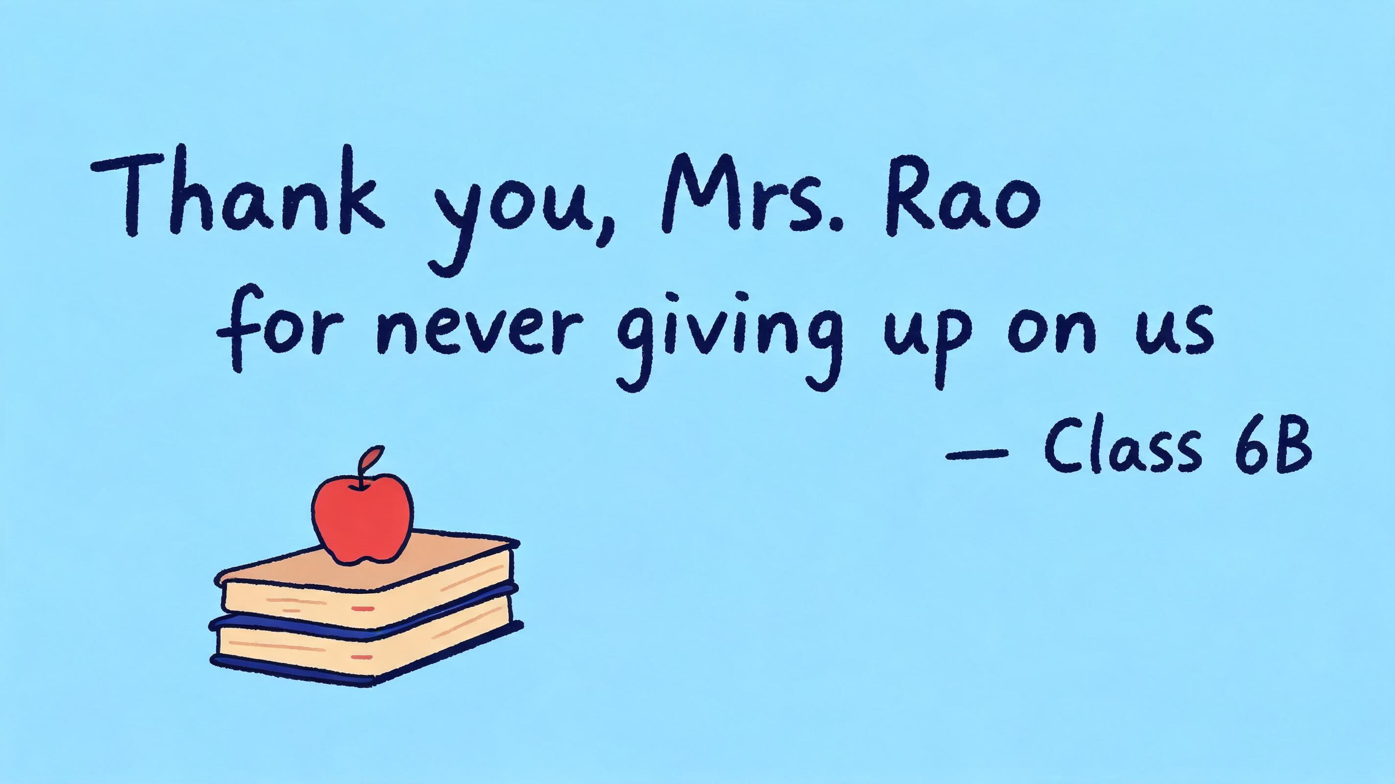
Real outputs from the Geometric style. Click any image to see details.















Looking for copy-paste fancy text? Try our free Font Generator Tools — cursive, gothic, bubble & 30+ styles.
Perfect for These Projects
Geometric Text Effect — FAQ
What is the Geometric Font Style?
The Geometric font style is a distinctive AI-generated typography effect. Bauhaus capitals built from circles, squares and straight strokes in flat red, blue, yellow and black, standing as solid blocks under hard overhead light. Using FontVibe's AI geometric generator you can create stunning text effects in seconds — no Photoshop, no font licensing, no design experience needed.
Explore the Geometric gallery for inspiration, or browse all 138+ AI text effect styles available on FontVibe.
How to Create Geometric Typography in FontVibe Studio
The Story Behind Geometric
History, visual DNA, and cultural context.
When the Circle Became a Letterform
Geometric type design has a specific historical moment: the mid-1920s, at the Bauhaus in Dessau, where Herbert Bayer and Josef Albers were investigating whether letterforms could be constructed entirely from geometric primitives — circles, arcs, straight lines — rather than derived from calligraphic or historical forms. Bayer's Universal typeface (1925) proposed that the entire Latin alphabet could be constructed from a minimal set of geometric elements, eliminating the variation and complexity that historical letterforms had accumulated.
This project had a philosophical dimension: if letterforms could be reduced to pure geometry, they would transcend historical and cultural associations and become genuinely universal. The utopian dimension of Bauhaus typography was inseparable from the formal experimentation.
Paul Renner's Futura (1927), built on geometric principles but more practical than Bayer's Universal, became the defining typeface of geometric modernism. It has been in continuous production and use for nearly 100 years. Stanley Kubrick used it for 2001: A Space Odyssey; the Apollo 11 plaque left on the Moon was set in Futura. The geometry is not minimal in Futura — it is architectural.
Sources: Wikipedia — Herbert Bayer · Wikipedia — Futura (typeface) · Typeset in the Future — 2001: A Space Odyssey · Fonts In Use — NASA Apollo 11 mission
The Visual DNA
Typographic Landmarks
Did You Know?
The plaque left on the Moon by Apollo 11 in 1969 — "Here men from the planet Earth first set foot upon the Moon" — was set in Futura, Paul Renner's geometric sans-serif from 1927. Source ↗
Herbert Bayer's Universal alphabet, designed at the Bauhaus in 1925, proposed eliminating capital letters entirely — a single lowercase case constructed from geometric elements would be sufficient for all purposes. The proposal was never widely adopted, but it established the intellectual framework for later experiments in geometric type design and remains a reference point for radical typography. Source ↗
Sources: Wikipedia — Lunar plaque
Create Your Geometric Typography in Studio
Free to start. No design skills needed. Your artwork, your copyright.
AI Geometric Text Effect Generator
Bauhaus capitals built from circles, squares and straight strokes in flat red, blue, yellow and black, standing as solid blocks under hard overhead light. — no font license needed.
Geometric in different AI fonts
Generate Your Geometric Text Effect
Type any word — see it transformed in seconds. No sign-up required.
Geometric Style Gallery
Real outputs from the Geometric style. Click any image to see details.







Similar Text Effect Styles
Try these styles and create your own AI-generated text effects.
Looking for copy-paste fancy text? Try our free Font Generator Tools — cursive, gothic, bubble & 30+ styles.
Perfect for These Projects
Geometric text effects are popular for creative projects where visual impact matters.
What is the Geometric Font Style?
The Geometric font style is a distinctive AI-generated typography effect. Bauhaus capitals built from circles, squares and straight strokes in flat red, blue, yellow and black, standing as solid blocks under hard overhead light.
Using FontVibe's AI geometric generator you can create stunning text effects in seconds — no Photoshop, no font licensing, no design experience needed.
Explore the Geometric gallery for inspiration, or browse all 138+ AI text effect styles available on FontVibe.
How to Create Geometric Typography in FontVibe Studio
1. Enter your text — Any word, phrase, or brand name. Works best with short, punchy text.
2. Select Geometric — From the style library. Optionally describe a mood in the custom prompt.
3. Generate and download. Your Geometric font artwork is ready in seconds. PNG, JPG, or transparent PNG.
Looking for something different? Browse the full font style library for more AI typography options.
Geometric Text Effect — FAQ
The Story Behind Geometric
History, visual DNA, and cultural context — everything that makes this style what it is.
When the Circle Became a Letterform
Geometric type design has a specific historical moment: the mid-1920s, at the Bauhaus in Dessau, where Herbert Bayer and Josef Albers were investigating whether letterforms could be constructed entirely from geometric primitives — circles, arcs, straight lines — rather than derived from calligraphic or historical forms. Bayer's Universal typeface (1925) proposed that the entire Latin alphabet could be constructed from a minimal set of geometric elements, eliminating the variation and complexity that historical letterforms had accumulated.
This project had a philosophical dimension: if letterforms could be reduced to pure geometry, they would transcend historical and cultural associations and become genuinely universal. The utopian dimension of Bauhaus typography was inseparable from the formal experimentation.
Paul Renner's Futura (1927), built on geometric principles but more practical than Bayer's Universal, became the defining typeface of geometric modernism. It has been in continuous production and use for nearly 100 years. Stanley Kubrick used it for 2001: A Space Odyssey; the Apollo 11 plaque left on the Moon was set in Futura. The geometry is not minimal in Futura — it is architectural.
Sources: Wikipedia — Herbert Bayer · Wikipedia — Futura (typeface) · Typeset in the Future — 2001: A Space Odyssey · Fonts In Use — NASA Apollo 11 mission
The Visual DNA
Typographic Landmarks
Did You Know?
The plaque left on the Moon by Apollo 11 in 1969 — "Here men from the planet Earth first set foot upon the Moon" — was set in Futura, Paul Renner's geometric sans-serif from 1927. Source ↗
Herbert Bayer's Universal alphabet, designed at the Bauhaus in 1925, proposed eliminating capital letters entirely — a single lowercase case constructed from geometric elements would be sufficient for all purposes. The proposal was never widely adopted, but it established the intellectual framework for later experiments in geometric type design and remains a reference point for radical typography. Source ↗
Sources: Wikipedia — Lunar plaque