


AI Cyberpunk Text Effect Generator
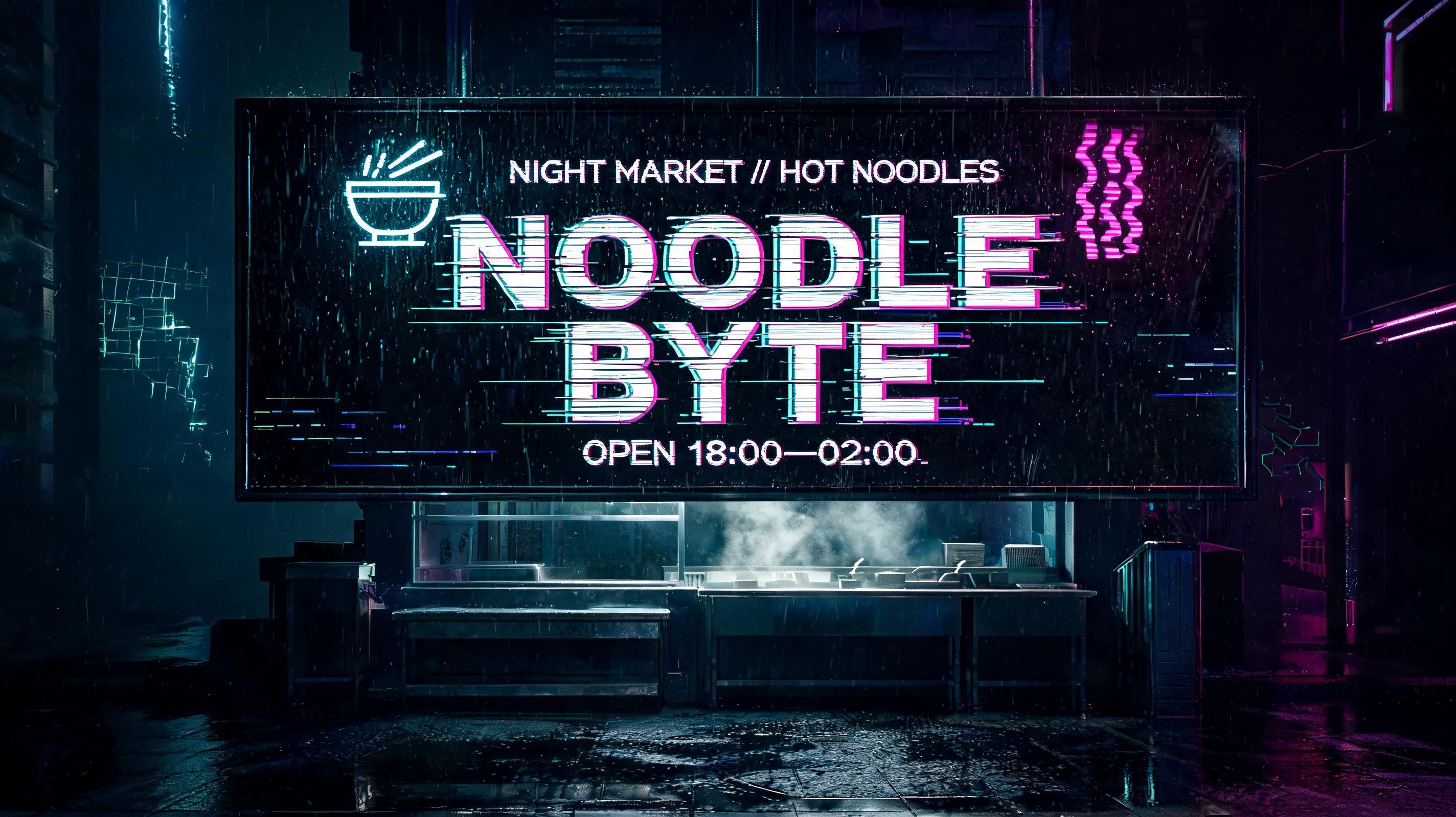
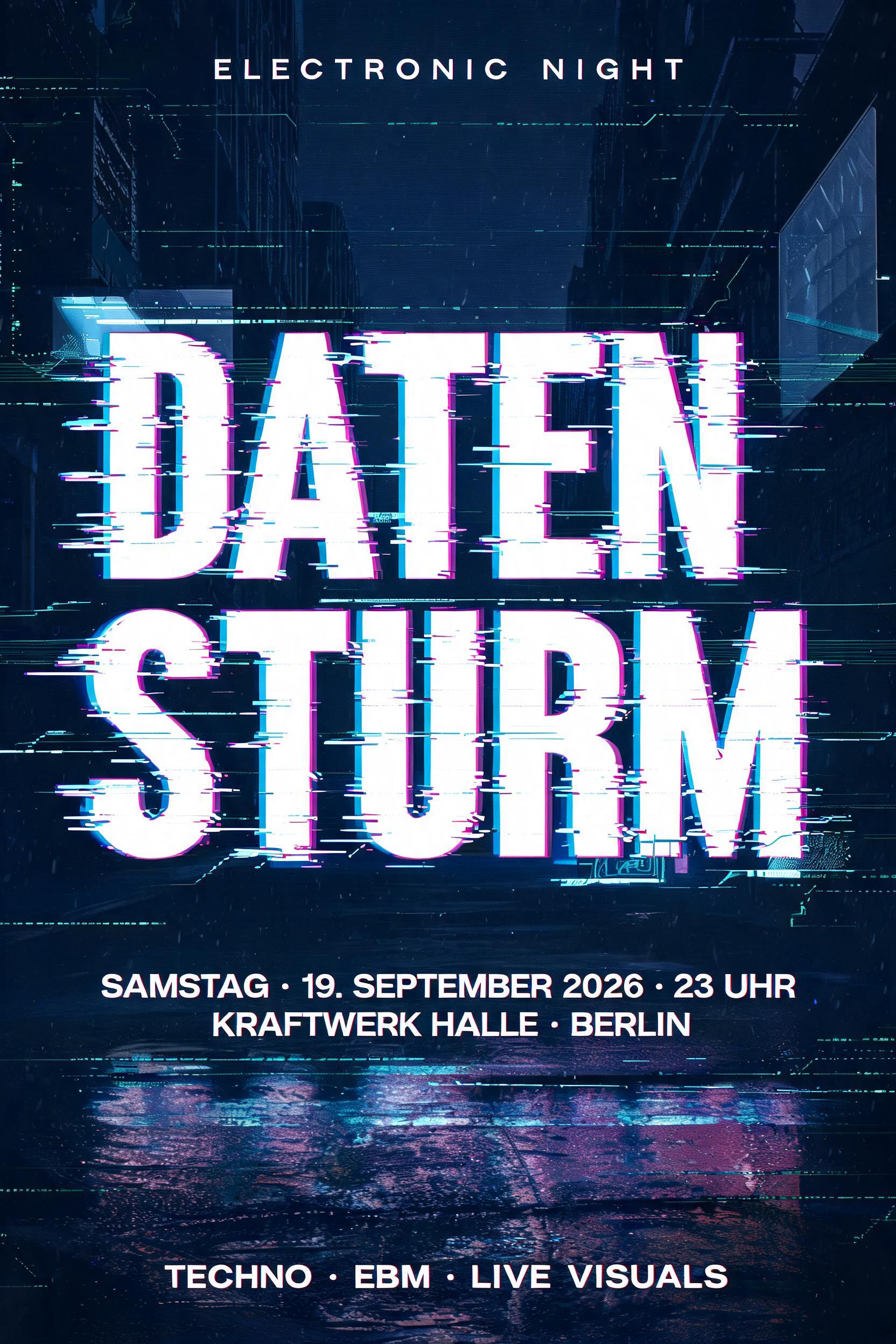
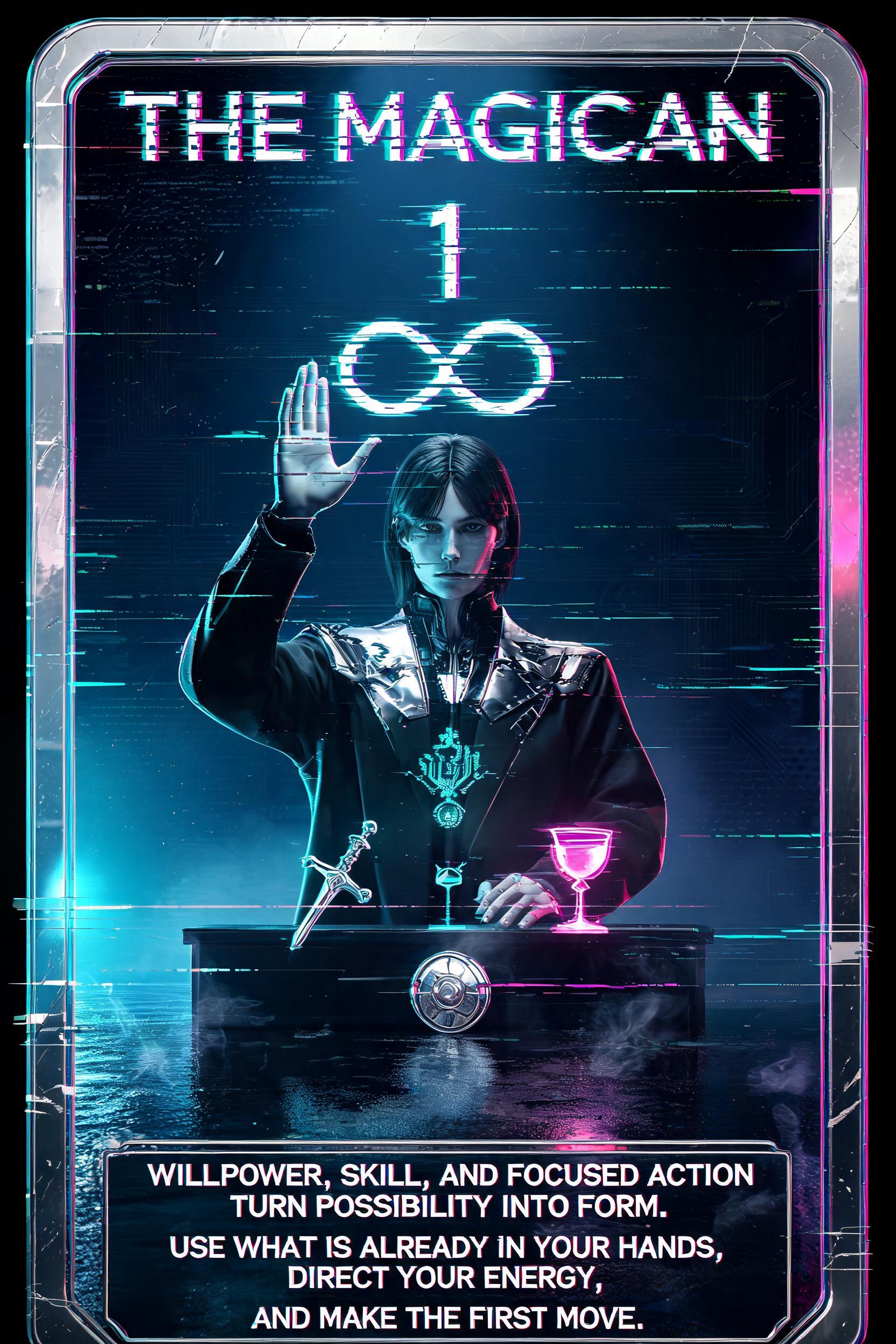
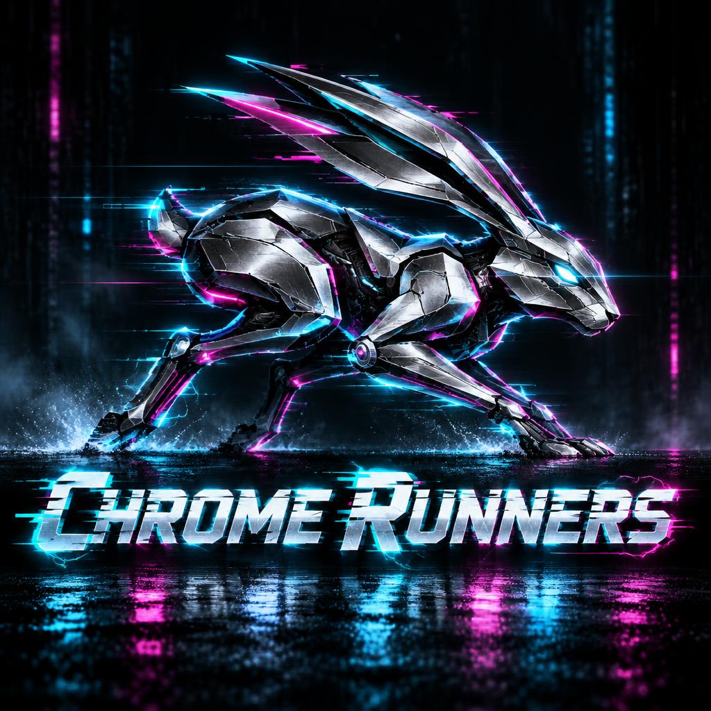
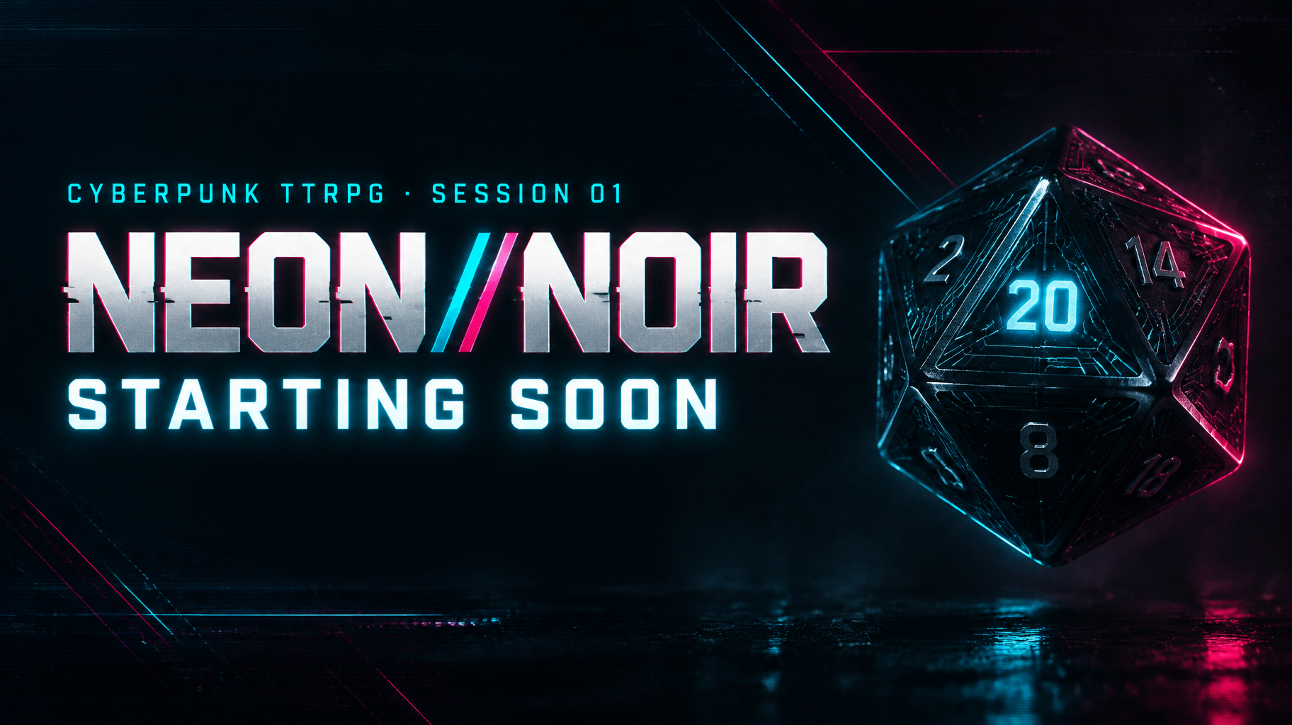
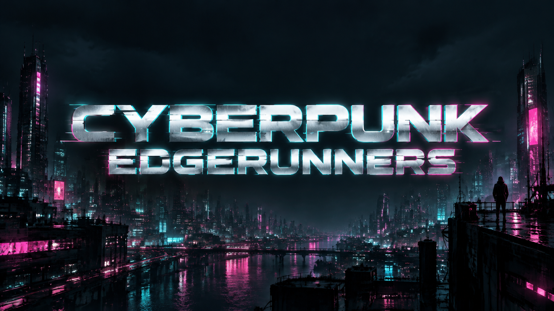
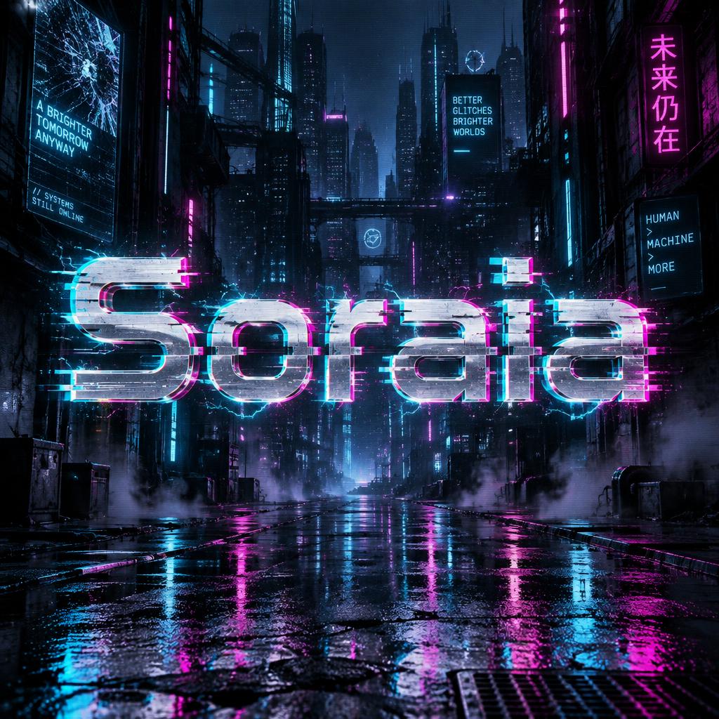
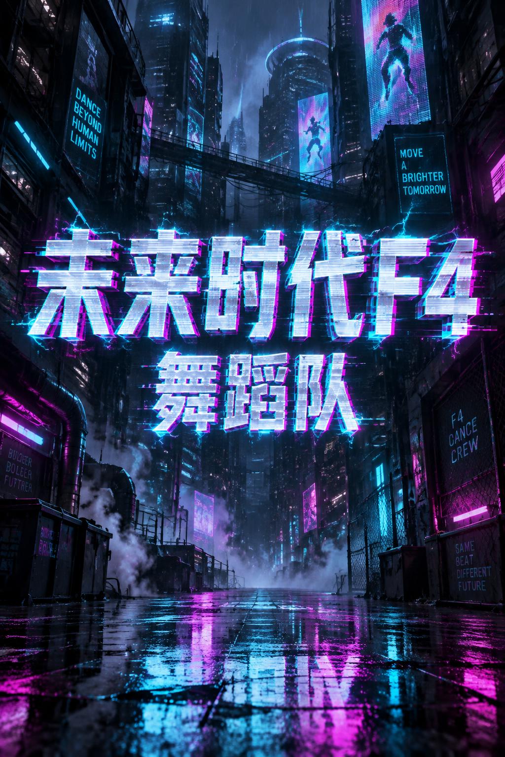
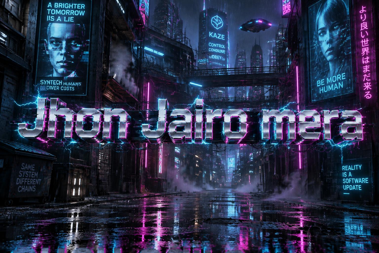
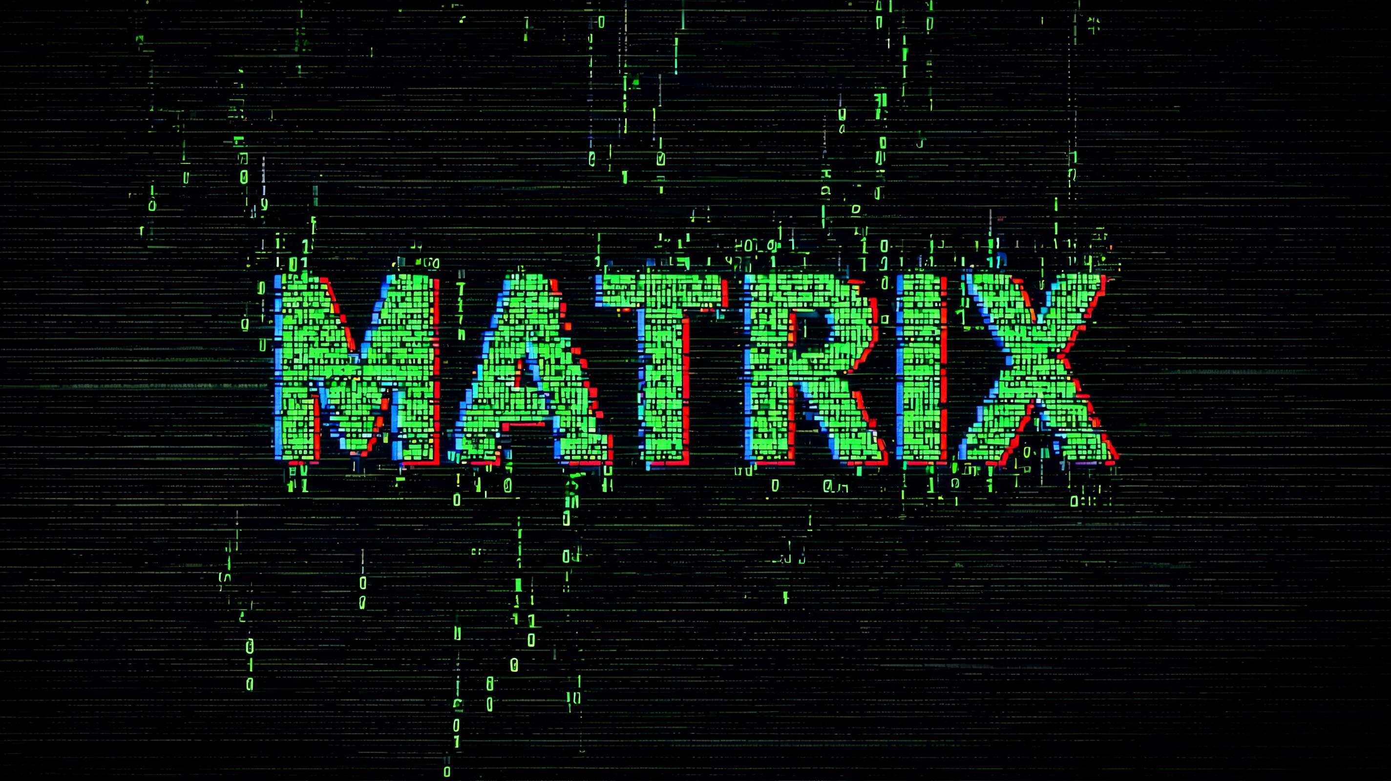
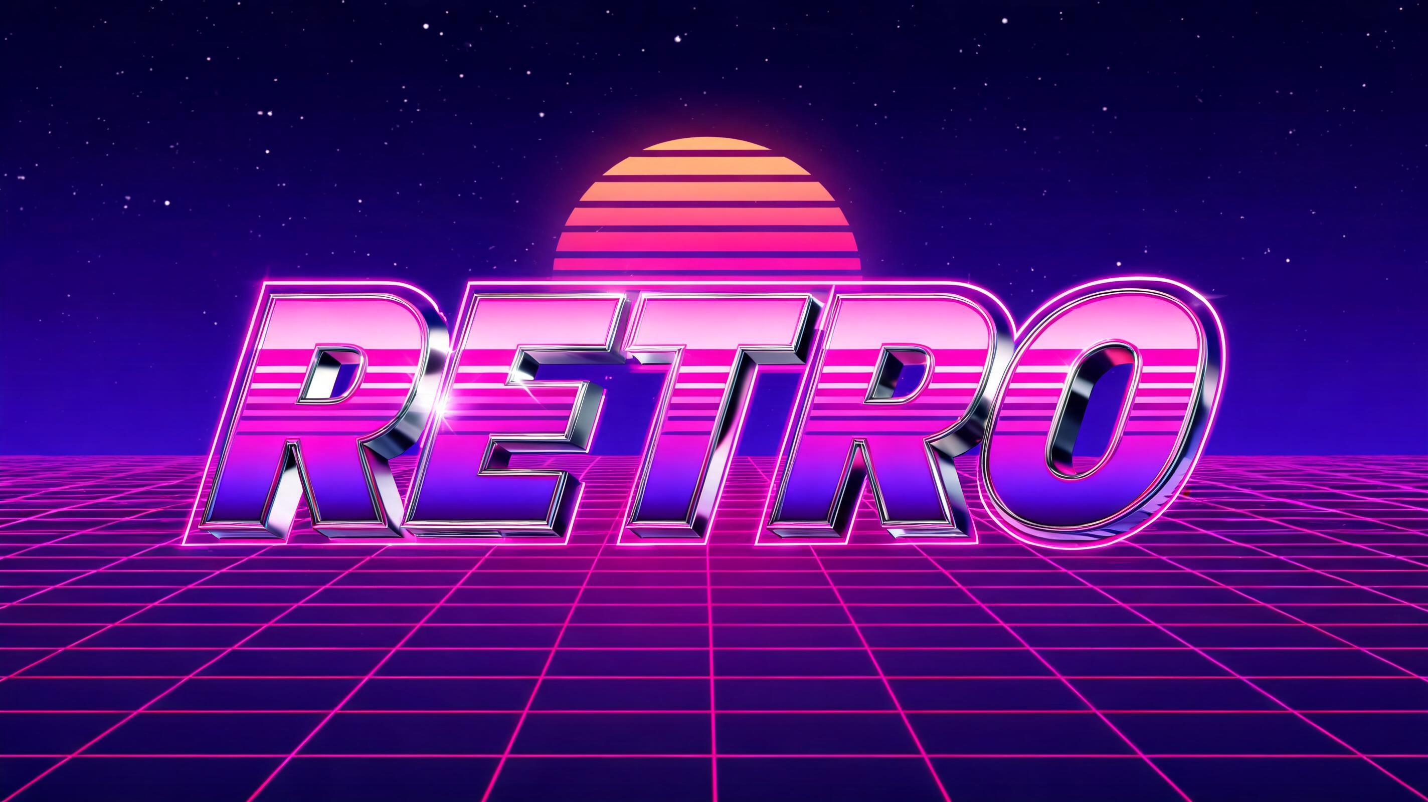
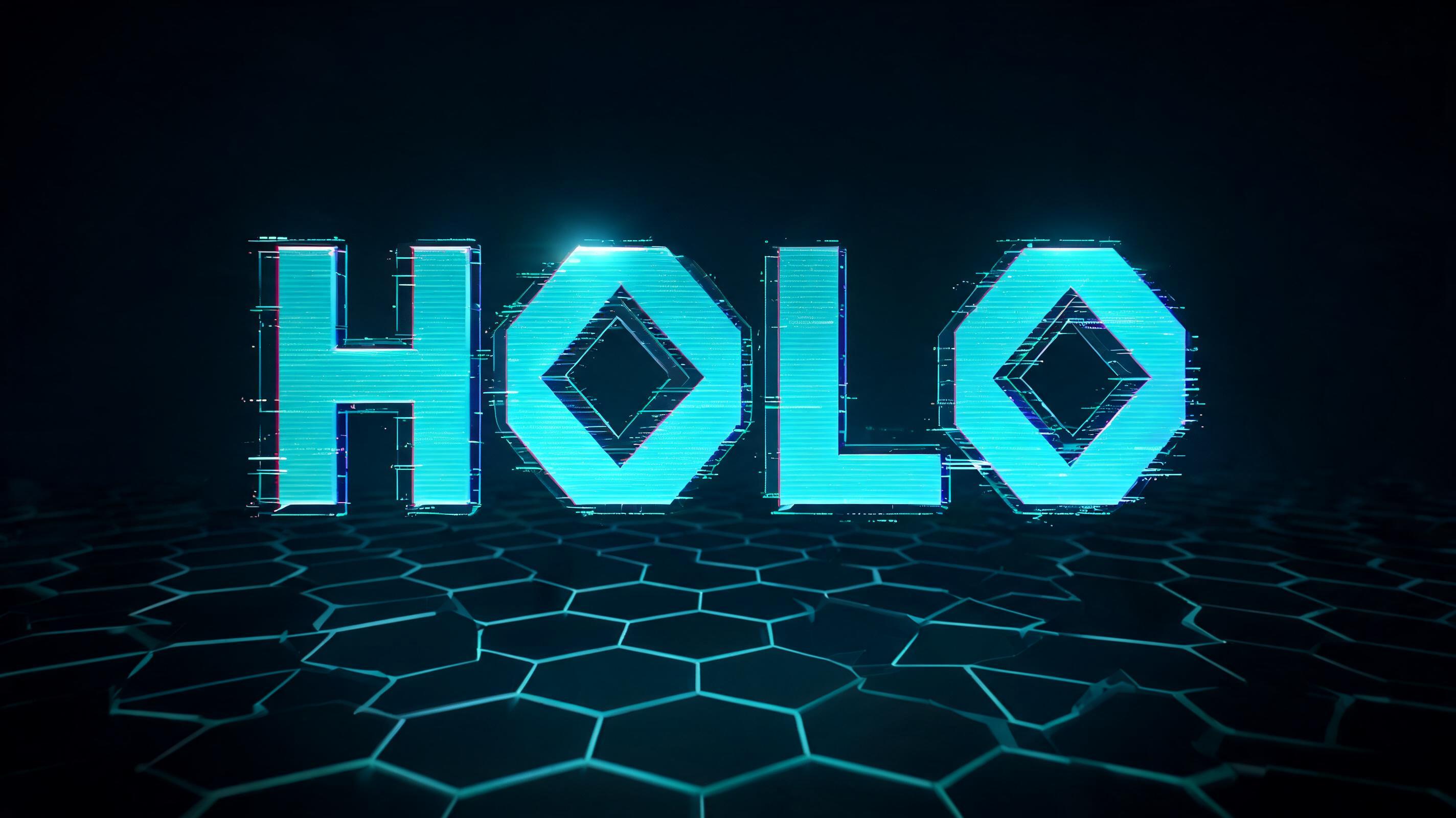
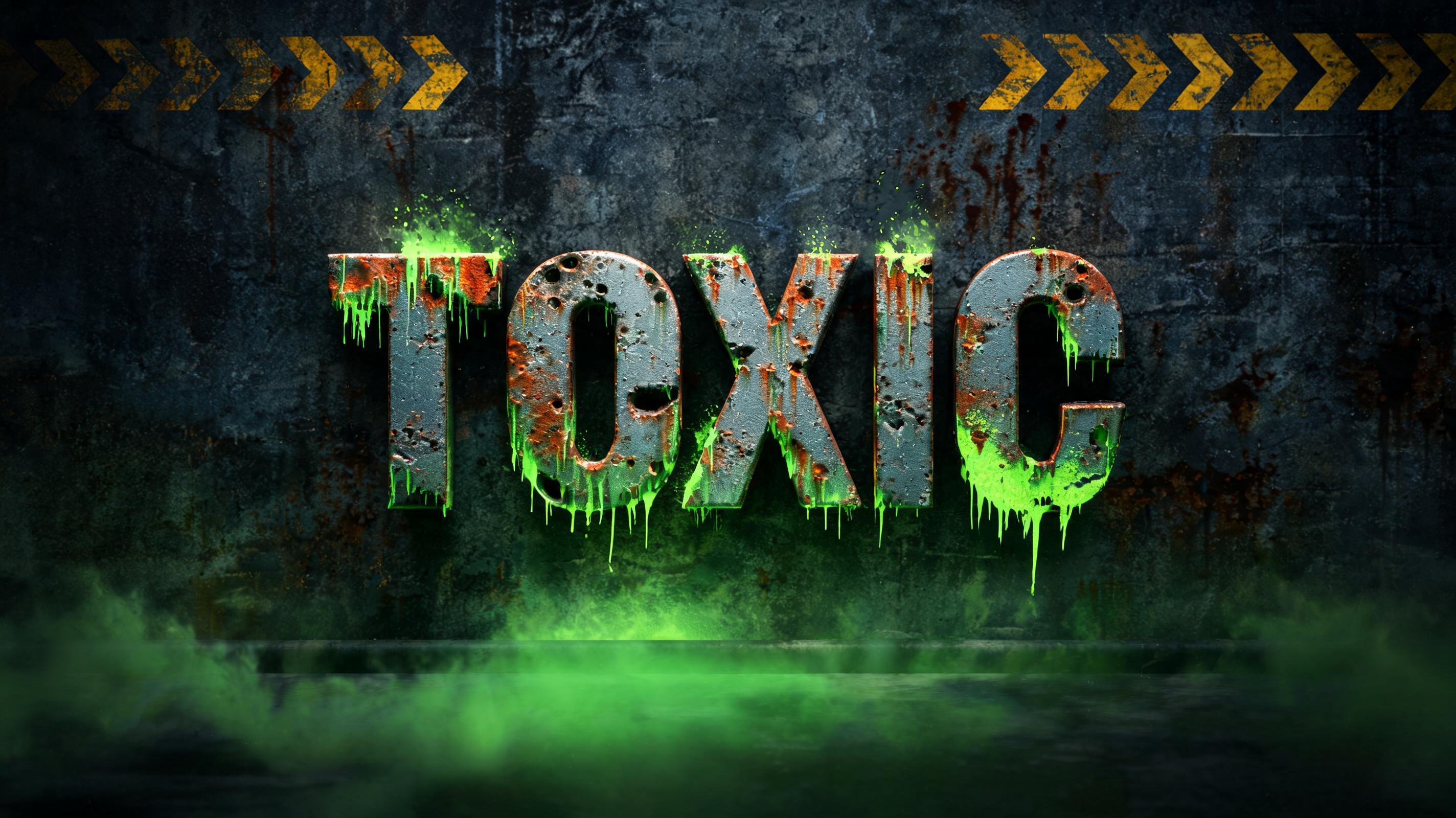
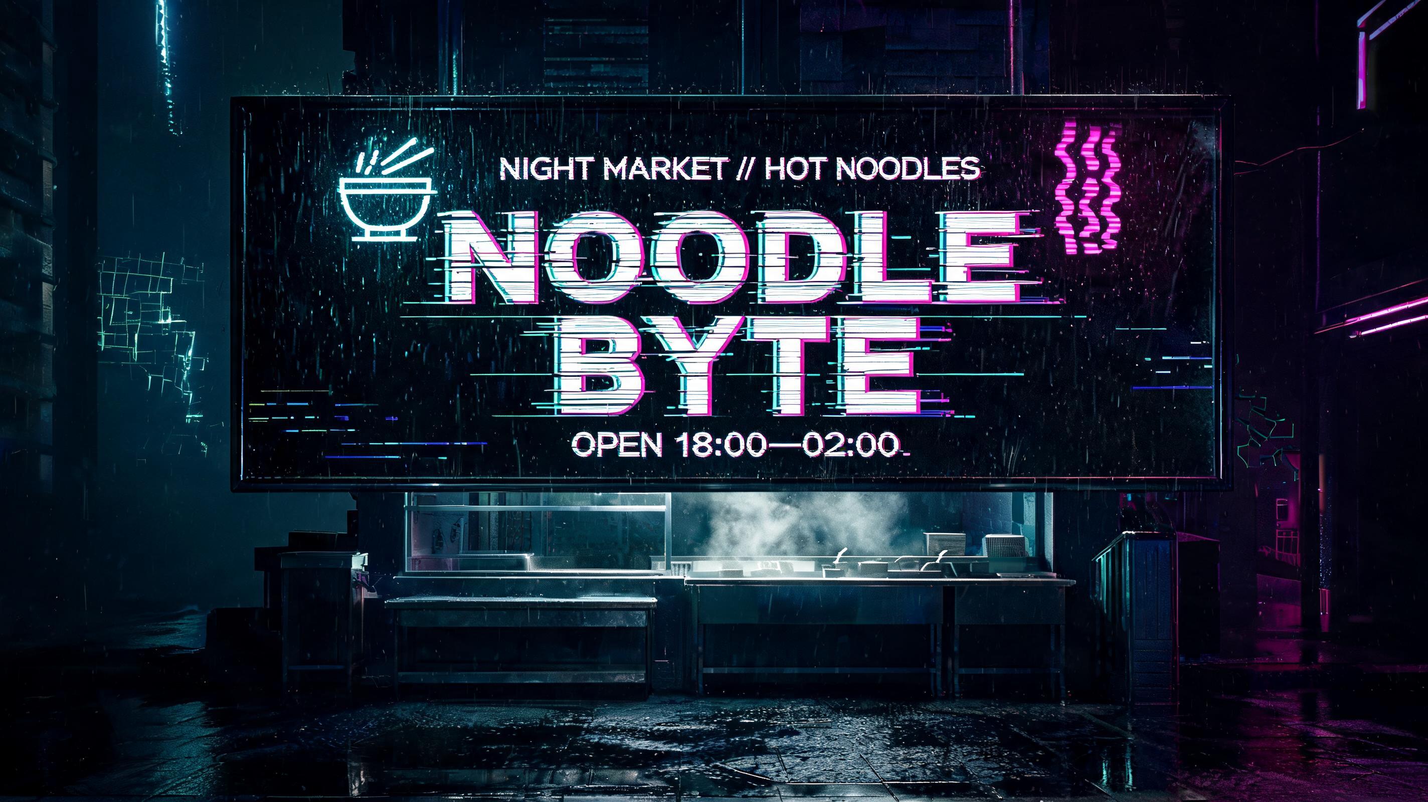
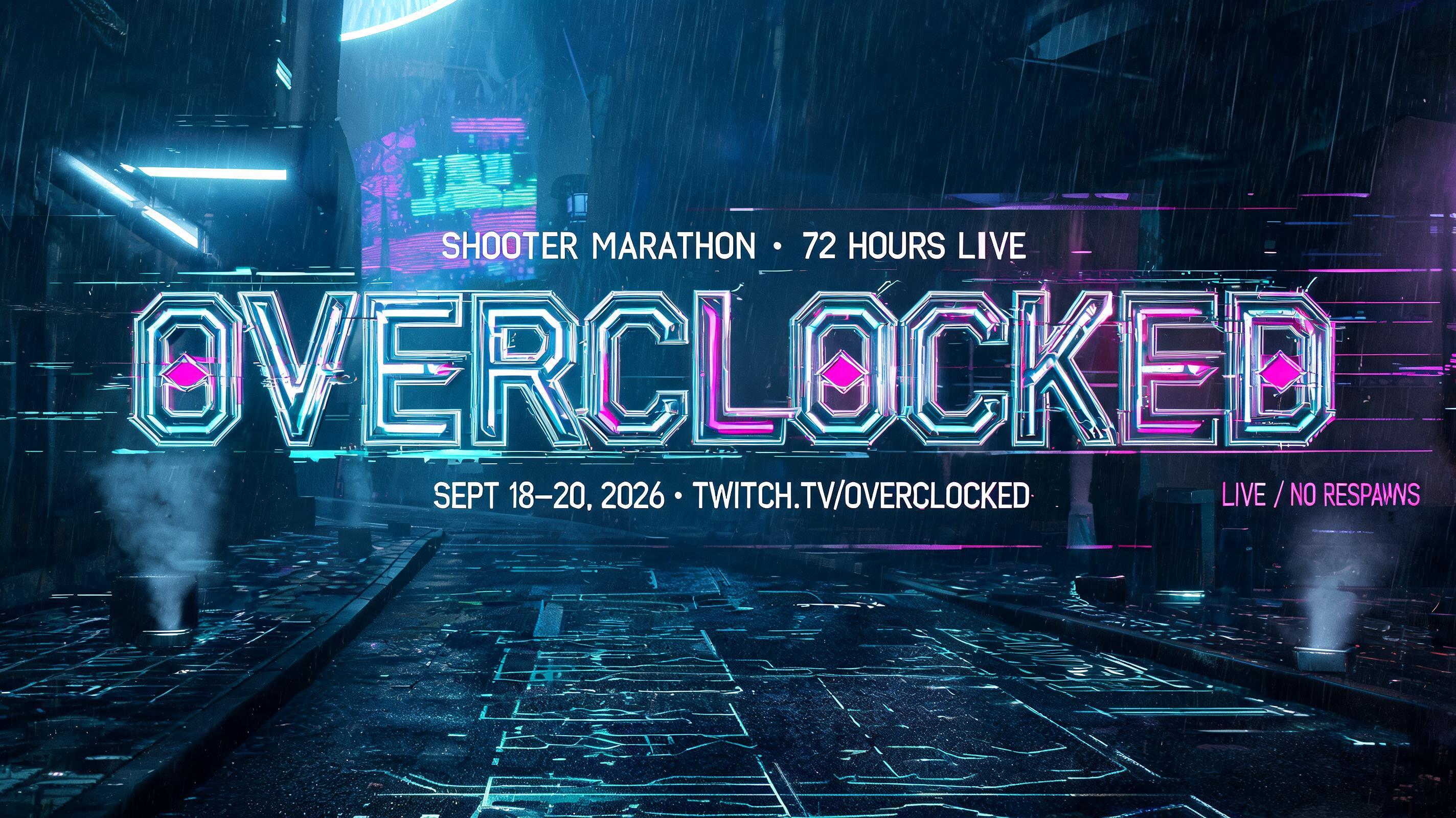
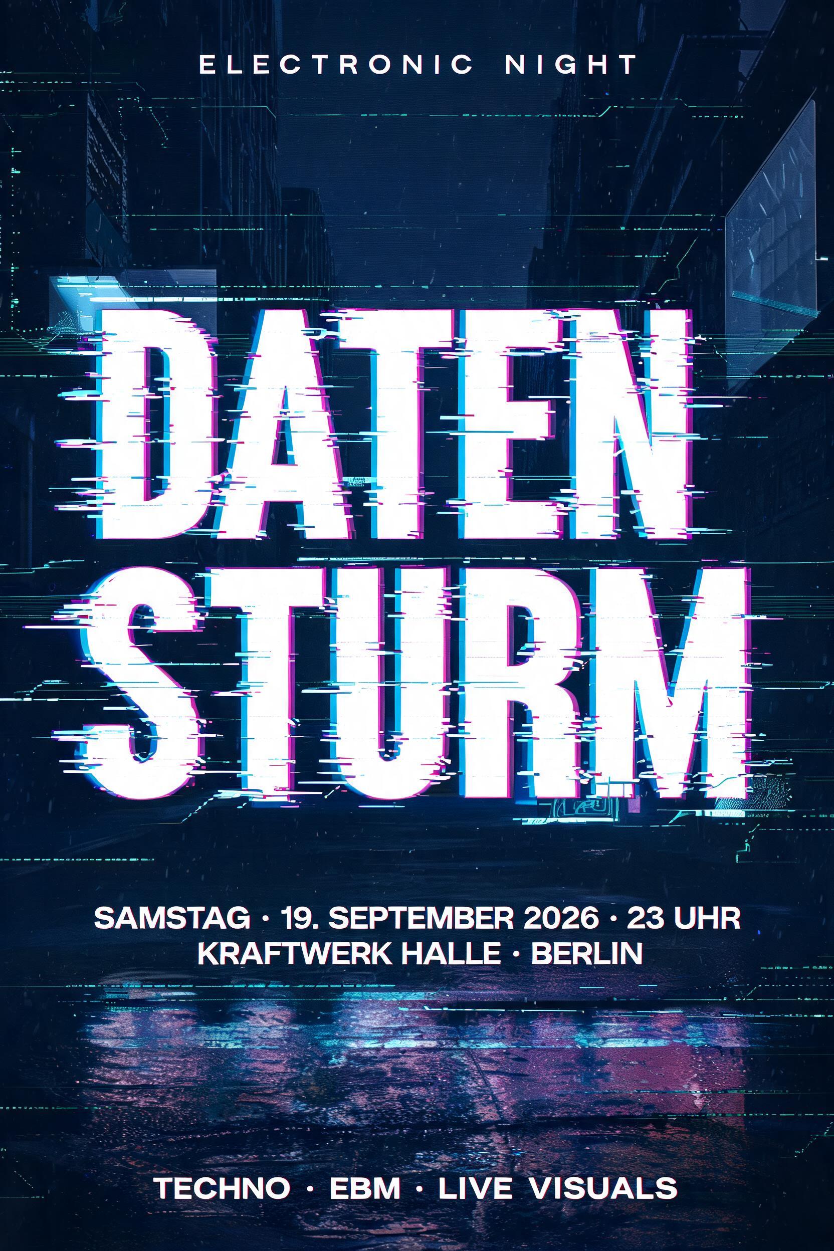
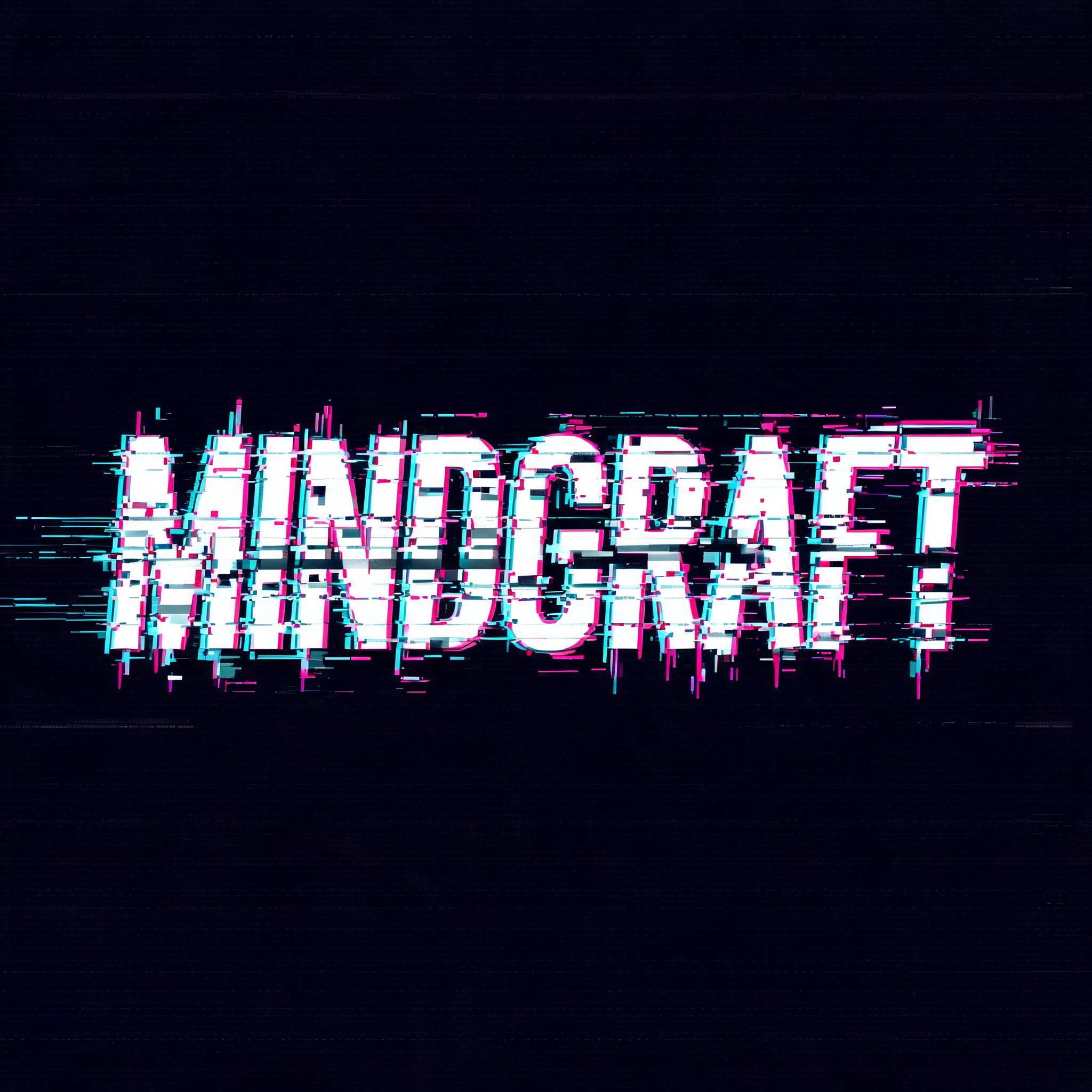
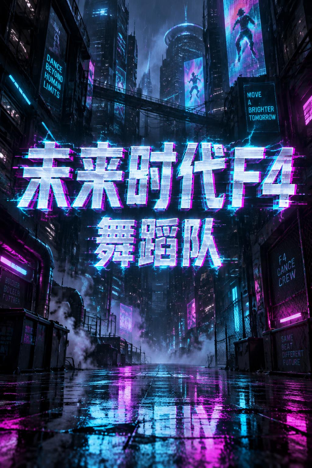
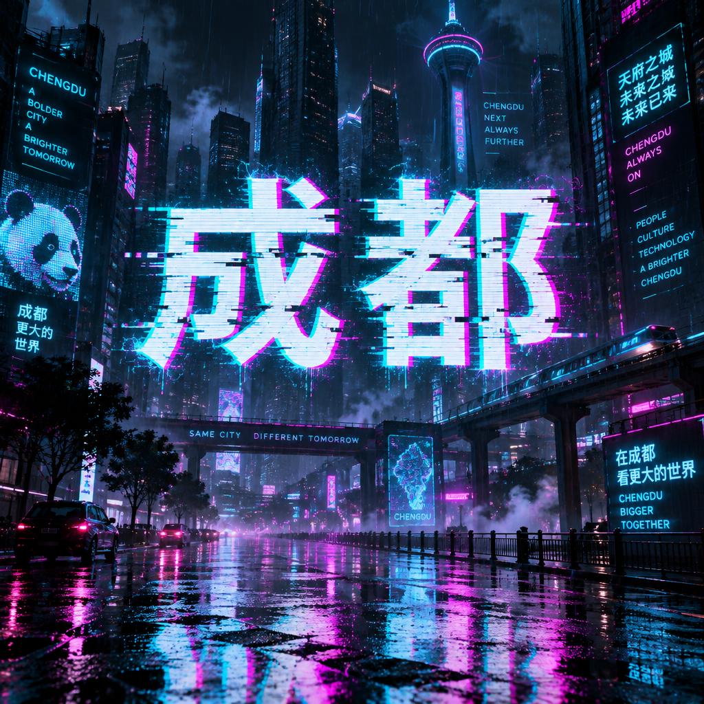
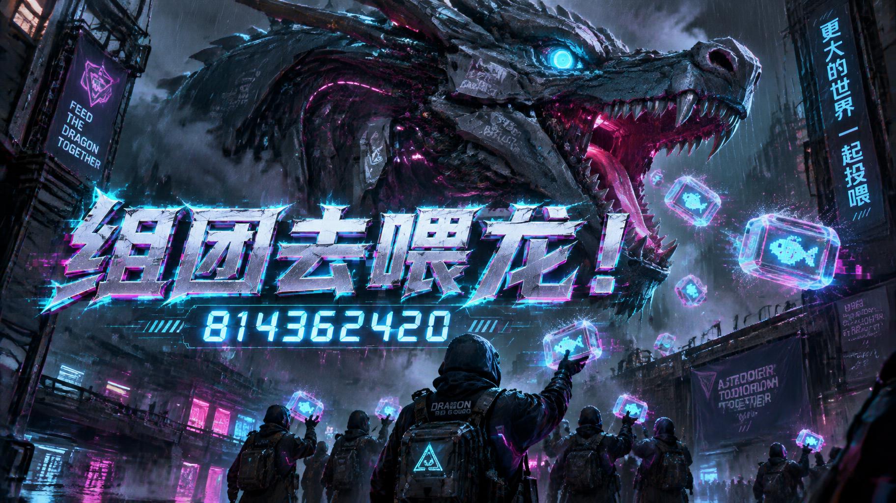
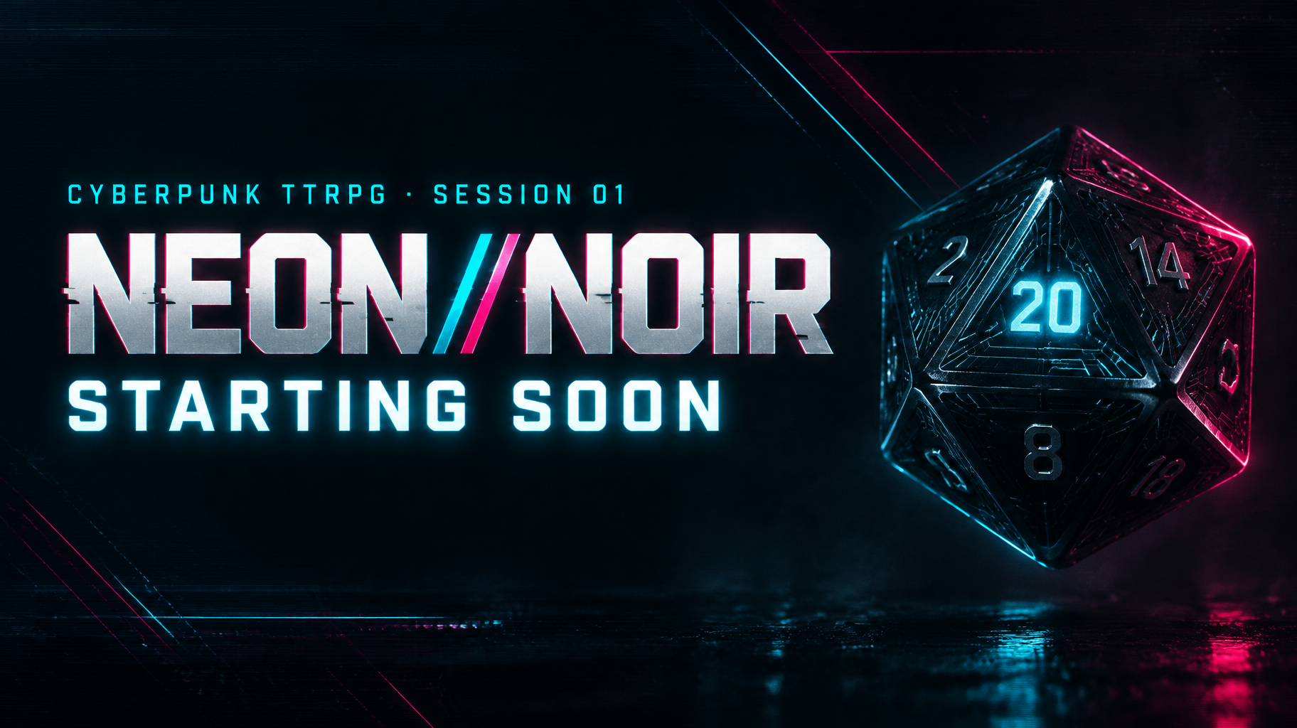
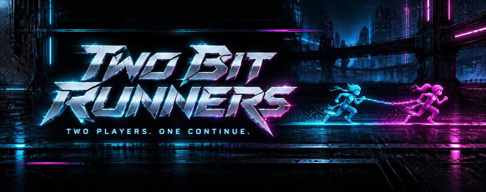
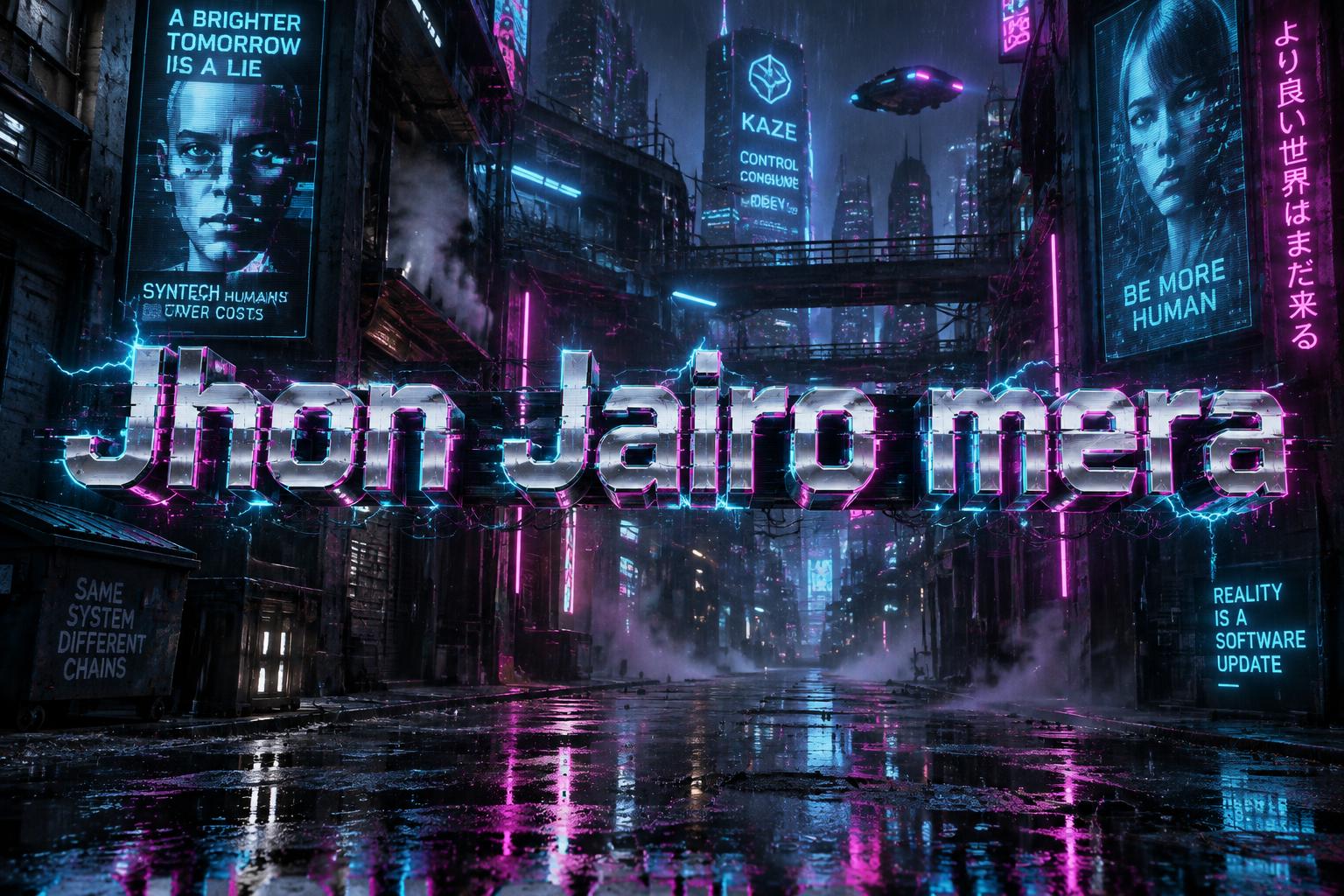
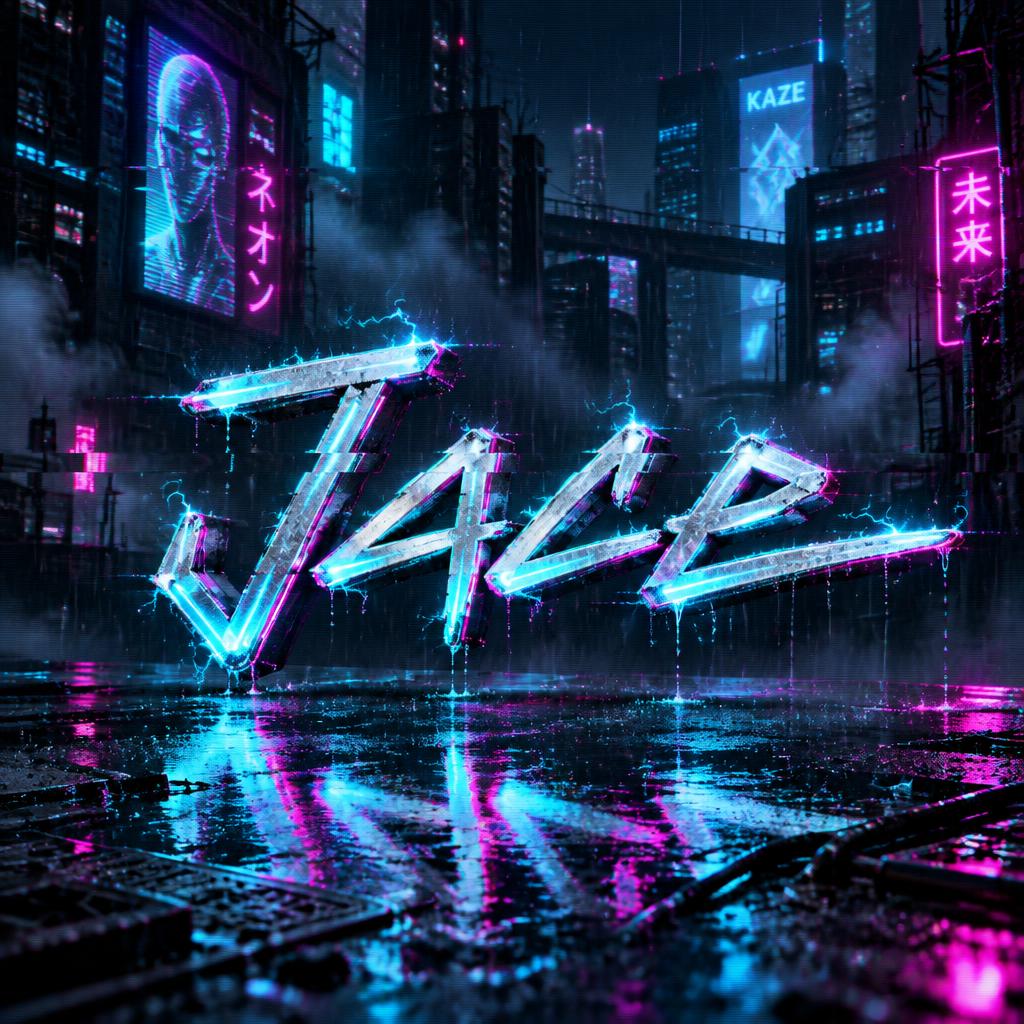
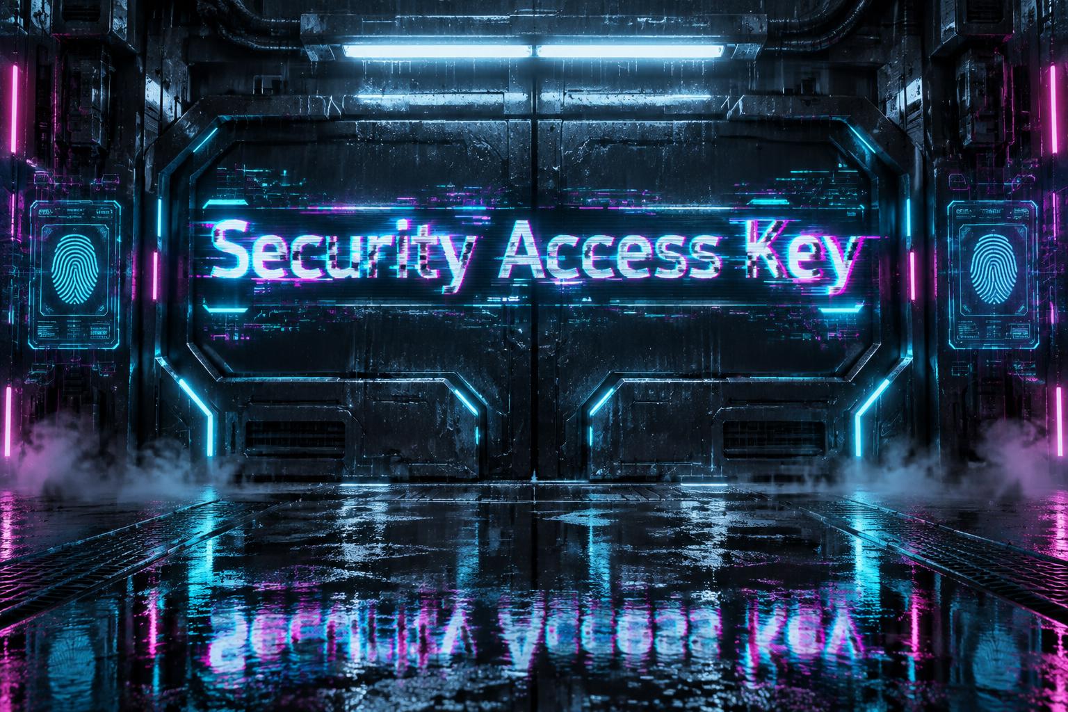
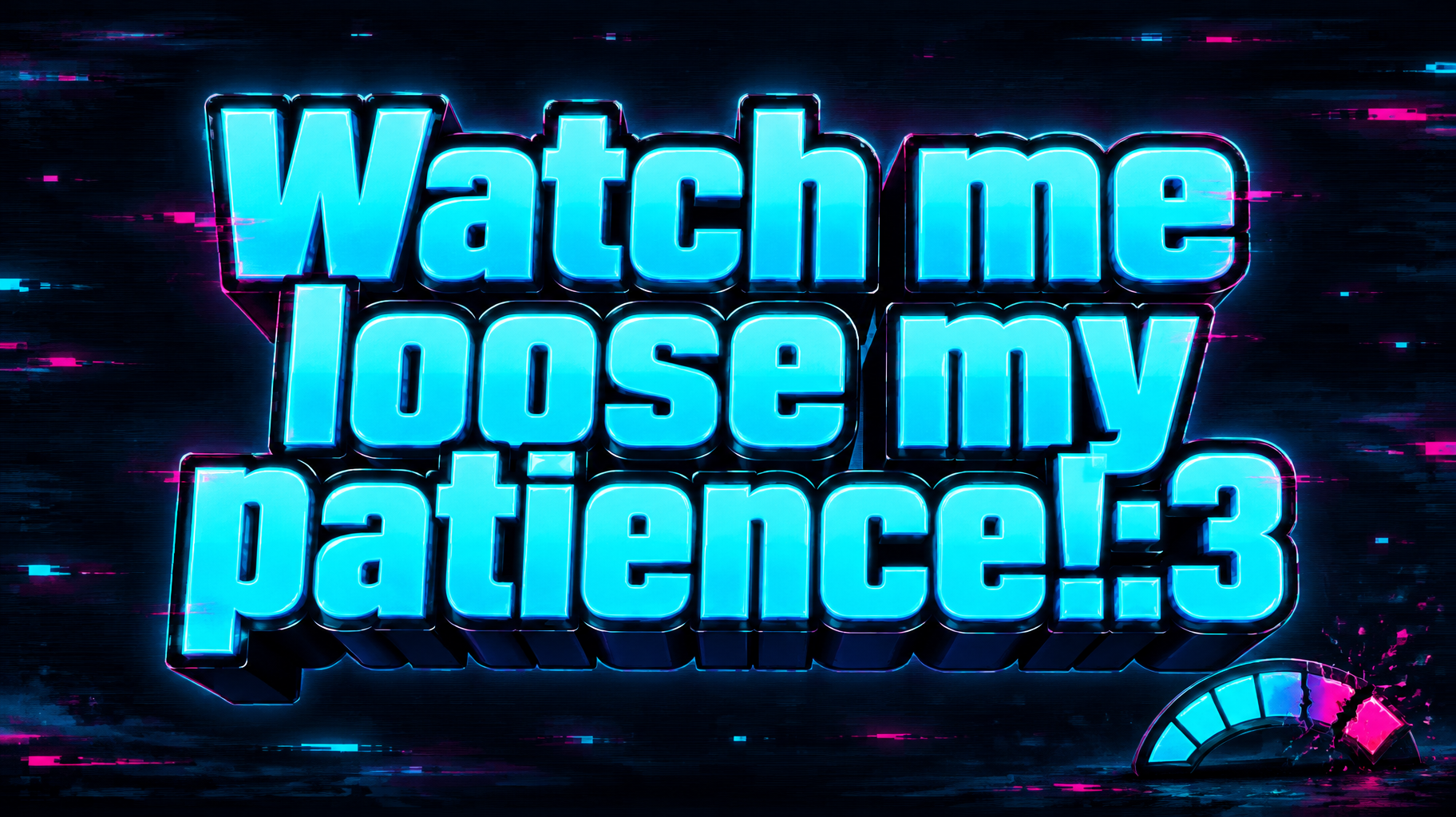
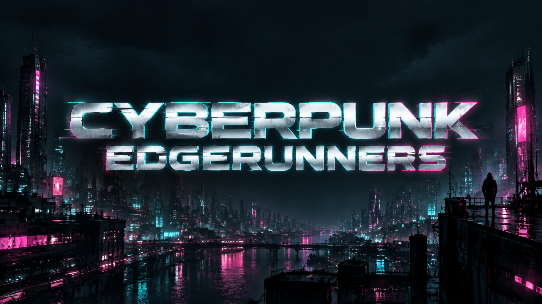
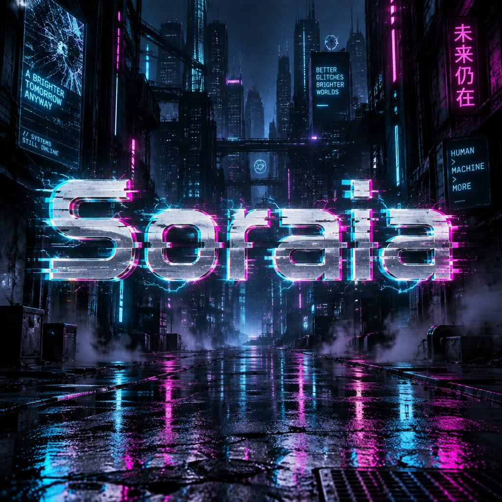
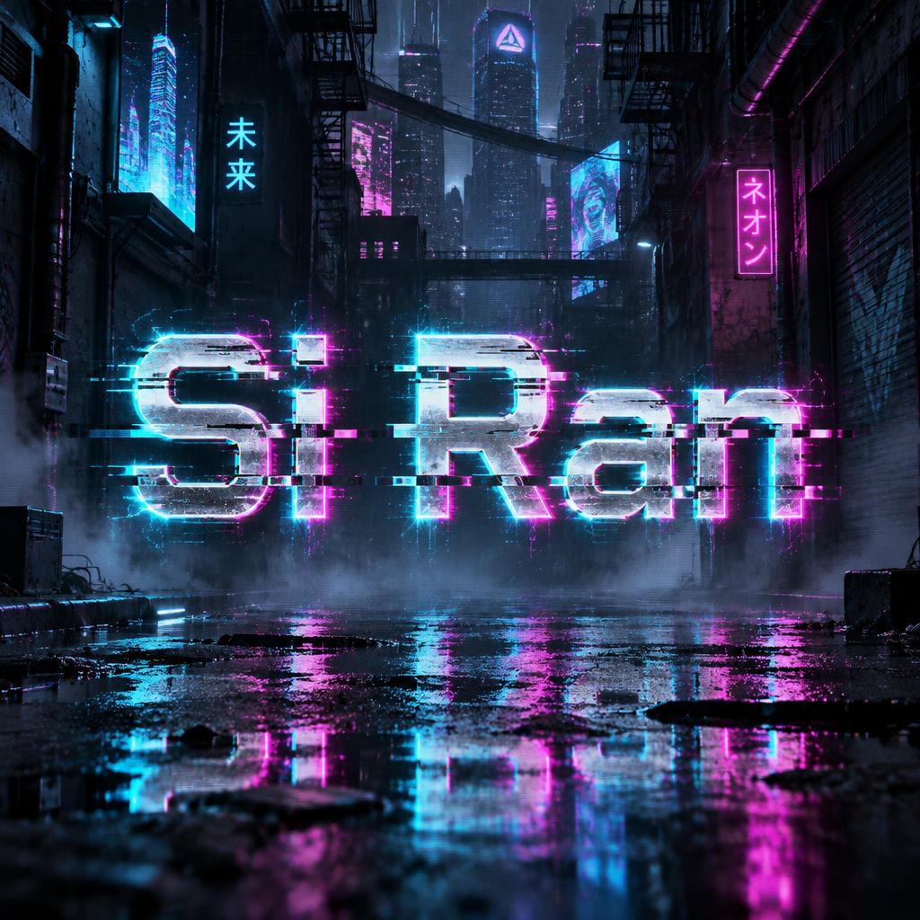
Chrome block capitals with magenta and cyan color fringing, horizontal glitch slices and scanlines, glowing over a rainy neon megacity at night. — no font license needed.
Cyberpunk in different AI fonts



What you can make with Cyberpunk
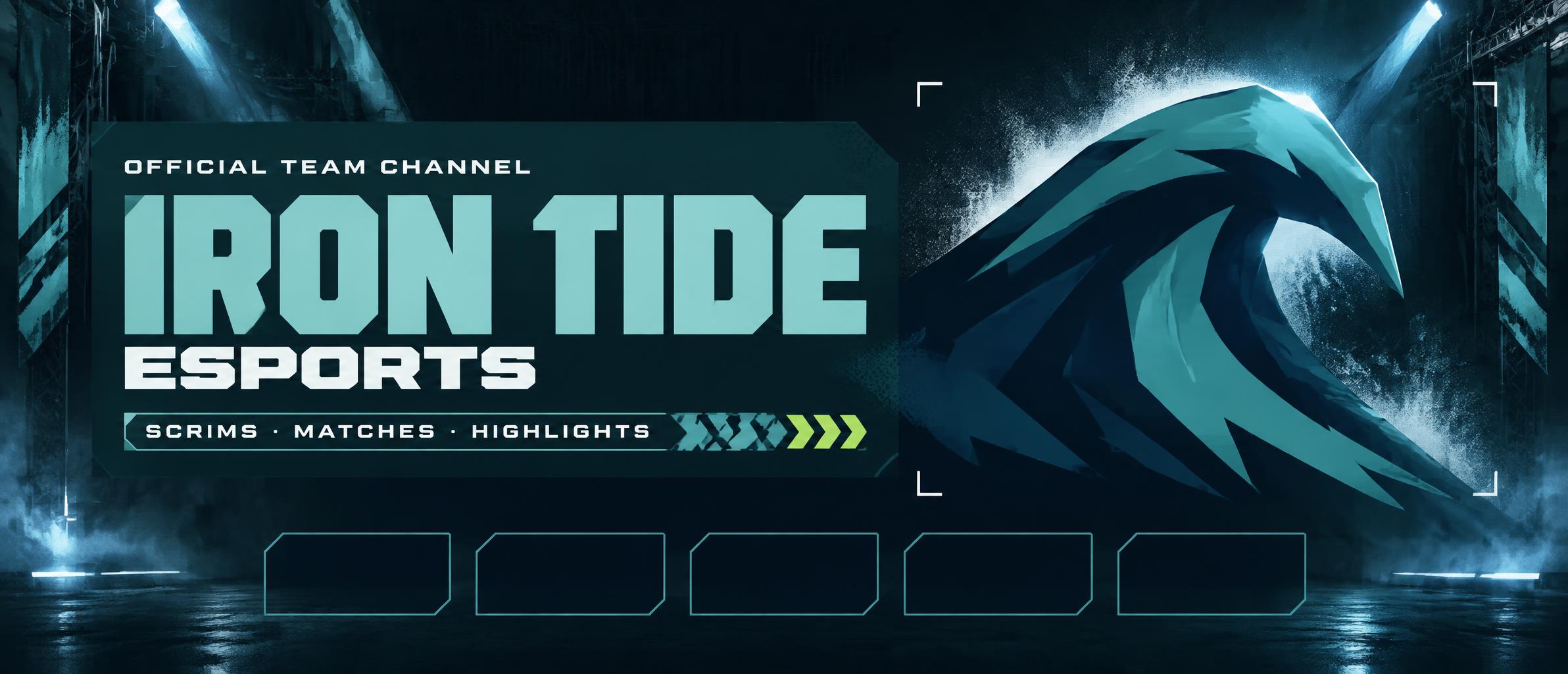
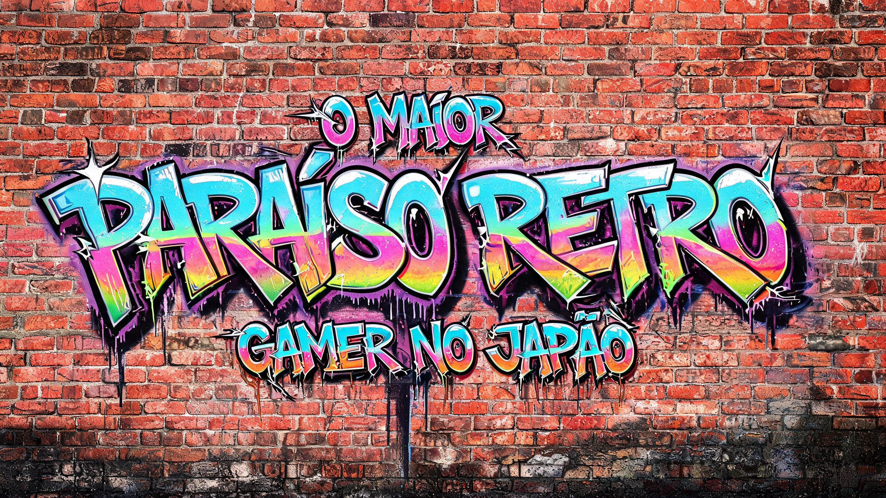


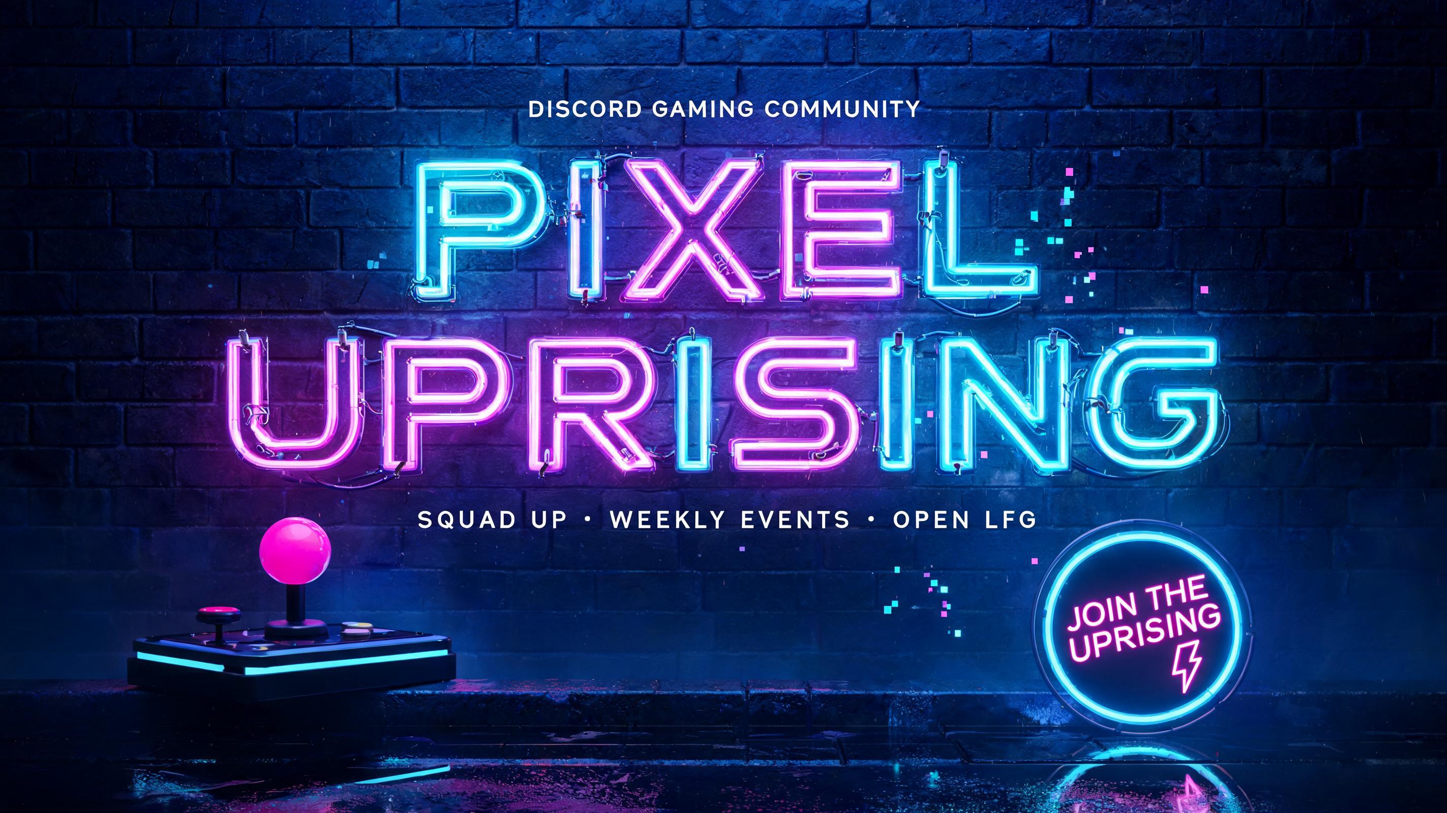

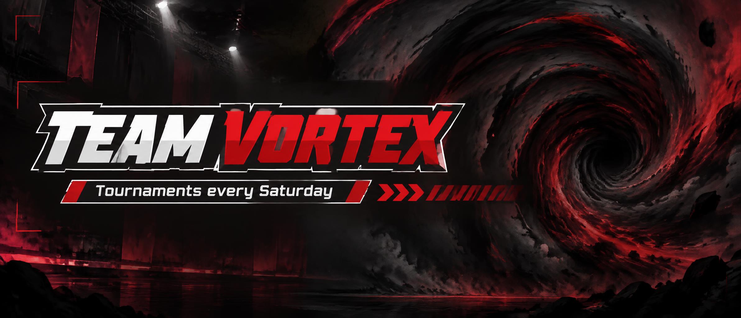
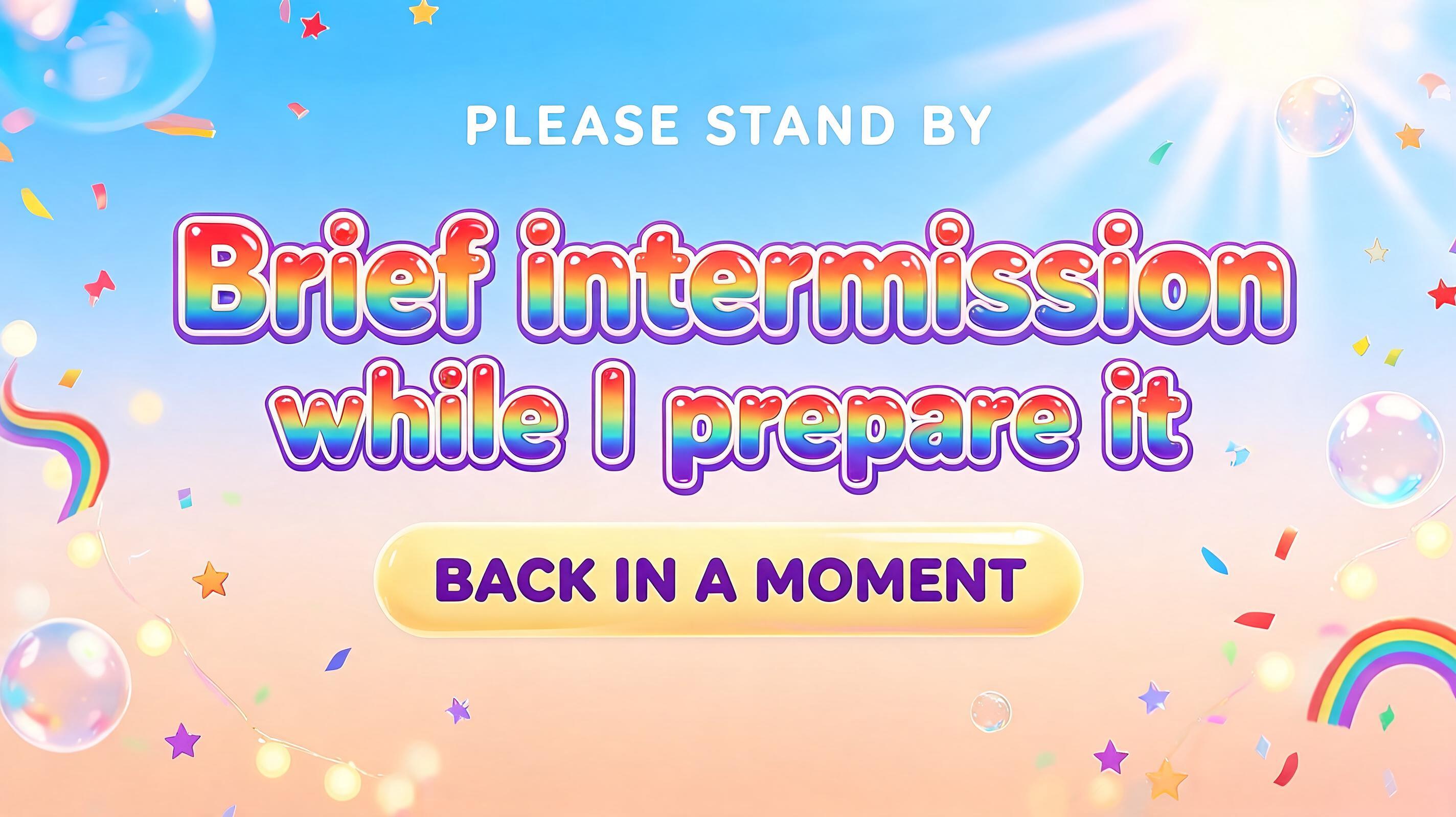

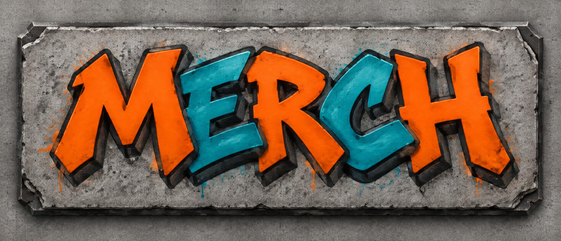
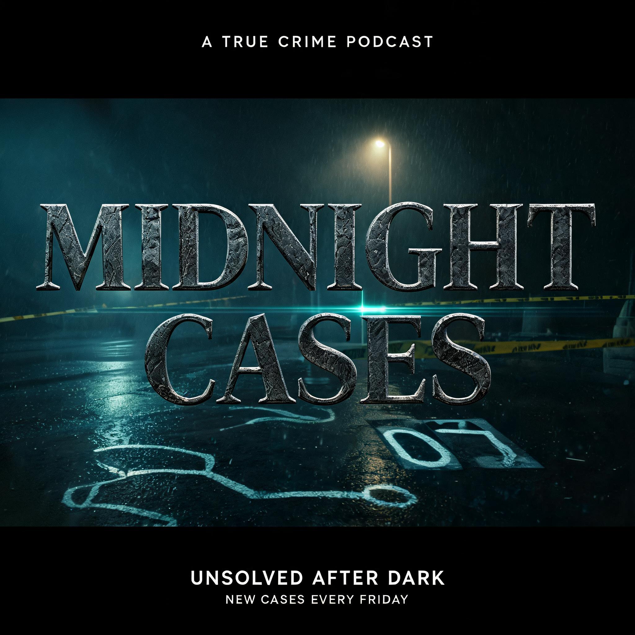

Find the Right Cyberpunk Style for Your Project
9 distinct variations — each locked to a specific look and use case.


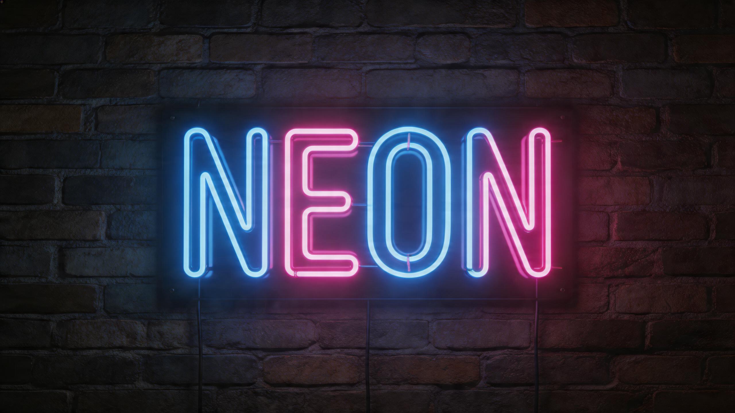


Cyberpunk Gallery
Real outputs from the Cyberpunk style. Click any image to see details.
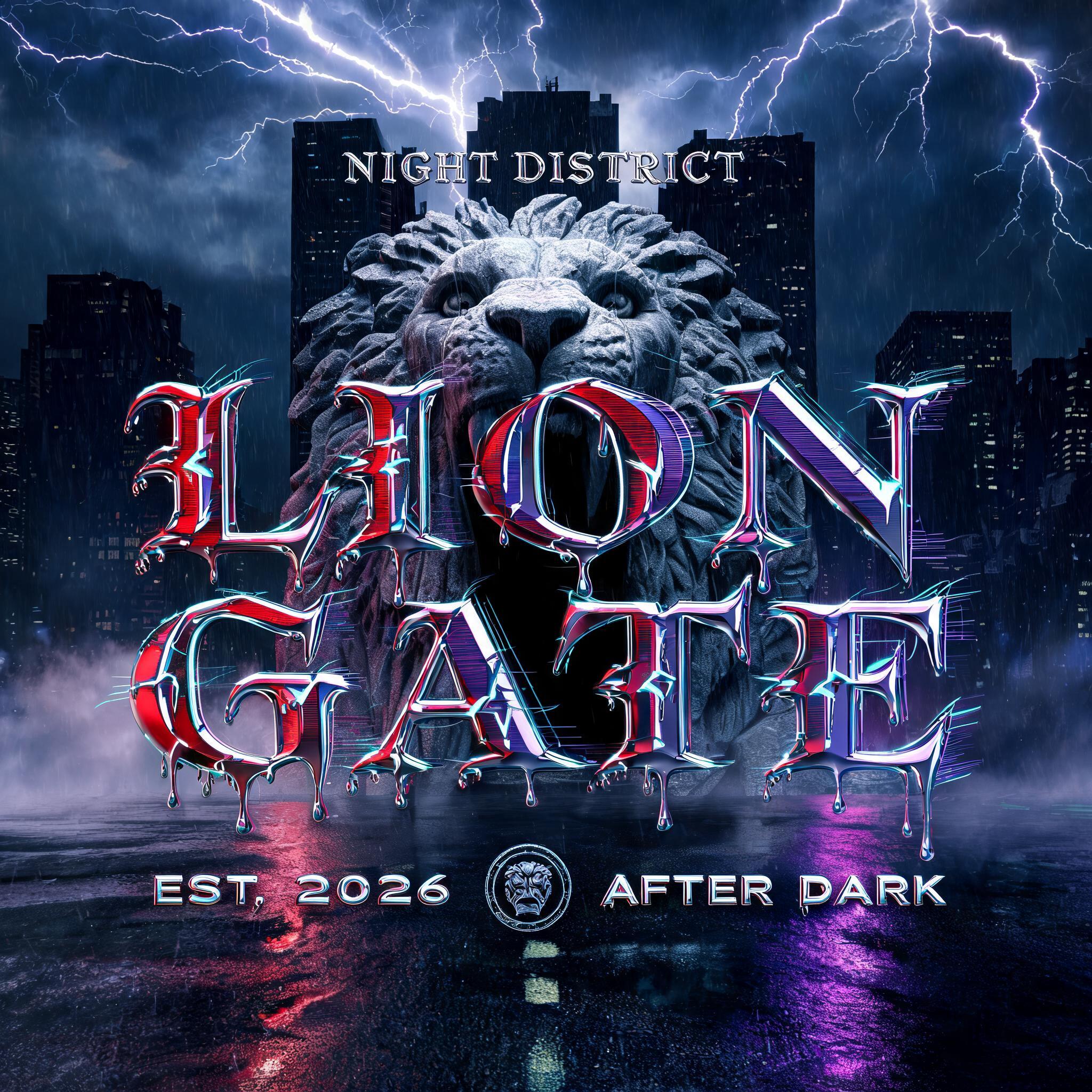
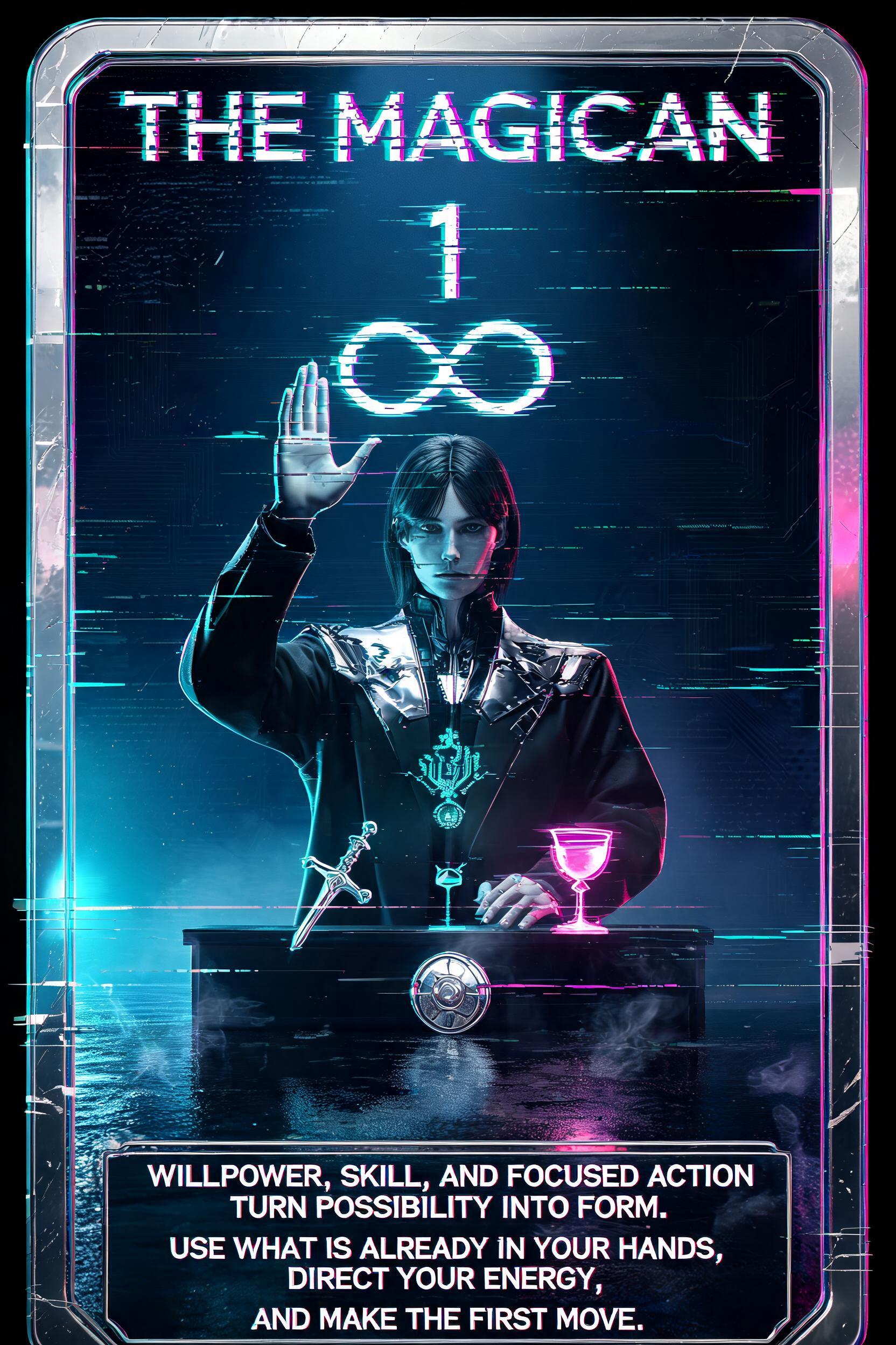
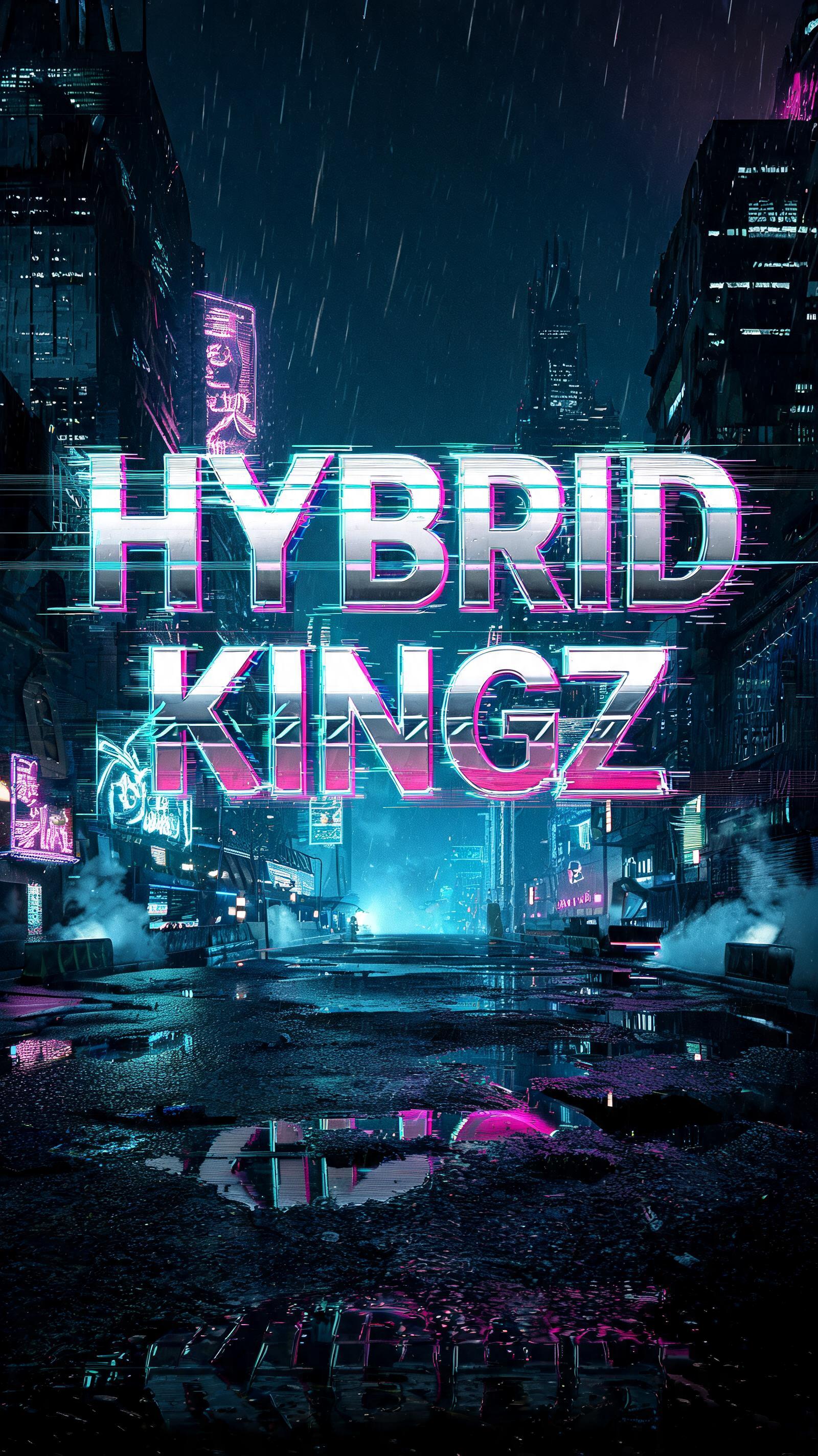






Looking for copy-paste fancy text? Try our free Font Generator Tools — cursive, gothic, bubble & 30+ styles.
Perfect for These Projects
Cyberpunk Text Effect — FAQ
What is the Cyberpunk Font Style?
The Cyberpunk font style is a distinctive AI-generated typography effect. Chrome block capitals with magenta and cyan color fringing, horizontal glitch slices and scanlines, glowing over a rainy neon megacity at night. Using FontVibe's AI cyberpunk generator you can create stunning text effects in seconds — no Photoshop, no font licensing, no design experience needed.
Explore the Cyberpunk gallery for inspiration, or browse all 135+ AI text effect styles available on FontVibe.
How to Create Cyberpunk Typography in FontVibe Studio
The Story Behind Cyberpunk
History, visual DNA, and cultural context.
Where It Came From
Cyberpunk didn't start as a visual style — it started as an attitude. The word was coined in 1980 by writer Bruce Bethke, but it was William Gibson's 1984 novel Neuromancer that turned it into a cultural movement. Gibson imagined a world where corporate power had consumed everything, teenagers jacked into global networks through ports in the back of their skulls, and neon-soaked city blocks were the only refuge left for the dispossessed. The central tension — high tech, low life — became the genre's defining logic.\n\nThe aesthetic followed. Ridley Scott's Blade Runner (1982) gave the ideas a face: rain-slicked streets, kanji billboard advertisements, acid-yellow lighting bleeding through perpetual fog. Japan's cyberpunk lineage ran parallel — Katsuhiro Otomo's Akira (1982) introduced a harder, more kinetic visual grammar that would echo through anime, streetwear, and gaming for decades.\n\nBy the time Cyberpunk 2077 dropped in 2020, the aesthetic had fully escaped its genre origins. It wasn't science fiction anymore — it was a design language.
The Visual DNA
Cultural Landmarks
In Typography
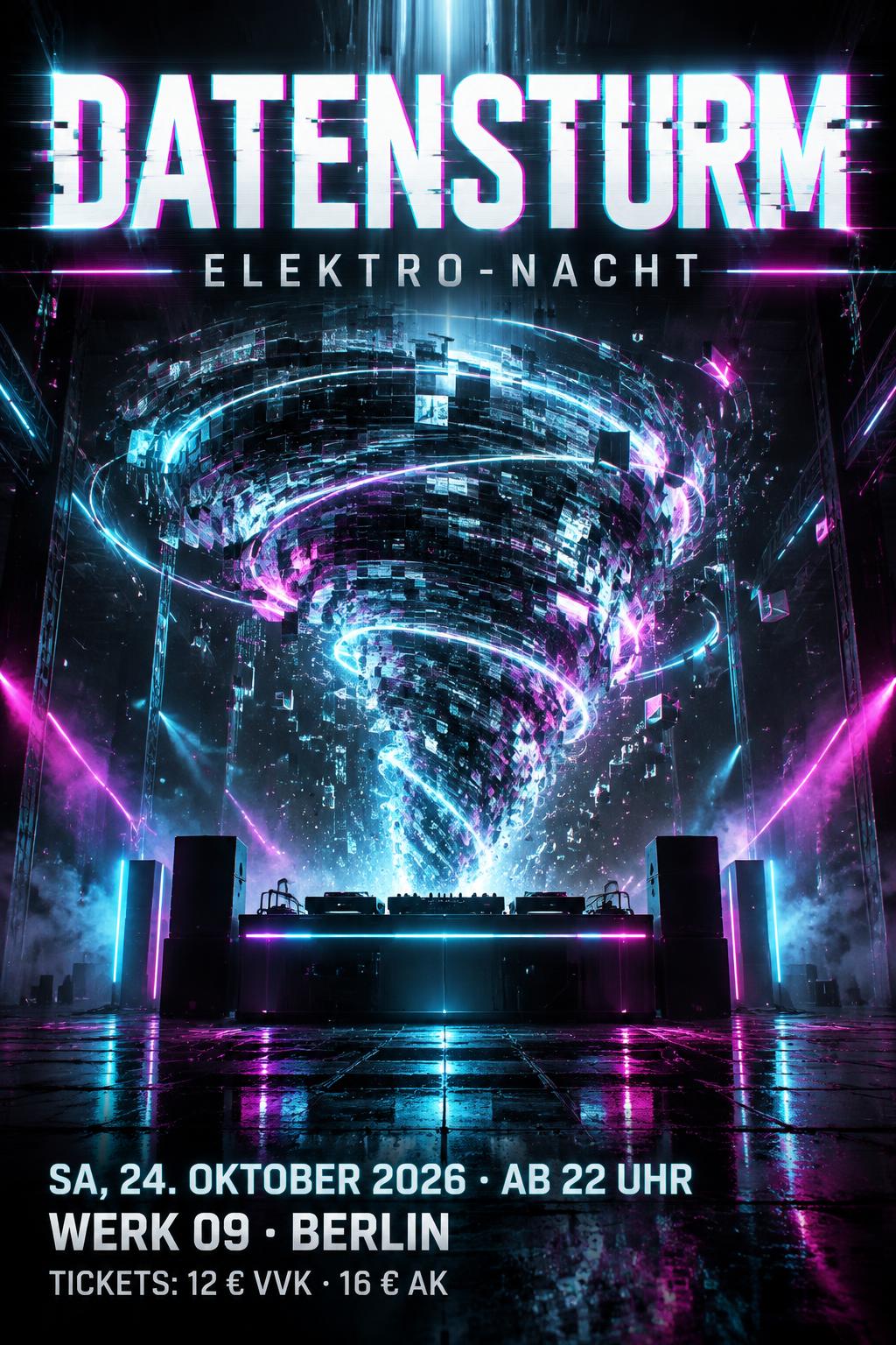
Cyberpunk typography refuses to be readable at the cost of being forgettable. The priority is presence — the text should look like it belongs to a world that doesn't care about your comfort.\n\nFor headlines — channel banners, game titles, event posters — the goal is impact at distance. Letterforms distorted by glitch offsets, where the same character exists in three colors at once, slightly out of register. Type set against backgrounds so dark they feel like voids. Outlines that spark and fragment at the edges.\n\nFor smaller applications — Discord names, watermarks, stickers — the glitch needs to be tight and precise so it reads on a thumbnail. A good cyberpunk treatment at small sizes should look like it was transmitted, received imperfectly, and still survived.
In Their Words
“The future is already here — it's just not very evenly distributed.”
“What is required for true credibility is a used future.”
Did You Know?
William Gibson wrote Neuromancer on a manual typewriter. He had never owned a computer when he invented the internet. His vision of cyberspace came entirely from watching kids play arcade games through a window.
Blade Runner flopped at the box office in 1982. It made $14 million against a $28 million budget. The 1992 Director's Cut — and decades of cultural influence — turned it into the most referenced sci-fi film in design history.
The word 'cyberpunk' was originally a joke. Bruce Bethke made two word lists — one for technology, one for troublemakers — and combined them. He was trying to coin a catchy title for a short story. It accidentally named a genre.
Blade Runner's production designer Syd Mead called his visual style 'used future' — the idea that in a real future, nothing stays clean for long. Every surface has been touched, worn, repaired and broken again. It's the opposite of sterile sci-fi.
Create Your Cyberpunk Typography in Studio
Free to start. No design skills needed. Your artwork, your copyright.
AI Cyberpunk Text Effect Generator
Chrome block capitals with magenta and cyan color fringing, horizontal glitch slices and scanlines, glowing over a rainy neon megacity at night. — no font license needed.
Cyberpunk in different AI fonts
What you can make with Cyberpunk
Generate Your Cyberpunk Text Effect
Type any word — see it transformed in seconds. No sign-up required.
Cyberpunk Style Gallery
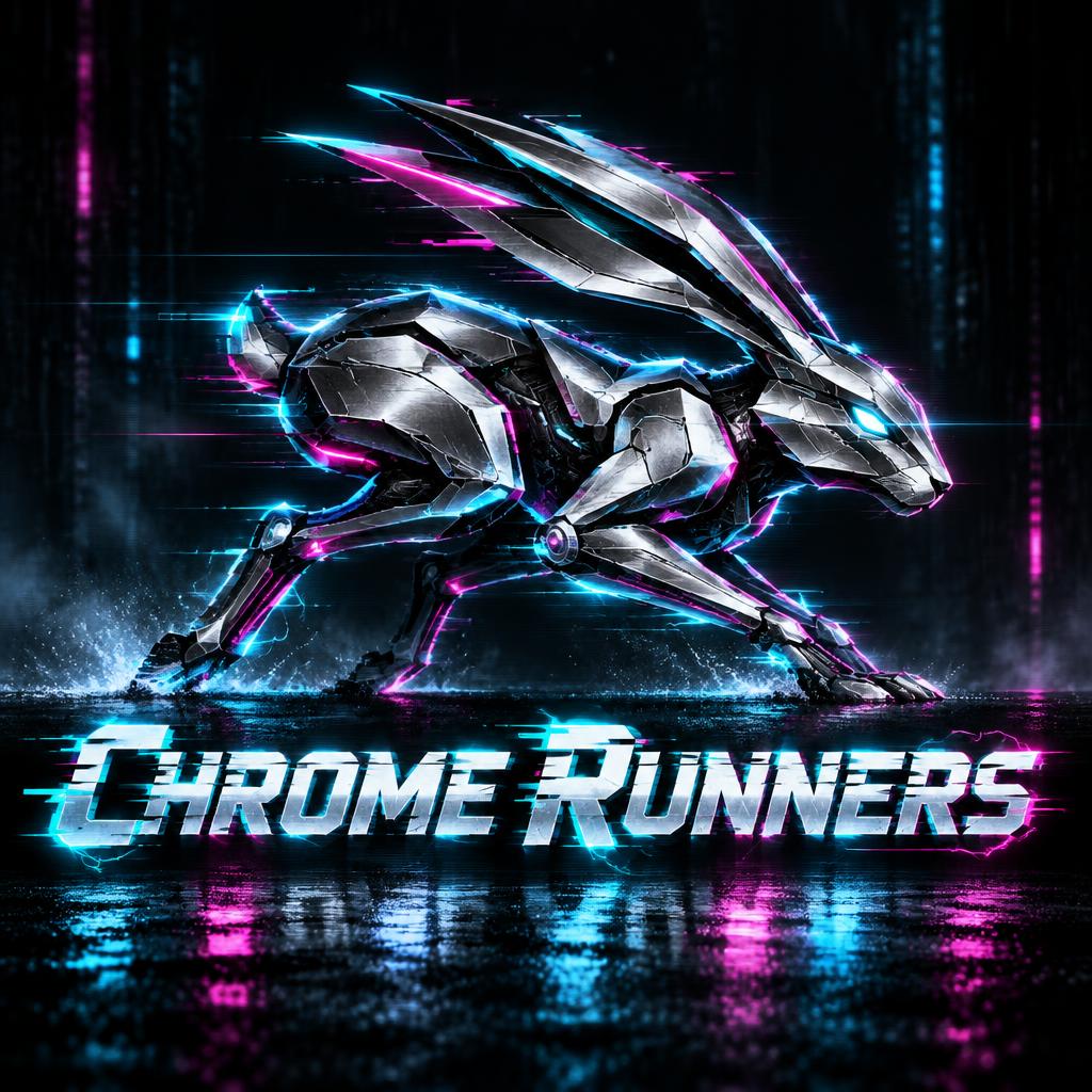
Real outputs from the Cyberpunk style. Click any image to see details.






Similar Text Effect Styles
Try these styles and create your own AI-generated text effects.
Looking for copy-paste fancy text? Try our free Font Generator Tools — cursive, gothic, bubble & 30+ styles.
Perfect for These Projects
Cyberpunk text effects are popular for creative projects where visual impact matters.
What is the Cyberpunk Font Style?
The Cyberpunk font style is a distinctive AI-generated typography effect. Chrome block capitals with magenta and cyan color fringing, horizontal glitch slices and scanlines, glowing over a rainy neon megacity at night.
Using FontVibe's AI cyberpunk generator you can create stunning text effects in seconds — no Photoshop, no font licensing, no design experience needed.
Explore the Cyberpunk gallery for inspiration, or browse all 135+ AI text effect styles available on FontVibe.
How to Create Cyberpunk Typography in FontVibe Studio
1. Enter your text — Any word, phrase, or brand name. Works best with short, punchy text.
2. Select Cyberpunk — From the style library. Optionally describe a mood in the custom prompt.
3. Generate and download. Your Cyberpunk font artwork is ready in seconds. PNG, JPG, or transparent PNG.
Looking for something different? Browse the full font style library for more AI typography options.
Cyberpunk Text Effect — FAQ
The Story Behind Cyberpunk
History, visual DNA, and cultural context — everything that makes this style what it is.
Where It Came From
Cyberpunk didn't start as a visual style — it started as an attitude. The word was coined in 1980 by writer Bruce Bethke, but it was William Gibson's 1984 novel Neuromancer that turned it into a cultural movement. Gibson imagined a world where corporate power had consumed everything, teenagers jacked into global networks through ports in the back of their skulls, and neon-soaked city blocks were the only refuge left for the dispossessed. The central tension — high tech, low life — became the genre's defining logic.\n\nThe aesthetic followed. Ridley Scott's Blade Runner (1982) gave the ideas a face: rain-slicked streets, kanji billboard advertisements, acid-yellow lighting bleeding through perpetual fog. Japan's cyberpunk lineage ran parallel — Katsuhiro Otomo's Akira (1982) introduced a harder, more kinetic visual grammar that would echo through anime, streetwear, and gaming for decades.\n\nBy the time Cyberpunk 2077 dropped in 2020, the aesthetic had fully escaped its genre origins. It wasn't science fiction anymore — it was a design language.
The Visual DNA
Cultural Landmarks
In Typography
Cyberpunk typography refuses to be readable at the cost of being forgettable. The priority is presence — the text should look like it belongs to a world that doesn't care about your comfort.\n\nFor headlines — channel banners, game titles, event posters — the goal is impact at distance. Letterforms distorted by glitch offsets, where the same character exists in three colors at once, slightly out of register. Type set against backgrounds so dark they feel like voids. Outlines that spark and fragment at the edges.\n\nFor smaller applications — Discord names, watermarks, stickers — the glitch needs to be tight and precise so it reads on a thumbnail. A good cyberpunk treatment at small sizes should look like it was transmitted, received imperfectly, and still survived.
In Their Words
“The future is already here — it's just not very evenly distributed.”
“What is required for true credibility is a used future.”
Did You Know?
William Gibson wrote Neuromancer on a manual typewriter. He had never owned a computer when he invented the internet. His vision of cyberspace came entirely from watching kids play arcade games through a window.
Blade Runner flopped at the box office in 1982. It made $14 million against a $28 million budget. The 1992 Director's Cut — and decades of cultural influence — turned it into the most referenced sci-fi film in design history.
The word 'cyberpunk' was originally a joke. Bruce Bethke made two word lists — one for technology, one for troublemakers — and combined them. He was trying to coin a catchy title for a short story. It accidentally named a genre.
Blade Runner's production designer Syd Mead called his visual style 'used future' — the idea that in a real future, nothing stays clean for long. Every surface has been touched, worn, repaired and broken again. It's the opposite of sterile sci-fi.